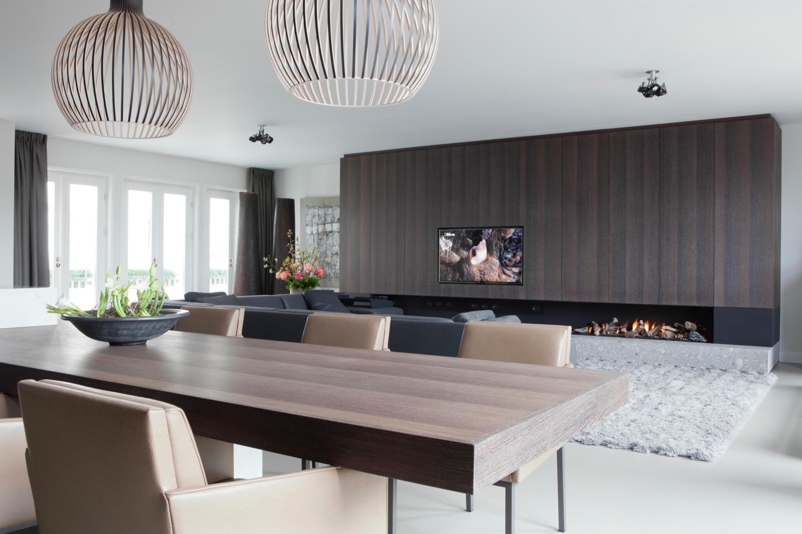
Penthouse interior with long kitchen and built-in fireplace
The light screed floor gives the room its first clear line, then the dark timber wall takes over and runs the length of the living space. In this penthouse interior, the contrast is immediate: pale underfoot, dark at eye level, with the kitchen and sitting area pulled into one open sequence. The long kitchen stretches for roughly nine metres, and its scale is matched by a built-in fireplace set into the same wall language. Nothing here feels incidental. Each element is placed to make the plan legible at a glance.
A dark timber wall that carries the room
The strongest gesture is the continuous wall in dark wood. It folds in storage, a fireplace, and the television zone, so the surface reads as one long architectural line instead of a series of separate parts. That line matters in a room of this size. It holds the open plan together and gives the penthouse interior a clear edge without closing it off. A built-in fireplace sits within the panelled wall, its opening cut into the timber rather than treated as a freestanding object.
Seen alongside the light screed floor, the wall does more than divide surfaces. It marks out the living area, draws attention to the depth of the room, and sets off the brighter walls around it. The material shift is direct: dark wood, pale floor, white plaster, glass. In the images, the same timber treatment continues into the corridor and bedroom, where panels and fixed wall lights repeat the rhythm in a quieter register. The result is consistent without becoming repetitive.
Built-in fireplace in a long wall composition
The fireplace is not placed as a decorative finish. It sits inside the wall volume, alongside shelving, joinery and media storage, so the whole composition reads as one piece of custom work. Flame and timber meet at close range, which gives the room a clear focal point from several angles. In the seating area, the wide carpet and low furniture sit against the harder line of the wall, but the architecture stays dominant. This is where the penthouse interior shows its structure most clearly.
A kitchen that runs the length of the plan
The kitchen is almost a room in itself. At about nine metres long, it stretches across the plan and uses that length rather than hiding it. Dark cabinetry follows the wall, while the island sits forward as a heavy centre point. Its top is light and veined, which lifts the mass of the joinery and gives the work surface a sharper edge. The proportion of the island is important: large enough to hold the room, but not so bulky that it blocks the view through the penthouse interior.
The kitchen island with integrated dining table changes the way the space is used. The table extends from the island rather than sitting beside it, so cooking and dining happen in one continuous move. From the photographs, the connection is practical and exact: a single piece of joinery that resolves two functions with one gesture. Above it, pendant lights drop into the open volume and pull the eye back to the centre of the kitchen. The long kitchen remains open to the living area, but the island gives it a clear internal order.
Storage, niches and the working edge of the kitchen
Along the kitchen wall, open niches and fitted storage break up the dark surface just enough to keep it from flattening. Glass, shelves and recessed compartments add depth to the joinery, while the light worktop provides the counterpoint. In one view, the kitchen reads as a carefully assembled sequence of planes: vertical cabinets, horizontal top, open shelves, then the island in front. The room depends on that layering. It allows the penthouse interior to feel open without leaving the kitchen visually unresolved.
Panels and spotlights in the corridor
The corridor is more restrained, but it repeats the same material logic. Dark wall panels run beside a white ceiling with small spotlights set into the line above. The route is narrow and straight, which makes the panelled wall feel more deliberate; it guides movement instead of merely lining a passage. A column-like element appears in one of the views, and the large window on the side keeps the walk from becoming closed in. The space is simple, but the detailing is exact.
That corridor treatment matters because it connects the more public parts of the penthouse interior with the private rooms. The same dark finish turns up again behind the bed, where the wall becomes a full-height backdrop rather than a corridor lining. In the bedroom, the panels and a fixed wall light create a similar depth, though the atmosphere is quieter. It is the same material family, adapted to a different scale and use.
Wengé behind the closed rooms
Toilet, bathroom and storage are hidden behind a wengé surface, which gives the closed zones a darker, more compact reading within the open plan. That surface appears again elsewhere in the apartment, tying the secondary rooms back to the main composition. The dark tone stands out against the pale floor and the white walls, so the change in function is visible as soon as the material changes. In a layout like this, that distinction helps the penthouse interior stay clear and readable.
The material choice is also useful because it allows the service areas to recede without disappearing entirely. They remain part of the overall sequence, but the darker finish signals a shift from living and cooking to support spaces. Nothing is overdrawn. The effect comes from surface, proportion and placement rather than from ornament. Seen as a whole, the apartment relies on a few strong moves: a long kitchen, an integrated dining table, a built-in fireplace, and a dark timber envelope that binds the rooms together.
Want to see more of Remy Meijers? View the page of Remy Meijers for even more great projects and company information.





NEW 2026 Jubileum Edition The Best Interior Designers Benelux
Order Now €125


NEW 2026 Jubileum Edition The Best Interior Designers Benelux
Order Now €125


NEW 2026 Jubileum Edition The Best Interior Designers Benelux
Order Now €125