Quiet luxury interior
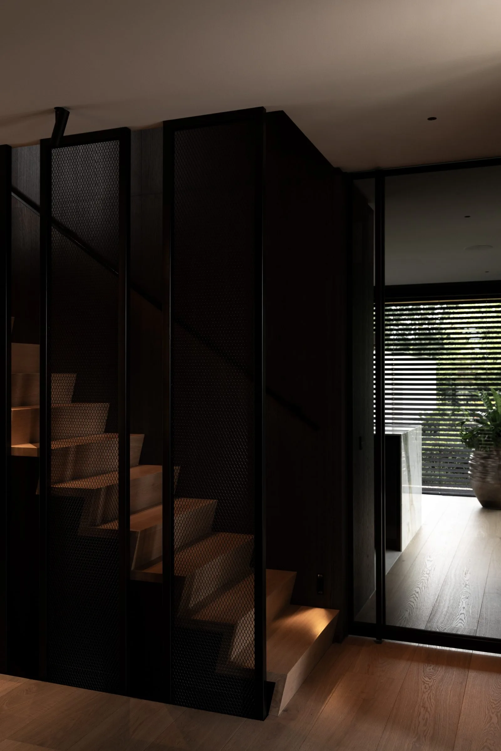
Quiet luxury interior starts here with a line of sight that runs past the kitchen, across the living spaces and back out toward the landscape. The room sequence is restrained, but it never feels closed in. Openings are placed to pull daylight and greenery into view, so the house reads as one continuous interior rather than a set of separate rooms. That sense of continuity is the main gesture, and everything else is built around it: material restraint, custom joinery and a kitchen that sits quietly at the center.
Long sightlines linking living spaces
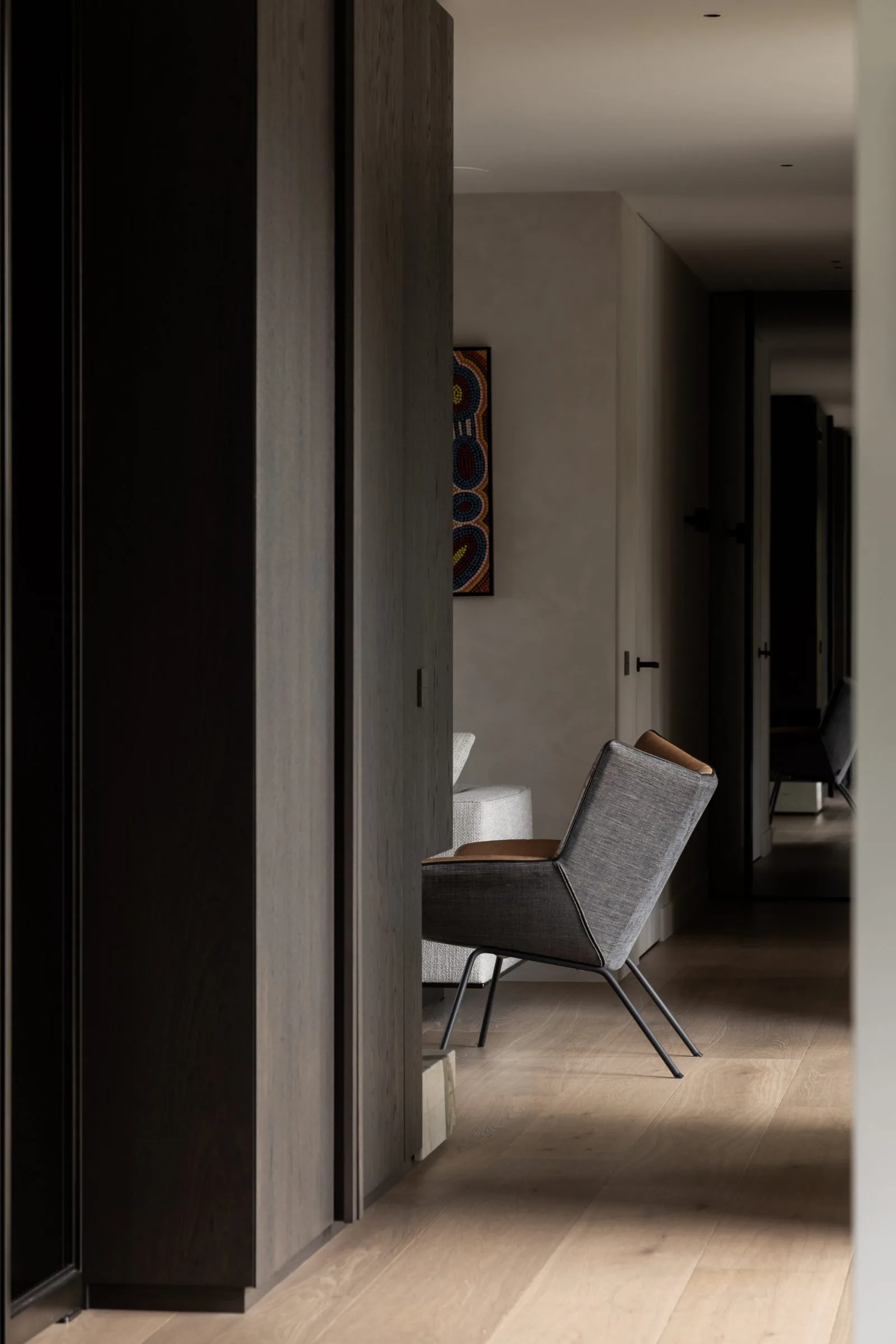
The strongest impression comes from the way the plan holds together. Long sightlines connect the living zones, while carefully placed openings keep the outside visible at more than one point. A glazed edge, a framed view and a darker transition in the joinery all help direct the eye without drawing attention to themselves. The result is not theatrical. It is measured, with each opening doing practical spatial work. In a quiet luxury interior, that kind of control matters more than decoration.
Routing is treated as part of the architecture, not an afterthought. Paths between rooms stay clear, and the relationship between openness and enclosure shifts gradually rather than abruptly. That is what gives the house its calm pace. The interior never needs to announce itself because the materials, views and proportions already do the work. This is where bespoke interior design becomes visible: in the way a doorway lands, in the pause before a view opens, and in the decision to keep the material palette small.
A natural stone kitchen island as the anchor
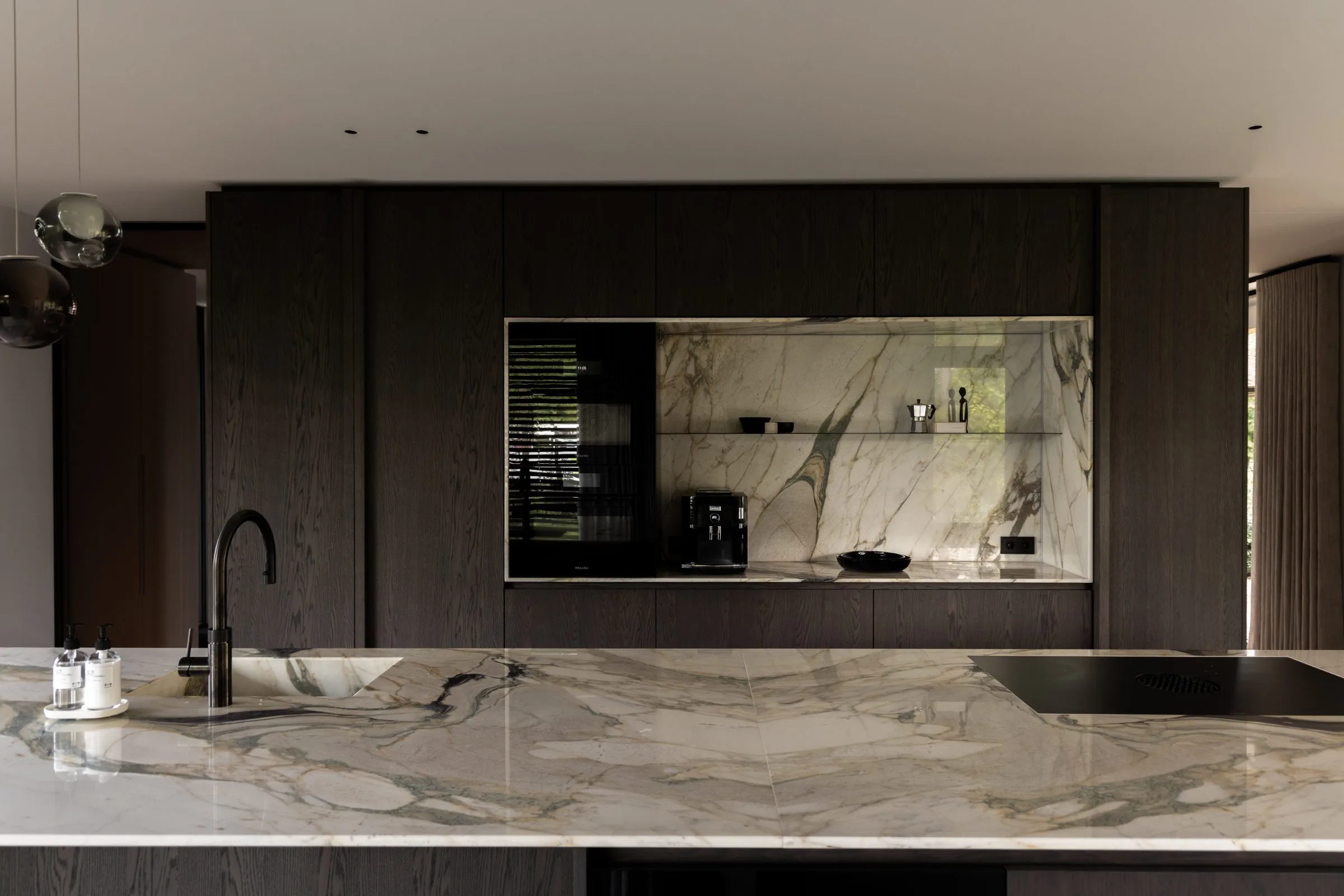
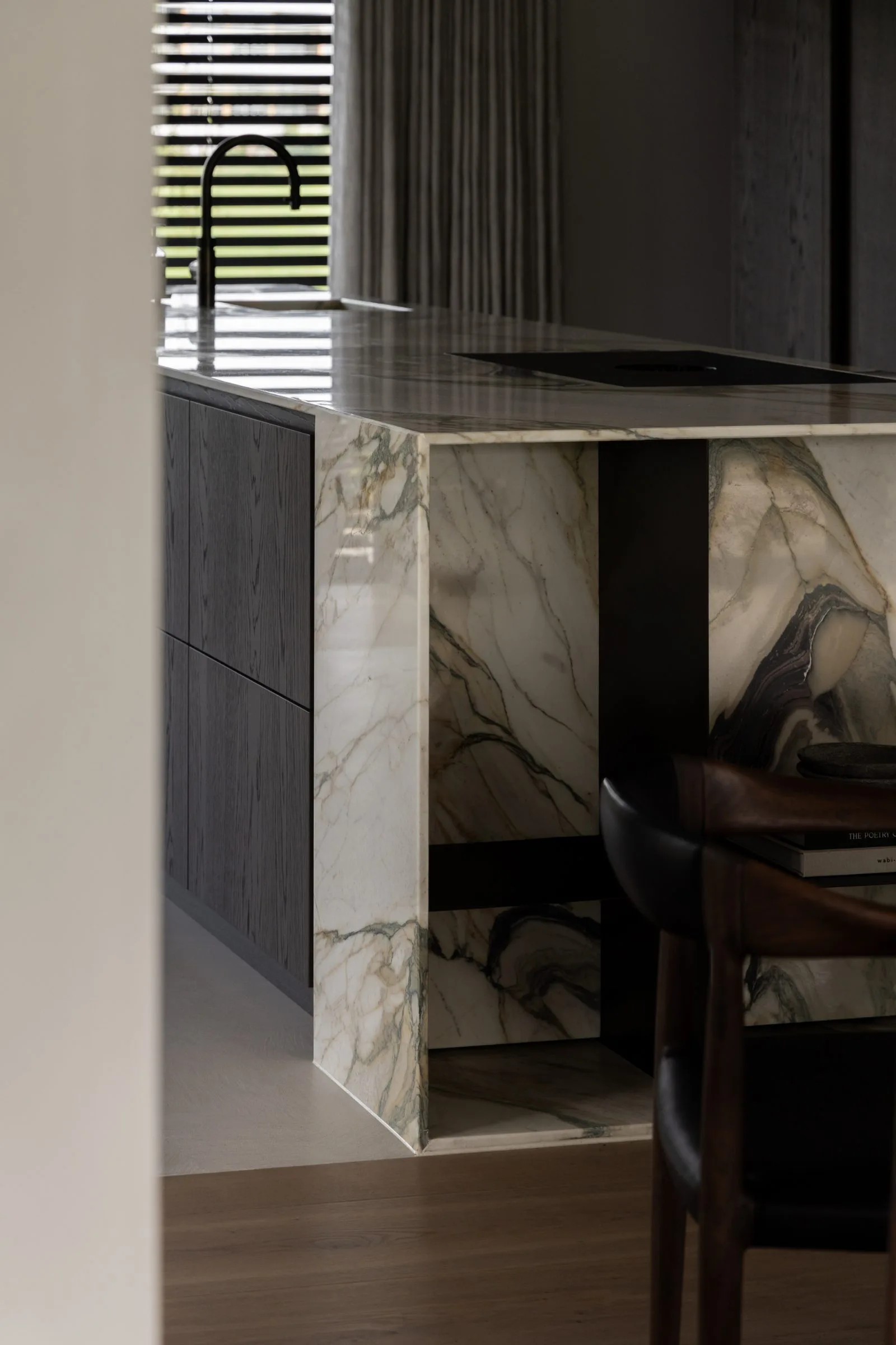
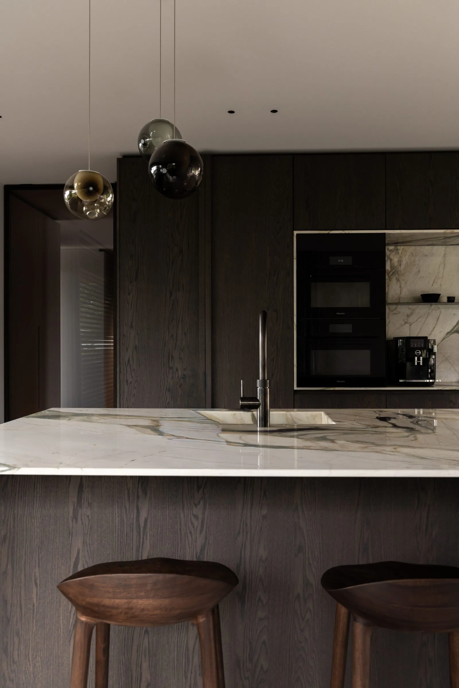
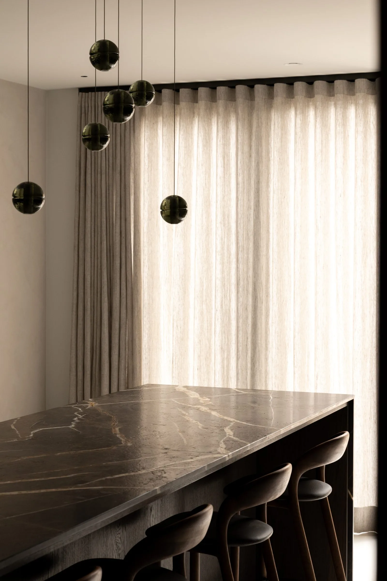
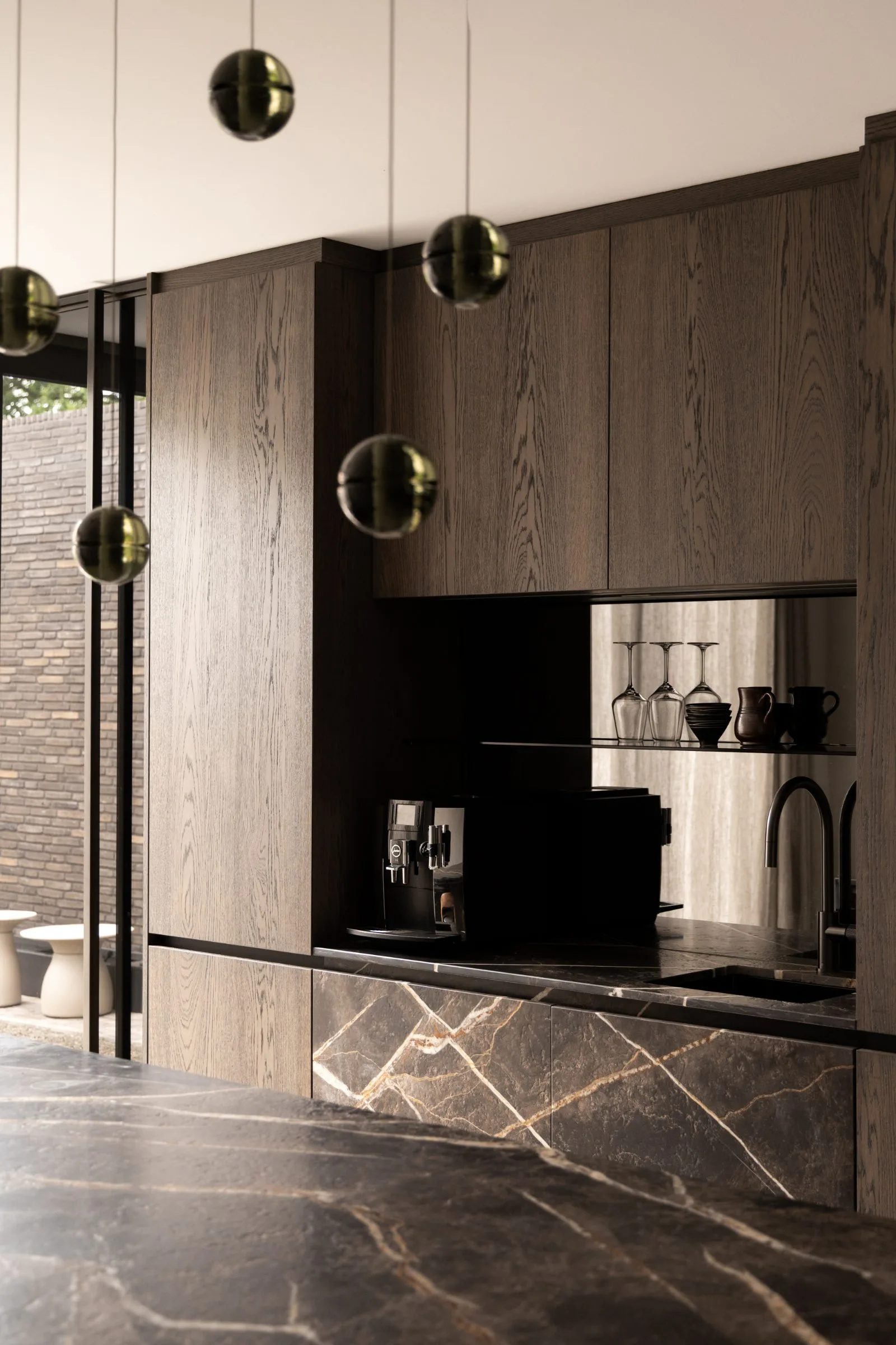
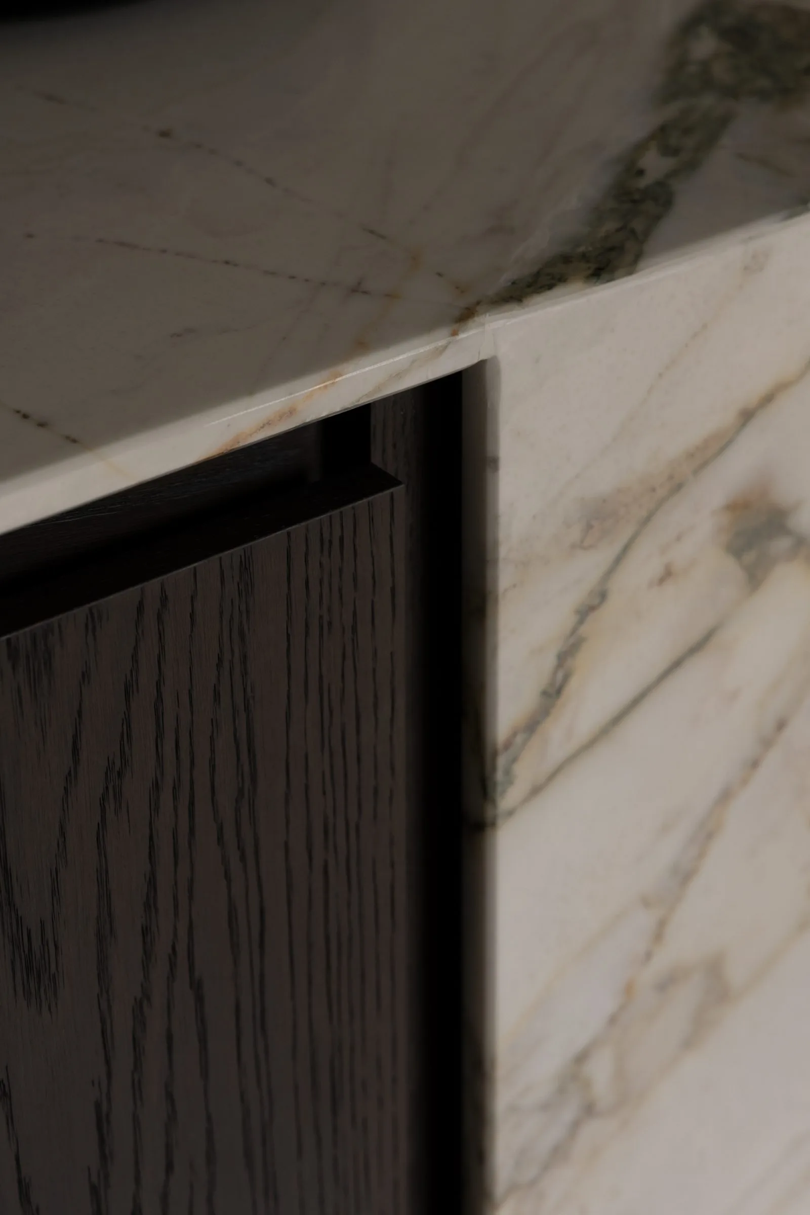
The kitchen carries the project’s main visual weight. A natural stone kitchen island sits in the middle of the space as a single, solid volume, its expressive veining setting up a subtle contrast with the dark oak custom joinery around it. The stone is not used as a bright accent; it is the surface that gives the room its core. Around it, the darker wood absorbs light and keeps the composition grounded. Together they define a kitchen that feels decisive without becoming loud.
What makes the kitchen memorable is the way the island relates to the surrounding storage and wall runs. The joinery is pulled into the architecture, so the room reads as one sequence of volumes rather than a collection of loose elements. That is where dark oak millwork becomes more than finish. It frames the working parts of the kitchen, holds the visual line, and lets the stone remain the focal point. The effect is precise, but never stiff.
Material contrast without visual noise
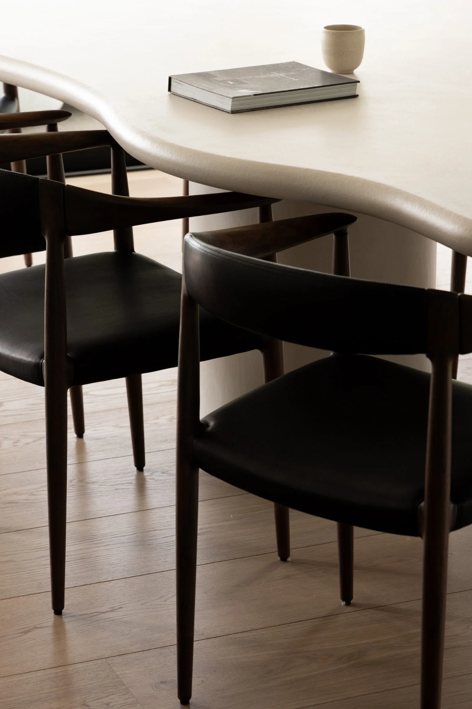
The palette stays narrow on purpose. Expressive stone, dark oak, soft plaster, warm oak flooring and upholstered pieces are repeated across the house, but each material is allowed its own texture. The plaster walls stay matte and quiet. The timber floor introduces a warmer grain underfoot. Stone appears in the kitchen and again in the bathroom details, always with enough restraint to keep the interior coherent. Because the palette is limited, the differences in texture become more noticeable, not less.
Daylight changes that reading over the course of the day. Morning light softens the plaster, while later light brings out the edges in the timber and the veining in the stone. Nothing here depends on ornament. The project relies on surfaces that respond to light and on proportions that give those surfaces room to breathe. That is why the interior can feel detailed without becoming busy. The material decisions are quiet, but they are never neutral.
Built-in storage that belongs to the architecture
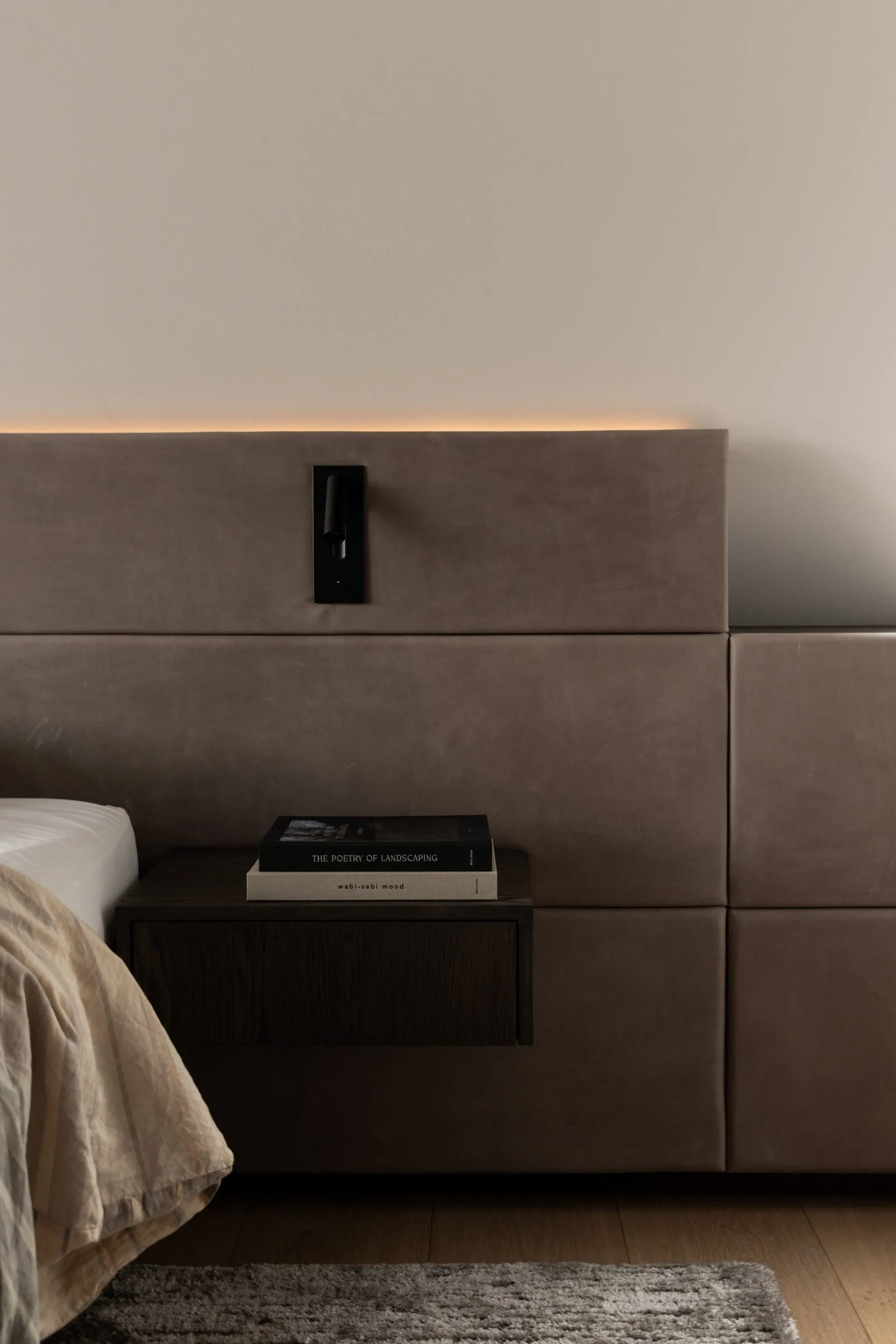
Built-in storage is handled as part of the room composition, not as furniture placed against a wall. The custom cabinets read as architectural volumes, with the fronts aligned into long planes and the technical parts kept out of sight. Storage, appliance zones and practical functions disappear into the darker joinery wherever possible. The result is a cleaner field of wood and stone, with fewer interruptions across the walls and a stronger sense of order in the room.
This approach also supports the quieter parts of the house. When cupboards and technical elements recede, the larger gestures become clearer: the line of a corridor, the edge of a wall opening, the shift from one floor surface to another. It is a useful example of bespoke interior design at close range. The eye is not pulled toward the storage itself. It moves across the volumes, registers the joinery as part of the architecture and then returns to the larger spatial composition.
Dark oak millwork and hidden functions
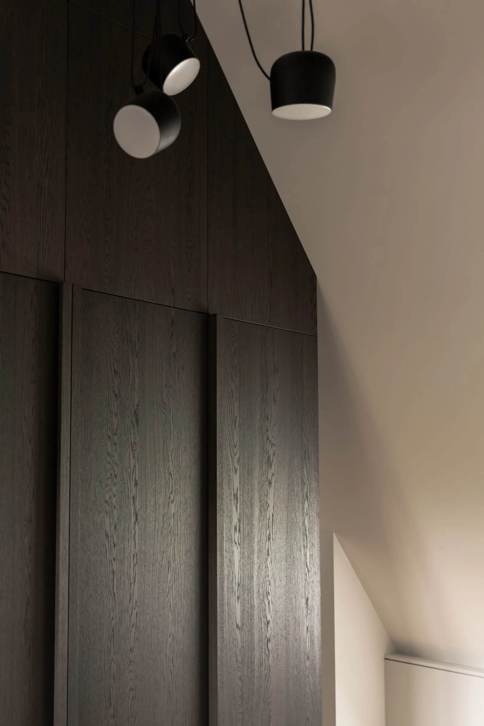
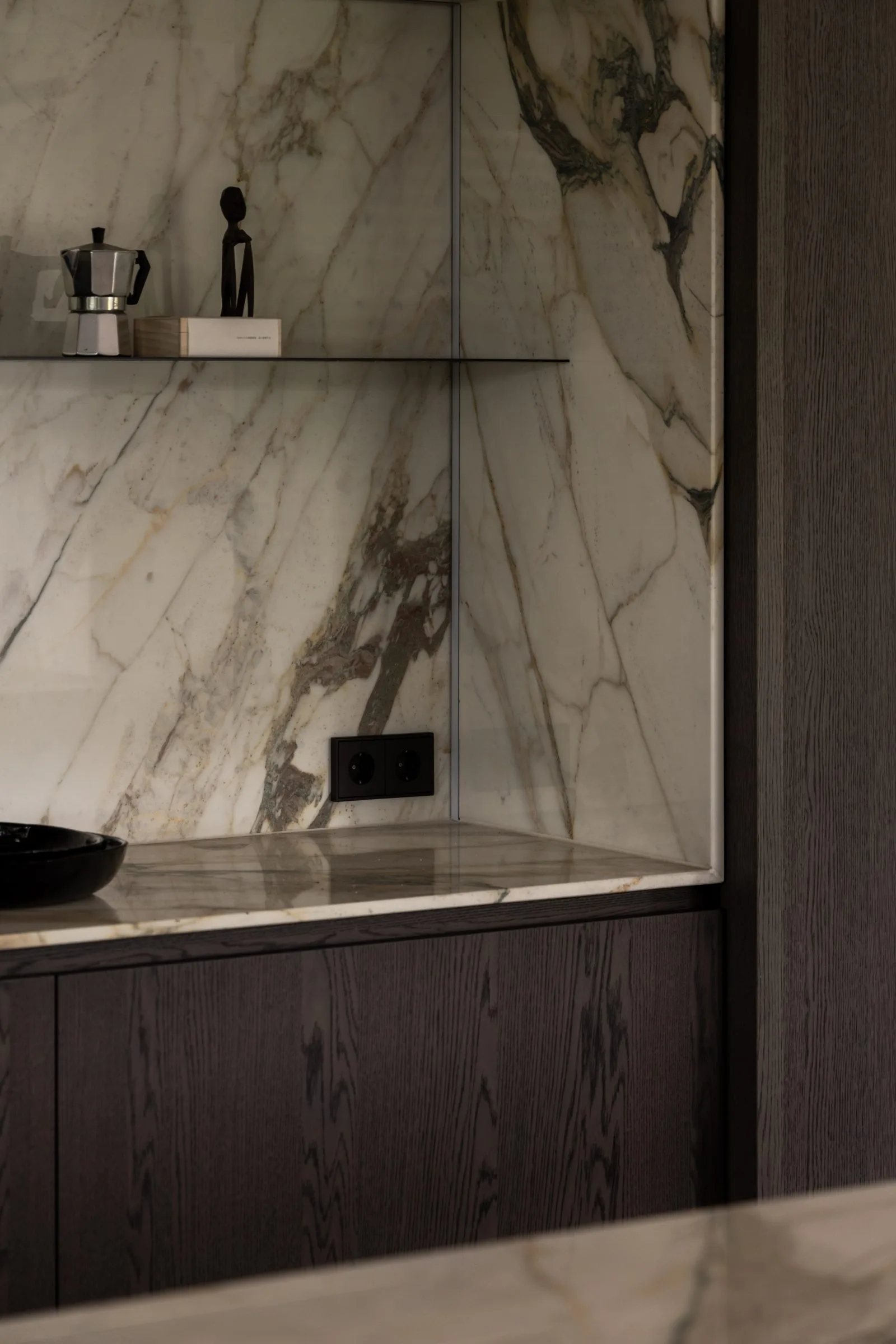
Dark oak millwork carries much of that discipline. The wood has enough grain to feel tactile, but it is controlled enough to hold long, uninterrupted runs. In the images, the fronts sit flush, the joints stay quiet and the nooks are detailed to disappear into the wall. Even where the kitchen and storage areas need to work hard, the visible result remains composed. The important point is not that everything is hidden. It is that the visible parts are edited with care so the room can stay calm.
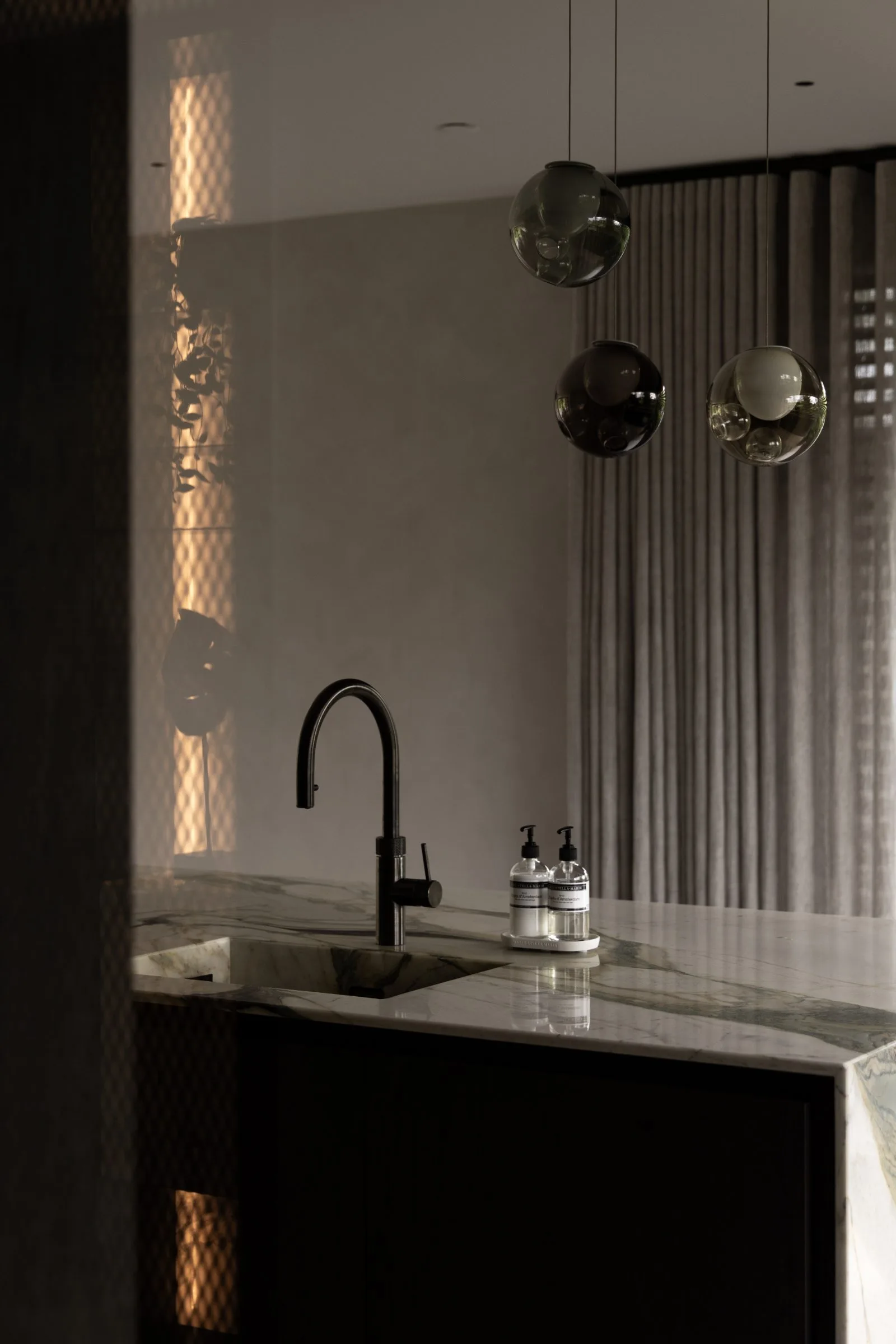
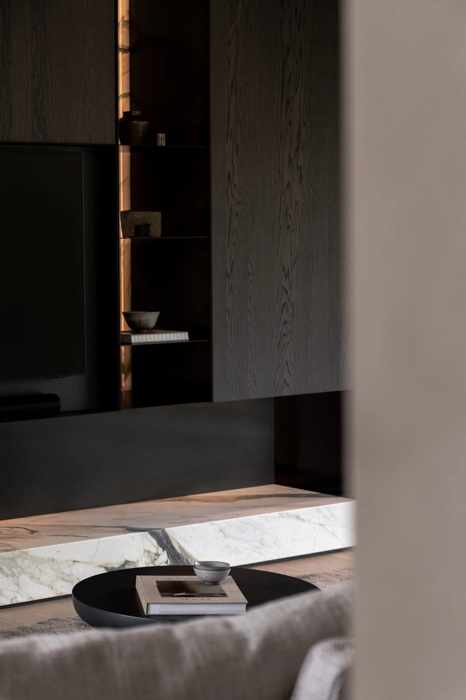
That same edit continues in smaller moves throughout the interior. A niche lights softly within a dark wall panel. A glass edge catches reflection near the kitchen. A black tap sits sharply against the stone. These are modest details, but they give the project clarity. A quiet luxury interior does not depend on one signature object; it depends on the consistency of those details across the plan.
Daylight, texture and the slower rhythm of the house
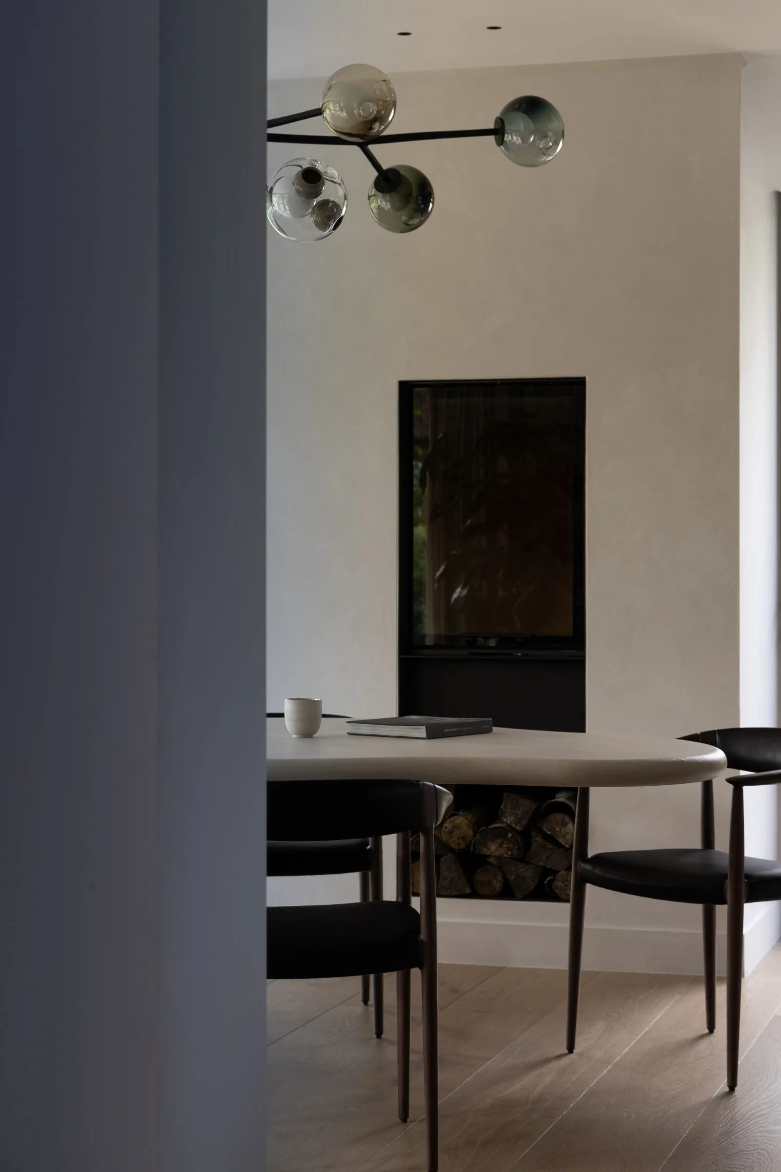
Elsewhere in the house, the same spatial discipline remains visible. The living areas show broad openings to the outside, with greenery holding a constant place in the view. Bolvormige glazen hanglampen and smaller spotlights add a light layer at ceiling level, but the room still depends most on daylight and the reflections it creates on glass and matte surfaces. The seating area stays low and linear, which lets the room stretch out horizontally instead of turning into a collection of isolated corners.
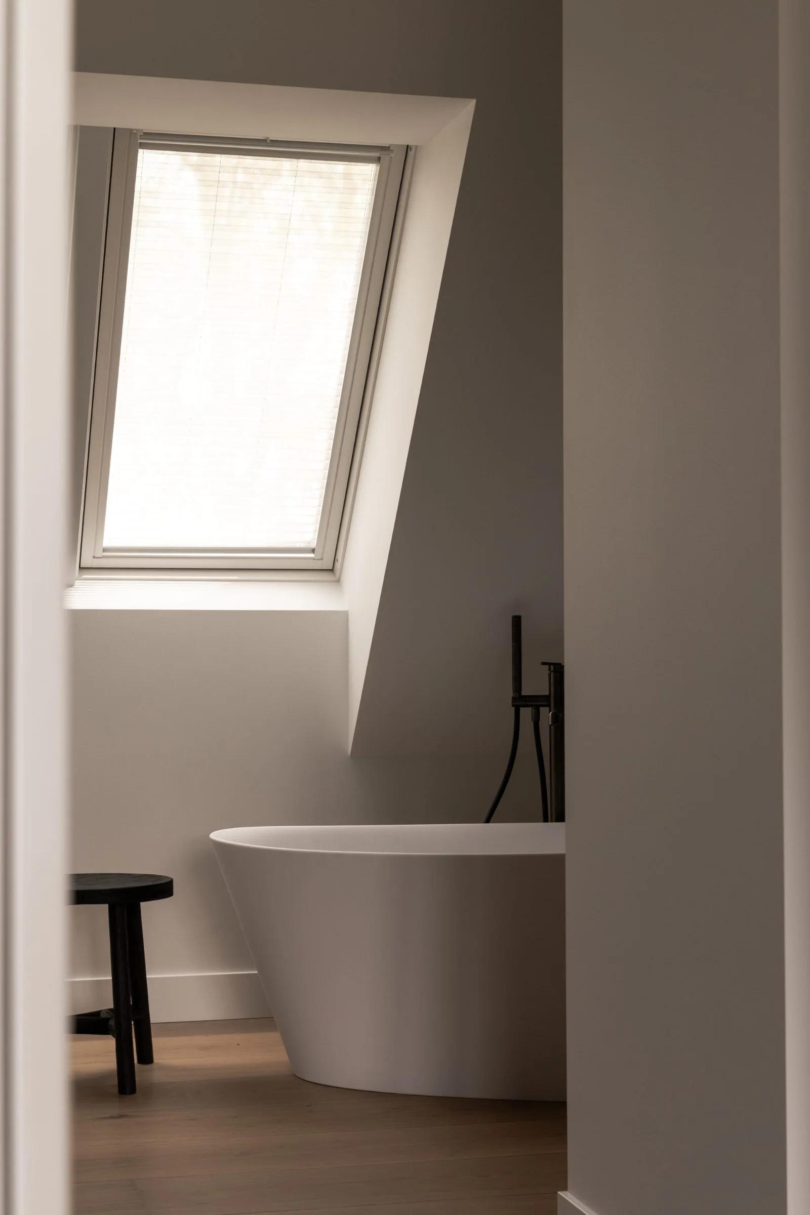
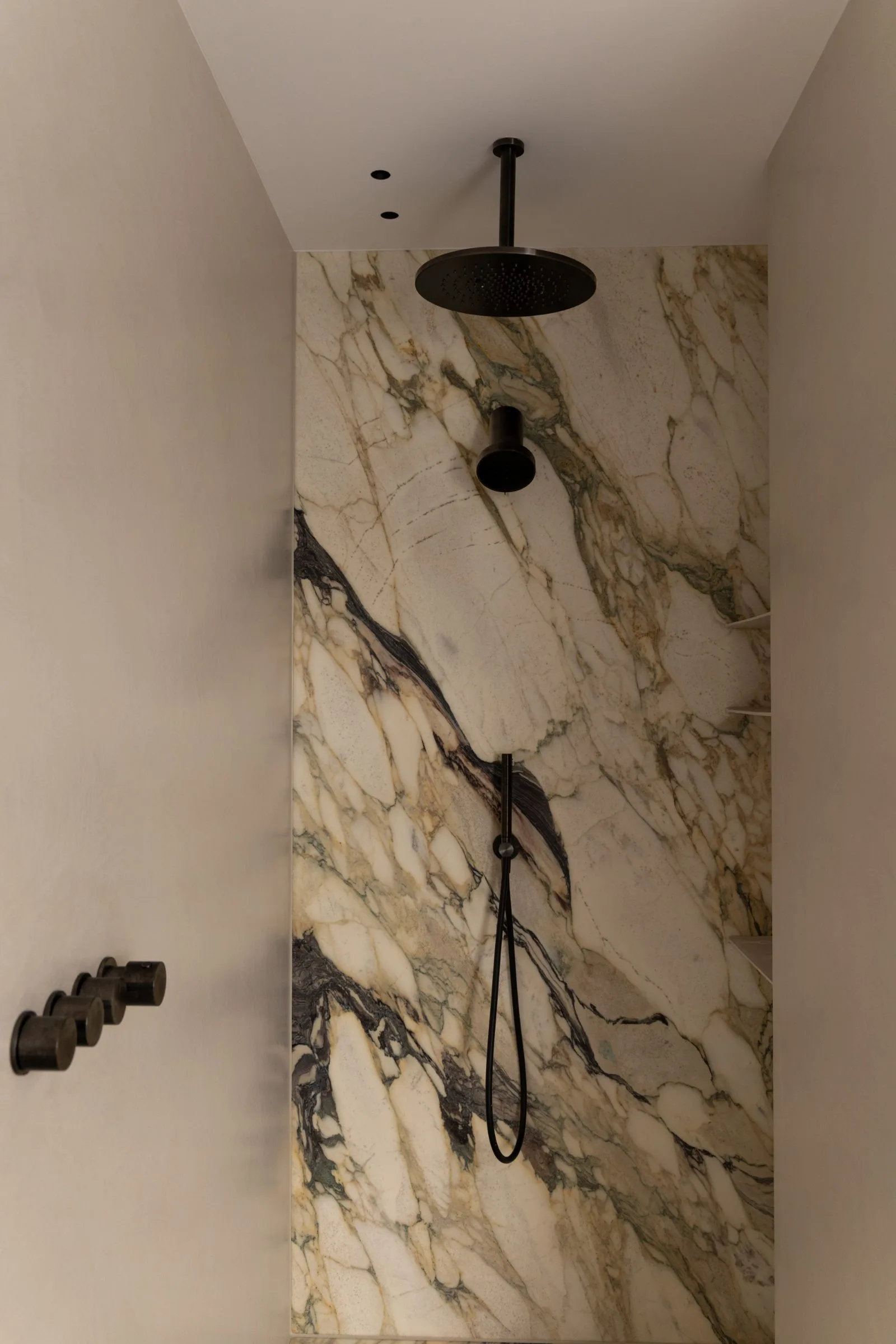
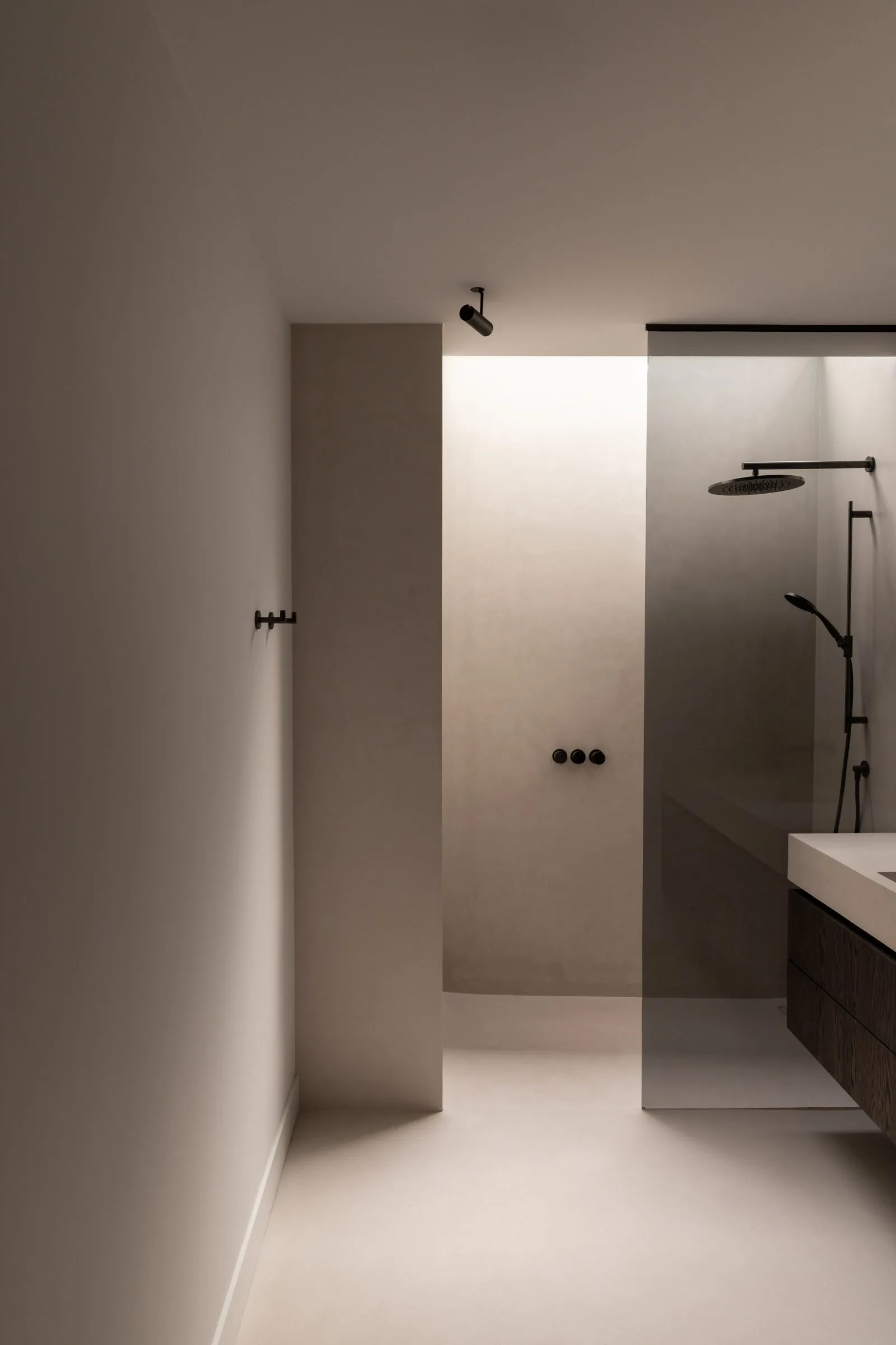
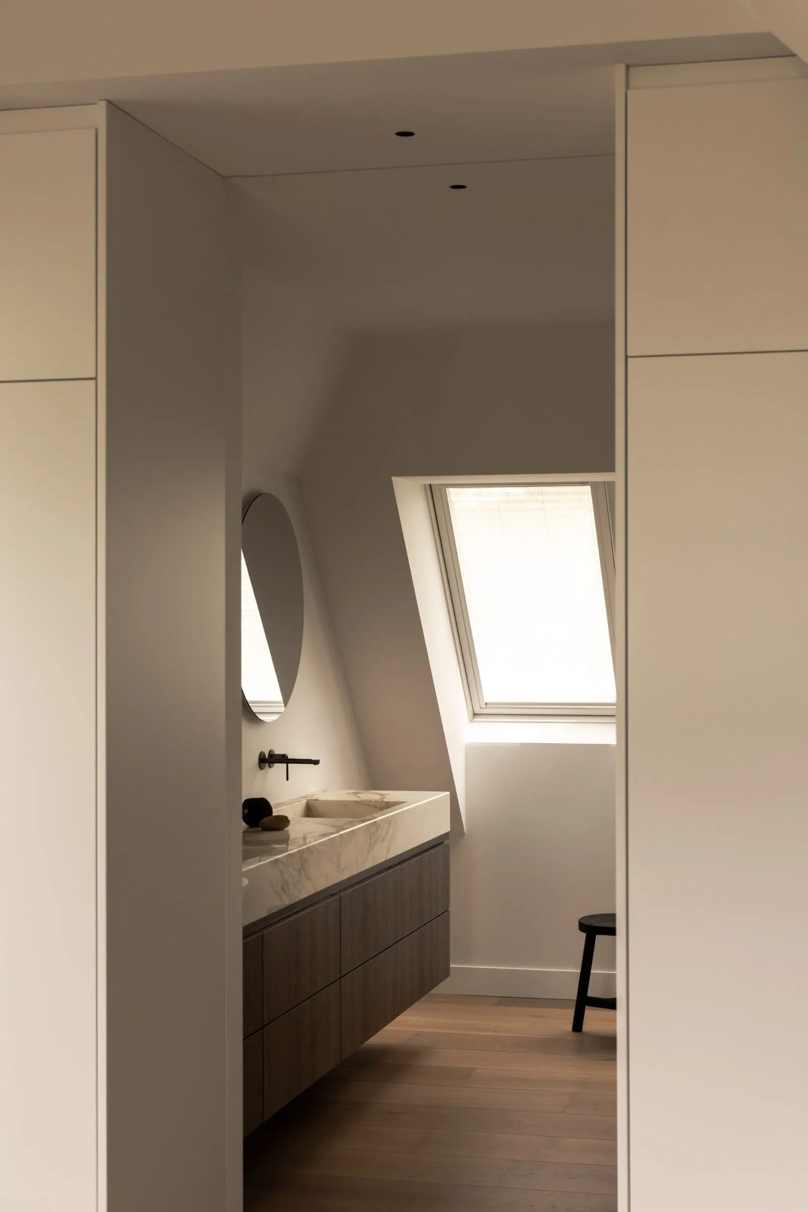
The bathroom follows the same language through a narrower set of materials: marble-like wall surfaces, black fittings and glass shower partitioning. It is a supporting space, but it confirms the project’s approach to detail. Surfaces are large, lines are straight and ornament stays absent. Across the interior, the project prefers visible grain, veining and shadow over obvious statement pieces. That is why the whole house feels settled into its own rhythm rather than staged for effect.
In the end, the project is defined by restraint that never turns cold. Long sightlines, custom joinery, a natural stone kitchen island and a limited palette of timber, plaster and fabric create a house that feels measured from the first step to the last. The spaces do not compete with each other. They extend one another. That is the quiet luxury interior at work: not as a mood, but as a clear way of arranging space, light and material.
Want to see more of ZOUT Ontwerphuis? View the page of ZOUT Ontwerphuis for even more great projects and company information.



NEW 2026 Jubileum Edition The Best Interior Designers Benelux
Order Now €125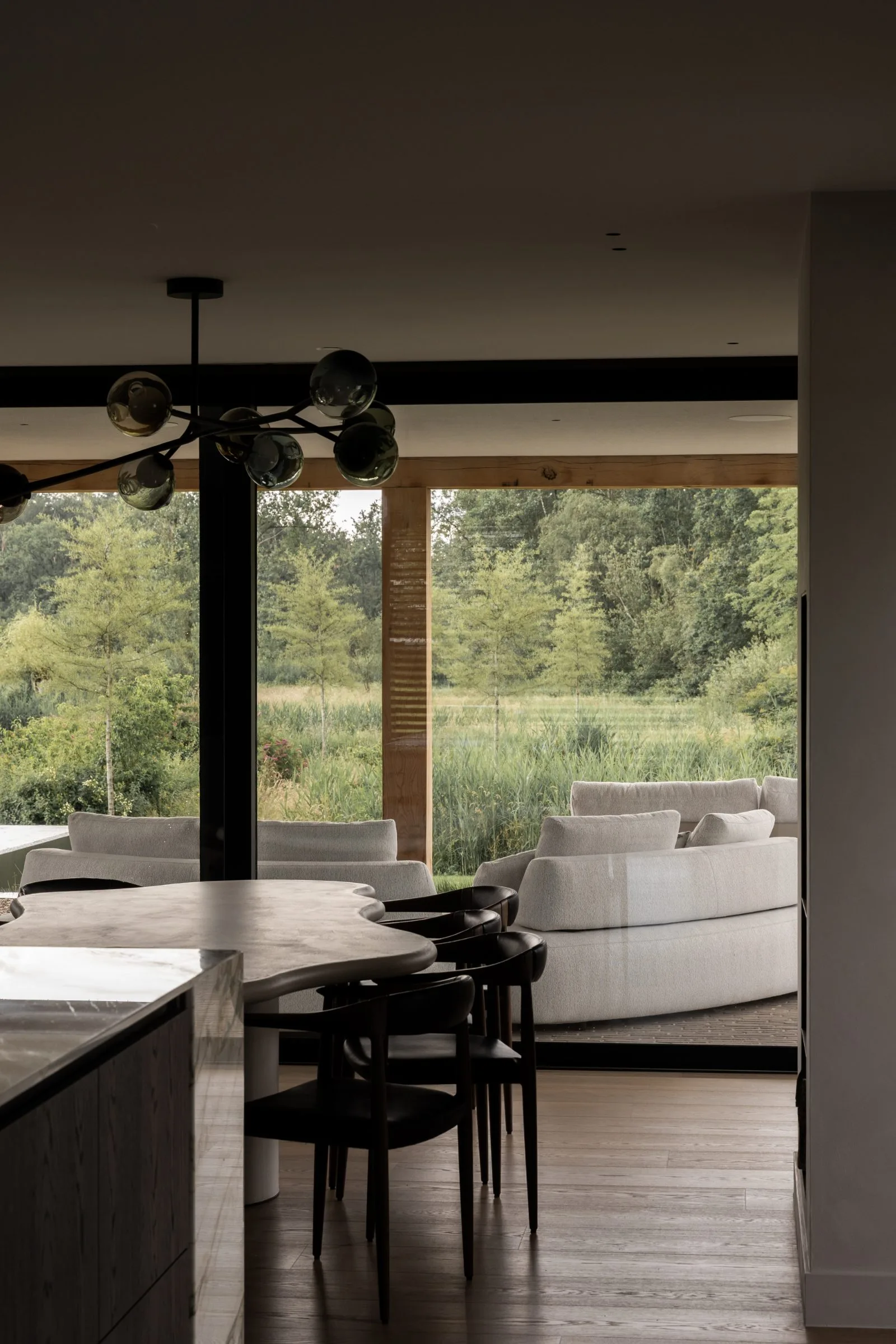
NEW 2026 Jubileum Edition The Best Interior Designers Benelux
Order Now €125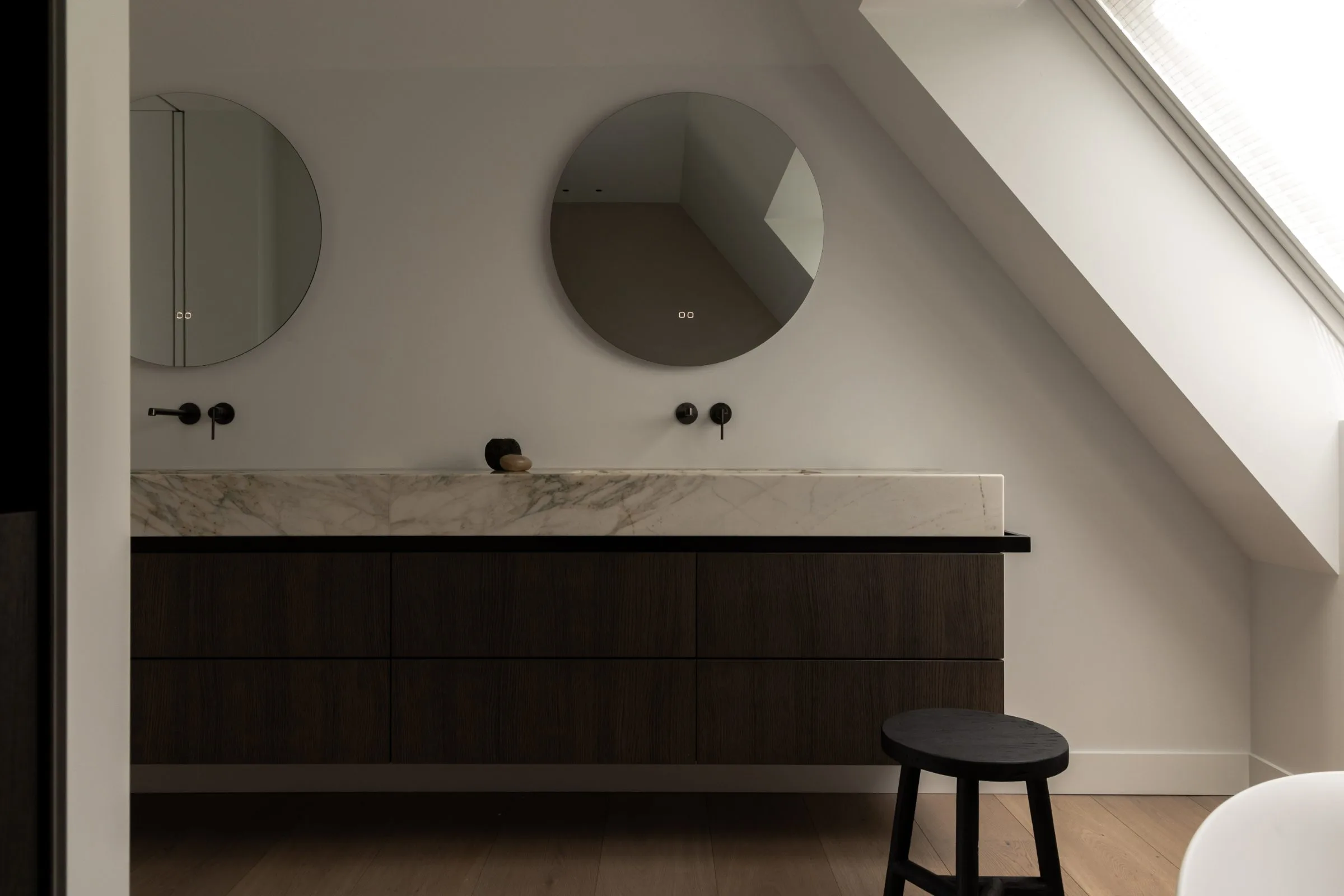
NEW 2026 Jubileum Edition The Best Interior Designers Benelux
Order Now €125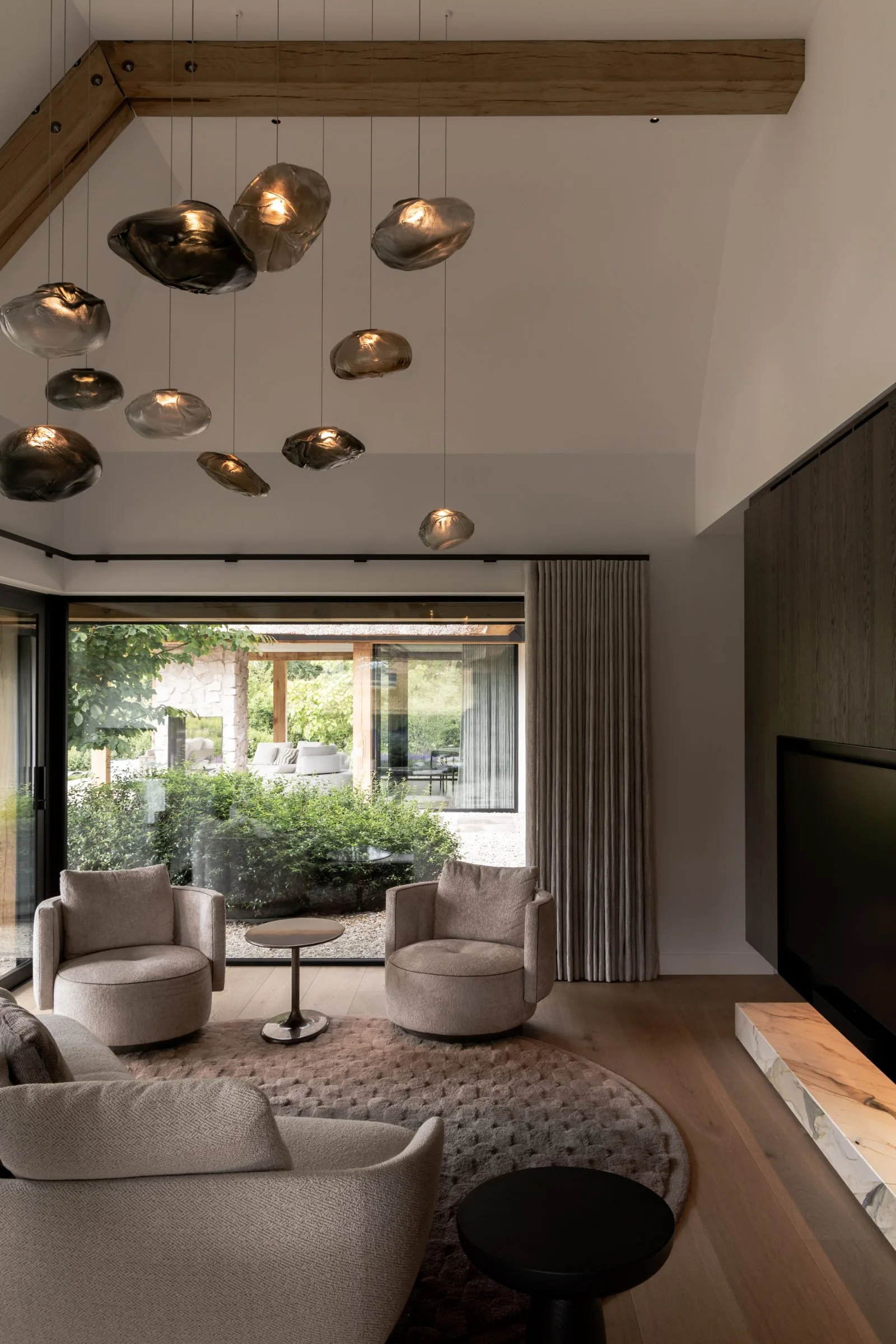
NEW 2026 Jubileum Edition The Best Interior Designers Benelux
Order Now €125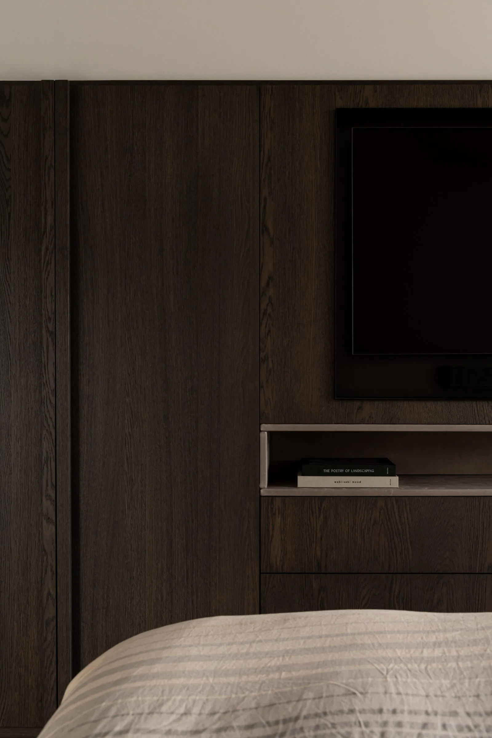
NEW 2026 Jubileum Edition The Best Interior Designers Benelux
Order Now €125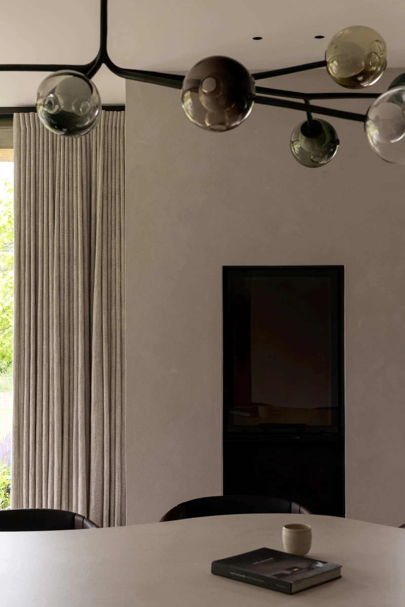
NEW 2026 Jubileum Edition The Best Interior Designers Benelux
Order Now €125