Refined luxury in a monumental property
A run of full-height joinery sets the tone immediately: flat fronts, vertical joints and a restrained line rhythm that carries through the rooms. In this luxury interior with bespoke cabinetry, the eye keeps returning to edges, reveals and the way light lands on stone and timber. The material palette stays measured, but never flat. A stone worktop catches the light differently from the surrounding panels, while recessed strips and ceiling spots draw thin lines across the walls and ceilings.
Full-height cabinetry and a clear line rhythm
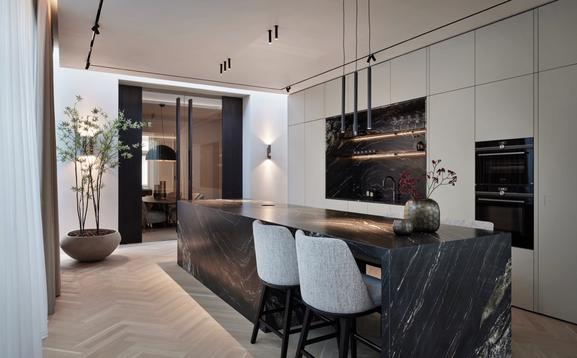
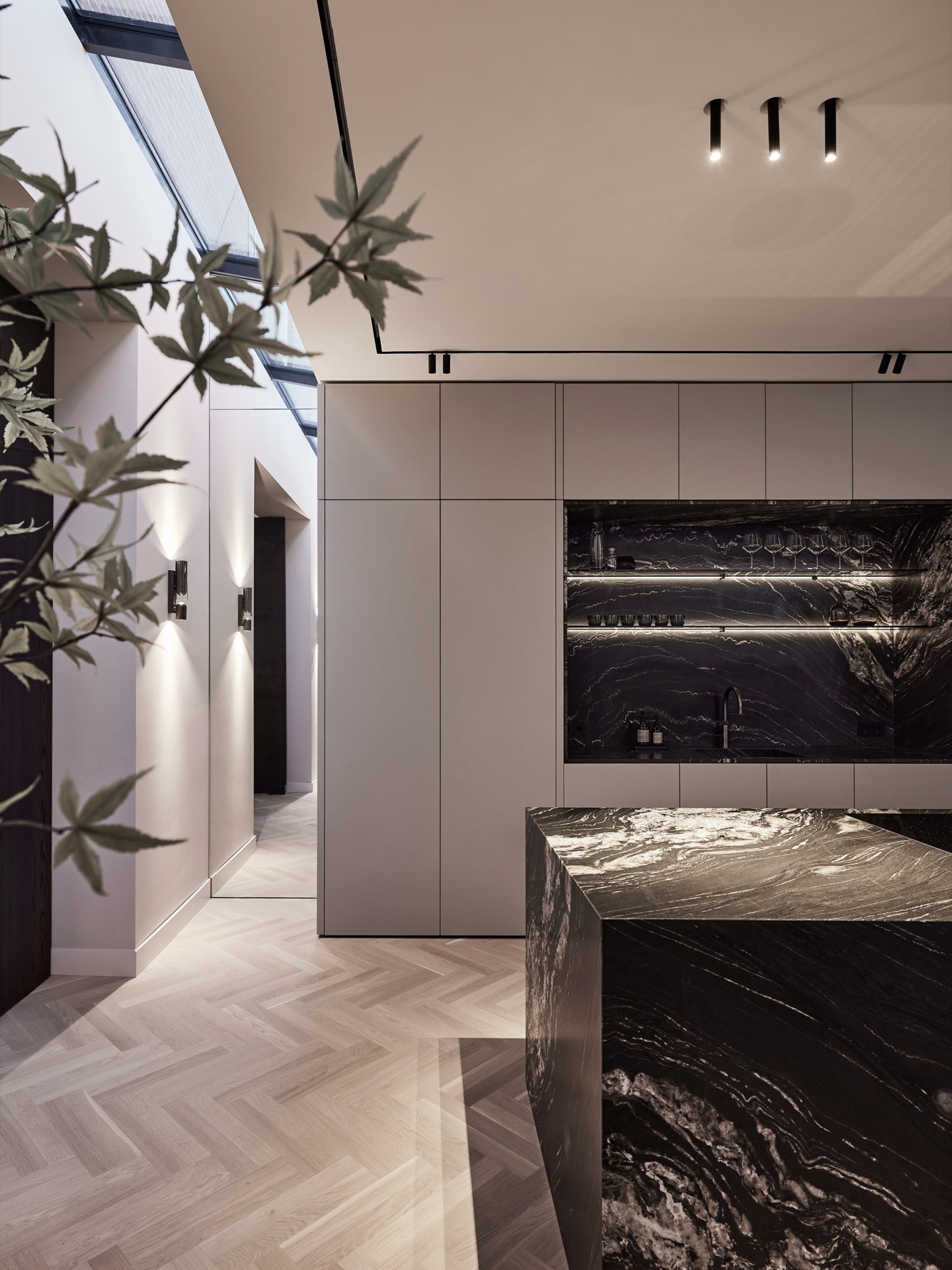
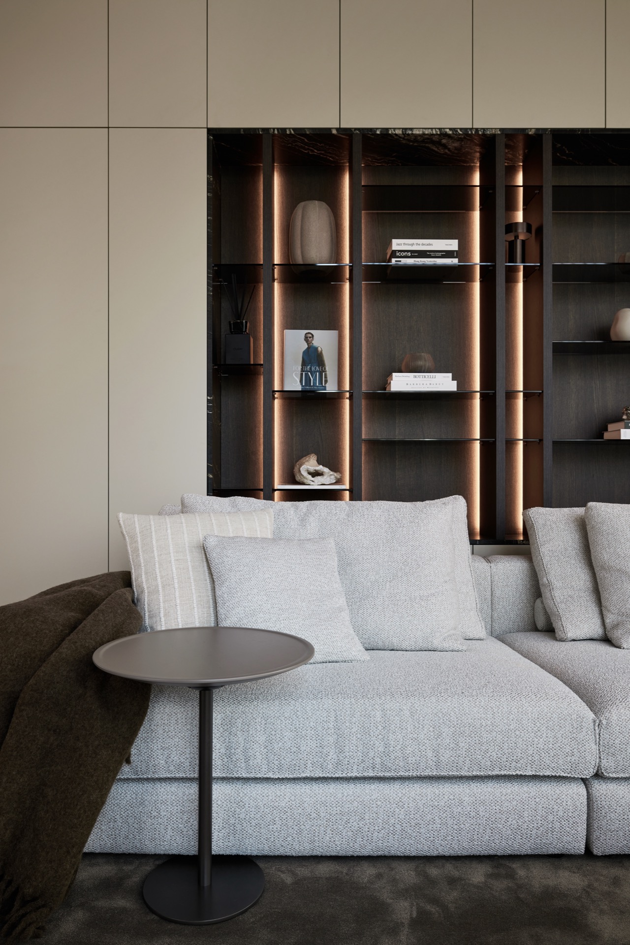
The cabinetry reads as part of the architecture rather than furniture placed afterward. Vertical seams break up broad surfaces and give the wall panels a steady pace, especially where the fronts rise from floor to ceiling. In a luxury interior with bespoke cabinetry, that kind of detailing matters: the joins become visible, the proportions feel intentional, and the storage turns into a quiet backdrop for the rest of the room. The same approach appears in the kitchen area, where smooth fronts meet sharper stone edges.
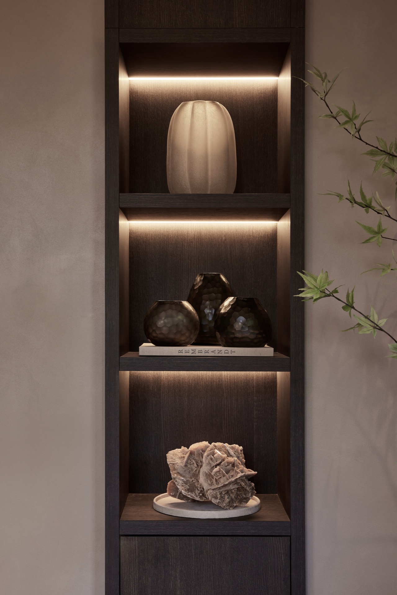
One of the strongest impressions comes from the way the joinery frames the light. Narrow openings, recessed zones and open niches interrupt the larger panels, so the walls do not close off the room. Instead, they step back and forward in shallow layers. The result is a sequence of surfaces that feels drawn rather than merely built. That linear wall paneling carries through the interior and gives each transition a clear direction, from circulation zones to the more enclosed bathroom areas.
Stone surfaces that take the lead
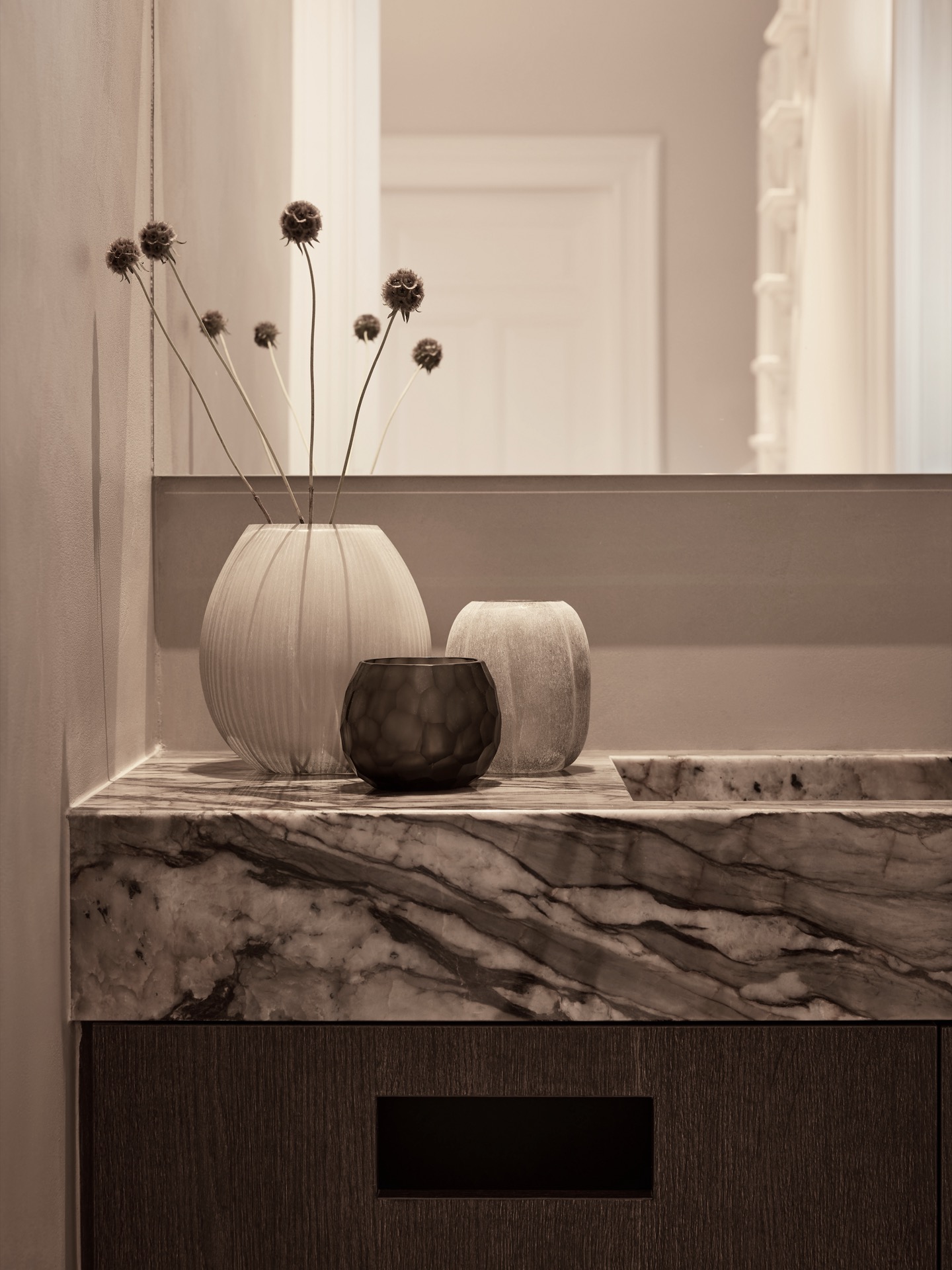
Natural stone appears in several places, but it is the worktops and bathroom surfaces that give it the most presence. In the kitchen, the stone top sits against flat cabinet fronts and reads almost like a slab of colour and movement in an otherwise calm composition. The grain is visible enough to matter, not so dramatic that it overpowers the room. That is where the kitchen with natural stone worktop gains its character: the material introduces depth while keeping the composition spare.
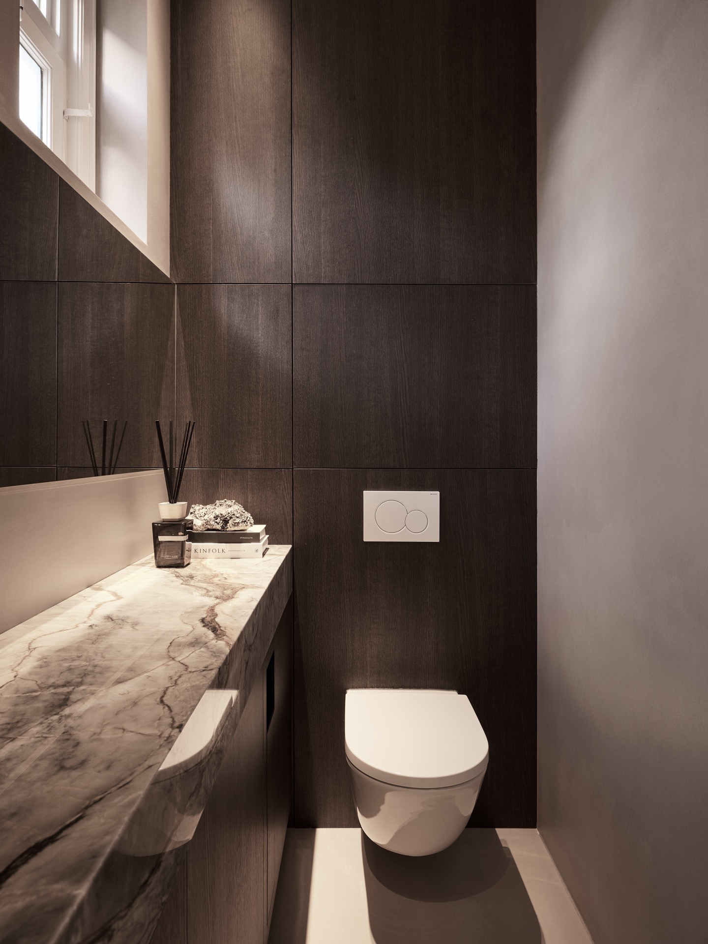
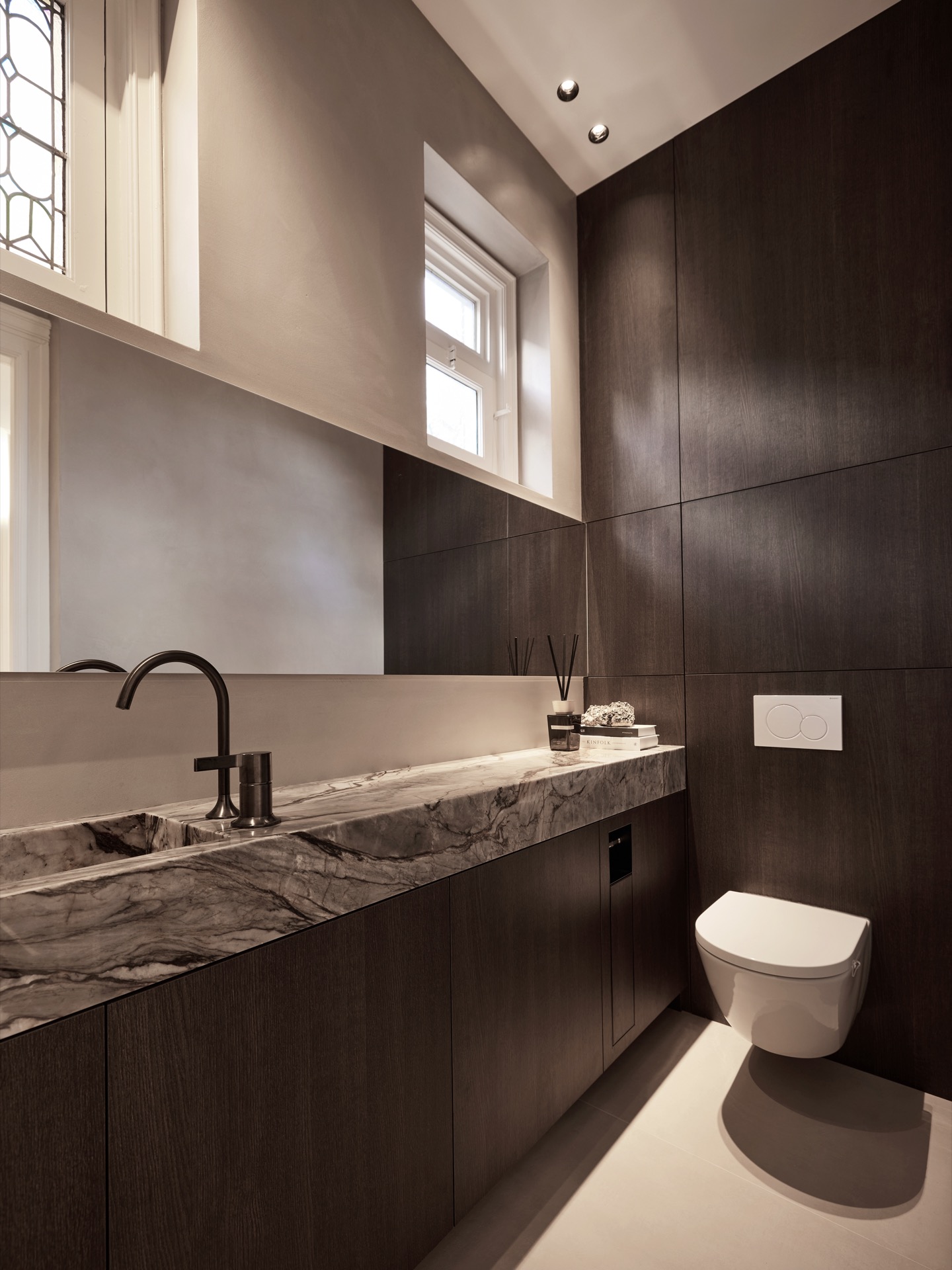
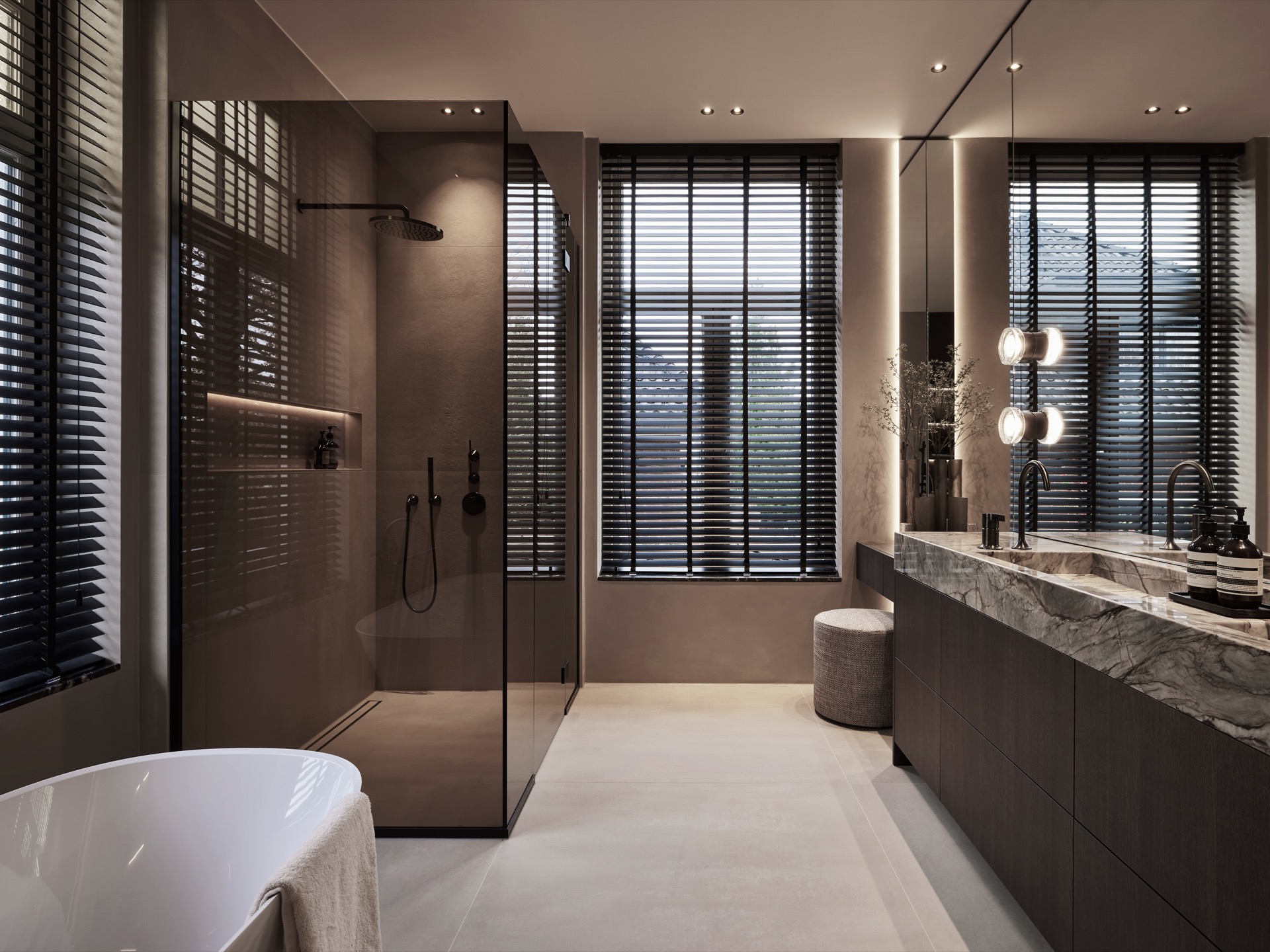
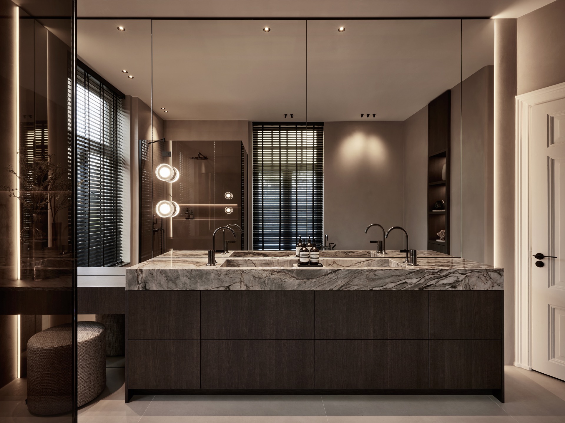
In the bathroom, the stone continues across the vanity area and wall surfaces, paired with polished metal fittings and a glass shower enclosure. The shower panels are slim and clear, which keeps the room open to view and lets the stone do the visual work. These are natural stone bathroom details that depend on proportion as much as material: the basin deck, the vertical wall plane, the shower edge and the reflective tapware all sit close together, so each surface is easy to read.
Polished fittings against matte mass
The contrast between the fittings and the heavier stone surfaces is part of what makes the bathroom so readable. A polished tap or shower fitting catches a small highlight, then disappears again into the broader field of stone and glass. That slight shift matters. It keeps the room from becoming static and gives the vanity zone a sharper edge. Even the glass shower enclosure stays understated, allowing the stone veins and the clean lines of the basin area to remain in focus.
Warm light used as a line, not a glare
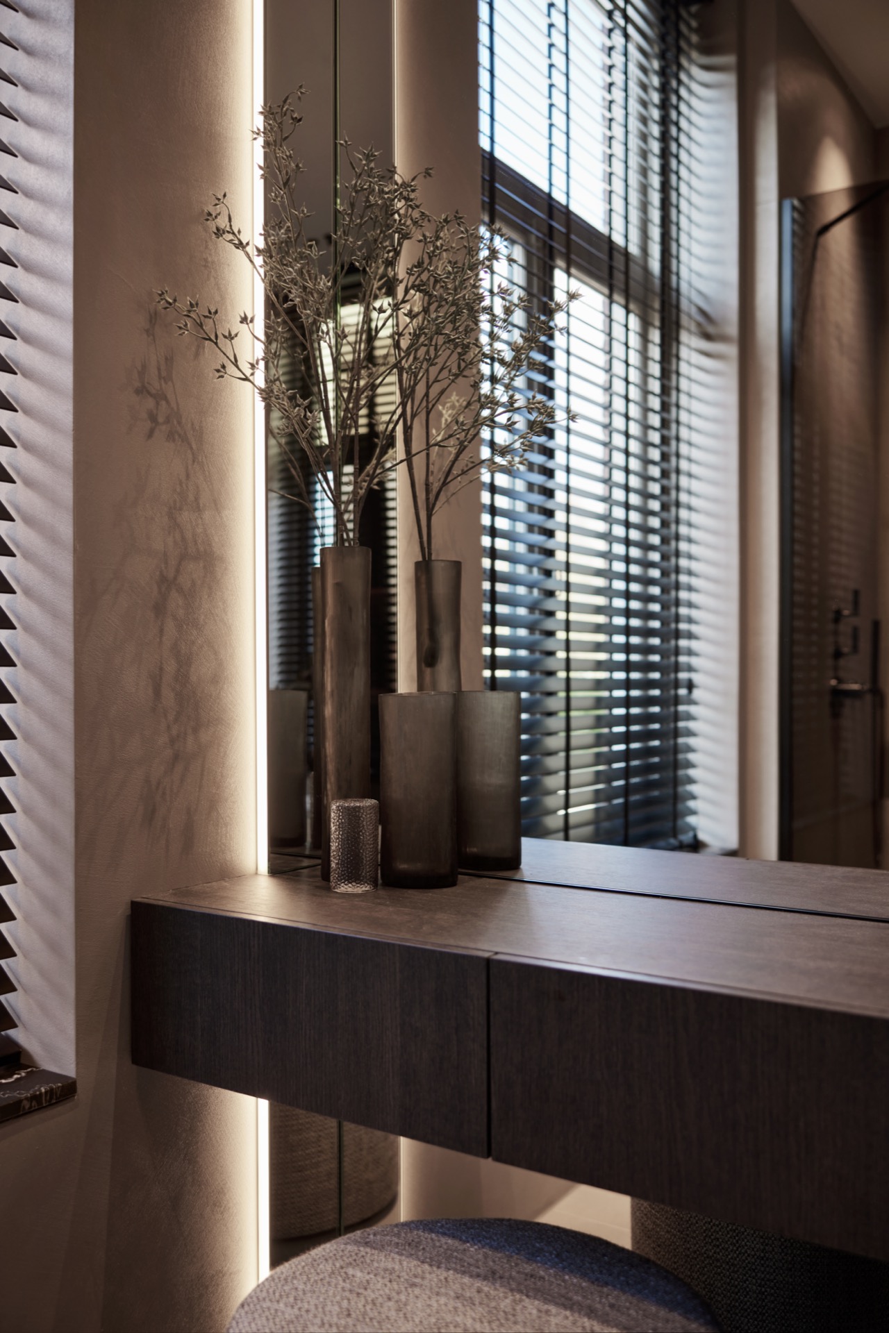
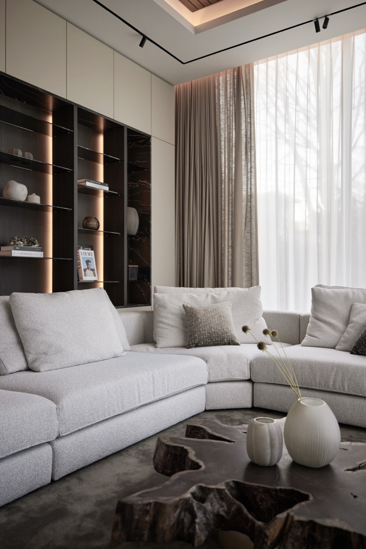
Lighting is handled as a drawn element. LED strips run along niches and under shelves, while ceiling spots pick out the change from one plane to the next. In several rooms, warm LED niche lighting sits inside darkened recesses and makes the opening feel deeper than it is. The light does not flood the interior; it marks edges, underlines shelves and softens the transition between built-in storage and open space. That approach suits the restrained material palette and keeps attention on the surfaces.
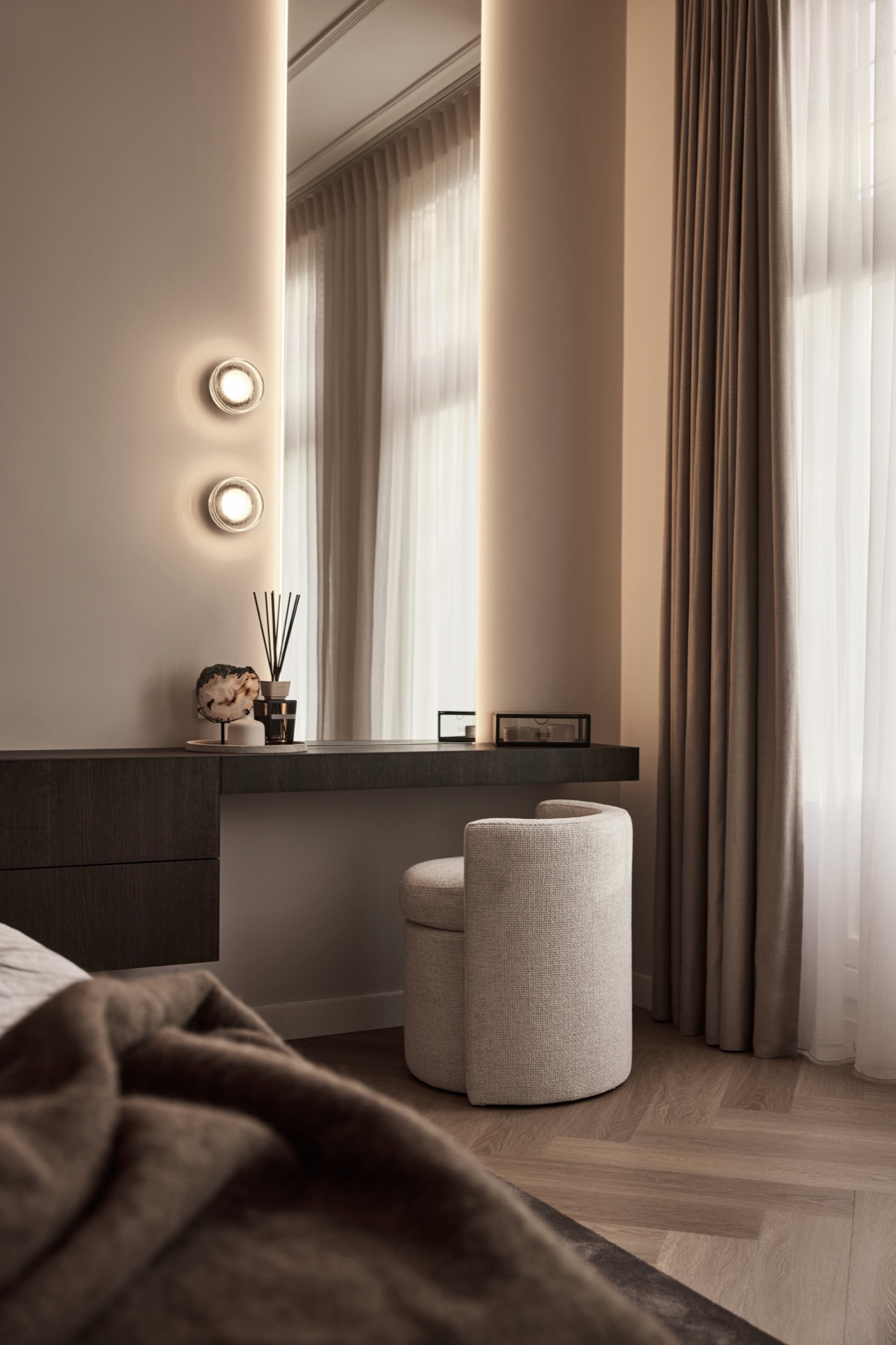
Open niches in the bathroom and living areas repeat the same idea. A horizontal line of light under a shelf, a small pool around a mirror, a strip along the back of a recess: each one gives the wall a clear direction. This is where the project gains much of its atmosphere, not through decoration but through controlled brightness. The warm LED niche lighting works with the stone and timber rather than competing with them, and it gives the joinery a more tactile read.
Shutters, shadows and the movement of daylight
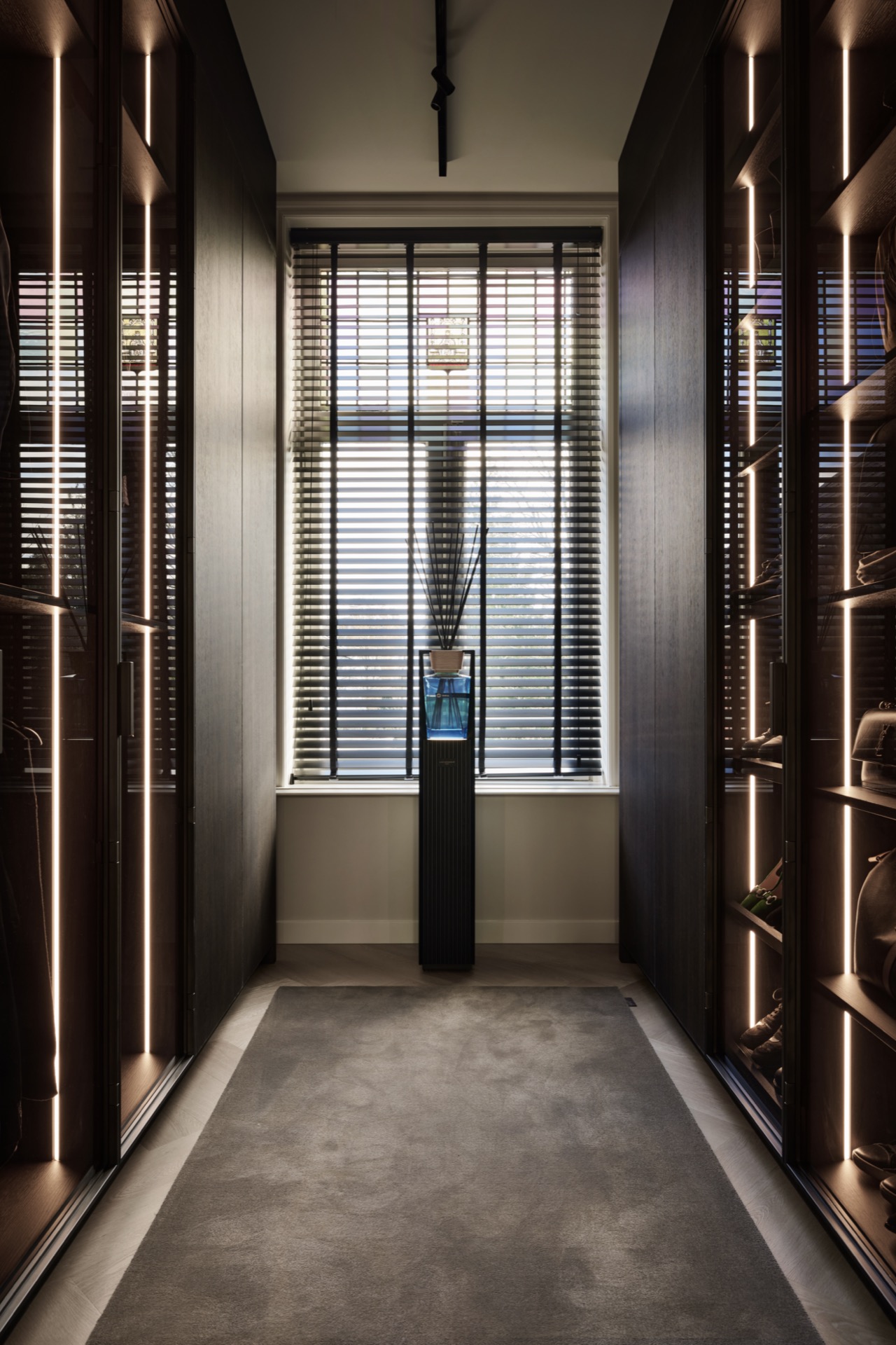
Daylight is filtered rather than left untreated. Horizontal shutters at the windows break the view into measured bands and cast strong light-and-shadow stripes across the opening and nearby wall. The effect is especially clear where the shutters sit beside darker cabinetry or a narrow passage. The pattern changes through the day, but the underlying structure remains the same: repeated slats, a framed window edge, and a wall surface that takes the shadow in a straight line.
That same attention to line appears in the entrance and passage areas, where the lighting is tucked into the sides of the route and the floor is kept visually calm. A narrow corridor leads to a window with shutters, so the path ends with a glimpse of daylight rather than a blank wall. It is a small move, but a telling one. In a luxury interior with bespoke cabinetry, these transitions carry as much weight as the larger rooms because they control how the whole plan is experienced.
Rooms that keep the materials connected
The living space continues the project’s language with built-in wall niches, layered lighting and a clear panel composition. A light-toned sofa sits against darker insertions, while the wall behind it breaks into open shelves and closed sections. The eye moves from the seat to the lit recesses and then up to the ceiling spots. Nothing is overdrawn. The room stays legible because the panels, lights and furnishings are kept in proportion, allowing the bespoke cabinetry to remain the structural thread that links the interior.
There is also a more intimate side to the project in the WC and secondary bathroom zones, where darker timber, stone edges and compact storage give the surfaces more contrast. A small cabinet, a shallow ledge, a strip of light: these are modest elements, but they echo the larger rooms. The same line discipline is present, only compressed. That consistency is what makes the interior feel considered from one space to the next, without forcing every room to speak in the same tone.
Measured detail across kitchen and bathroom
The kitchen and bathroom do not compete for attention here; they share the same visual grammar. Flat fronts, stone slabs, recessed light and precise joints keep reappearing in different combinations. In the kitchen, the counter and island-like surfaces read as broad horizontal planes. In the bathroom, the glass shower enclosure and mirrored zones sharpen the room’s reflection and make the stone seem denser. Across both settings, the project stays focused on materials that reveal their structure through light, edge and surface.
That shared discipline is what gives the project its calm authority. The interiors do not rely on ornament, but on the placement of lines, the thickness of a reveal, the finish of a stone edge and the way a niche is lit. The result is an elegant sequence of rooms where bespoke cabinetry, linear wall paneling and natural stone bathroom details all support the same reading: measured, architectural, and built around detail rather than gesture. Photography by Ewoud Rooks.
Want to see more of Strakk Interieurbouw? View the page of Strakk Interieurbouw for even more great projects and company information.



NEW 2026 Jubileum Edition The Best Interior Designers Benelux
Order Now €125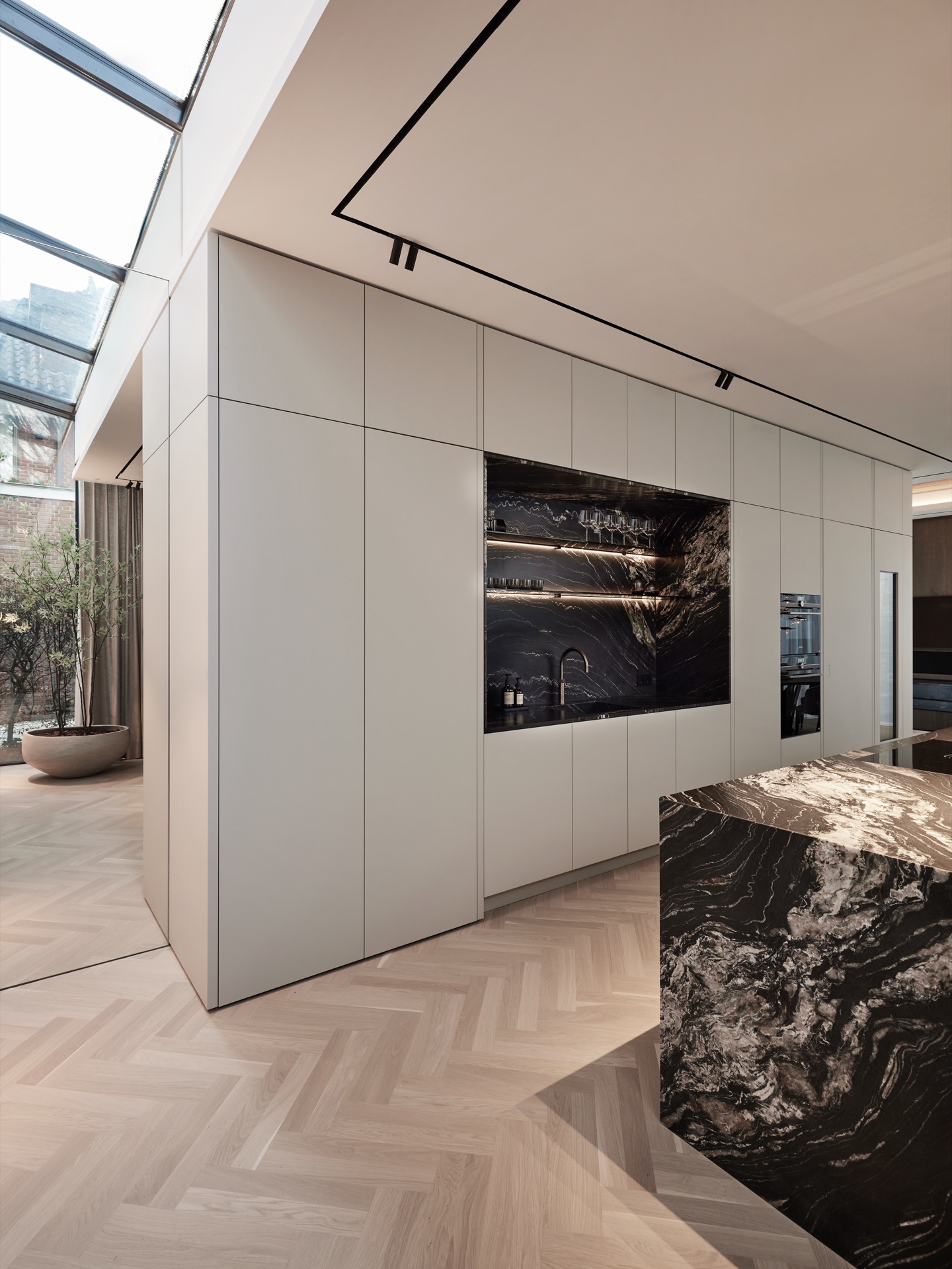
NEW 2026 Jubileum Edition The Best Interior Designers Benelux
Order Now €125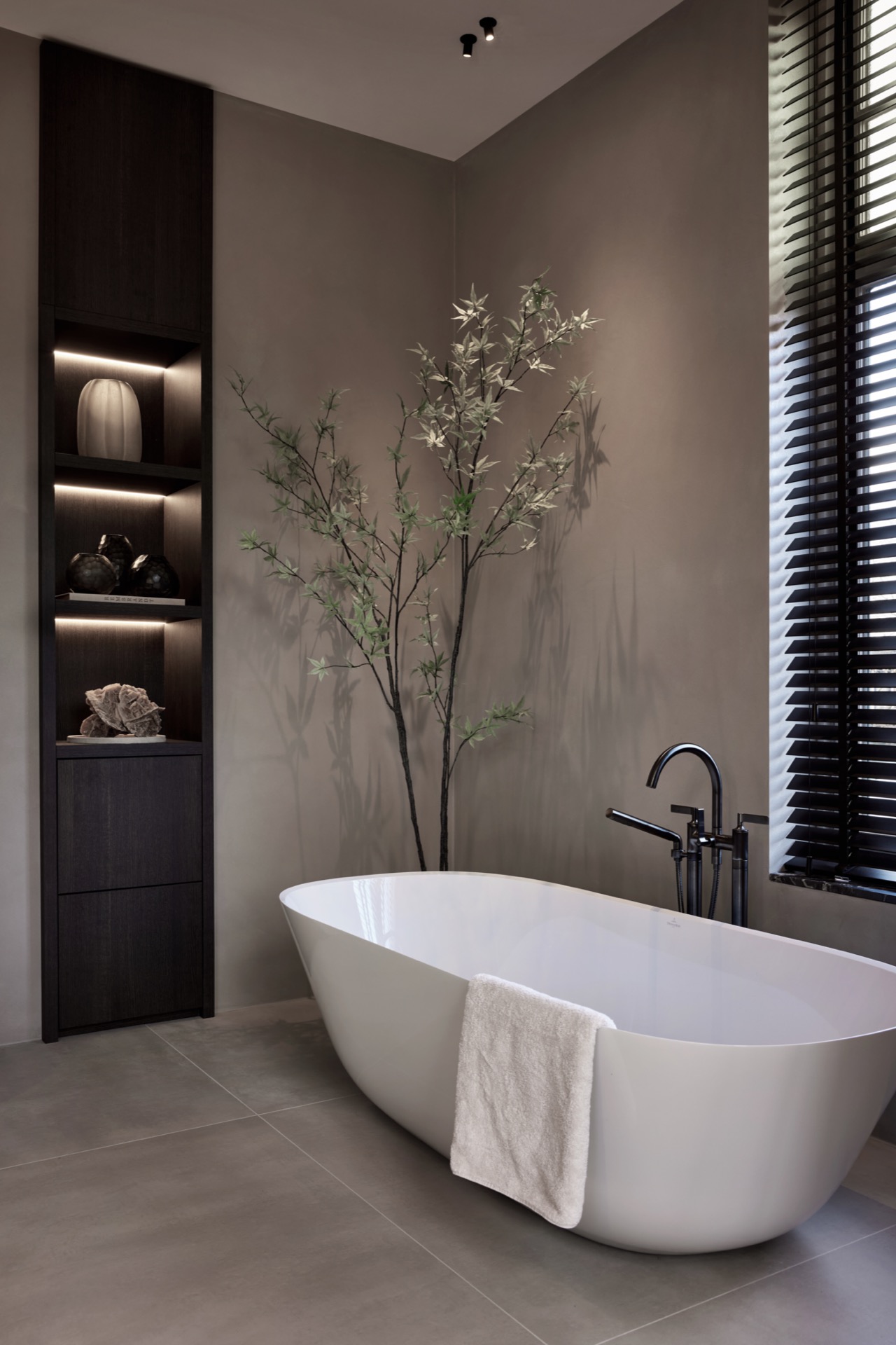
NEW 2026 Jubileum Edition The Best Interior Designers Benelux
Order Now €125