Renovating a listed building: exposed wooden beams, custom built-ins and a modern kitchen living space
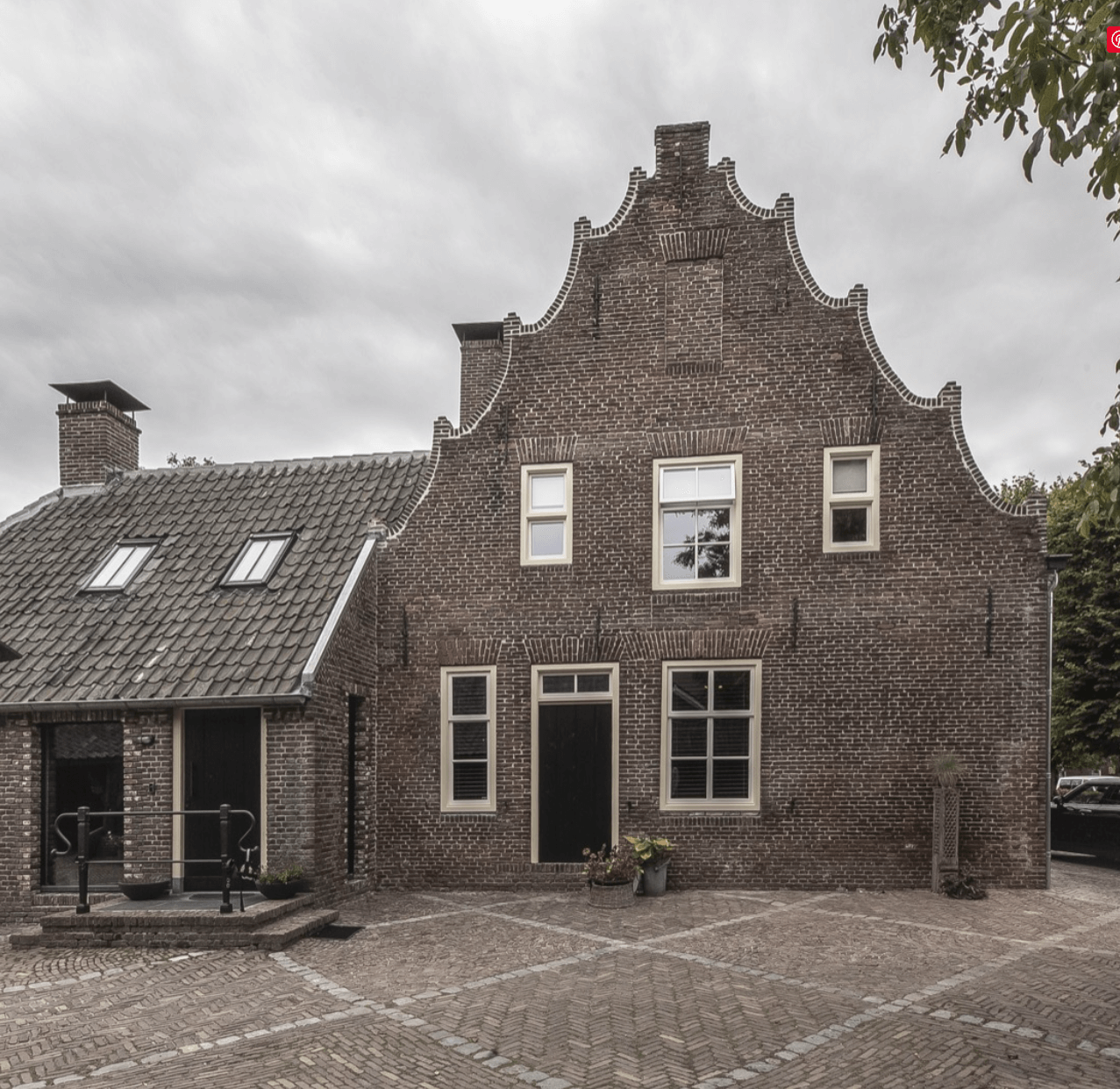
Brickwork sets the tone before you step inside: dark masonry, white window frames and decorative arches above the openings give the house its historic profile. Inside, the pace changes. White ceilings, exposed wooden beams and light floors create long sightlines through a series of rooms that have been opened up and fitted out with restraint. It is the kind of listed building renovation that keeps the structure legible while giving the interior a sharper daily rhythm.
Historic brick details that frame the house
The exterior reads as a sequence of brick surfaces and framed windows rather than one flat front. Ornamental brickwork near the roofline and above the windows adds depth to the facade, while the paved forecourt keeps the setting practical and compact. The same brick language continues around the side and rear views, where larger panes open the house to the outside space. That contrast between masonry and glass carries through the project.
From the first approach, the house feels grounded by material rather than decoration. The white-painted joinery sits against the darker brick, and the window rhythm creates a steady pattern across the elevation. Nothing here is overstated. The visual interest comes from proportion, from the curved brick details, and from the way the openings break up the wall surface.
Renovate a listed building interior exposed wooden beams
Once inside, the ceiling structure becomes the main feature. Dark exposed wooden beams run across white surfaces and immediately change the scale of the rooms. In the kitchen living space, the beams sit above an open arrangement with a central work zone, spotlights and large windows. The result is straightforward and clear: the structure remains visible, while the floor plan supports a more open way of living.
The kitchen living space beams are not treated as background detail. They define the room and sharpen the contrast with the lighter walls and floor. In the same space, the black structural elements and ceiling lights give a measured outline to the kitchen wall and the adjacent seating area. A fireplace niche appears in another room, set into the wall and framed by the same exposed timber rhythm overhead.
Built-ins that follow the room, not the other way around
Custom built-in wardrobes appear in several parts of the house, especially in the hall and attic rooms. Their flat fronts keep circulation clear, and their pale surfaces sit neatly beneath the beam ceilings. In the hallway, the storage runs along the wall beside a visgraat floor, so the room feels longer and more ordered. The joinery also works in the attic, where low walls and sloped ceilings would otherwise leave awkward corners unused.
The attic built-in storage is practical without drawing attention to itself. White cabinet doors line the room beneath the roof structure, and the warm wood floor softens the change between sleeping, storage and movement. In a separate room, a bed is placed centrally under the beams, with low cupboards tucked beneath the line of the roof. The architecture sets the limits; the built-ins make those limits usable.
A kitchen living space built around beams and light
In the main living zone, the kitchen and sitting area share one open field. Large windows bring in daylight from the side, while the beam structure keeps the ceiling from feeling blank. The kitchen block is compact and dark, with drawers and a worktop that sit quietly against the room. Rather than filling the interior with extra elements, the renovation lets the openings, beams and floor finish do most of the work.
That approach continues in the living room, where a fireplace is set into a niche and the windows stack beside one another. The room has a clear line from wall to wall, and the exposed timber overhead keeps that line from becoming too smooth. It is one of the strongest examples in the project of a listed building renovation that respects the shell of the house without freezing it in place.
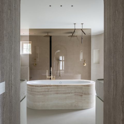
Bathroom grey wall tiles and a freestanding bath
The bathroom changes tone through surface rather than color. Grey wall tiles cover the main walls, giving the room a stone-like backdrop for the white freestanding bath. A towel radiator sits close by, and a large opening above the tub brings in daylight from the upper part of the room. The arrangement is simple, but the materials do the quiet work.
The bath reads as a rounded interruption in a space of straight edges. Tile joints, the radiator bars and the rectangular wall opening all sharpen that contrast. Even without extra ornament, the room feels considered because every element has a fixed place. The result is a bathroom that stays close to the language of the rest of the house: measured, material-led and easy to read.
Traditional wooden staircase with a historic profile
The staircase carries a more decorative note. Its wooden handrail and detailed balusters give the stairwell a historic profile, and the adjacent brick wall makes the timber read even more clearly. Light surfaces nearby keep the composition from becoming heavy. The stair hall feels like a transition zone rather than a corridor, with each step framed by texture, shadow and the grain of the wood.
Seen from below, the stair detail connects the lower rooms to the upper levels without losing the character of the original structure. The treads, balusters and railing are more elaborate than the built-in storage, but they belong to the same logic: preserve the visible parts of the house, then refine the circulation around them. It is a practical way to handle a traditional wooden staircase in a renewed interior.
Attic rooms with storage along the roofline
Under the roof, the renovation turns low walls and angled ceilings into usable rooms. The attic built-in storage follows the slope of the roof, with cabinet fronts that stop where the ceiling drops. In one room, the beam structure stays exposed above a warm wood floor, while daylight enters through roof windows and side openings. The room feels compact, but not cramped, because the storage has been tailored to its shape.
Across the upper floor, the same material mix repeats with small shifts in tone: white plaster, dark beams, pale cabinetry and wood flooring. The rooms are not overfurnished, which lets the roof form remain visible. That restraint makes the upper level one of the clearest parts of the project, where listed building renovation is expressed through fit and proportion rather than display.
What stays with you after moving through the house is the sequence: brick outside, timber inside, and a set of rooms that each respond to the structure in their own way. The custom built-in wardrobes, kitchen living space beams, bathroom grey wall tiles and traditional wooden staircase all pull in the same direction. Nothing feels forced. The house simply gives its historic frame a sharper interior life.
Want to see more of AOZ interieur? View the page of AOZ interieur for even more great projects and company information.





NEW 2026 Jubileum Edition The Best Interior Designers Benelux
Order Now €125


NEW 2026 Jubileum Edition The Best Interior Designers Benelux
Order Now €125


NEW 2026 Jubileum Edition The Best Interior Designers Benelux
Order Now €125