Renovated townhouse with a black staircase and classic ceiling ornaments
Light hits the ceiling first, then the black staircase cuts through the hall like a clear line through the house. In this renovated townhouse, the entrance sets the tone at once: a tall space, classical ceiling ornaments, and cornices that keep the upper room edges sharp. The staircase does not disappear into the background. Its dark finish turns it into the main gesture in the plan, pulling the eye upward before the rest of the interior opens out.
A hall that keeps its period detail in view
The hall is high enough to give the ornamented ceilings room to breathe. The plasterwork sits above the route through the house and gives the entry a measured rhythm, while the black stair rail and glossy surfaces introduce a stronger contrast. That combination of profile and shadow is what shapes the first impression here. It feels exact rather than decorated for effect, with the classical ceiling ornaments and ceiling cornices doing as much visual work as the staircase itself.
From the stairs, the interior reads in layers. Pale walls and white trim hold the light, and the dark stair line anchors the composition. The result is a modern chic interior that still keeps its older shell visible. Instead of hiding the building’s structure, the design lets the hall, the landings, and the ceiling edges stay legible as you move through the house.
Ochre tones and a quieter living room pace
The living room shifts the mood with mustard ochre tones that sit naturally beside the lighter floor and the pale upholstery. A large light-coloured sofa takes up the main seating zone, giving the room a broad horizontal line after the vertical emphasis of the hall. Nearby, a separate seat with a patterned armchair adds a sharper note. It is the kind of detail that changes the room’s focus without crowding it.
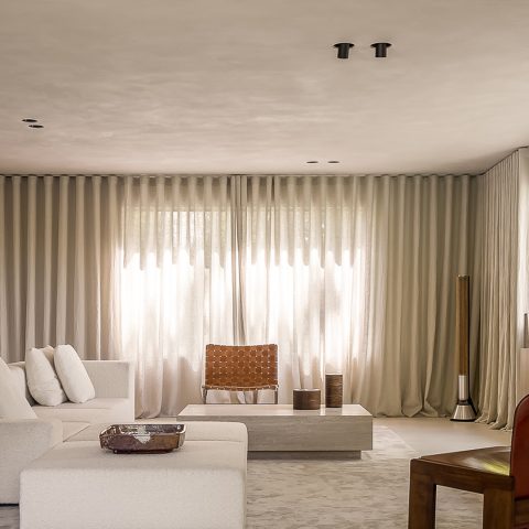
Large windows natural light enters the room in broad sheets, so the warm palette never feels heavy. Beige curtains soften the edges of the openings and frame the view outward. In one seating area, a brown leather sofa and a textured wall add depth, while elsewhere the ceiling ornament remains visible above the furniture. The room uses these older architectural lines as a backdrop for everyday use, not as a stage set.
One image shows a large corner sofa with cushions and low round tables, another a black fireplace-like console with a marble-look top. Those details matter because they show how the room is arranged: low surfaces, clear walking space, and furniture that does not block the windows. The renovated townhouse keeps its living area calm by letting light, fabric, and wall texture carry the composition.
A black kitchen with strong lines and daylight
The kitchen moves into a more graphic register. Dark cabinetry, straight front lines, and a black palette give the space a firm outline, while the marble-look kitchen surface breaks up the darkness with veining and reflection. High windows bring in a level of light that keeps the room open, so the kitchen feels bright even when the materials are restrained. The effect is precise rather than showy.
Built-in spots and open shelving keep the upper part of the room readable, and the marble-look backsplash gives the working wall a cleaner finish. Here the modern black kitchen is less about trend than about clarity: storage sits back, the counter reads as one long plane, and the window zone stops the room from feeling enclosed. The material contrast does the rest, especially where the dark fronts meet the lighter worktop.
Seen from another angle, the kitchen sits comfortably alongside the rest of the house’s classical detailing. That tension between period ceiling lines and stripped-back cabinetry gives the renovated townhouse its pace. Nothing in the room needs to be loud. The black finish, the light on the surface, and the tall opening to outside already hold the attention.
Work space and dining room details between the larger rooms
A compact office space brings the plan back to essentials: a minimal desk, a clean wall, and enough room around it to keep the focus on the surface in front of you. The room does not rely on extra decoration. Its value lies in the clarity of the setup, which suits a house where the larger rooms already contain enough visual movement. In the images, the desk area is framed by soft wall texture and hanging lights that keep the zone distinct.
Elsewhere, the dining area picks up a more formal note. A large chandelier hangs above the table, and the ceiling moulding gives that part of the house a more defined edge. A console, patterned wall treatment, and framed artwork show how the townhouse handles transition spaces: they are not left empty, but they are not overloaded either. Each surface has a role, from storage to reflection to the line of a frame against the wall.
Ceilings, frames and the way the light lands
Across the house, the ceiling remains part of the composition. Cornices, central ceiling ornaments, and suspended lights create a layered upper plane that changes from room to room. In the living spaces, daylight touches those details softly. In the stair zone, warmer artificial light sharpens the contrast against the black rail. That change in light temperature helps the house move from one atmosphere to the next without a sudden break.
Large windows natural light also plays a practical role. It reduces the heaviness of the dark kitchen fronts, keeps the ochre tones in the living room readable, and allows the classical plaster details to remain visible instead of flattening into the wall colour. These are small effects, but they shape how the renovated townhouse is experienced: by steps, turns, and surfaces rather than by one single focal point.
A bathroom built around the bath and the window
The bathroom keeps to a quieter palette, with minimal tiles and a freestanding oval bathtub set up as the main object in the room. Its curved shape softens the straight tile lines and gives the space a slower reading after the more linear rooms elsewhere in the house. A statement pendant drops a diffuse light over the bath, while the window brings in the clearest natural light in the room. That combination makes the bath zone feel settled without resorting to excess detail.
Window light matters here because it reveals the surface changes in the tile and the edge of the tub. The room is pared back, but not bare. The bathtub, the hanging light, and the window frame are enough to define the scene. In the context of the whole house, the bathroom works as a final shift in tempo: enclosed, controlled, and much softer in line than the stair hall that opens the project.
Old structure, new reading
What stays with you after moving through the rooms is the way the townhouse keeps its classical shell visible while the new elements sharpen the plan. The black staircase, the ceiling ornaments, the ochre living room, the modern black kitchen, and the freestanding oval bathtub each hold a different part of that story. Together they show a renovated townhouse that uses contrast carefully, letting light, moulding, and dark joinery speak for themselves rather than competing for attention.
The house does not lean on a single gesture. It moves from hall to living room, from kitchen to office, and from there to the bathroom with a steady change in tone and material. That measured sequence is what gives the interior its appeal: not a fixed formula, but a clear reading of each room, each opening, and each surface as part of one lived route through the building.
Want to see more of Maaike van Diemen? View the page of Maaike van Diemen for even more great projects and company information.



NEW 2026 Jubileum Edition The Best Interior Designers Benelux
Order Now €125


NEW 2026 Jubileum Edition The Best Interior Designers Benelux
Order Now €125


NEW 2026 Jubileum Edition The Best Interior Designers Benelux
Order Now €125


NEW 2026 Jubileum Edition The Best Interior Designers Benelux
Order Now €125


NEW 2026 Jubileum Edition The Best Interior Designers Benelux
Order Now €125