


Binnenkijker: Rustig minimalist interieur met grote ramen en warme tinten
The thatched roof is immediately visible in the way the project is framed. Sunlight pours in through broad windows, setting natural woods and soft textiles aglow. The pale walls keep the room bright while subtle wood grains add motion to the surfaces. This restrained palette anchors the space quietly, allowing texture and shape to guide movement rather than color contrasts or ornate detail.
thatched roof as the architectural starting point
Horizontal wooden boards stretch along the walls, their lines emphasizing the room’s width and stability. Varied grain patterns create a moving play of light and shadow as daylight shifts, while warm undertones in the wood invite close examination. This cladding serves as a continuous backdrop linking key areas and reinforcing the natural material presence throughout.
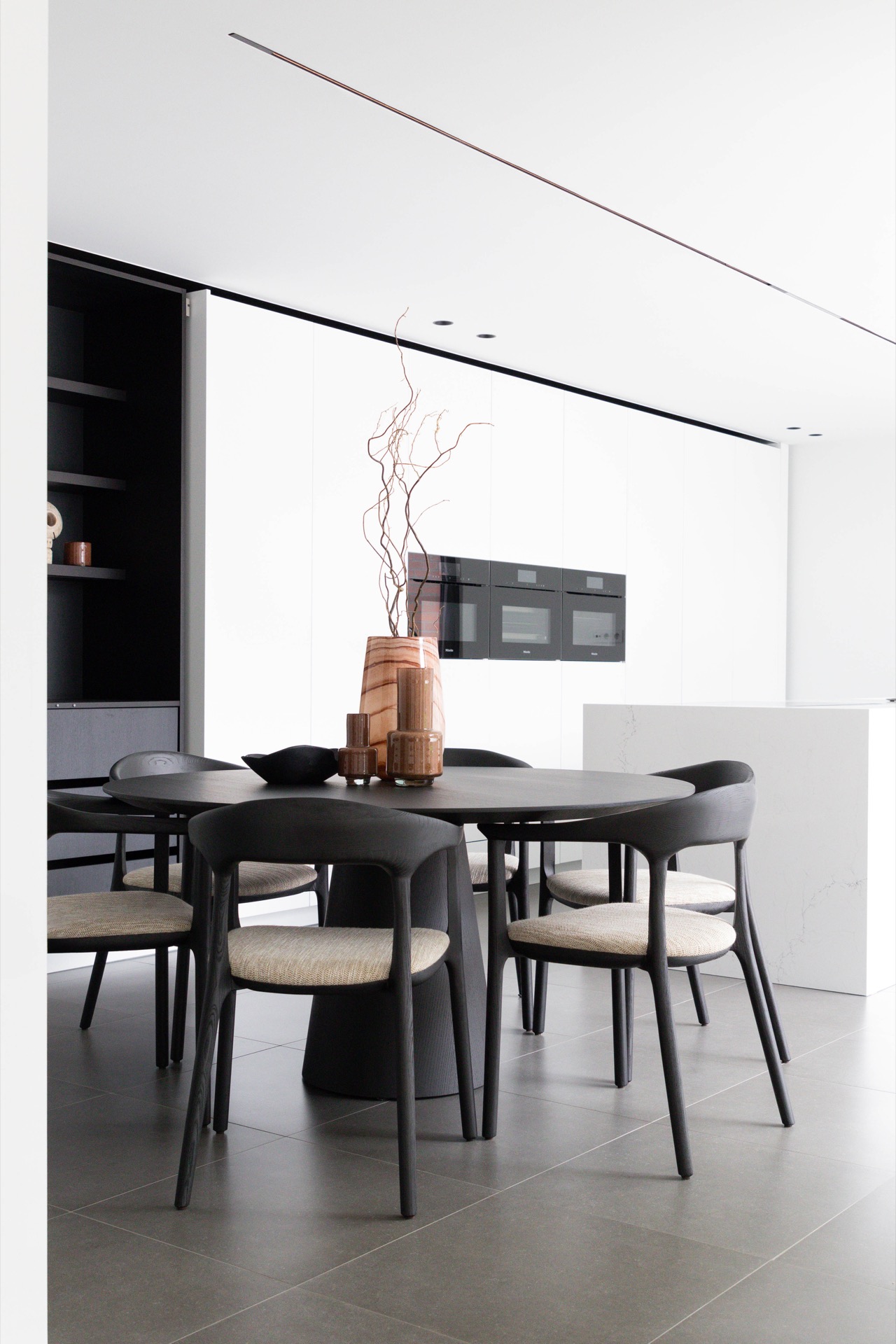
Kitchen surfaces combine stone solidity with sharp geometry
Countertops of lightly veined marble offer a smooth yet tactile plane, catching light without glare. The cabinetry below favors straight, simplified forms in warm wood tones that complement the stone. Shelves and ceramic containers introduce matte finishes, softening reflections and adding subtle textural layering that breaks any monotony.
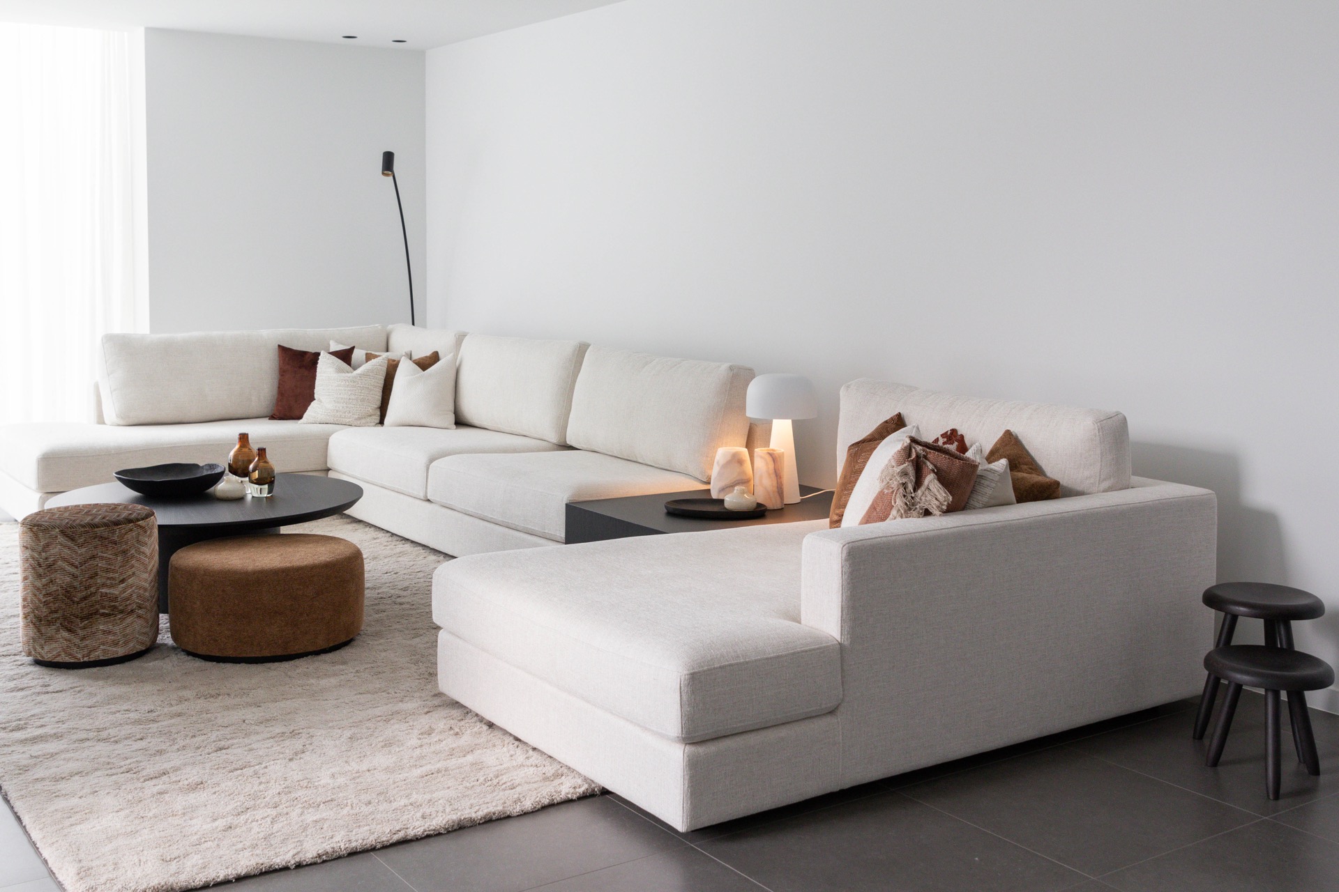
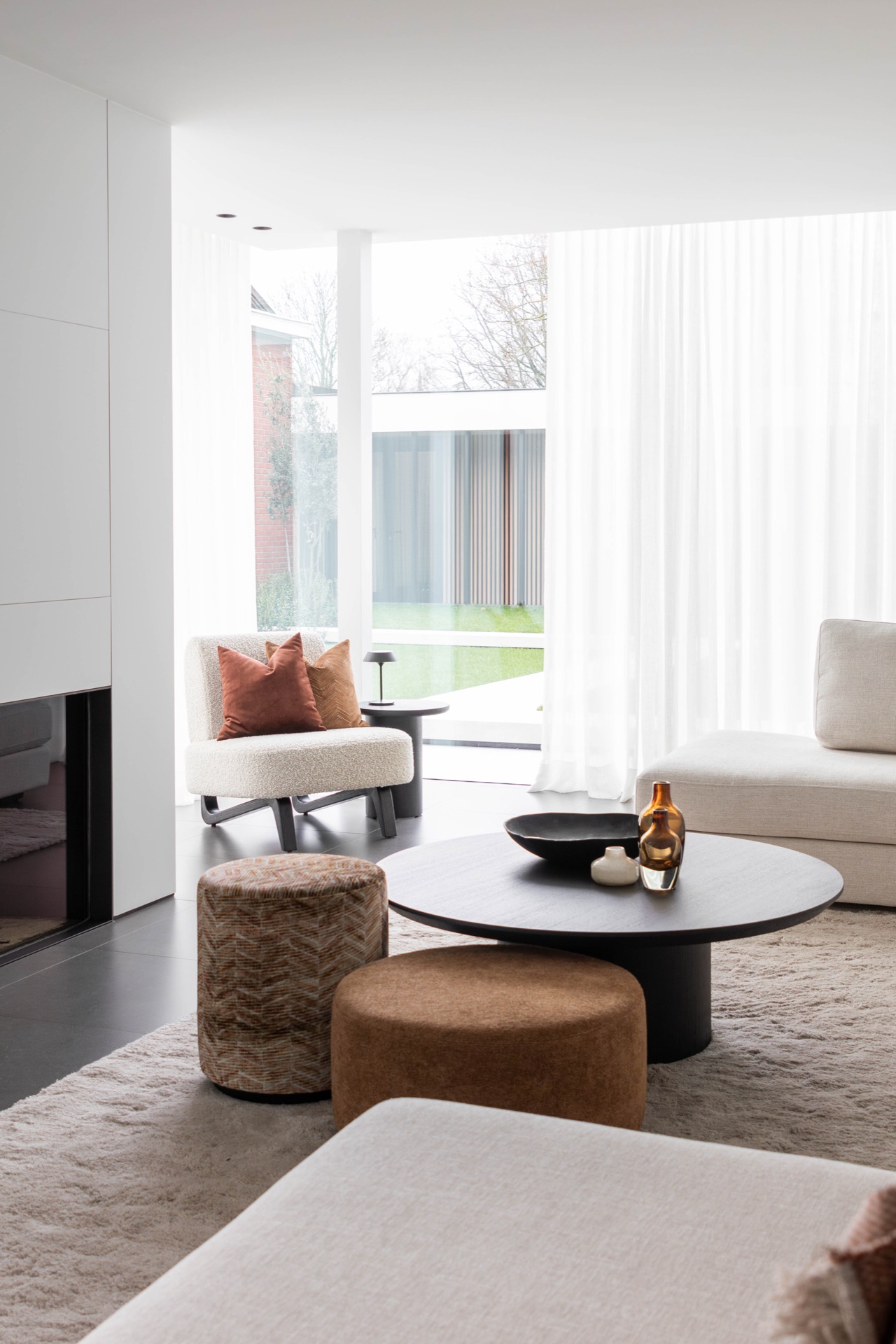
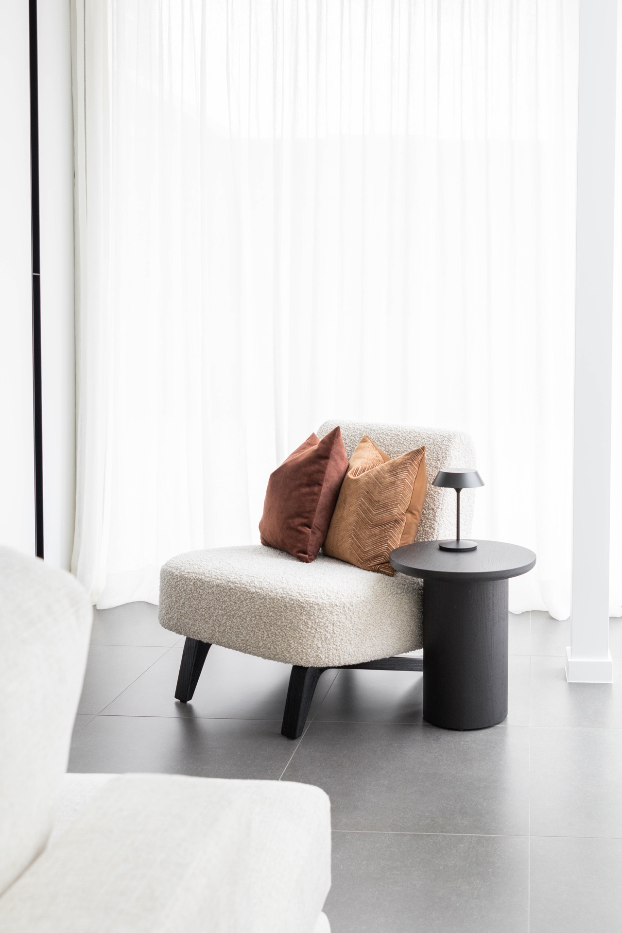
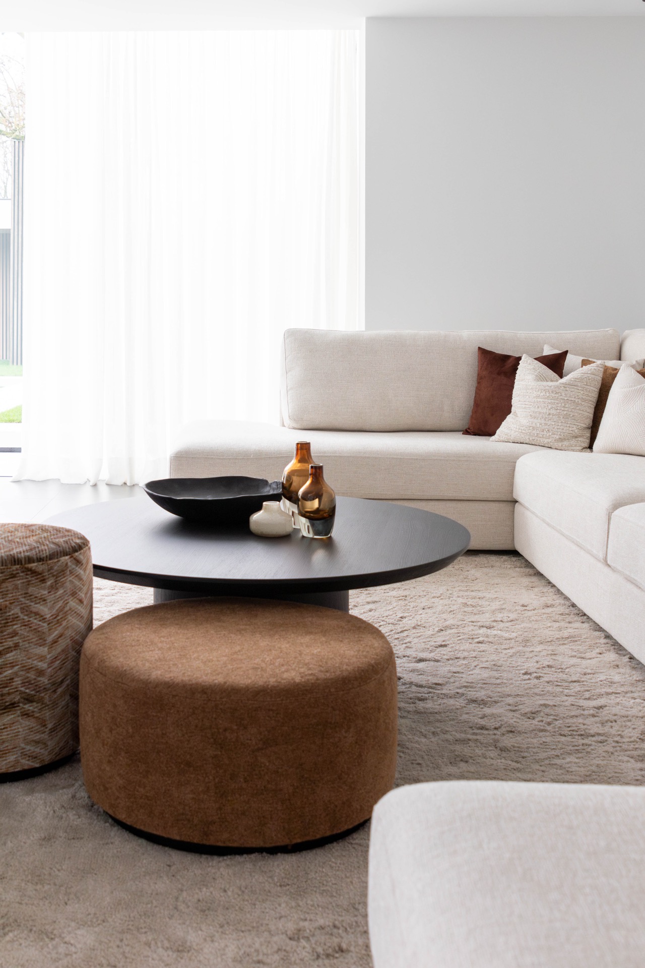
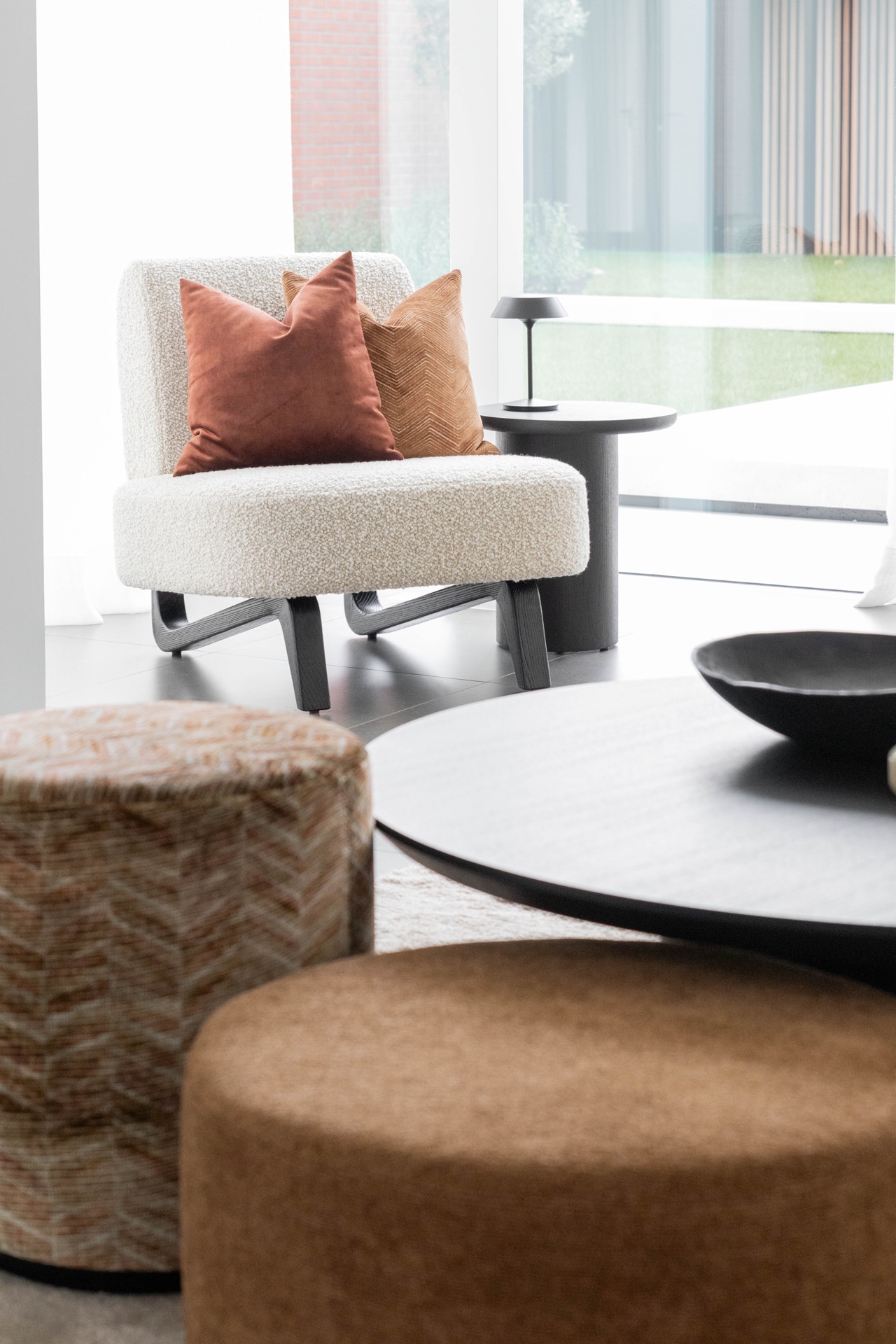
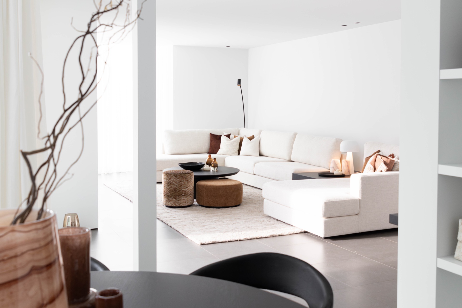
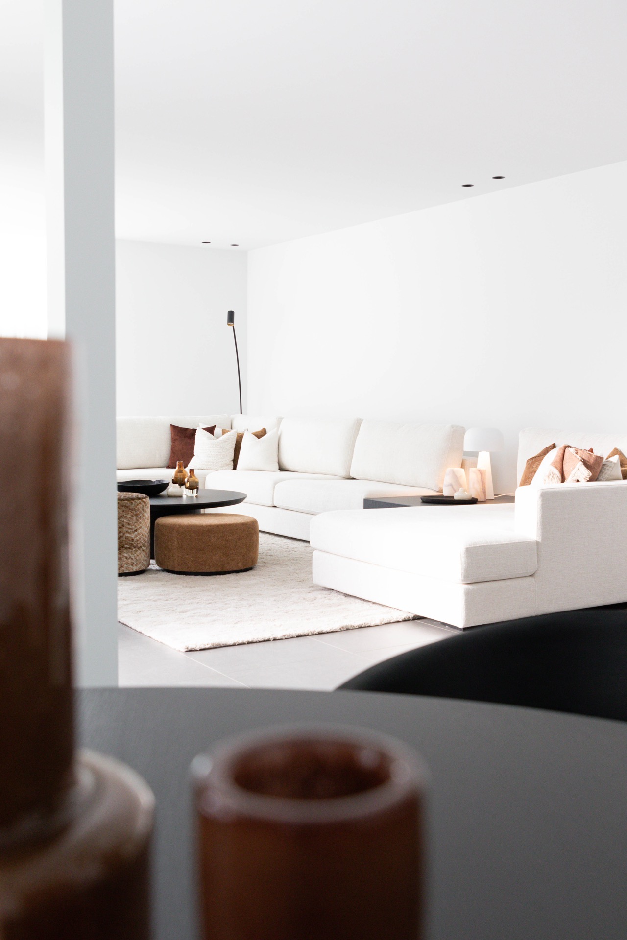
Seating areas balance social zones and quiet retreats
A large, neutral-toned sofa defines the main gathering spot with its generous scale and uninterrupted expanses of fabric. In contrast, a single curved armchair in rich leather occupies a corner, cushioned with knitted plum pillows that add depth and tactile contrast. These seating choices create zones for conversation or solitary moments without disrupting the spatial flow.
Contrasting geometric shapes determine room flow
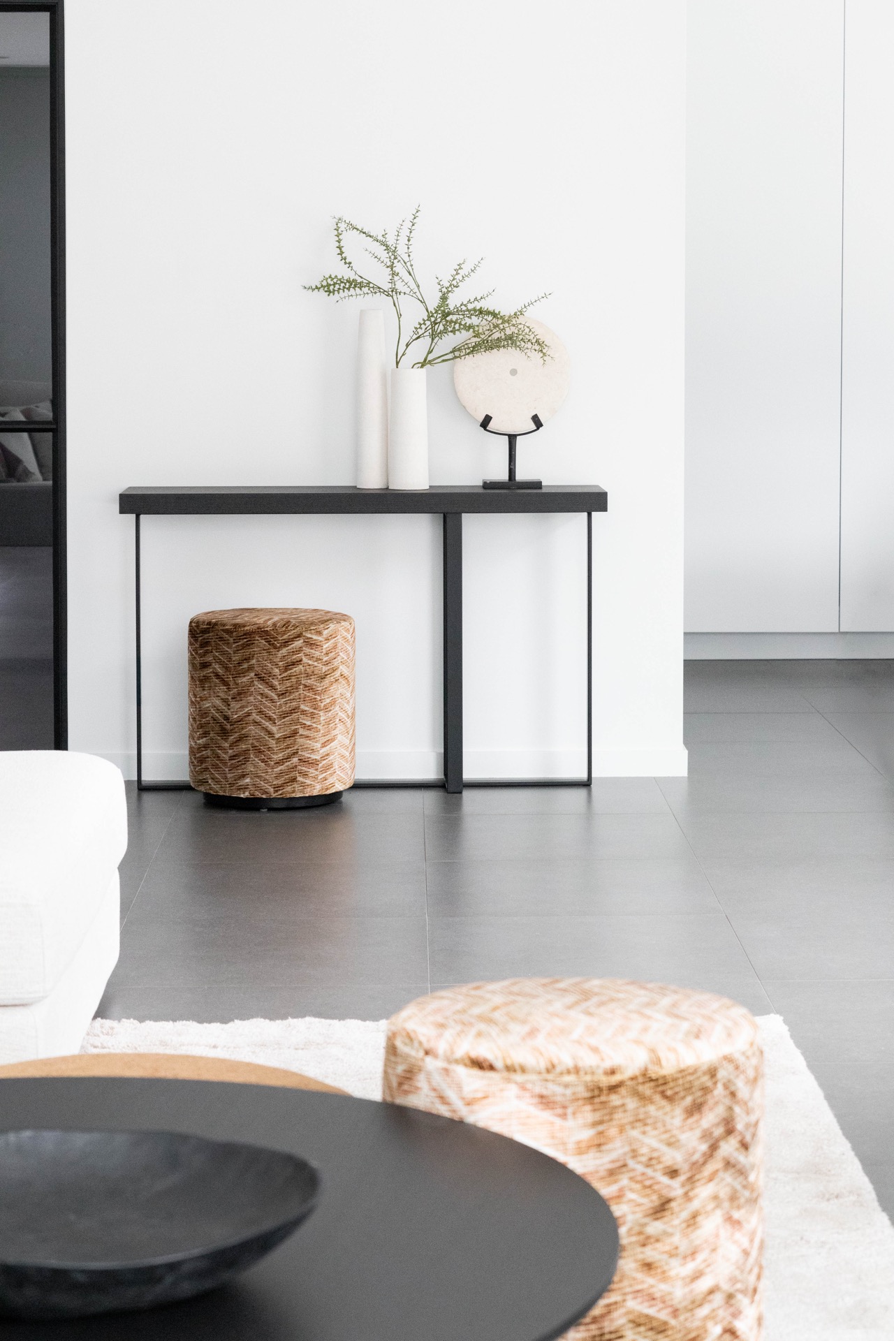
The kitchen island’s rectangular form aligns with floor and ceiling lines, reinforcing order and structure. Nearby, a round dining table interrupts this rigidity with soft curves that subtly ease movement around it. This dialogue of straight and rounded shapes structures different activities while maintaining an open, adaptable space.
Light hues amplify the sense of space
Walls, floors, and textiles lean toward soft grays and warm whites, chosen to maximize daylight reflection and suggest openness. This color restraint allows the diverse textures of wood, marble, and ceramic to express themselves naturally, while providing a neutral stage for the furnishings and accents.
Warm accent colors articulate seating areas
Rich cognac and touches of plum appear in cushions and upholstery, delineating zones without overpowering the light surroundings. These colors highlight material qualities—like the nap of fabric and patina of leather—adding a measured complexity and inviting tactile attention within the calm environment.
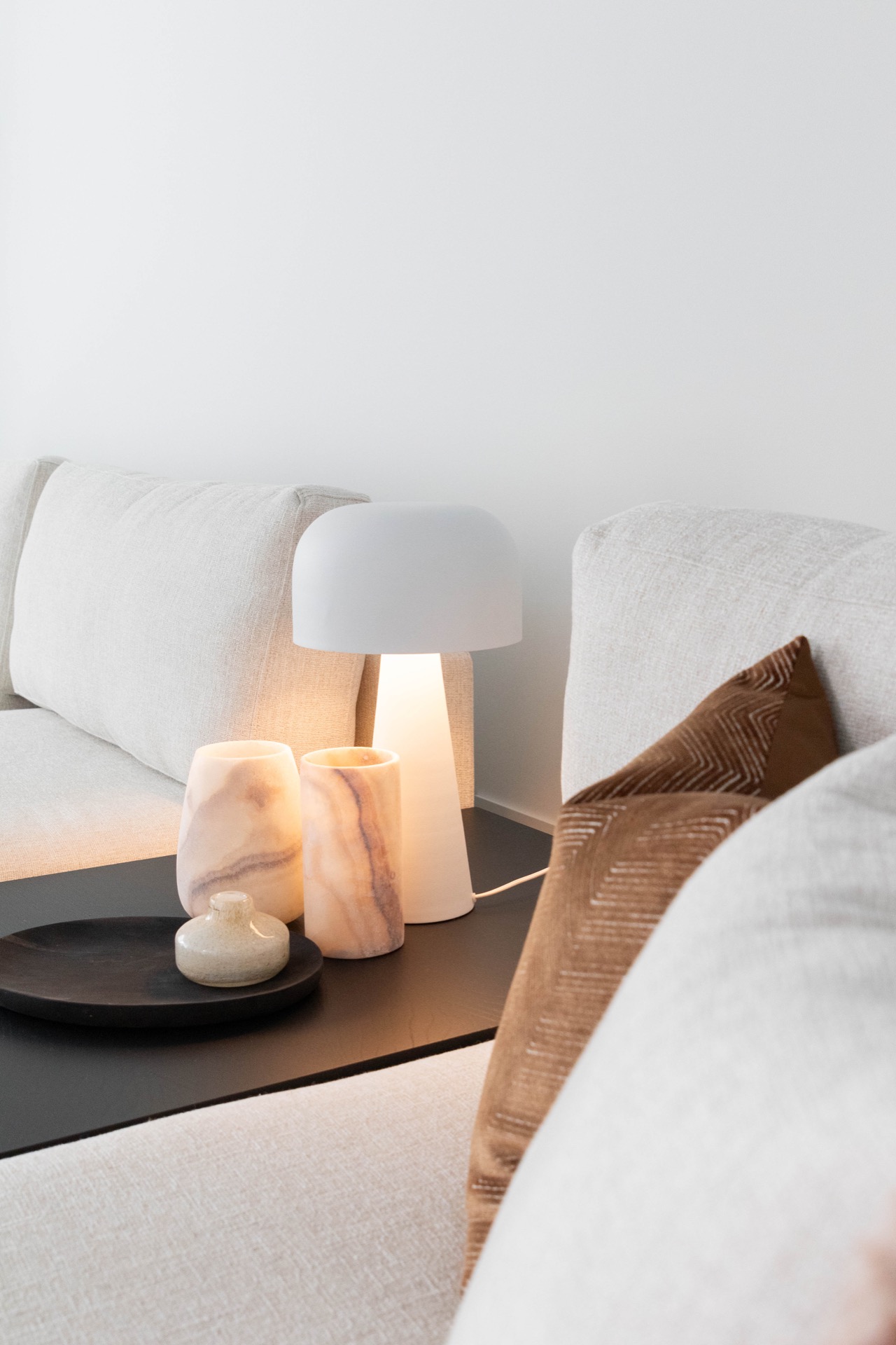
Textural variety invites sensory engagement
The transition between smooth marble, grainy wood, matte ceramics, and soft textiles encourages a multifaceted touch experience. Knitted pillows rest alongside polished wood, producing a nuanced tactile contrast that deepens the spatial impression beyond visual aesthetics alone.
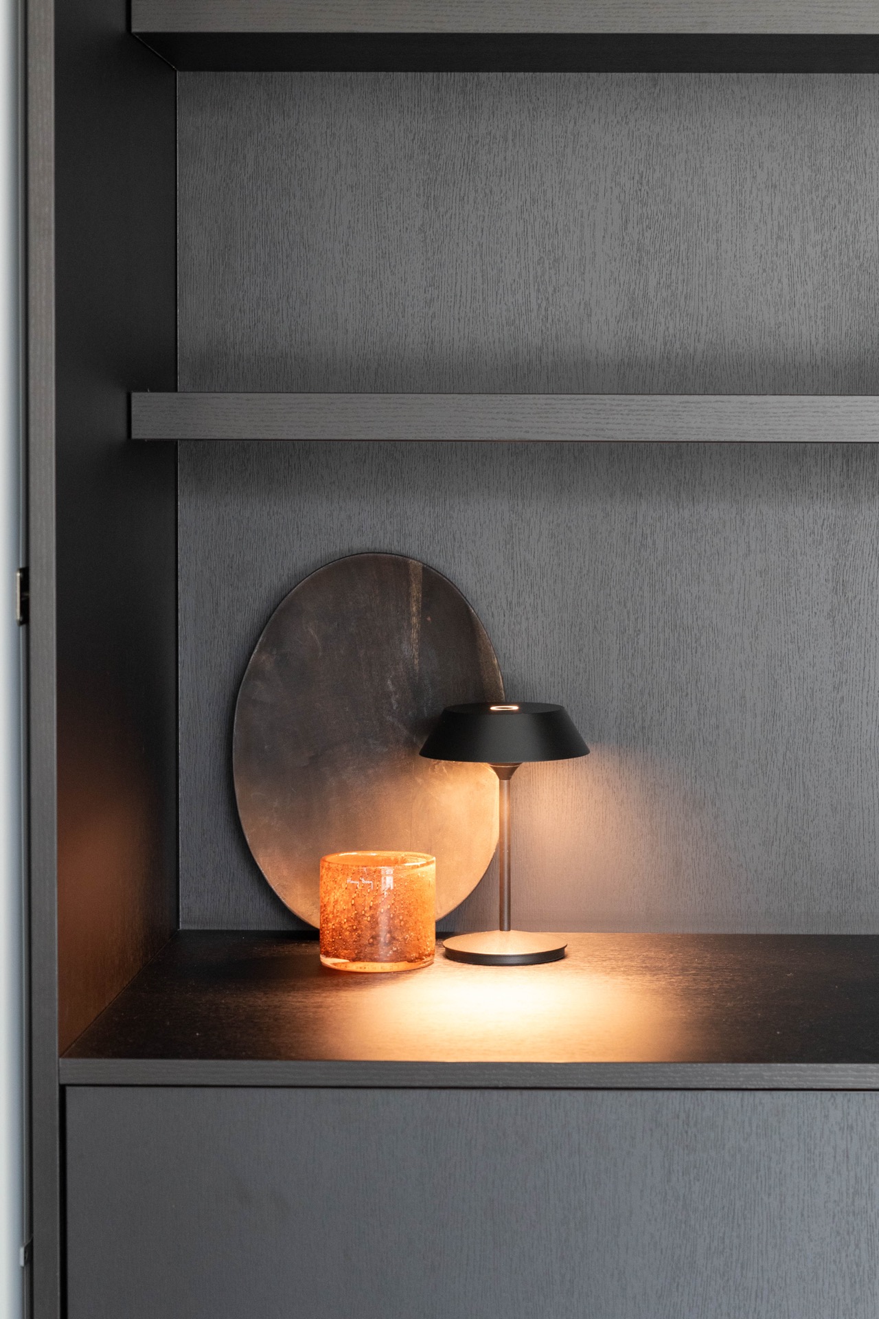
Lighting preserves material qualities after sunset
Recessed fixtures and concealed LED strips provide gentle illumination that respects surface textures and subtle shadows. This lighting supports a tranquil evening atmosphere, highlighting architectural and decorative details without harsh contrasts or visual intrusion.
Flooring subtly signals functional shifts
Warm-toned hardwood naturally guides circulation in living and dining areas, while muted ceramic tiles near the kitchen mark a functional zone change. These material transitions function as discreet spatial cues, supporting movement and use without the need for partitions or abrupt separations. That makes the thatched roof part of the architectural character rather than a loose finish.
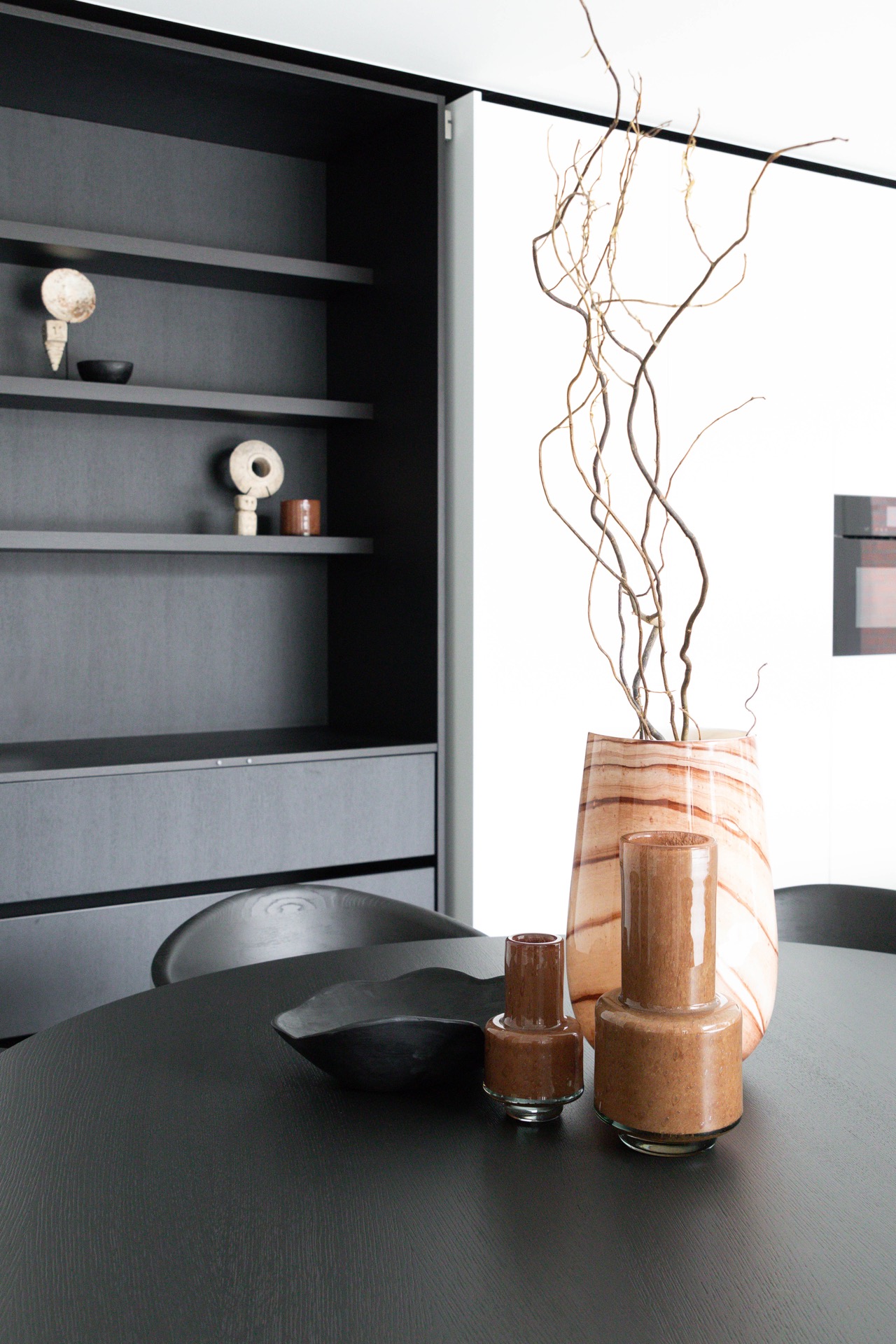
Decor details reinforce material narratives
Wooden bowls and ceramic vases, hand-formed and earth-toned, punctuate the scene with organic shapes and muted finishes. Positioned thoughtfully, these objects echo the architectural materials, enhancing spatial depth and maintaining a quiet, tactile dialogue between form and function.
Black accents frame form with subtle precision
Delicate black lines in lighting fixtures, cabinet handles, and select furniture pieces define edges and planes but never dominate. This graphic detail provides visual anchors that lend crispness to the composition, balancing softness with clarity in the overall arrangement.
Interior evokes thatched roof qualities through layered textures
Instead of direct motifs, the design channels the tactile layering characteristic of thatched roofs through the interplay of wood grains, stone surfaces, and nuanced lighting. This layering produces depth and visual warmth that shifts with the daylight, inviting sustained observation within a spatially open environment.
The kitchen fuses stone solidity and streamlined wooden elements, with under-cabinet lights subtly highlighting marble veining. Nearby, the round dining table encourages intimate conversation, contrasting the strict lines of the kitchen island. Throughout, changing daylight animates surfaces and textiles, enriching the sensory experience of everyday living.
Collectively, the materials and light cultivate an interior that balances openness with differentiated spaces. The natural woods, stones, and fabrics guide use intuitively, without forcing divisions, creating a quietly distinctive setting defined by texture and illumination.
Windows bring expansive views and natural light inside
Generous glazing articulates the interior’s connection with the outside, casting shifting daylight across surfaces and highlighting textures in changing weather. These framed views expand the interior volume visually while linking it to the surrounding environment.
Layered finishes create depth and interest
The interplay of polished stone, smooth wood, and soft upholstery produces a tactile complexity. Matte and reflective surfaces alternate, keeping the eye engaged and preventing visual monotony across the primarily neutral scheme.
Seating arrangements offer diverse experiences
The large family sofa accommodates shared gatherings, while smaller armchairs tucked into corners create intimate retreats. This spatial play encourages multiple activities without barriers, supporting both connection and privacy within an open plan.
Color cues define spaces with restraint
Warm cognac hues and plum cushions mark seating areas subtly, layering the interior without overwhelming its light base. This chromatic approach supports spatial organization and material appreciation without disrupting the calm atmosphere. That makes the thatched roof part of the architectural character rather than a loose finish.
Want to see more of Charrell Home Interiors? View the page of Charrell Home Interiors for even more great projects and company information.

.png)
NEW 2026 Jubileum Edition The Best Interior Designers Benelux
Order Now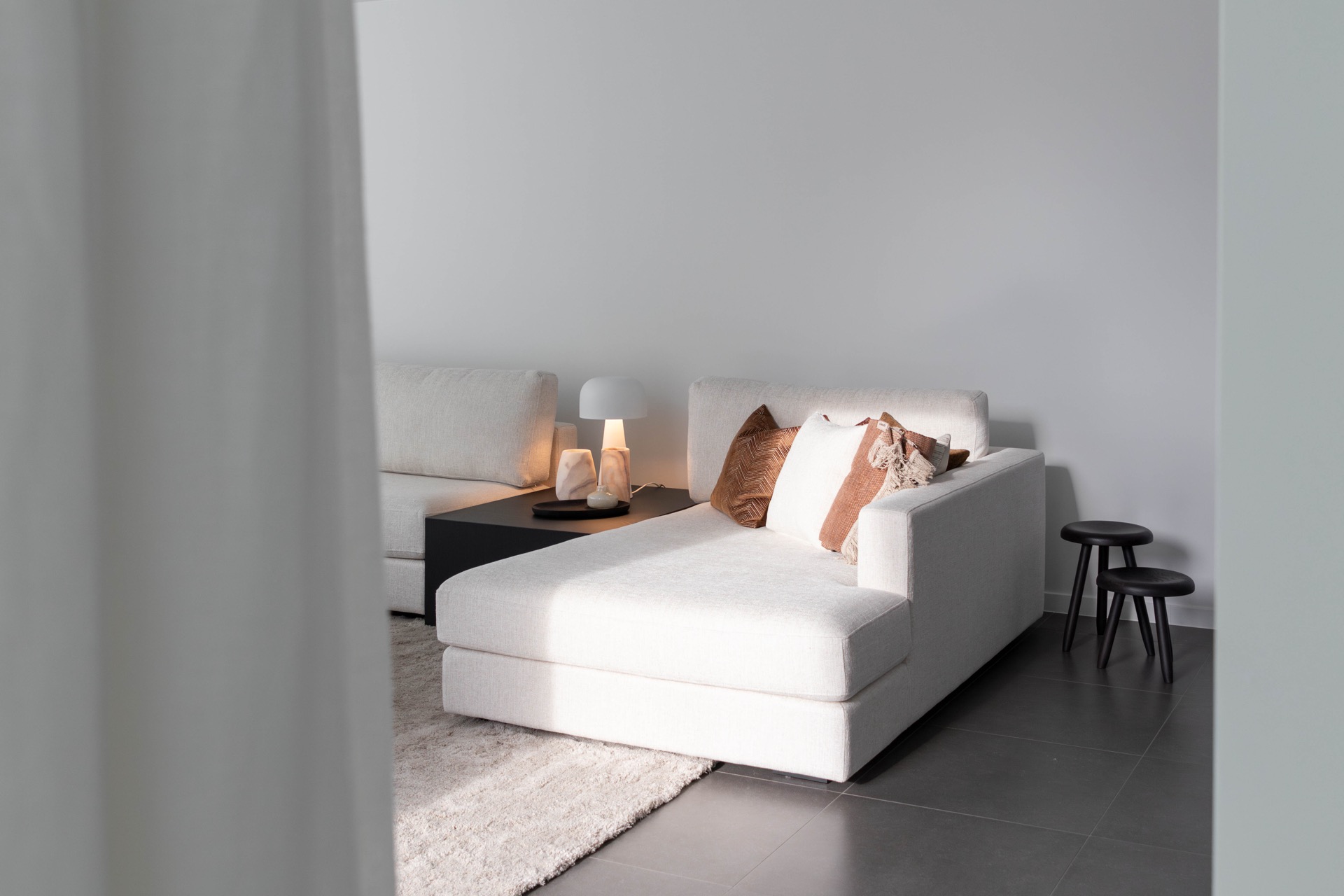
NEW 2026 Jubileum Edition The Best Interior Designers Benelux
Order Now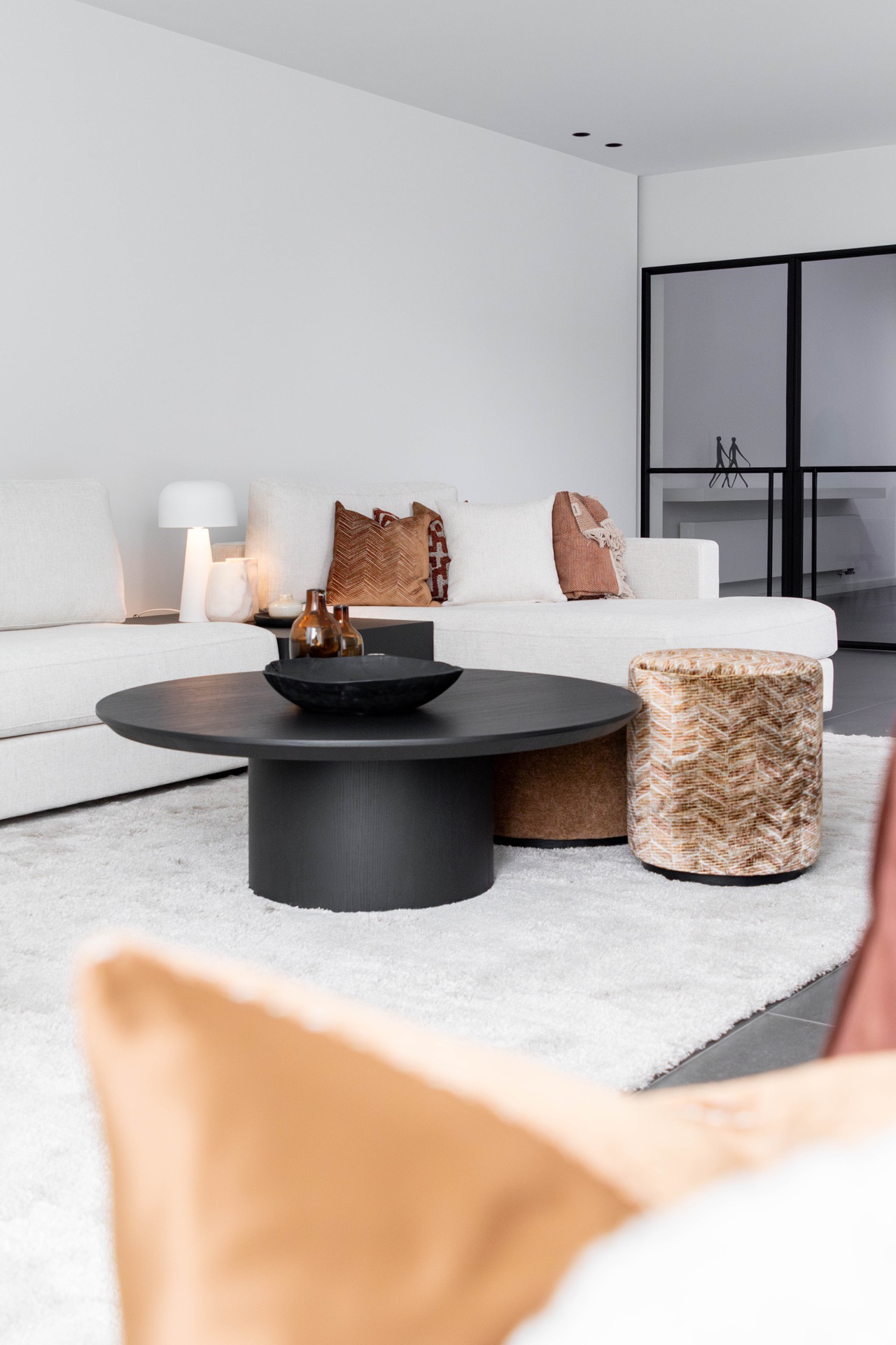
NEW 2026 Jubileum Edition The Best Interior Designers Benelux
Order Now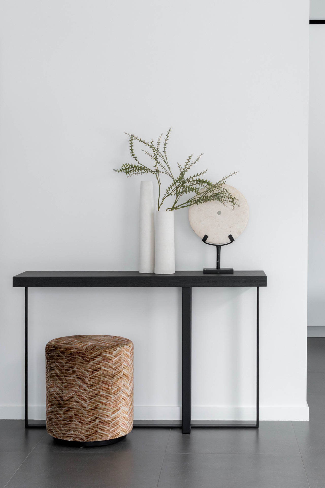
NEW 2026 Jubileum Edition The Best Interior Designers Benelux
Order Now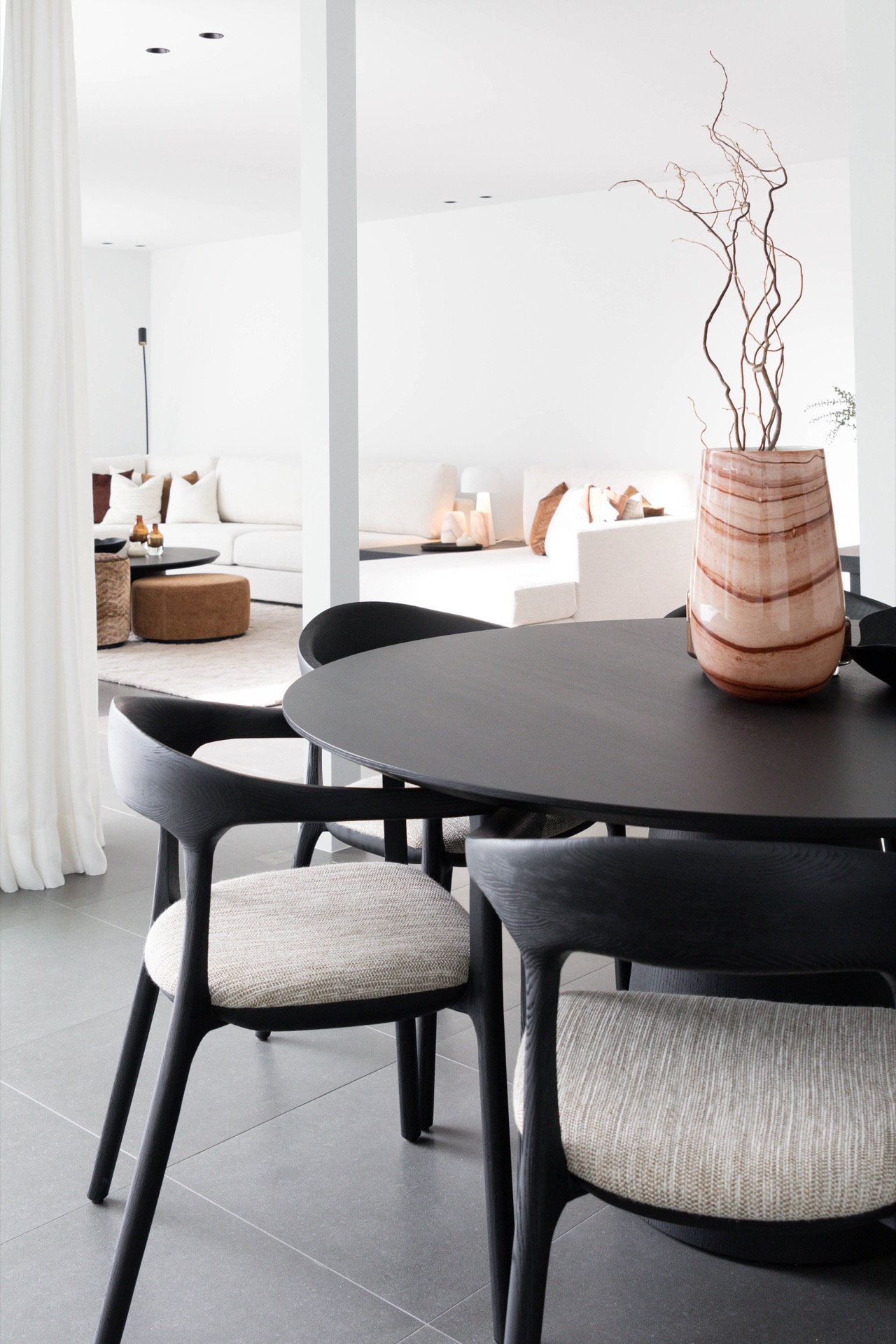


