










Seamless kitchen finish with microtopping flooring and marble-look stone
The floor sets the tone before the eye reaches the cabinets: a seamless kitchen finish in microtopping gives the room a quiet, even base. In this kitchen, the surface runs without visible joints, so the floor reads as one continuous field beneath the wood fronts and stone worktop. The project text also points to the easy maintenance of microtopping, which fits the calm, uncluttered look shown in the images.
Wood fronts and stone surfaces in one view
Warm wood cabinet fronts line the lower run, broken by simple horizontal handles that keep the composition lean. Above them, the marble-look kitchen backsplash and marble-look countertop draw the eye with dark veining and lighter streaks that shift from green to white. The stone catches the light differently from the matte wood, so the kitchen gains contrast without relying on extra color or ornament. In the wider shots, that difference is what gives the room its pulse.
The layout places the cooking and washing zone against a wall niche, which frames the stone surfaces and turns them into the main backdrop. A dark work zone sits against the veined material, making the pattern on the backsplash more legible. The edges read cleanly, and the transitions between wall, counter, and cabinetry stay tight. That precision supports the idea of a seamless kitchen finish without needing to overstate it.
A light pink accent that changes the mood
Among the wood and stone, the light pink accent stands out as the one note that shifts the room’s temperature. It does not cover the kitchen; it appears as a color decision that catches attention immediately, just as the source text describes. Against the pale walls and ceiling, the pink reads as deliberate and restrained, not decorative filler. It gives the otherwise grounded palette a point of tension, especially where the stone and timber already do most of the visual work.
That use of color matters because the kitchen already carries a strong material language. The stone has movement, the wood has grain, and the floor brings a smooth, jointless plane underfoot. The pink accent steps in as the element you notice second, after the material contrasts. It is a small intervention, but in the photographs it changes how the cabinetry and stone are read together.
What the close-ups reveal about the material rhythm
Close-up images show the marble-look kitchen backsplash with a denser pattern of green, white, and dark veining than you see from a distance. The countertop reflects a little more light, while the backsplash holds the pattern in a flatter plane behind the work zone. Together they create a layered surface story: one material spans two functions, but each part behaves differently. That difference keeps the composition from feeling repetitive.
At the sink and cooking area, the black appliances and fixtures sit against the stone like a graphic layer. The curve of the tap breaks the hard lines of the front edges, and the dark zone anchors the lighter surfaces around it. In the wall recess, the cabinetry and stone meet in a way that reads as built-in rather than added later. The result is a kitchen that depends on simple alignments, not visual noise.
Seamless kitchen finish, made visible through detail
The seamless kitchen finish is most convincing where the floor meets the cabinetry and where the stone edges meet the wall. There are no decorative transitions calling attention to themselves. Instead, the room relies on long horizontal runs, straight fronts, and a steady material palette. The microtopping seamless flooring reinforces that reading by keeping the lower plane visually quiet. It lets the wood and stone take the lead while the floor stays present but unobtrusive.
Several images also show a light-filled background with white walls, integrated ceiling lights, and window coverings in the side areas. Those elements matter because they keep the kitchen from becoming too heavy. The pale envelope balances the darker stone and the warmer timber, and the open plan allows the materials to be seen from more than one angle. From one view the stone dominates; from another, the wood fronts do. The room shifts without changing its core language.
How the cabinetry frames the room
The wood kitchen cabinet fronts run in a straight line, with the handles aligned horizontally so the eye moves along the run instead of stopping at each door. That line is especially visible in the images where the cabinets sit inside a wall niche. The niche acts like a frame, pushing the cabinetry inward and making the stone surfaces feel more concentrated. In the wider composition, the cabinetry does not compete with the backsplash; it supports it.
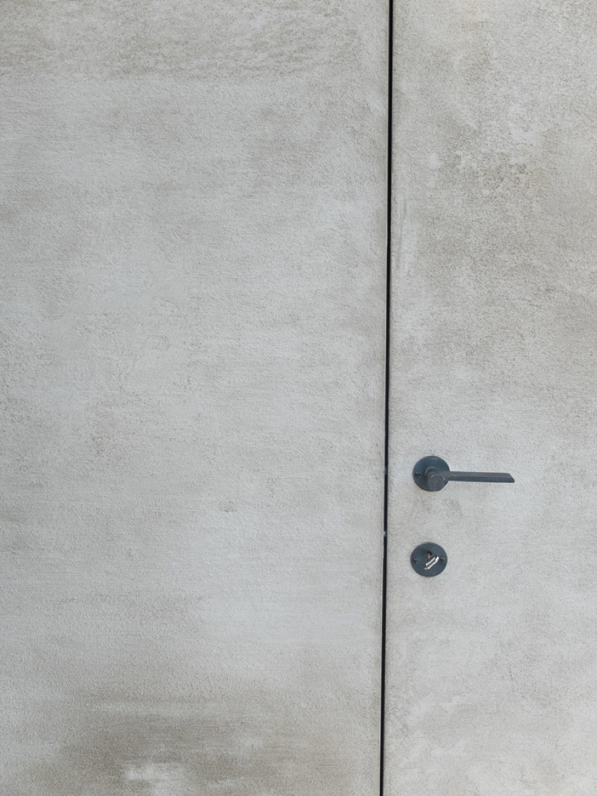
One image shows a door and adjacent timber paneling that continue the same material logic beyond the main cooking wall. This extends the kitchen vocabulary without changing it. The wood repeats, but it is not simply decorative repetition. It marks storage, circulation, and the boundary of the working area. That is part of why the room feels composed around surfaces and joins rather than around isolated pieces of furniture.
Why the floor matters as much as the stone
Microtopping is easy to miss in a room full of visual cues, which is exactly why it works here. The floor does not interrupt the view of the cabinetry or stone; it supports them. In the source text, the material is described as jointless and easy to maintain, and those qualities match what the images suggest: a surface that sits quietly under a busy visual field. With no visible tiling grid, the lower plane keeps the kitchen open and legible.
That continuous floor surface also helps the pink accent register more clearly. Because the base is so even, the eye notices shifts in color and texture faster. The stone veining, the timber grain, and the pink note all stand out against a floor that refuses to compete. In a kitchen like this, the floor is not a backdrop in the weak sense; it is the surface that lets the rest of the room read with clarity.
Stone, wood and color held in a single composition
The strongest view in the project is the one where the marble-look kitchen backsplash, the marble-look countertop, and the wood fronts are all visible at once. From that angle, the kitchen becomes a study in surface changes: glossy and matte, patterned and plain, dark and light. The light pink accent interrupts that sequence just enough to keep the palette from settling into one register. It is a kitchen of measured contrasts, built around finishes that can be read immediately.
What remains after the first look is the clarity of the arrangement. The wall niche, the linear handles, the veined stone, and the microtopping seamless flooring all work through direct visual contact rather than through decoration. That gives the room its character. Not because it tries to do more, but because every visible surface has a clear role in the composition.
Want to see more of Texture Painting? View the page of Texture Painting for even more great projects and company information.




NEW 2026 Jubileum Edition The Best Interior Designers Benelux
Order Now €125


NEW 2026 Jubileum Edition The Best Interior Designers Benelux
Order Now €125


