Serene modern classic kitchen with continuous countertop and a marble-look bathroom
A pale green kitchen sets the tone from the start. The color sits softly against straight cabinet lines, while walnut surfaces pull the room away from feeling too cool. The result is a serene modern classic kitchen that reads through material and proportion rather than ornament. A continuous countertop runs into the back wall, where a raised edge creates a narrow ledge for objects and gives the surface a second layer.
Where the kitchen begins, the rest of the house follows
The kitchen is described as the key room in the house, and that priority is visible in the way it organizes the interior. Long lines draw the eye across the space, from the storage wall to the worktop and into the adjoining conservatory-like area. The cabinet fronts stay restrained, but the detailing does not disappear. Handles are worked into the joinery with care, so the doors read as part of the architecture instead of separate fittings. In a serene modern classic kitchen, that kind of restraint matters more than decoration.
Light green kitchen color accents bring a quiet 1930s reference without pushing the room into nostalgia. They sit beside matte white fronts and wood veneer, which gives the composition a measured contrast. The walnut warmth in kitchen cabinetry is not used as a heavy block; it appears in panels and framing that soften the sharper white surfaces. Seen together, the finishes shape a room that feels precise, but not severe. The visual rhythm is calm, yet there is enough variation to keep the eye moving.
A continuous countertop with a raised edge
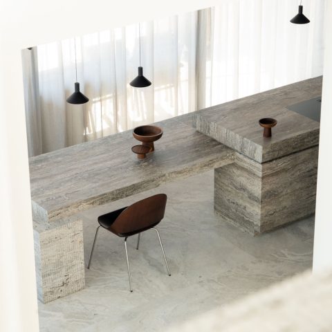
The kitchen with continuous countertop does more than extend the work surface. Because the top turns up along the back wall, it creates a shelf-like edge where small items can be set down. That small move adds depth to an otherwise disciplined composition. It also lets the backsplash and worktop speak together, especially where marble-look surfaces catch the light and break up the larger planes of white and wood. The line is simple, but it gives the kitchen a layered reading.
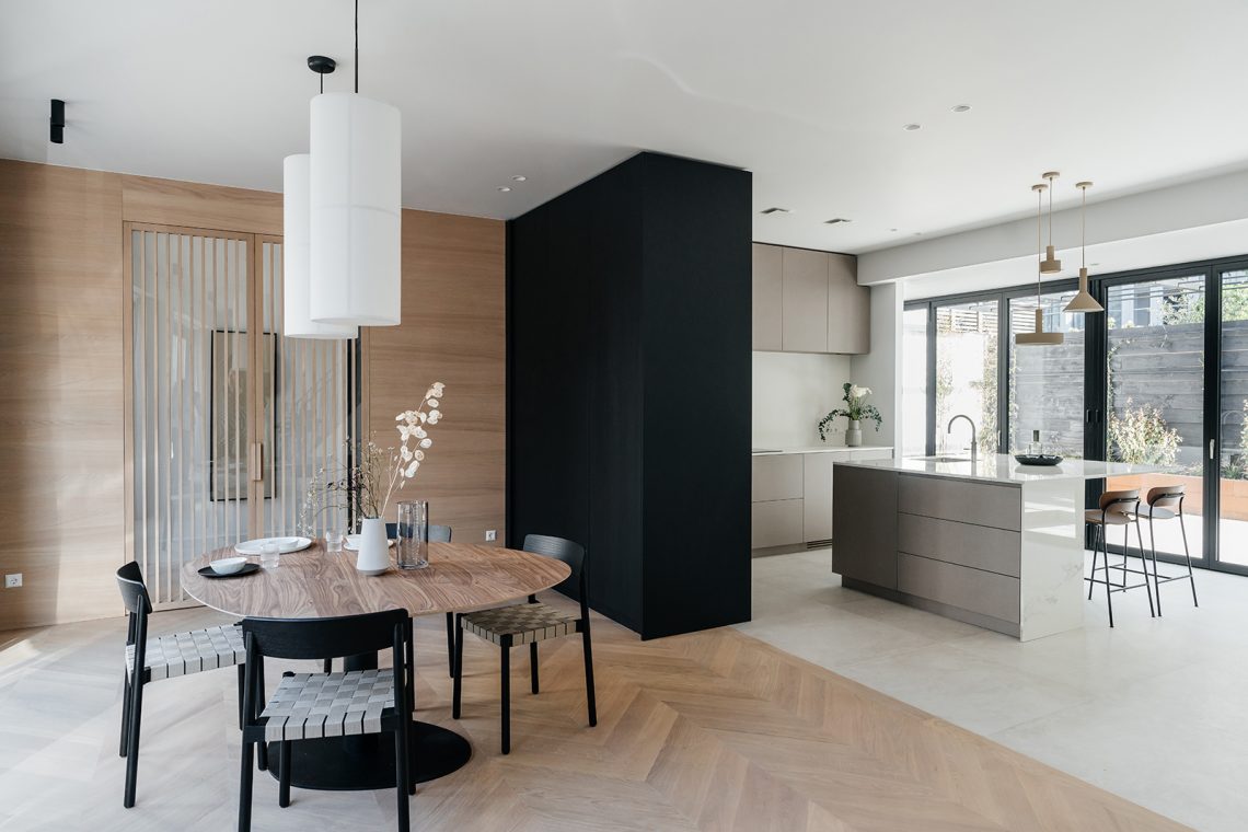
In the images, the same discipline appears in the integrated storage wall. Tall fronts and built-in appliances keep the massing flat, while a darker cooking zone marks the practical center of the room. The contrast between light cabinetry and darker equipment is small but important: it anchors the kitchen without cluttering it. A marble look kitchen backsplash and stone-look worktop also introduce a subtle movement in the surface, just enough to prevent the space from becoming too uniform.
Material shifts that keep the room measured
What stands out most is the way the surfaces change without abrupt jumps. White fronts meet wood veneer, then stone-look counter, then the pale green tone that ties the room back to the overall concept. In a serene modern classic kitchen, those transitions have to stay quiet. Here they do. The cabinet detailing remains slim, the lines stay straight, and the built-in elements keep the composition readable from several angles. Even the kitchen’s profile feels designed to be seen from adjacent spaces, not only from the cooking zone.
The image set shows several perspectives of the same idea: the kitchen as a long, measured sequence rather than a single showpiece. One view emphasizes the island-like work surface, another frames the wall of cabinetry, and a third focuses on the stone-look finish at the back. Together they make the room feel carefully routed. Nothing is overstated, but every surface has a job to do. The raised countertop edge, the concealed handling, and the continuous run of joinery all work toward that same calm reading.
Light and contrast in the master bathroom
The master bathroom turns toward a more restrained palette. Light reflects off marble-look bathroom tiles, and the room uses that surface to hold the brightness rather than scatter it. The shower sits behind glass with black profiles, which draws a fine outline around the enclosure and gives the wet zone clear edges. A double vanity with a marble-look top repeats the stone effect at wash level, so the bathroom feels composed in layers instead of isolated fixtures.
Glass, stone and a freestanding tub
A freestanding white bathtub is placed as a visual pause. Its oval shape breaks the stronger lines of the room, especially next to the sharper shower frame and the rectilinear vanity. The bath is not treated as a decorative object on its own; it works because of the surrounding surfaces and the open floor around it. Near the window, horizontal blinds filter the light into thin bands, which keeps the bathroom bright without flattening the materials. The light lands on tile, glass and enamel differently, and that difference carries the room.
The shower enclosure’s black profiling is a small but decisive move. It outlines the glass without making the partition heavy, and it ties in with the darker accents visible elsewhere in the interior. The vanity lighting runs in a straight line above the basins, adding a measured glow rather than a decorative gesture. In a bathroom like this, the appeal lies in that exactness: a marble-look bathroom with clear edges, practical surfaces and enough visual quiet for the finishes to register.
The bedroom and dressing room continue the contrast
Dark and rich materials take over in the adjoining bedroom, where the atmosphere shifts away from the lighter bathroom surfaces. The change is immediate in the images: deeper tones, denser textures and a more enclosed feeling around the bed area. Rather than trying to match the bathroom exactly, the bedroom extends the contrast. That move gives the suite a stronger spatial sequence. The transition from pale tile to darker surfaces is legible, and it helps each room hold its own character.
High doors to the walk-in closet reinforce the more stately side of the architecture. Their height makes the storage feel built into the room’s proportions rather than added later. The doors also sharpen the vertical lines of the upper floor, which already includes multiple passages connecting the different rooms. Those openings matter because they shape how the floor is used: one person can sleep quietly while another moves through the rest of the suite. The layout is not only about look and finish; it also controls sound, movement and privacy through the way the rooms connect.
Measured routes on the first floor
Several doorways open onto the various functions upstairs, and that structure gives the floor a clear logic. The passages allow the bedroom, bathroom and wardrobe areas to remain linked, but not collapsed into one space. From a design point of view, it is a useful restraint. The route through the floor is short and direct, yet it avoids unnecessary exposure between the rooms. That is especially noticeable where the taller openings and darker joinery create pauses in the sequence, almost like quiet thresholds.
Seen as a whole, the project uses a serene modern classic kitchen as its starting point and keeps that calm, material-led approach across the adjoining rooms. The kitchen relies on pale green accents, walnut warmth in kitchen cabinetry and a kitchen with continuous countertop to set its tone. The bathroom answers with marble-look bathroom tiles, a glass walk-in shower with black profiles and a double vanity marble look top. Between them, the bedroom and dressing room add contrast, height and a clearer sense of separation across the floor.
Want to see more of Studio Wendy Mahieu? View the page of Studio Wendy Mahieu for even more great projects and company information.
Contributors



NEW 2026 Jubileum Edition The Best Interior Designers Benelux
Order Now €125


NEW 2026 Jubileum Edition The Best Interior Designers Benelux
Order Now €125