










Showroom texture painting with plaster-like wall texture
A fine relief catches the light before the room does. On the showroom walls, the texture painting wall finish shifts between gray, beige, black, and white, with each surface reading a little differently under daylight and softer artificial light. Some areas feel close to a plaster-like wall texture, while others lean toward a darker, more concrete-like accent wall. The result is not one single finish repeated everywhere, but a sequence of wall sections and samples that show how texture can change the mood of a space without changing its language.
Matte surfaces that reveal the hand of the material
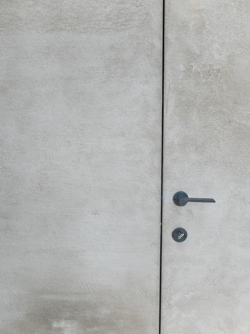
The closest details are the most telling. In the gray close-up, the relief looks granular and slightly uneven, with a trowel-like pattern that breaks up the surface just enough to hold shadow. A warmer beige section does something different: the finish stays matte, but the light skims across it and makes the texture legible without turning it busy. These are showroom wall textures meant to be seen at short distance first, where the small variations in the plaster surface matter more than any broad decorative gesture.
That same restraint appears in the larger wall planes. Beige and light tones stretch across wide sections, then give way to darker panels or framed openings. The surfaces are not polished to a shine; they stay matte and subdued, which lets the relief wall structure do the work. In one area, a dark brown or black field pushes the texture into deeper contrast. In another, a soft white wall keeps the finish almost quiet until the light moves across it. The palette stays grounded in white, gray, beige, dark brown, and black.
A staircase cast in stucco-like calm
The staircase has a different presence. Its white surfaces read as a monolithic stucco look, with the treads formed as crisp, solid volumes rather than as a decorative object. Shadows gather along the step edges and under the landings, which makes the mass of the stair more visible. The adjacent walls continue that plastered reading, so the stair feels embedded in the architecture instead of attached to it. It is one of the clearest moments in the showroom where the texture painting wall language extends into a spatial element.
Seen from the side, the stair details are spare: no visual clutter, no excess trim, only the line of the step and the continuity of the wall surface. That monolithic reading is reinforced by the matte finish, which keeps reflections low and leaves the shape of the stair to do the talking. It is a practical visual counterpoint to the more tactile wall samples nearby, and it helps the showroom show both scale and surface at once.
3D stone strips and framed relief
One of the strongest contrasts in the room comes from the stone-like 3D panels. The white relief segments are stacked into a strip pattern, creating a raised surface that breaks from the flatter plaster finishes around it. Dark framing panels sit beside the relief, tightening the composition and giving the texture a clearer edge. Glass and black frame elements make that contrast even sharper. The eye moves from the soft, matte wall fields to the more physical face of the paneling, where depth becomes the main feature.
Elsewhere, rectangular 3D wall plates form ordered rows with evenly spaced recesses. A niche opening cuts into the composition, bordered by a darker surround, so the wall reads as both surface and built-in structure. These details show how stone-like 3D panels can sit next to texture painting without competing with it. The relief is different, but the visual idea stays related: light lands on a raised face, then slides into shadow at the seams.
Contrasts that stay within one material family
The showroom works because the materials do not shout over each other. Concrete-look accents sit beside beige matte walls. A darker textured field is held next to a light plane. In the living room view, a large wall with a soft texture carries a television and open compartments in one clean line, while nearby a darker accent zone and a lit niche change the tone without changing the underlying order. The surfaces feel related through touch and finish, even when the colors move in different directions.
A separate set of panels shows the same idea in miniature. Multiple sample boards stand on a rail, each with its own surface variation and tonal shift. Some are smoother, some more granular, some lighter, some deeper in tone. Together they read like a study in plaster-like wall texture, not as a catalog of effects but as a series of possible readings under changing light. That is what the room keeps returning to: the surface is never flat for long, but it remains quiet enough to let the architecture stay visible.
Light, niche openings, and a measured palette
Daylight from a roof opening in the living area makes the texture easier to read. On the beige walls, the surface changes as the light shifts, and the finish moves from nearly smooth at a distance to visibly grainy up close. Niche openings and built-in edges interrupt the wall planes, creating points where the material turns inward or meets a darker surround. Those transitions are modest, but they matter; they keep the showroom from feeling like a set of isolated samples and tie the finishes back to actual room use.
The color range stays disciplined. White appears in the stair and some relief elements. Gray shows up in the close-up texture and in cooler accents. Beige carries much of the wall coverage. Dark brown and black appear in framing, niches, and contrast fields. Because the palette is restrained, the eye notices the surface changes first. That is where the texture painting wall approach proves its value: the finish can support a living room wall, a bathroom wall, a stair enclosure, or a display panel without needing to change its character.
Bathroom, living area, and stair details in one visual sequence
The bathroom view brings the finish into a smaller, more enclosed setting. A glass shower partition sits in front of the dark textured wall, so the surface is seen through reflections, edges, and a narrow strip of light. The finish does not become shiny; it stays matte and slightly irregular. In the living room views, the same attention to surface is stretched across broader walls, where the relief is softer but still visible. The stair image then pulls the focus back to form, showing how the stucco look can shape a route rather than just a wall.
What ties those spaces together is not uniformity, but a shared sense of material control. The finishes are shown in different conditions: close-up, under daylight, behind glass, beside dark paneling, and next to built-in furniture lines. That variety makes the showroom useful as a reference. It shows how a texture painting wall can read as discreet in one room and more graphic in another, while still belonging to the same interior family.
Wall samples that read like a material archive
The sample wall is almost the most revealing part of the presentation. Several panels sit side by side, each with a different texture density, color depth, or raised pattern. Some look closer to plaster, others to stone, others to a concrete-look accent wall with a darker body. Because the samples are displayed together, the differences become easier to compare: grain against smoothness, matte against slightly deeper shadow, pale against dark. It is less a decorative display than a working archive of surface options.
Across the project, the same principle repeats in larger and smaller moves. A relief wall structure becomes a feature when the light hits it. A 3D stone strip wall gains rhythm through repeated segments. The stucco look staircase turns volume into a finish. And the showroom wall textures, seen in white, gray, beige, dark brown, and black, show how texture can organize a room without overpowering it. The surfaces stay calm, but they never disappear.
Want to see more of Texture Painting? View the page of Texture Painting for even more great projects and company information.




NEW 2026 Jubileum Edition The Best Interior Designers Benelux
Order Now €125


NEW 2026 Jubileum Edition The Best Interior Designers Benelux
Order Now €125


NEW 2026 Jubileum Edition The Best Interior Designers Benelux
Order Now €125


NEW 2026 Jubileum Edition The Best Interior Designers Benelux
Order Now €125


