









Small Interior Changes, Big Impact
Small interior changes big impact can be read immediately in the way the rooms open toward one another. A line of sight runs from the kitchen to the dining area and further into the living space, while the white walls and grey floor keep the plan visually calm. Nothing here depends on a large gesture. The effect comes from placing storage, light and openings exactly where they are needed.
An open living kitchen that keeps its structure
The open living kitchen is not left to drift into the rest of the interior. Instead, the zones are clearly legible, with the cooking area, dining table and sitting zone each holding their own position. That separation happens without full-height walls. Doorways, cabinetry and the placement of furniture do the work, so the space remains open while still reading as a sequence of rooms. This is where small interior changes big impact becomes more than a title.
Wood accents soften the white cabinetry and the pale wall surfaces, especially along the kitchen run where the straight fronts are interrupted by warmer tones. The mix of lacquered surfaces, wood veneer and stone-look worktops gives the kitchen a measured rhythm. In close-up, the surfaces are spare and plain; from a distance, the same materials help define where one zone ends and the next begins.
The built-in fireplace wall as a quiet anchor
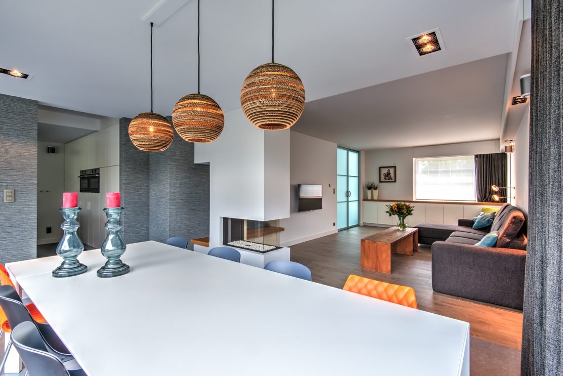
At the centre of the living area stands a modern built-in fireplace wall with a glass front set into a crisp white surround. The fireplace does not dominate the room with ornament. It works instead as a fixed point around which the seating arrangement can settle. Darker stone-textured surfaces frame parts of the wall, and the contrast between the white cladding and the darker edge makes the opening read clearly from across the room.
In one view, the fireplace sits beside a recessed niche and an integrated shelf area; in another, a low wooden bench appears beneath the darker wall section. These details show how the plan uses the wall thickness itself. Storage, seating and display are folded into the same zone. The result is not a decorative feature wall, but a place that holds several functions without breaking the calm line of the interior.
Light, layers and a clear ceiling line
Layered lighting ceiling spots and pendants give the rooms a second structure after dark. The ceiling spots pick out circulation and working areas, while the hanging lamps mark the dining table with a more concentrated circle of light. Their woven shades add texture without heavy colour. Because the ceiling remains visually clean, the lighting can define the different uses of the open space without adding clutter.
Daylight from large windows does the rest. The glazed openings bring a broad wash of light onto the kitchen fronts, the table and the grey tiled floor. Curtains soften the edges of the windows, but the strongest impression is still the amount of glass and the way it pulls the eye through the room. This daylight also makes the small transitions easier to read: the kitchen, dining space and lounge stay connected, yet each remains recognisable.
Storage shaped into the wall
The kitchen shows how storage can recede into the architecture instead of standing apart from it. Tall, flat cabinet fronts run along the wall, broken by an illuminated coffee niche that turns a practical corner into a visible part of the composition. The lit niche is small, but it changes the entire run of cabinetry. It introduces depth, gives the eye a pause, and creates a clear place for the coffee station without adding another loose element to the room.
Elsewhere, open niches and fitted recesses appear around the fireplace and in the kitchen wall, showing the same approach at different scales. Rather than filling the room with separate cupboards, the design uses wall thickness and built-in volumes to keep items close at hand. That is why the phrase small interior changes big impact fits the project so closely: the changes are modest in size, but they alter how the room is used and read.
Wood, white and grey in direct conversation
The material palette stays restrained. White walls set the background, while wood veneer introduces a warmer horizontal note across the kitchen and storage elements. Grey appears in the floor tiles, in the seating upholstery and in parts of the surrounding finishes. Because the tones are kept within a narrow range, the differences between surfaces become easier to see. A cabinet door, a stone-like worktop and a tiled floor each keep their own identity.
That discipline also supports the open living space. A more varied palette would have complicated the sightlines between the rooms; here, the eye can move across the plan without interruption. The wood accents do not read as decoration placed on top. They work as structural markers, helping to show where the kitchen run begins, where the fireplace wall takes over and where the dining area is meant to sit.
The furniture follows the same logic. A long dining table stretches under the pendants, while the seating group remains low and quiet beside the fireplace. Even in the close-up views of the worktop, sink zone and cabinetry, the composition stays linked to the larger room. Everything is measured against the same open living kitchen, so each detail supports the larger spatial reading rather than competing for attention.
Why the project feels larger than its footprint
The strongest impression is not a single material or object, but the way the plan frees up the available space. By shifting storage into wall depth, keeping the kitchen fronts flat and using light to mark the separate zones, the interior gains a clearer circulation line. You can move from the kitchen to the dining area and into the lounge without losing the sense of where you are. That is the real force of the project: small interior changes big impact, made visible in everyday use.
It is also why the line “we do not make cupboards, we create space” feels exact here. The built-in elements do more than store objects. They pull clutter into the walls, open the centre of the room and leave the larger surfaces available for light, movement and furniture. The result is an open living kitchen where the details are modest in scale, but the spatial effect is immediate and easy to read.
Want to see more of Helga interieur en architectuur? View the page of Helga interieur en architectuur for even more great projects and company information.





NEW 2026 Jubileum Edition The Best Interior Designers Benelux
Order Now €125


NEW 2026 Jubileum Edition The Best Interior Designers Benelux
Order Now €125


NEW 2026 Jubileum Edition The Best Interior Designers Benelux
Order Now €125


NEW 2026 Jubileum Edition The Best Interior Designers Benelux
Order Now €125


NEW 2026 Jubileum Edition The Best Interior Designers Benelux
Order Now €125


NEW 2026 Jubileum Edition The Best Interior Designers Benelux
Order Now €125


