


Stone-look ceramic tiles for modern light interiors
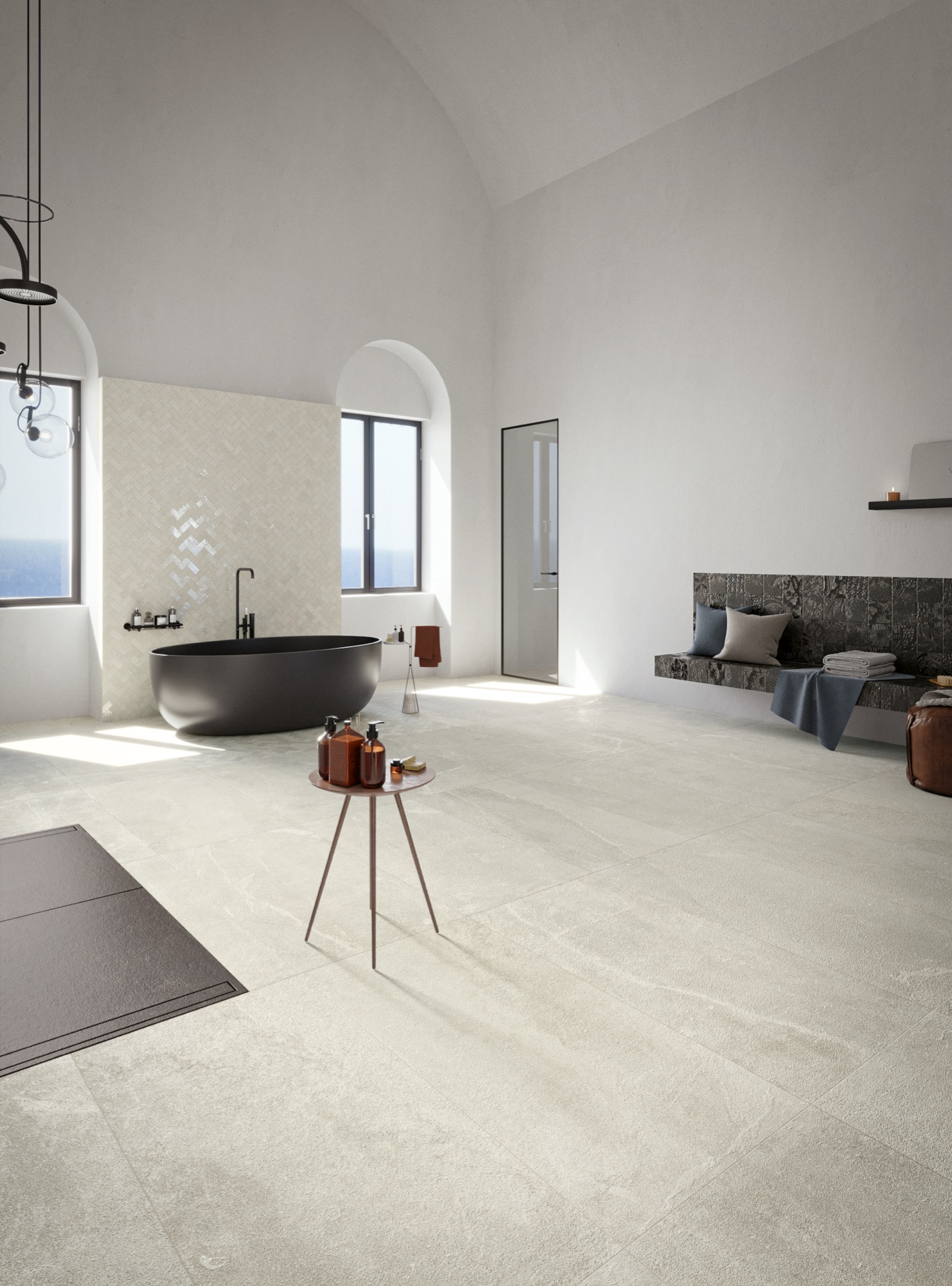
The stone-look ceramic tiles is immediately visible in the way the project is framed. The first thing you notice is the surface: a light grey floor that reads like stone, but keeps the cleaner edge of ceramic. In these interiors, the material is used as a steady base rather than a backdrop. The collection draws on a stone reference with dense veining and a strongly marked surface, then translates that character into tiles that work across floors and walls.
stone-look ceramic tiles as the architectural starting point
The palette stays restrained, but it is not flat. Four finishes — Nera, Linfa, Colofonia and Resina — move from black to white and from grey to beige, so each room can shift from cool contrast to a softer, more tonal field. That range matters in the visuals: the lighter tiles open up the room, while the darker notes sit deeper in the surface and sharpen edges around furniture, openings and wall panels.
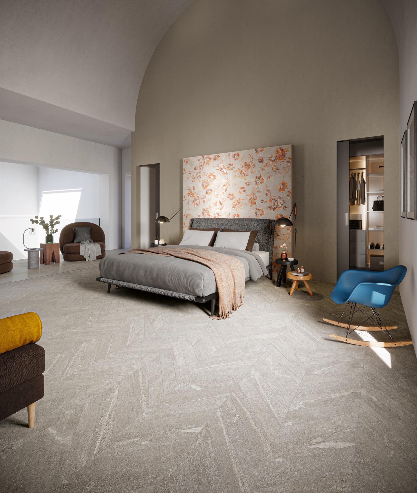
Large formats do most of the structural work here. The 60×120 and 60×60 sizes create broad planes with few interruptions, which suits the calm, architectural look shown in the bathroom, living area and bedroom. The 30×120 format extends that rhythm, stretching the surface in a way that can make the pattern feel longer and more continuous across a floor or up a wall. It is a collection built to be read in spans, not fragments.
Large format floor tiles that carry the room
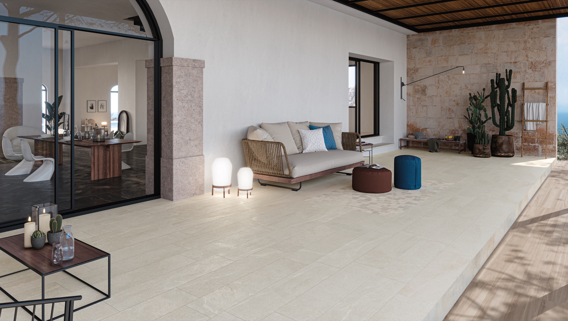
As ceramic floor tiles, the larger pieces keep the grain and colour variation visible without turning busy. In the bathroom image, the floor sits under a freestanding oval bath and a wall with a repeated decorative field, so the tile below has to hold the room together quietly. In the living space, the same light grey tile floor gives the seating area a level base, while a stone-look wall with a leafy trace of pattern adds one stronger vertical note.
That same approach appears in the bedroom scene, where broad light grey segments run under a bed and up to a decorative panel above it. The floor does not compete with the wall; it lets the warmer wall and ceiling tones stay readable. Across the three rooms, the collection keeps returning to the same visual idea: a stone-look ceramic tile that is calm enough for a floor, but detailed enough to move onto the wall without losing presence.
Pattern options that change the surface
The collection is not limited to plain planes. Chevron layouts, floral or decorative elements and mosaic details are all part of the range, which opens the door to a more marked surface where needed. A mosaic tile wall accent can break up a larger wall with smaller movement and tighter repetition, while a stone-look accent wall built from decorative pieces adds a different pace than a simple field of large tiles. The images use that contrast well: plain floor, patterned wall, clear spatial hierarchy. That makes the stone-look ceramic tiles part of the architectural character rather than a loose finish.
For layout choices, the smaller plank and chevron formats matter as much as the larger sizes. The 10×60 plank tiles form the basis for Italian right-angle block patterns, while the 10×53 chevron pieces support French chevron arrangements. Both read as a chevron tile pattern, but each changes the direction of the eye in a slightly different way. One pulls in crisp diagonals; the other sets up a sharper zigzag rhythm that feels more tailored and graphic.
From plank to chevron
The 10×60 plank tiles work especially well when the surface needs direction without too much contrast. In a floor, that can mean a clear movement across the room; on a wall, it can frame a niche or extend the line of a headboard panel. The 10×53 chevron format tightens that gesture. It is smaller, more articulated, and better suited to the type of patterned insert that sits between plain surfaces and fully decorative decoration. Both formats keep the stone reference visible, but the layout changes the reading of the surface more than the colour does.
Wall surfaces with a stronger presence
Used as a wall covering, the collection becomes more graphic. The bathroom shows how a repeated decorative field can sit beside a smooth floor without making the room feel overloaded. The pattern is visible, but the main effect comes from scale and repetition rather than ornament for its own sake. In the living area, the stone-look accent wall works in the same way: it gives the room a vertical anchor, then lets the rest of the space stay open and measured.
Because the tiles are available in several formats, the wall can stay strict or become more expressive. A 60×120 surface reads differently from a field built from smaller chevron or mosaic elements, even when the colour family stays within the same black-to-white or grey-to-beige range. That flexibility is what makes the collection useful across interiors with different levels of detail. The material can stay quiet under daylight, or it can take on more structure where a room asks for it.
What ties the rooms together is the light. It falls across the floor, catches the subtle veining, and softens the shift between tile and wall finish. In the bathroom, the reflective brightness around the bath makes the decorative wall read almost like a textile. In the bedroom, the larger wall panel above the bed becomes the main surface in the room, while the floor stays measured and low. The collection works by giving each surface a clear role.
Seen as a whole, the stone-look ceramic tiles move easily between floor and wall, between large planes and smaller patterned fields. The palette stays close to stone, but the collection is not trying to copy it exactly. Instead, it uses that reference to organise a room: a light grey tile floor under a bath or sofa, a stone-look accent wall behind a bed, a mosaic tile wall accent where a stronger gesture is needed. The result is a set of surfaces that can be repeated, shifted and composed without losing their link to the same material language.
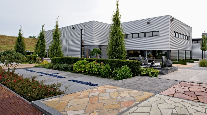
Want to see more of Michel Oprey? View the page of Michel Oprey for even more great projects and company information.

.png)


