Stylish home with steel staircase, aluminum canopy and lit pond edge
Dark metal lines do a lot of work in this house. They frame the stair, trace the canopy, and reappear at the water’s edge, where light picks out the pond after dusk. The result is not a decorative layer added at the end. Steel, aluminium, concrete, stone and glass are set against one another so the interior and exterior read as one route, from the stair landing to the terrace and on to the garden.
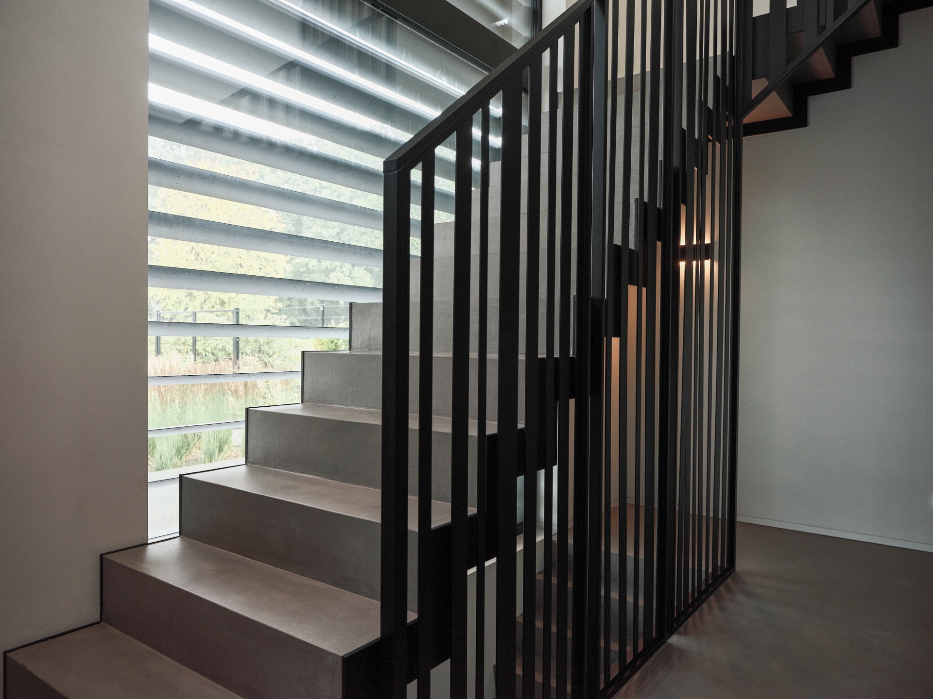
A steel staircase that continues into the floor
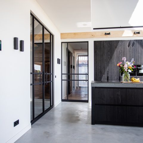
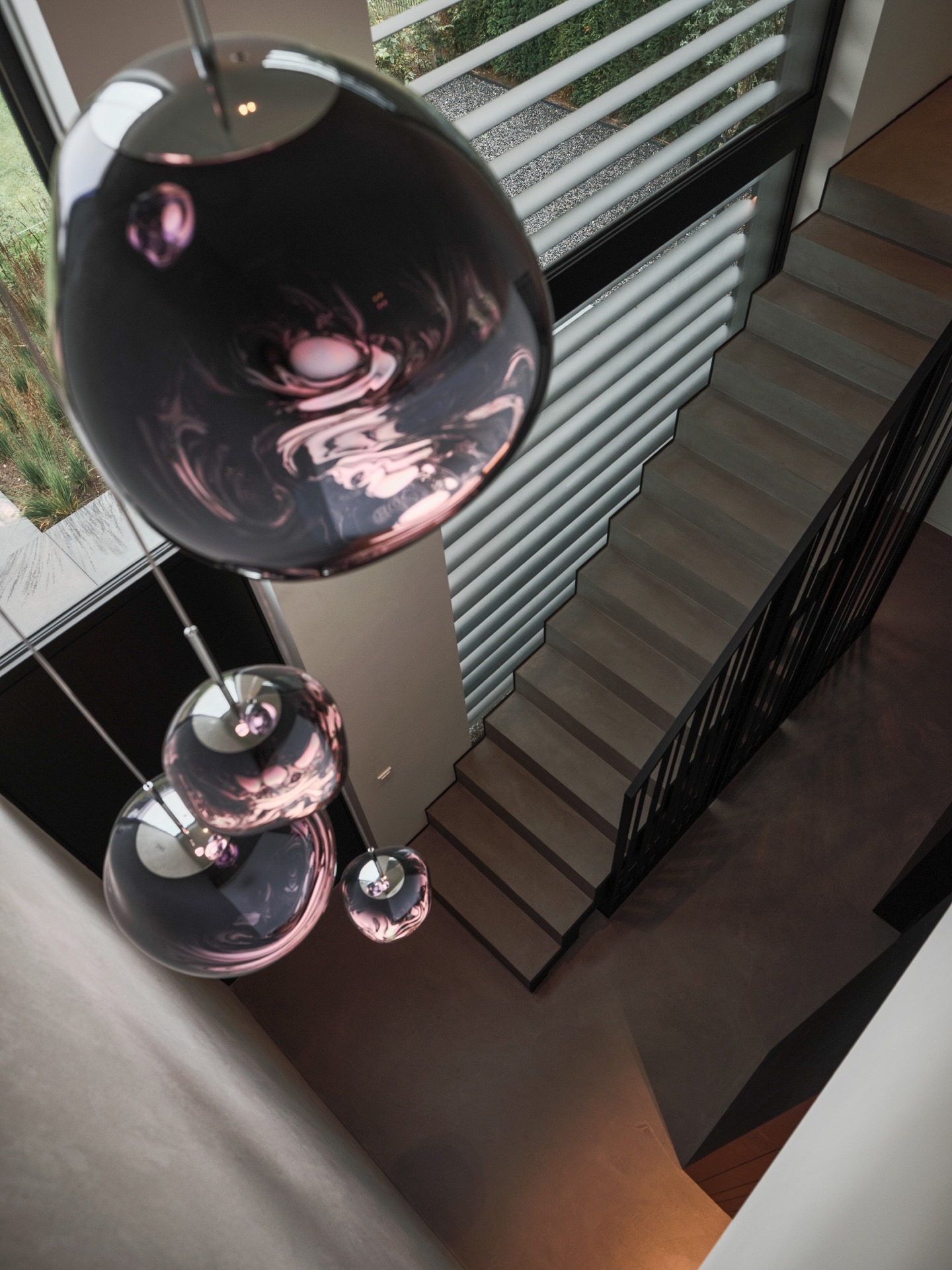
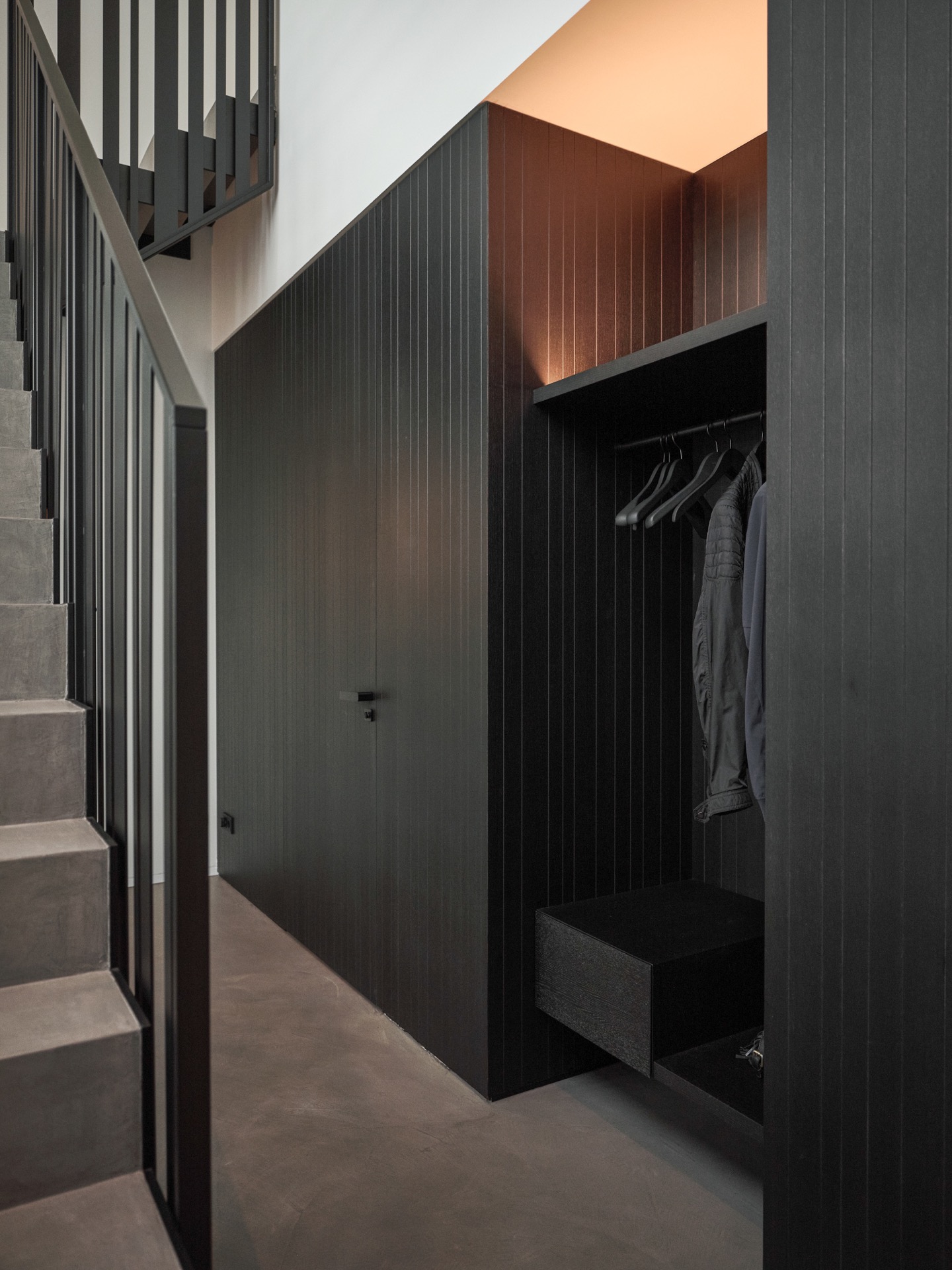
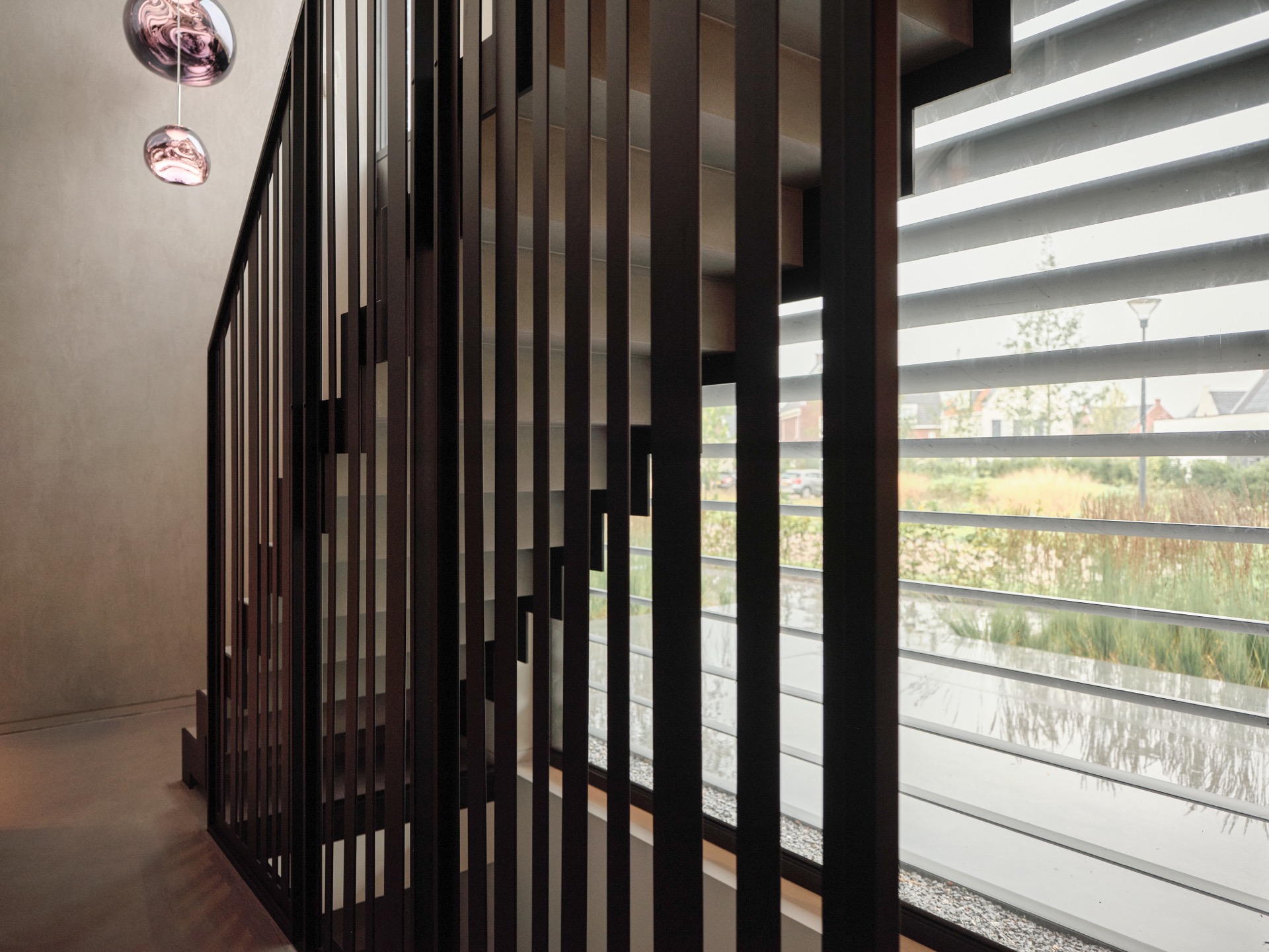
The stair is the first strong line in the project. Its steel balustrade sits beside concrete finishes that continue across the floors, so the movement between levels feels direct rather than interrupted. The treads and the railing share the same restrained palette as the rest of the house: grey surfaces, dark frames and clear edges. Large openings nearby bring in daylight, which makes the structure read sharply against the lighter walls and the glazed surfaces around it.
Seen from close range, the staircase is not treated as a separate object. It sits inside the language of the house, where the continuous concrete flooring meets steel details and hard corners. That material overlap is what gives the interior its clarity. You notice the vertical rhythm of the balustrade first, then the way the floor plane keeps running without a visual break. It is a small move, but it carries the whole interior toward the outside.
Concrete, glass and a dark frame
The visual contrast is plain: smooth concrete underfoot, slender steel lines at the edge, and broad glass panels alongside. In the image set, the stair zone opens toward the garden, so the balustrade does not close the space off. Instead, it marks the route while the view stays open. The dark metal accents keep the details legible without taking over the room, and the result is a quiet piece of circulation that still anchors the plan.
The aluminum canopy and the terrace line
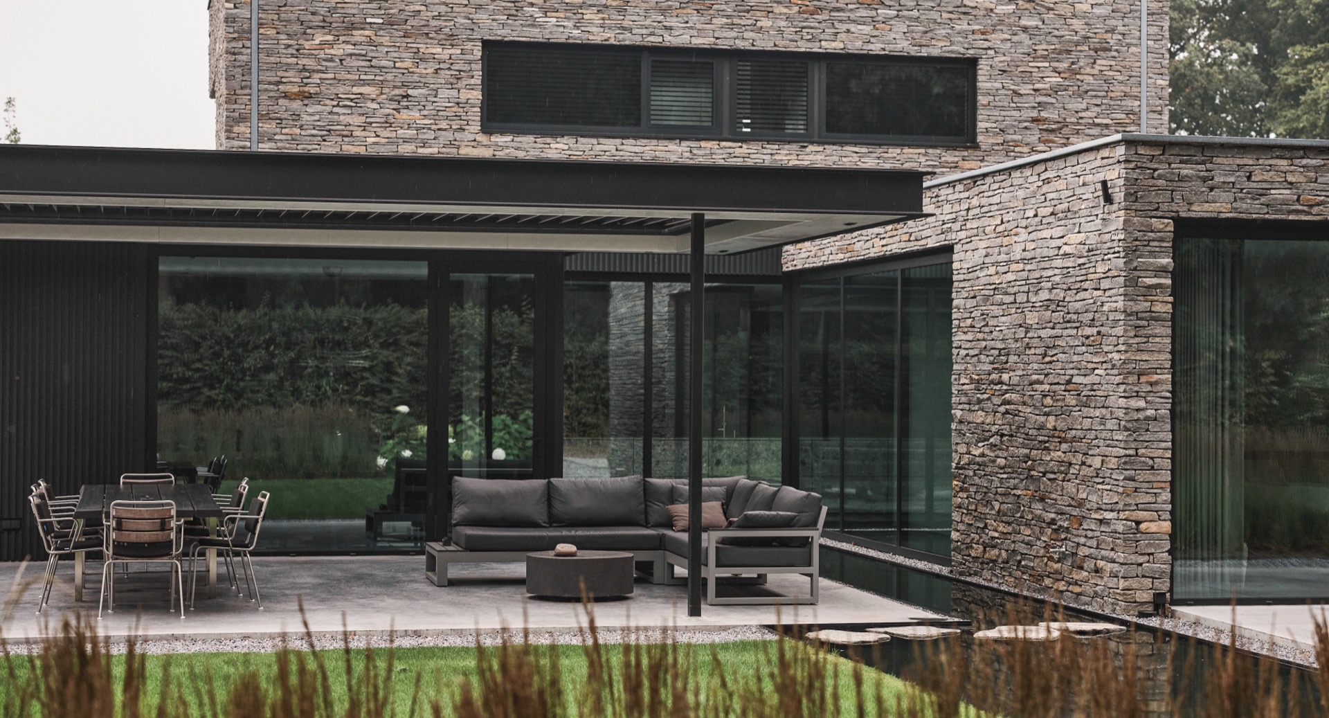
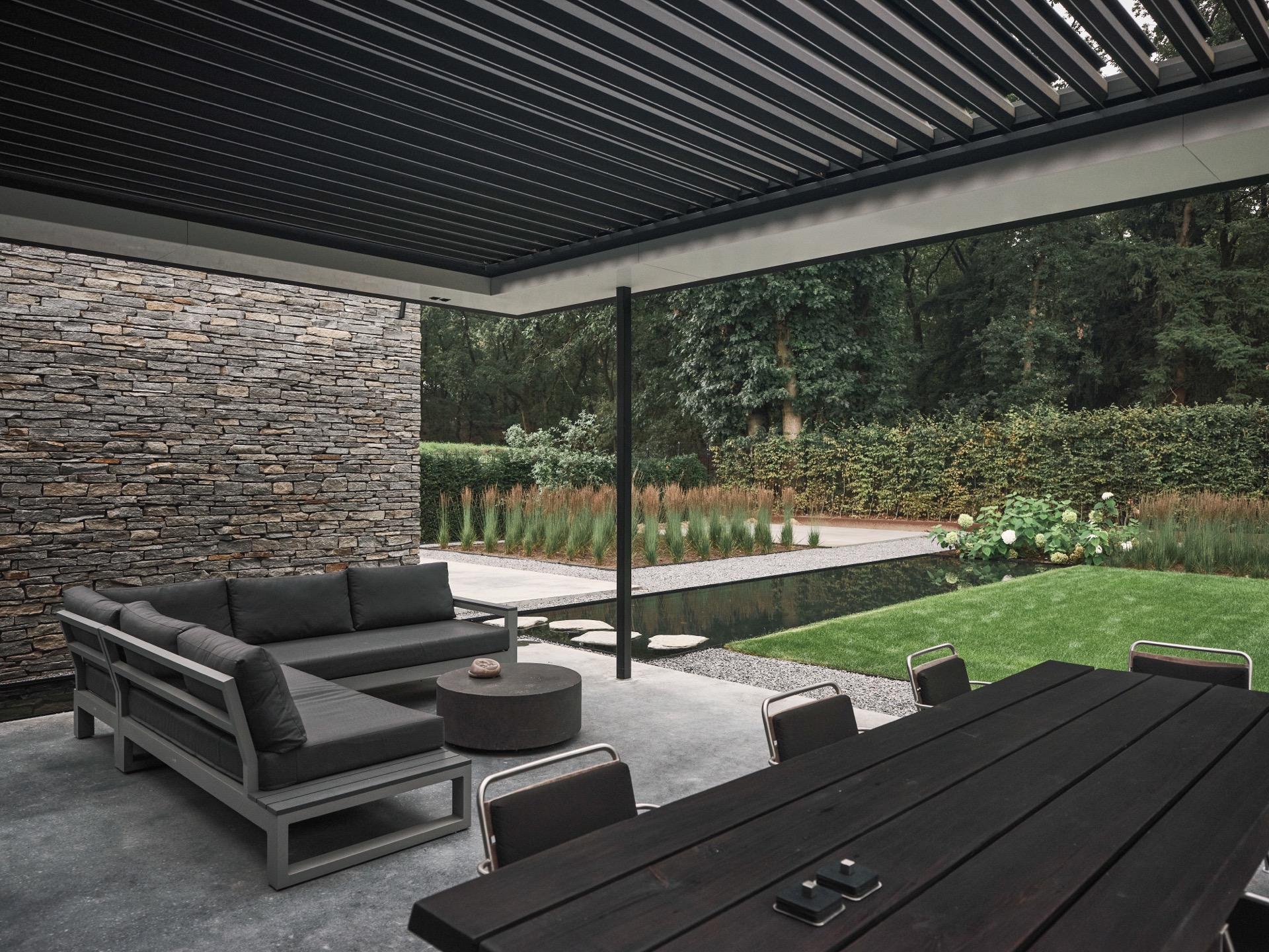
Outside, the aluminum canopy sets a crisp horizontal edge over the terrace. Its custom sheet metal finish keeps the underside neat and controlled, with straight lines that echo the house’s geometry. Horizontal slats and built-in light lines appear in the imagery, giving the canopy a layered look after dark without adding bulk. The canopy sits naturally against the stone-clad parts of the house and the large openings beneath it, where the terrace becomes a direct extension of the interior.
Because the canopy is drawn so cleanly, the surrounding materials get more presence. The natural stone facade catches daylight in a different way from the dark metal framing, while the glass reflects the terrace and garden back into the house. The canopy does not try to dominate the scene. It sets a boundary, gives shade, and keeps the terrace visually tight against the building. That restraint is what makes the detail work.
In the photographs, the underside of the canopy is one of the most precise parts of the project. The horizontal alignment of the elements gives the terrace a measured rhythm, and the lighting reads as part of the structure rather than an add-on. It is here that the aluminum canopy becomes most visible as a piece of architecture: a slim roof edge, a clear line, and a surface that ties the outdoor sitting area back to the rest of the house.
Stone, glass and metal in one view
The house is strongest when the materials appear together. Stone walls sit beside broad glazing, while dark metal accents draw the eye from one element to the next. This combination gives the exterior a calm but firm outline. The terrace sits within that frame, and the canopy carries the same visual discipline as the stair inside. Both elements rely on exact edges, fixed lines and a palette that stays close to grey, black and muted stone tones.
A pond edge drawn with light
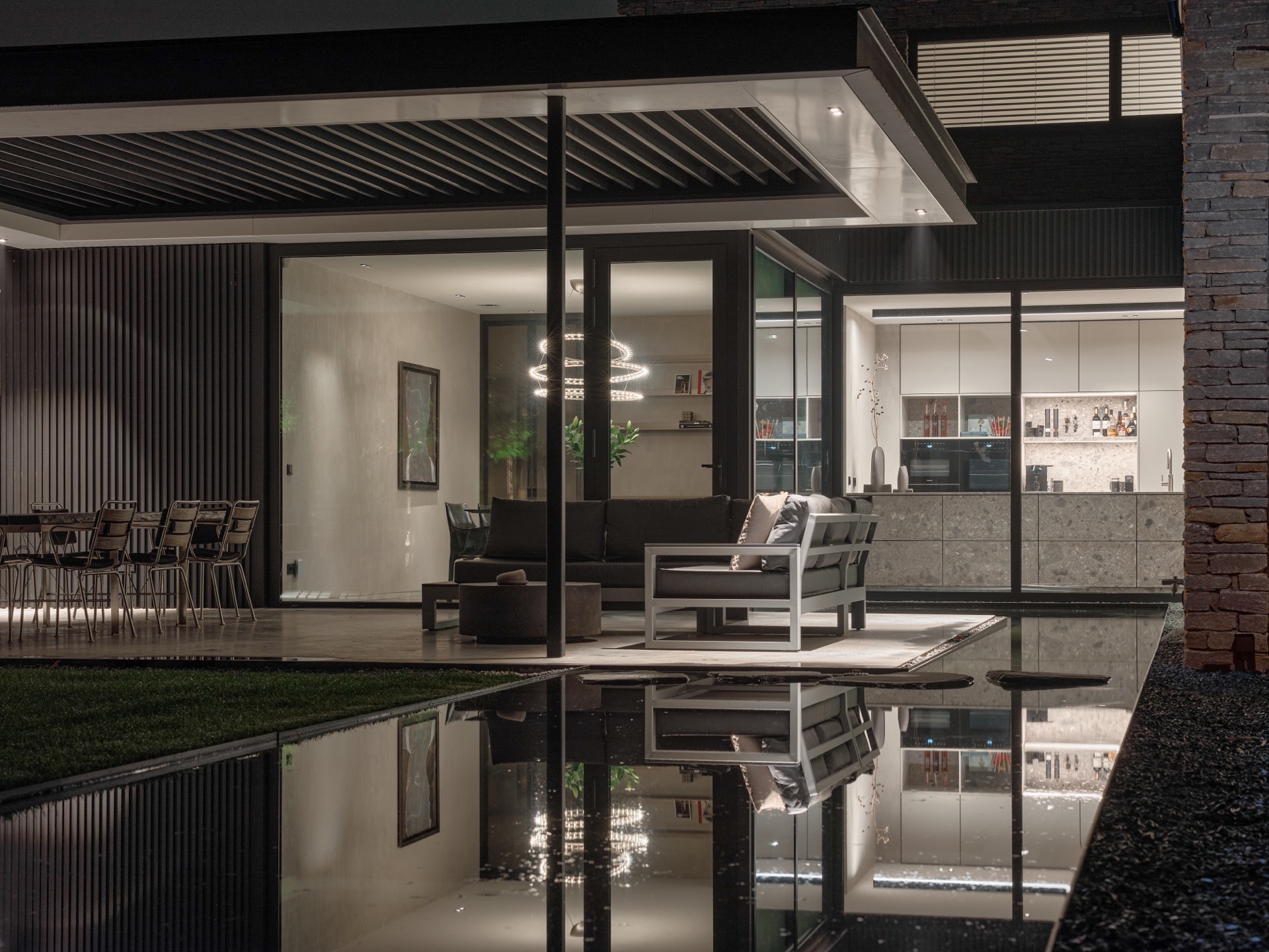
At the water, the project shifts from structure to detail. A 5 millimetre panel forms the pond edge, and the surface is colour-coated to keep the line visually clean. Waterproof LED lighting is integrated along that rim, so the waterline holds after dark as a thin band of light. Rather than washing the garden in brightness, the light stays close to the edge and follows the shape of the pond. The effect is controlled and precise.
In the evening images, the pond edge becomes a drawing in space. Light reflects across the water and the nearby paving, while the dark border keeps the shape readable. This is where the project’s quietest gesture happens: a narrow metal line, a measured strip of light, and a reflective surface that softens the hard materials around it. The garden does not need much more than that. The line of the pond is enough to hold the scene together.
The use of waterproof LED lighting along the pond edge is subtle, but it changes how the exterior is read at night. It gives the water a clear perimeter and ties the garden back to the same disciplined material language found at the stair and canopy. Steel, aluminium and coated plate all rely on the same idea: keep the lines exact, keep the surfaces plain, and let light reveal the edges.
How the house holds its material language
What gives the project its strength is not one dramatic gesture, but the way each detail repeats the same discipline. The steel staircase with balustrade, the aluminum canopy and the lit pond edge all use a narrow set of materials and colours. Concrete continues across the floors. Dark metal accents keep appearing in frames, railings and borders. Even the stone walls and glass panels seem to work to the same scale, so the house reads as a sequence of controlled transitions rather than separate parts.
The visual result is measured and clear. A stair landing, a terrace roof, a waterline: each one is handled differently, yet each is drawn with the same precision. That is what makes the modern house feel coherent in use, without relying on ornament. The details do the talking, and they do it through edges, joints, light and the way the materials meet.
The project shows how a steel staircase, an aluminum canopy and pond edge lighting can carry a whole house’s visual language. Nothing is overloaded. The lines stay sharp, the surfaces stay legible, and the light is used only where it defines a boundary. Inside and outside, the same logic applies.
Want to see more of Styls? View the page of Styls for even more great projects and company information.

NEW 2026 Jubileum Edition The Best Interior Designers Benelux
Order Now €125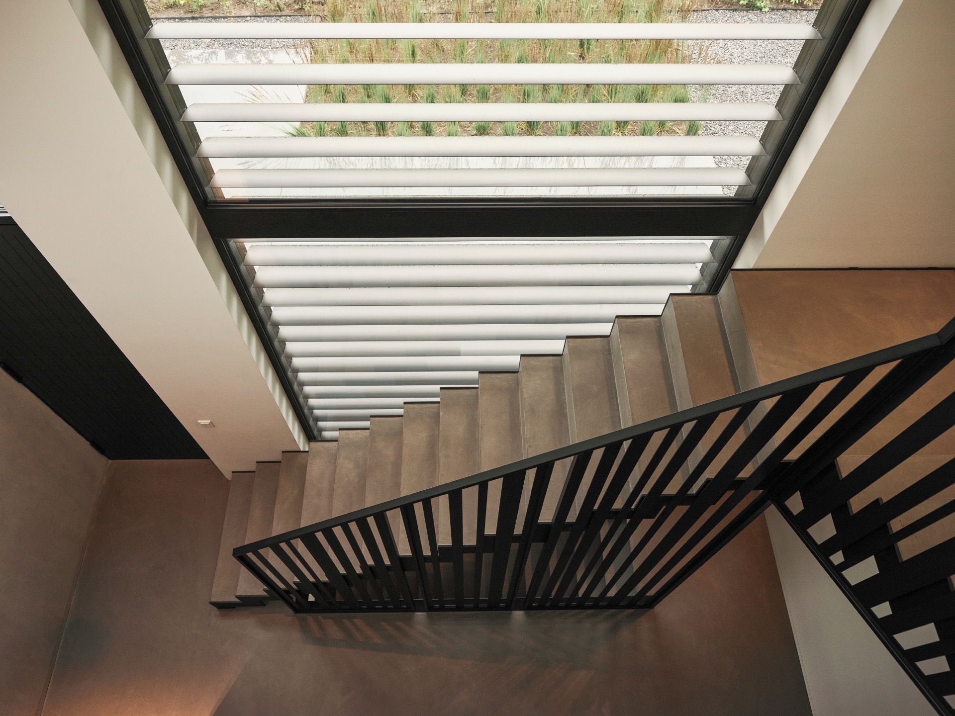
NEW 2026 Jubileum Edition The Best Interior Designers Benelux
Order Now €125