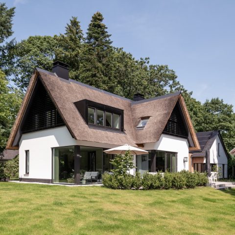
Stylish interior with luxury custom details
The dark panelled wall in the bedroom sets the tone immediately. A bed sits against a surface broken into clean vertical fields, with a lit niche pulling attention to the wall instead of the furniture. Above it, recessed spots and linear ceiling details draw the eye across the room, while the darker door at the side and the soft curtains at the other edge keep the composition grounded. It reads as a luxury custom interior built around materials, light and precise lines.
Bedroom lines that do the framing
In the bedroom, the most visible move is the wall treatment. Matte wood tones and panel divisions shape a backdrop that feels made for the room rather than added later. The light inside the niche gives the wall depth at night, and the ceiling strip lighting continues that effect overhead. The bed itself stays visually calm, with a dark upholstered headboard and layered cushions, so the room’s structure carries the visual weight. That restraint helps the room feel deliberate without becoming stiff.
What stands out here is how the luxury custom interior avoids clutter. The panel joints are clear, the ceiling stays quiet, and the storage and doorway elements are kept in darker tones so they recede. This makes the bedroom read as a composed whole, but the interest comes from the details: the break in the wall, the line of the ceiling, the way the light lands on the matte surfaces. It is a room where the finishes do most of the talking.
Stone-look surfaces in the living area
The living room shifts the material palette toward stone-look surfaces and darker cabinetry. One wall is divided into large panels with a textured look, giving the room a stronger vertical and horizontal rhythm. In front of it sits a low cabinet with dark fronts and open compartments, so the furniture does not interrupt the wall as much as anchor it. A large artwork adds scale, while the exposed ceiling spots and dark beams keep the upper plane visually active.
Another living area view introduces the fireplace as a built-in element rather than a separate object. The flame sits within a stone- or worktop-like surround, and the adjacent storage wall continues in dark cabinet fronts with open niches. It is a useful composition for a stylish interior because it combines display and storage without breaking the surface order. The eye moves from the fire to the cabinetry, then up to the ceiling lights, which keeps the room visually connected.
Dark cabinetry with room to breathe
The custom joinery in the living spaces is noticeable because it does not try to dominate. Open shelves interrupt the darker fronts just enough to prevent a flat block effect, and the stone-look elements lift the composition away from simple wood paneling. The result is calm, but not empty. Every line has a job: to frame, to recess, or to hold light. That is where the luxury custom interior feels most specific.
A bathroom built from glass and marble-look planes
The bathroom replaces the warmer wood tones with light stone-look tiling and glass. A shower enclosure with dark profiling cuts a clean line through the room, while the walls and floor carry pale veining that reads as marble-look rather than decorative pattern. Recessed ceiling lighting tightens the focus around the shower zone, and the darker beams above keep the upper part of the room from feeling flat. The effect is practical in layout, but the visual appeal comes from the sharp contrast between glass, grout lines and stone surfaces.
In another bathroom view, the shower becomes more transparent and the surrounding finishes take over. Light grey veining runs across the walls and floor, while dark cabinetry sits beside the wash zone as a strong block of contrast. A long vanity wall extends the room horizontally, and the lighting tucked into the composition gives the stone-look surface more depth. This is where the marble look bathroom idea becomes clear: not ornate, but detailed enough to catch light on every plane.
Long lines, clear reflections
The bathroom works because the materials are disciplined. Glass keeps the shower visually open, the stone-look tiling brings texture without noise, and the dark furniture gives the space a fixed edge. Even the lighting stays quiet, mostly recessed or concealed, so the room reads through reflection and surface rather than ornament. In a luxury custom interior, that kind of control matters more than showiness.
Kitchen fronts and the stone-look worktop
The kitchen continues the darker palette with front panels that sit flush and close together, giving the cabinetry a measured rhythm. A stone-look worktop and matching splashback carry pale veining across the cooking area, which lifts the dark fronts without softening them. Above, ceiling spots keep the room bright enough to read the surfaces clearly, and the illuminated niches add another layer of depth. It is a dark kitchen stone look, but one that relies on contrast rather than heaviness.
The kitchen details are strongest where the materials meet. Panel lines run vertically and horizontally with little interruption, and the edge of the worktop cuts a clean line against the cabinetry. Because the surfaces are kept matte or low sheen, the light from the ceiling and niches becomes part of the composition. That is what ties the kitchen back to the rest of the project: the same discipline in joinery, the same preference for dark tones, the same use of light to mark a surface.
Hallway panels that set the rhythm
The hallway offers a different kind of precision. Long vertical lines run across the door and wall composition, with dark panel fields mirrored on both sides of the entry route. A white surround frames the darker surfaces, and the floor in wood or laminate look keeps the passage visually continuous. Nothing here is decorative in itself, but the alignment matters. The hall creates the first clear read of the luxury custom interior before the rooms open out around it.
Seen as a sequence, the project relies on repetition without monotony: dark wood tones, stone-look finishes, integrated light and custom cabinetry appear in each room, but each space uses them differently. The bedroom makes the wall feel upholstered in structure. The living room gives stone and cabinetry more mass. The bathroom turns to glass and pale veining. The kitchen sharpens the contrast. Together they form a stylish interior that is defined less by decoration than by the way its surfaces meet.
Photography: René van Dongen
Watch the video with the inspiration book by RMR Interieurbouw
Want to see more of RMR interieurbouw? View the page of RMR interieurbouw for even more great projects and company information.


Contributors



NEW 2026 Jubileum Edition The Best Interior Designers Benelux
Order Now €125


NEW 2026 Jubileum Edition The Best Interior Designers Benelux
Order Now €125