









Stylish villa with thatched roof and modern interior
The first impression comes from contrast: a thatched roof above white volumes, then a calm interior where matte cabinetry, pale floors and dark details set the tone. In the modern thatched villa, the kitchen and living spaces take the lead, with a layout that keeps sightlines open and materials restrained. Light moves easily through the rooms, catching the edges of the island, the frames around the windows, and the black line of the staircase railing.
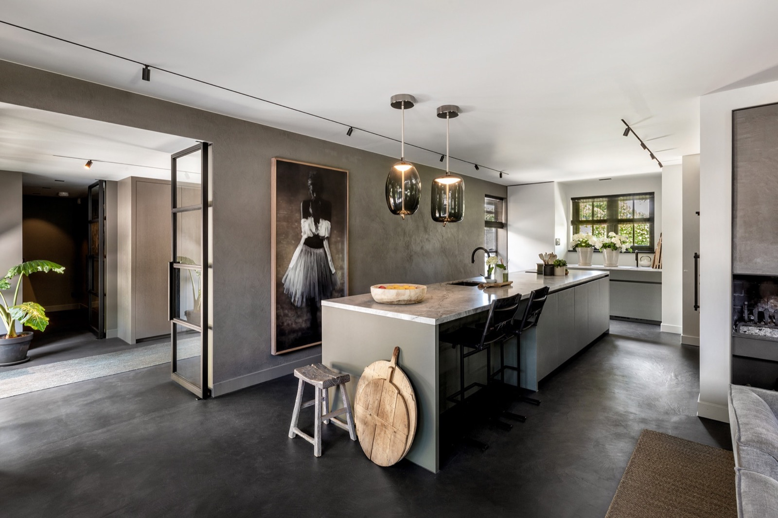
Kitchen island with pendant lights
The kitchen is built around a large island with light stone-look worktop surfaces and pale fronts that read almost soft in the room. Above it, pendant lights hang in a clear row and pull focus to the centre of the space. Their glass and amber tones sit against the otherwise quiet palette, while the island itself gives the room a strong horizontal line. It is a practical centre, but visually it also anchors the entire living level of this modern thatched villa.
Along the perimeter, the cabinetry stays low in contrast and precise in its detailing. Matte finishes keep reflections under control, which lets the larger openings do their work instead. The kitchen does not compete with the view; it frames it. A wide opening beside the cooking zone and the adjacent dining table connects the room to the greenery outside, so the open plan kitchen reads as one continuous field rather than a sequence of separate corners.
Open plan kitchen and dining space
What makes the open plan kitchen feel generous is not just its size, but the way the furniture is spaced. The dining table sits close enough to the island for easy movement, yet far enough away to keep the cooking area visually clean. Large windows run along the wall and bring in a soft, even daylight. In several images, the green outside becomes part of the interior composition, reflected in the glass and echoed by the understated palette inside.
The ceiling treatment stays discreet, with rail lighting and recessed spots doing the technical work without drawing attention away from the room. That restraint suits the stylish villa interior. Surfaces are kept pale, the floor has a concrete-like look, and the joinery lines remain straight. Nothing is overdrawn. The effect is not one of display, but of control: enough detail to feel resolved, not enough to break the calm of the larger volume.
A living zone that stays visually open
From the kitchen, the eye travels easily across the living zone. The window rhythm and the low, horizontal furniture keep the room from feeling segmented. Even the transition toward the dining area stays understated, with chairs, table and lighting grouped in a way that supports circulation rather than interrupts it. This is where the luxury villa interior shows itself most clearly: in the distance between elements, in the room left around them, and in the way natural light lands on the pale finishes.
The material palette remains consistent from one view to the next. Pale fronts, glass, black frames and wood accents appear in measured amounts. That repetition gives the interior a clear visual logic without making it rigid. It also allows the kitchen island with pendant lights to remain a focal point whenever the room is seen from another angle. The island keeps returning as a reference point, whether the camera looks in from the dining side or from deeper inside the kitchen.
Bathrooms with darker contrasts
The bathroom shifts the mood with a darker edge. A long vanity combines light work surfaces with timber-toned front panels, while the wall finish stays smooth and restrained. Horizontal blinds filter the window light into narrow bands, which softens the room without making it decorative. The details are precise: a slim basin, a dark wall-mounted element, and a straight mirror edge that holds the composition together. It is a compact room, but the surfaces give it enough depth to feel deliberate.
The guest toilet pushes contrast further. Dark wall finishes, a round mirror construction and a black tap set up a sharper scene than the main bathroom. Overhead lighting falls onto the basin and the surrounding wall, so the fixtures stand out clearly against the darker background. In this part of the house, the dark accent bathroom approach is not about drama; it is about limiting the palette so the shape of each object becomes easier to read.
Quiet detailing in the washrooms
What connects the wet rooms to the rest of the home is the same discipline in line and material. The vanity cabinet sits flush, the sink edges stay crisp, and the mirror shapes are kept simple. Rather than introducing ornament, the rooms rely on surface changes and controlled light. That makes them feel consistent with the broader minimal luxury interior, where texture matters more than decoration and where the room is defined by what is left out as much as by what is included.
Wood steps and a black railing in the stair hall
The staircase is one of the clearest vertical moments in the house. Wooden steps rise beside a black metal-look railing, and the contrast between the two materials gives the hall a strong graphic line. The wall and ceiling around it stay light, so the staircase reads almost like a drawn element against the background. From the landing, the view opens toward the living area, which keeps the hall connected to the rest of the plan instead of turning it into a closed passage.
In the stair hall, the lighting is kept subtle. Recessed spots and a clean ceiling line keep attention on the steps, the railing and the movement between levels. This is where the staircase with wooden steps becomes more than a connector. It shapes the way the interior is experienced, marking the shift from one level to another and giving the house a clear sense of direction. The route is simple, but the visual reading is not: the eye tracks the stair, then moves outward again toward the rooms below.
Bedrooms with built-in storage and texture
The bedroom images introduce a quieter, more enclosed atmosphere. One room uses built-in wardrobes with wood-toned panels and a window fitted with horizontal blinds behind the bed. The composition stays low and orderly, with bedding, cabinet fronts and window lines all moving in the same direction. Another bedroom takes a darker turn, using a textured wall as the main backdrop and placing two beds or sleeping platforms in front of it. Small points of light around the ceiling and wall soften the edges of the room.
These rooms extend the same visual language seen elsewhere in the house: straight lines, controlled colours, and a limited set of finishes. The wardrobes are part of the architecture rather than an afterthought, and the blinds contribute to the flat, quiet surface of the room. Even with the darker textured wall in the second bedroom, the palette remains close to the rest of the house. That consistency is what ties the bedroom views back to the overall stylish villa interior.
The roofline outside, and the large openings beneath it
Outside, the thatched roof gives the house its strongest silhouette. Two roof volumes are visible, with chimneys or roof outlets rising from the ridge and large dark openings cutting into the white volume below. The contrast between the light façade surfaces and the deep openings makes the house read in clear layers. Black frames and broad glazed sections repeat the same language seen inside, so the exterior does not feel separate from the interior story.
A terrace-like line runs alongside the house in some views, together with paving and a stretch of lawn. The openings are large enough to make the interior feel exposed to the garden, yet the roofline still reads as a strong cap over the volume. In the modern thatched villa, the exterior and interior share the same discipline: broad shapes, limited colour, and details that stay visible rather than disappearing into decoration. That is what gives the project its clear, composed presence.
Architect: Kabaz
Want to see more of Villabouw Van der Windt? View the page of Villabouw Van der Windt for even more great projects and company information.




NEW 2026 Jubileum Edition The Best Interior Designers Benelux
Order Now €125


NEW 2026 Jubileum Edition The Best Interior Designers Benelux
Order Now €125


NEW 2026 Jubileum Edition The Best Interior Designers Benelux
Order Now €125


