Sustainable sports club interior with stone-look finishes
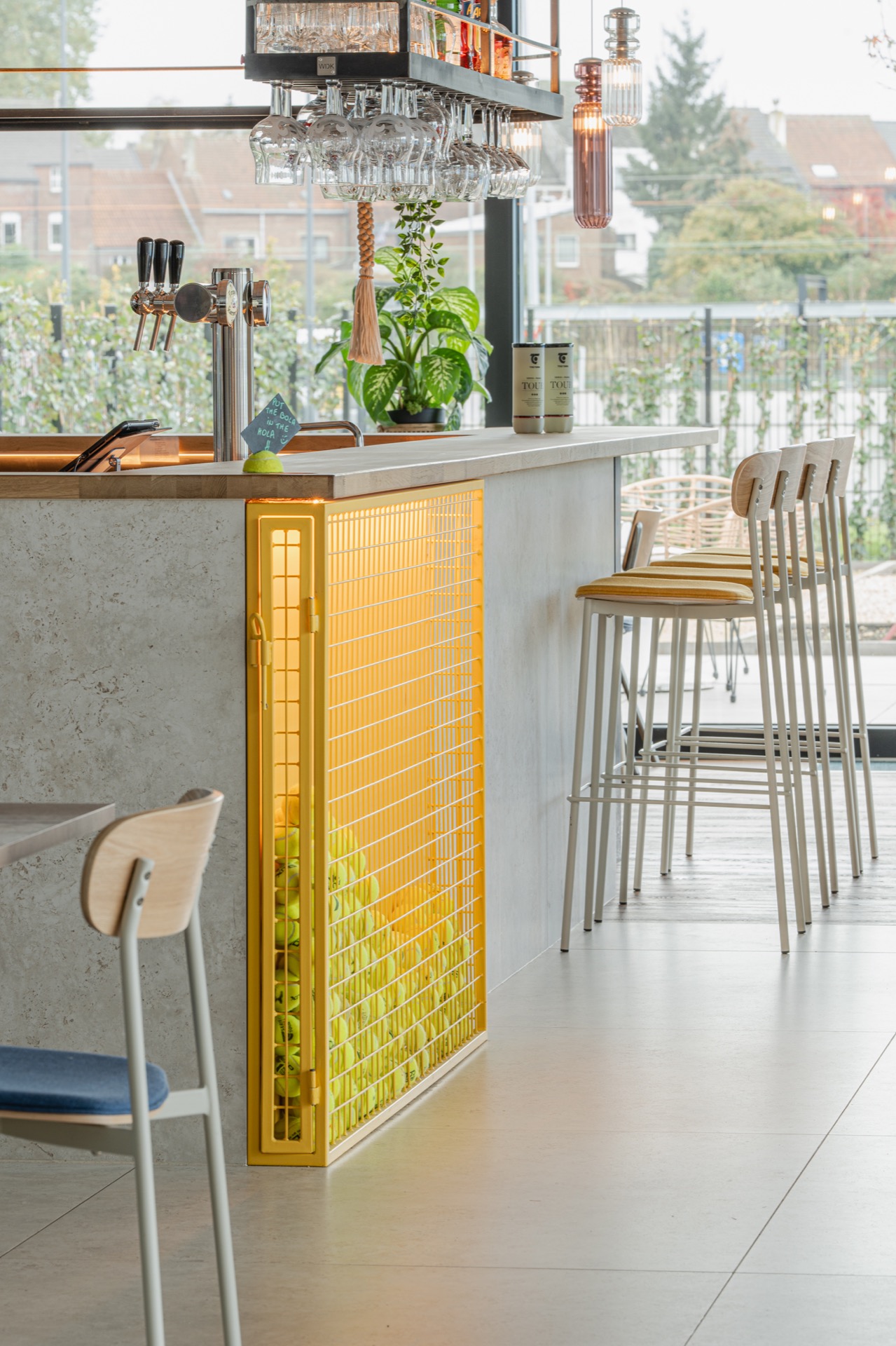
The bar catches the eye first: a yellow metal front, pendant lights overhead and a large window that pulls daylight deep into the room. In this sustainable sports club interior, the counter sits against a calm palette of stone-look floor surfaces and pale walls, while the open view outside keeps the room from feeling closed in. The setting is practical, but the material choices give the space a clear identity. You read the room through its surfaces, its lines and the way the light lands on them.
A sports bar shaped by light and a clear route through the room
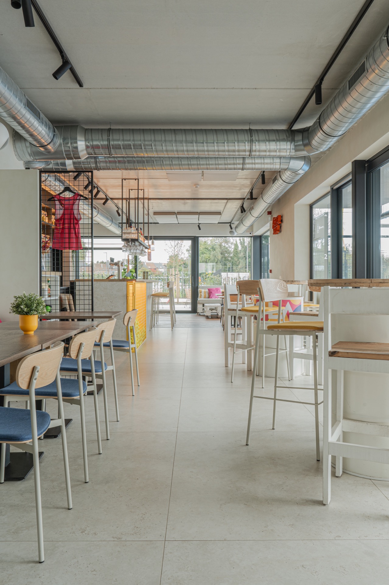
The modern industrial sports bar is arranged around movement. Chairs sit close to the bar, tables are set back just enough to keep the circulation readable, and the long window line brings contrast to the more technical ceiling above. The visible ventilation ducts are not hidden away; they run across the room and become part of the composition. That decision leaves the ceiling open and honest, while the flooring carries the weight of the room with a stone-look wall and floor finish that can take repeated use.
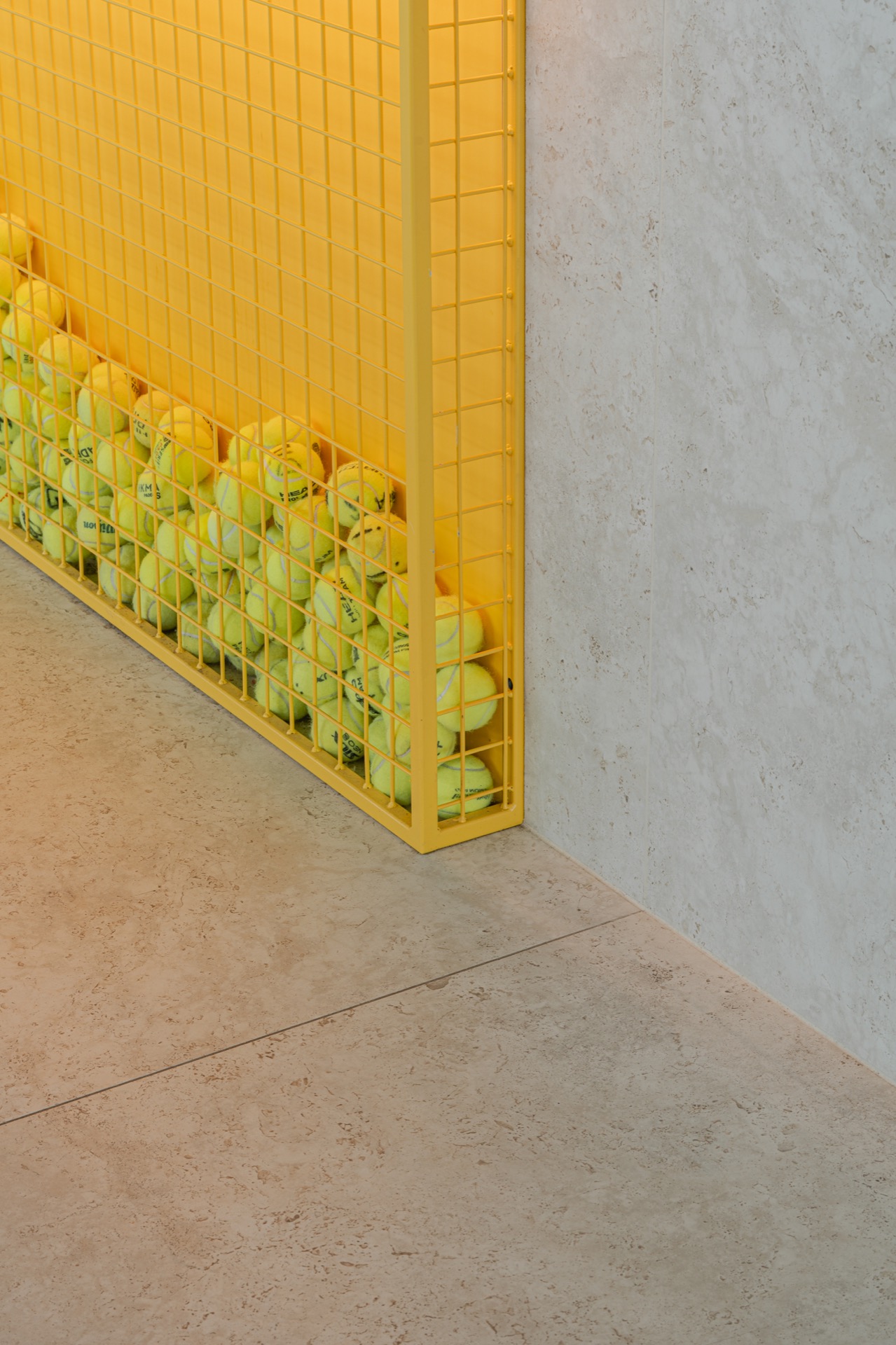
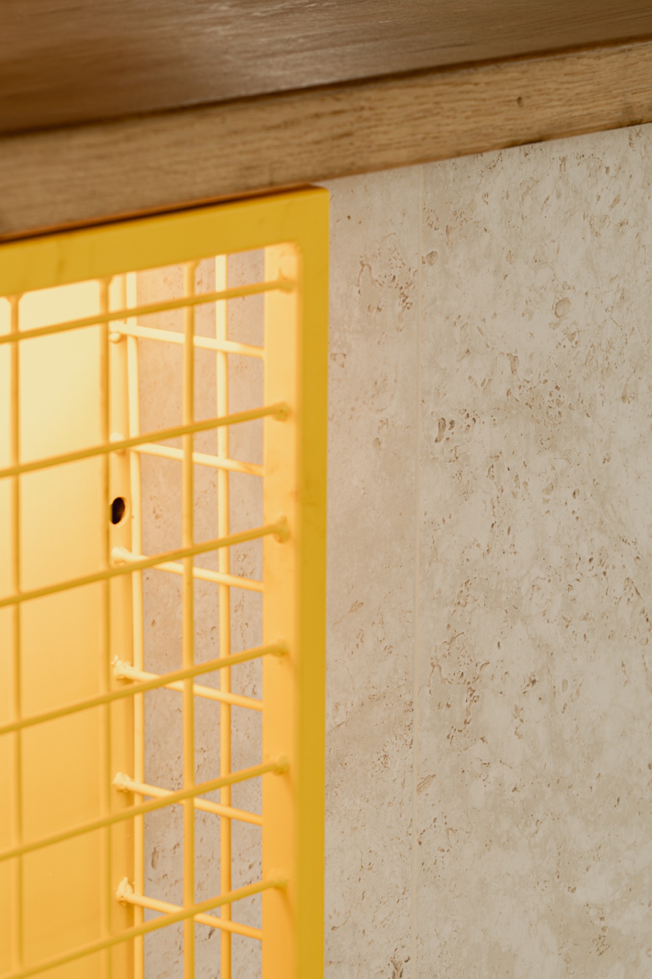
Material contrast is central here. The yellow metal interior accents break up the lighter shell of the room, giving the bar zone a stronger edge without crowding it. Against the pale walls, the colour reads sharply. On the floor, the stone-look surface continues the project’s measured palette, linking the social area to the rest of the club. The result is a space that feels organised through surface rather than decoration. Every line has a job, from the bar front to the ceiling ducts above it.
Large-format panels used where the room needs fewer joints
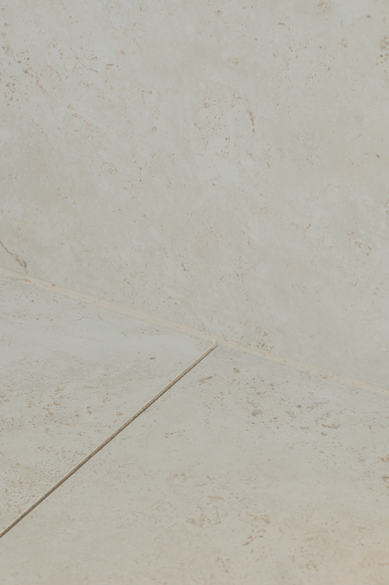
In the wet areas, the project leans on large-format panels to reduce visible joints. That choice matters most in the shower wall cladding, where the wall surface has to work harder than a decorative finish. The text notes that fewer joints were especially relevant for hygiene in shower spaces, and the visual language supports that idea: straight runs, restrained detailing and a surface that reads as one plane rather than a patchwork of tiles. The finish stays quiet so the room can be read at a glance.
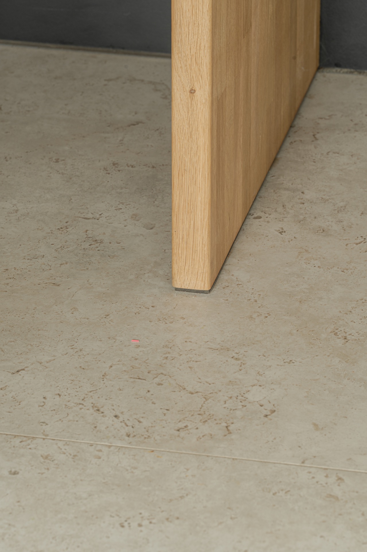
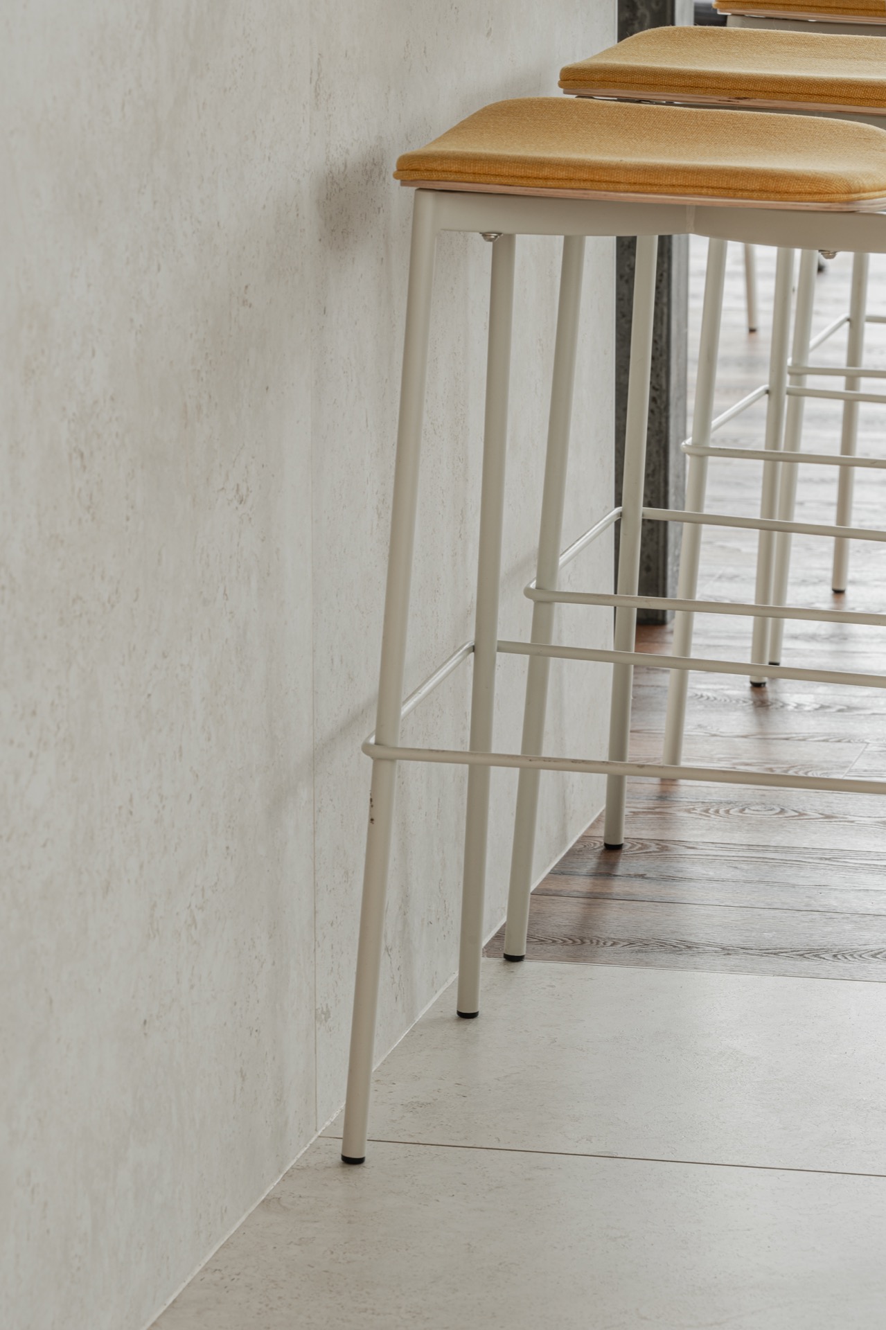
One of the materials, Dekton Sabbia, is described as having a warm, natural appearance, and that comes through in the photos as well. The tone sits comfortably beside the brighter walls and the harder metal elements. Its pattern is also presented as one where dirt is less visible, which makes sense in a club bar or canteen setting where people move in and out all day. The stone-look wall and floor language keeps the materials connected across uses, from social zone to wet area.
A 4 mm wall finish that installers could work with
For the shower walls, the project also uses Dekton Nacre in a 4 mm thickness. That thinner format is mentioned as being easy to handle during installation, even for fitters with limited experience with the material. In the final room, the effect is understated: a soft surface that sits close to the architecture and does not demand attention. It works alongside the floor rather than competing with it, which helps the shower area stay visually calm even with all the activity around it.
The choice of a seamless finish is not treated here as a slogan but as a practical reading of the rooms. Fewer joints, larger sheets and careful placement all point in the same direction. The walls in the images show a similar restraint, with pale textured surfaces, clean edges and minimal interruption. Where many sports interiors turn loud, this one keeps the detailing measured. The visible ventilation ducts, the yellow grid and the stone-like floor give the club enough texture without needing more layers.
Circular choices carried into the canteen interior
The circular canteen interior extends the same thinking into the seating area. The source text says the furniture was selected as second-hand pieces given a new life in the club. That detail is visible in the way the room avoids a fixed showroom feel. Instead of matching sets and polished repetition, the space relies on a mix of tables, chairs and simple furnishings that sit lightly against the architectural shell. The room keeps its focus on use, but the reuse of objects gives it another layer of meaning.
That approach also softens the modern industrial sports bar mood. The bar and canteen share the same visual field, yet the seating area is less rigid. The large window, hanging lights and pale walls keep the room open, while the furniture selection breaks the monotony of the harder surfaces. In this part of the club, circular thinking is expressed through what is left in view: a table edge, a chair back, a reused object that no longer reads as disposable. The room makes that choice visible without explaining it.
Stone, metal and a room that stays legible under use
Across the project, the strongest impression comes from how the surfaces hold together under pressure. The stone-look wall and floor finish sets a durable base, the metal accents add structure, and the lighter wall surfaces keep the rooms readable. The bar zone feels open because the ducts remain visible; the wet rooms feel controlled because the joints are reduced; the canteen stays grounded because the furniture was chosen with reuse in mind. Each space uses a different expression, but the materials keep them tied together.
What makes the sustainable sports club interior persuasive is not decoration. It is the way the room lets material logic do the work. Sabbia and Nacre are used as distinct but related surfaces, the bar carries a yellow front that cuts through the pale shell, and the overall composition keeps its attention on detail rather than display. From the stone-look floor texture to the clean shower walls, the club reads as a place where function, reuse and visual restraint meet in one clear interior.
Why the material palette stands out in the photos
The images show how the palette behaves in practice. Daylight from the windows lifts the bar area, while the ceiling ducts add a technical line above the seating. The yellow metal grid and bar front bring a sharper rhythm to the room, and the floor’s stone-like surface anchors everything below. Close-ups of the flooring and wall finishes reveal the texture more clearly: fine variation in the surface, visible joints where they are allowed, and a steady, controlled tone throughout. It is an interior built to be read in layers, not all at once.
That layered reading suits the club’s broader brief. Sport, durability and a conscious approach to materials are all present, but they are never forced into one gesture. Instead, they appear in specific choices: large-format panels in the wet areas, a warm-toned surface in the bar, reused furniture in the canteen and open technical elements overhead. The result is a sports club interior that feels composed through its surfaces, with each detail doing visible work.
Want to see more of Cosentino België? View the page of Cosentino België for even more great projects and company information.



NEW 2026 Jubileum Edition The Best Interior Designers Benelux
Order Now €125