










Textured wall finish with a clay effect in a modern minimal interior
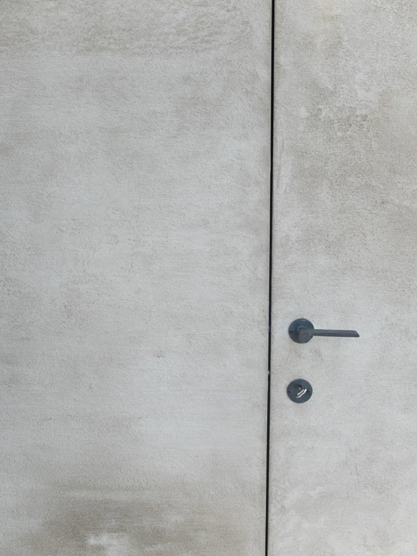
The walls set the tone immediately: a textured wall finish with a clay effect runs across broad surfaces and gives the interior a rough, almost hand-worked look. In this safehouse, that finish is not treated as an accent. It carries through the rooms and shapes how the light lands on the walls, from the kitchen to the bedroom and into the bathroom. The result is a modern minimal interior that relies on surface, shadow, and restraint rather than decoration.
Walls that carry the room
The clay-effect plaster wall finish softens the straight lines of the plan without making the rooms feel soft in mood. You see it most clearly where the surface catches daylight and where the texture turns slightly darker in recesses. That rough finish gives the larger spaces a dry, tactile quality, almost like a continuous skin across the interior. It also keeps the palette quiet, so the dark cabinet fronts, black fixtures, and stone surfaces can stand out without competing for attention.
Because the finish stretches across so many zones, the eye reads the house as one sequence rather than a set of separate rooms. Kitchen, hallway, bedroom, and bathroom all keep the same material language on the walls. This is where the textured wall finish with a clay effect does most of its work: it connects areas that have different uses, while still letting each one show its own furniture, lighting, and details.
Built-in storage with clear lines
Stripped-back storage sits close to the wall and keeps the main rooms visually calm. The modern minimal interior with built-in storage uses flush cabinet fronts, narrow edges, and integrated grip lines that almost disappear until the light catches them. Darker cabinet tones cut into the lighter wall surfaces and make the joinery read as a deliberate frame rather than a bulky block. In the kitchen, this contrast is especially clear beside the pale worktop and the textured wall behind it.
In the hallway and other transition spaces, the cabinetry continues that same logic. Panels follow the slope of the ceiling, and the storage sits neatly under the architectural lines instead of fighting them. The surfaces remain plain, but the arrangement is precise: vertical seams, concealed handles, and clean corners keep the room from feeling overworked. The focus keyword appears here again in a practical way, because the built-in furniture is what lets the wall finish remain uninterrupted for so long.
A bathroom defined by glass and stone
The bathroom shifts the material emphasis from wall texture to reflection and edge. A minimal glass shower partition keeps the room open to view, with the metal framing drawn as a thin border rather than a heavy divider. Behind and around it, the same textured walls continue, so the shower does not feel sealed off from the rest of the space. The dark taps and fittings sharpen the scene and give the lighter surfaces a clear counterpoint.
At the vanity, the stone countertop vanity with dark faucets introduces a firmer horizontal line. The rectangular basin area sits on top of the darker cabinet base, while the mirror and glass elements pick up the geometric pattern seen elsewhere in the project. It is a restrained setup, but not bare. Every element has a visible edge: stone against wall texture, black metal against pale plaster, glass against shadow. That is what keeps the room legible as a bathroom within the larger interior language.
Light that stays close to the ceiling
Warm recessed ceiling spotlights do much of the atmospheric work here, yet they stay discreet. They are set into niches and flat ceiling planes, so the fitting itself does not interrupt the clean surfaces. Instead, the light washes down the wall texture and picks out the grain-like irregularities in the finish. In the bedroom and the passage areas, this gives the rooms a low, controlled glow that suits the minimal layout. The light does not flood the interior; it traces it.
That approach becomes especially visible in the ceiling detail, where several small spots sit beside a black hanging fixture. The contrast is sharp but measured. One source pulls attention upward, while the others stay embedded in the surface. Together they show how lighting can mark zones without adding clutter. The same principle appears in the bedroom, where the bed frame, striped textile, and sloped ceiling remain visually calm under the spots.
Sloped ceilings and visible timber
A sloped ceiling with exposed wooden beams brings a different kind of structure into the project. The timber breaks up the smooth ceiling plane and gives the upper part of the room a more architectural reading. It also frames the wall texture below it, especially in the bedroom and adjoining spaces where the ceiling angles down toward the walls. The beam line is not decorative in the usual sense; it defines volume and height, and it makes the room feel measured from above.
Elsewhere, the slope continues into a corridor-like zone where large cabinet panels follow the ceiling shape. Light wood appears in a niche, while darker storage runs beside it, creating a clear contrast between closed surfaces and open passage. This is one of the more telling details in the project: the structure of the house remains visible, and the finishes are chosen to work with that structure rather than hide it. The textured wall finish with a clay effect remains the background that lets those lines read clearly.
Where minimalism becomes tactile
The project does not rely on ornament to create interest. It depends on touchable surfaces, narrow joints, and the way light shifts across a wall. The rough clay-like finish gives the rooms a grounded surface, while the built-in storage and glass shower details keep the plan visually clear. Even the darker accents are used sparingly, so each one has a sharp role: to outline a cabinet, mark a tap, or frame a doorway. The interior stays minimal, but the texture stops it from feeling flat.
What makes the sequence memorable is the consistency of the wall treatment across different functions. Kitchen, bedroom, hallway, bathroom, and ceiling detail all share the same material base, yet each zone responds differently to it. One room uses stone and dark fittings, another relies on timber beams, another on glass and spotlights. Seen together, they show how a textured wall finish with a clay effect can do more than decorate a surface. It can hold a whole interior together without making itself loud.
Want to see more of Texture Painting? View the page of Texture Painting for even more great projects and company information.




NEW 2026 Jubileum Edition The Best Interior Designers Benelux
Order Now €125


NEW 2026 Jubileum Edition The Best Interior Designers Benelux
Order Now €125


