









Thatched Roof House Renovation: Rural, Light and Spacious Interior
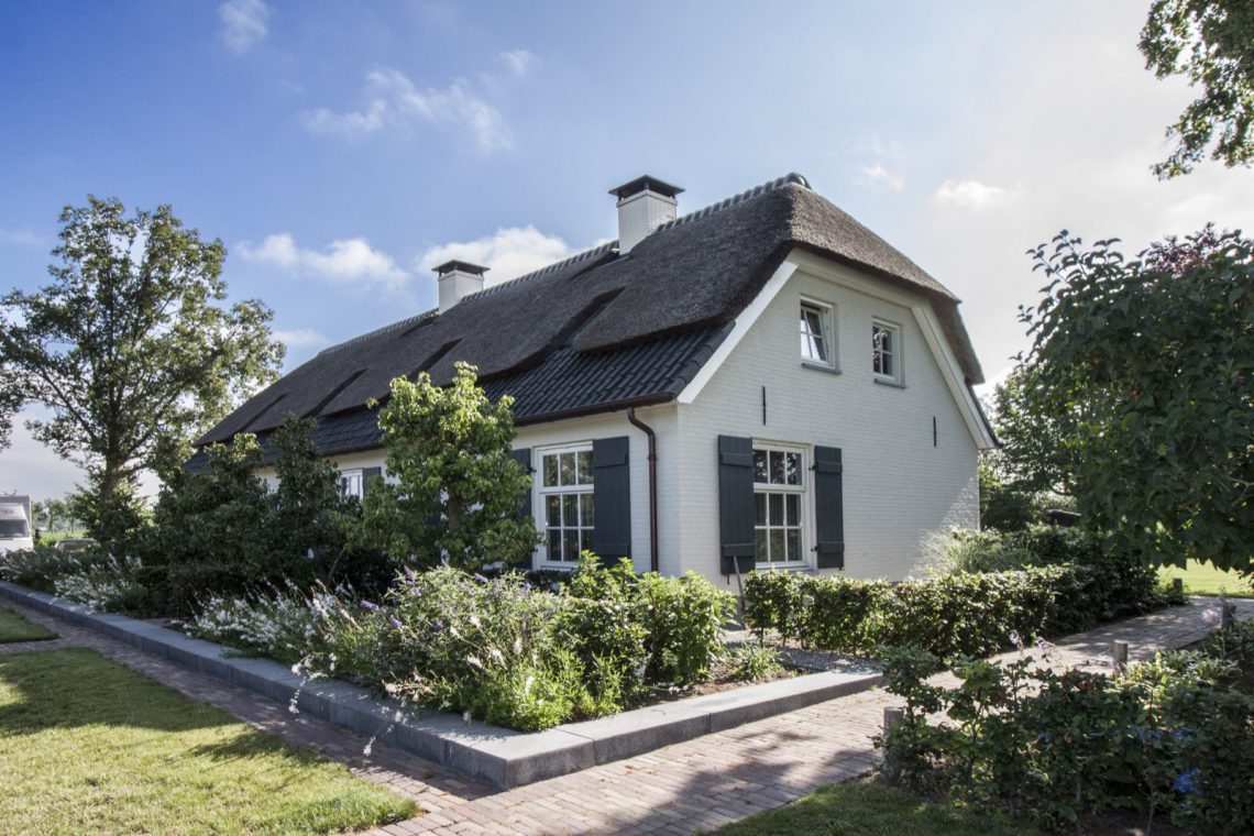
A thatched roof house renovation begins with the roofline. Here, the thick sweep of thatch sits above a white exterior, interrupted by dark shutters, dark window frames and a few roof penetrations that read clearly against the surface. The house has been technically and visually renewed, but the first impression is still rooted in the rural profile of the building. The lighter finish sharpens that outline and gives the old farmhouse a fresher presence without erasing its original character.
White walls, dark accents and a roof that still leads the view
From the front, the composition stays straightforward: white masonry, dark openings and a thatched roof that spans several slopes. Chimneys and roof details break the surface at different points, which keeps the roof from becoming a single flat plane. The dark shutters and frames add contrast rather than decoration, and they make the facade easier to read from a distance. In this home renovation, the exterior gains clarity through restraint, not through added layers.
The garden edge works in the same measured way. Paving runs along the house and towards low, rectangular border beds, so the outdoor route feels drawn rather than scattered. Those low edges keep the planting close to the ground and let the paved areas stay visually open. A wooden canopy appears at the terrace side, giving the rear elevation a practical frame and linking the house to the outdoor sitting area without taking over the view.
Inside, the beams stay visible and the rooms feel lighter
Step inside and the structure becomes the main feature. Exposed wooden beams run across the ceilings and hold the eye before any furniture or colour does. Around them, the walls and finishes stay pale, with light grey and white surfaces that reflect daylight rather than absorbing it. The result is a rural farmhouse renovation that feels open from room to room, while still keeping the roof structure readable. Nothing is hidden behind heavy finishes; the timber remains part of the room’s rhythm.
In the sleeping area, the sloping ceiling makes the beams even more visible. A window opening cuts through the wall under the roof, bringing light to the lower part of the room while the timber line stays prominent overhead. The material contrast is simple: wood, paint, glass and a plain floor surface. That small set of elements is enough to define the space. It is a quiet interior, but not an empty one; the structure itself does most of the work.
A kitchen with wooden fronts and long daylight
The kitchen continues the same language, but with a clearer working layout. Wooden fronts bring a grounded tone to the cabinets, while the worktop and the visible cooking zone keep the composition practical and direct. Large windows sit close to the work area, so daylight reaches the sink, counter and hob instead of stopping at the edge of the room. This kitchen with wooden fronts does not rely on display pieces. Its character comes from the surfaces, the light and the way the kitchen sits in the house.
Several views show the kitchen as part of a larger living space rather than a closed-off room. The open sightline lets the ceiling beams continue across the interior, and the cooking area remains visible from deeper in the house. That arrangement makes the room easy to understand at a glance: the window wall, the cabinets, the hob and the connection to the adjacent space all sit within one frame. In a project like this, that kind of legibility matters as much as the materials themselves.
Light, timber and the work surface
The strongest detail in the kitchen is the way the timber fronts meet the daylight. The wood softens the longer lines of the cabinetry, while the windows stop the room from feeling enclosed. A simple work surface, a sink and a tap are enough to anchor the layout. Nothing is overdesigned. The room is shaped by the opening in the wall and by the visible grain of the fronts, which keeps the kitchen connected to the rest of the home renovation.
Diamond tiles turn the bathroom wall into a clear feature
The bathroom and shower area switch to a more graphic detail. A walk-in shower is set without a visible step, and one wall is finished with diamond-shaped tiles that catch the light in a tighter pattern than the larger surfaces elsewhere in the house. The tile field gives the room a sharper edge, but the rest of the space stays calm: a wooden door panel, pale surroundings and the exposed shower zone itself. The contrast between the plain surfaces and the patterned wall is what makes the room memorable.
Because the shower is built into the room rather than boxed off, the floor reads as one continuous plane. That makes the tile wall and the shower opening stand out even more. It is a small space, but it still follows the same logic as the rest of the house: clear lines, few materials and direct daylight where possible. The walk-in shower diamond tiles become the visual marker, while the rest of the bathroom stays deliberately understated.
The yard is set out with paving and low planting edges
Outside, the ground plane is organised rather than left open-ended. Paving creates a clean route along the house, and the low border beds sit as rectangular islands beside it. Those borders give the garden structure without adding height, so the roof and facade remain the main visual elements. The layout suits the rural farmhouse renovation well: the outdoor space is tidy, but it still leaves room for the house, the roof and the terrace canopy to stay in view.
The combination of paving and low borders also ties the front and rear sides of the plot together. On one side, the white walls and dark accents are read against the thatched roof; on the other, the terrace edge and wooden canopy extend the living area outdoors. The project does not rely on elaborate garden gestures. Instead, it uses simple paving, measured planting edges and a clear relationship to the house. That keeps the outdoor setting in step with the interior renewal.
A farmhouse renewed through surfaces, not excess
What stands out most in this thatched roof house renovation is the discipline of the material palette. White walls, dark frames, exposed timber, wooden kitchen fronts, diamond tiles and paving are the main notes, and each one appears where it can do the most work. The house feels lighter because the finishes are clearer. The rooms feel larger because the structure is visible. Even the garden follows that logic, with low borders that keep the lines close to the ground and leave the house itself in focus.
The result is a rural interior and exterior that read as one project, but each room still has its own accent. The roof remains the most recognisable part of the house, yet the renewed surfaces inside carry the same attitude: practical, direct and calm in detail. Seen together, the beams, kitchen, shower and garden show how a home renovation can sharpen a farmhouse without stripping away the features that define it.
Want to see more of Spanjers Architect? View the page of Spanjers Architect for even more great projects and company information.





NEW 2026 Jubileum Edition The Best Interior Designers Benelux
Order Now €125


NEW 2026 Jubileum Edition The Best Interior Designers Benelux
Order Now €125


