









Timeless bathroom with marble-look tiles
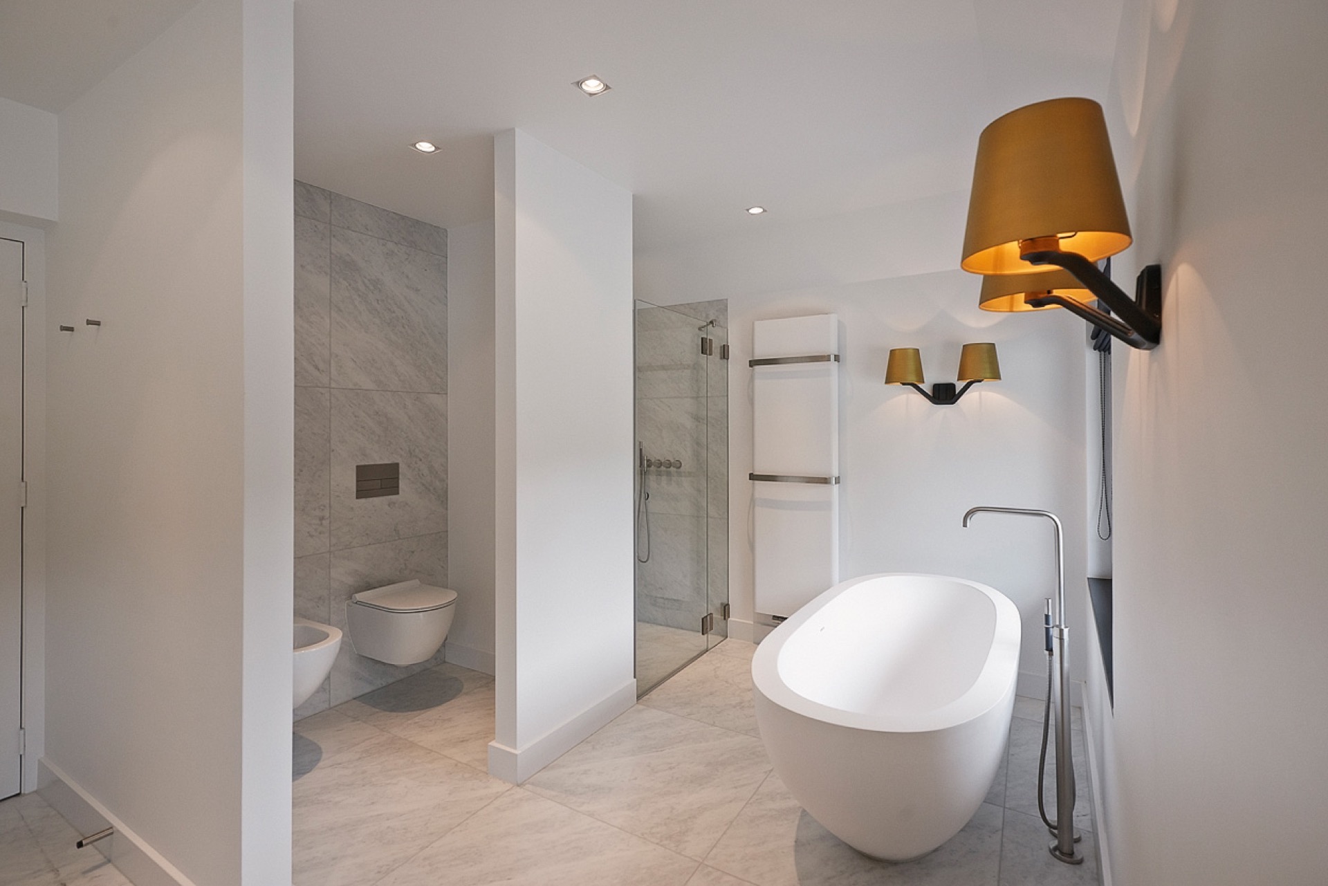
Large marble-look tiles set the tone from the first step in. Their pale surface runs across floor and walls, while the dark vanity cuts a clear line through the room. That contrast gives the space its strongest visual rhythm. The layout stays open, but the wet areas are arranged so the shower and toilet can be used with enough privacy. It is a bathroom that relies on proportion, surface and light rather than ornament.
Large marble-look wall and floor tiles
The tilework is the most immediate presence in the room. Big formats keep the surfaces calm, and the light tone reflects the ceiling spots without glare. On the floor, the same marble-look finish continues the line of the walls, so the room reads as one volume instead of separate parts. The result is clear and restrained, with the material itself doing the work. These marble-look tiles also make the darker elements stand out more sharply.
That contrast is visible around the custom bathroom vanity, where the darker fronts sit against the pale background like a solid block. The storage is built into the wall line, so the furniture does not interrupt the room. Instead, it anchors the sink zone and gives the bathroom a steady centre. A bathroom projects overview shows more completed spaces where material and layout carry the story in the same way.
A freestanding oval bathtub in the open plan
The freestanding oval bathtub sits away from the walls and softens the harder geometry of the room. Its curved shape breaks up the straight tile joints and the right angles of the built-in furniture. Because the bath stands in the open, it becomes a clear focal point, yet it does not compete with the rest of the arrangement. The placement leaves room around it, so the bathroom still feels easy to move through. A freestanding bathtub can change the reading of a room simply by how it occupies the floor.
From the images, the tub has a quiet, sculptural presence. It sits near the shower zone and the toilet area, but each part keeps its own address within the plan. The oval form also works well against the straight runs of tile and furniture, which keeps the room from feeling boxy. The bath is not treated as decoration; it is one of the main spatial elements. That is what gives the room its measured, composed feel.
The walk-in glass shower and the hidden wet-zone logic
The walk-in glass shower uses a frameless glass element that keeps the sightlines open. You can read the shower as a separate zone, but the glazing prevents it from closing off the room. Metal fittings and crisp edges keep the composition light. The glass also lets the marble-look tiles continue behind it, so the shower does not feel like an added box. It belongs to the room in the same visual language as the rest of the surfaces.
Privacy is handled by placement rather than by heavy partitions. The source text notes that the open layout still offers enough privacy for showering and for the toilet area, and the images support that reading through the way the zones are set apart. In a room like this, that kind of arrangement matters. The walk-in shower remains visible, yet it does not expose everything at once. The effect is open, but not unguarded.
Toilet and urinal in a separate zone
Near the toilet area, the room shifts into a more enclosed part of the plan. The sanitary elements sit in a nook-like setting, and the wall finish continues there as well, so the zone feels deliberate rather than improvised. The source content mentions a toilet and urinal, while the images show the toilet placed in a more sheltered position. This division keeps the line of movement through the bathroom clear and leaves the main floor area visually open.
Dark custom vanity with storage and double sinks
The dark custom vanity is the strongest counterpoint to the pale tilework. Its front panels are clean and straight, and the depth of colour gives the sink wall more weight. In the wider compositions, the vanity stretches across the room with built-in storage, so the surface stays quiet even though the cabinet has a practical role. The dark finish also brings the sink area into focus without needing extra detail. A custom bathroom vanity works best when its lines are this direct.
In the closer views, the vanity carries double sinks, with metal-look taps placed neatly above them. The basin arrangement is straightforward, almost architectural in the way it is set into the furniture. A round mirror with a light ring appears in one of the details, adding a softer shape above the straight cabinet line. It is a small but important contrast: circle against rectangle, reflection against matte front, light against dark. That tension keeps the sink zone from becoming static.
Plumbing details, mirrors and light
Several images focus on the quieter technical parts of the bathroom. A control plate sits neatly in the wall, and the toilet zone shows the kind of precise integration that keeps surfaces clean. The round mirror with its illuminated edge adds a controlled glow rather than a decorative statement. It catches the eye, but only after the main forms have been read. The ceiling spots reinforce that same approach, spreading light evenly across the tile and the vanity fronts.
The lighting does not try to hide the room’s geometry. Instead, it picks out the edges of the bath, the shower glass and the cabinet faces. That is what gives the bathroom its measured atmosphere at night and in the lower light of day. The marble-look tiles hold the room together, while the darker furniture and metal details give it definition. The whole composition feels resolved through line and material, not through excess.
A bathroom shaped by contrast and clear zones
What stays with you is the way the room balances openness with separation. The floor runs freely, the bath stands out in the middle of the arrangement, and the shower and toilet zones are given enough privacy without being sealed off. Each part has a clear purpose, but the materials keep the language consistent. Light tile, dark cabinetry, glass, metal and the soft curve of the bathtub work together as visible elements, not as an abstract concept. That is what makes this timeless bathroom read so clearly.
The space avoids clutter by keeping every feature in the right place. The vanity stores what needs to disappear, the shower glass stays visually light, and the bath marks the room with one calm gesture. Even the details around the sink and toilet areas remain restrained. As a finished project, the bathroom shows how a careful layout and a limited material palette can carry a room without overstatement. The focus stays on the surfaces you can see and the route your eye takes across them.
Want to see more of TONSCHOLTEN? View the page of TONSCHOLTEN for even more great projects and company information.





NEW 2026 Jubileum Edition The Best Interior Designers Benelux
Order Now €125


NEW 2026 Jubileum Edition The Best Interior Designers Benelux
Order Now €125


