Townhouse transformation
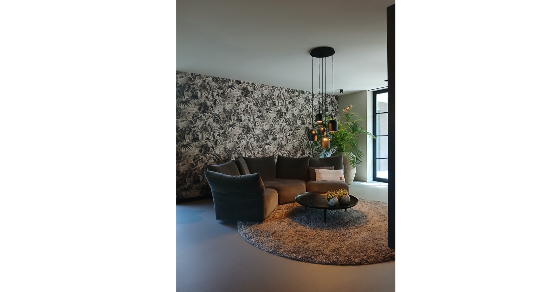
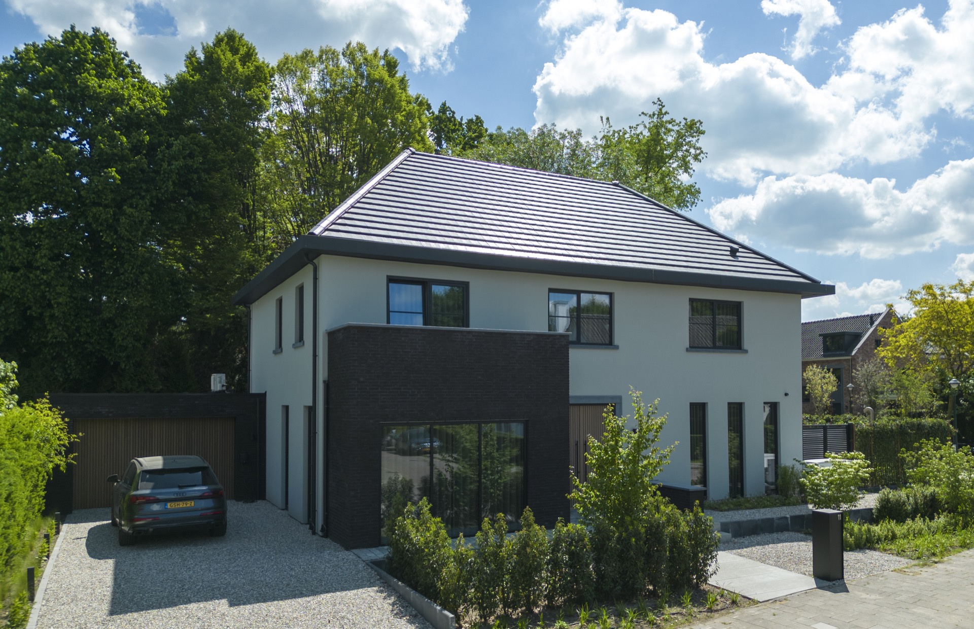
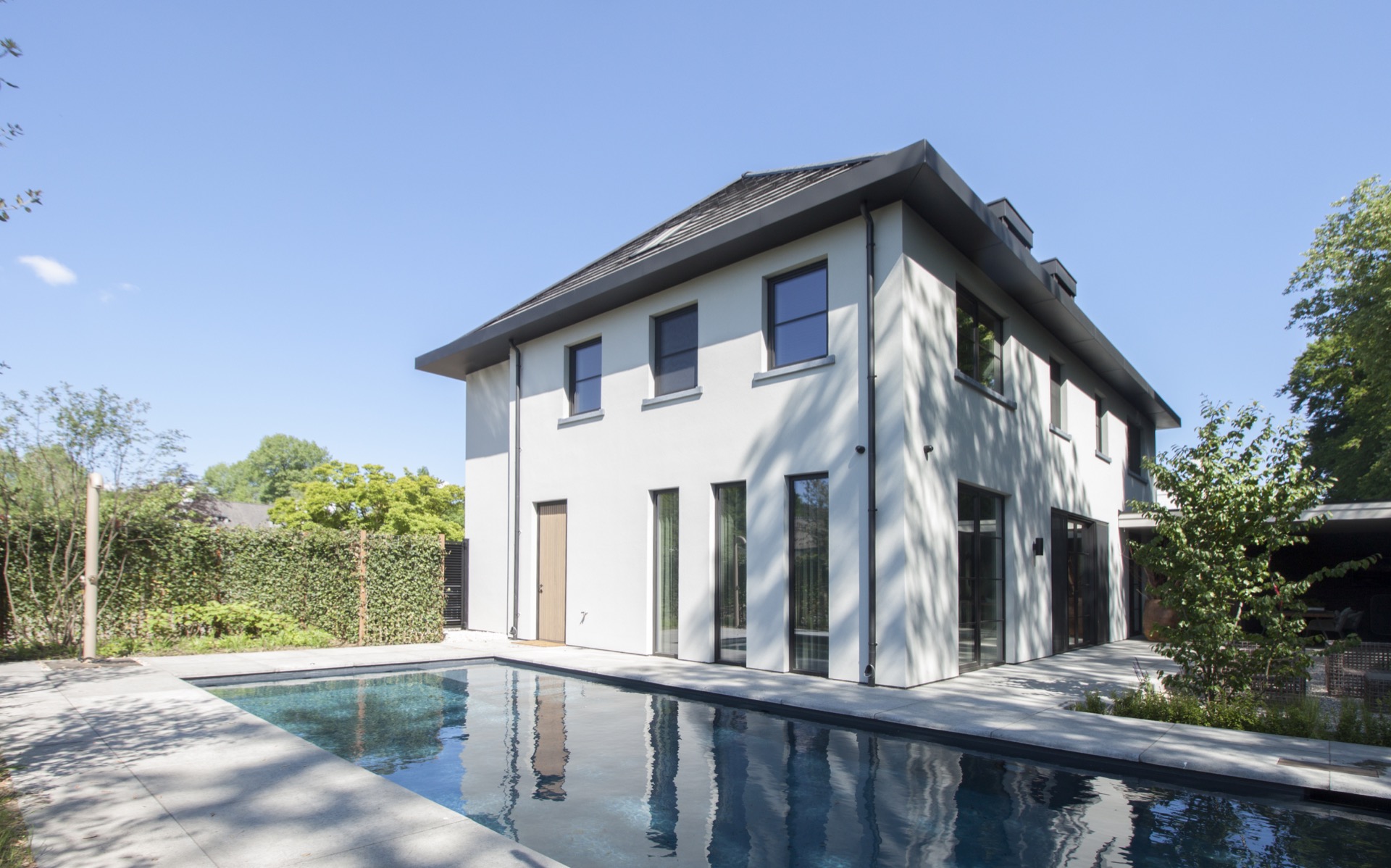
Dark brick accents break the plastered surface before the eye settles on the changed proportions of the house. The roofline has been lifted, the openings have been rearranged, and the building now reads as a townhouse transformation rather than a faded corner house. The shift is visible from the street and continues inside, where the same controlled character is carried through in the hallway wall panels, ceiling spotlights, and the long line of sight toward the window at the end of the corridor.
Major renovation with a lifted roofline
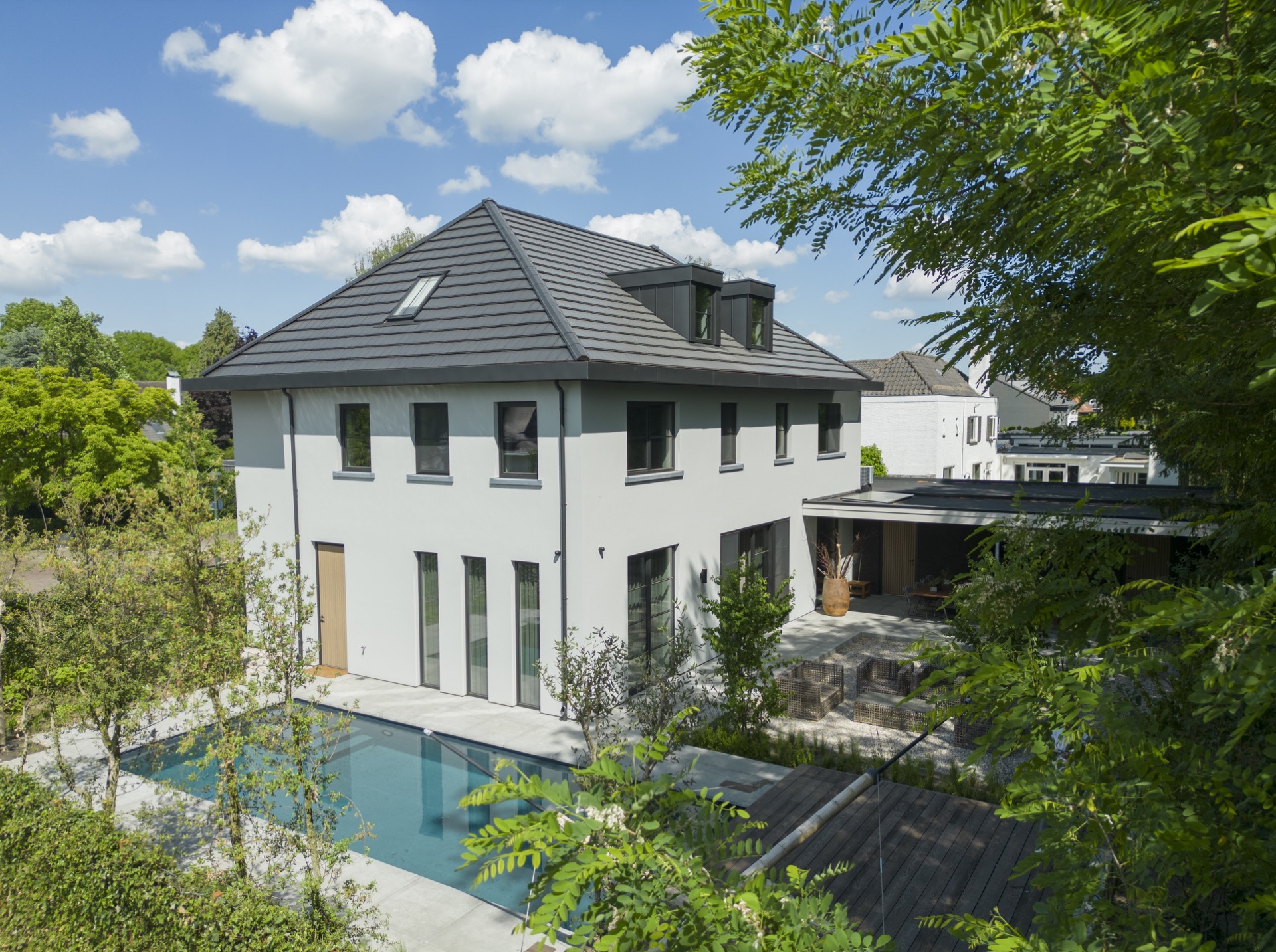
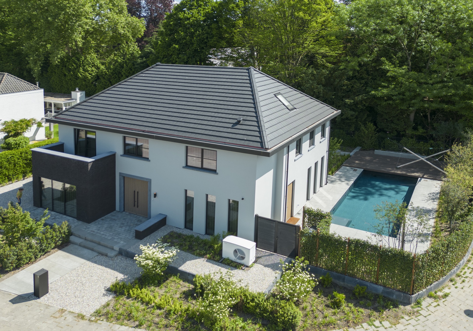
The most immediate change is the height. By raising the roofline, the volume gains a more assertive profile, and the whole façade responds to that new proportion. What once stood as a neglected shell has been reworked through a major renovation that touches the structure, the envelope, and the room layout behind it. The result is not about adding ornament. It is about adjusting the massing so the building settles back into its setting with a clearer presence.
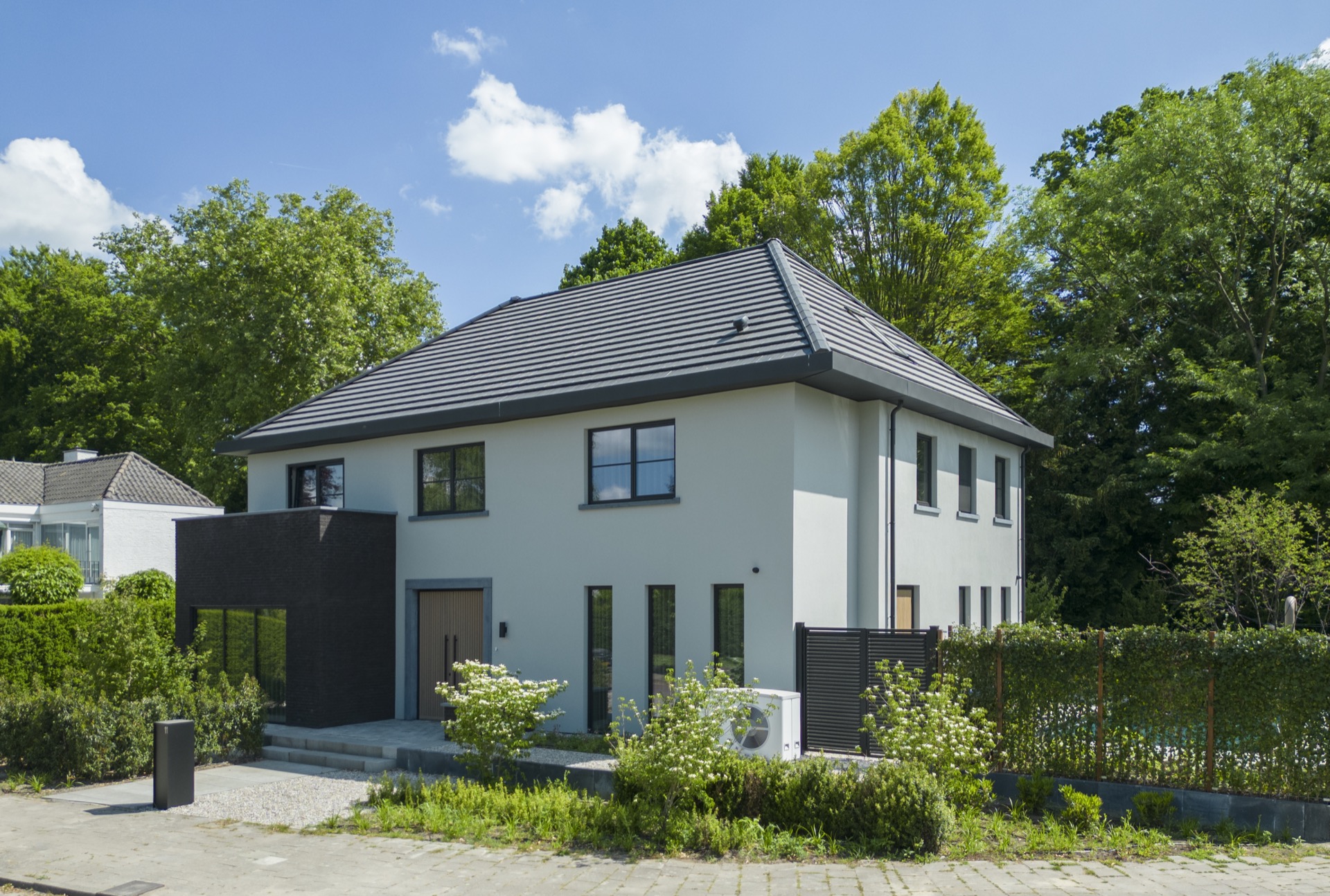
That change is reinforced by the way the exterior has been wrapped in an insulating layer, then finished in plaster and darker masonry details. The surface reads in two speeds: broad, pale planes and measured dark accents. This keeps the townhouse transformation from becoming too formal. The composition still feels ordered, but the interruption of symmetry gives it a more relaxed stance at the corner.
Façade renovation through a new rhythm of openings
Instead of repeating the old window layout, the façade renovation rethinks the openings as part of the whole composition. Some alignments are shifted, and the rhythm changes from side to side. That adjustment is small in appearance, but it changes the way the building addresses the street. The openings no longer sit as a fixed pattern. They belong to the renewed massing, which makes the façade renovation read as an architectural move rather than a simple refresh.
The broken symmetry matters here. It softens the formal edge of the house without losing the sense of order that comes from the raised roof and the clear vertical surfaces. Dark brick accents sit against the plastered finish and give the front depth at key points. Seen together, those elements shape a townhouse transformation that feels composed but not rigid. The façade renovation also extends into the interior atmosphere, where the same preference for clean lines and restrained contrast continues.
Plaster, brick and a quieter street presence
The material contrast is straightforward and effective. Plaster forms the larger fields, while the darker brick introduces weight and shadow. That pairing prevents the street elevation from reading as flat. It gives the walls a layered look without relying on decorative trim. The result is an elegant façade look built from surface and proportion, not from excess detail. From the outside, the house now has a clearer outline and a more deliberate relation to the corner plot.
Because the openings were redesigned at the same time, the façade never feels like a static front. It has movement in the spacing of the windows and in the way the solid parts take over between them. This is where the townhouse transformation becomes legible as a full-building intervention. The roof, openings, and wall finish work together, and the house now carries itself with less strain and more clarity.
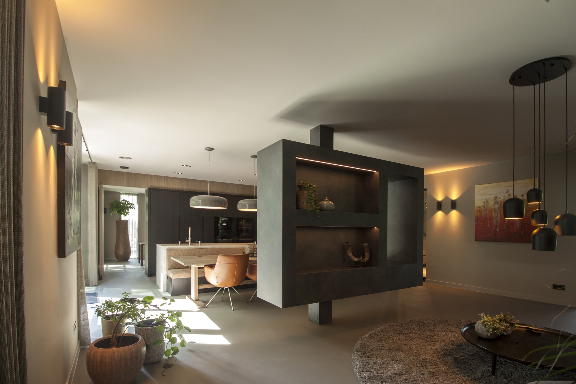
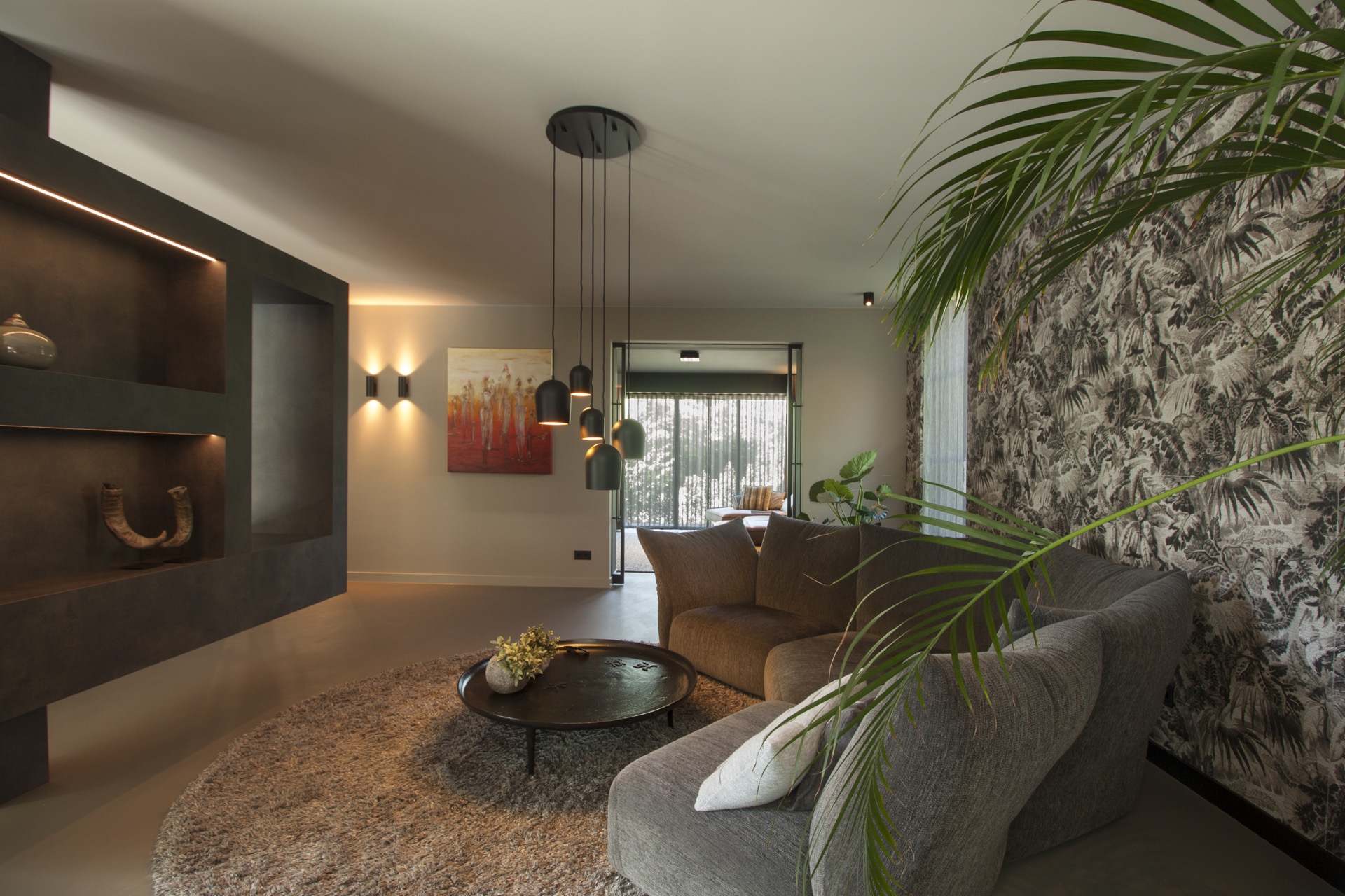
Inside, the same discipline continues in the hallway
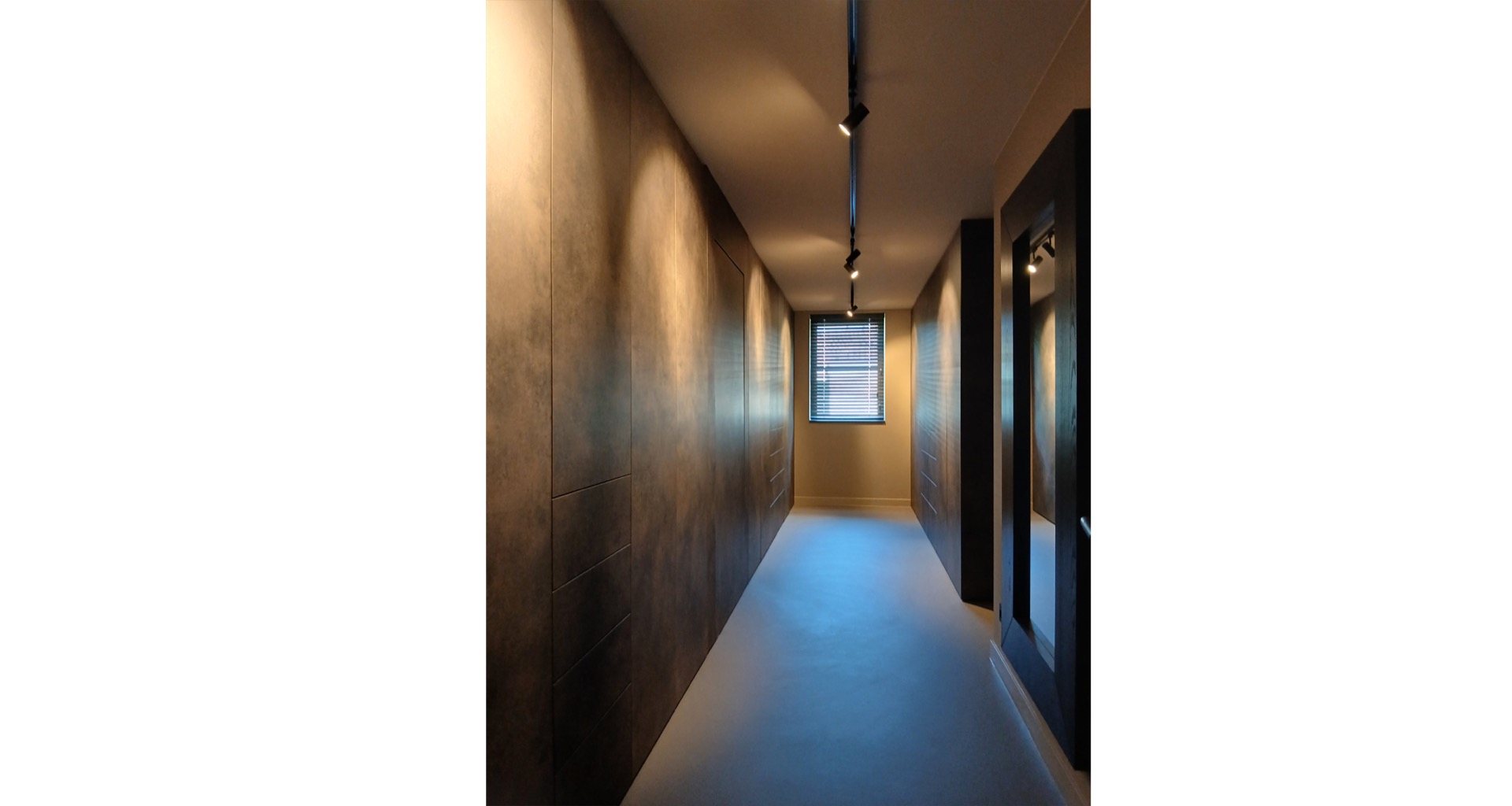
The corridor shows how the exterior logic was carried into the interior. Wall panels line the passage, giving the long route a measured surface that keeps the walls visually calm. Ceiling spotlights sit neatly overhead and guide the eye forward. At the end of the corridor, a window and ventilation opening mark the termination of the view, while the floor meets the wall in a clean junction. These are simple elements, but together they give the hallway a precise reading.
What stands out most is the way the passage is handled as a sequence of planes: panelled wall, lit ceiling, straight floor edge, then the framed opening at the far end. The space is not trying to announce itself. It relies on alignment and finish. That approach matches the larger townhouse transformation, where each adjustment seems aimed at making the building read more clearly, both from the street and once you step inside.
Wall panels and ceiling spotlights along a long view
The hallway wall panels do more than cover the surface. They set a vertical rhythm that works against the length of the corridor and keeps the passage from feeling empty. The recessed lighting adds another layer, washing the ceiling in small points instead of a single bright source. That choice makes the route feel deliberate, with the light following the geometry rather than interrupting it. The end wall, with its window and vent, closes the view in a straightforward way.
Here, the interior details avoid any sense of display. The careful floor junction, the panelled wall surface, and the spotlights are all part of one measured language. It is a language that connects back to the façade renovation: plain surfaces, controlled openings, and a preference for clear edges over decoration. The townhouse transformation therefore reads as one continuous project, not as separate exterior and interior gestures.
A renewed character carried through the whole house
The original building may have been worn down, but the new version uses restraint rather than display to recover its presence. The raised roofline gives the house more room in the composition, while the redesigned openings break up the old rigidity. Outside, plaster and dark brick define the elevation; inside, panels and lighting continue the same measured tone. That shared approach is what makes the major renovation convincing. Nothing is overexplained. The house simply reads with more clarity at every point.
Seen from the corner, the villa now belongs to its setting in a different way. The formal structure is still there, but the symmetry has been relaxed just enough to avoid stiffness. Inside, the hallway shows the same restraint through its materials and lighting. Together, these changes turn the townhouse transformation into a building-wide renovation where the exterior and interior speak the same architectural language.
Want to see more of Spanjers Architect? View the page of Spanjers Architect for even more great projects and company information.


NEW 2026 Jubileum Edition The Best Interior Designers Benelux
Order Now €125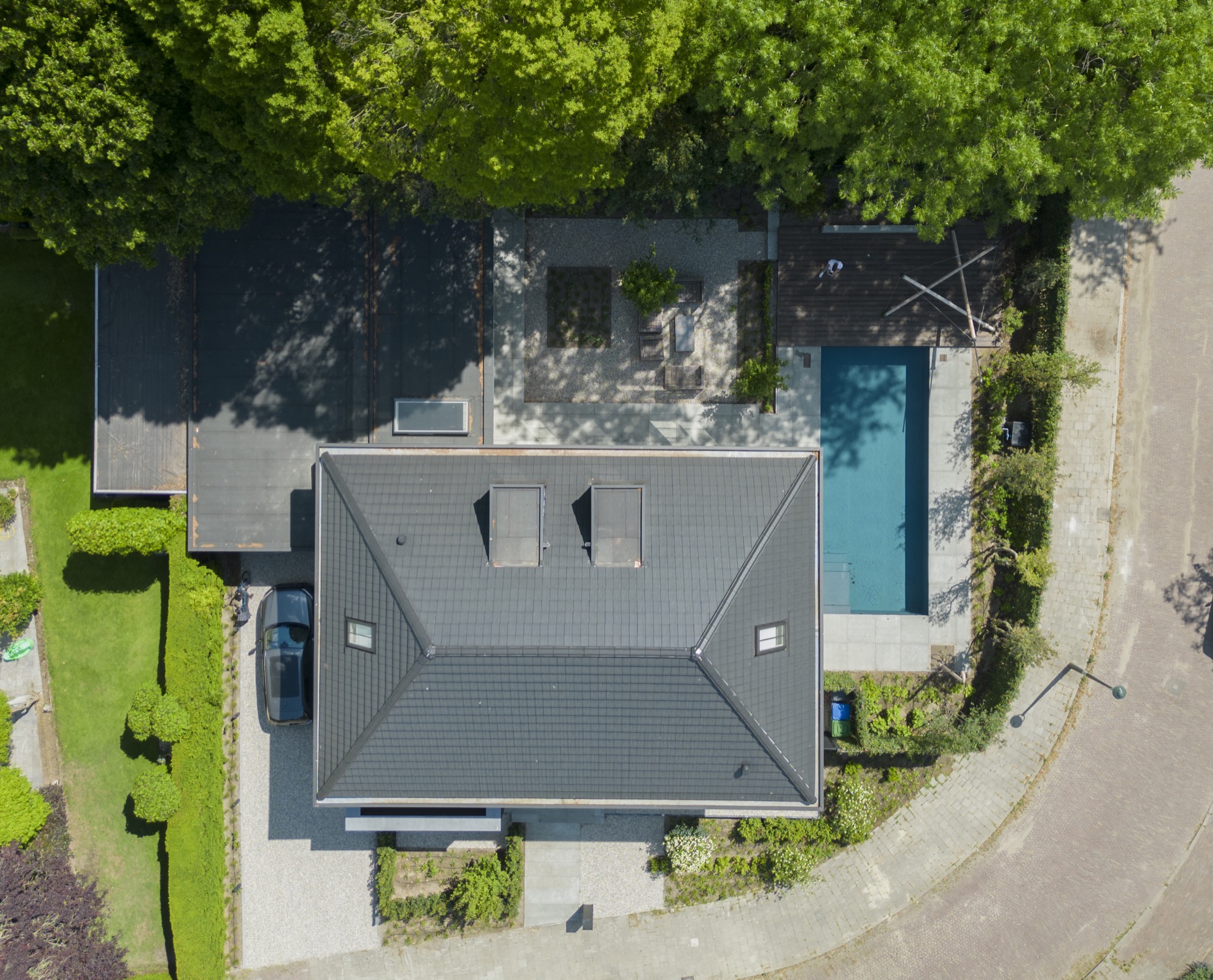
NEW 2026 Jubileum Edition The Best Interior Designers Benelux
Order Now €125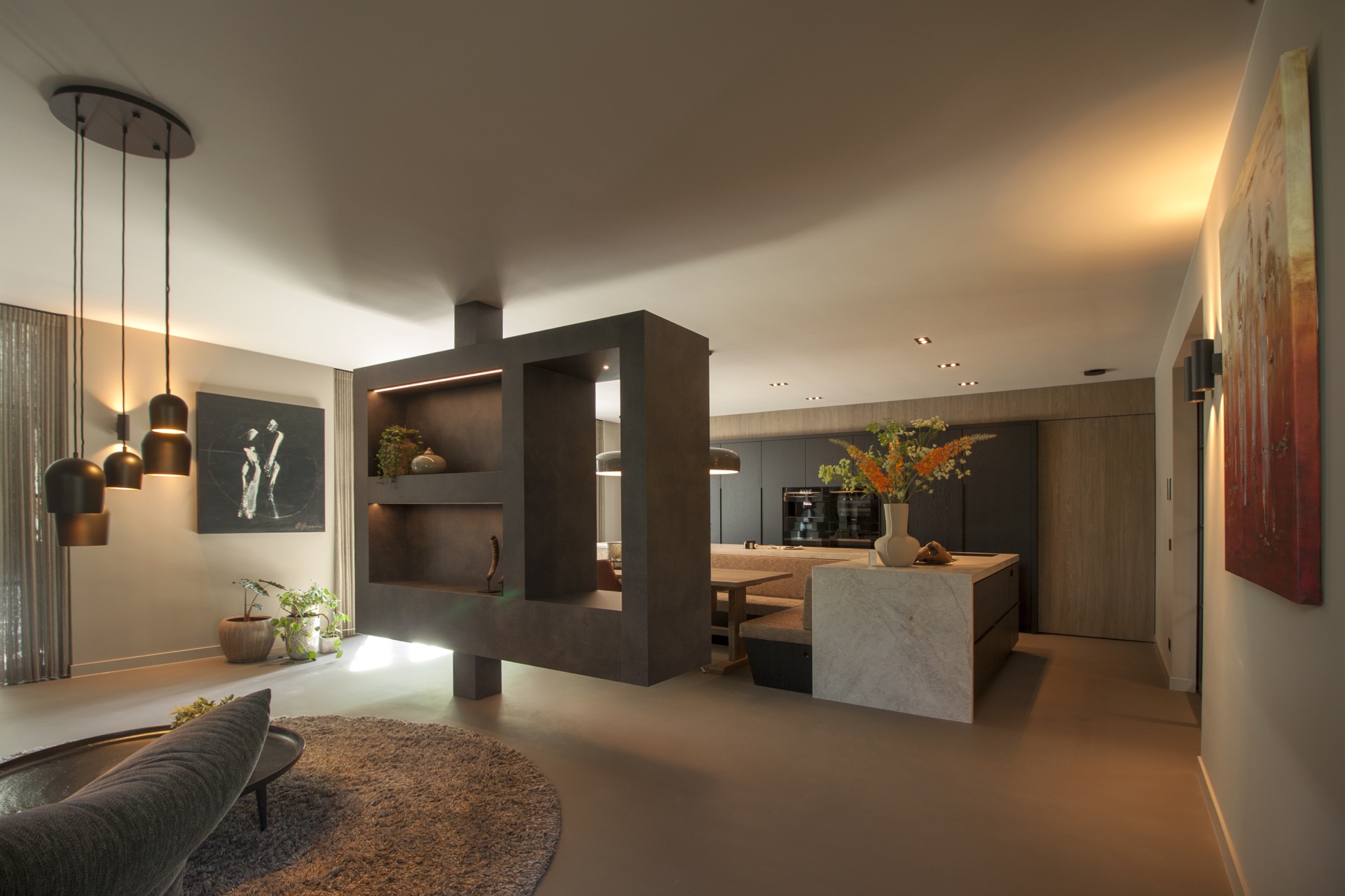
NEW 2026 Jubileum Edition The Best Interior Designers Benelux
Order Now €125