









Transformation of a stately family home in two phases
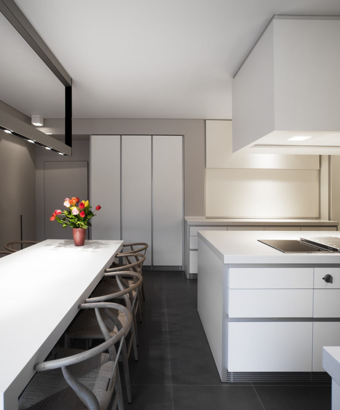
The first room that sets the tone is the living kitchen with island, where the working surface takes the lead and the surrounding cabinetry stays visually quiet. Two rooms were brought together to make space for the kitchen, and that structural move is still readable in the long lines of the joinery and the open passage to the adjacent zones. The finish is structural lacquer, sharpened by anodized aluminium detailing that traces edges without drawing attention away from the island.
A kitchen built from two rooms
Phase one focuses on the living kitchen and the annex spaces beside it. Rather than adding volume through decoration, the project gains room by removing the partition between two areas and allowing the kitchen to stretch out across the new span. The central island now anchors the plan. Around it, the layout stays direct: cabinets run in clear bands, appliances are integrated, and the floor plane remains calm so the island can do the visual work. The result is a living kitchen with island that reads as one measured composition rather than a collection of separate parts.
Structural lacquer gives the kitchen fronts a clean, even surface, while the anodized aluminium details introduce a precise edge where materials meet. That contrast matters in a room with so many hard working elements. The aluminium profiles mark the cabinetry without thickening it, and the lacquer softens the larger blocks of storage so the island and wall units remain legible from across the room. Seen alongside the large-format tiled floor, the kitchen feels grounded and exact.
Handleless fronts and a clear working line
The cabinetry stays close to the wall and avoids visual noise. Handleless sleek cabinetry keeps the run of storage simple, and the straight-line layout and sightlines make the room easy to read from one end to the other. The island sits in the middle as a working block, with a cooktop set into the surface and practical clearance around it. Nearby, the tall units gather ovens and storage into one vertical strip, which keeps the rest of the kitchen open.
Light from the large openings lands on white and neutral surfaces before reaching the darker appliance fronts. That mix keeps the room from becoming flat. Horizontal blinds soften the glazing without cutting off the view, and the long ceiling lines lead the eye toward the adjoining spaces. The kitchen does not stop at the island; it opens toward the next rooms with the same measured rhythm, so the transition feels deliberate rather than abrupt.
The same line carried into the living zone
In phase two, the design language continues through the rest of the living zone, including the TV room, the adjacent living space and the entry hall. The straight geometry stays in place, but the material tone shifts. The furniture receives a warm sandblasted veneer finish that introduces grain and depth against the otherwise restrained setting. This change is subtle, yet it changes the pace of the room: the surfaces feel less reflective, and the joinery reads as furniture rather than built-in architecture alone.
The custom TV wall unit is part of that second move. It sits within a wider sequence of fitted elements, with open recesses, low storage and a clear wall plane around the screen area. In the living room, an open fireplace with a stone surround adds another fixed point in the composition, while the vertical slats in one niche give the wall a different texture. Nothing competes for attention; each piece has a defined role in the room.
Entry hall built-in storage and passing views
The entry hall built-in storage extends the same disciplined approach into the arrival sequence. Instead of a separate hallway statement, the hall is treated as part of the interior route, with storage integrated into the wall and openings that maintain sightlines to the rooms beyond. Large tiles continue underfoot, and the door and window details stay slim, so the hall does not feel cut off from the rest of the house. It prepares the move into the living spaces by keeping the geometry clear.
Through the corridor-like zones, the built-ins alternate between closed fronts and open niches. That shift keeps the walls from reading as heavy. The effect is especially visible where a bookcase-like recess meets a plain wall panel or where the line of a doorway interrupts a run of storage. These small breaks matter in a plan built on straight lines; they give the house its pacing and help the living kitchen with island relate to the TV room and hall as part of one interior sequence.
Across the whole transformation, the project relies on restraint in shape and contrast in finish. Structural lacquer, anodized aluminium detailing and sandblasted veneer are not used as decoration, but as tools for defining zones and edges. The kitchen takes the first step, the living areas continue the line, and the entry hall completes the route with built-in storage and clear thresholds. It is a measured interior, but never monotonous, because each room introduces one material shift or one change in depth to keep the eye moving.
Want to see more of iXtra interior architecture? View the page of iXtra interior architecture for even more great projects and company information.




NEW 2026 Jubileum Edition The Best Interior Designers Benelux
Order Now €125


NEW 2026 Jubileum Edition The Best Interior Designers Benelux
Order Now €125


NEW 2026 Jubileum Edition The Best Interior Designers Benelux
Order Now €125


NEW 2026 Jubileum Edition The Best Interior Designers Benelux
Order Now €125


NEW 2026 Jubileum Edition The Best Interior Designers Benelux
Order Now €125


NEW 2026 Jubileum Edition The Best Interior Designers Benelux
Order Now €125


NEW 2026 Jubileum Edition The Best Interior Designers Benelux
Order Now €125


