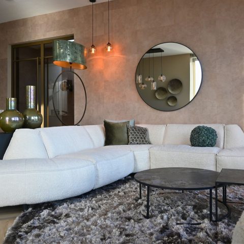
Warm contemporary interior with a stone-look wall
The first thing that catches the eye is the stone-look wall in the living room. Its block-like pattern gives the seating area a clear backdrop, while beige upholstery and a light wood floor keep the room from feeling heavy. This warm contemporary interior uses a restrained palette of cream, brown, black, and soft grey, so every material has room to show its texture. The result is calm without becoming flat, with the TV zone, sofa, and round table read as one composed living area.
Stone-look feature wall in the living room
The stone-look wall living room setting anchors the whole space. Seen next to the TV furniture, it works less like decoration and more like a surface that shapes the room’s rhythm. The repeated stone pattern brings depth to the wall, especially where daylight moves across the different tones. Around it, the furniture is kept low and quiet, which lets the wall do the visual work. Nothing feels crowded. The composition leaves clear lines between the lounge, the screen area, and the open floor.
That same discipline shows in the way materials are placed. A round glass-topped coffee table breaks up the heavier surfaces and reflects light back into the room. The sofa and armchairs sit in beige tones with visible weave and soft edges, which gives the room a tactile layer without changing the calm colour range. This is where the stone-look wall living room idea becomes more than a backdrop: it sets the pace for the rest of the interior and keeps the seating area grounded.
Beige upholstery and textured seating
Close up, the upholstery matters as much as the wall finish. The beige upholstered seating has a clear fabric texture, and the rounded arms soften the geometry of the room. A matching chair appears in a similar neutral tone, so the lounge area reads as a family of pieces rather than separate objects. The fabric does not try to stand out; instead, it catches light in small shifts, which is enough to keep the surfaces alive. Against the stone wall, that softness makes the room feel settled and layered.
Decorative details stay close to the material language of the furniture. A sculptural black table lamp and other accent pieces introduce darker lines, while the table surface and small objects add pauses between the larger volumes. The palette remains understated, but the room never feels bare. The textured upholstery and the stone-look wall keep the eye moving between smooth, rough, matte, and reflective surfaces, which is what gives the lounge its depth.
Window dressing and daylight
Daylight is filtered rather than left open and bright. Horizontal blinds and pleated shades sit at the windows, and the slats break the incoming light into softer bands. That matters in a room with stone surfaces, because the change in light stops the wall from reading as one flat plane. Near the seating, the window treatment keeps the brightness controlled while still letting the room register as open. The effect is subtle, but it shapes how the beige seating and the floor colours sit against the wall.
The window side also shows how the project handles transitions. The room moves from the screen wall to the glazed edge without a hard break, and the blinds help that shift feel measured. You can see the outside light touching the armchair, the floor, and the table edge in different ways. The room stays composed even as the light changes. For a stone-look wall living room, that variation is important: the surface needs daylight to bring out the detail in the pattern.
Lighting that works at table height and above
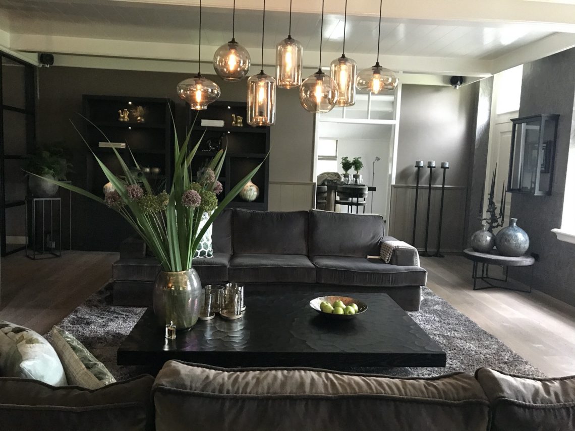
Lighting is handled with restraint but not with anonymity. A glass pendant hangs above the round table, its clustered elements catching reflections as soon as the room brightens. It gives the centre of the seating area a vertical note, balancing the broad horizontal run of the sofa and TV wall. Elsewhere, smaller lamps with sculptural black bases and pale shades sit lower in the room. They draw attention to the side tables and styling pieces rather than competing with them. In a warm contemporary interior, that layered lighting keeps the room readable after dark.
The fixtures do more than illuminate objects. They also mark zones. The pendant signals the social centre, while the smaller lamps define the edges of the seating arrangement. Combined with the stone wall TV area, they give the room a clear internal structure. Nothing depends on one large gesture. Instead, the room is built from a sequence of smaller cues: glass, shadow, rounded upholstery, stone blocks, and the pale reflection of the floor.
A kitchen and dining area at the heart of the house
Beyond the living room, the source text places the kitchen and dining area at the centre of the house. The kitchen is described with high-grade materials and modern appliances, while the dining space provides room for everyday meals and longer gatherings. Even without a full visual inventory of that zone, the intent is clear: this is where the house shifts from lounge into shared use. The move from sitting area to dining area supports the wider layout of the semi-detached home and keeps circulation easy to follow.
The tone remains consistent across those spaces. Modern elements are paired with classical accents, so the interior does not rely on a single style cue. Instead, the rooms are tied together through material discipline and a neutral colour range. That consistency is visible in the furnishings, the light surfaces, and the way the rooms are furnished without excess. The kitchen and dining zone extend the same quiet logic seen in the living room, only with a different function and a stronger sense of activity.
Details that hold the composition together
Small details keep the rooms from becoming too anonymous. A patterned wall panel near a doorway adds a graphic note, while consoles, frames, and tabletop objects break up larger blank surfaces. The light wood floor runs through the interior as a soft base, and in some views a rug helps settle the seating arrangement. These are not decorative extras added at the end; they are part of how the space is held together. Each one gives the eye a point to land on before moving to the next surface.
The project works because it treats the living room, kitchen, and dining area as connected parts of one interior rather than separate scenes. The stone-look wall living room remains the visual anchor, but the beige upholstered seating, the horizontal blinds and pleated shades, and the glass pendant lighting all help the rest of the house feel measured. It is an interior built from visible decisions: where light stops, where texture changes, and where a surface becomes the centre of the room.
Want to see more of Miryam Schotman Interieurs? View the page of Miryam Schotman Interieurs for even more great projects and company information.




NEW 2026 Jubileum Edition The Best Interior Designers Benelux
Order Now €125


NEW 2026 Jubileum Edition The Best Interior Designers Benelux
Order Now €125


NEW 2026 Jubileum Edition The Best Interior Designers Benelux
Order Now €125