Warm minimal interior with bespoke details
A quiet material shift sets the tone here: pale ceramic tiles at the entry give way to wood underfoot, and the change marks the move into a warm minimal interior shaped by light, storage and long sightlines. Large windows pull daylight deep into the rooms, while the restrained palette keeps attention on the edges, joints and surfaces that define the house. Nothing shouts for attention. The layout does its work through openness, and the details carry the rhythm from one zone to the next.
Open-plan living with daylight and long sightlines
The living spaces are arranged as open plan living rather than a series of closed rooms, so views run across the interior and outward through the glazing. That openness is reinforced by the broad window sections, which brighten the floor and soften the transition between the white walls, dark accents and natural wood. The result is measured and legible: a room sequence where the eye keeps moving, from the entrance to the dining area and further into the kitchen. Daylight interior planning is not treated as a feature on its own, but as part of how the house is used.
Material changes help divide the zones without using walls. Ceramic flooring appears in the more circulated areas, then shifts to wood where the rooms settle. That move gives the plan a clear tempo. It also lets the furniture and built-ins sit against a calmer background, especially where a tall cabinet line meets a long wall of glass. The interior reads as a minimal interior, but one with enough texture to avoid flatness: plaster, timber, stone-look surfaces and soft textile accents all appear in the same frame.
Custom cabinetry that keeps the rooms quiet
Storage is handled through custom built-in cabinets that run almost wall to wall in several spaces. Their long vertical handles draw the eye upward and keep the fronts visually calm, even when the volumes are generous. In the hall, the tall units set a neat line beside the ceramic floor, and that same discipline returns in the living areas, where the cabinetry sits flush instead of breaking the room apart. The effect is not decorative; it is spatial. The rooms stay clear, and the visible hardware remains discreet.
Vertical slat wall and linear lighting
One of the strongest surfaces in the house is the vertical slat wall. The narrow timber rhythm brings movement to a room that is otherwise kept still, and the line of suspended lighting runs in parallel with it. Together they give the dining zone a defined edge without closing it off. A small shelf detail and an open niche break the surface just enough to prevent repetition. Across the room, the same timber tone returns in chairs, floor and joinery, so the material palette stays consistent while the geometry changes.
That same restraint appears in the living room, where a dark slatted wall frames the fireplace and a built-in recess interrupts the surface for equipment and display. The unit is integrated rather than presented as a separate object. Around it, the ceiling remains plain, which makes the wall treatment carry more weight. Seen from the dining area, the composition feels deliberate but not rigid. It gives the open rooms a fixed point without turning the space into a display of individual features.
A kitchen island anchored by stone-look surfaces
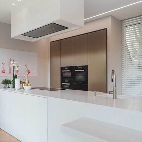
The kitchen acts as the anchor of the home, and the kitchen island sits at the center of that role. Its light worktop extends in a single plane, with a stone look that catches the light differently from the matte cabinet fronts around it. Behind the island, the darker feature wall introduces a stronger material note, with a recessed shelf and a surface that reads as stone rather than gloss. The contrast is controlled. It gives the kitchen more depth while keeping the overall palette close to the rest of the interior.
Above and around the work zone, the ceiling spots and compact pendant lights set out the main routes of use. The arrangement is practical, but it also keeps the kitchen visually calm from a distance. Open plan living depends on that kind of discipline: every element is visible from more than one angle, so the fronts, the countertop and the joinery need to hold together when seen from the dining table or the hallway. Here, the kitchen island does that job without becoming oversized or theatrical.
Wood and ceramic flooring as a clear transition
The shift between wood and ceramic flooring is one of the most readable moves in the house. In the hall, the ceramic tiles give a harder, more compact base for the circulation zone and the built-in storage. Further in, the wood flooring softens the room depth and adds a quieter grain beneath the tables and seating. The transition is not hidden; it is used as a marker between functions. That makes the plan easier to read, especially in a home where open circulation and long perspectives are part of the design language.
In the hall and the corridor, tall built-in cabinets repeat the same language of straight edges and integrated handles. The passage does not feel secondary. Instead, it extends the interior logic with another narrow band of storage, a clean floor field and a direct view into the rooms beyond. Even the smaller turns in the plan remain consistent with the larger spaces: no excess trim, no decorative interruptions, only the practical line of the joinery and the light that washes across the surfaces.
Rooms that keep the same tone, even in smaller details
The bathrooms and bedrooms continue the same careful use of surface and proportion. In the bathroom, a stone-look countertop sits above lower storage, while tall cabinets rise beside it with long, vertical pulls. The finish is matte rather than reflective, which suits the rest of the interior and keeps the room from feeling isolated from the main living areas. A similar discipline appears in the bedroom zones, where textiles soften the harder materials without changing the overall language of the house. Everything remains tied to the same measured palette.
What gives this home its presence is not a single gesture but the way each room holds to the same standard of detail. The open plan living arrangement, the daylight interior, the built-in storage and the kitchen island all work together through repetition of material and line. The house stays calm because its elements are carefully limited: wood, ceramic, stone-look finishes, glass and a few darker accents. From one room to the next, the interior keeps its pace, and that steady movement is what the project leaves behind.
Photography – Bert Demasure
Want to see more of Laura Calleeuw? View the page of Laura Calleeuw for even more great projects and company information.




NEW 2026 Jubileum Edition The Best Interior Designers Benelux
Order Now €125


NEW 2026 Jubileum Edition The Best Interior Designers Benelux
Order Now €125


NEW 2026 Jubileum Edition The Best Interior Designers Benelux
Order Now €125


NEW 2026 Jubileum Edition The Best Interior Designers Benelux
Order Now €125


NEW 2026 Jubileum Edition The Best Interior Designers Benelux
Order Now €125


NEW 2026 Jubileum Edition The Best Interior Designers Benelux
Order Now €125