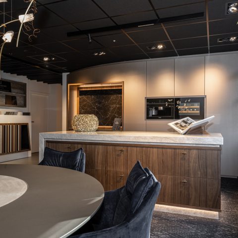
White custom cabinetry and a modern kitchen
White custom cabinetry sets the tone as soon as the kitchen comes into view. The fronts are built as a sequence of tall units and lower drawers, kept in a restrained white finish and interrupted by black pulls that sharpen the lines. A dark countertop runs across the work area and gives the cabinetry a clear base. On the floor, dark tiles pull the whole composition down visually, so the white surfaces read even more clearly in the room.
White cabinetry and kitchen fronts with black pulls
The cabinet run is not treated as a backdrop here; it carries the room. Paneled fronts and drawer divisions bring structure to the white custom cabinetry, while the black handles give each opening a precise edge. In the detail views, the joinery reads cleanly, with drawer stacks, vertical door panels and narrow breaks between volumes. The result is a kitchen where storage is visible in its order, not hidden behind decorative excess. The straight geometry keeps attention on the lines of the units and the dark worktop that cuts through them.
Open shelving appears in one of the taller compositions, where books are placed inside a recessed niche. That small shift from closed front to open storage changes the rhythm of the wall. It breaks the run of solid white surfaces without disturbing the calm alignment of the cabinetry. The niche also gives the kitchen a lived-in layer, but it does so through a few visible objects rather than display styling. Here, the custom kitchen cabinetry is built to hold both everyday use and a little visual relief.
Dark countertop surfaces and working edges
The dark countertop kitchen detail is one of the clearest contrasts in the project. The work surface sits as a continuous band against the white fronts, with a stone-like or composite look that reads dense and matte in the images. It frames the cooking and prep zone without adding visual noise. In close-up, the edge of the countertop is crisp, and the transition to the drawers below is tight. That sharp relation between light cabinetry and dark surface gives the kitchen its strongest horizontal line.
Across the room, the same dark plane appears beside a windowed wall, where daylight falls across the worktop and cabinet fronts. The light lifts the white paint and the pale finish of the panels, but the countertop stays grounded and steady. Black pulls repeat the darker note in a smaller scale, linking the drawers to the work surface. It is a simple palette, yet the project uses it carefully: white cabinets, black handles, dark tiles, and a deep-toned counter that holds the center of the room.
Recessed ceiling spots and a clear ceiling line
Recessed ceiling spots are used with a light touch. In the kitchen ceiling and in a niche, the round fittings sit flush and keep the surface uninterrupted. They do not compete with the cabinetry or the window opening. Instead, they define where the eye moves: from the ceiling line down to the tall units, then across the countertop and into the open shelf. The ceiling treatment stays restrained, but it matters because it supports the sharp outline of the room.
The lighting also helps register the depth of the fitted joinery. A recessed niche becomes more legible when a spotlight picks out the opening. The white surfaces then shift from flat planes to shallow volumes, especially where the cabinet doors step back or where the shelving is set into the wall. In a kitchen built around white custom cabinetry, that kind of lighting keeps the details readable without adding clutter.
Book-filled open niches inside the fitted wall
One of the quieter moments in the project is the open niche with books. It sits inside the white cabinetry as a cut-out rather than as a separate object, so the storage remains part of the larger composition. The books add color and texture, but the framing stays measured: white surround, straight edges, and a shallow recess. The detail matters because it shows how the fitted wall can carry more than one function without losing its line.
An entrance hall wardrobe with paneled doors
The entrance hall wardrobe continues the same language, but in a different setting. Double doors in white stand against a matte painted wall, each one marked by black handles that echo the kitchen hardware. Nearby, a window with divided panes brings in a gridded pattern that sits well with the cabinet fronts. The hall is therefore not treated as a passage of leftover space; it has its own fitted storage and a clear visual order. The entrance hall wardrobe gives the first room a defined edge before the kitchen opens up.
Because the wardrobe fronts are plain and vertical, the hall remains calm even with the window divisions and adjacent openings. The surfaces do the work. White panels, dark handles, and a flat wall finish keep the room legible in one glance. This part of the interior shows how built-in storage can be used to control a route through the house, not just to hide belongings.
Dark floor tiles and the route toward the stair
Dark floor tiles extend through the interior and anchor the lighter cabinetry. Their tone is especially useful in the hall, where the wardrobe, wall surfaces and window frames would otherwise feel too pale together. The tiles give the route a stronger base and help connect the kitchen to the entrance. Under daylight, they read as a continuous field rather than a busy pattern, which suits the quiet lines of the joinery.
The staircase then rises from that same grounded surface. It has a white balustrade and white side elements, with the treads finished in a red covering that stands out against the rest of the palette. The contrast is direct. White rails, dark floor tiles below, and the red staircase run create a strong vertical sequence. The stair does not fade into the background; it becomes part of the interior’s structure, visible from both the hall and the surrounding rooms.
A stair run that ties the rooms together
Seen from another angle, the staircase carries the same disciplined approach as the cabinetry. The balusters are slim and white, the side panels are kept light, and the overall form is straight rather than ornamental. That clarity makes the stair easy to read beside the fitted wall and the kitchen compositions. Even the red tread finish is handled as a single visible strip, not as a decorative flourish. It gives the stair some contrast without breaking the calm of the larger interior.
Across the project, the same set of materials returns in different combinations: white custom cabinetry, black pulls, recessed spots, dark floor tiles and a dark countertop kitchen surface. The hall adds a paneled wardrobe and a divided window; the kitchen adds open shelving with books; the stair adds a white balustrade and a clear upward line. Taken together, these elements shape a finished interior project that is built from repetition, variation and direct material contrast rather than from ornament.
Want to see more of Strakk Interior Design? View the page of Strakk Interior Design for even more great projects and company information.



NEW 2026 Jubileum Edition The Best Interior Designers Benelux
Order Now €125