Wine bar interior with dark green tones and warm accents
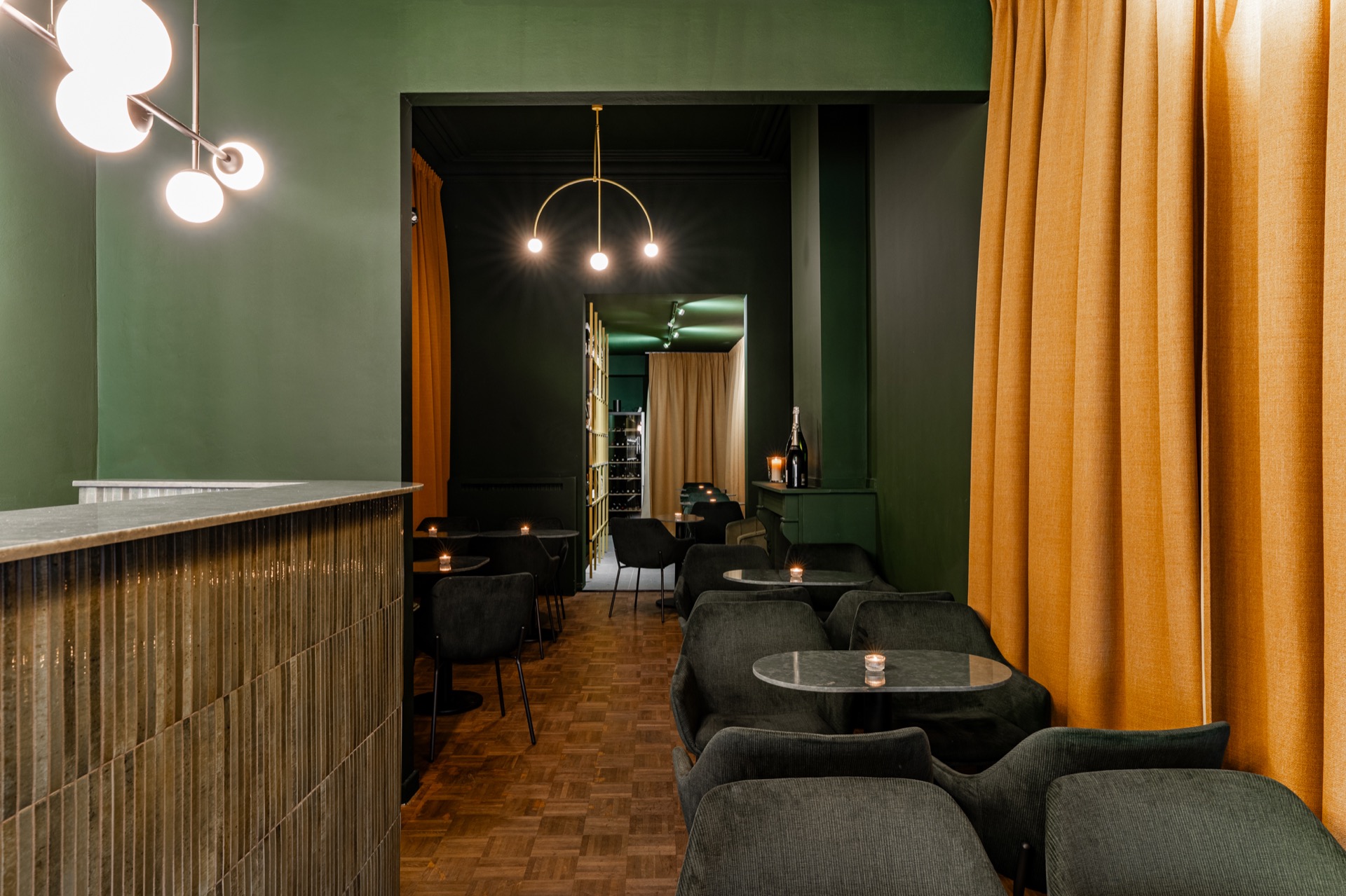
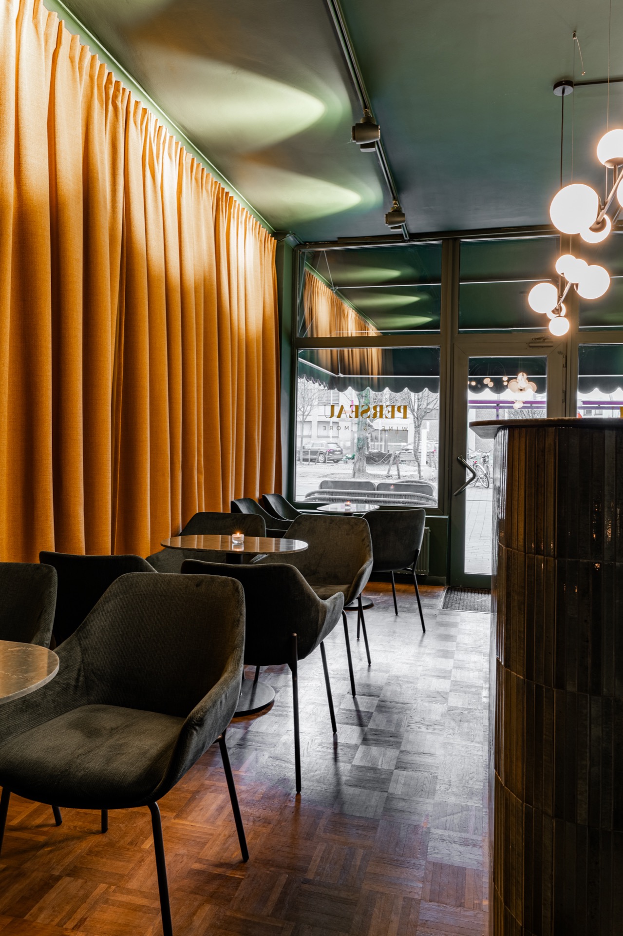
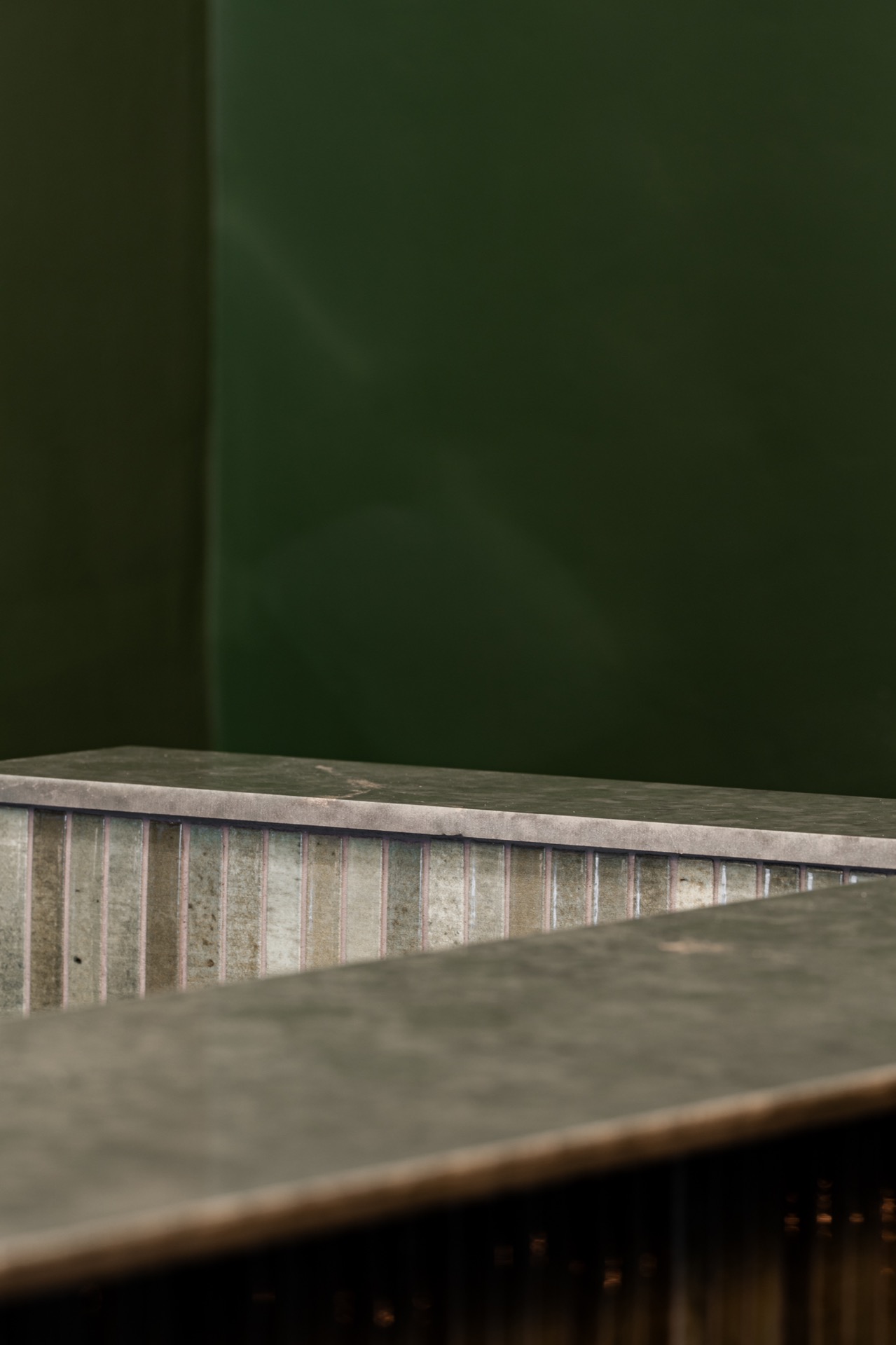
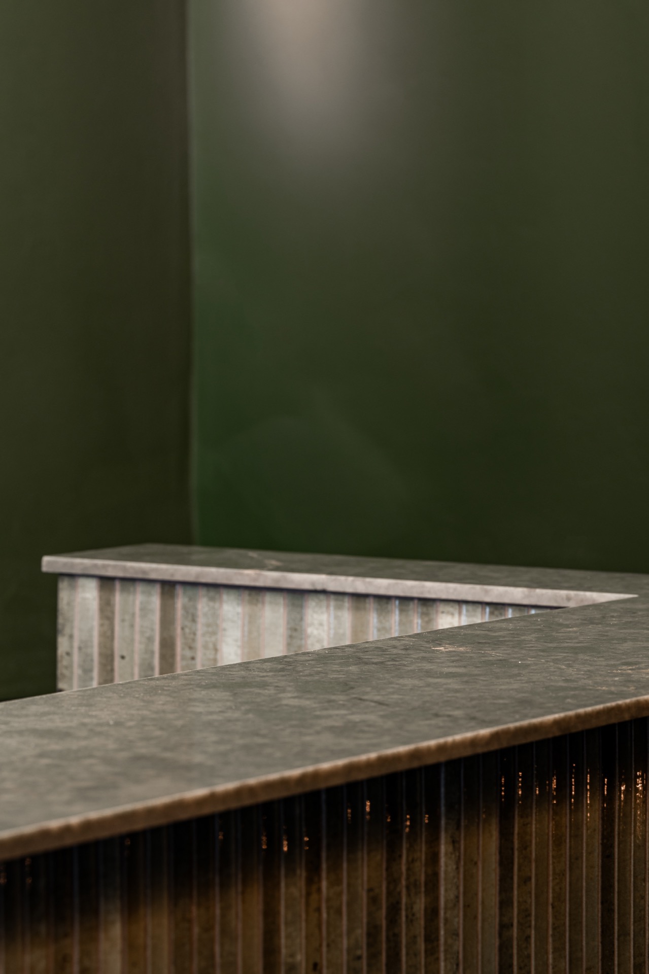
The room is set by the dark green walls before anything else. They pull the eye toward the bar, where a stone-look surface catches the light and a yellow-framed niche breaks the darker field with a sharper note. In this wine bar interior, the palette does most of the spatial work: green for depth, yellow for contrast, and warm dim lighting to soften the edges between seating, shelving and counter.
Dark green walls and a steady first impression
The dark green wine bar setting reads as one continuous envelope rather than a series of separate corners. That makes the seating zone feel anchored, while the bar remains visible as a clear destination. The colour is not used as a backdrop only. It frames the room, absorbs some of the brightness, and lets the reflective points from the lamps and glass surfaces stand out more clearly. The result is restrained in movement, but never flat.
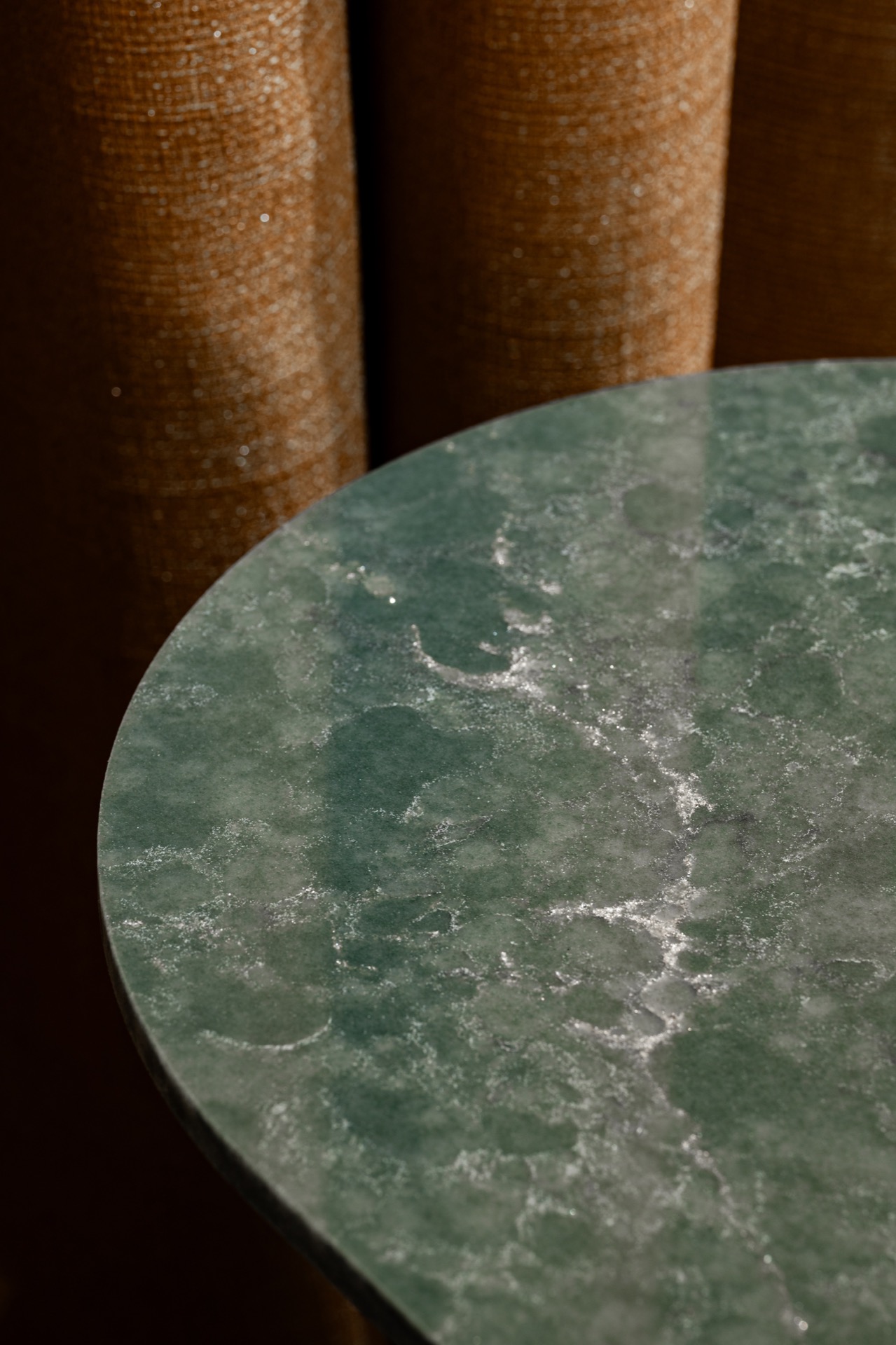
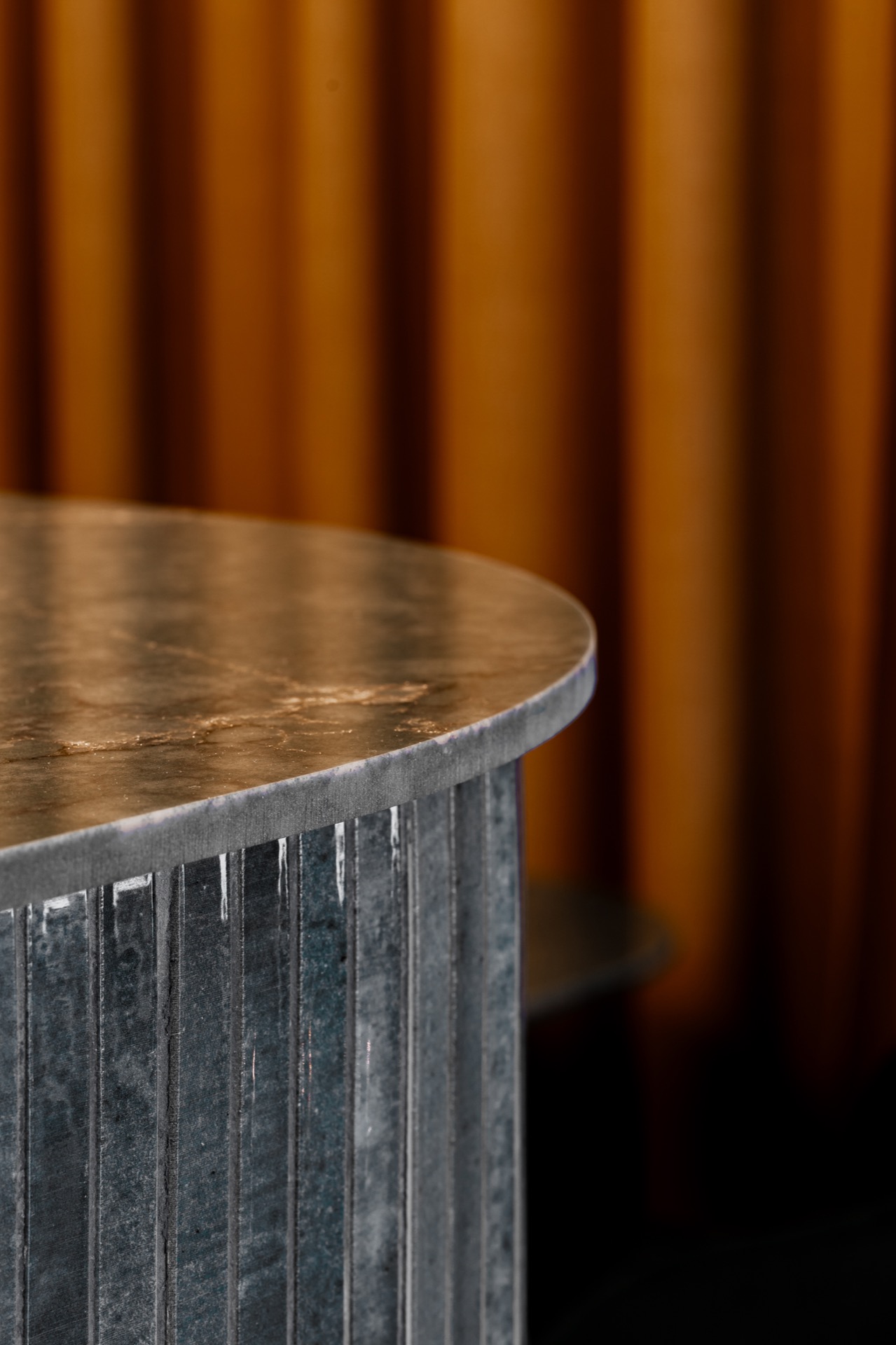
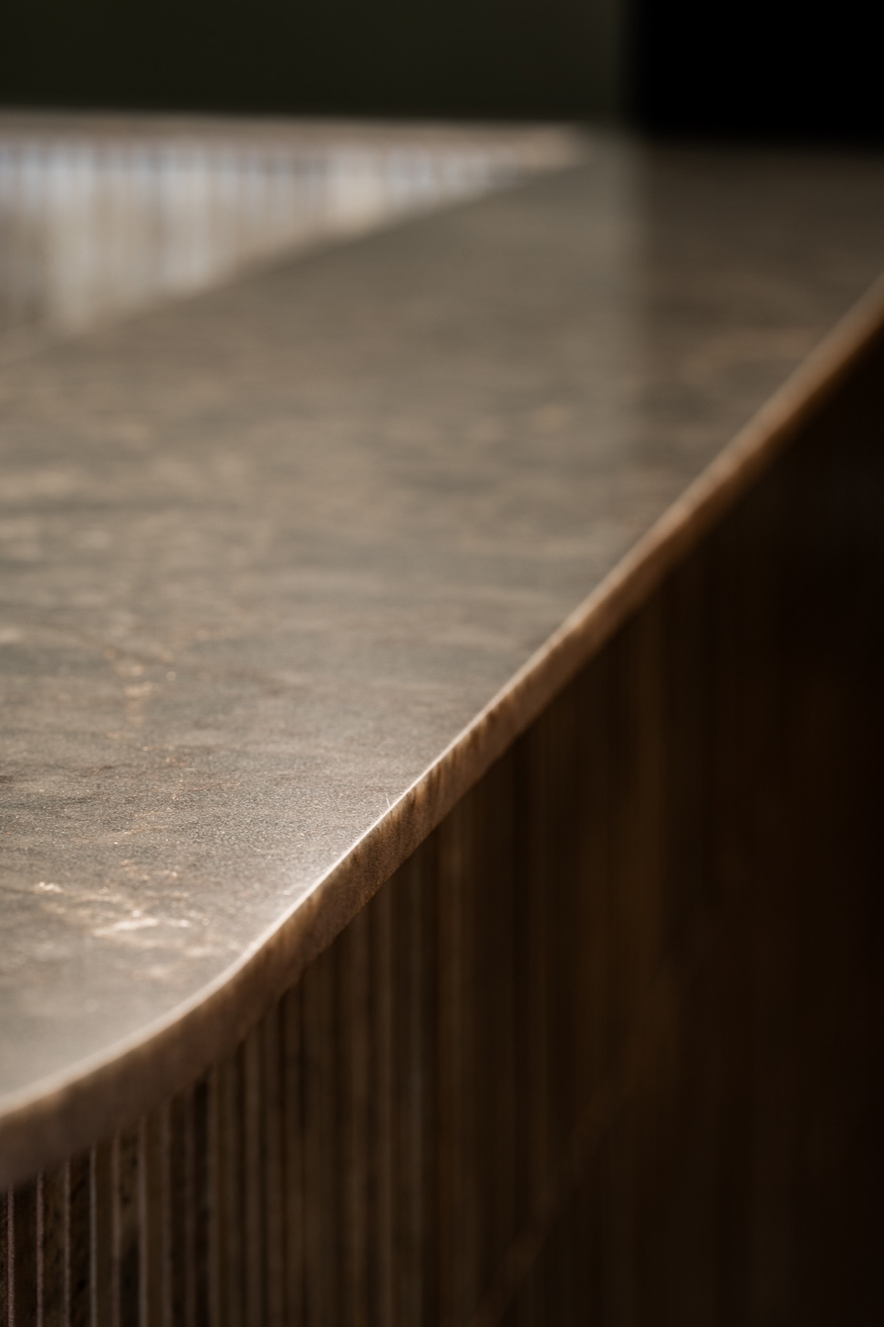
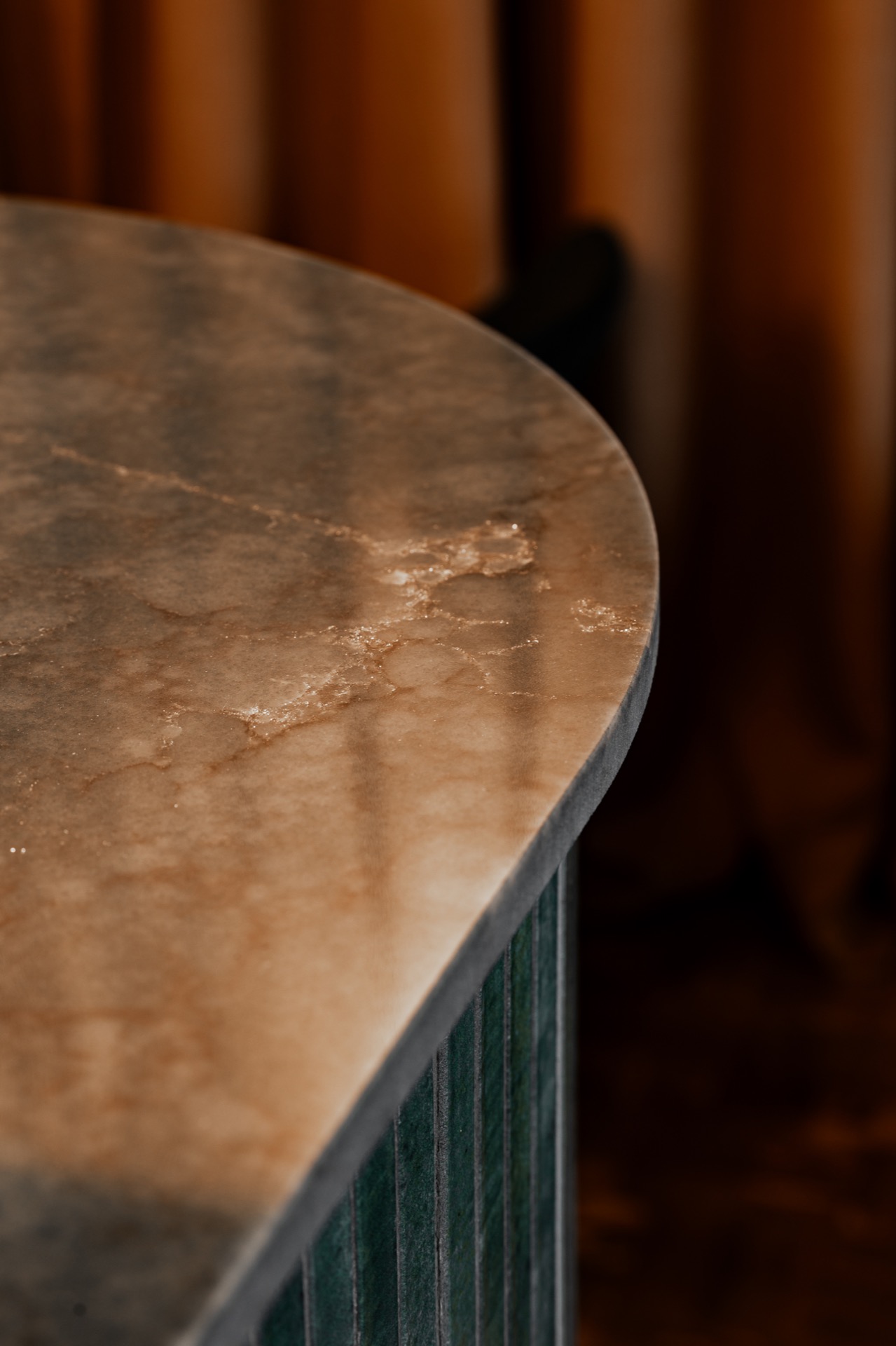
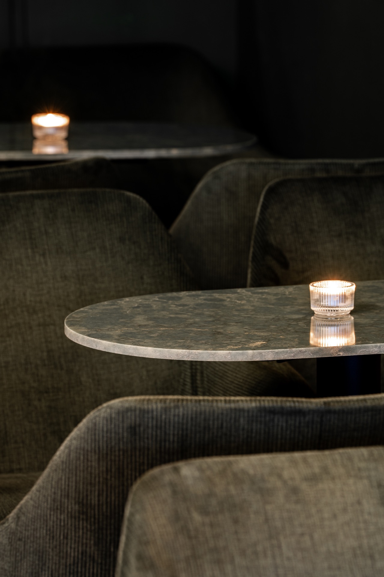
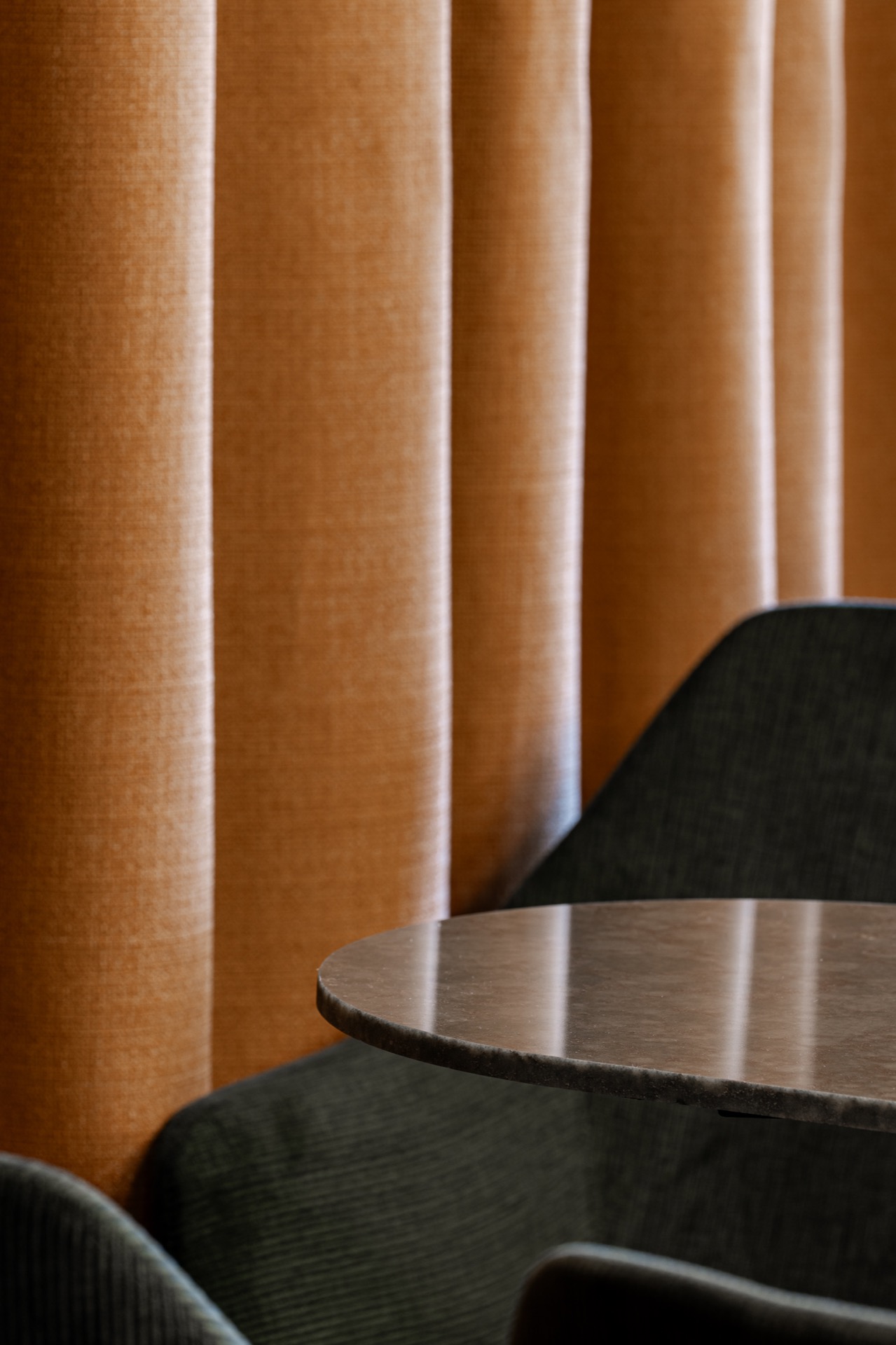
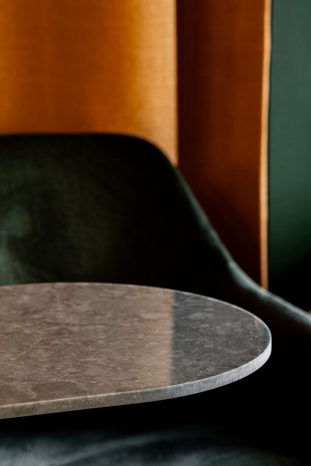
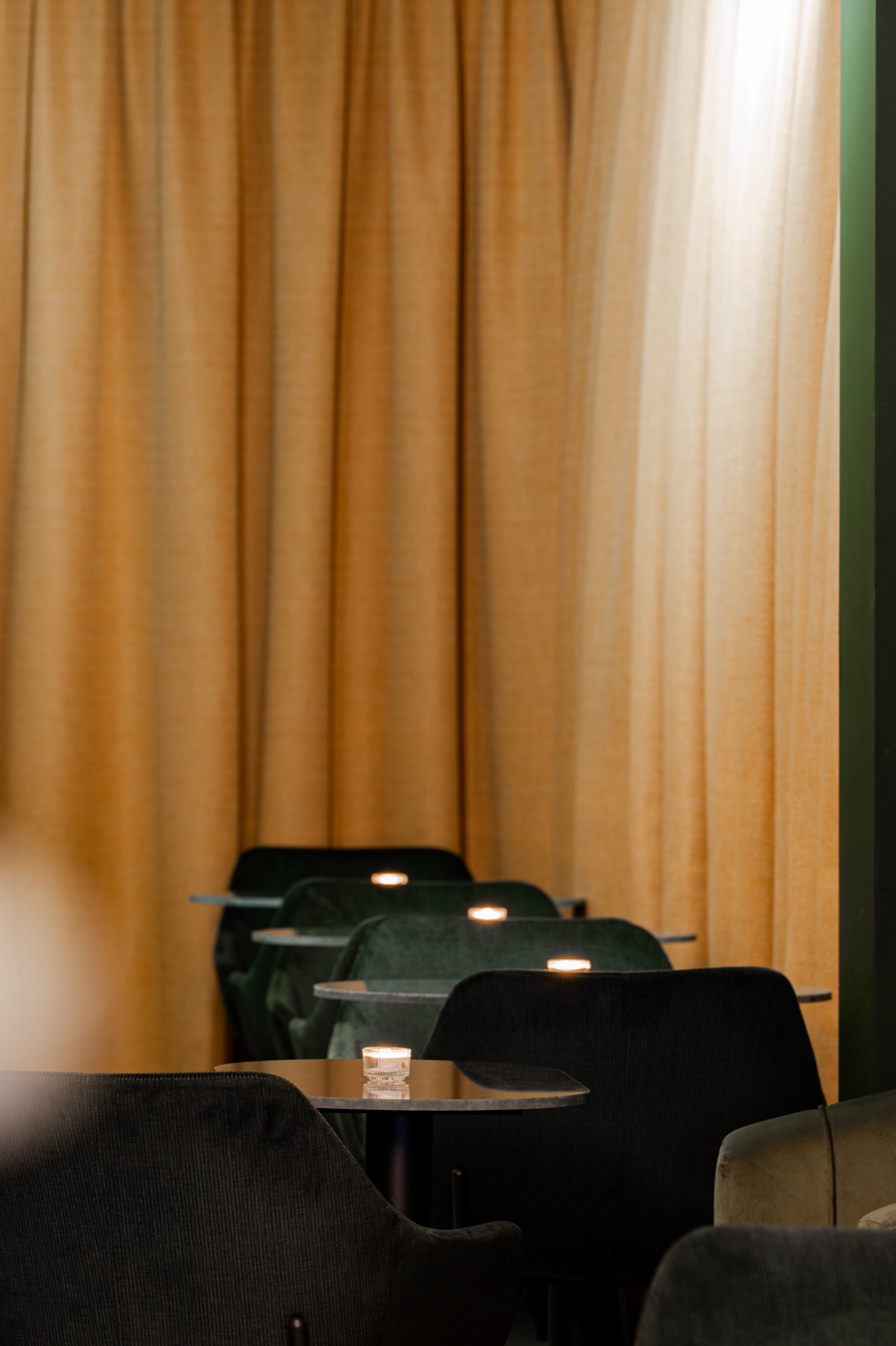
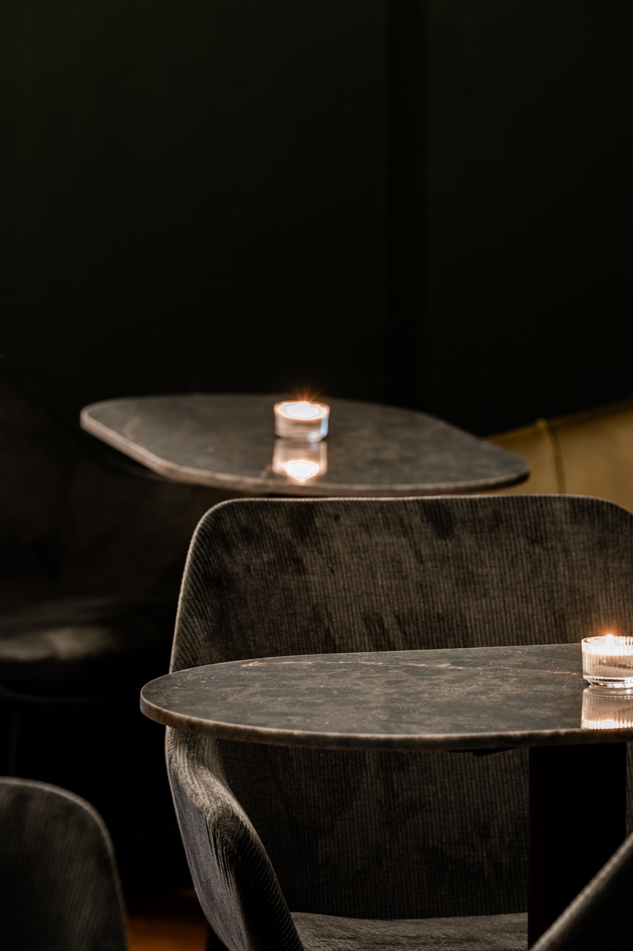
Against that green base, the furniture stays visually quiet. Grey upholstery keeps the chairs from competing with the walls, and the round tables cut a softer line through the space. A stone-look bar top and matching table surfaces add another layer of texture, with visible veining and a slight sheen that shows up especially where the light hits the curves. The materials do not try to hide themselves; they register as part of the composition.
Yellow contrast where the room needs a cut
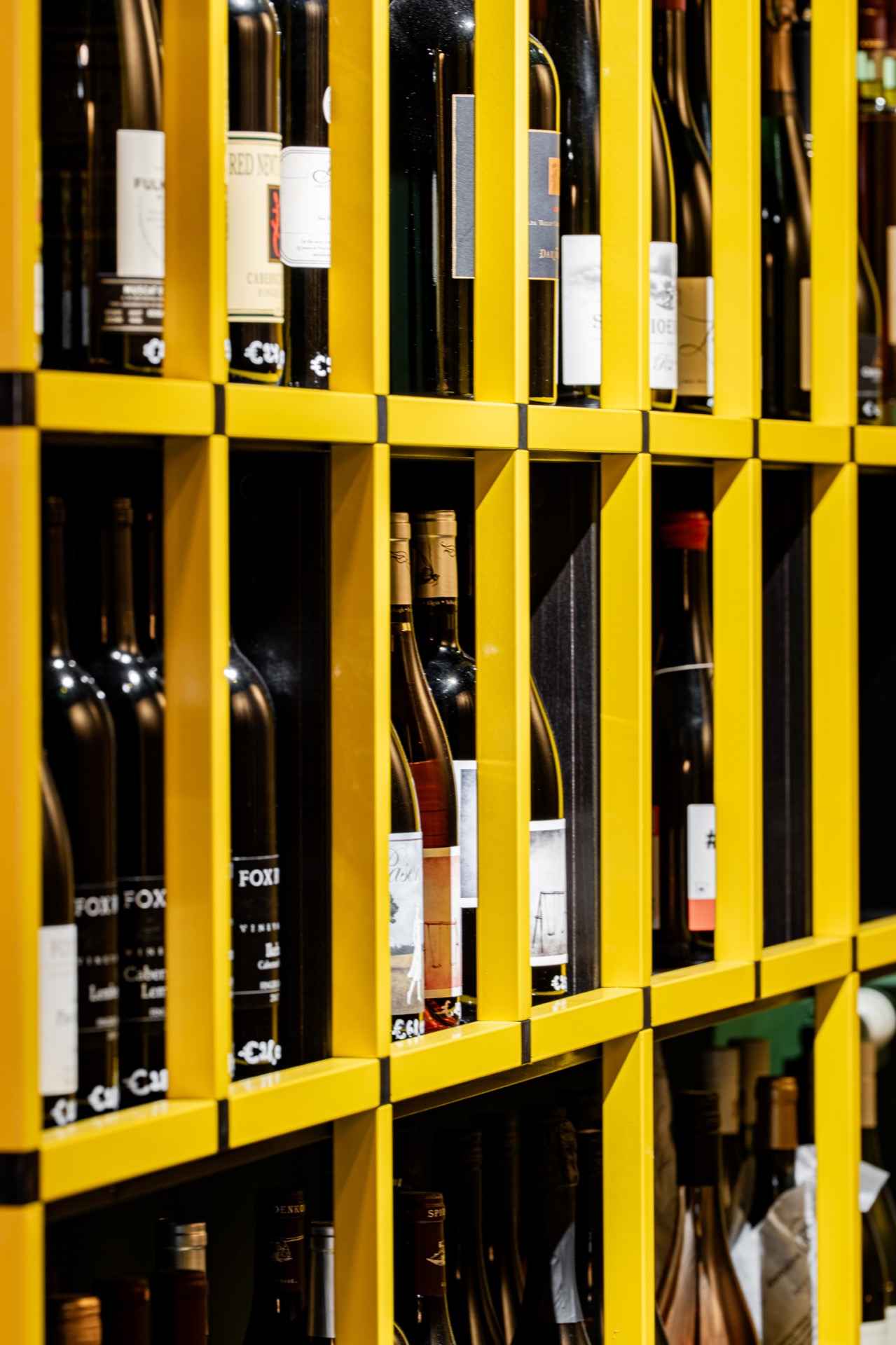
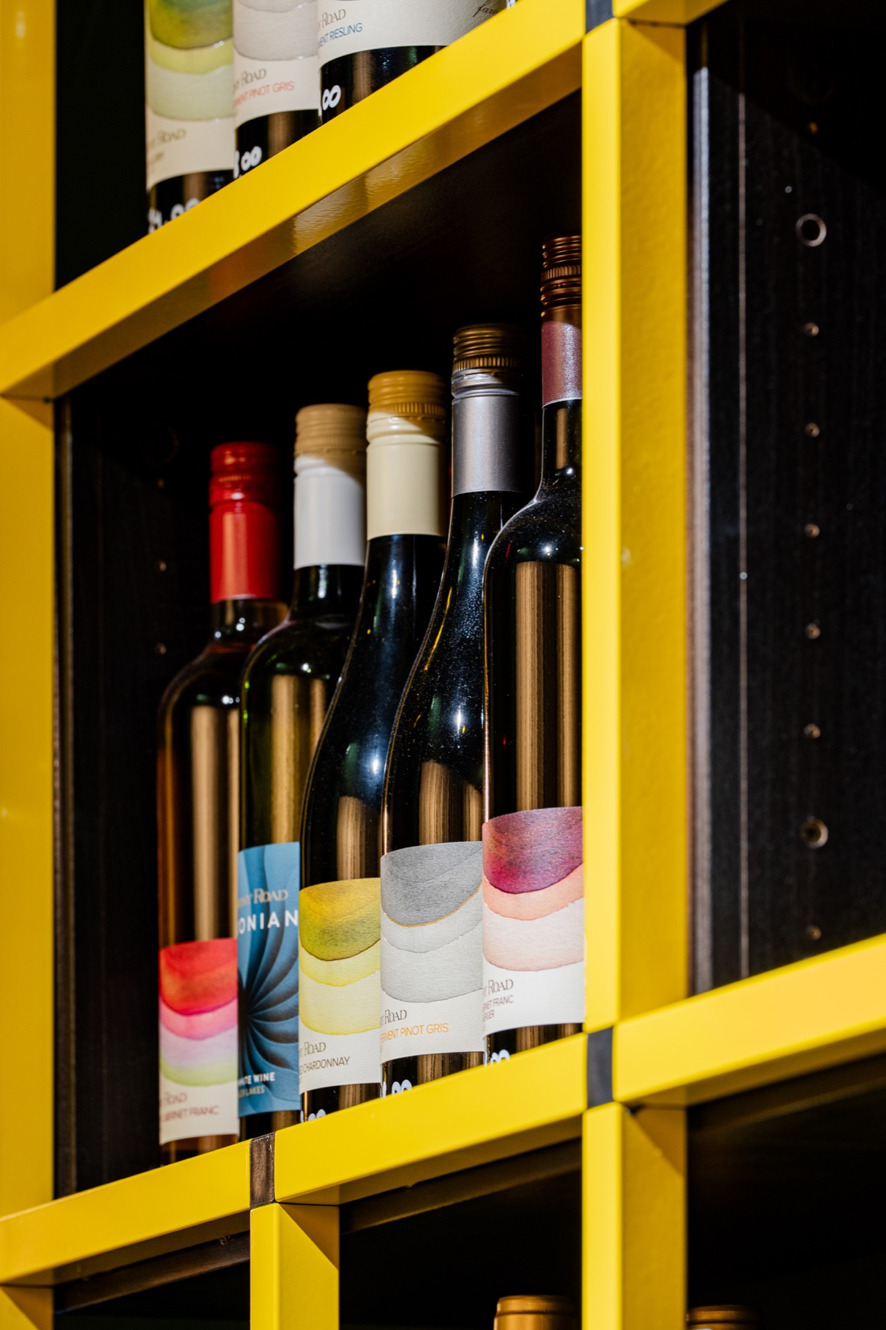
The yellow accent niche is the sharpest interruption in the interior. Set into the darker structure, it works as a small storage and display field with a strong graphic outline. The open compartments hold bottles and create a grid that reads from across the room. Because the yellow sits inside the green envelope, it feels deliberate rather than decorative. It gives the wine bar interior a point of focus without taking over the wall.
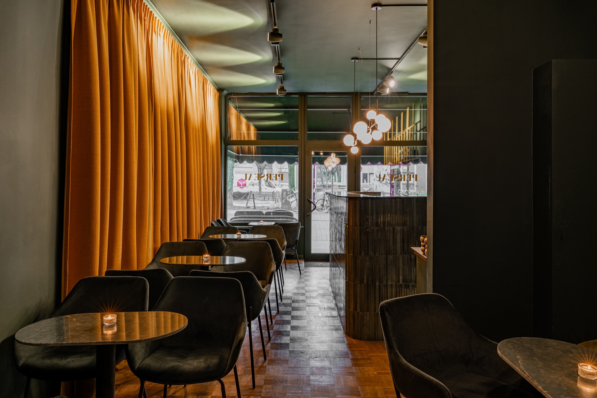
That colour shift is reinforced by the warmer surfaces around it. Orange curtain panels hang in long vertical folds and break the hard edges of the architecture. They do not behave like a background textile only; they filter the view, soften reflections and add a slower rhythm along the wall. Together with the yellow niche, they introduce a warmer register that lifts the otherwise dark green wine bar palette.
Warm dim lighting above the tables
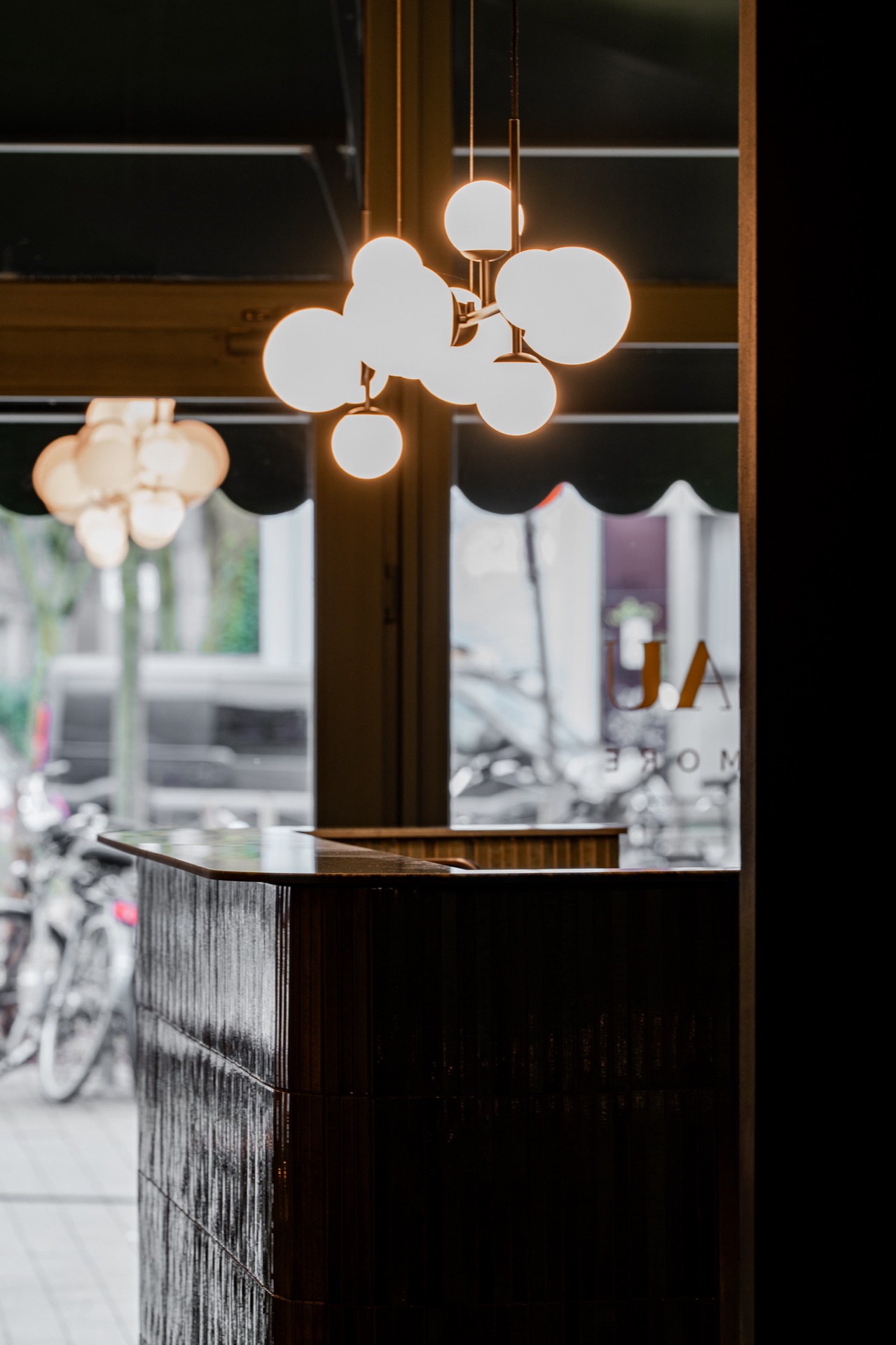
Lighting is kept low and layered. A circular fixture with several round points hangs above the seating area, while smaller light sources pick up the bar edge and the surrounding surfaces. This warm dim lighting matters in a room intended for lingering. It keeps faces and tabletops legible without turning the interior bright. Glass, stone and painted wall planes each catch a different amount of light, which helps the space read in depth rather than in one wash.
The lighting also supports the luxury wine bar ambience without making the room feel staged. There is enough brightness to read the grain in the stone-look tops and to separate the chairs from the floor, but not enough to flatten the colour. Shadows remain visible under the tables and along the curtain folds. That softer contrast is what gives the room its slower tempo.
Wine bar acoustics shaped by material and layout
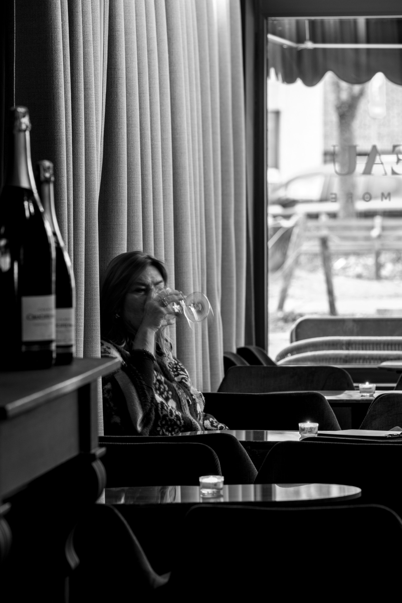
Attention to wine bar acoustics runs through the project in a practical way. The room is not described as acoustically isolated; instead, the material choices and the layout are used to keep sound from becoming too sharp. Upholstered chairs, heavier curtain panels and the division between bar and seating all help to reduce the sense of hard reflection. In a wine bar, that matters as much as the visual palette, because conversation has to sit comfortably inside the room.
The layout leaves enough distance between the main seating zone and the bar so that each part keeps its own role. The tables sit within the darker envelope, while the counter and storage elements remain more architectural. That separation gives the room order without making it rigid. You can read where to sit, where to stand and where the bottle display begins, all from the way the surfaces are arranged.
Stone-look surfaces with a practical role
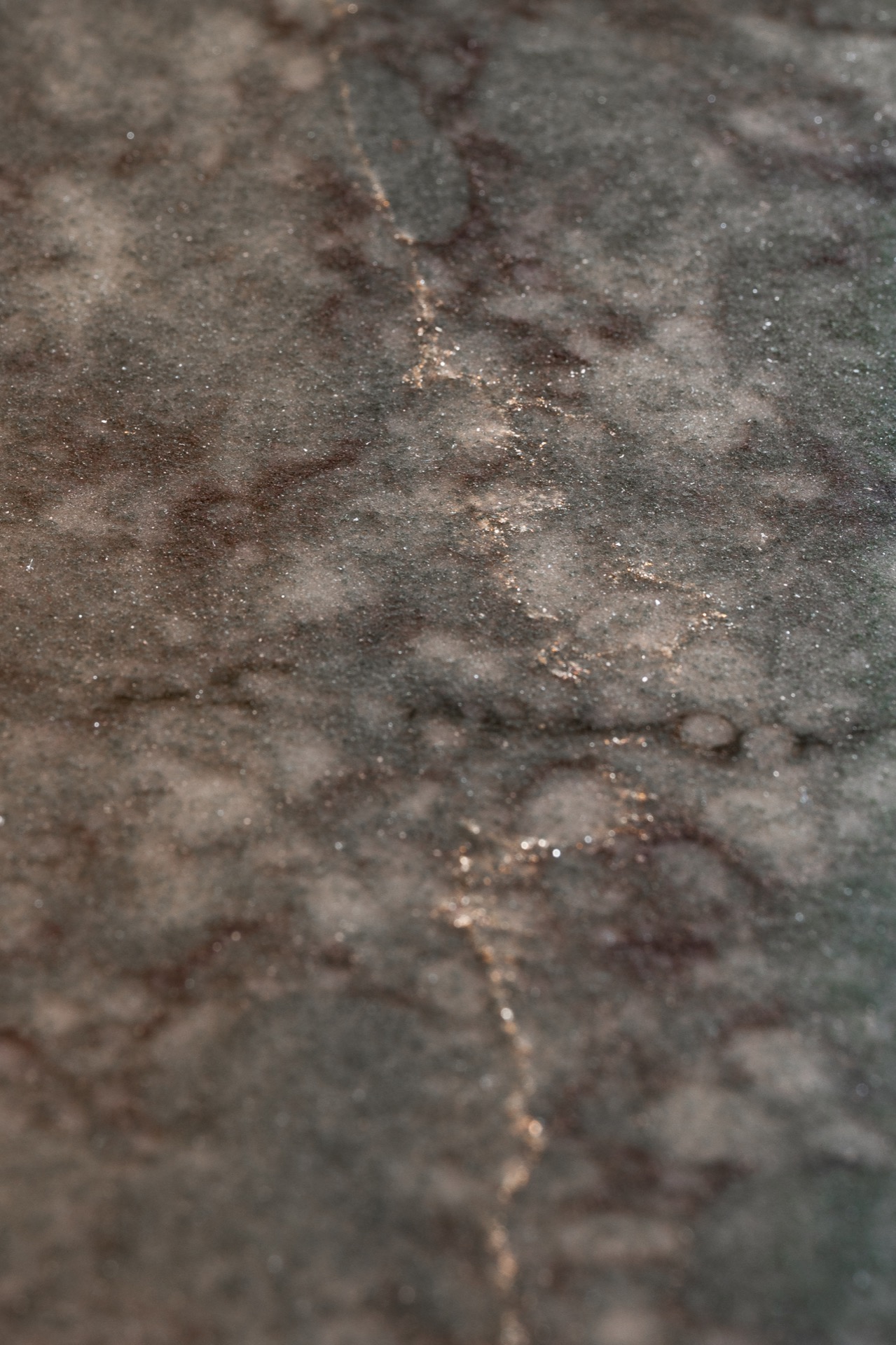
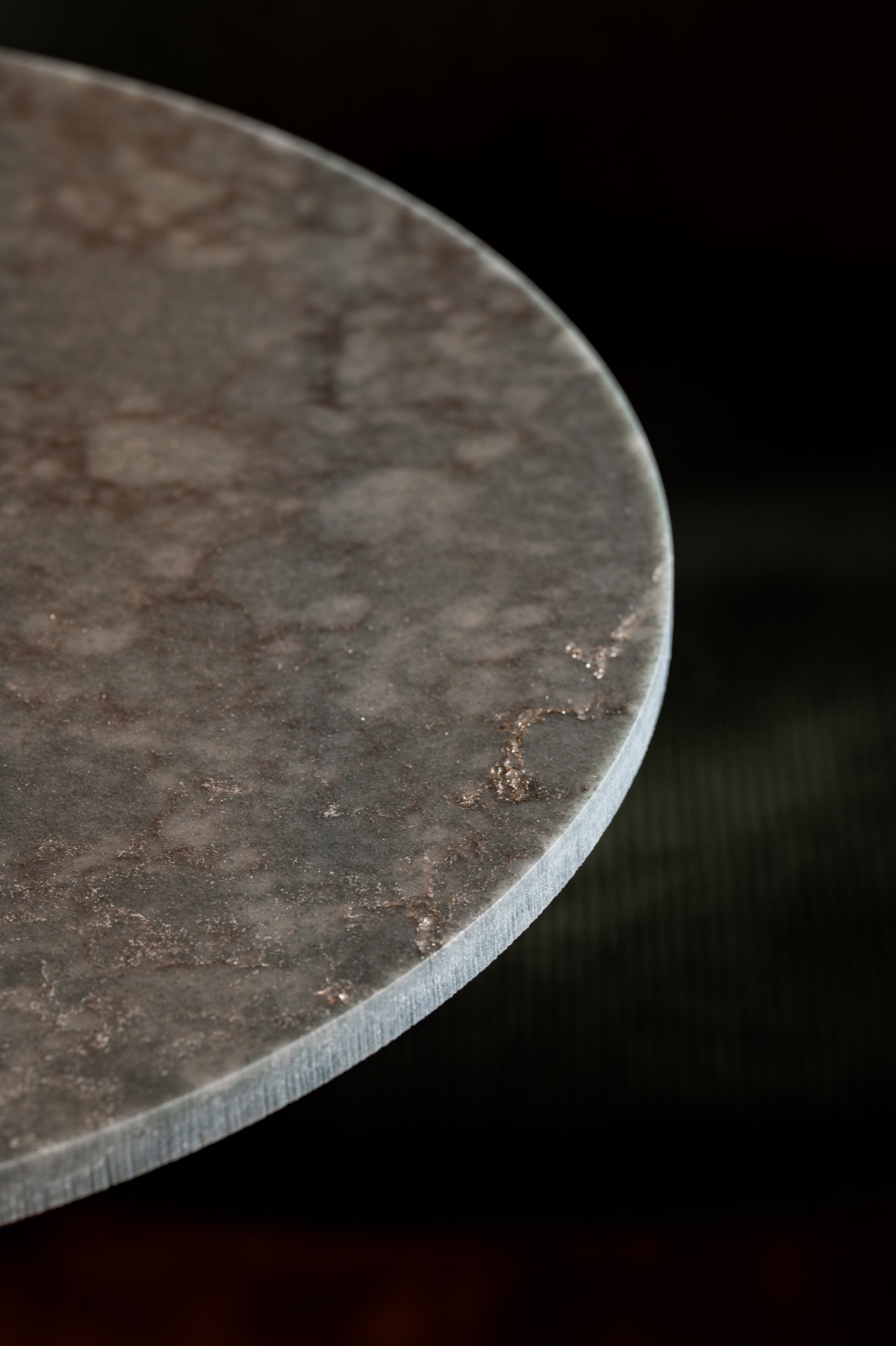
The bar top is more than a visual anchor. The stone-look surface has the kind of density that suits a hospitality setting where drinks are poured, placed and cleared all day. In the source material, the specified surface is noted for stain resistance and strength, which suits that use. The polished finish catches highlights along the rounded edges, and the surface veining gives the counter a grain that remains visible even in low light.
That same material language returns on the smaller tables. Their rounded profiles interrupt the straight lines of the wall and shelving, and the tops echo the bar without copying it exactly. Seen together, the counter and the tables create a consistent field of surfaces that can handle daily use while keeping the room visually calm. The choice is practical, but it also keeps the room grounded in one material family.
Furniture, storage and the route through the room
The furniture is arranged so the route through the wine bar remains easy to read. The seating stays close to the perimeter and along the glazed side, while the bar commands the deeper part of the room. This lets the yellow niche, the counter and the curtain line work like markers as you move through the space. Even in a compact hospitality interior, that kind of spatial clarity matters. It keeps the eye moving without adding noise.
Small shifts in texture carry the rest of the project. Wood appears in the lamel-like elements and floor, while the painted walls absorb the more saturated tones. The contrast between matte wall planes, glossy highlights and textured surfaces gives the room depth without relying on ornament. The wine bar interior is built from those transitions: from green to yellow, from curtain to wall, from stone to upholstery, from open seating to enclosed storage.
The overall effect stays close to the facts of the room itself. A dark green base, a yellow accent niche, orange curtain panels, warm dim lighting and stone-look surfaces do the main work. None of them acts alone. Together they create a wine bar interior that feels composed through material choice and proportion, with enough restraint to let the lighting, surfaces and acoustic decisions remain visible.
Want to see more of Cosentino België? View the page of Cosentino België for even more great projects and company information.



NEW 2026 Jubileum Edition The Best Interior Designers Benelux
Order Now €125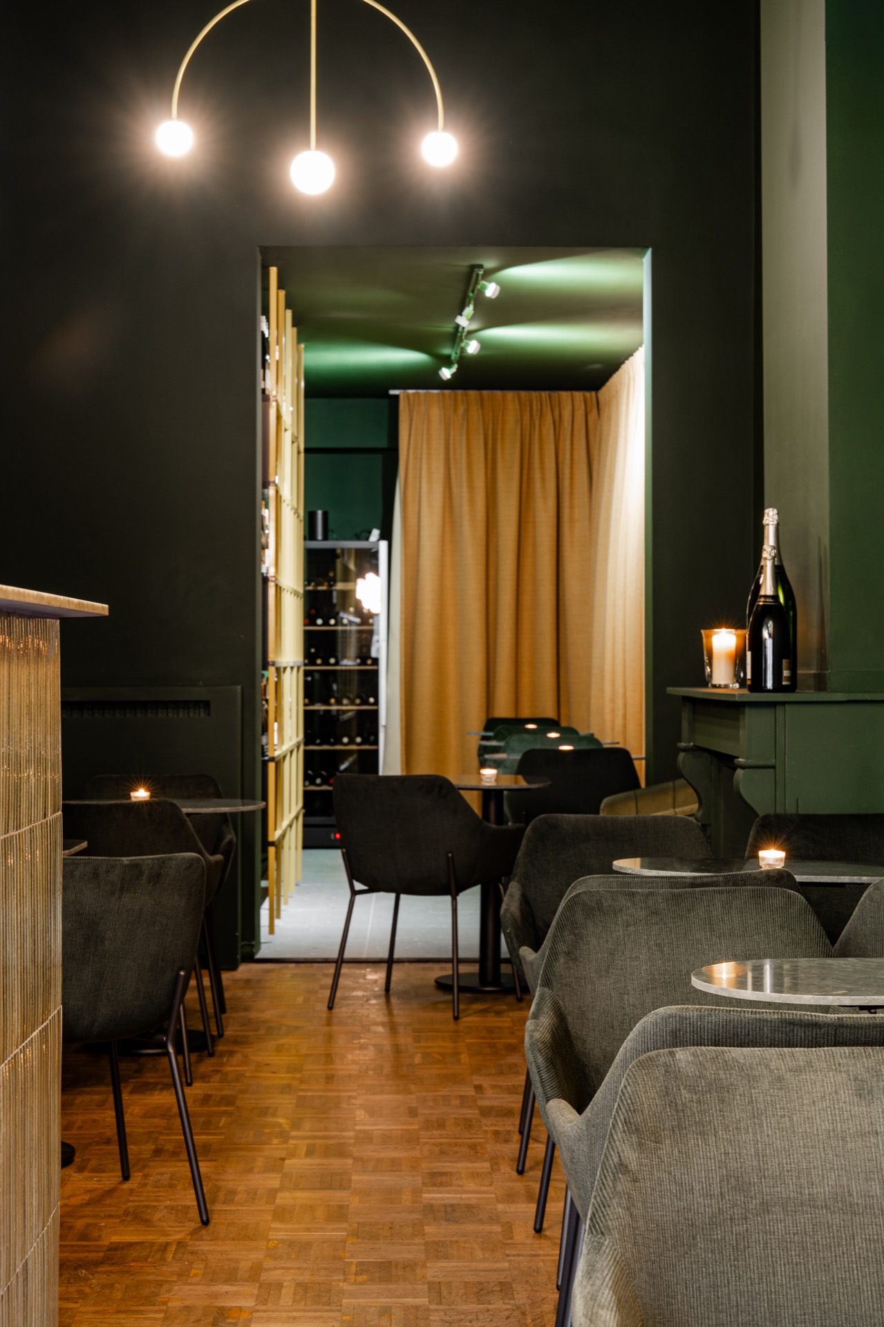
NEW 2026 Jubileum Edition The Best Interior Designers Benelux
Order Now €125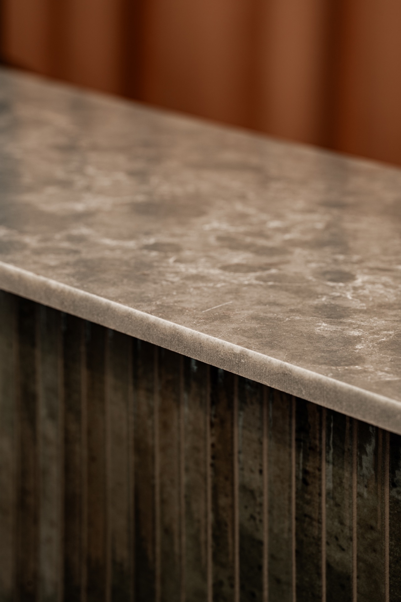
NEW 2026 Jubileum Edition The Best Interior Designers Benelux
Order Now €125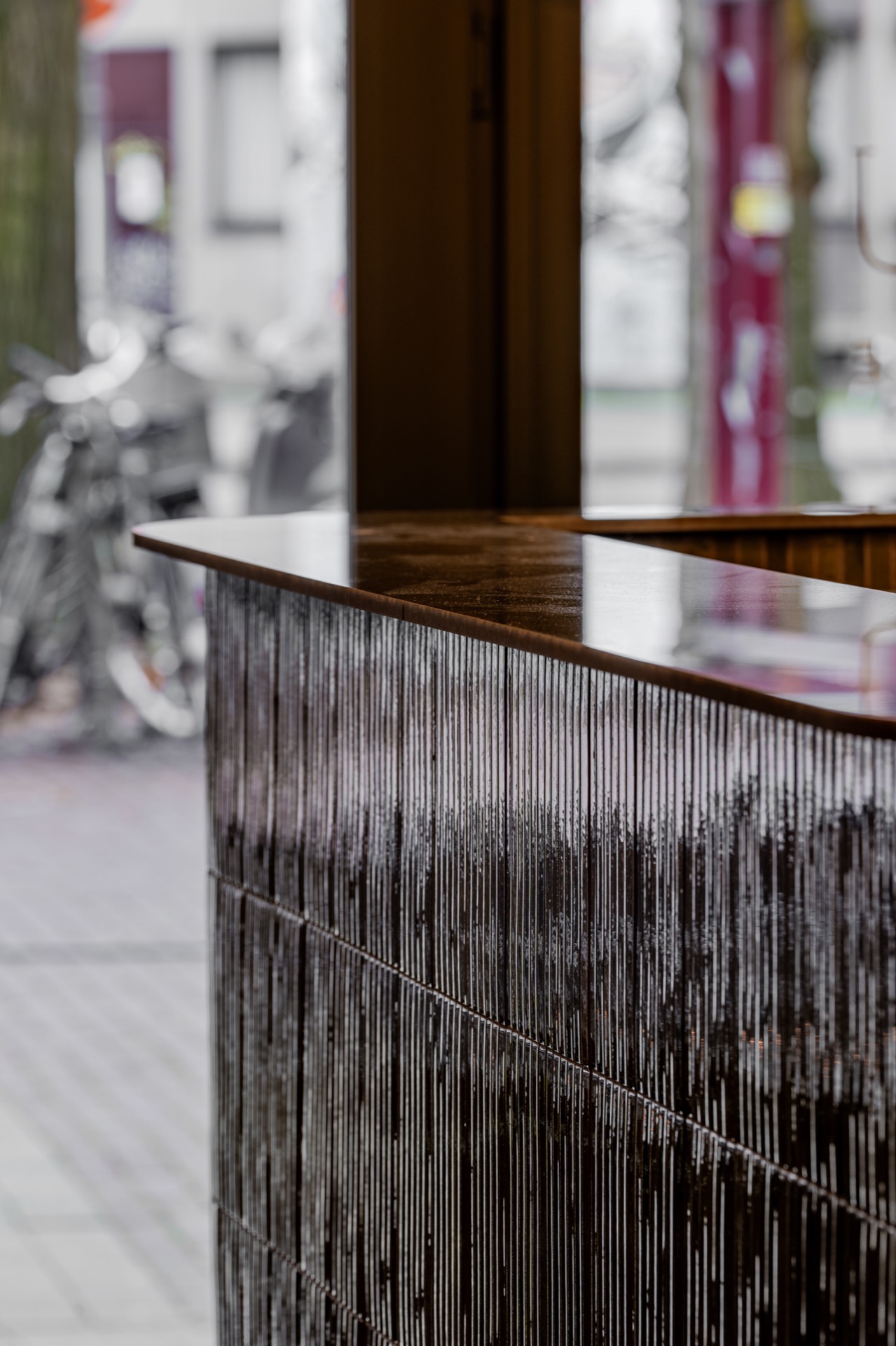
NEW 2026 Jubileum Edition The Best Interior Designers Benelux
Order Now €125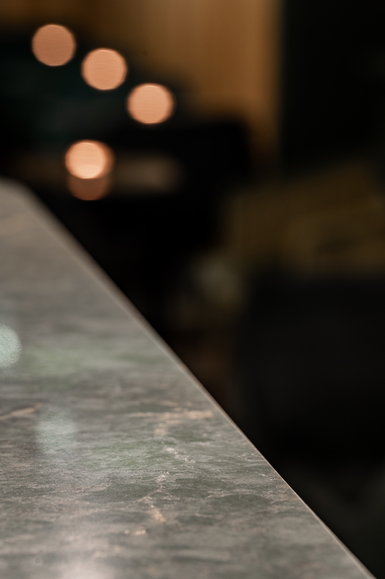
NEW 2026 Jubileum Edition The Best Interior Designers Benelux
Order Now €125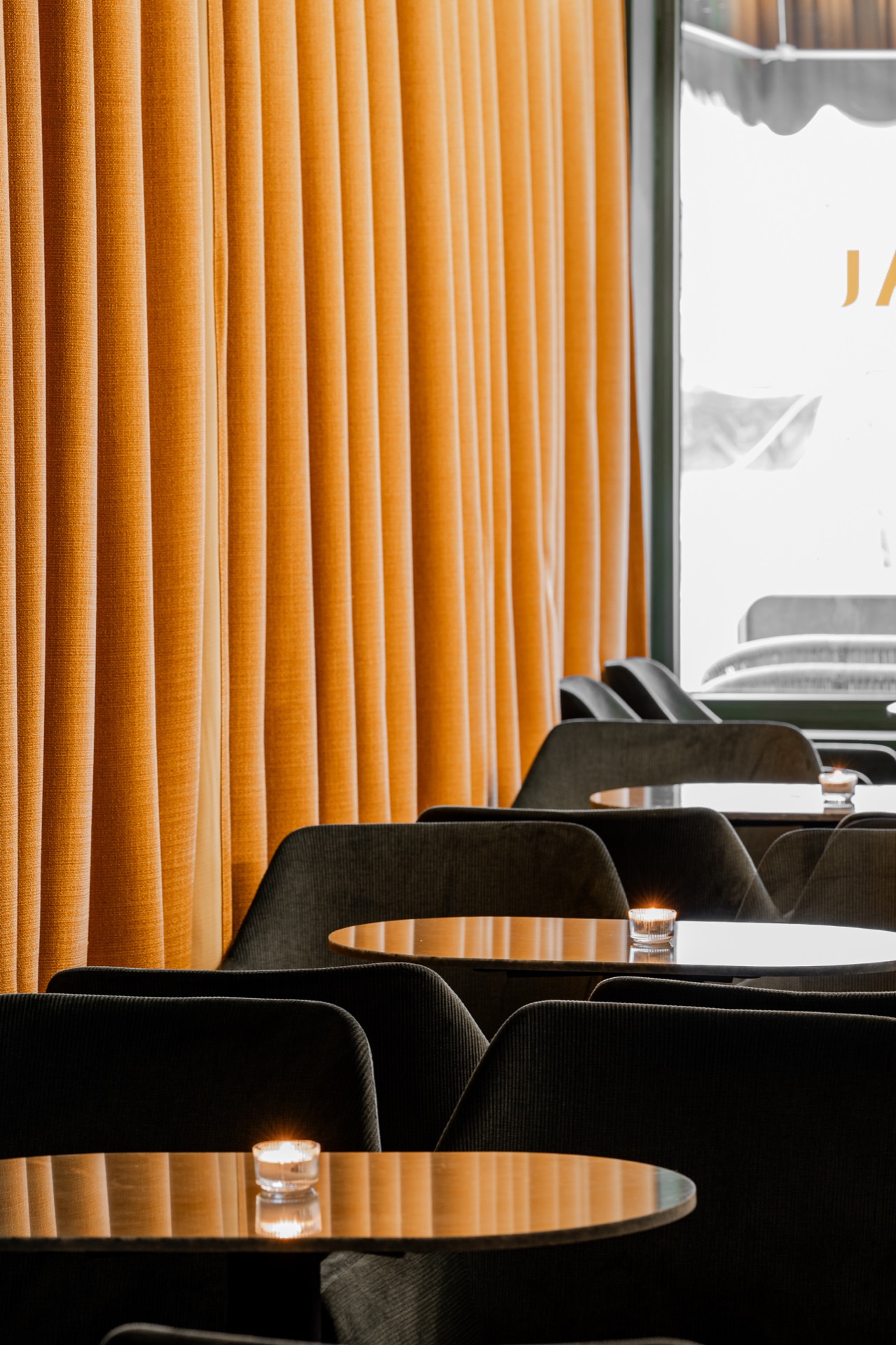
NEW 2026 Jubileum Edition The Best Interior Designers Benelux
Order Now €125