










Luxury modern interior project
Dark cabinetry, pale worktops and soft light set the tone before the rooms even open up. Across the sequence of spaces, the finish changes from reflective tile to wood, glass and painted surfaces, with each transition handled in a very direct way. It reads as a luxury modern interior project built through contrast rather than excess, with recessed spots, wall niches and clean edges doing most of the work.
Materials that stay close to the surface
Black, white and timber are the main threads running through the project. In the bathroom, the white bath and basin area sit against darker horizontal bands and tiled surfaces, while the kitchen uses dark fronts with a light countertop and stainless steel fittings. The result is not decorative layering but a clear reading of each zone. Surfaces are kept simple so the shapes, joints and light points remain visible. That restraint gives the luxury modern interior project its calm pace.
Several details rely on shadow rather than ornament. Built-in niches appear in walls and furniture lines, and the light inside them is tucked back from the edge so the opening reads as a cut in the wall. In other rooms, wood softens the harder finishes: a floor with a timber look, a paneled wall, a shelf, a bench edge. These elements are repeated across the project without becoming repetitive because the scale changes from room to room.
A bathroom arranged around light and a freestanding bathtub
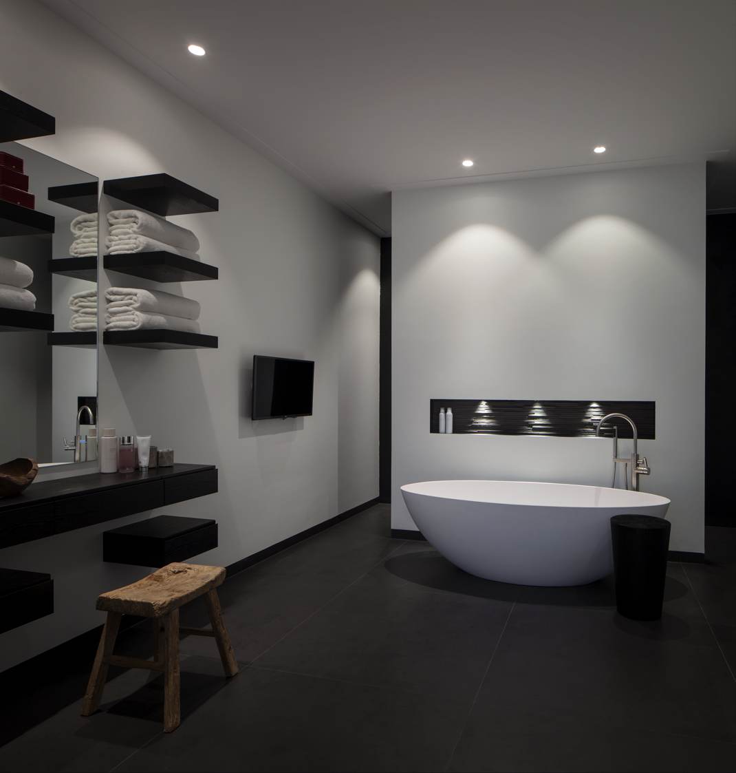
The modern bathroom is one of the clearest spaces in the project. A freestanding bathtub sits in front of a dark wall band, and the ceiling spots pick out the white surfaces around it. The bath is not isolated as an object; it sits within a wider composition of panel edges, wall-mounted fittings and straight lines. A second view shows the same room from another angle, with the tub, shower fittings and tiled wall held together by a narrow palette. The room feels precise because every line is easy to read.
Recessed lighting gives the bathroom its depth. The ceiling stays visually quiet, which makes the illuminated surfaces stand out more sharply. The basin area is handled in the same way: white planes, dark accents and metal fittings are kept clear of visual clutter. Rather than using a decorative finish to carry the room, the design depends on proportion and contrast. That makes the luxury modern interior project feel consistent even as the rooms change function.
Built-in details that keep the room ordered
Wall-mounted storage and narrow ledges reduce the need for loose objects. The built-in niches are especially effective in the bathroom because they sit flush with the surface and do not interrupt the wall plane. Elsewhere in the project, similar recessed details appear in furniture walls and under sloped ceilings, where upholstery and joinery follow the shape of the architecture. These smaller gestures matter because they keep the rooms open while still giving them places to hold light, objects and everyday use.
The kitchen keeps the contrast sharp
The modern kitchen uses the same discipline. Dark cabinet fronts run beneath a pale worktop, and the sink zone is cut into that lighter plane without extra decoration. A stainless steel tap stands out against the quiet surface. Nearby, the open-plan kitchen dining arrangement is marked by ceiling spots and a large pendant above the table, which gives the room a stronger centre without separating it from the rest of the interior. The kitchen reads as part of the whole, not as a stand-alone set piece.
What gives the kitchen weight is the combination of solids and reflections. The dark joinery absorbs light, while the countertop and metal fittings catch it. That difference becomes clearer in the closer detail shots, where the sink, worktop edge and tap are all visible at once. It is a compact composition, but not a cramped one. The lines stay clean, and the room can carry both cooking and dining without losing its order. In that sense, the modern kitchen is less about display and more about control.
Living spaces shaped by wood, glass and window rhythm
The living room shifts the mood without changing the language. Large windows bring in daylight, and shutters or blinds break that light into horizontal bands across the glass. A grey sofa, a low table and a rug sit against a floor with a timber look, while darker furniture pieces anchor the seating area. The room stays quiet in tone, but the surface changes keep it from feeling flat. Timber, textile and glass all work together through their texture rather than through color alone.
Another detail is the way the room opens and closes at the same time. Glass doors and black metal frames mark the transition to adjacent areas, while the window treatment controls how much of the outside light is admitted. This makes the space feel edited rather than open-ended. The living room inspiration here comes from the arrangement of views, not from decorative filling. Even a small object on the table or a spotlight on the wall feels considered because the backdrop is so clear.
Custom joinery and wall niches in the quieter rooms
Custom joinery appears in several parts of the project, often as built-in shelving or wall-mounted storage that follows the lines of the room. One detail shows curved lighting and a niche-like opening; another uses vertical wood texture beside a recessed light band. These features are not treated as focal points on their own. Instead, they support the room by holding books, objects or simply light. The indirect lighting works best where the architecture already has depth, because it lets the wall read in layers.
The bedroom continues that approach in a softer register. A large bed with upholstered detailing sits against a calm background, and the niche lighting near the headboard gives the wall a clear edge after dark. The floor has a wood tone that carries through from the rest of the interior, which helps the room feel connected without repeating the same materials too literally. Even here, the project keeps its contrast between smooth and tactile surfaces.
A staircase that keeps the line moving
The staircase detail is handled with the same clarity as the rooms. A white balustrade frames the run of the stairs, while the timber treads bring in a warmer note underfoot. Wall lighting nearby marks the vertical plane and keeps the edge of the stair visible. It is a simple composition, but one that depends on proportion and finish. The balustrade, tread and wall light are all readable at once, which gives the stair a measured presence within the interior.
Viewed as a whole, the project moves through a series of controlled contrasts: dark and light, smooth and textured, solid and open. The luxury modern interior project never relies on one gesture for long. Instead, it shifts from freestanding bathtub to modern kitchen, from open-plan kitchen dining to built-in niches and staircase detail, always returning to the same clear language of surfaces, light and joinery. That consistency is what holds the rooms together.
Want to see more of Clairz Interior Design? View the page of Clairz Interior Design for even more great projects and company information.





NEW 2026 Jubileum Edition The Best Interior Designers Benelux
Order Now €125


NEW 2026 Jubileum Edition The Best Interior Designers Benelux
Order Now €125


NEW 2026 Jubileum Edition The Best Interior Designers Benelux
Order Now €125


NEW 2026 Jubileum Edition The Best Interior Designers Benelux
Order Now €125


NEW 2026 Jubileum Edition The Best Interior Designers Benelux
Order Now €125


NEW 2026 Jubileum Edition The Best Interior Designers Benelux
Order Now €125


