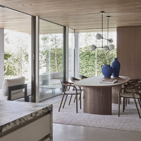
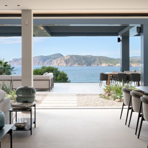
Modern classic kitchen-dining: integrated kitchen and dining area in a townhouse interior
The first thing you notice is the contrast: dark cabinetry against white walls, an oak-toned table on a pale floor, and a black pendant pulling the eye to the centre of the room. In this townhouse renovation, the modern classic kitchen-dining layout turns the kitchen into part of the dining room rather than a separate zone. The result is a living area with long sightlines, clear edges, and enough surface variation to keep the room from feeling flat.
Kitchen and dining room brought into one line
The kitchen integrated with dining area is laid out as one continuous space, with the work zone set against the wall and the table placed where it can catch the light from above. That move opens the centre of the room and gives the dining setting more presence. The transition is quiet but readable: cabinetry stays low and dark, while the dining furniture shifts to lighter oak tones and slim black frames. It is a straightforward arrangement, yet the change in materials makes the room feel edited rather than crowded.
Seen from across the space, the black and white kitchen interior depends on contrast rather than ornament. White plastered surfaces and ceiling details keep the room bright, while the darker joinery anchors the wall. A light worktop softens the cabinet run and reflects daylight back into the room. Because the finishes are kept restrained, the architectural details of the house remain visible instead of being covered over by new elements.
Ornate ceiling details above a clean-lined room
The ceiling carries decorative moulding, and that detail changes the mood of the room immediately. Instead of erasing the original envelope, the renovation leaves the ornament in place and sets it against a more pared-back kitchen installation. That contrast is most visible where the ceiling line meets the white wall surface and the dark furniture below it. The room therefore reads as both refreshed and retained, with the older details still doing part of the visual work.
The ornate ceiling modern style is handled with restraint. Nothing is overdescribed; the moulding simply frames the room and gives the light a surface to skim across. Ceiling spots sit discreetly within the white plane, while the black pendant adds a stronger shape over the table. Together they create a layered lighting scheme that supports cooking, dining, and evening use without filling the room with unnecessary fixtures.
Oak tones, dark joinery and a table that sets the pace
Oak tones run through the space in the floor and in the dining table, which brings a calmer register to the sharper black elements around it. The wood grain introduces movement underfoot and at table height, so the room does not rely only on paint and cabinetry for texture. In a setting this clear, even small changes in tone matter: a lighter tabletop, a darker base, a black chair leg, a pale wall.
The oak-toned kitchen dining arrangement is strongest where those materials are seen together in one view. The cabinetry sits in a darker block, the table extends the wood note into the dining zone, and the floor ties both areas together. Rather than trying to hide the join between kitchen and eating area, the design uses it. The shift from fixed joinery to freestanding furniture gives the room a practical rhythm that suits daily use.
A wall niche that breaks the cabinet run
One of the clearest custom details is the kitchen wall niche with open shelving. Set into the darker run of cabinetry, it breaks the surface and gives the wall a place for display and light. The niche is small, but it changes the read of the whole composition because it interrupts the heavy block of storage and introduces depth. In close-up, the shelf edges, the surrounding joinery, and the lighting all become part of the same composition.
The open shelf wall with lighting is not treated like decoration for its own sake. It offers a practical ledge, but it also catches light and creates a pause in the wall. In a room that already depends on crisp lines and strong tonal contrast, that kind of insertion matters. It gives the kitchen a measured point of detail without disturbing the calm between the work area and the dining table.
A statement pendant above the table
Above the dining table, the black pendant has the strongest graphic presence in the room. Its radiating frame reads almost like a drawing suspended in space, and it stands out against the pale ceiling. Because the table below is kept relatively simple, the light fitting becomes the main vertical element in the dining zone. It marks the centre of the room and gives the table a fixed point within the larger open plan.
The statement pendant above dining table also works as a bridge between the classical and the contemporary sides of the project. The ceiling moulding is present, but the lamp does not echo it literally. Instead, it adds a sharper line and a darker weight, which keeps the room from slipping into pastiche. The effect is direct: old details remain visible, but the new lighting asserts its own shape.
Small shifts in level, surface and shadow
Close details show how much this room depends on surface. The plaster around the ceiling edges catches shadow. The cabinet fronts sit flatter and darker. The worktop lightens the centre of the kitchen wall. Even the pendant throws a patterned shadow that changes as you move around the table. These are modest effects, but together they keep the room from feeling static.
In several views, the sightline runs from the kitchen wall past the table and into the rest of the room, so the layout can be read at a glance. That is where the renovation feels most considered: not in a dramatic gesture, but in the way the kitchen integrated with dining area allows the furniture, the joinery, and the preserved ceiling details to remain legible at the same time. The room holds its shape because each part has a clear role.
The completed interior is built from a small number of well-chosen contrasts: black against white, smooth against textured, fixed joinery against a freestanding table. The result is a modern classic kitchen-dining space that looks composed without becoming formal. It is roomy enough for daily life, but the most memorable elements are the ones that speak quietly—the moulding at the ceiling, the open niche in the wall, the pendant that hangs over the table and draws everything together.
For a closer look at related work, see townhouse interior renovation projects, custom kitchen and built-in joinery projects, interior finishing with ornate details, and interior lighting projects.
Want to see more of Inge van Poppel Interieurarchitectuur? View the page of Inge van Poppel Interieurarchitectuur for even more great projects and company information.



NEW 2026 Jubileum Edition The Best Interior Designers Benelux
Order Now €125


NEW 2026 Jubileum Edition The Best Interior Designers Benelux
Order Now €125


NEW 2026 Jubileum Edition The Best Interior Designers Benelux
Order Now €125


NEW 2026 Jubileum Edition The Best Interior Designers Benelux
Order Now €125


NEW 2026 Jubileum Edition The Best Interior Designers Benelux
Order Now €125