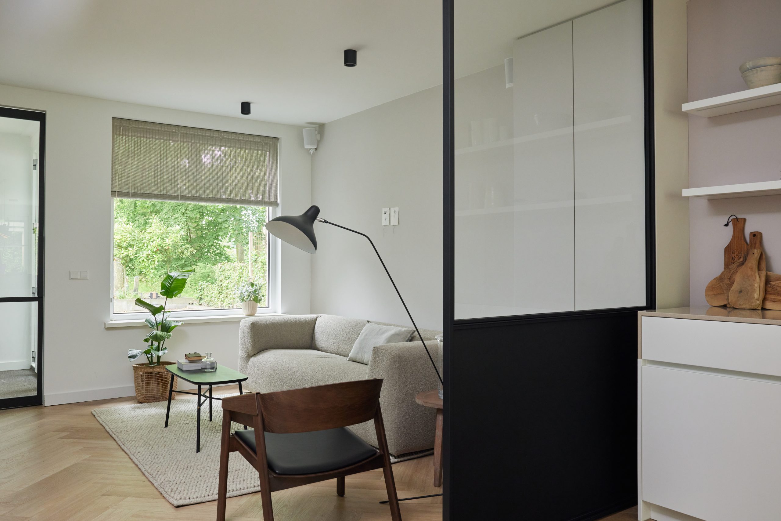
Renovated corner house with kitchen island
The extension pulls daylight deeper into the plan, but the first thing you notice is the kitchen island sitting right at the center of the house. In this long, narrow renovation, the cooking zone now anchors the route from front room to garden side. The sitting area stays at the front, the dining table shifts into the extension, and the kitchen connects them with a clear line of sight and a calm palette of off-white, nude and greige.
A kitchen island that reorganizes the plan
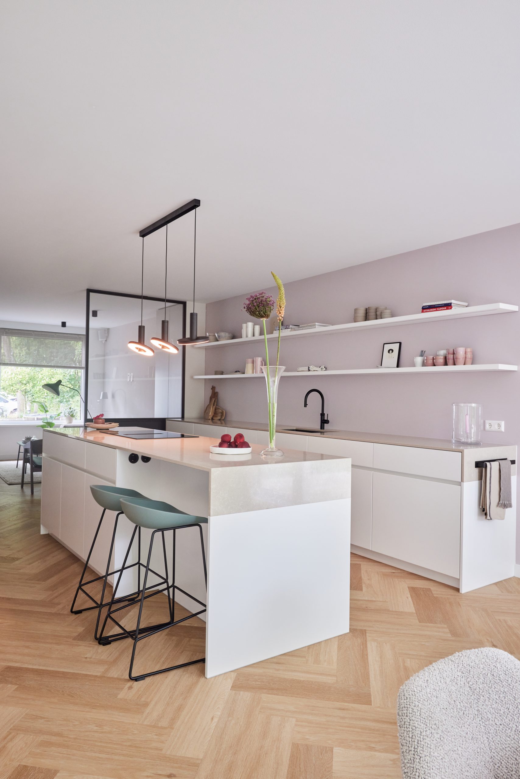
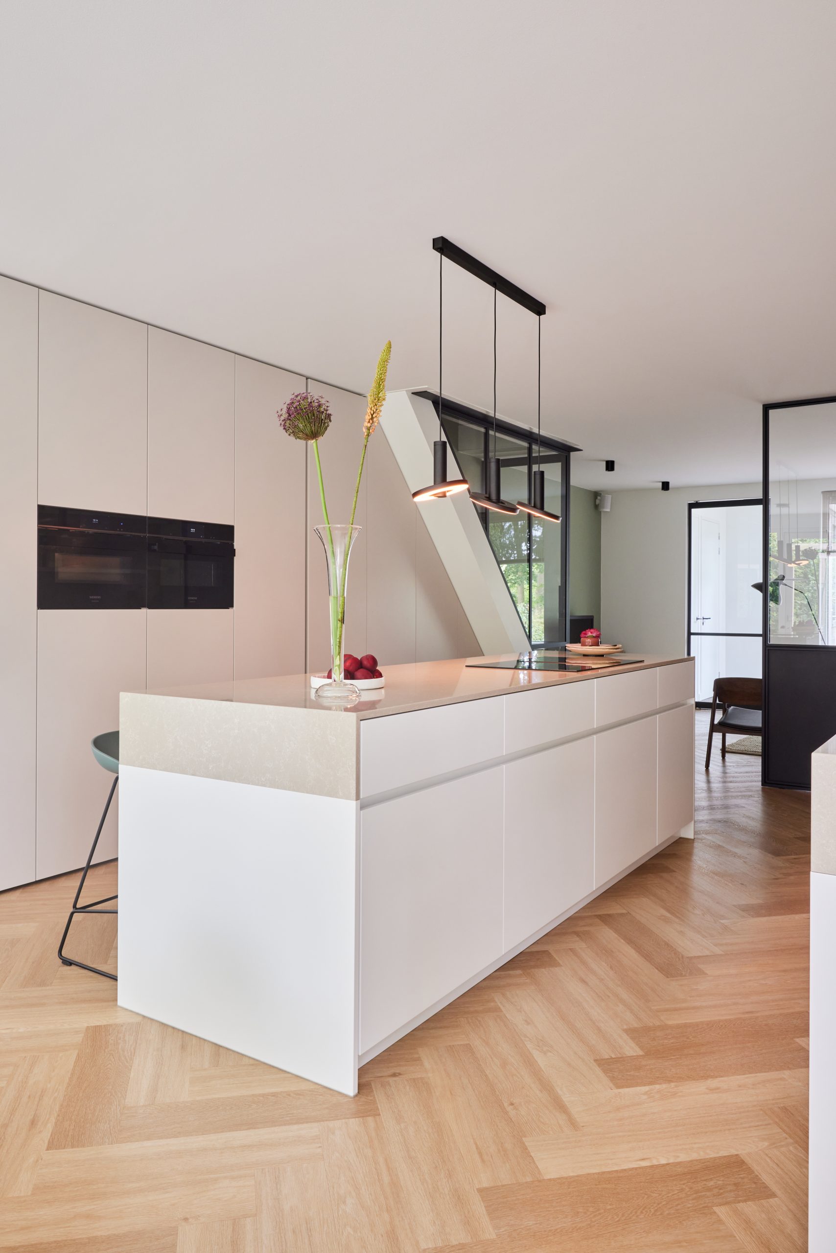
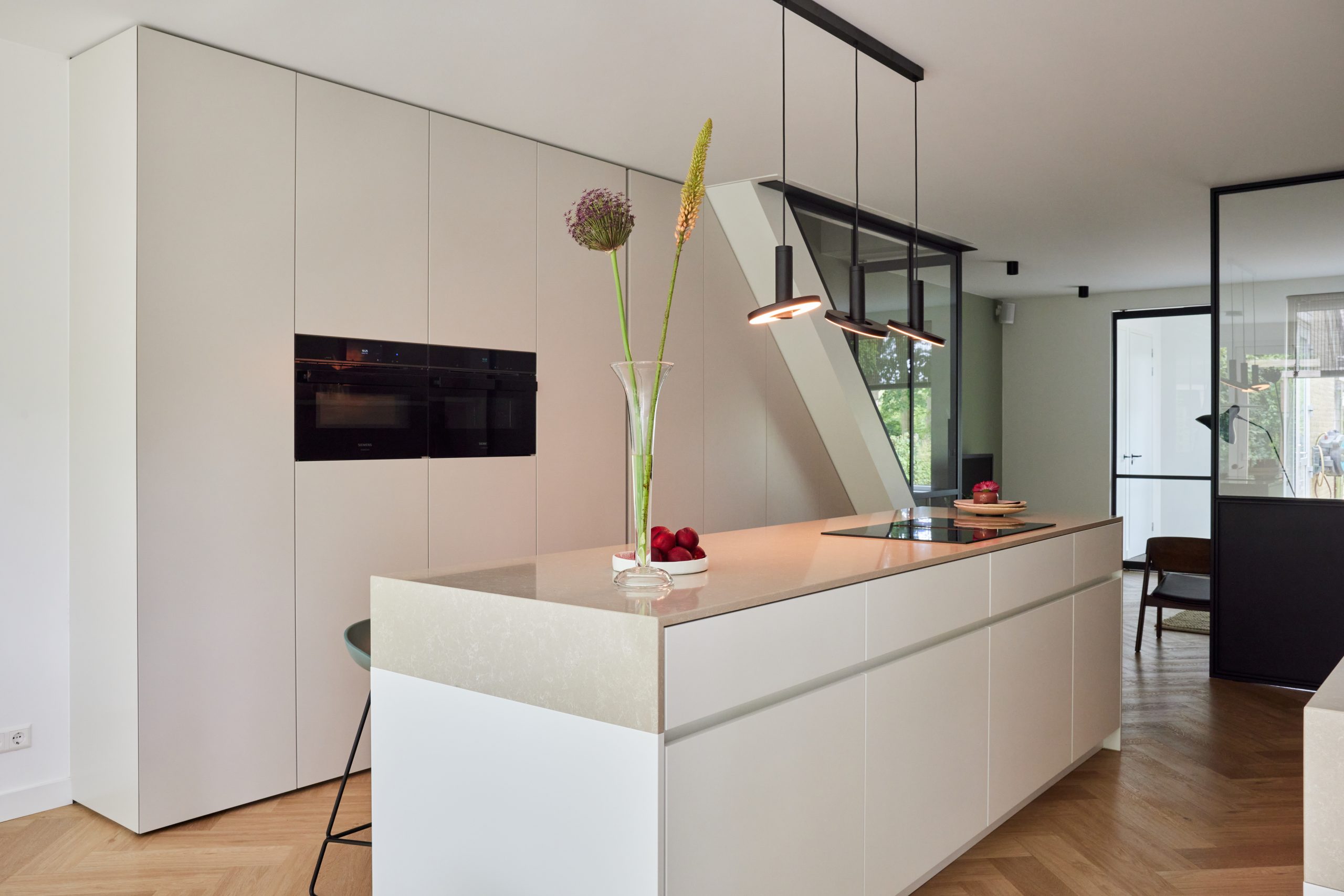
The kitchen island does more than define the room. It gives the whole ground floor a new point of orientation. Along the long wall, a very extended run of cabinetry follows the length of the house in a soft nude tone, while the island and its fronts are kept in off-white for a lighter read. The countertop detail is subtle but deliberate: thicker at the short end, slimmer along the long side. That change in profile gives the custom kitchen a measured, tailored character without turning it into a display piece.
Across from the island, the long wall is fitted with storage and appliances so the work surfaces stay open. The layout suits the narrow footprint because it keeps circulation free around the central block. From the front sitting area, the eye moves straight through the kitchen toward the glass at the back, where the extension opens the room toward the garden side. This is where the kitchen island becomes the hinge between everyday movement and the more settled dining zone.
Steel and glass between kitchen and living room
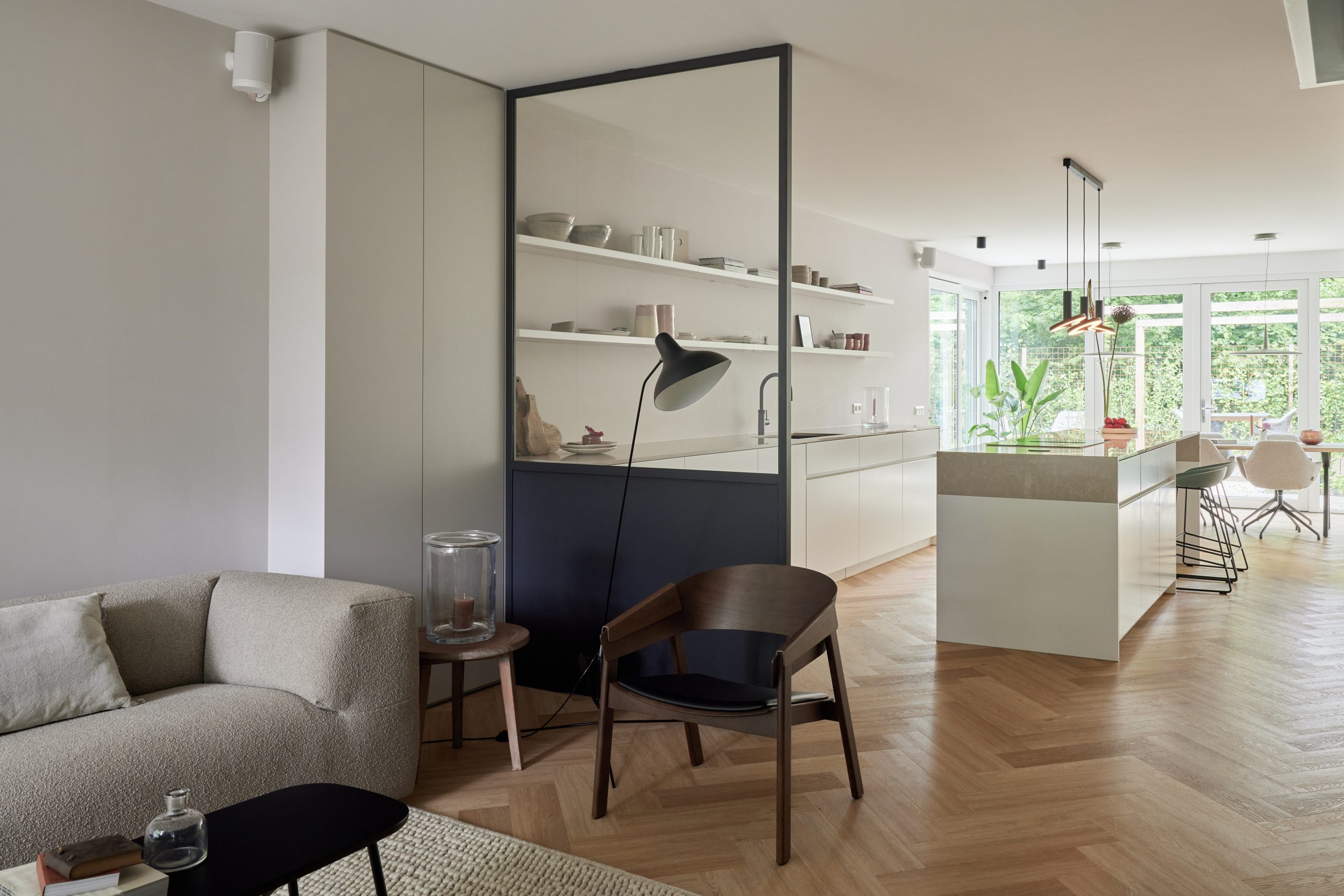
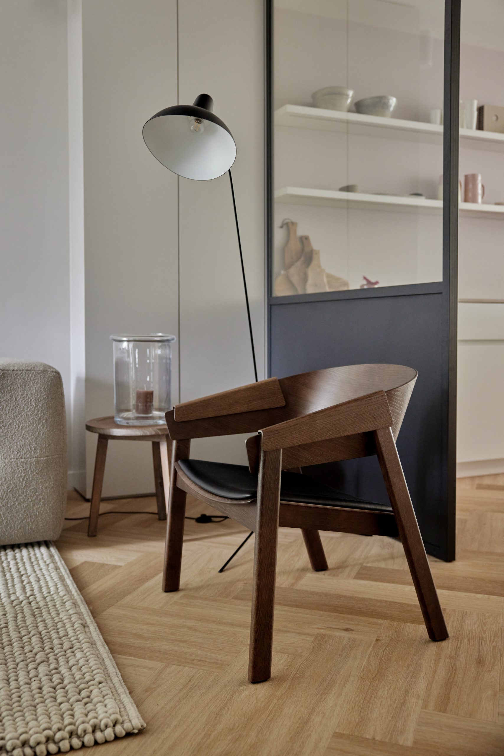
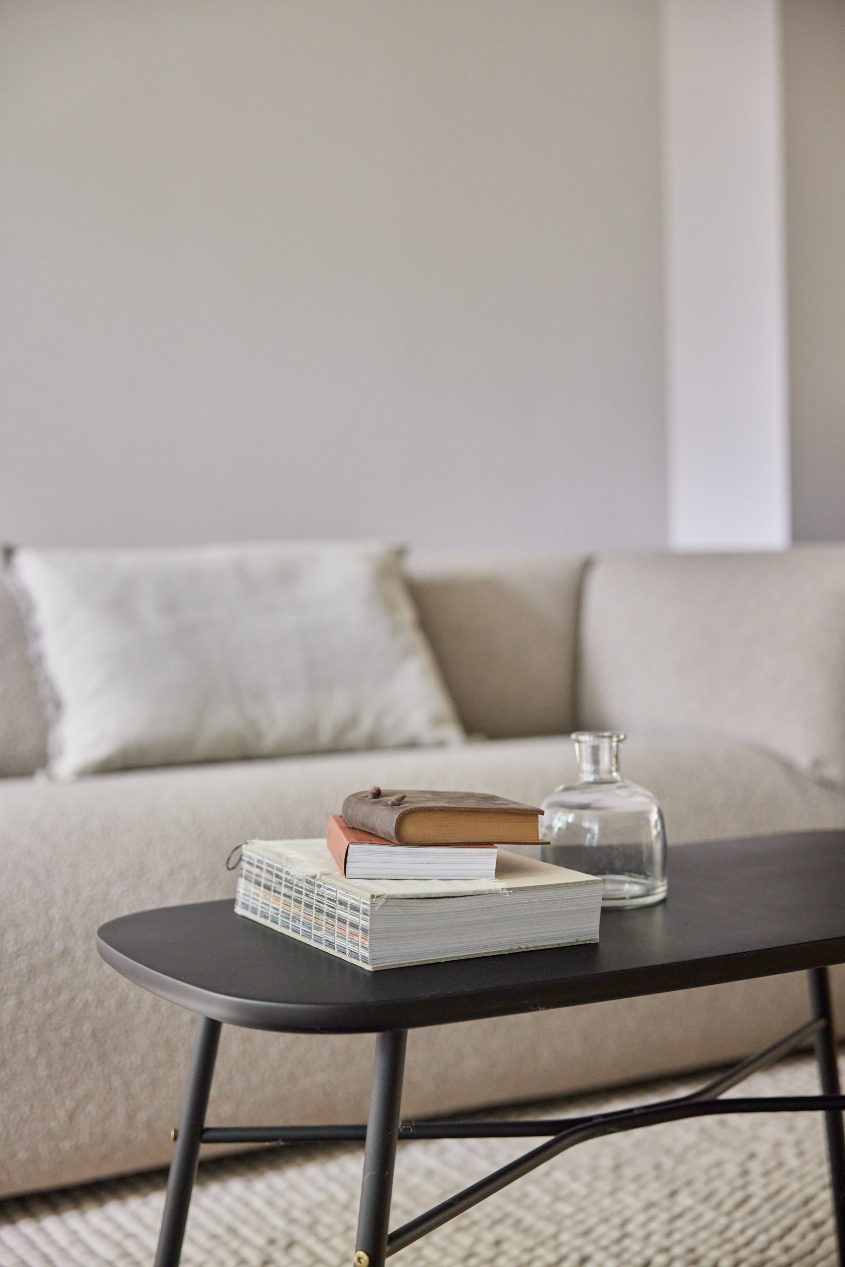
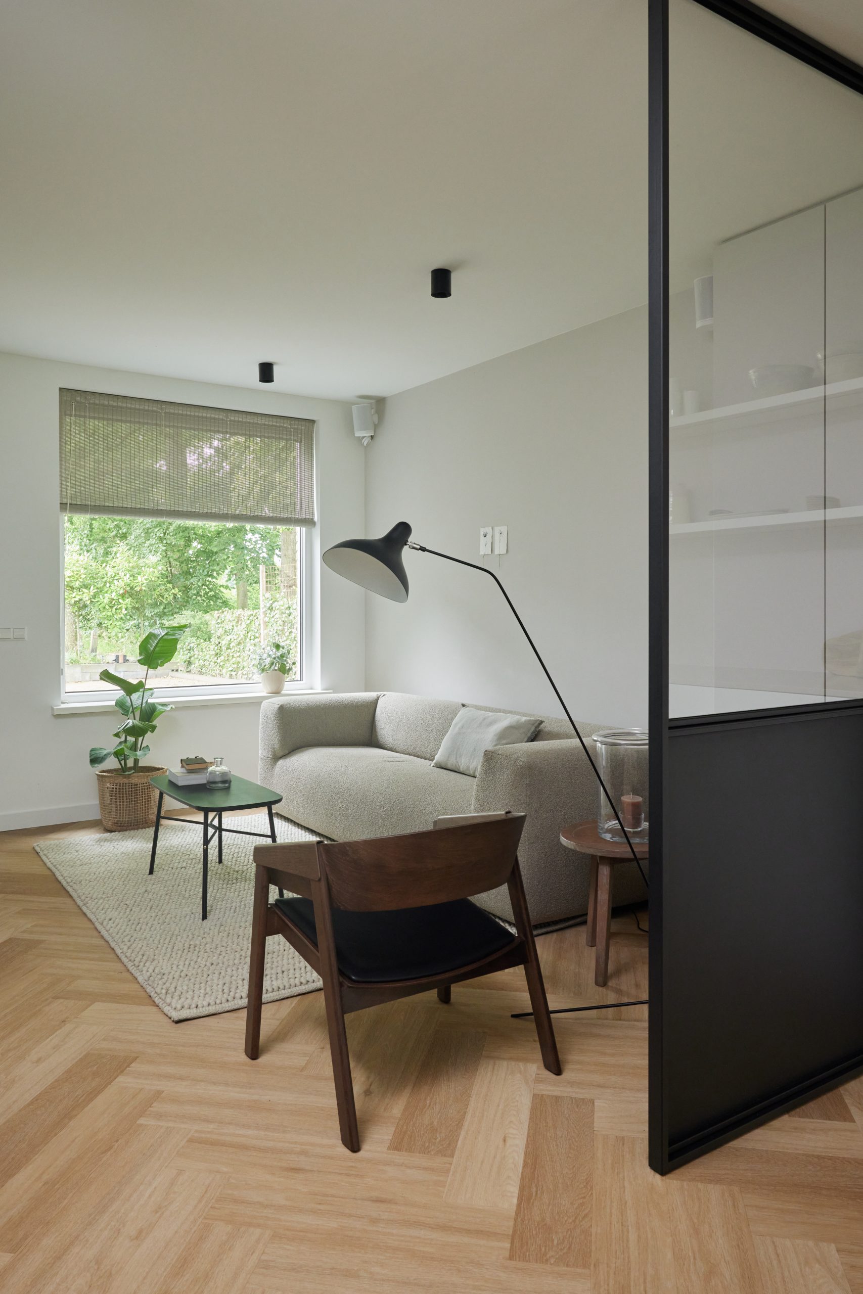
A steel glass partition wall separates the kitchen from the living room without cutting off the view. The black frame is visible, but the glazing keeps the two spaces in conversation. It works as a threshold rather than a barrier. In one direction there is the cooking island and the run of white built-in cabinetry; in the other, a lounge sofa and armchairs arranged for family use. The partition gives both rooms their own pace, while the sightlines stay open.
The integrated staircase sits in the middle of the house and becomes part of that same spatial order. A steel casing gives it a sharper outline, and the door leading to the first floor folds it neatly into the composition. Beneath it, a long greige storage wall contains appliances and cupboard space. The volume is practical, but it also cleans up the center of the plan, turning a difficult zone into a solid piece of joinery that helps the open plan kitchen living layout feel controlled rather than exposed.
Storage built into the center
Under the stairs, the cabinetry is not treated as leftover space. It stretches into a continuous wall, visually quiet and useful at the same time. The greige finish sits between the off-white fronts of the kitchen and the darker steel frame around the stair. That middle register keeps the transition calm. Because the appliances are tucked into this storage band, the main kitchen wall can stay visually long and uncluttered, which is especially valuable in a narrow house where every surface is read at once.
White built-in cabinetry and a softer material palette
The white built-in cabinetry gives the kitchen its brightest surface, but it does not dominate. Instead, it reflects the light from the large openings and lets the joinery read as part of the architecture. The long countertop in a nude tone runs beside it like a measured stripe. Together with the off-white island fronts, the palette stays restrained and close to the surrounding plastered walls and pale flooring. Natural materials and subtle textures do the work here, not contrast for its own sake.
That restraint is what makes the custom kitchen feel settled into the house rather than inserted later. The island, the full-height storage and the long worktop follow each other in one visual rhythm. There is enough difference in tone to separate the pieces, but not enough to break the room apart. Seen from the dining area in the extension, the kitchen reads as one long composition of planes, edges and concealed storage.
Daylight across the open plan kitchen living space
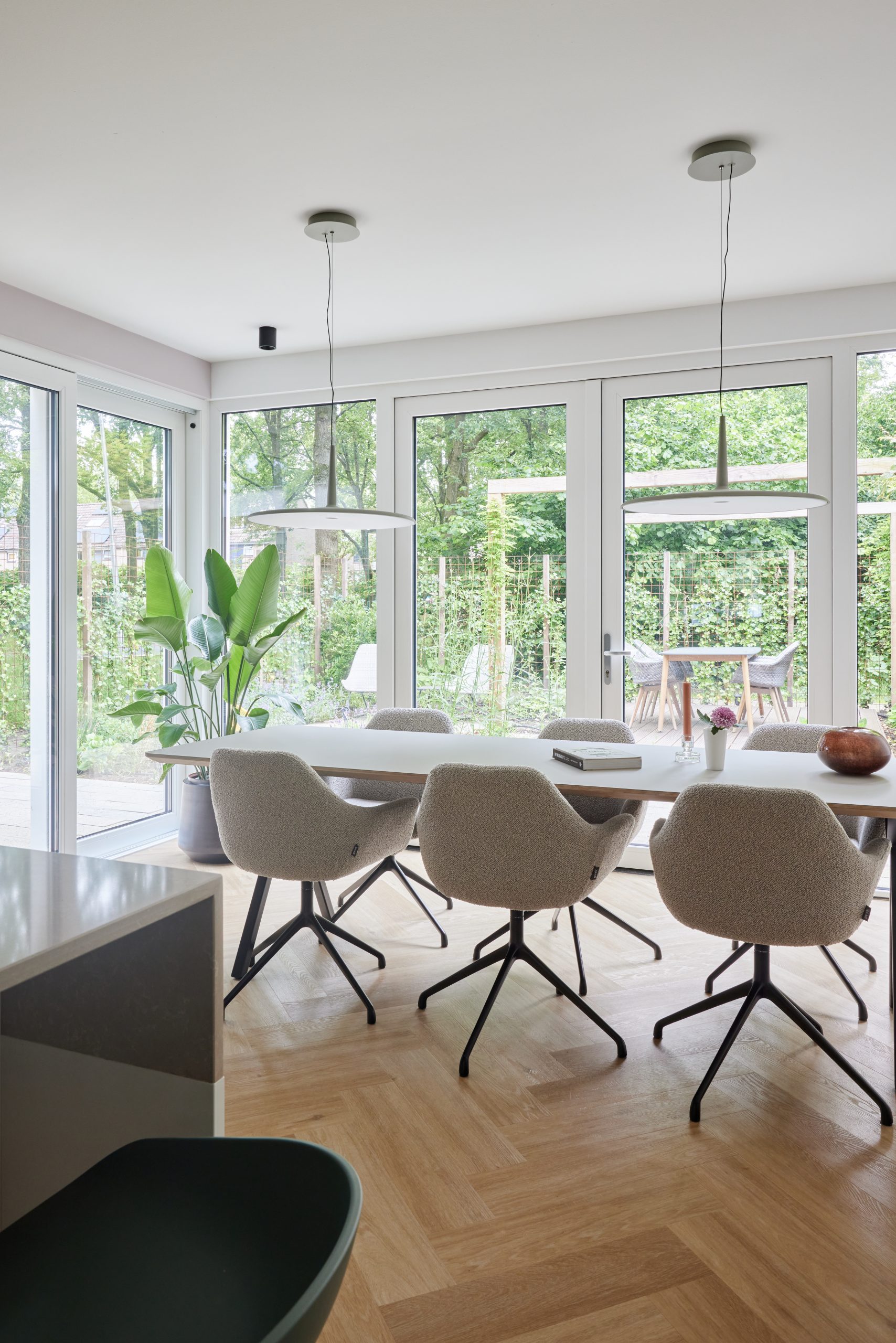
Light enters from several sides, and the room responds by opening up rather than flattening out. A large window in the living room draws in a broader view, while the sliding door in the extension brings in a second band of glass at the garden side. The result is a bright living room that feels connected to the rest of the plan through view lines, not through unnecessary openness. Even the lounge area stays distinct, with a sofa and armchairs placed for quiet use rather than as a passage zone.
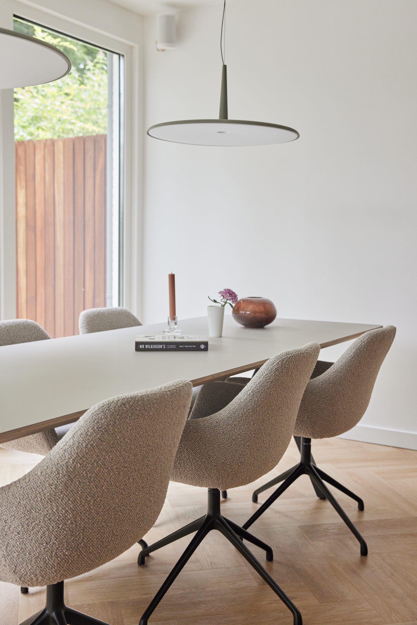
Above the dining table and near the kitchen, the pendant lights add a clear overhead line. Their slim supports echo the black steel details elsewhere in the house, but the effect remains light. On the floor, the pale wood surface softens the harder materials around it. It is one of the reasons the open plan kitchen living area does not feel overworked. The sequence from front seating, to central kitchen island, to the extension at the back is easy to read because every zone has its own scale and material emphasis.
From front room to garden side
The front of the house keeps the sitting area close to the entrance, while the back of the house opens into the dining zone. That simple shift in use changes how the whole home is experienced. The long table sits in the extension, with comfortable armchairs around it, so the rear space can handle both meals and longer stays. Glass takes a strong role here: the sliding door and the large window keep the edge of the house visually open, and the kitchen island remains visible from several points in the room.
What makes the renovation convincing is the way the pieces lock together without losing their individual roles. The steel glass partition wall keeps kitchen and living room legible. The integrated staircase tucks away a difficult corner. The white built-in cabinetry and the custom kitchen follow the length of the house instead of fighting it. With the extension in place, the plan now moves in a straight, readable sequence, and the bright living room at the back gives that sequence a clear endpoint in daylight and glass.
Photography: House of I Am – housofiam.nl
Want to see more of Jolanda Diks interieurontwerp? View the page of Jolanda Diks interieurontwerp for even more great projects and company information.


NEW 2026 Jubileum Edition The Best Interior Designers Benelux
Order Now €125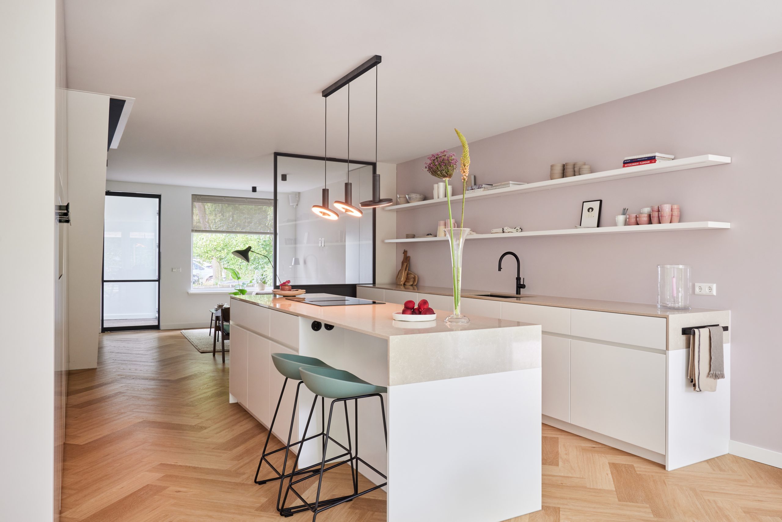
NEW 2026 Jubileum Edition The Best Interior Designers Benelux
Order Now €125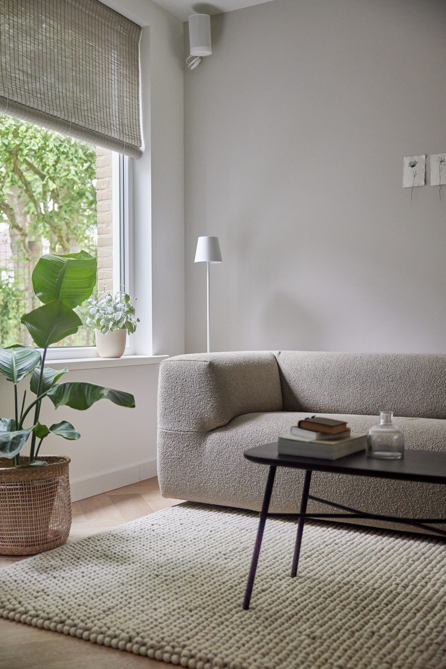
NEW 2026 Jubileum Edition The Best Interior Designers Benelux
Order Now €125