Modern interior in a 1930s home
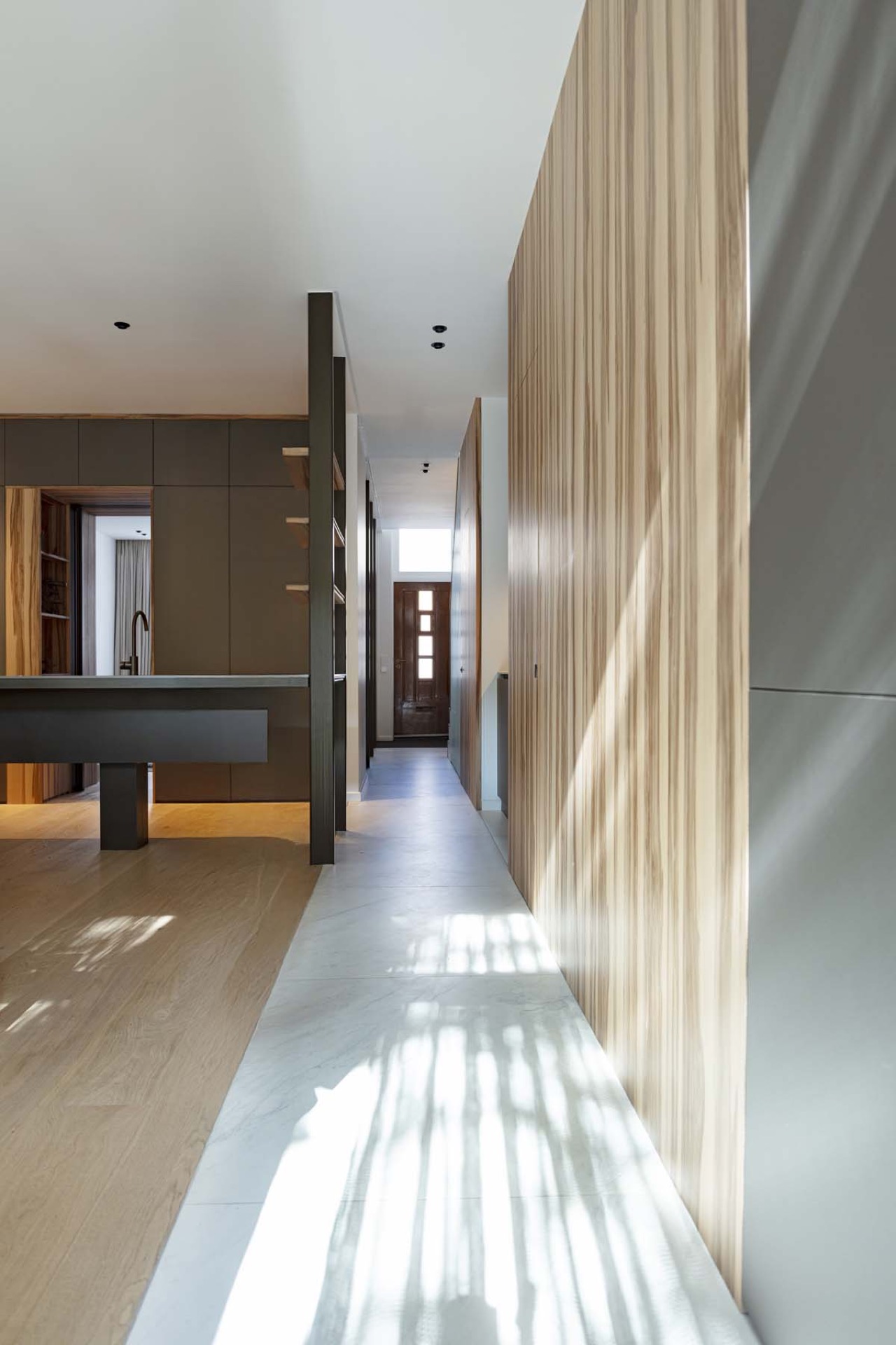
Vertical slats catch the light before the room opens up to the living kitchen. The layout keeps the logic of a modern living with bay suite, but strips it down to a clearer family sequence: a shared centre, quieter edges, and routes that do not collide. Dark cabinet fronts, pale walls and a stone-look floor set the tone at once. Nothing here shouts. The surfaces do most of the work, guiding the eye from the island to the deeper rooms.
The living kitchen as the centre of the plan
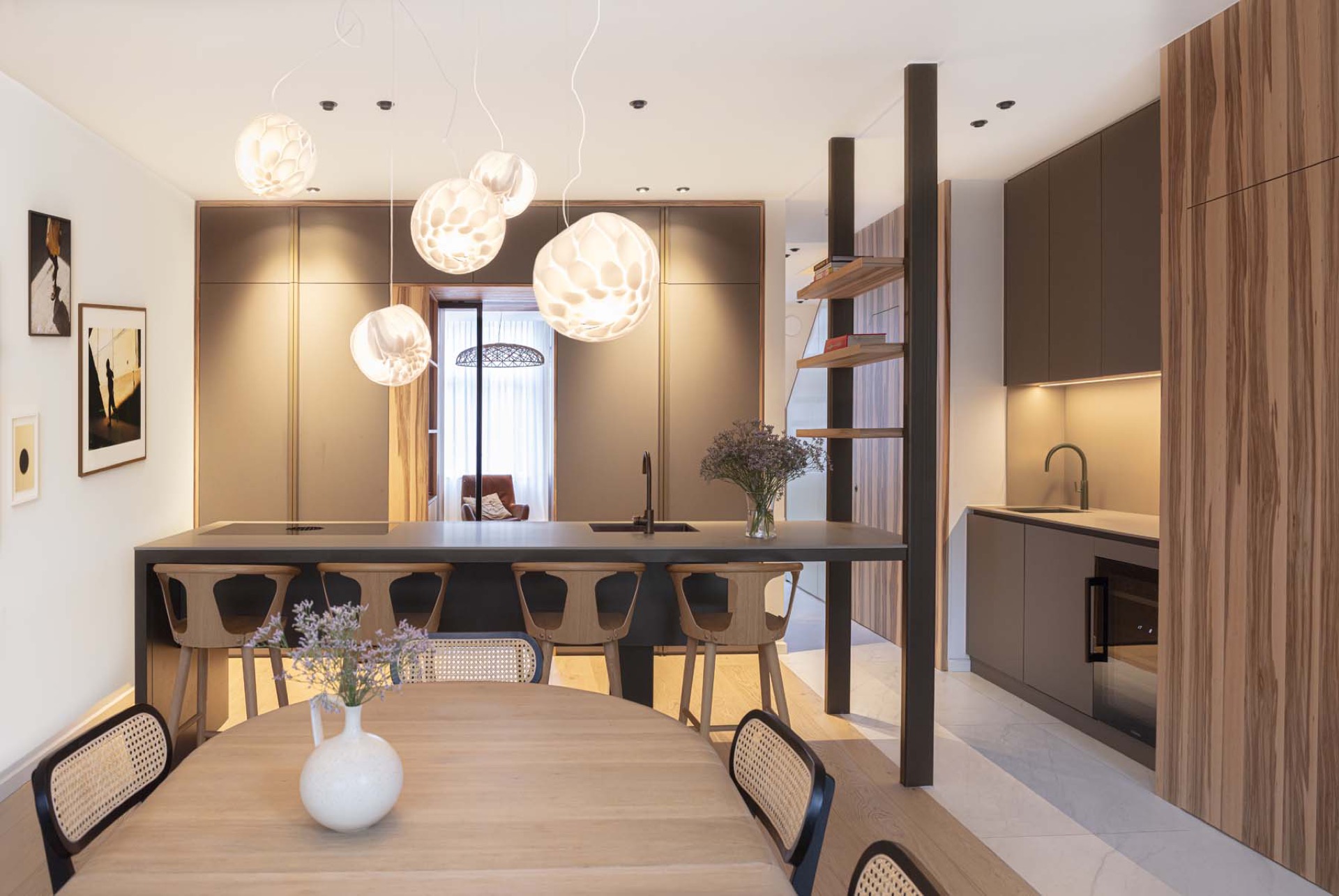
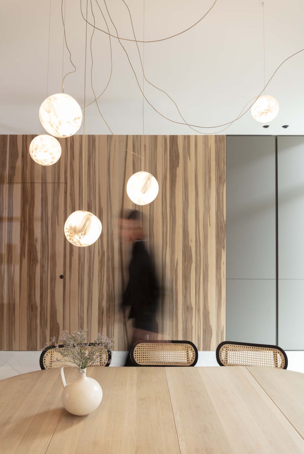
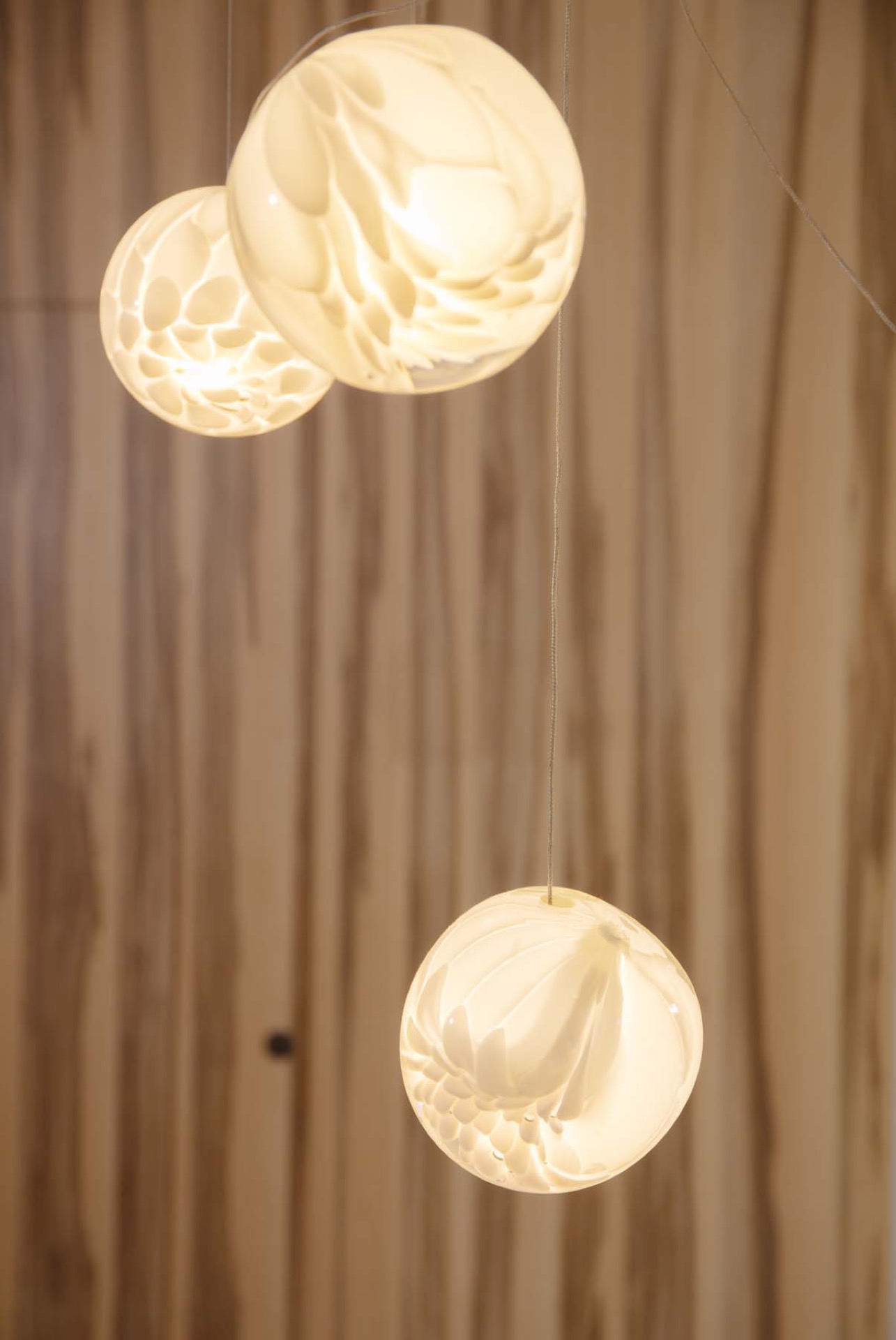
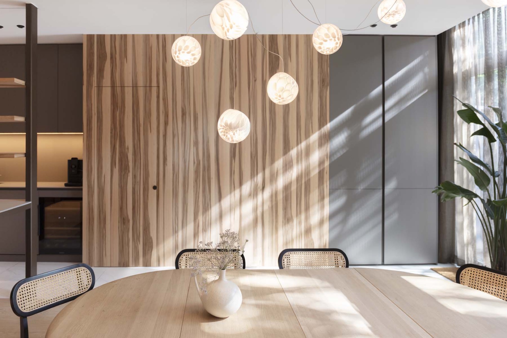
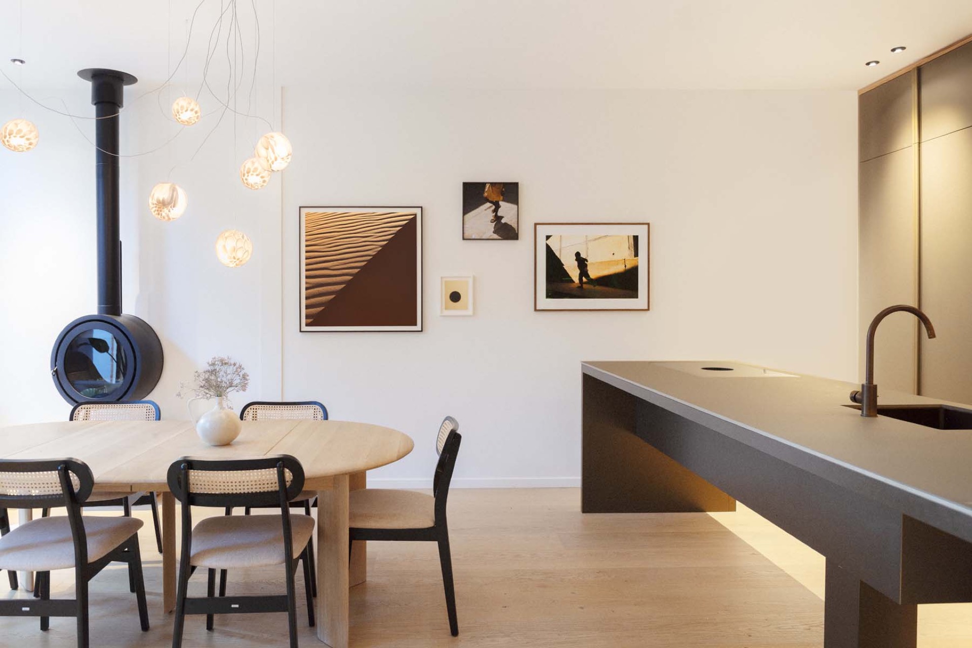
The living kitchen with island anchors the main floor. It is the point where cooking, talking and passing through all happen in the same room, without the space feeling overexposed. Round glass pendant lights hang low enough to mark the dining zone, while the island keeps the room readable from every angle. The open structure is not used as a display piece; it is there to support movement, seating and daily use in one shared volume.
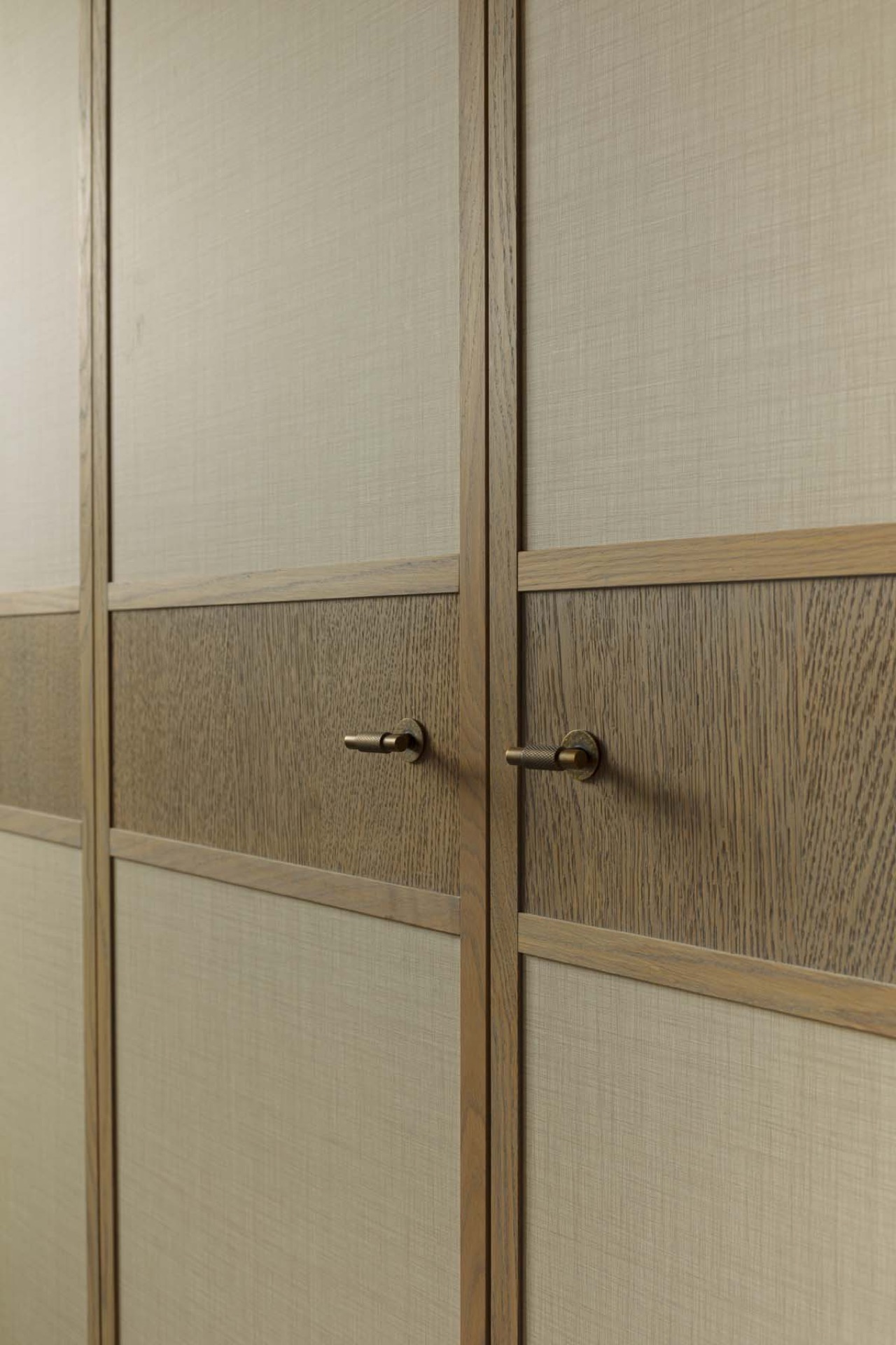
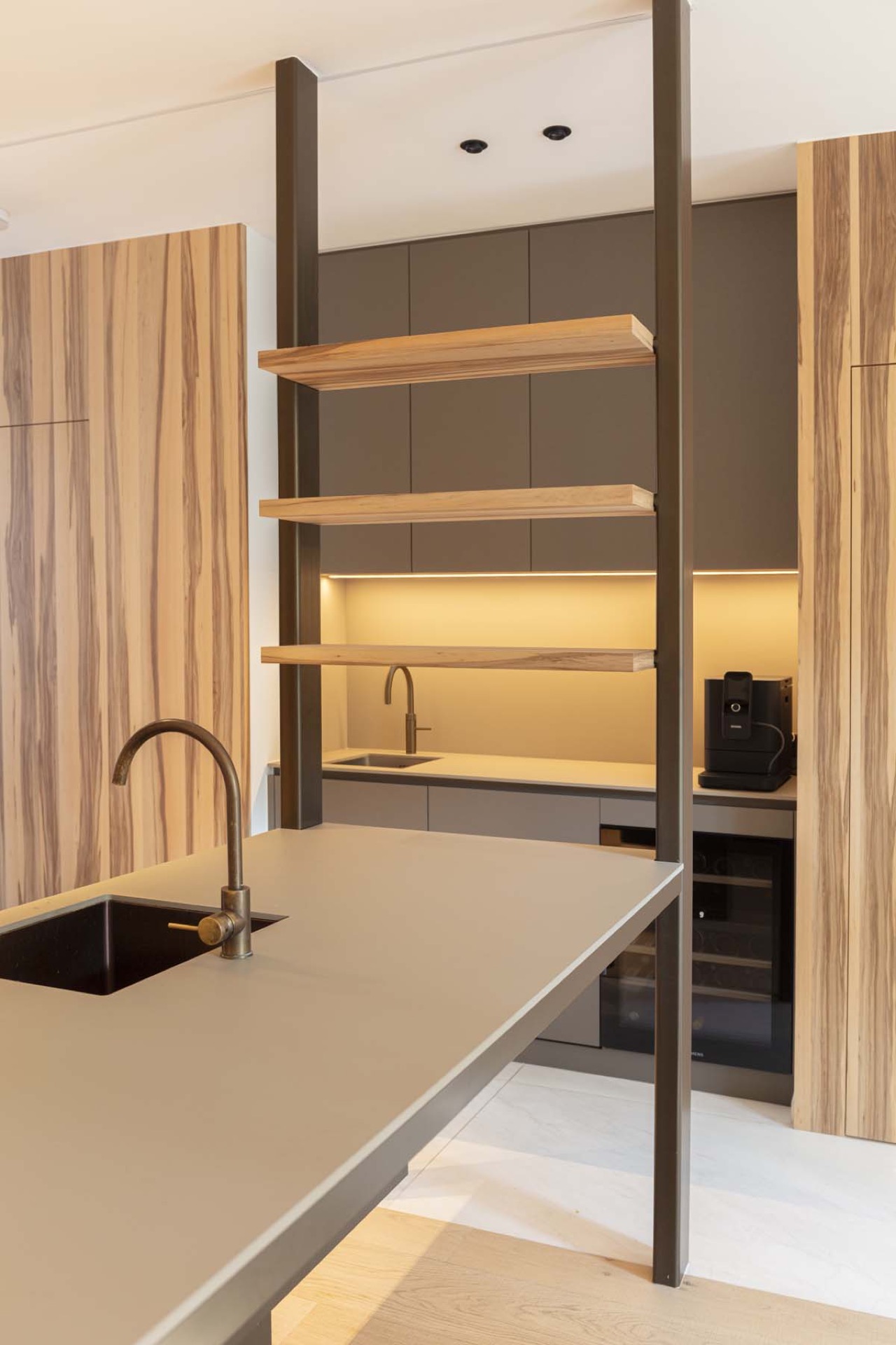
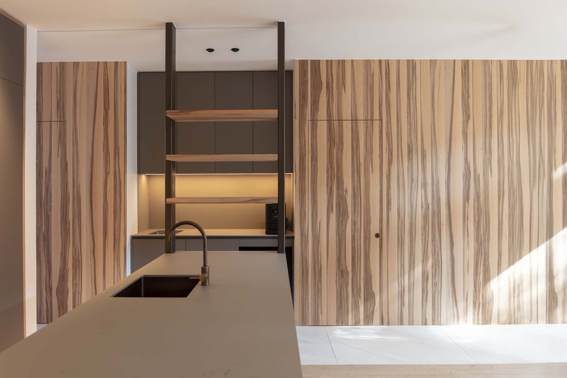
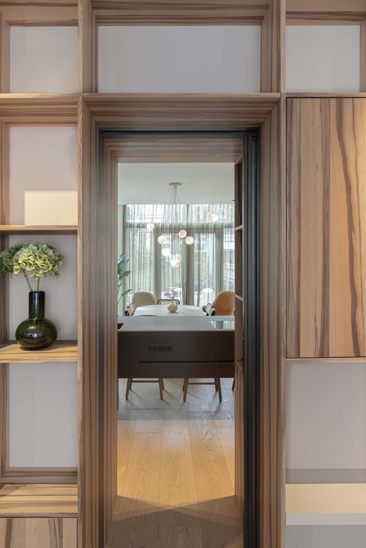
Custom joinery turns the perimeter into a series of measured planes. Ribbed panels, flush fronts and darker framed sections create depth without adding visual noise. In one view the cabinetry reads almost like a wall; in another, a narrow opening or shelf breaks it up and reveals how much storage is hidden behind the calm surface. That restraint gives the room its steady pace. The materials stay present, but they do not compete for attention.
Material transitions that stay quiet
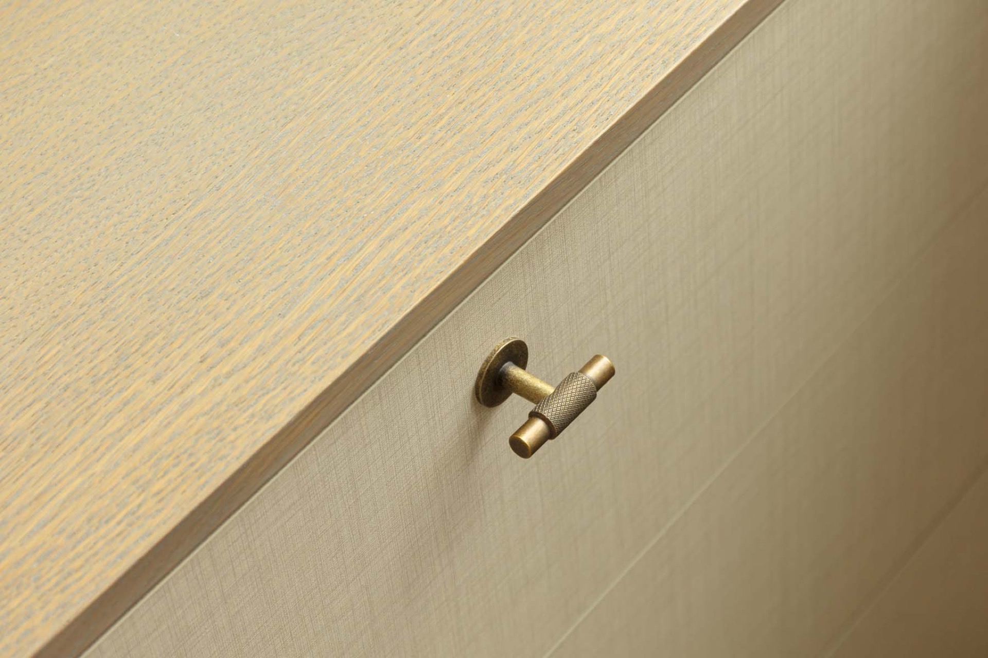
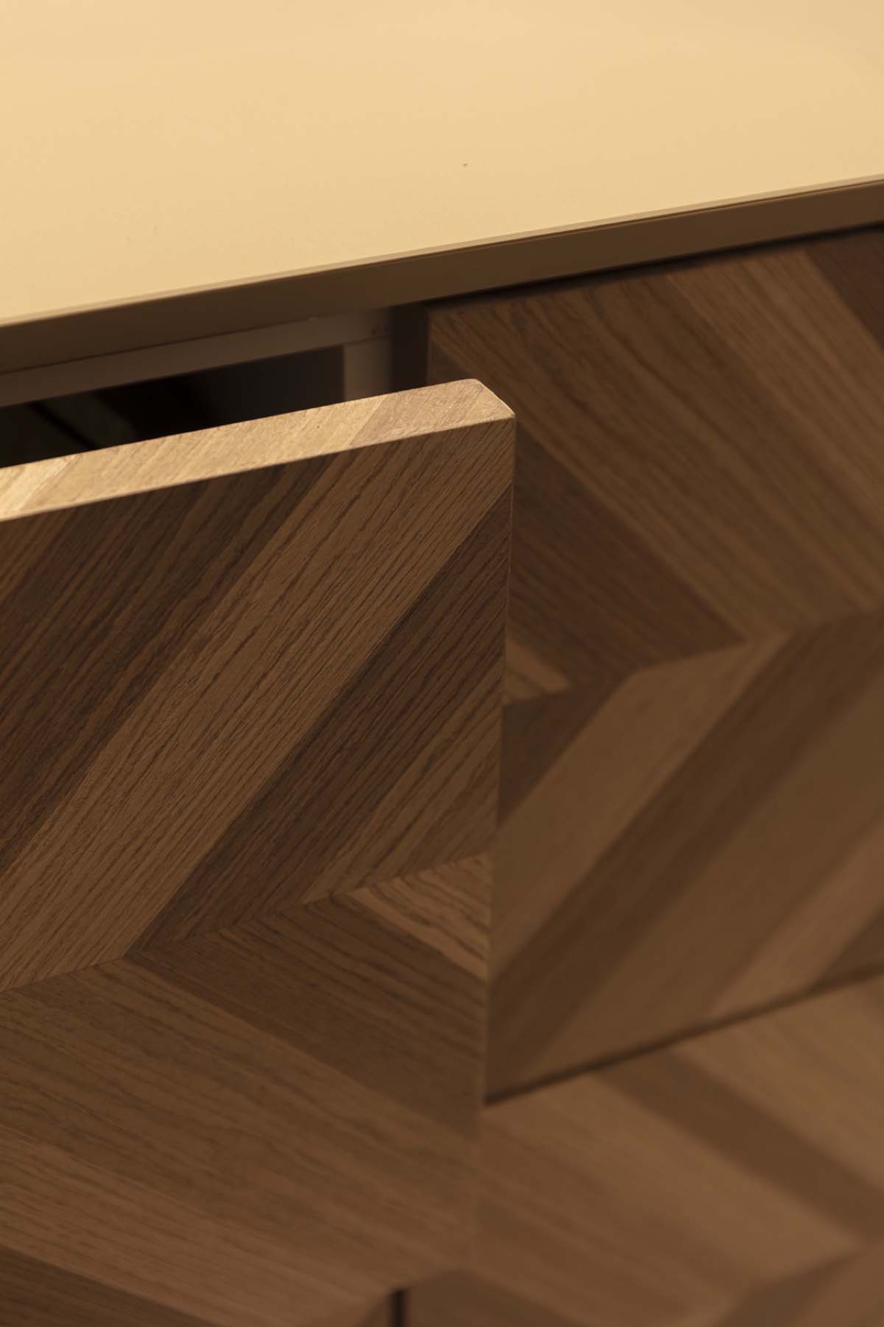
Wood softens the harder lines of the kitchen, especially where the grain meets the lighter flooring and the white ceiling above. A close-up of the joinery shows how panel edges are handled with precision, but the effect remains understated. The warm minimalist interior depends on these small transitions: the seam between two finishes, the change from matte cabinet face to open shelf, the shift from shadow to reflected light. Each one marks the room without breaking it apart.
Across the ground floor, the years 30 inspired interior keeps its references subtle. Rather than copying period details, it reinterprets the older suite logic through wider openings and cleaner surfaces. The result is a room arrangement that can take noise, people and movement, then settle again when the house goes quiet. A dining table sits comfortably in the same visual field as the kitchen, held in place by the rhythm of the slatted wall and the steady line of the island.
From shared space to a more private sequence
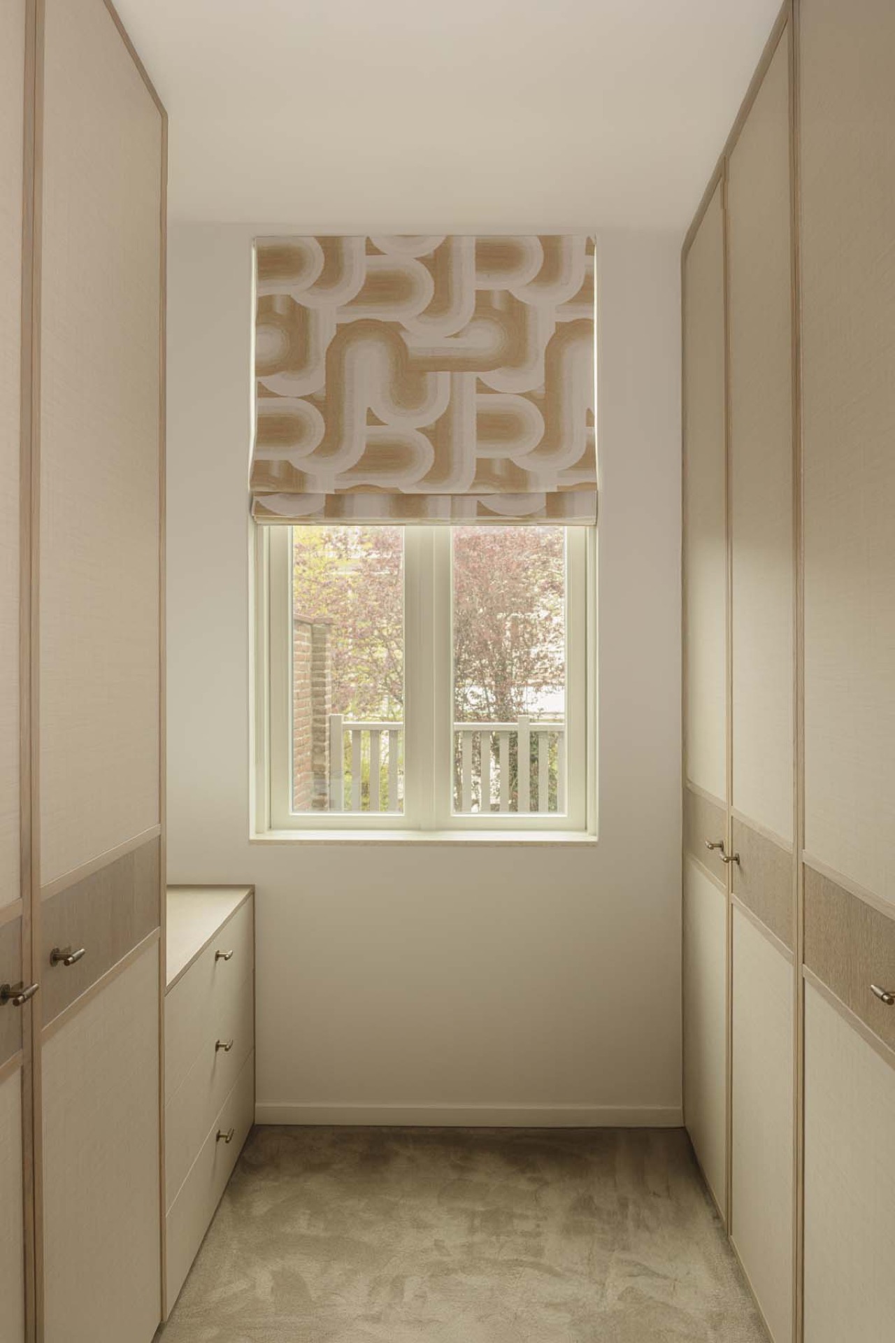
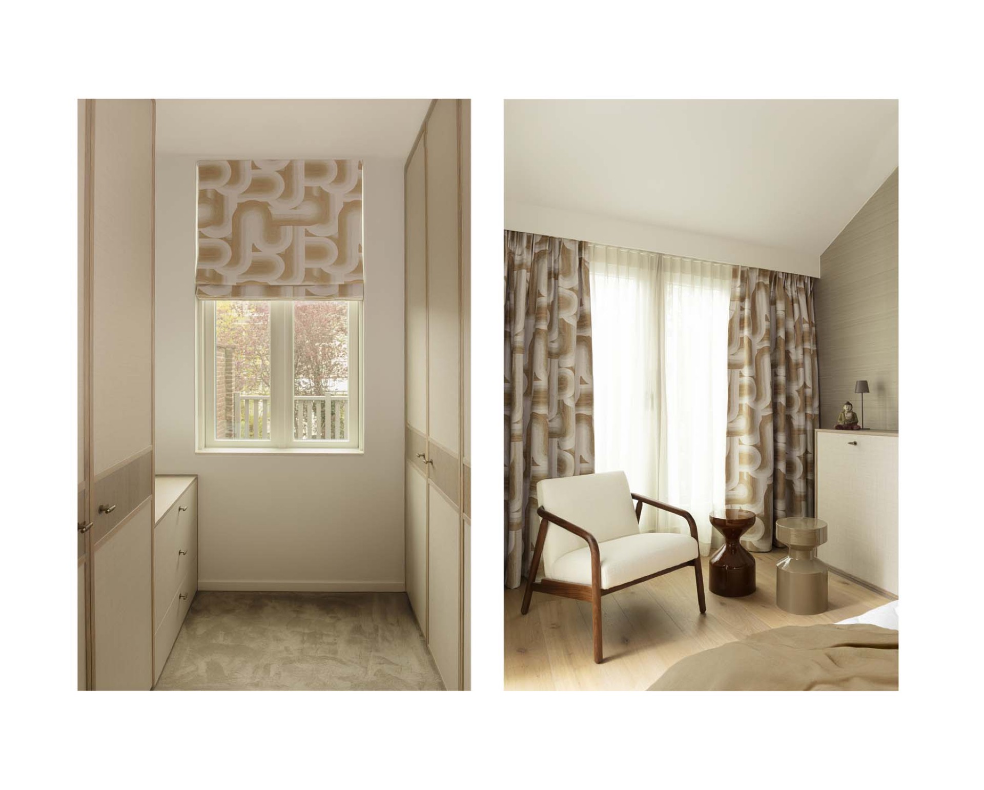
The suite idea continues beyond the living area. Instead of one abrupt shift from social zone to bedroom, the plan moves through a series of calmer rooms and narrower transitions. That sequence matters. It lets the house hold both togetherness and privacy without making either feel secondary. The walk-in closet is part of that route, and it acts less like a separate destination than a soft threshold before the bedroom. The connection is direct, but not exposed.
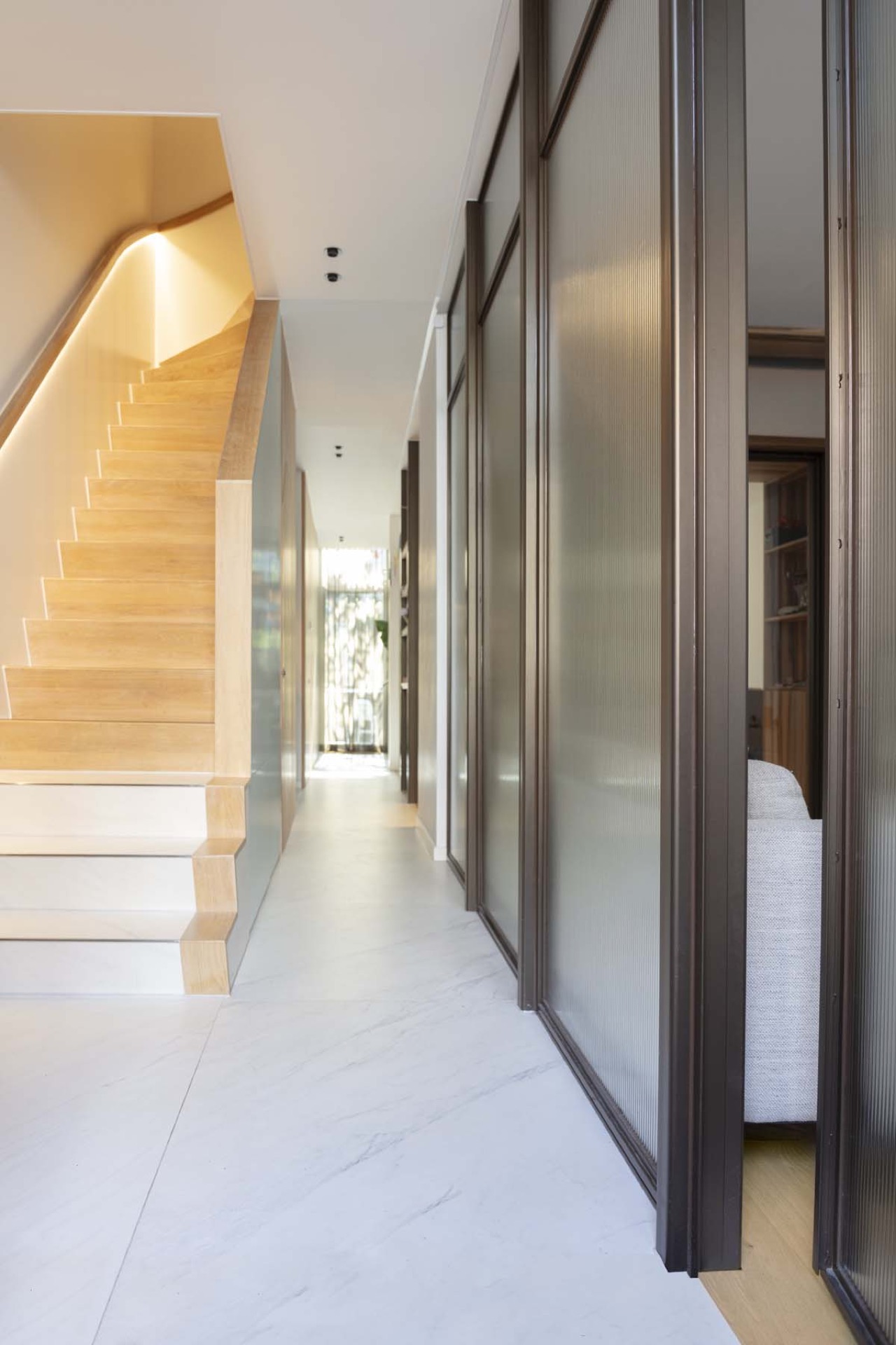
In the corridor and landing, the custom joinery returns as a wayfinding device. Tall cabinet fronts, a ribbed surface and a darker structural frame mark the passage, while the staircase beside it adds a change in texture with its wooden treads and pale side panels. These are small moves, yet they shape how the house is read. The eye moves from open to enclosed, from light floor to darker partition, then back again as the route opens to the next room.
A calm bathroom with a clear division
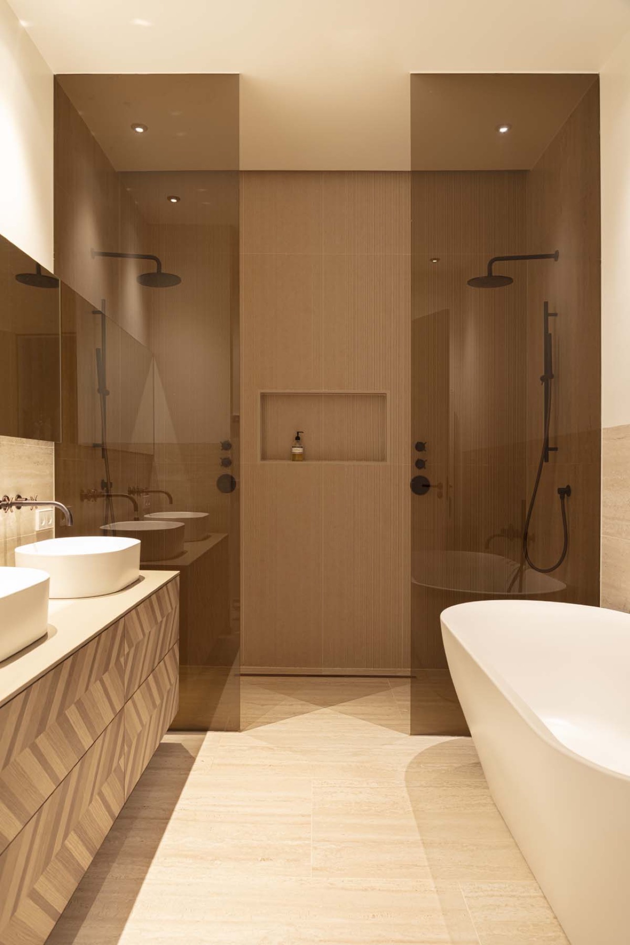
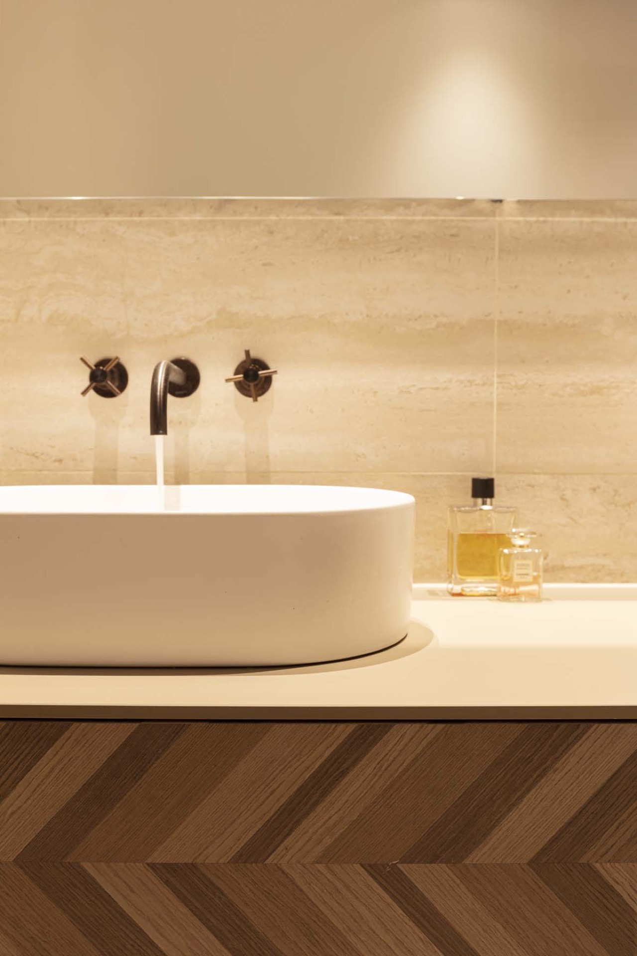
The bathroom carries the same measured language, only in a quieter register. A double vanity bathroom gives the wall a broad horizontal line, and the basin pair sits beneath a pale surface that reflects light rather than scattering it. The room feels controlled, but not sealed off. A glass shower partition keeps the shower visible as part of the composition, with wood behind it adding texture where most bathrooms rely on blank tile alone. The glass allows the room to stay open while still separating wet and dry zones.
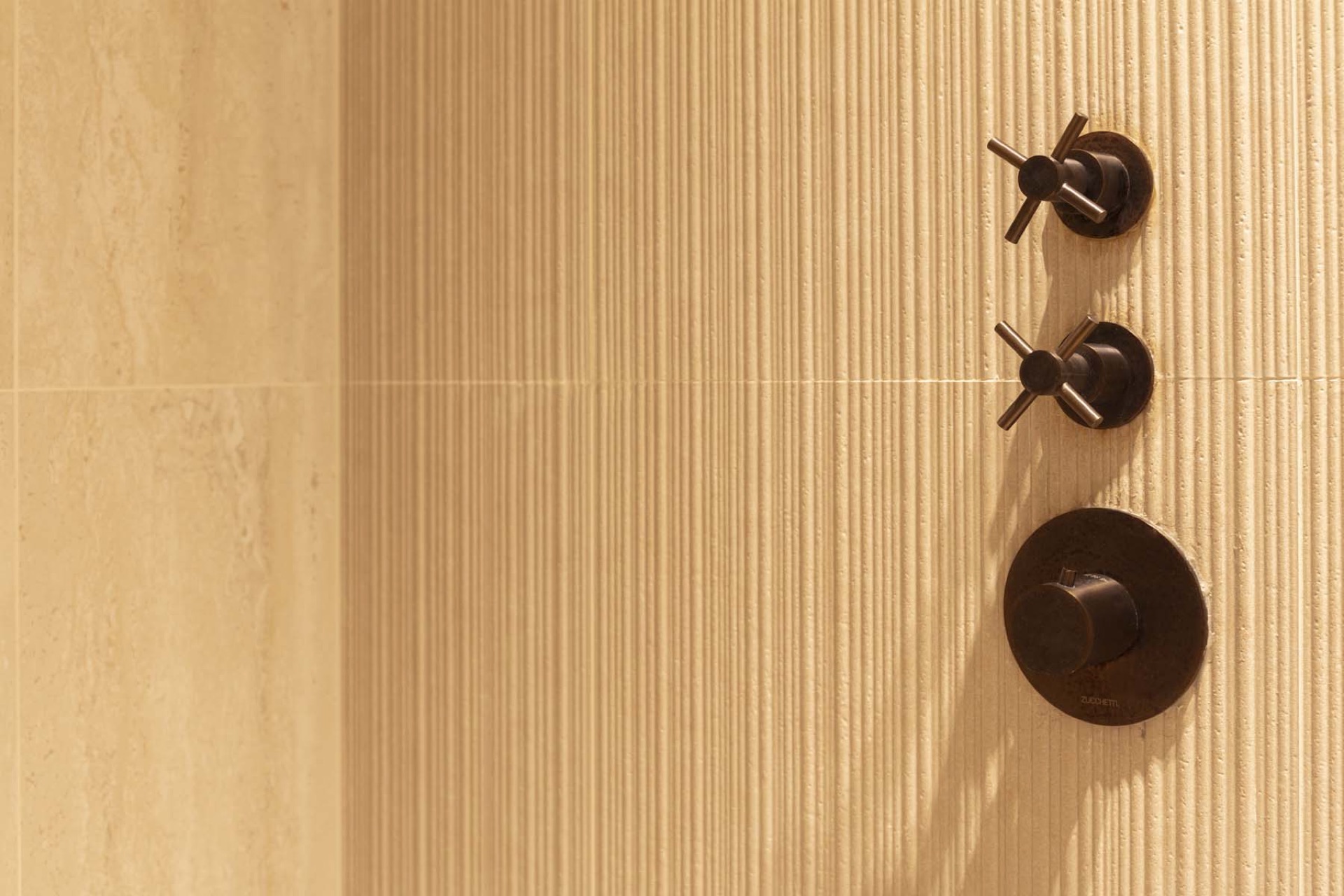
Detail shots reveal how the finishes hold together. The shower area is framed by a wood-panelled surface, and the fittings bring in a darker metal note that stands out against the lighter wall. The double vanity bathroom does not rely on ornament; it depends on proportions, the spacing between bowls, and the clean run of the countertop. Light from above lands on the fittings and the edge of the basin, making the material change read clearly even in a restrained palette.
Light, reflection and surface
In the bathroom and the circulation spaces, light is used as another material. Inbuilt ceiling spots keep the rooms even, while the glass enclosure and pale surfaces throw back a soft reflection. Round shapes return in the pendants above the living area, but here the emphasis shifts to planes and edges. The contrast between ribbed panels, smooth paint and wood grain gives each room a distinct temperature without changing the overall tone of the house.
That consistency is what holds the project together. The house does not depend on one dramatic gesture. It works through repetition with variation: the slatted wall in one room, the joinery wall in another, the stone-look floor running under both. Even where the rooms change in function, the material language stays disciplined. The modern living with bay suite idea is therefore less about nostalgia than about structure, using an older domestic arrangement as a framework for a more open daily life.
Storage that stays visible only when it needs to
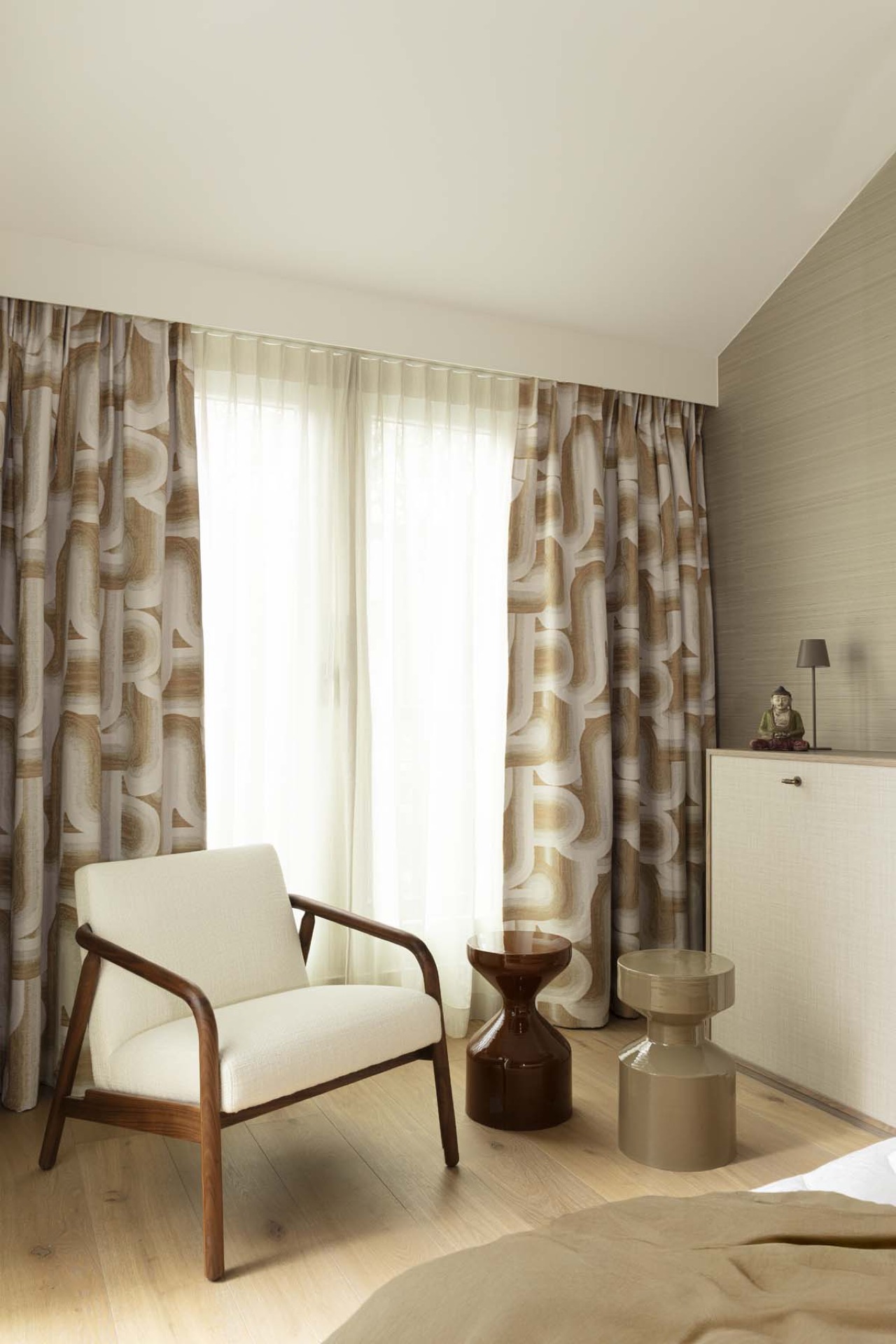
Custom joinery carries the practical side of the scheme without turning it into a storage showcase. Open shelves appear only where they are useful, while closed fronts absorb the bulk of the everyday objects. In the bedroom-adjacent zone, the walk-in closet is handled as a measured extension of the room rather than a separate dressing suite. That makes the transition feel legible: one space prepares the next, and the wardrobe line disappears into the architecture instead of standing away from it.
Seen across the whole interior, the palette remains deliberately limited. Wood, dark framing, white walls and a pale floor are repeated in different proportions from room to room. Because the finishes are consistent, the plan can open up without losing order. The living kitchen with island is the most social part of the house, the bathroom is the most closed, and the closet sits between them as a quieter pause. Together they give the house its clear sequence, shaped by light, storage and surface rather than by decoration.
Want to see more of DMD Amsterdam? View the page of DMD Amsterdam for even more great projects and company information.


NEW 2026 Jubileum Edition The Best Interior Designers Benelux
Order Now €125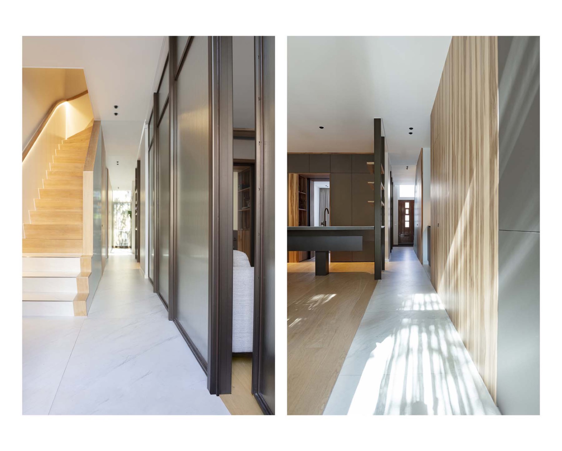
NEW 2026 Jubileum Edition The Best Interior Designers Benelux
Order Now €125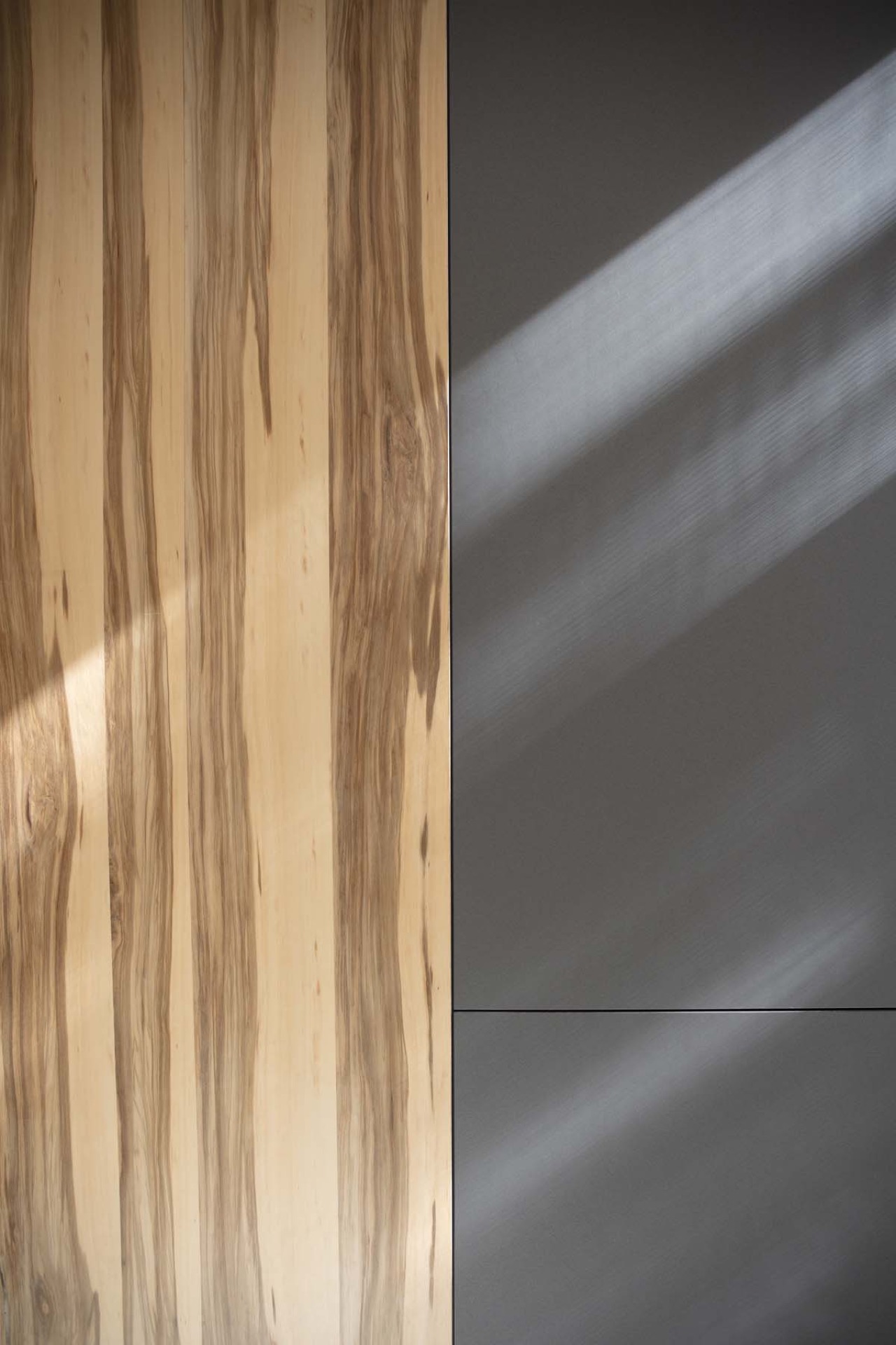
NEW 2026 Jubileum Edition The Best Interior Designers Benelux
Order Now €125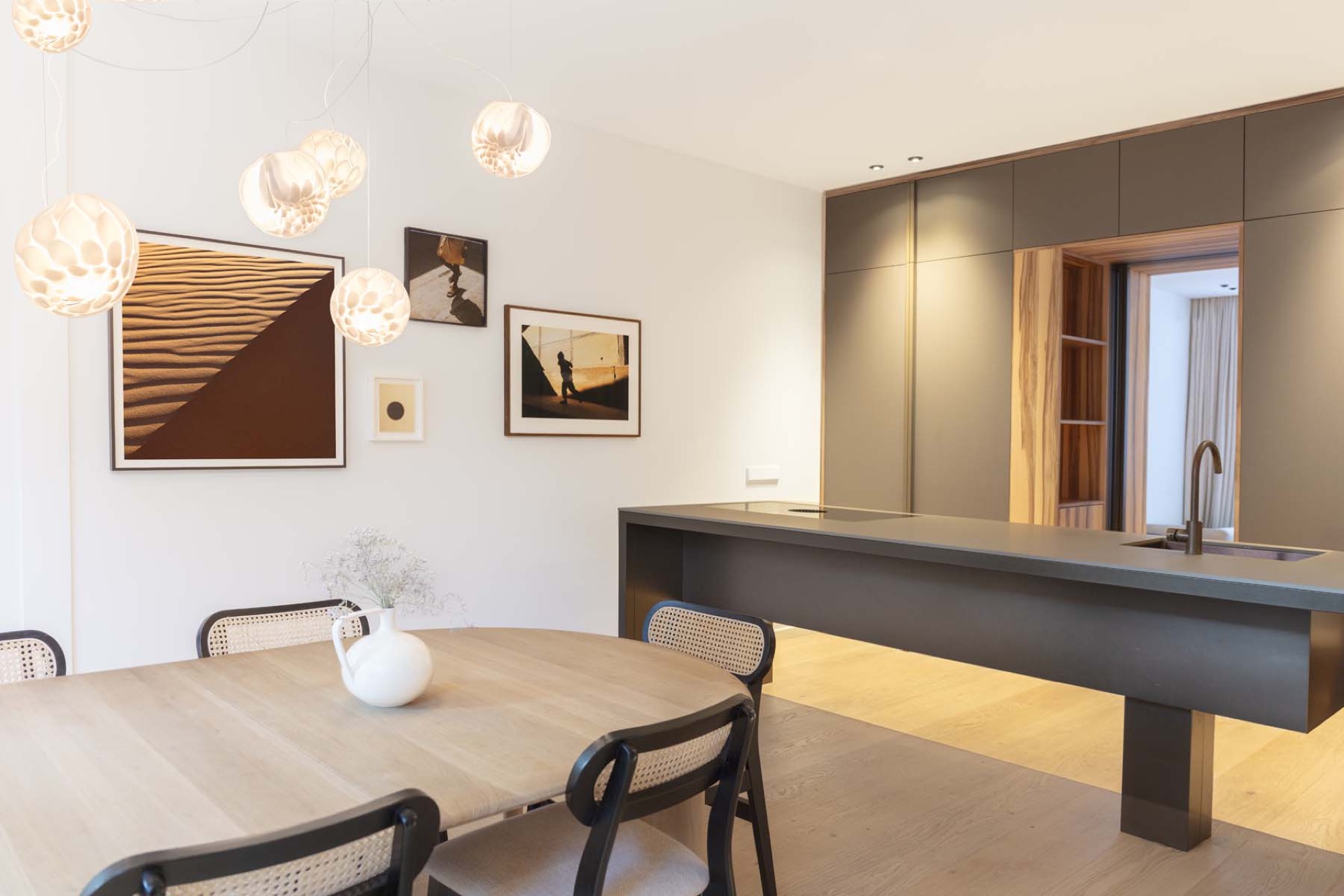
NEW 2026 Jubileum Edition The Best Interior Designers Benelux
Order Now €125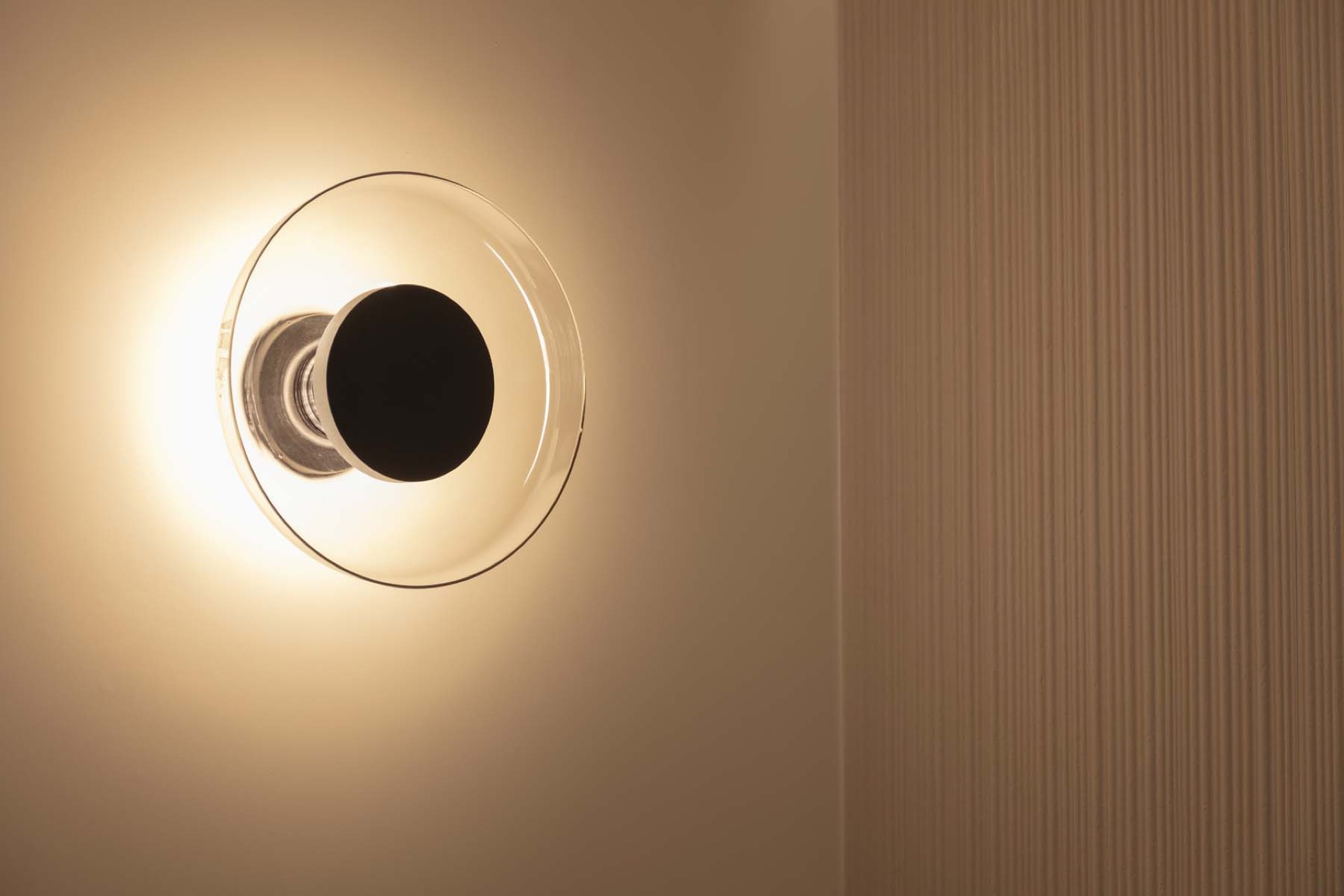
NEW 2026 Jubileum Edition The Best Interior Designers Benelux
Order Now €125