High-end home cinema in a converted indoor pool
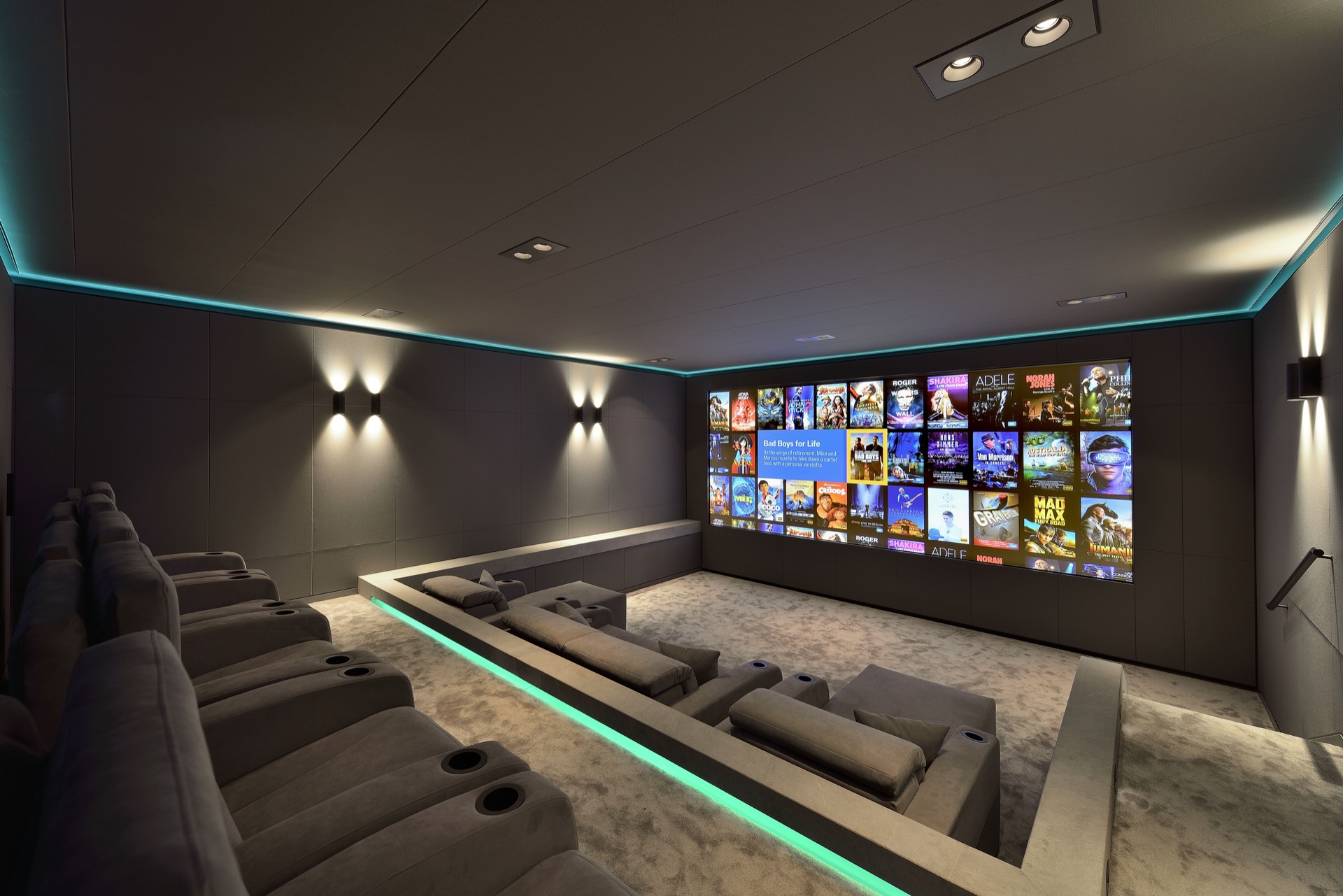
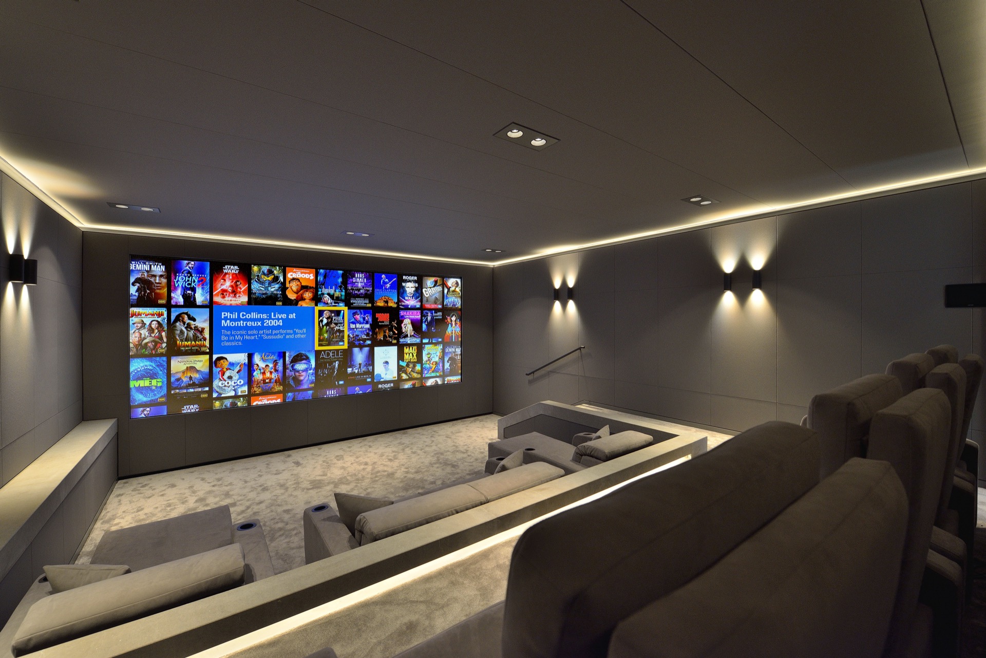
A wide screen now anchors the room where water once filled the floor. The sightline runs straight toward that wall, and the seating follows the same axis, turning the former pool into a high-end home cinema for about ten people. The request was specific: the screen had to work for both 16:9 television viewing and cinemascope films. That requirement shapes the whole room, from the long viewing distance to the dark surfaces around the image.
A screen wall made for two formats
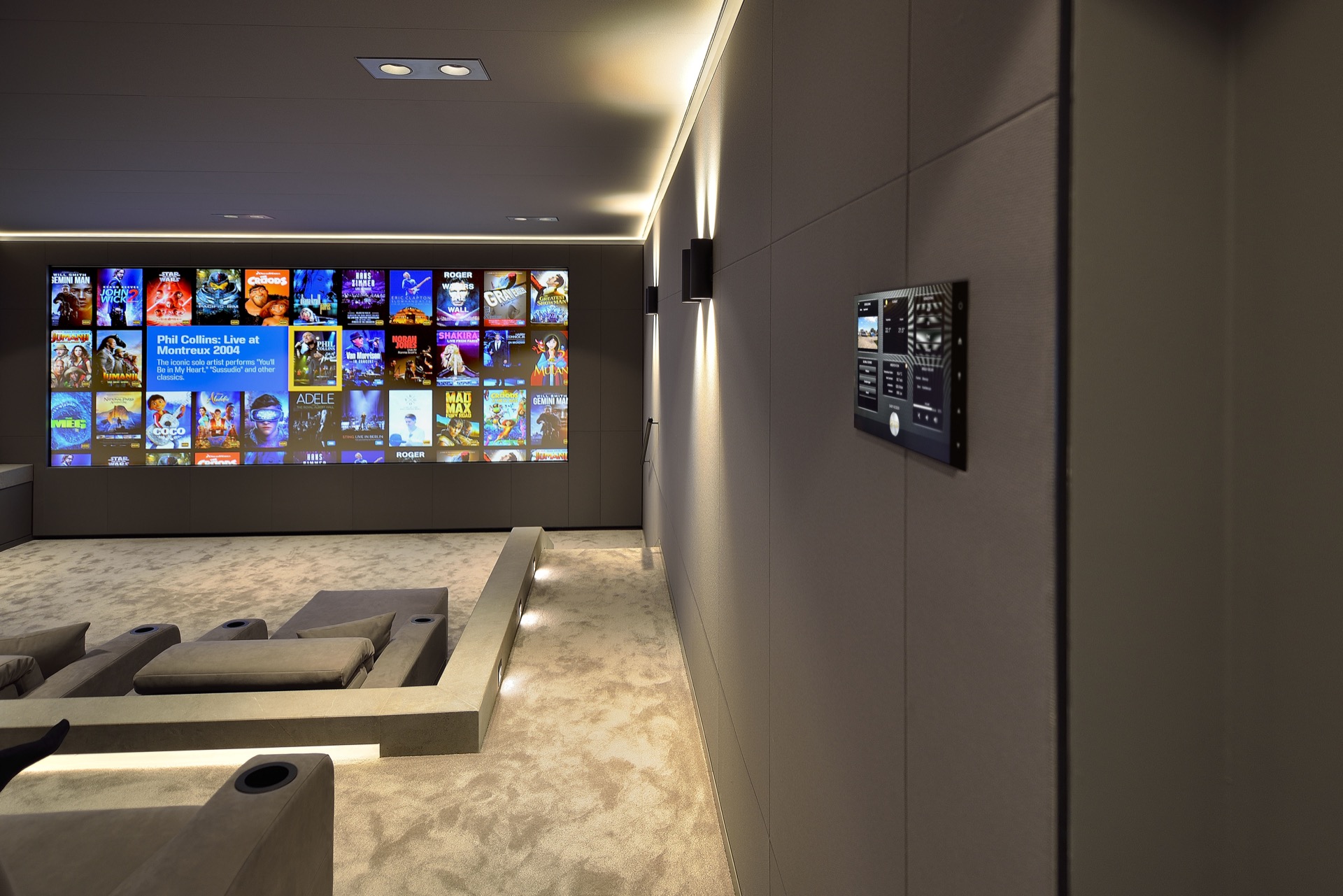
The screen is the most dominant element in the space, stretching across the front wall and holding the frame of the room together. It is not treated as a display hidden in the background. Instead, it takes the lead, with the seating and lighting arranged so the image remains central. In a large screen home cinema, that kind of placement matters: the screen must carry everyday television as well as wider film compositions without making either feel compromised.
The project therefore reads as a careful home cinema conversion rather than a simple room swap. The former indoor pool has been repurposed into a dedicated viewing environment, and the new use is visible in the proportions. Dark wall zones, low ambient light and the broad projection surface all push attention forward. Nothing in the room competes with the screen for long. Even the furniture stays low and compact, leaving the front wall visually open.
Viewing from a fixed axis
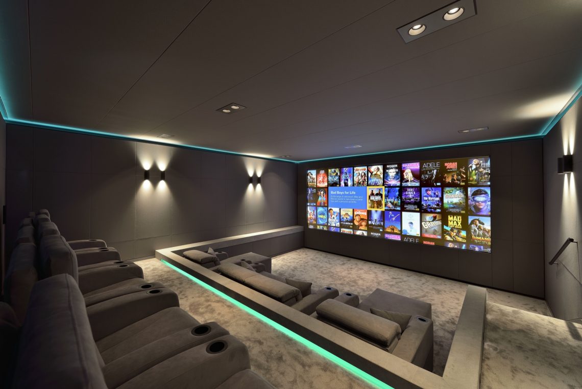
From the entry side, the room pulls the eye toward one clear destination. The seating sits on a central route, and the screen closes the view at the end of the space. That straight line gives the interior its structure. The arrangement also explains why the room can serve a family audience of around ten seats without feeling crowded. The benches are set in a stepped layout, so each row keeps its own sightline to the screen wall.
The image of the room makes that axis easy to read. A narrow passage opens into the cinema, then the dark enclosure widens around the screen. The change in scale is abrupt, but controlled. You move from a circulation zone into a seated volume where the wall surfaces and the lighting immediately shift to a darker register. It is a clear example of how a home cinema interior can be built through sequence, not just through finishes.
Light traced along the edges of the room
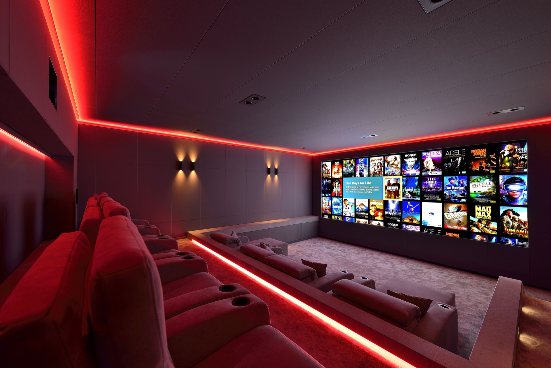
Indirect LED lines run around the ceiling perimeter and along the floor edge, drawing a thin outline through the darkness. In one image the accent light reads turquoise-blue; in another it shifts to red. Those color changes do not flood the room. They stay at the margins, where they mark the shape of the interior and separate the seating zone from the shell around it. The effect is visible immediately, especially when the screen glow is added to the mix.
The lighting is not decorative in the loose sense. It does practical work by defining paths, edges and levels. The room has a raised walk zone between seating and screen, and the light line helps that transition stay legible. Ceiling spots and wall spots add a second layer, but they are kept quieter than the perimeter glow. The result is a cinema room that remains readable even when the main image is on. It is a restrained use of indirect LED home cinema lighting.
Color as a guide, not a distraction
The blue and red accents appear in separate views of the same space, which suggests a room that can be tuned rather than fixed to one atmosphere. That is useful in a cinema interior where the walls are already dark and the screen is bright. The accents stay close to the architecture: a line under the seating edge, a band near the ceiling, a trace along the room’s perimeter. They help the viewer understand the volume without turning the space into a light show.
This is also where the room feels most controlled. The illuminated lines are thin, the seating is low, and the dark wall panels absorb the rest. Because of that, the accents read as spatial markers. They show the boundary of the room and the route through it. In a project built around a screen wall, that kind of clarity matters more than ornament. It keeps the eye moving toward the image rather than away from it.
Wall panels that quiet the room visually
Along the sides, the wall treatment shifts into perforated and upholstered-looking panels. Their texture is visible even in the darker parts of the room, where they break up broad surfaces that might otherwise feel flat. The panels are set beside inbuilt spots and linear lighting, so the walls do not disappear; they become part of the composition. This is where the acoustic wall panels cinema look is strongest, because the surfaces are doing more than just closing the room.
Color is kept to dark grey, black and a few lighter zones. That limited palette lets the screen and lighting carry the visual weight. It also makes the room feel less like a converted utility space and more like a dedicated interior with its own logic. The former pool shell is no longer legible as such. What remains is the structure of a cinema room: panelled walls, controlled reflections and a clear front-facing orientation.
The benches contribute to that same reading. Their rounded fronts and circular openings are visible in several images, and they add a softer shape against the strict geometry of the screen wall. The seating is not the point of the project, but it anchors the room at human scale. With about ten places available, the layout stays intimate without becoming narrow. Each seat is part of the same viewing field, and none of the rows breaks the room’s direction.
Projector detail and the mechanics behind the image
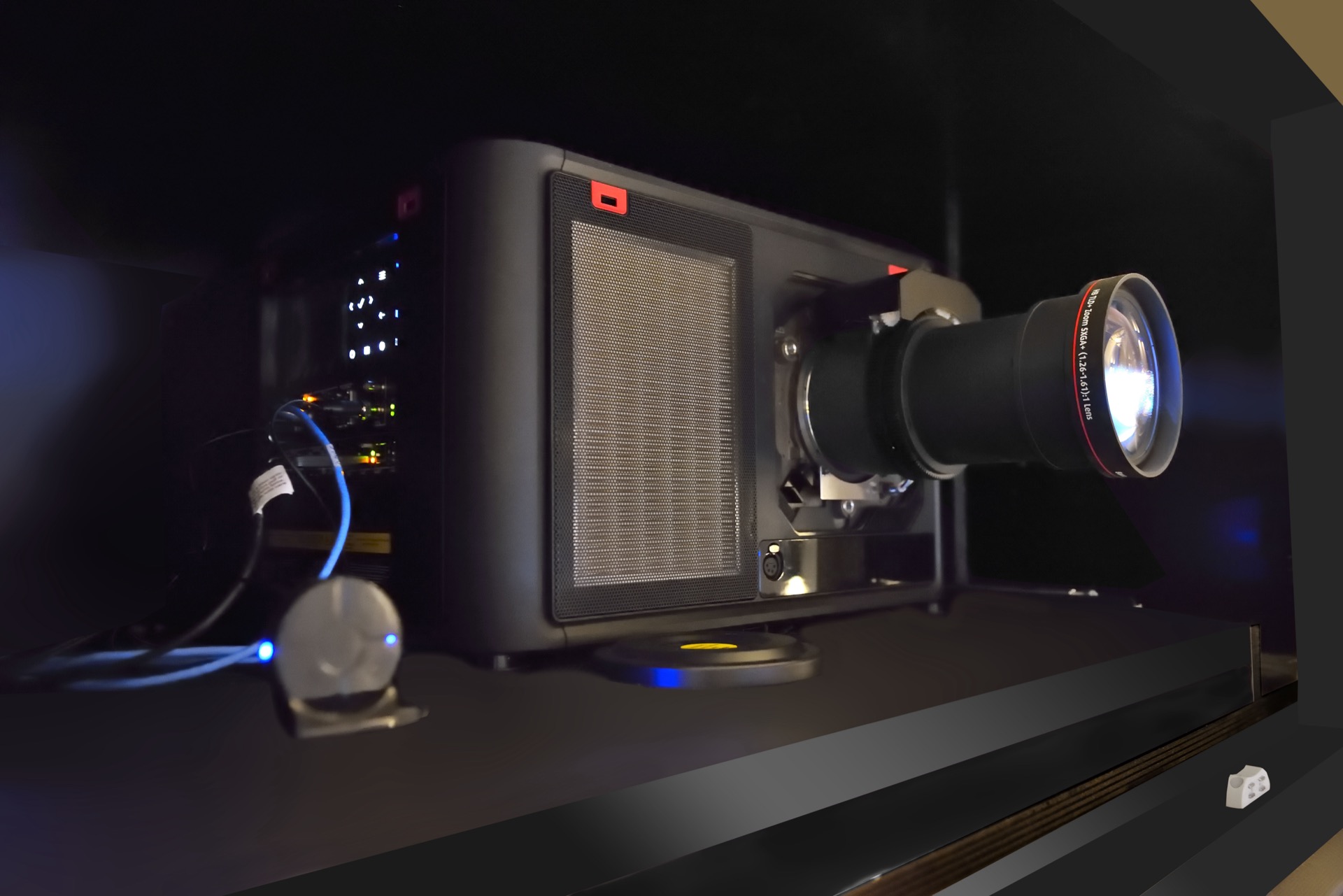
One close view shows the projector area itself, with the optical unit, a protective grille and visible fixing points. It is a useful reminder that the room is not only about finishes and mood. Behind the screen wall, there is working technology, and the installation detail matters because the whole room depends on it. The image does not show a complete equipment package, only the technical presence needed to support the projection setup.
That detail reinforces the project’s practical side. The room had to support a screen large enough for different formats, and the projection hardware is part of making that possible. Even so, the technology stays visually controlled. It is presented as part of the interior rather than as a standalone feature. In a projector installation detail shot, the equipment reads as precise and contained, which suits the rest of the room.
A conversion that keeps the focus on the picture
What makes this project convincing is the way every visible element points back to the screen. The former pool space is no longer about reflection or depth in the literal sense; it is about focus. The dark panels, the perimeter light, the stepped seating and the wide viewing axis all work toward the same end. The result is a room designed for watching, but also for moving through, with the transition from entry to screen clearly staged.
Seen as a whole, the project is a strong example of a high-end home cinema built from an unexpected shell. It does not rely on excess detail. Instead, it uses proportion, lighting and surface treatment to convert an indoor pool into a cinema room that can handle both television and widescreen film. The images show that idea plainly: a broad screen, measured light and a room that knows exactly where the eye should land.
Want to see more of De Opera Domotica? View the page of De Opera Domotica for even more great projects and company information.


NEW 2026 Jubileum Edition The Best Interior Designers Benelux
Order Now €125