Open-plan apartment with historic character and refined modern finishes
Light runs straight through the apartment, picking out the grain in the wood floor and the edges of the steel staircase. The plan stays open from one room to the next, so the interior reads in long lines rather than separate enclosed zones. That sense of breadth is what defines this open-plan apartment: a renovation built around sightlines, a restrained palette, and details that are left visible instead of hidden away.
Open layout and long sightlines
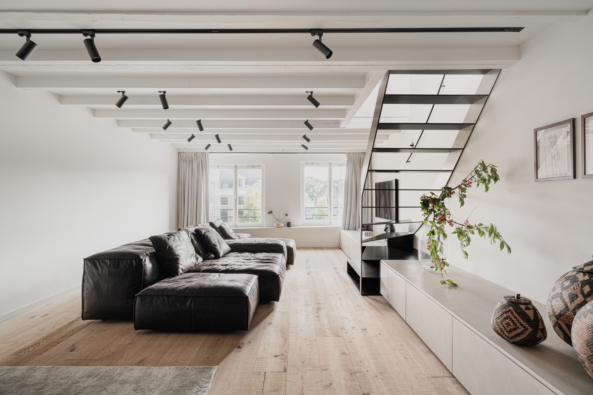
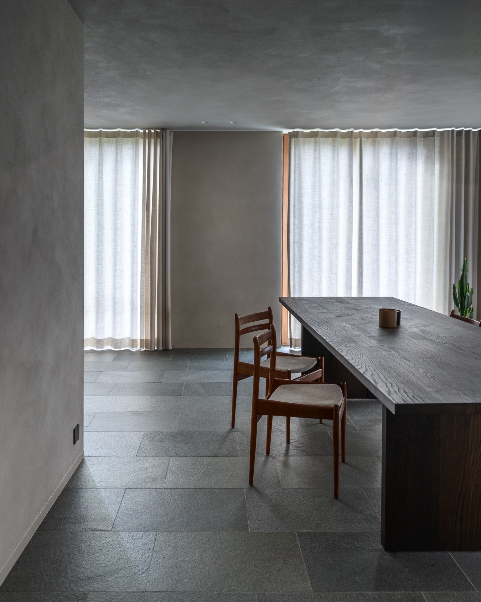
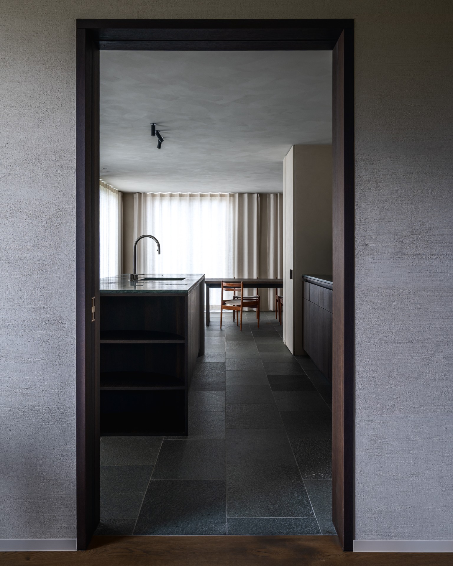
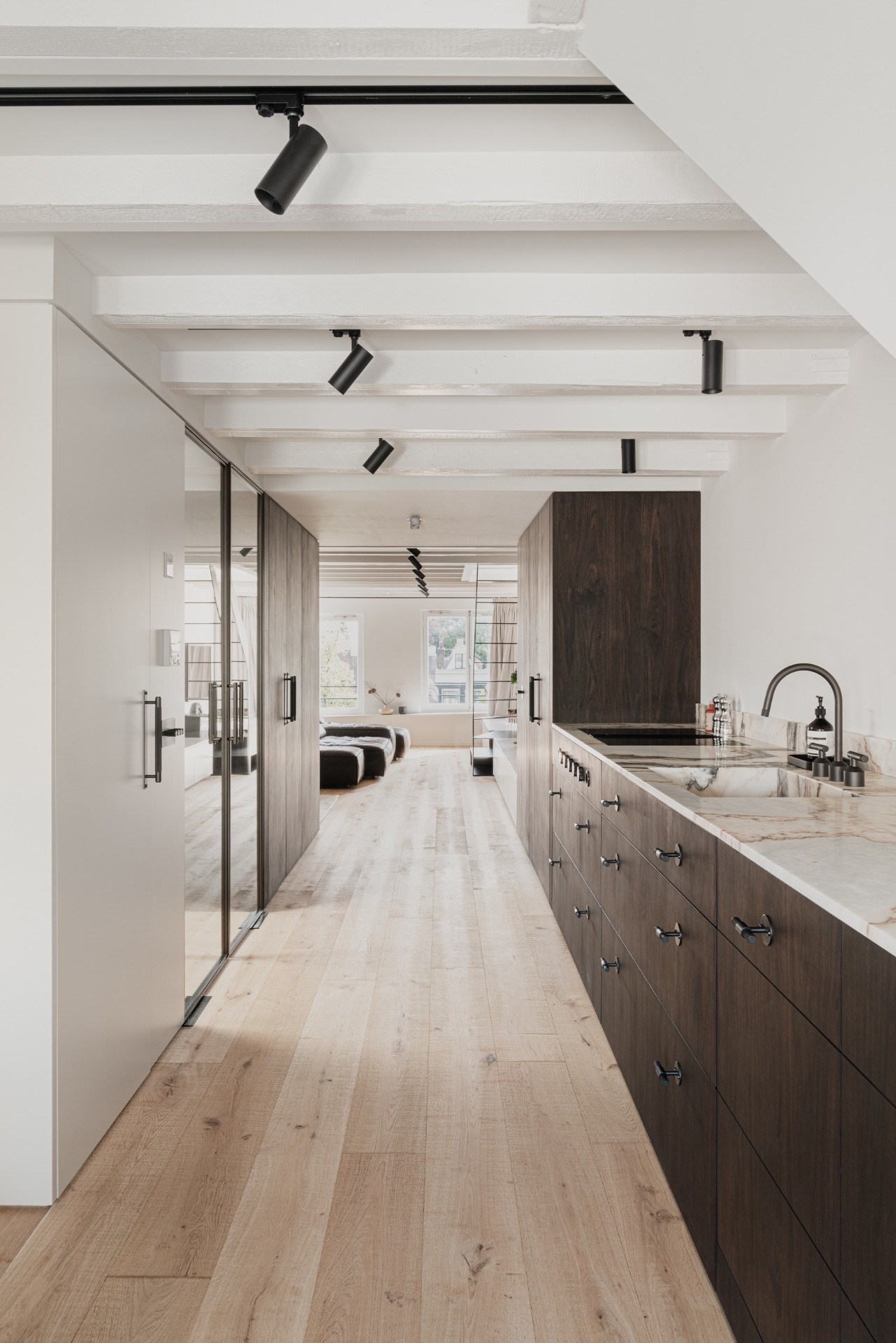
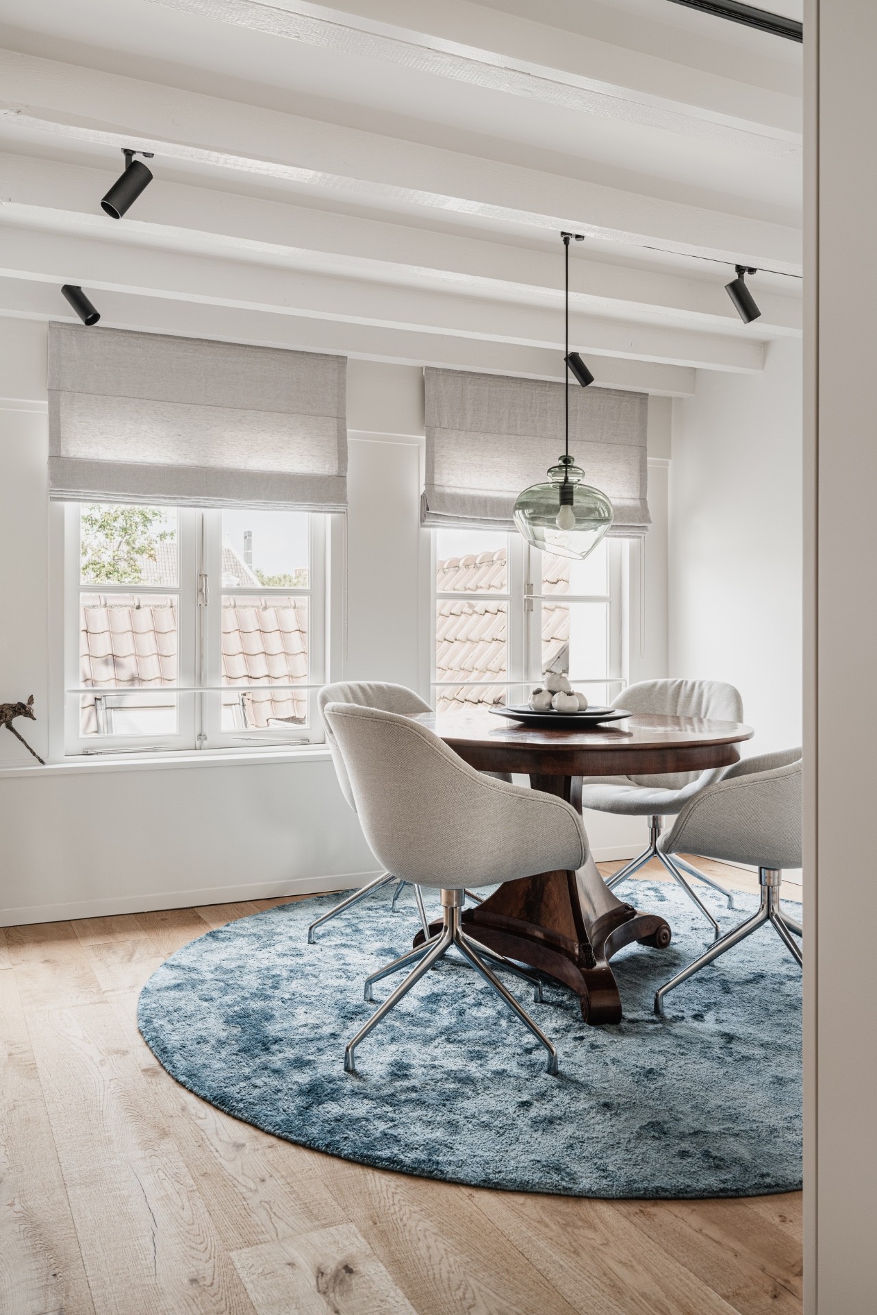
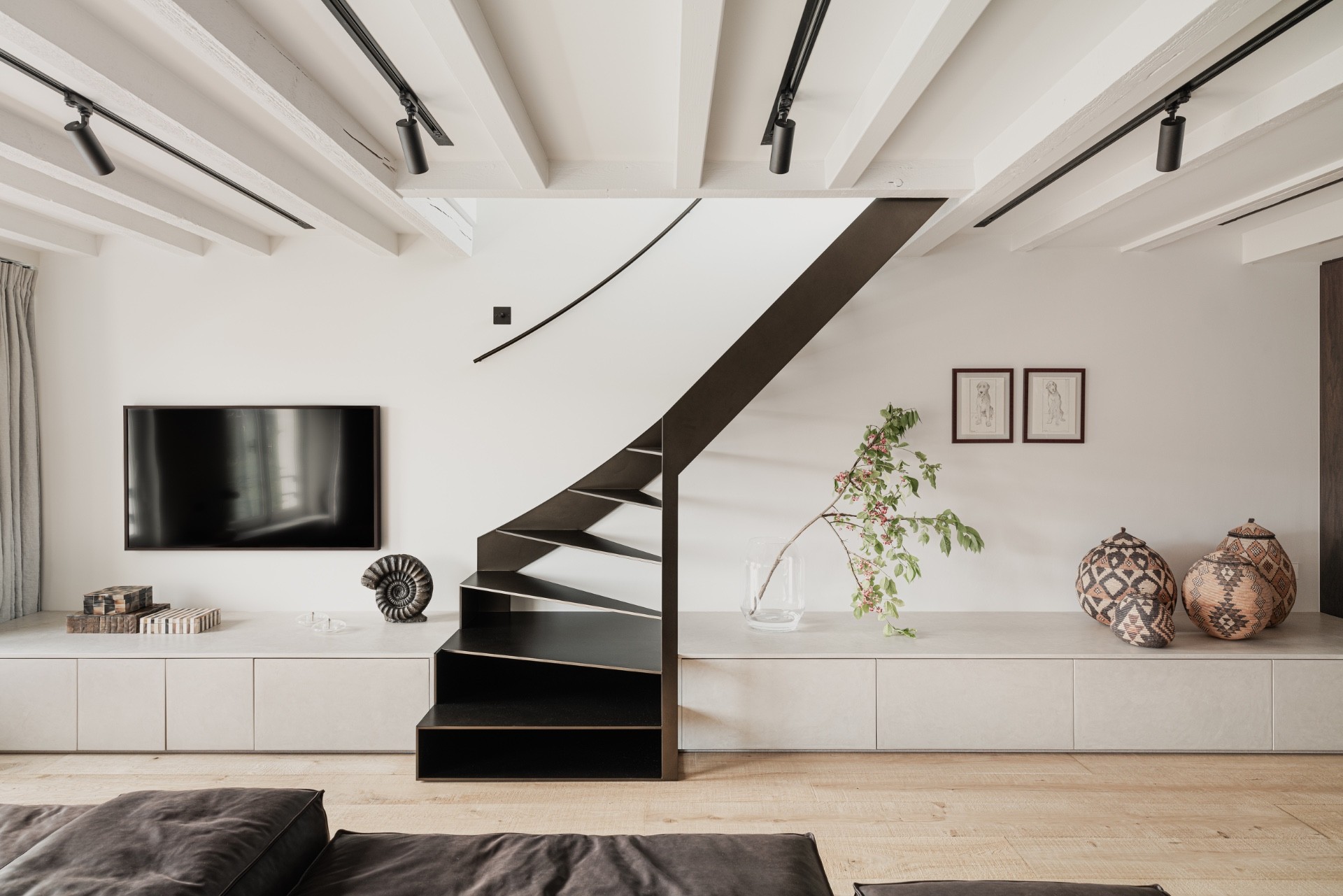
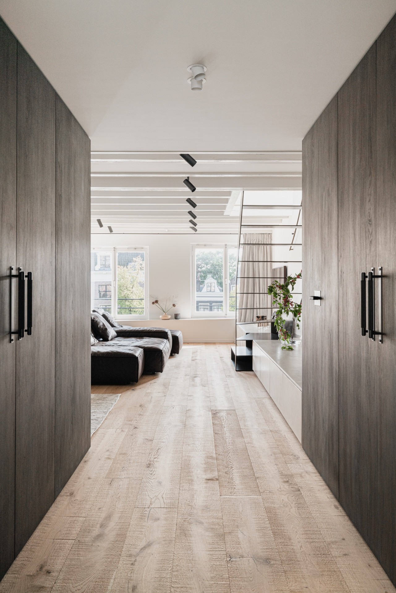
The first impression comes from the way the rooms stay connected. From the living area, the eye moves past the staircase, along the floor, and toward the next opening without interruption. Large windows bring in daylight and catch the lighter tones in the walls and timber, while the darker door and cabinet fronts give the plan a sharper edge. Nothing feels crowded. The furniture sits low, the circulation stays clear, and the structure of the apartment remains easy to read.
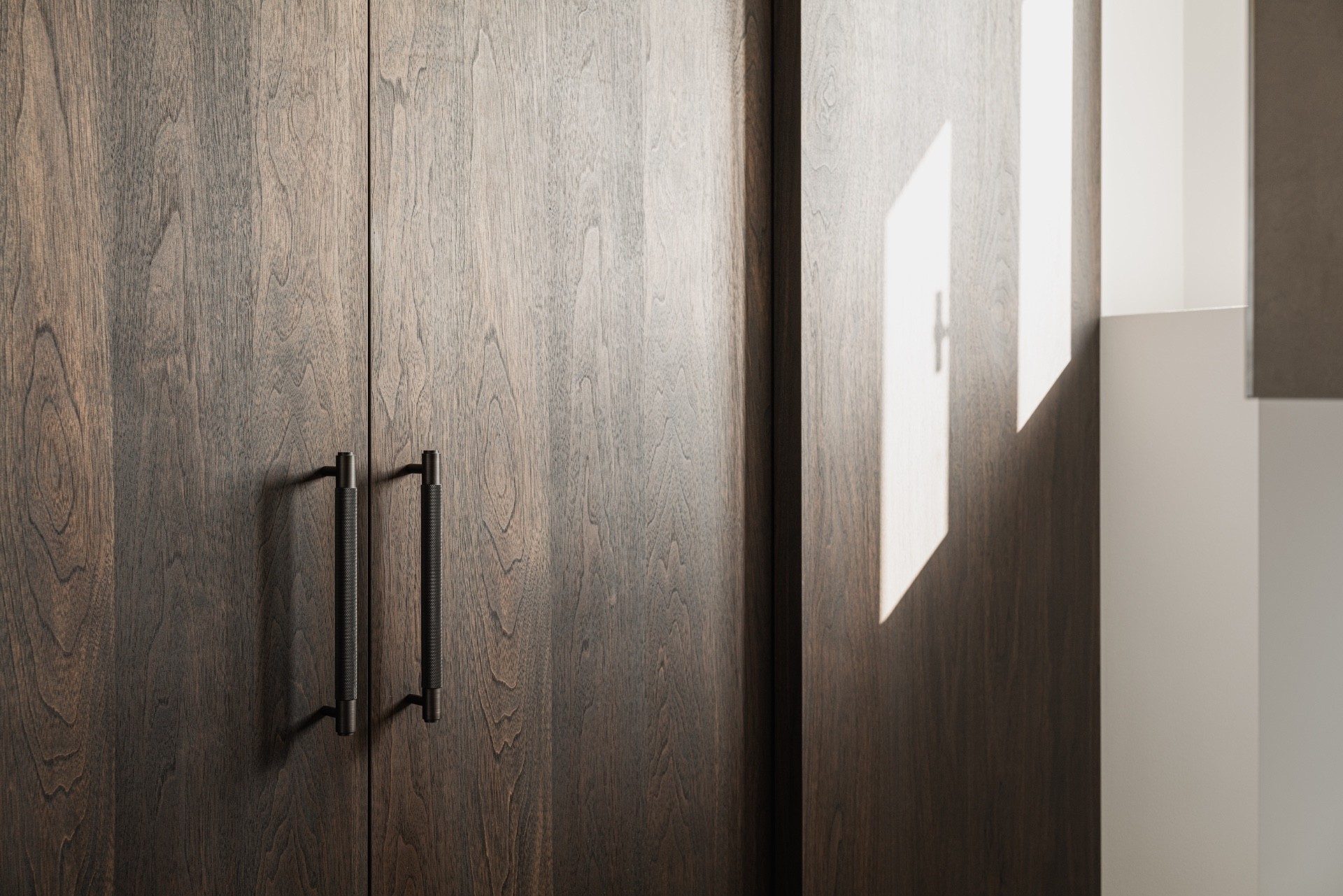
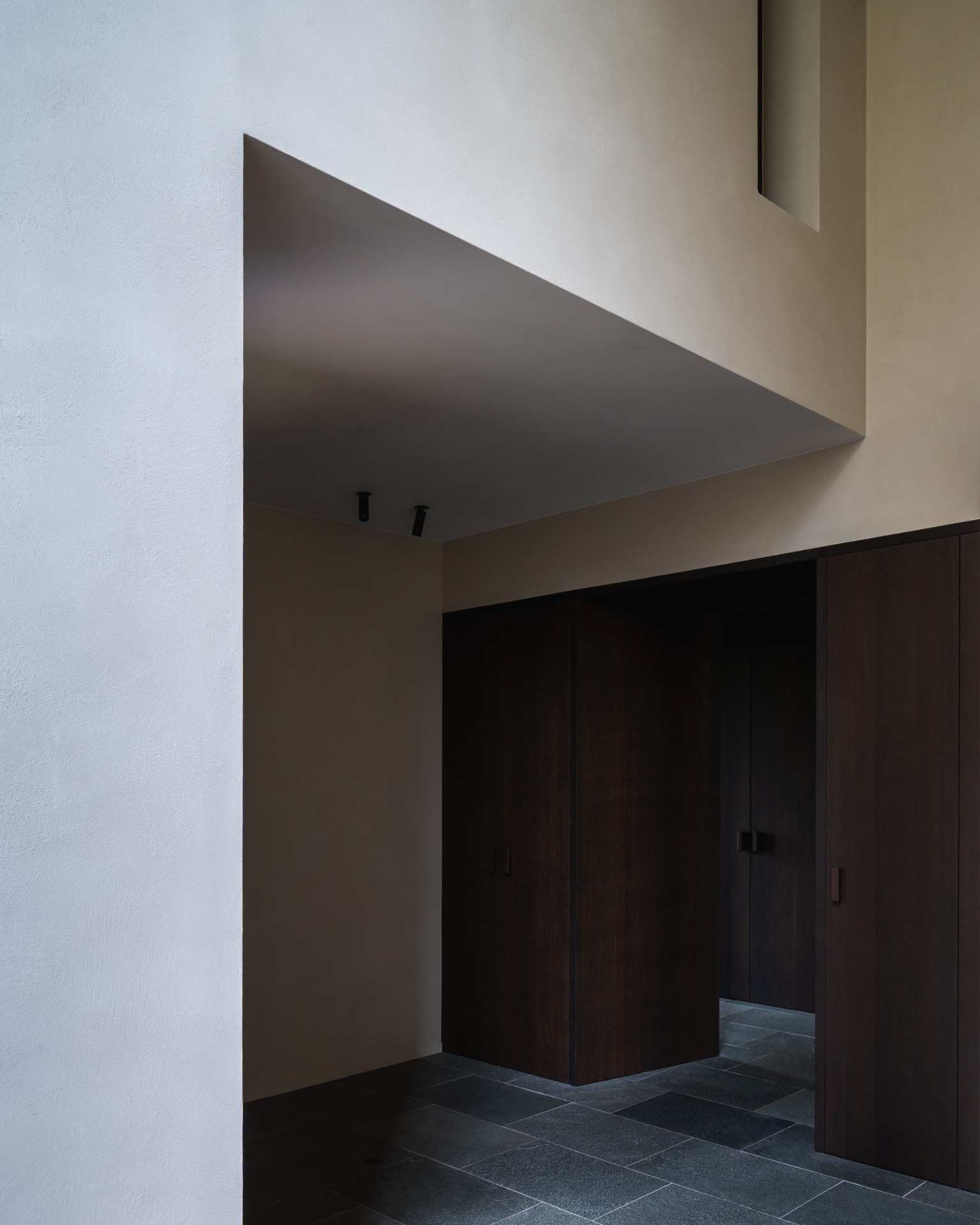
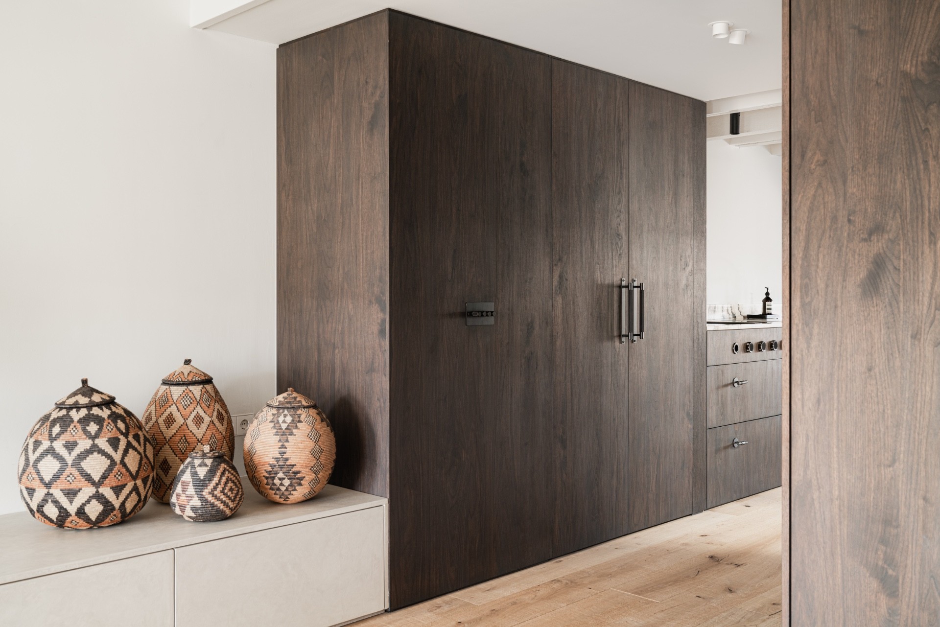
That openness is not achieved by emptiness alone. Built-in elements absorb storage and keep the surfaces calm, so the room can carry stronger material notes without becoming busy. The custom built-in cabinetry follows the walls closely, leaving the centre of the apartment open for movement and for longer views across the living space. In a project like this, the plan itself becomes part of the interior expression.
The steel staircase as a clear centre point
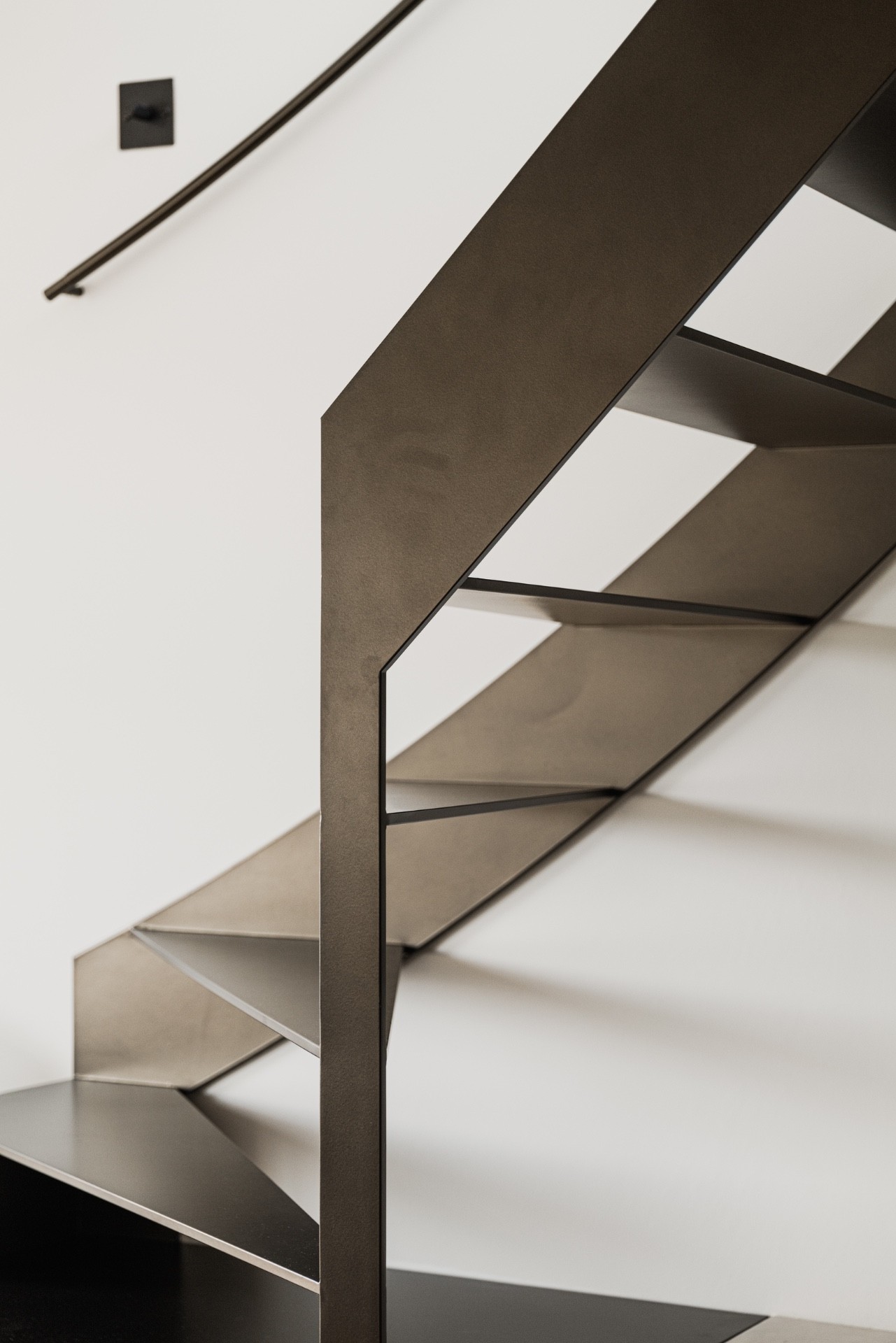
The steel staircase interior is placed where the apartment needs a vertical marker. Its slim frame and open structure sit lightly against the surrounding finishes, but it still anchors the room. Seen beside the exposed beams contrast above, the staircase sharpens the dialogue between old and new without turning the space into a pastiche. The beams stay present overhead, while the staircase introduces a cleaner line through the middle of the home.
Track lighting spots follow the ceiling line and reinforce the length of the room. They pick out the steel details, the wall surfaces, and the transitions between zones without taking over the scene. From different angles, the staircase changes character: sometimes almost graphic, sometimes reduced to a quiet outline. It works as circulation, but also as a clear piece of spatial composition.
Historic structure left in view
The original timber ceiling gives the apartment its strongest historic note. Rather than being covered up, the exposed beams contrast with the smooth wall finishes and the crisp edges of the joinery. That contrast is visible in nearly every room. The beams hold their rougher rhythm above the cleaner surfaces below, and the result is a space that shows its age while speaking in a much more restrained language at floor level. The renovation does not erase the structure; it lets it stay readable.
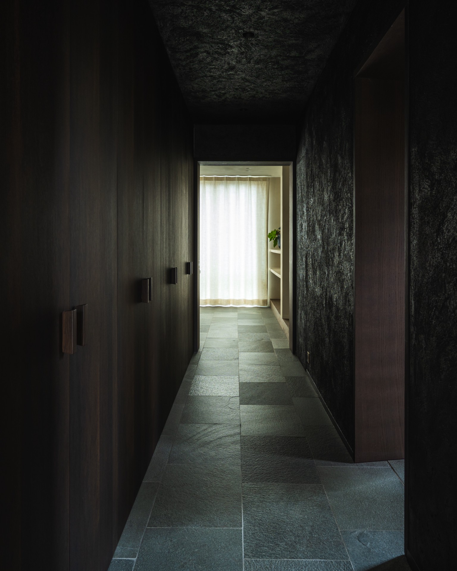
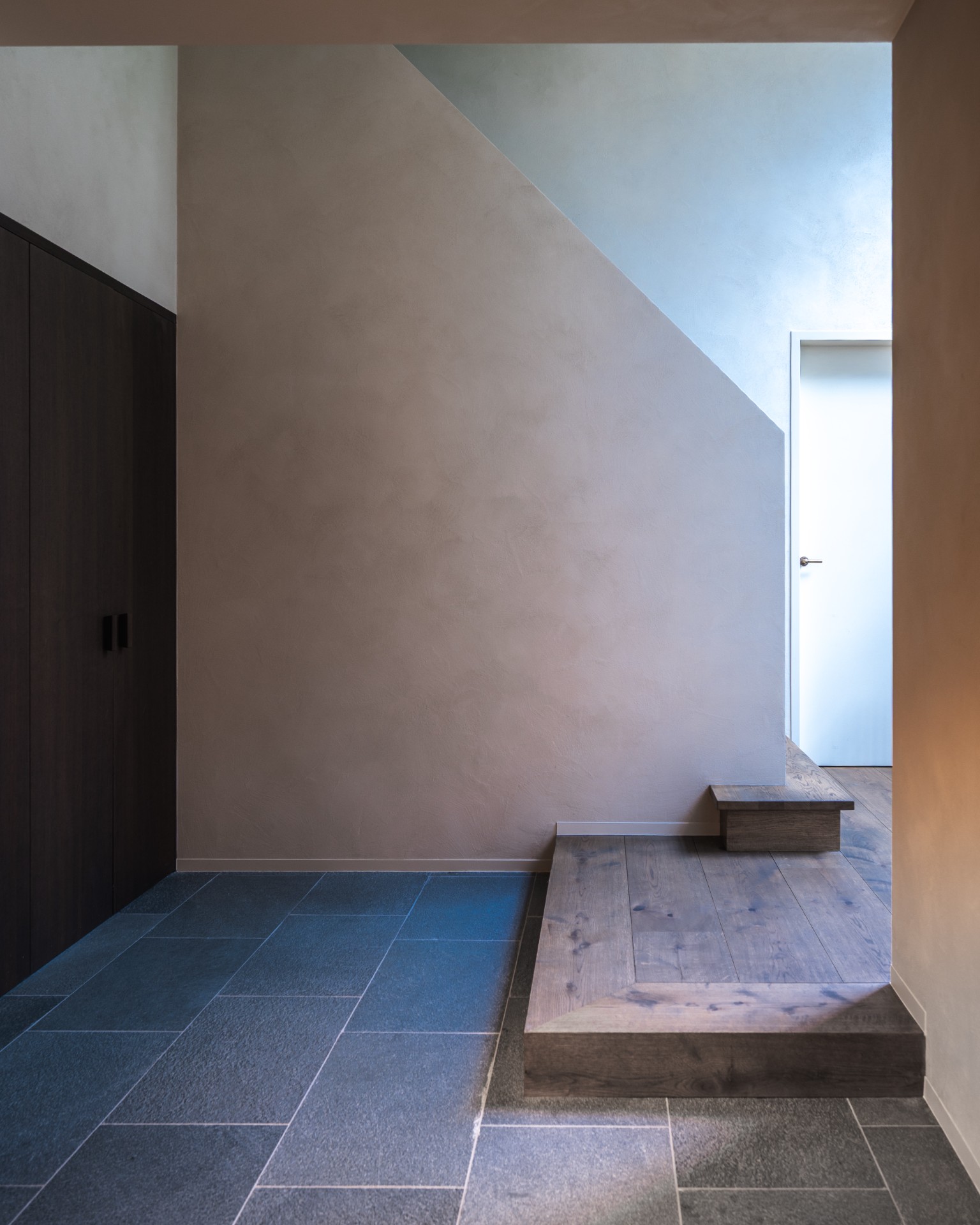
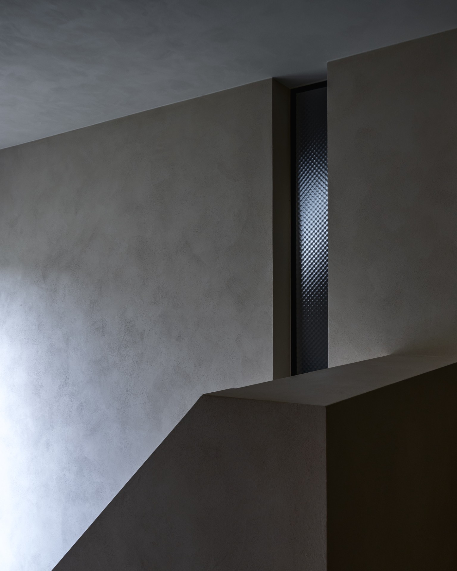
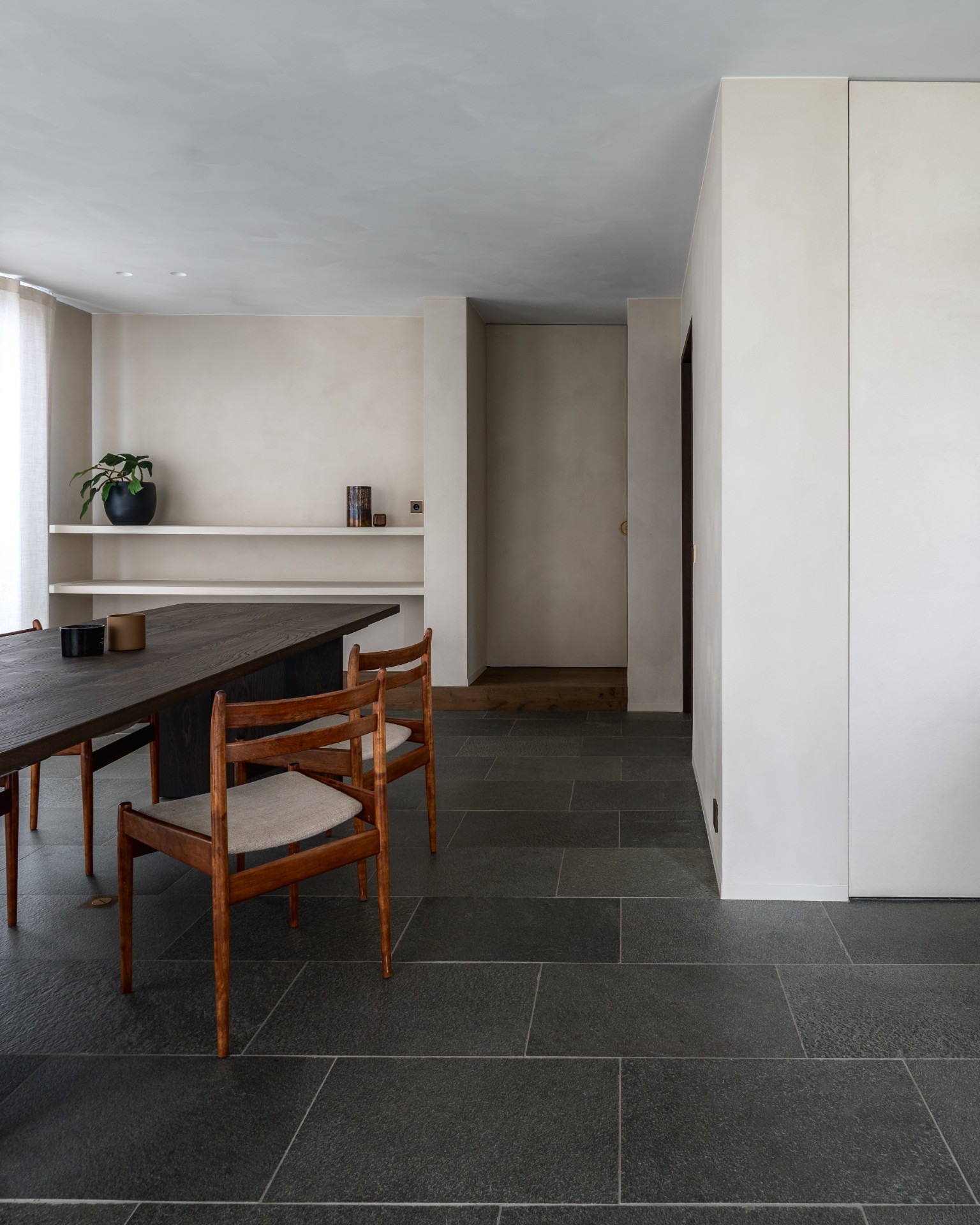
Elsewhere, the same approach appears in small transitions and surface changes. A dark floor in the hall, a pale wall plane, a recessed opening, a narrow shadow line: each move is modest on its own, but together they give the apartment a clear sequence. The historic fabric is never isolated as decoration. It works with the plan, the light, and the furniture layout.
Kitchen and living space held together by stone and timber
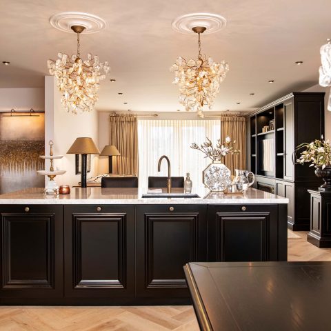
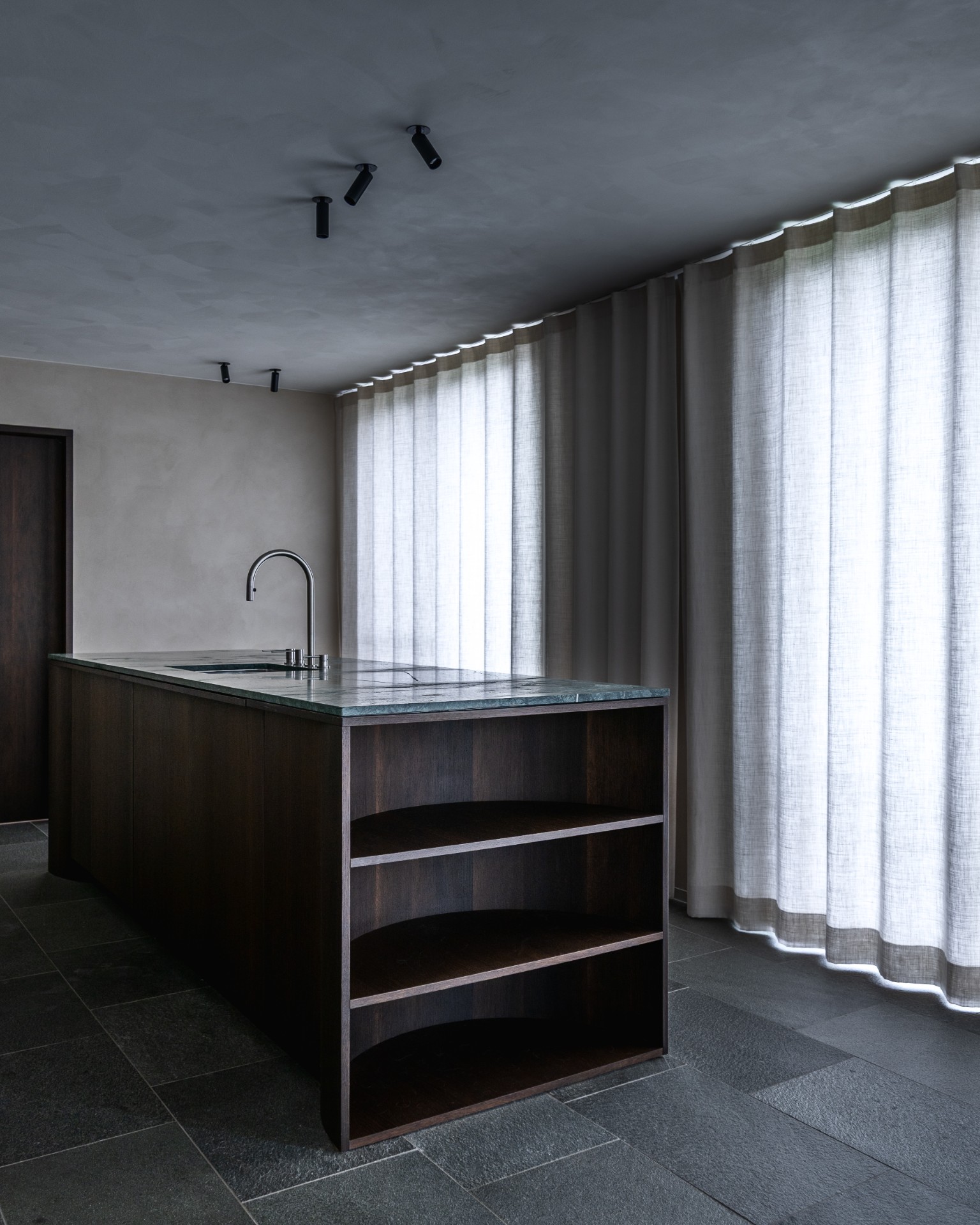
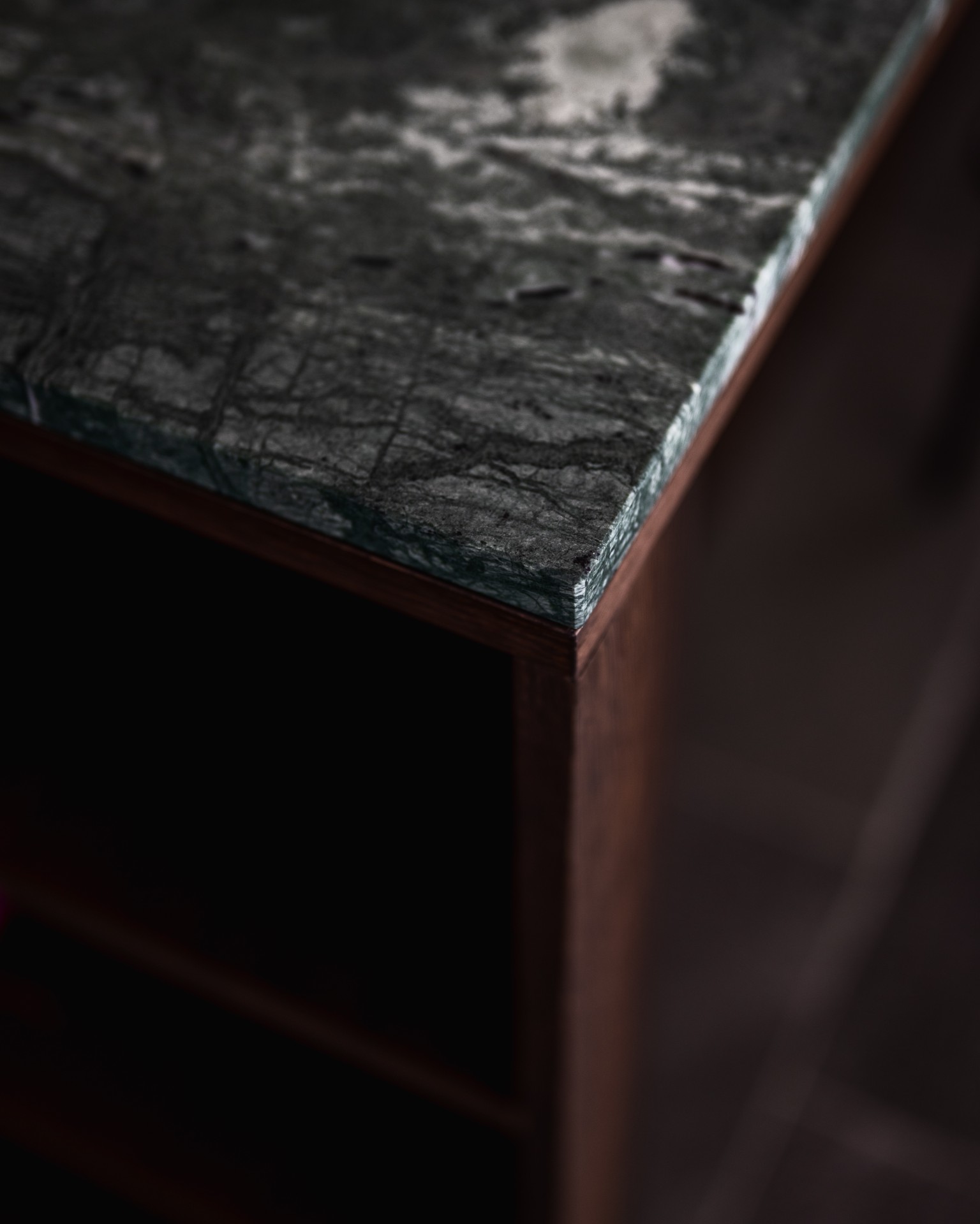
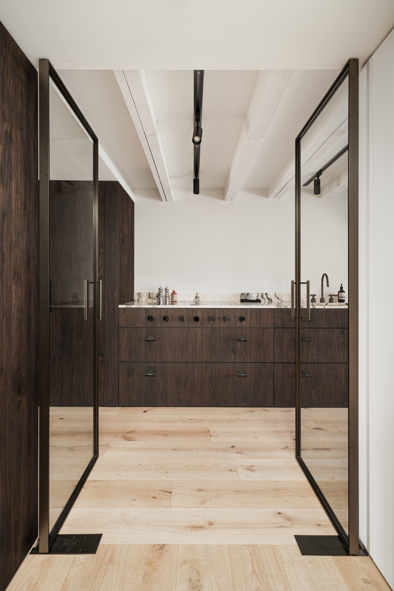
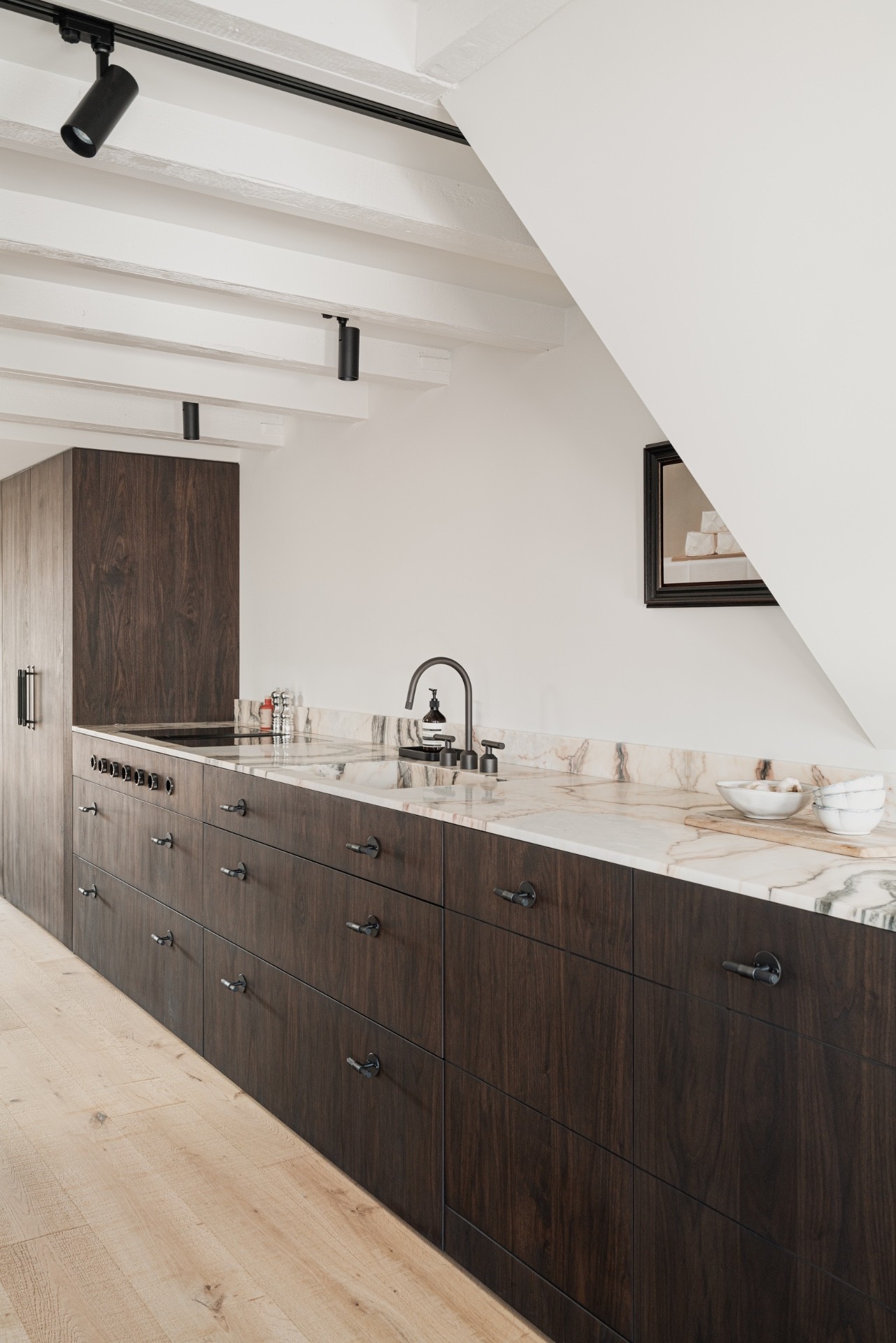
The kitchen sits close to the living area and uses the same restrained material language. A marble-like countertop runs across the work zone and sets a lighter note against the wood fronts. The cabinetry is built in flush and without decorative breaks, so the kitchen reads as part of the room rather than a separate object placed inside it. The effect is practical, but also visual: the eye can move from the worktop to the seating area without meeting a hard transition.
Natural stone accents appear again at the fireplace, where a darker surround gives the wall a firmer centre. The stone creates depth without becoming heavy, especially next to the paler plaster and the warm timber around it. This is where the apartment’s material strategy becomes most legible. Wood softens the long planes, stone gives weight to the key points, and the open-plan apartment keeps both visible at once.
Detail in the hall and guest toilet
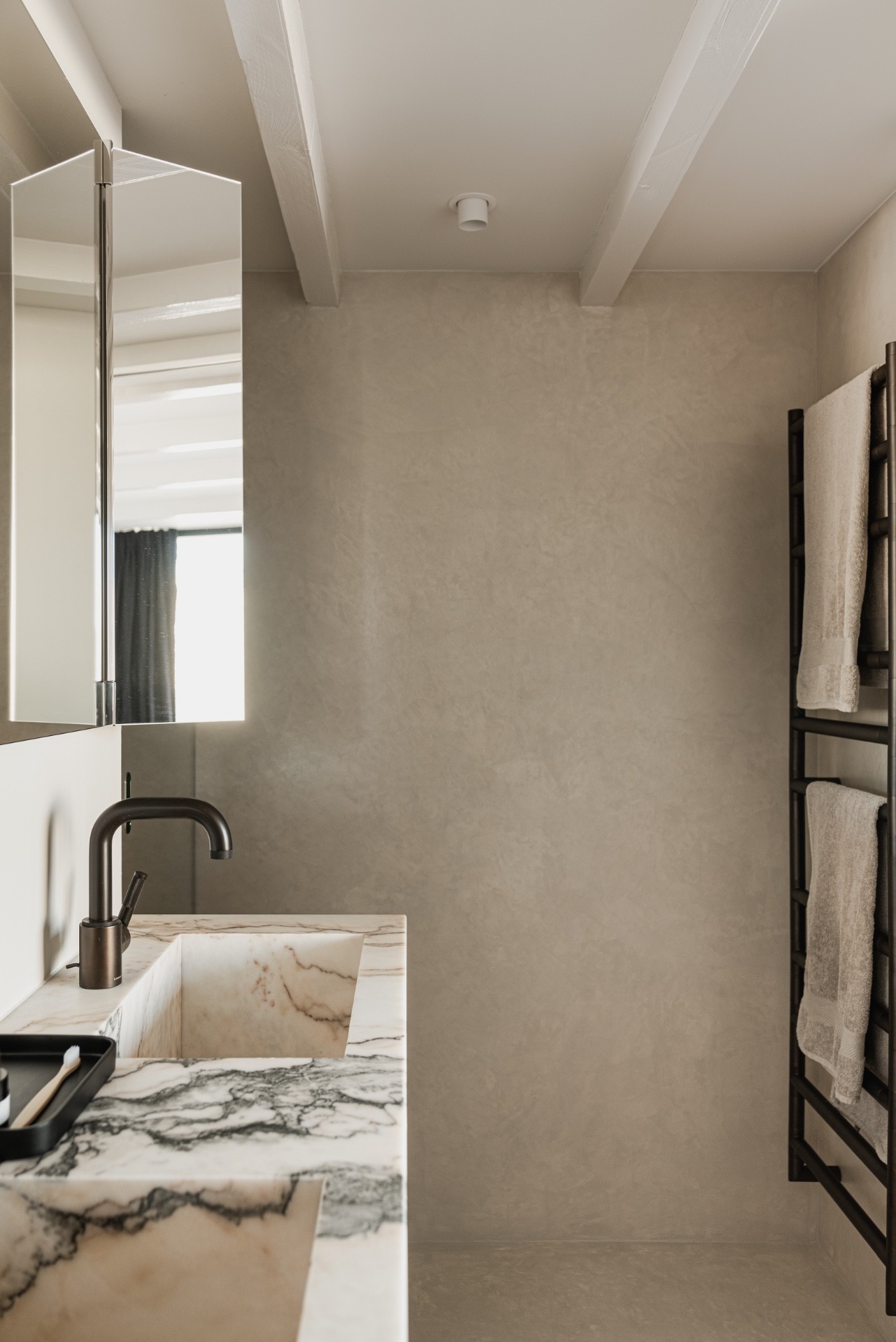
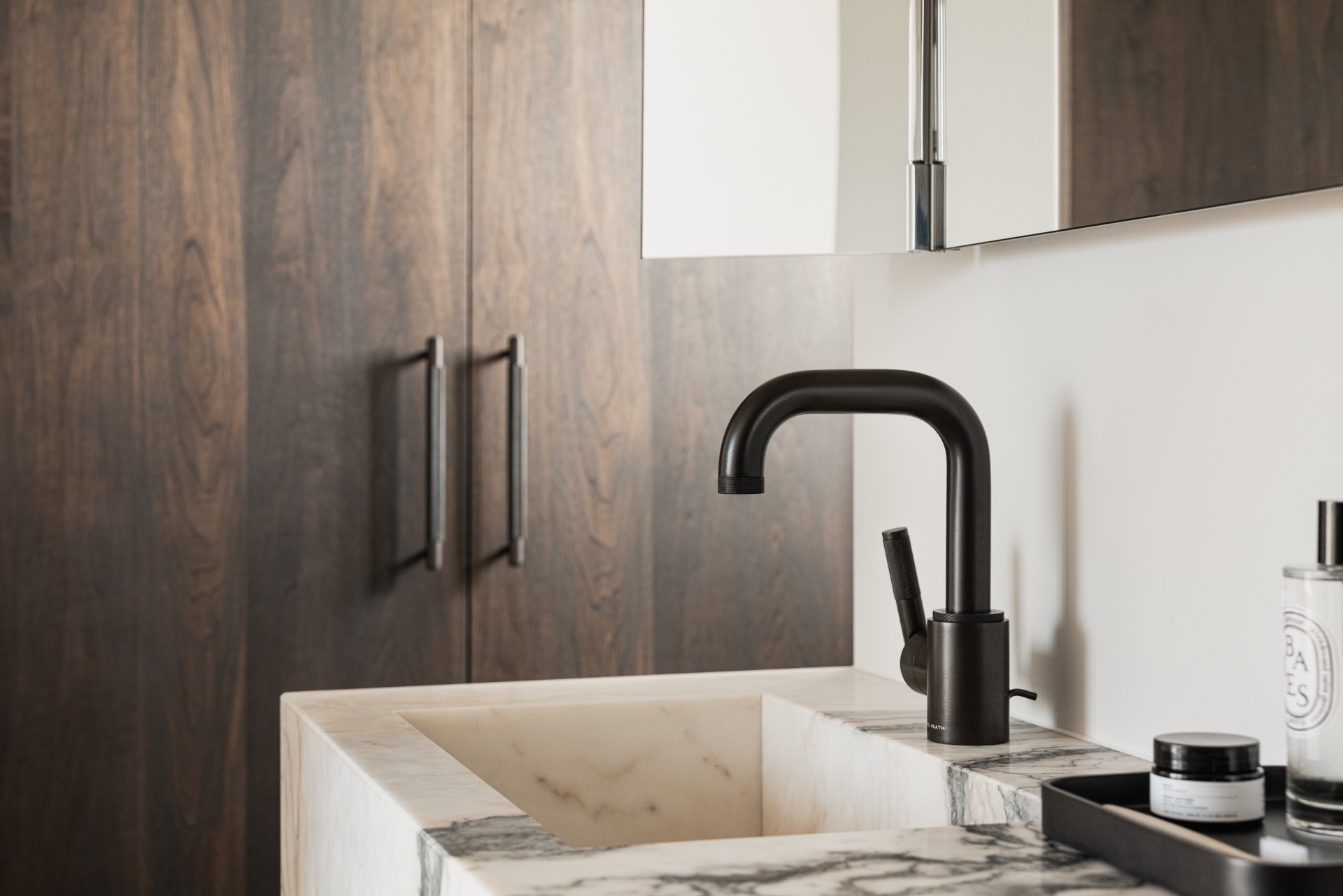
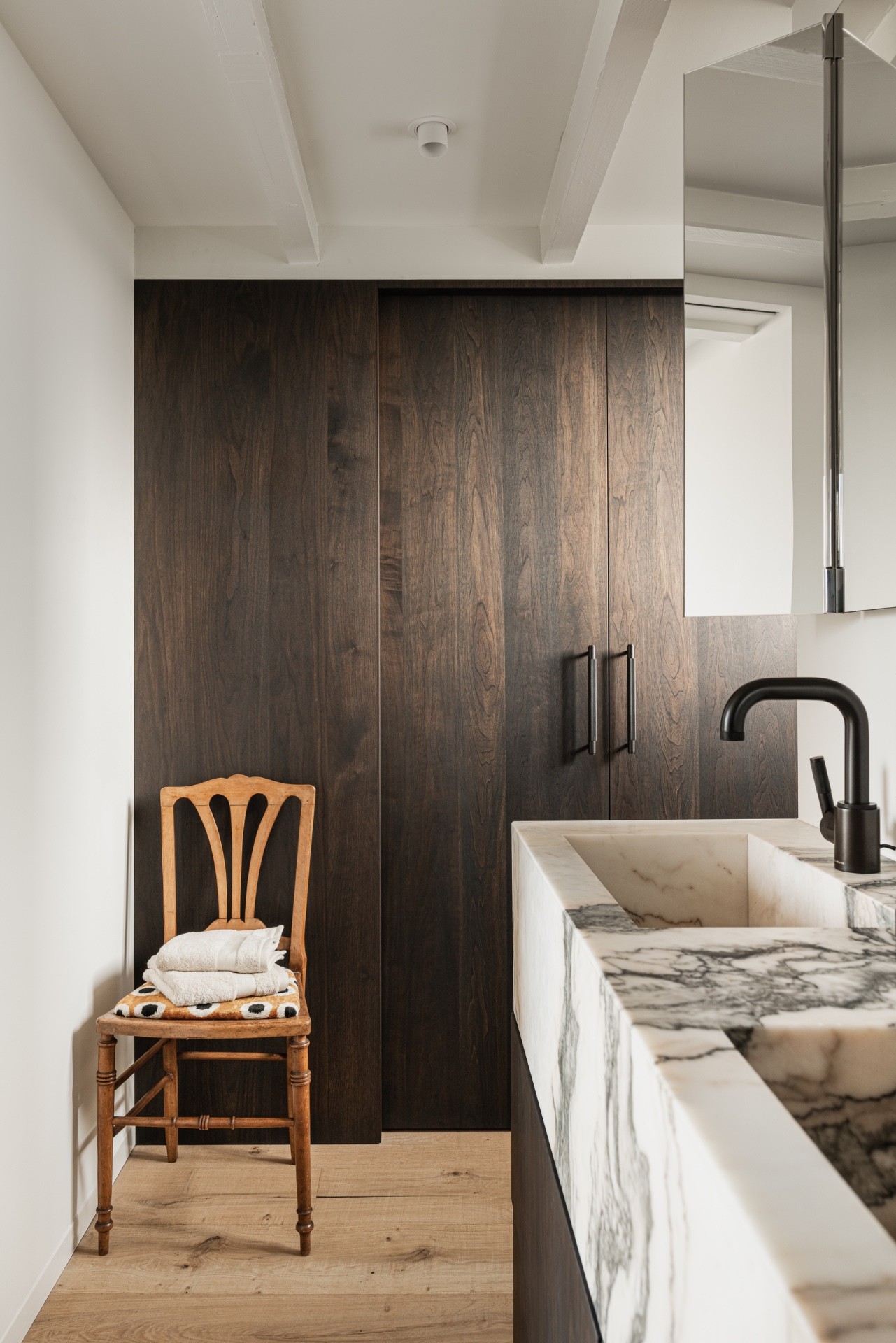
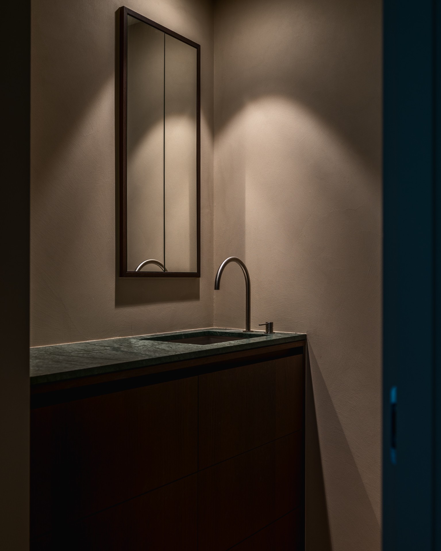
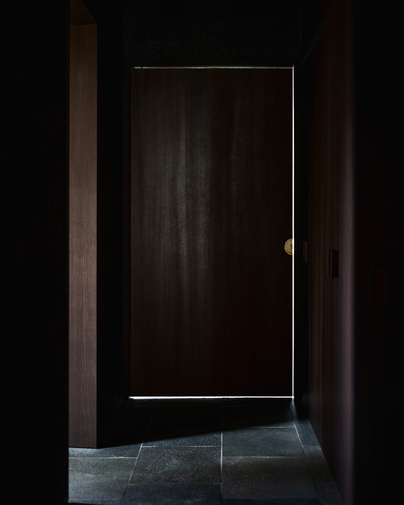
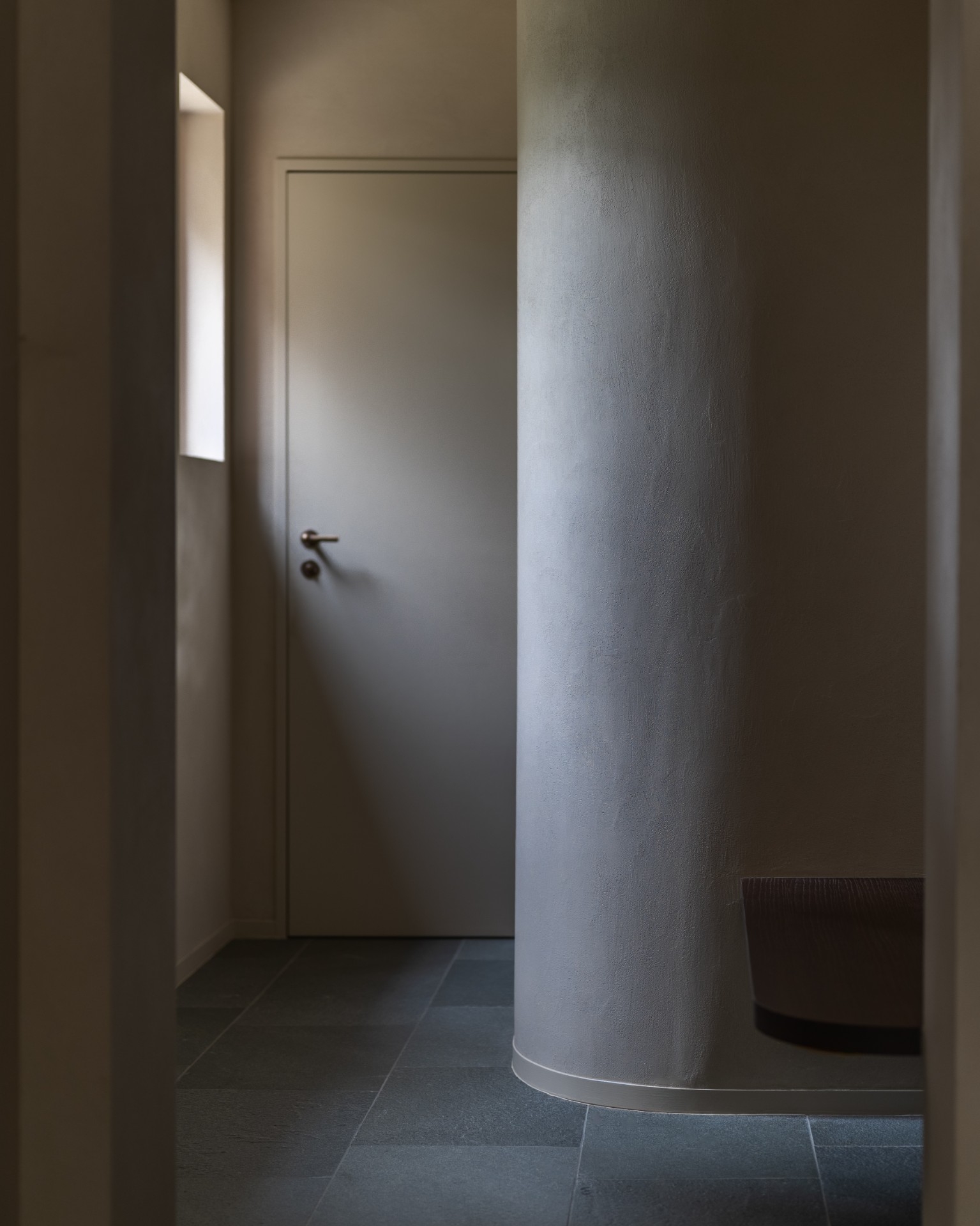
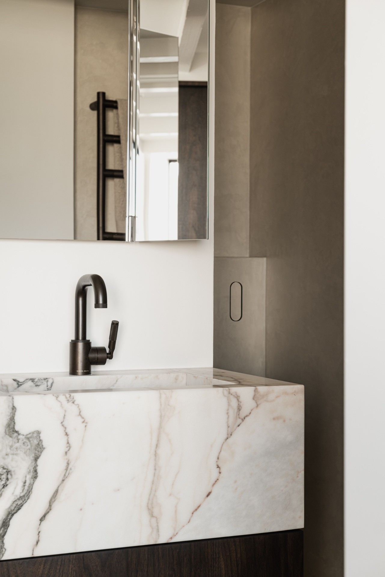
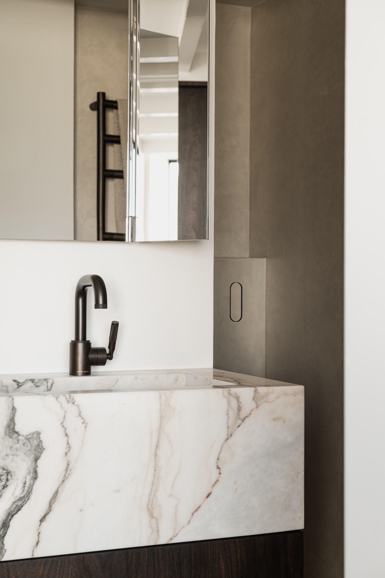
The hall is narrower and darker, which makes the details there more noticeable. A refined guest toilet introduces a smaller but more precise set of surfaces, including a mirror with an unusual frame and a stone-topped basin area. Even in this compact setting, the apartment avoids visual noise. The materials are consistent with the rest of the home, but the scale is tighter and the gestures more direct. A doorway, a reflection, a stone edge: that is enough to hold the space.
Here, the apartment shows how it handles smaller rooms. Instead of changing language, it reduces the number of moves. The finish stays controlled, the lines stay straight, and the lighting leaves the surfaces easy to read. The result is a sequence that prepares the transition from the public rooms to the more private upper floor without a sudden shift in character.
Upper floor rooms and the terrace threshold
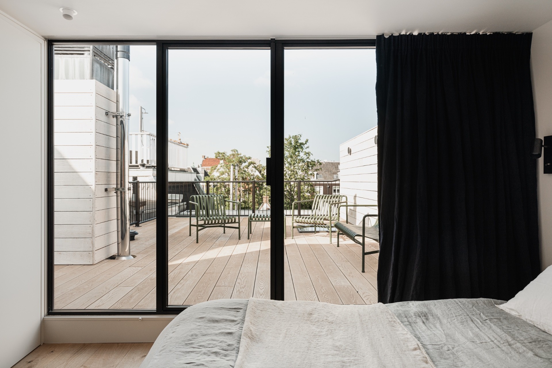
Upstairs, the plan opens into the main bedroom, a walk-in wardrobe, and a bathroom arranged with the same measured use of materials. The wooden floor continues through these rooms and out toward the roof terrace, where the change from inside to outside is handled with the same continuous surface. That run of flooring keeps the transition calm, but it also makes the terrace feel like part of the interior sequence rather than a separate destination.
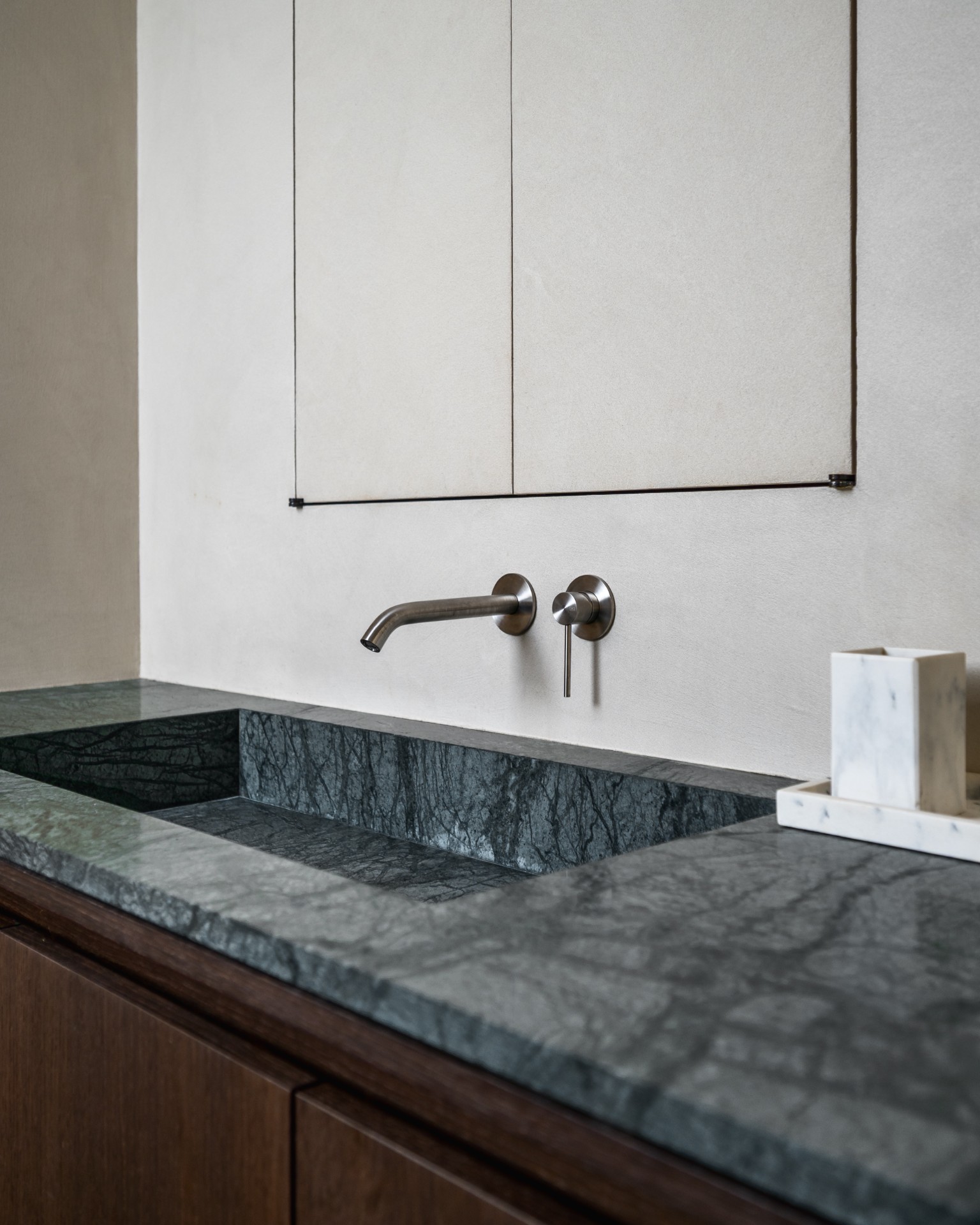
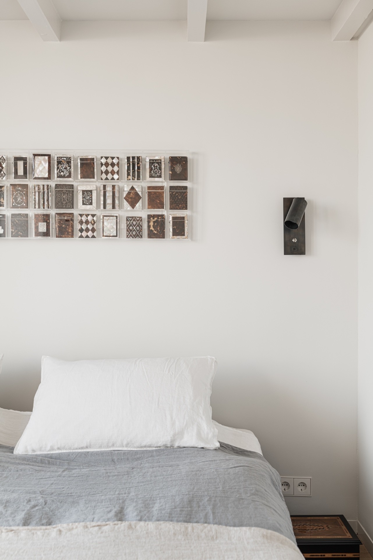
The bedroom and bathroom rely on the same combination of light surfaces, timber, and stone accents seen below. A darker tile or stone note appears in the wet zone, while the wood brings the upper floor back into the same material rhythm as the rest of the apartment. Nothing is overdrawn. The rooms are defined by surfaces, thresholds, and the way daylight lands on them across the day.
A renovation shaped by material contrast
What stays with you after moving through the apartment is the way each material supports the next one. The marble-like countertop brightens the kitchen. The custom built-in cabinetry keeps the walls clear. The steel staircase interior gives the plan a strong vertical line. Above all, the exposed beams contrast with the cleaner modern finishes below, so the apartment never loses sight of its earlier structure. The renovation works by keeping those layers visible, not by smoothing them into one generic finish.
That is what makes the open-plan apartment read so clearly as a finished project. Long sightlines, natural stone accents, warm wood, and precise joinery all do specific work in the rooms. Nothing is decorative for its own sake. Every surface has a task, whether it is catching light, framing movement, or holding a quiet line across the plan. The result is an interior that feels composed from the structure outwards.
Material palette across the apartment
Wood, stone, steel, and plaster carry the whole project. The floor connects the rooms, the stone marks the places where weight matters, and the steel keeps the staircase visually light. In the living areas, the track lighting spots skim the ceiling and make the long room legible after dark. In the quieter spaces, the surfaces stay more contained, with fewer interruptions and a stronger emphasis on texture. Across the apartment, the palette stays consistent while each room uses it in a slightly different way.
The finished interior is not about one dramatic gesture. It is about how the openings, the built-in storage, the fireplace, and the upper-floor rooms hold together in a measured sequence. That is where the open-plan apartment succeeds: in the clear relation between old structure and new finish, between wide views and close detail, between the staircase at the centre and the quieter rooms around it.
Want to see more of Studio Thijs Fris? View the page of Studio Thijs Fris for even more great projects and company information.


NEW 2026 Jubileum Edition The Best Interior Designers Benelux
Order Now €125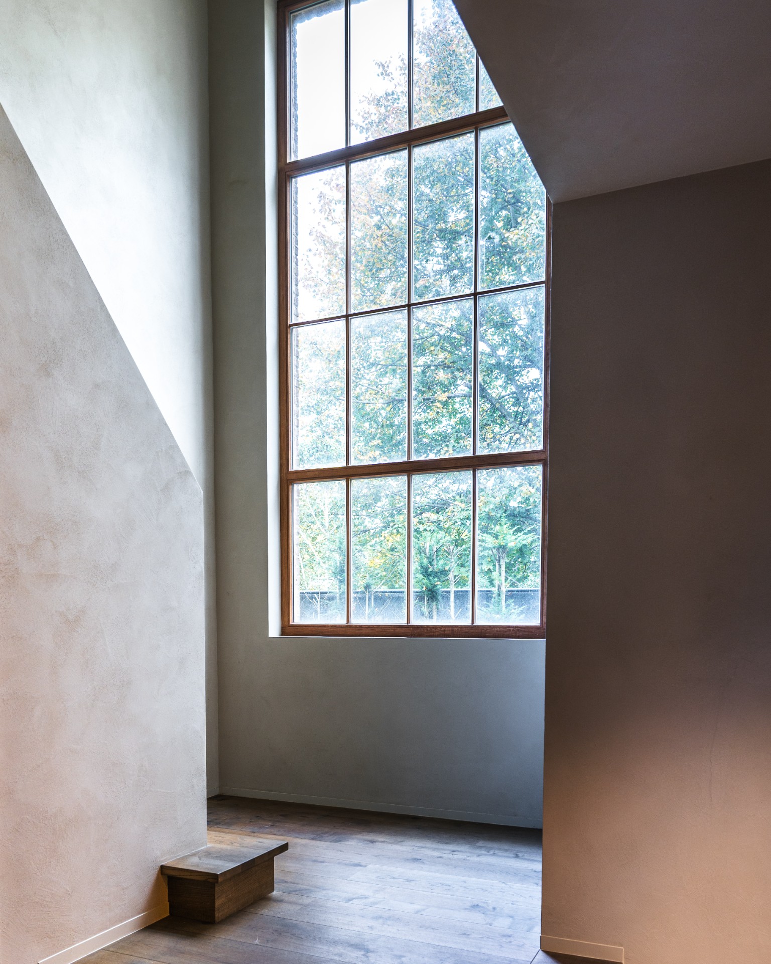
NEW 2026 Jubileum Edition The Best Interior Designers Benelux
Order Now €125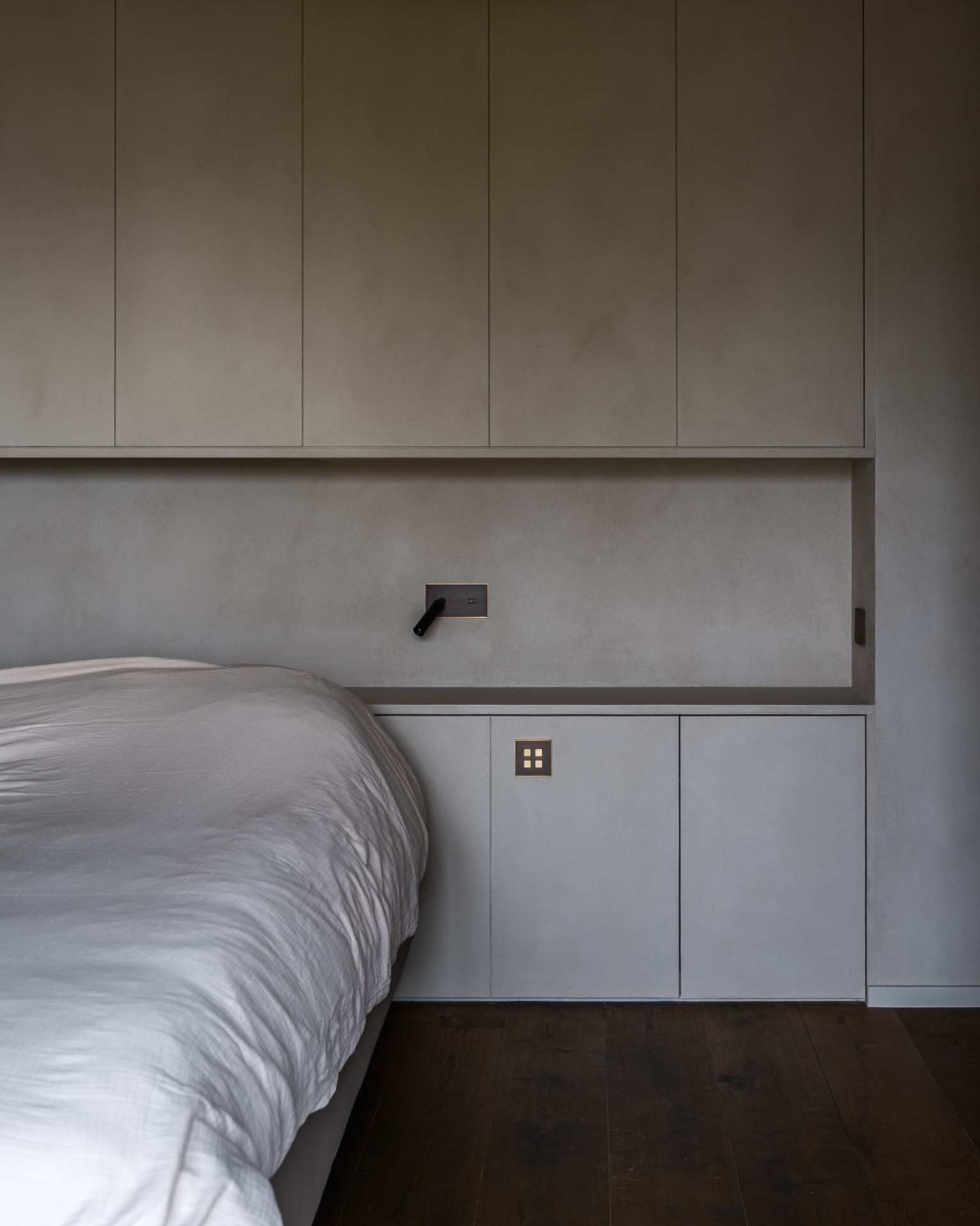
NEW 2026 Jubileum Edition The Best Interior Designers Benelux
Order Now €125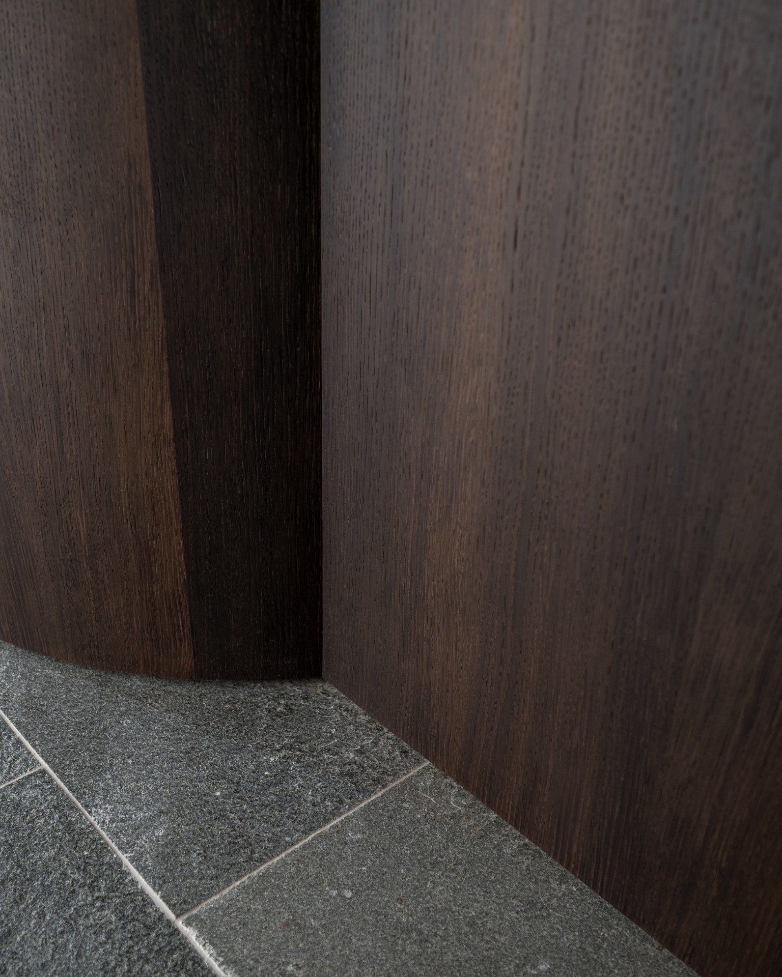
NEW 2026 Jubileum Edition The Best Interior Designers Benelux
Order Now €125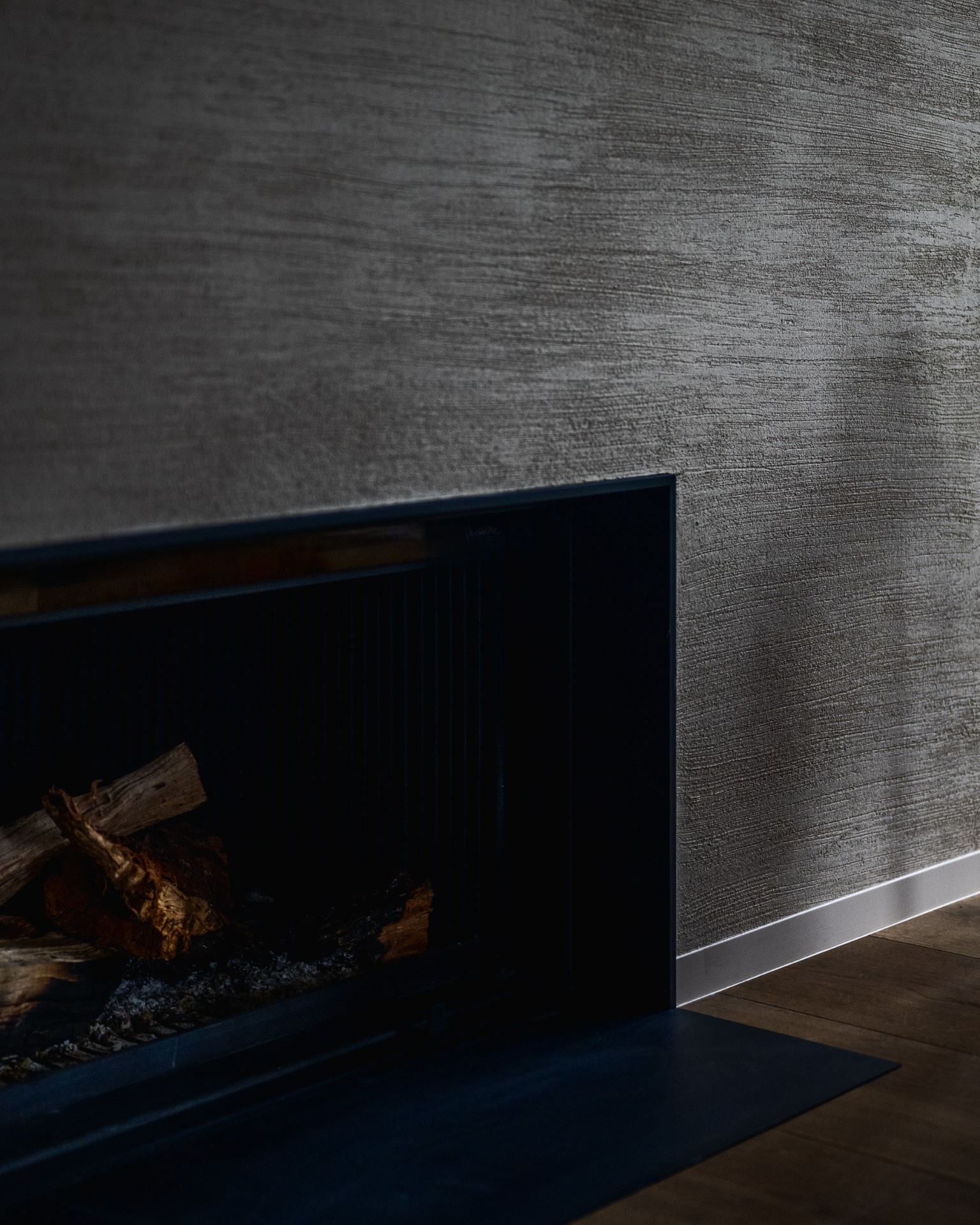
NEW 2026 Jubileum Edition The Best Interior Designers Benelux
Order Now €125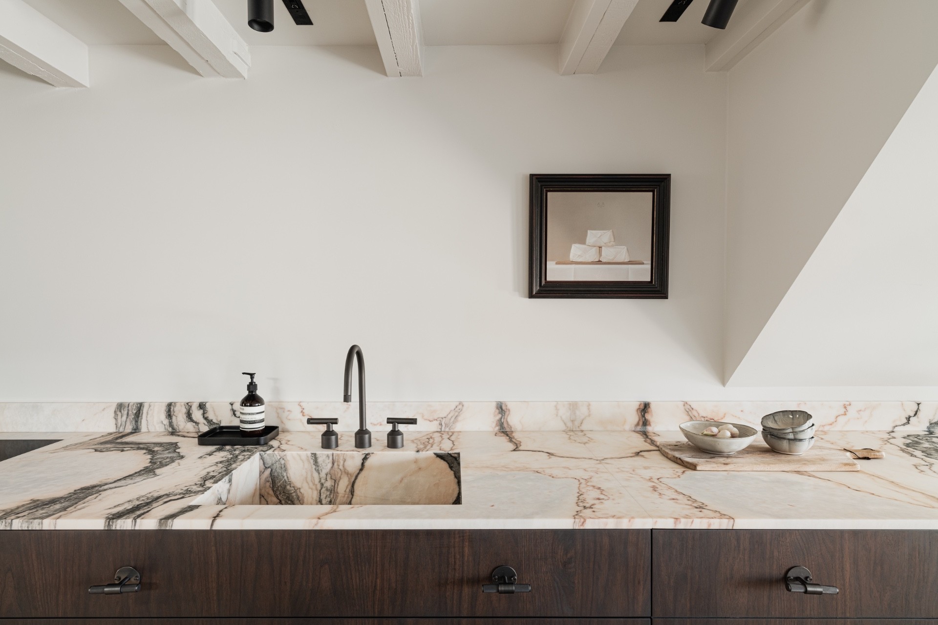
NEW 2026 Jubileum Edition The Best Interior Designers Benelux
Order Now €125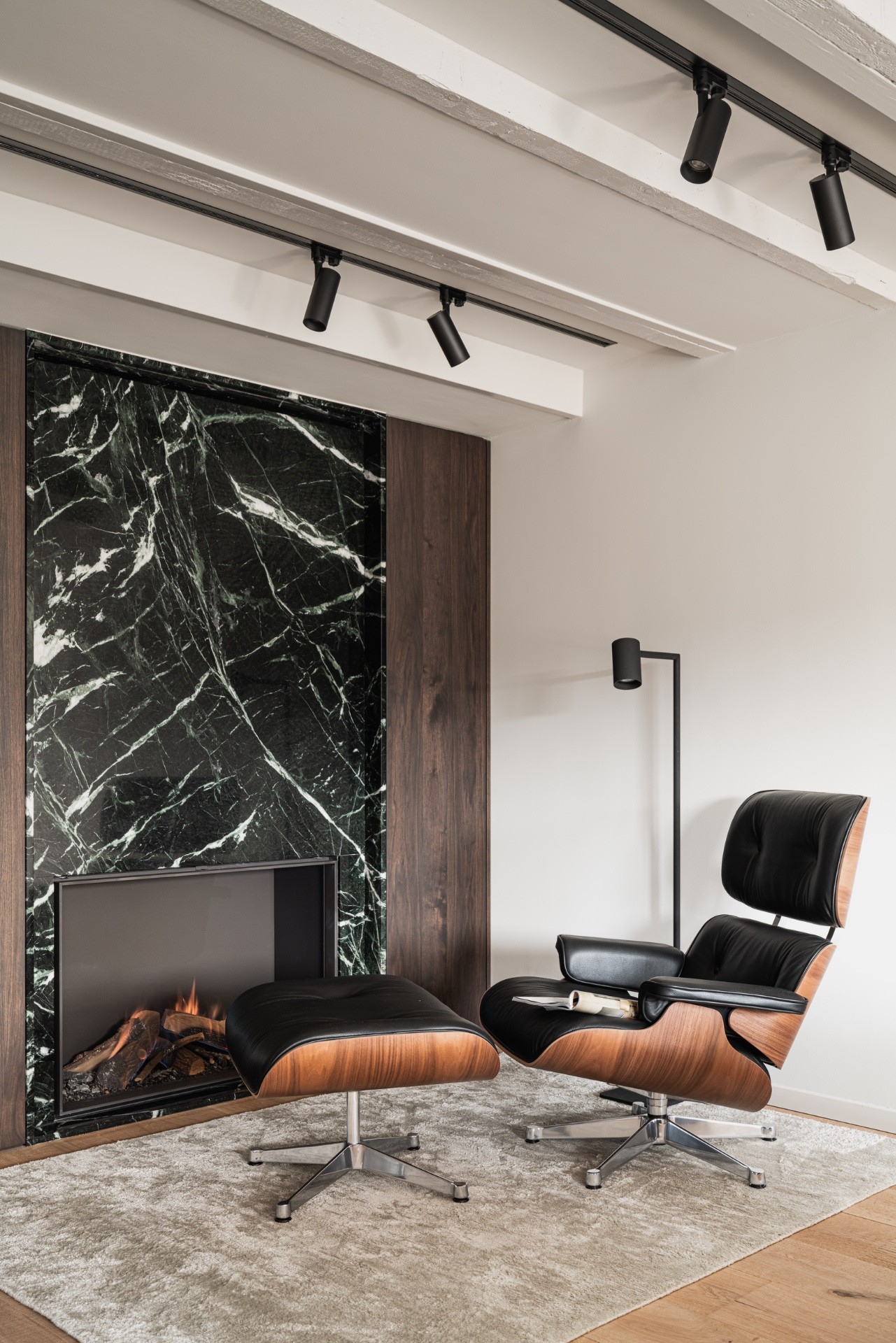
NEW 2026 Jubileum Edition The Best Interior Designers Benelux
Order Now €125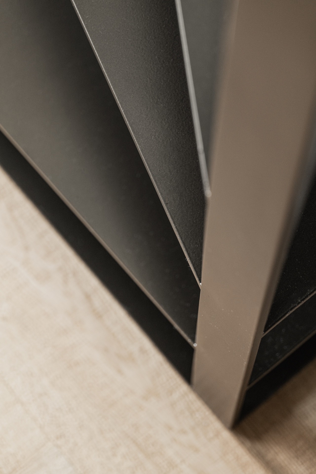
NEW 2026 Jubileum Edition The Best Interior Designers Benelux
Order Now €125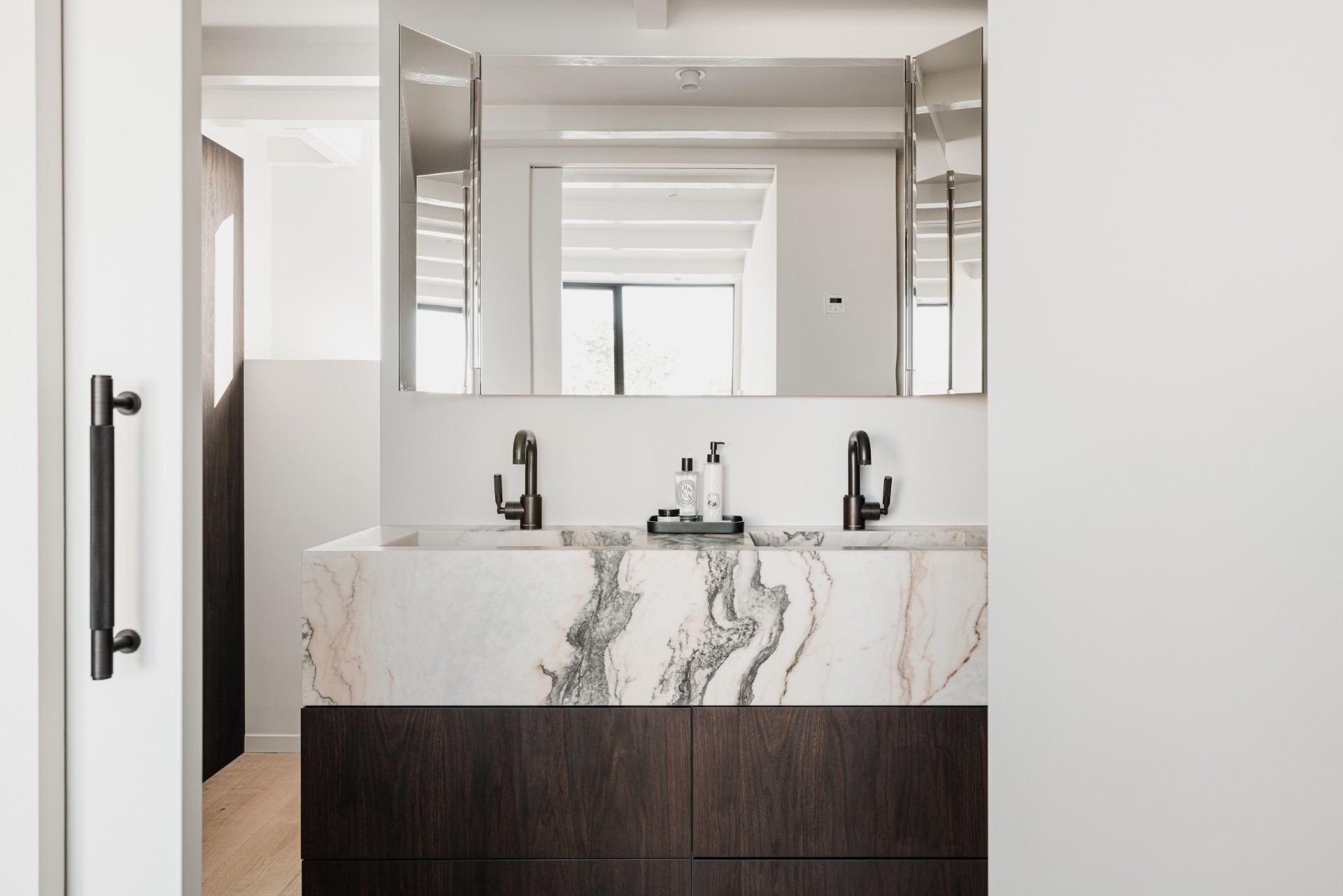
NEW 2026 Jubileum Edition The Best Interior Designers Benelux
Order Now €125