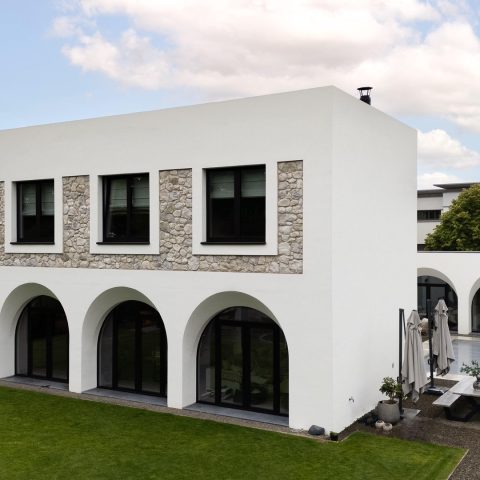
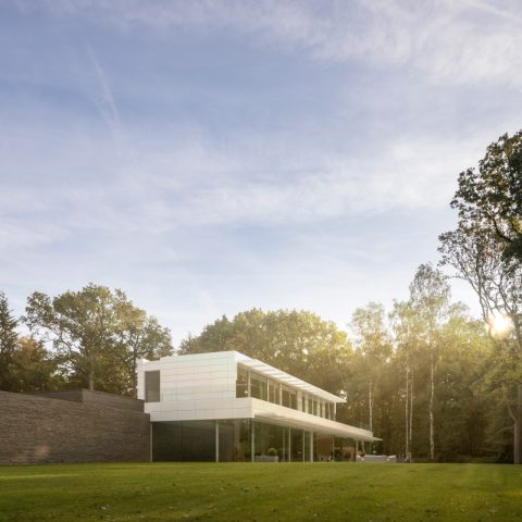
White brick house with floating volume and large glass openings
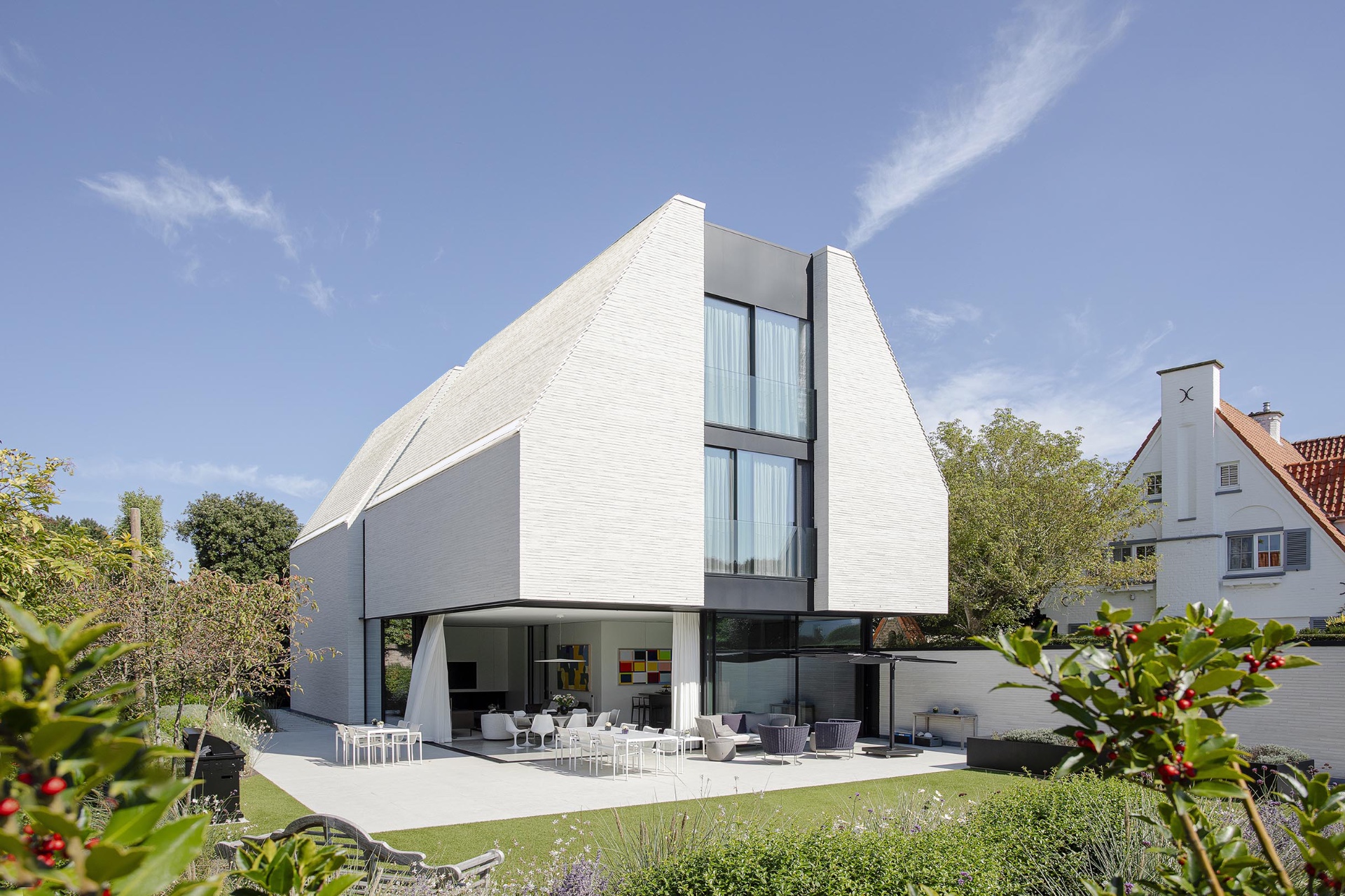
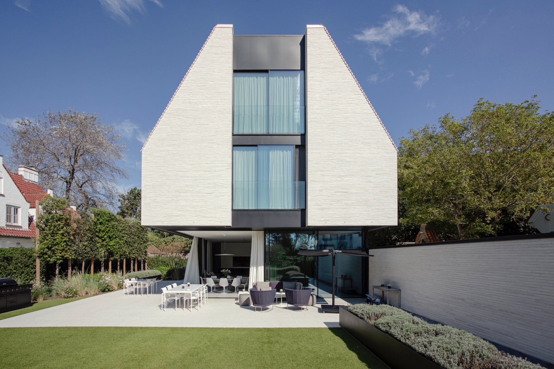
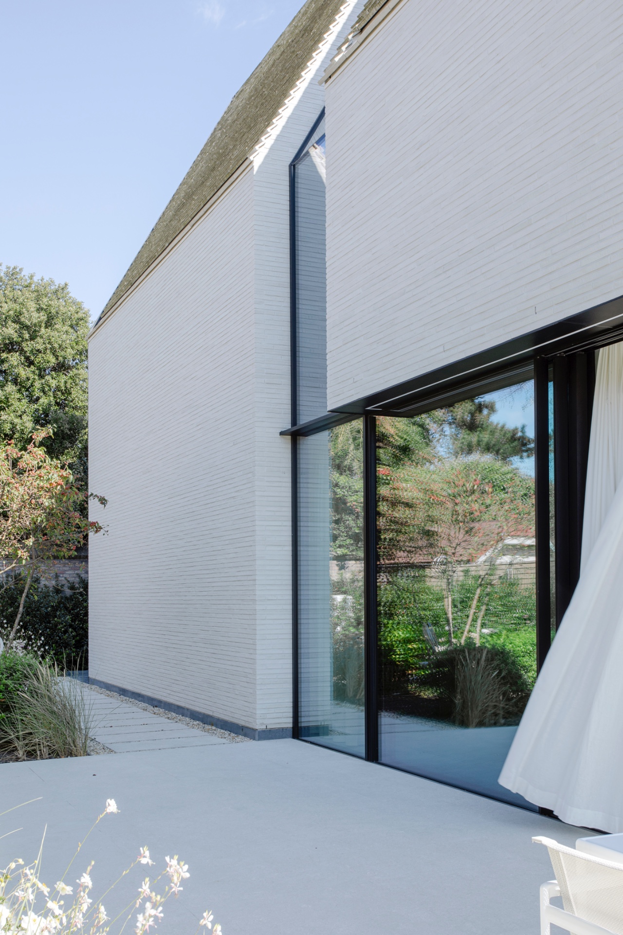
Two volumes meet, but a clear void keeps them apart. That gap is the first thing you read from the house: a strip of light, air and silence between two masses of white brick. One volume appears to hover above the terrace, while dark window frames cut sharp lines through the pale masonry. The result is less a single block than a measured composition, where the empty space does as much work as the built form.
Light held between two masses
The project begins with that tension between contact and distance. Instead of closing the gap, the design leaves it open, so the eye moves from one volume to the other through a bright pause in the middle. The white brick house takes on a calm, almost graphic presence because of that empty center. From the outside, the interlocking volumes read as a floating volume home in visual terms, not as a structural claim, but as a deliberate play of weight and lift.
That spatial idea carries through the rest of the composition. Large glass openings interrupt the masonry with tall, clear planes, and the dark frames sharpen the edges around them. The facade window frame detail is not decorative here; it sets the rhythm of the elevations and gives each opening a firm outline. Even before entering, the house already works through contrast: solid and transparent, closed and open, grounded and lifted.
White brick and dark frames set the pace
White brick covers the main surfaces and gives the house its continuous texture. The masonry is visible in the joints as well, so the facade does not flatten into a blank white plane. It holds shadows at the edges and stays readable in daylight. Against that pale field, the black and dark grey frame elements do more than frame windows. They draw the eye across the elevation and underline the long horizontal parts that sit under the overhang.
The house reads as a modern minimalist house without relying on a stripped-back cliché. What makes it feel restrained is the repetition of clear materials: brick, glass, dark metal, and a few stone-toned surfaces inside. Nothing is overworked. The exterior language is direct, and the changes in depth are what give it character. A beam, a recess, a glazed strip, a terrace edge: each one changes how the surface catches light.
Facade window frame detail and the sense of lift
One of the strongest moments is the edge where the upper mass seems to step forward above the terrace. Slender supports and a dark underside make the overhang read lightly, especially when seen against the greenery below. The facade window frame detail becomes more noticeable in these views, because the openings sit close to the corner and guide the surface toward the void between the volumes. That edge is where the project’s quiet tension is most visible.
From a distance, the volumes appear almost locked together, yet the empty strip between them keeps the composition open. This is where the project’s architectural ambition is most visible: not in a gesture of excess, but in a precise arrangement of mass, shadow and opening. The white brick house holds that arrangement together through repetition, while the glass prevents the facade from feeling sealed off.
A covered terrace that extends the room
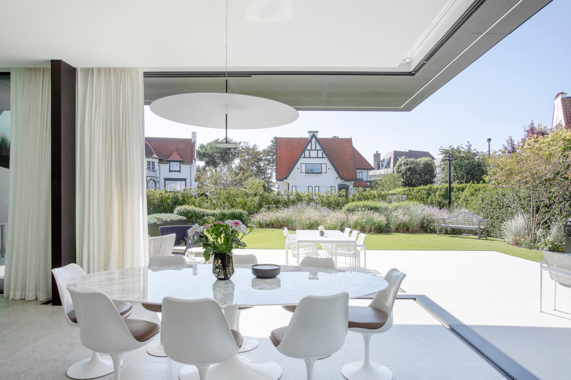
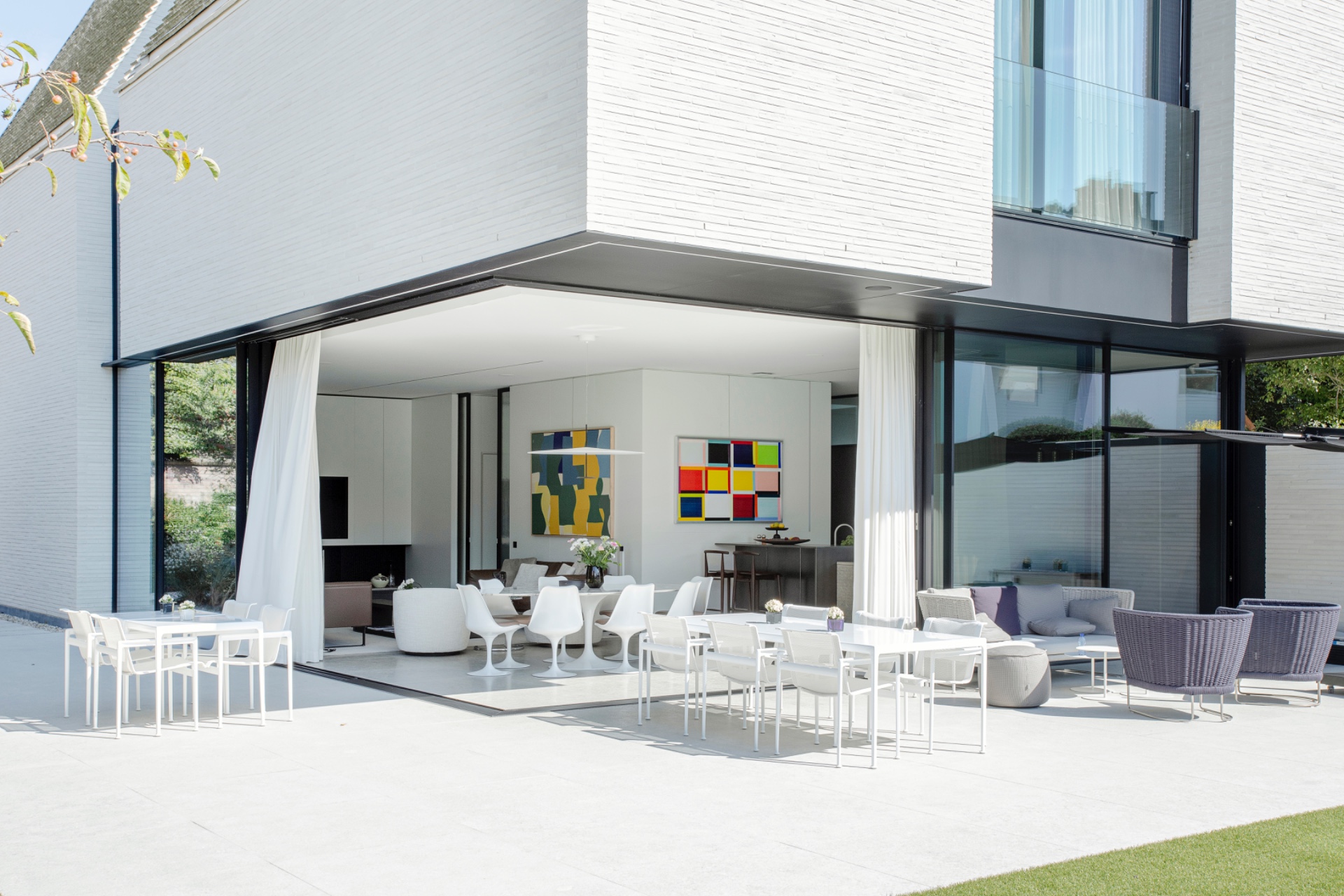
The covered terrace sits directly in the line of that lifted mass. It is not treated as an extra zone at the edge of the house, but as a place that extends the living area outward. The terrace cover creates shade, and the opening beside it allows views toward planting and lawn. In several images, the table sits close to the glazing, which makes indoor outdoor dining feel like a practical extension of the plan rather than a staged idea.
Because the terrace is partially sheltered, the transition from interior to exterior feels gradual. The dark edge of the overhang marks that threshold, while the white brick keeps the surrounding surfaces legible. Openings on both sides allow the garden to stay visually present from the seating area. This is where the large glass openings matter most: they pull daylight deep inside and keep the terrace connected to the interior, even when the frames themselves remain visually firm.
Rooms aligned with the garden
Inside, the light moves across a broad room with a clear view toward the outside. A dining table sits near the glazed wall, so the interior does not end at the window line. Instead, the room extends toward the terrace and the lawn beyond it. The dark frames return here, outlining the view like a measured composition. In one set of images, pale curtain-like screens soften the openings without hiding them, so the room still reads as open and direct.
The palette stays close to the exterior: white, grey, black and green. That limited range keeps attention on proportion and surface. Large glass openings bring in the garden, while the interior remains quiet enough for the view to dominate. The project does not depend on ornate furniture or layered decoration. Its strength lies in how the room is placed against the glazing, how the table aligns with the light, and how the outdoor space remains present just beyond the floor.
Interior surfaces with a colder note
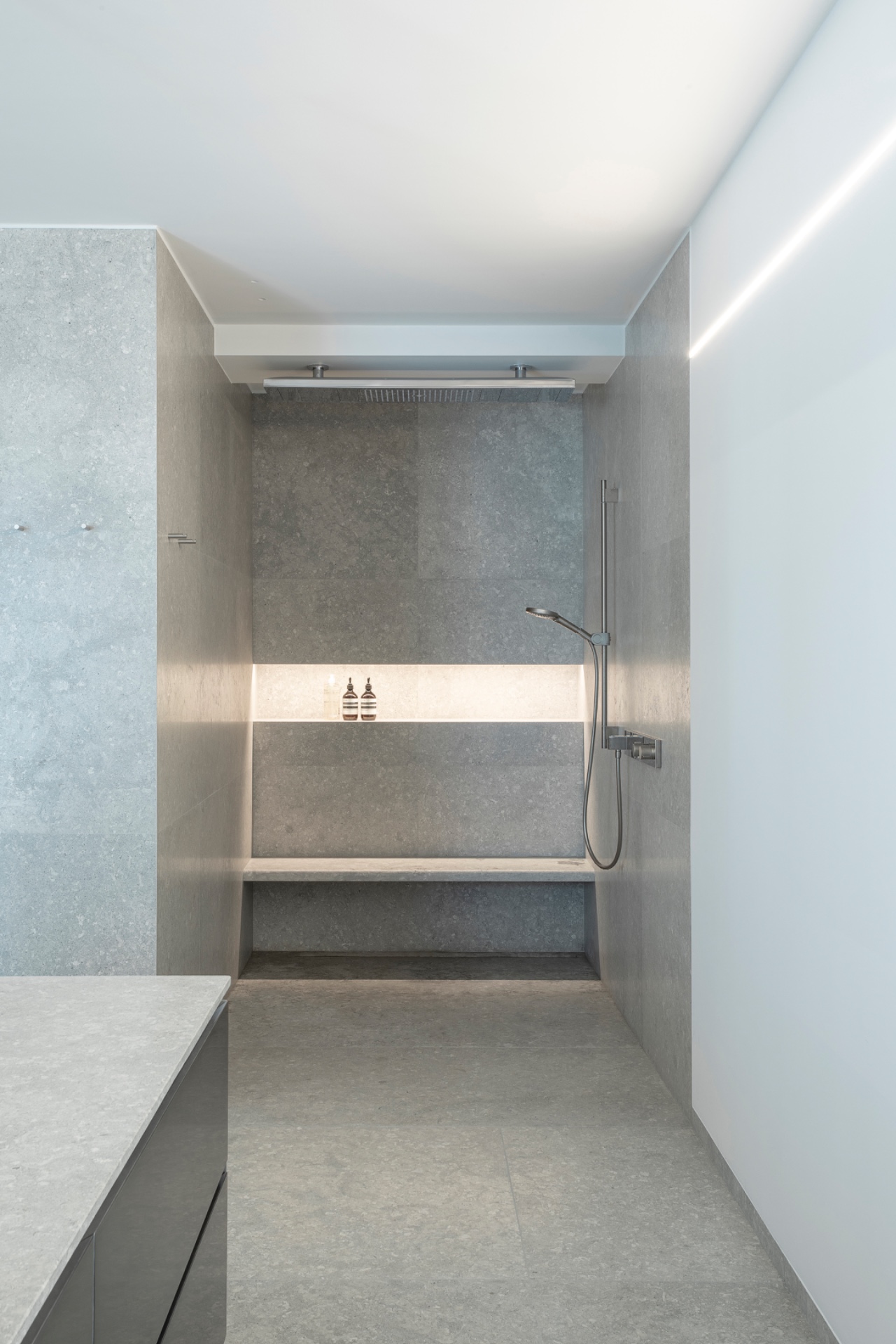
A secondary set of images shifts to a more enclosed, service-like space. There the material changes to grey stone-like tiles, with a linear light strip above the shower zone. The surface is more reserved, almost pared back to essentials. That change in tone matters because it shows how the project handles different rooms without breaking the overall language. The same attention to edges and joins appears here, only in a tighter setting and with less daylight.
The shower area is useful as a counterpoint to the glazed living spaces. It uses a more compact arrangement of planes, with the fixture line, tile joints and a recessed zone visible at once. Nothing distracts from the geometry. Even in this smaller room, the project remains focused on surfaces and their meeting points, rather than on decoration. The shift from garden-facing room to enclosed wash space is abrupt, but the discipline of the detailing keeps it coherent.
A project built around measured emptiness
What stays with you is not a single feature, but the way the void organizes everything around it. The two interlocking volumes depend on that open strip to separate and connect them at the same time. White brick gives the house a steady outer shell, while glass cuts through it to bring light, views and movement into the plan. The floating volume home idea is strongest when seen from the terrace, where the upper mass seems to rest lightly above the outdoor space.
It is a technical composition, but it never feels mechanical. The fragility described in the source text comes through visually as a careful arrangement of masses rather than a show of force. Light, shadow and empty space do the main work. That is what gives the white brick house its presence: a house made not only of walls and openings, but of the space held between them.
Photographer: Caroline Dethier
Project suppliers/materials: Briques Petersen
Want to see more of Architectenbureau Luc Spits? View the page of Architectenbureau Luc Spits for even more great projects and company information.


NEW 2026 Jubileum Edition The Best Interior Designers Benelux
Order Now €125