Warm custom apartment interior with refined materials
Wood fronts, a plastered wall surface and a dark sink zone set the tone from the first view. In this custom apartment interior, the kitchen is not treated as a separate insert, but as part of a broader composition of light, material and line. Studio Damhuis handled both the design and realization, and that layered approach shows in the way the cabinetry, worktop and lighting sit together without competing for attention.
Custom kitchen with wood fronts
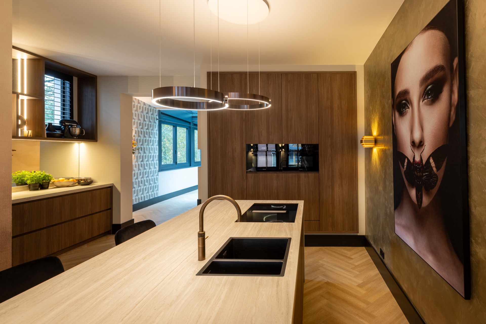
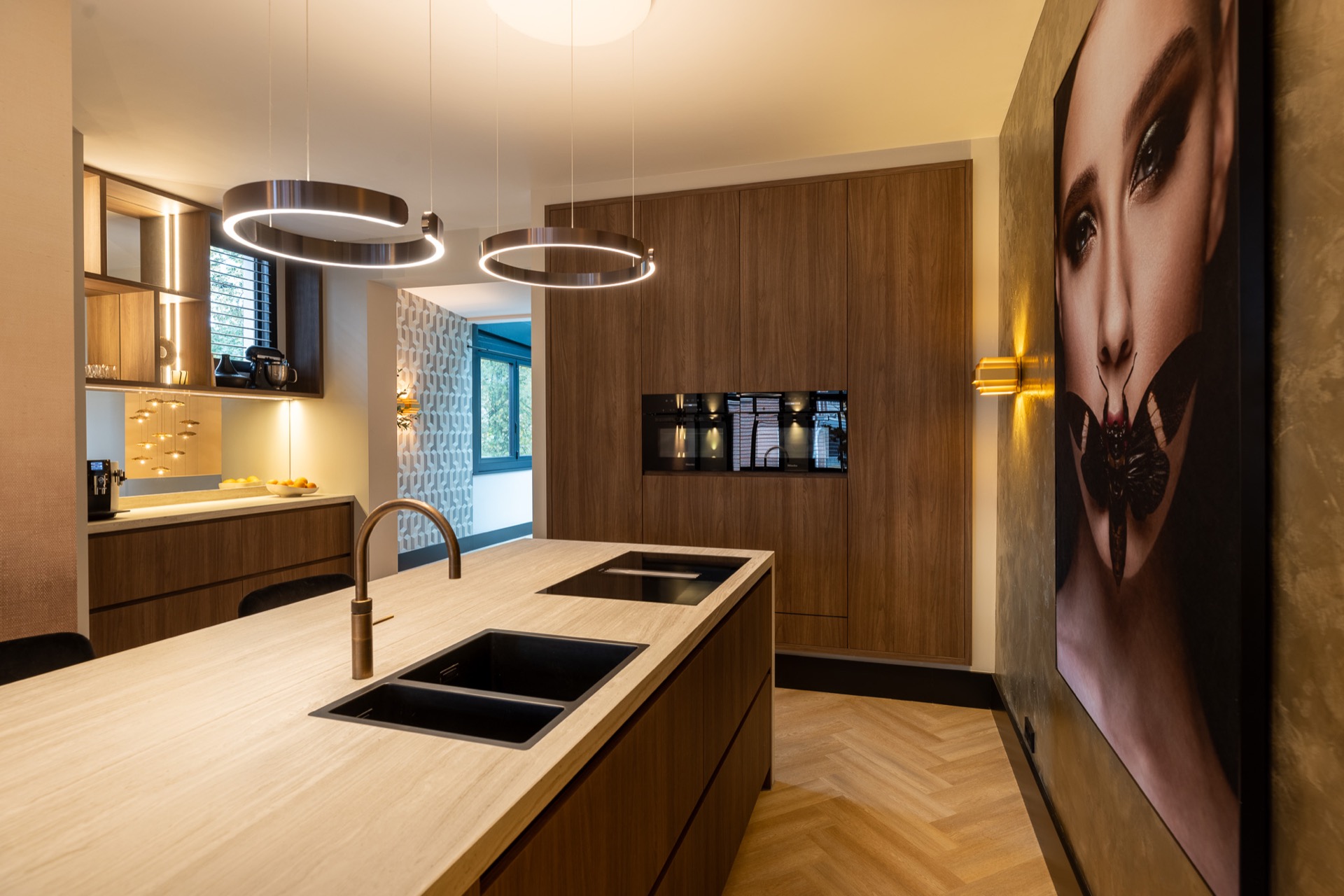
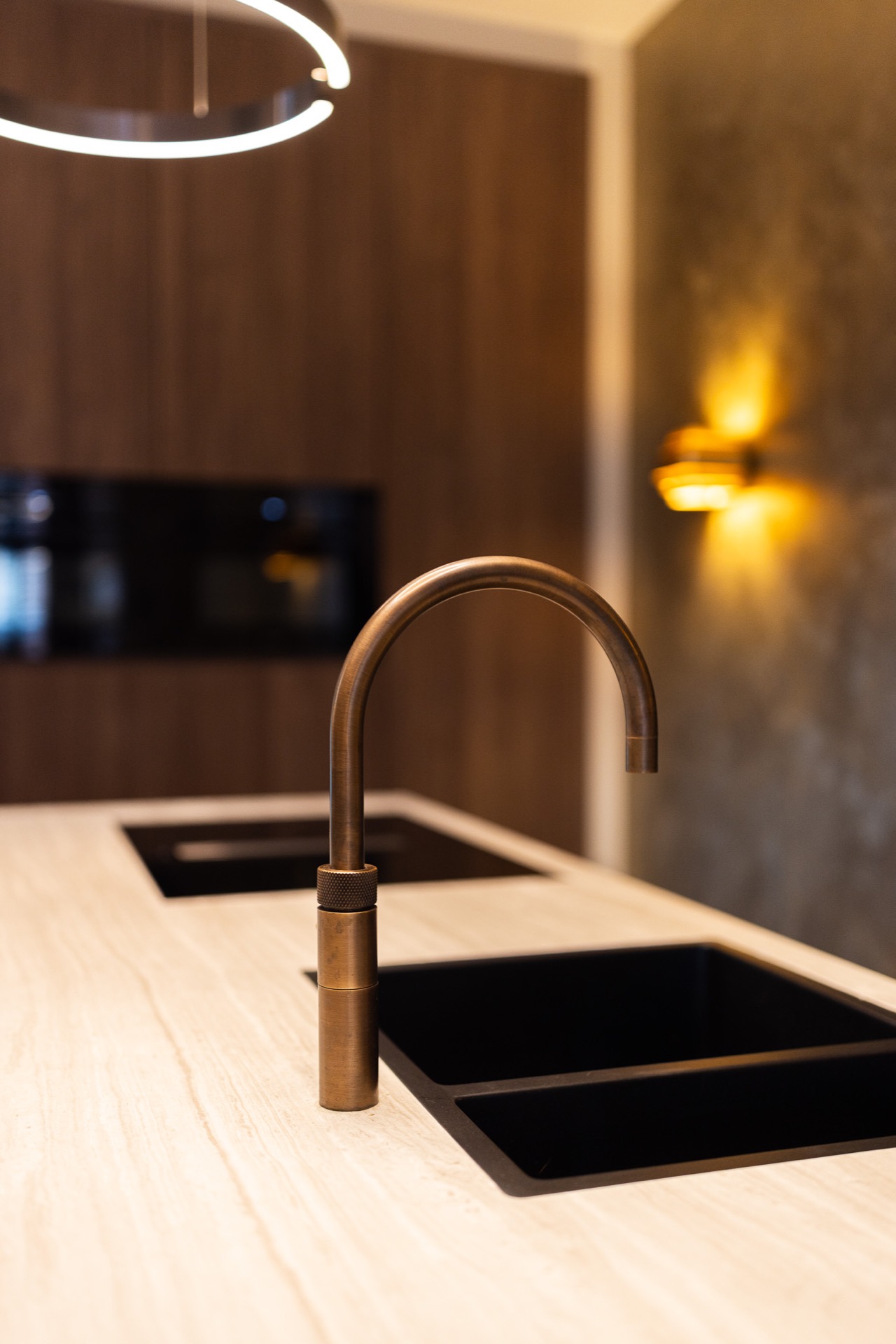
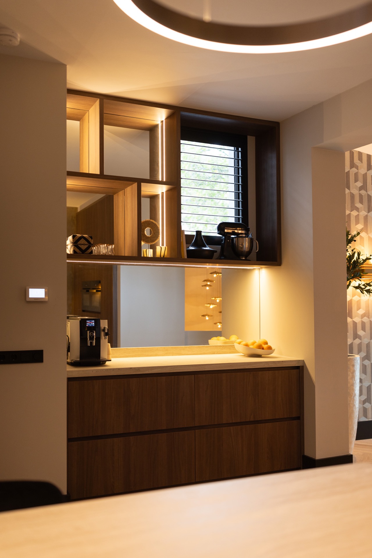
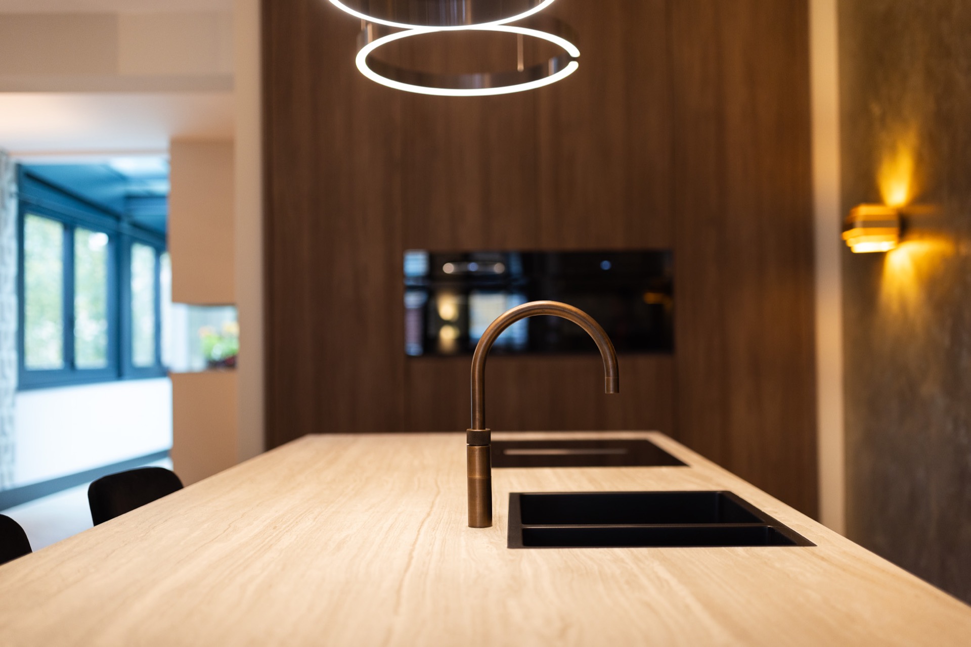
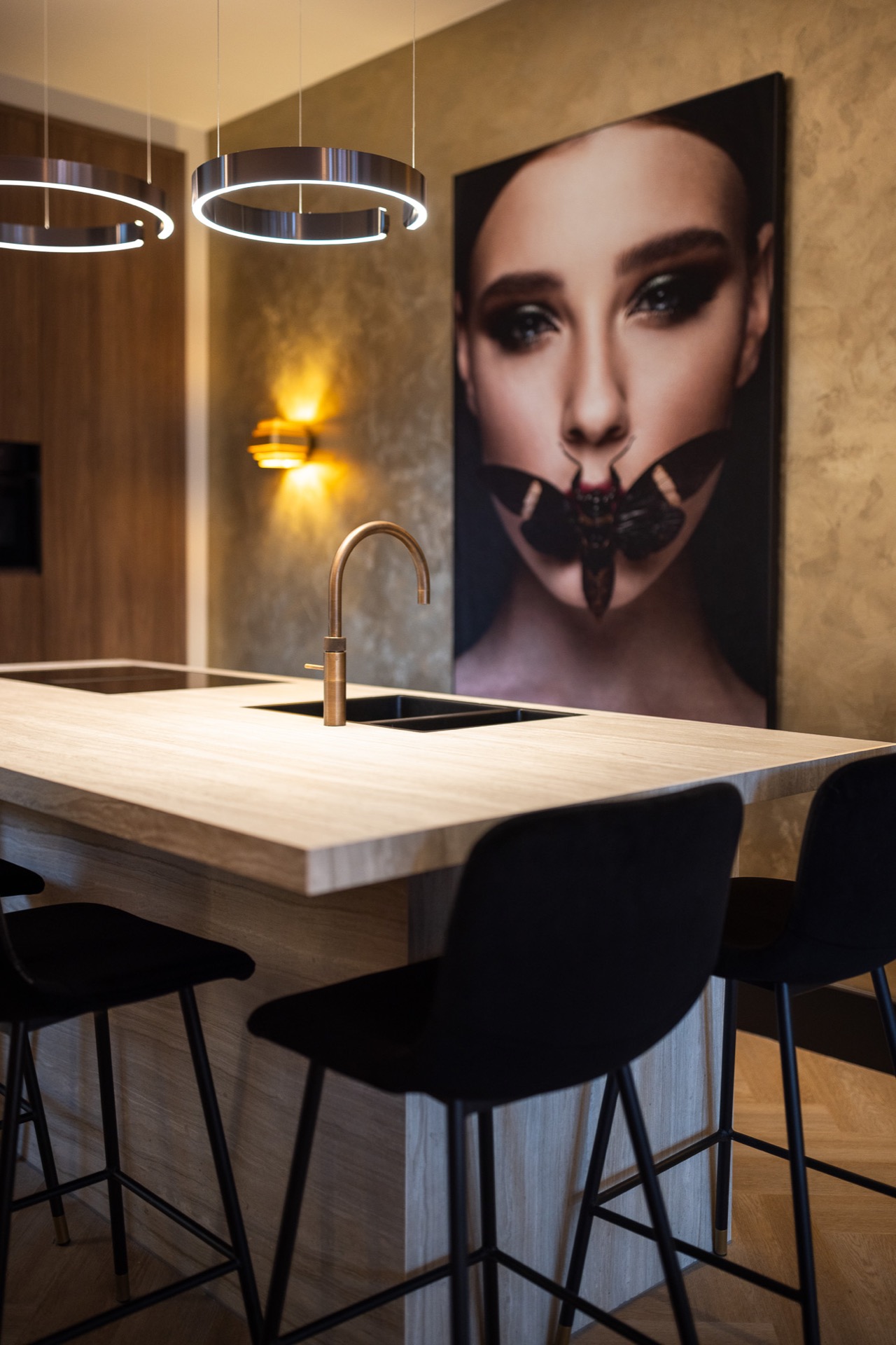
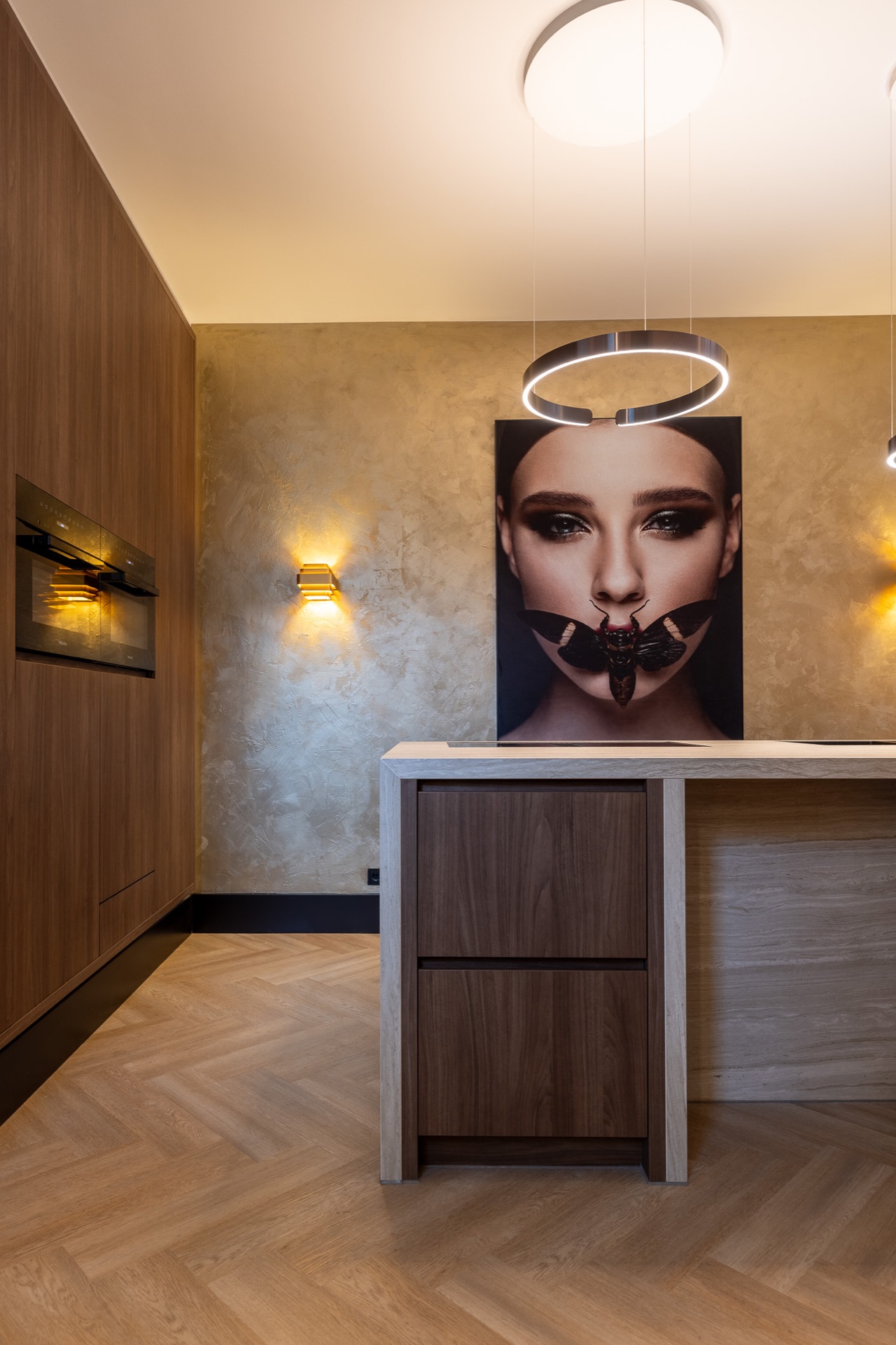
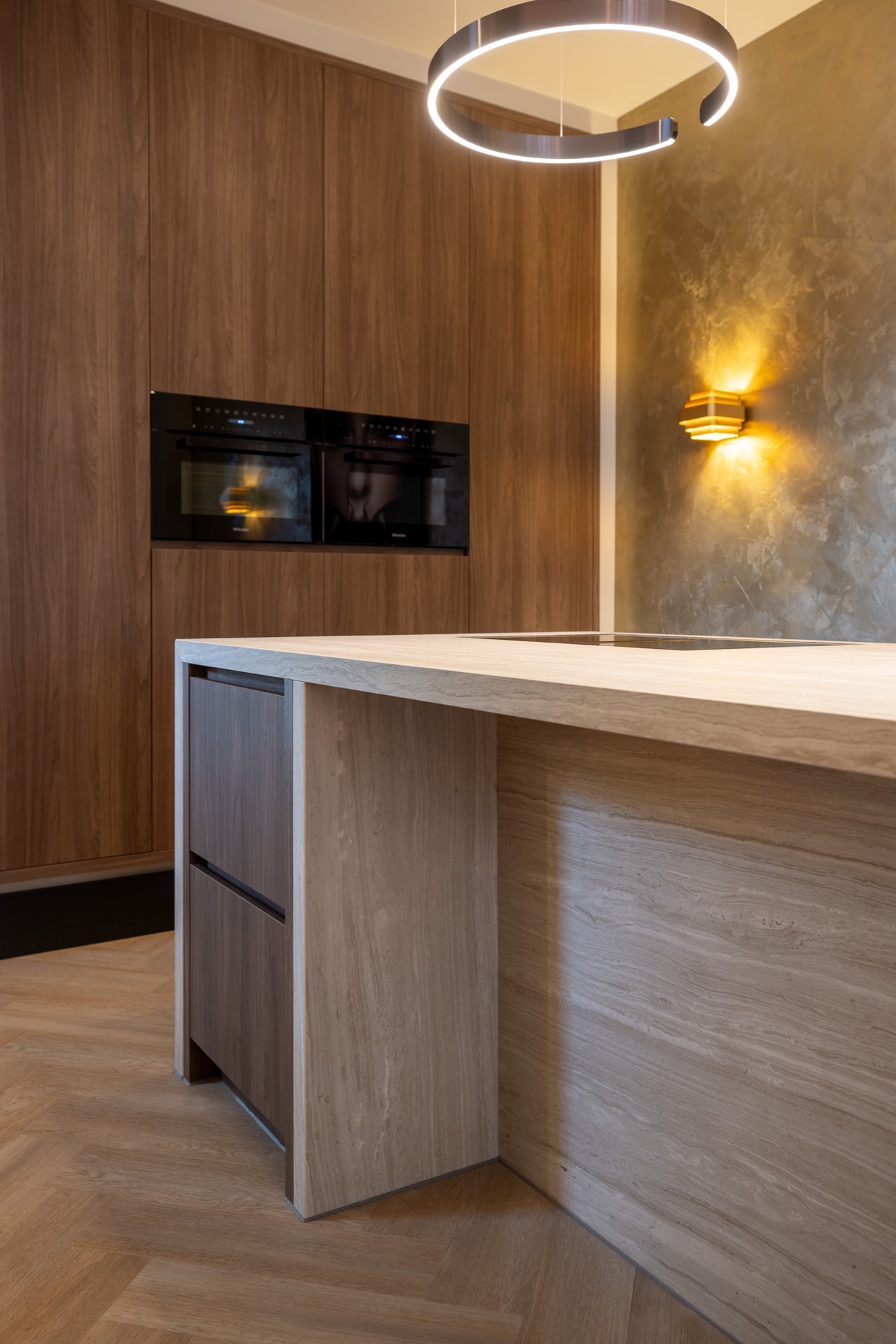
The kitchen wall is built as a continuous piece, with tall storage, integrated appliances and open niches tucked into the wood cladding. A light stone-look countertop runs across the base and gives the darker sink insert room to stand out. The curved tap adds a softer line to the straight cabinet faces, while the surrounding joinery keeps the details tight and measured. It is a custom kitchen that relies on proportion rather than gesture.
Across the work zone, the material shift is easy to read. Warm timber frames the darker technical parts, and the plaster wall finish behind it catches the light in a quieter way than the cabinetry does. That contrast keeps the composition clear. The room does not depend on decoration; it depends on surfaces that carry enough texture to hold the eye, from the visible grain in the wood to the matte planes around the sink area.
Warm ambient lighting above the table and worktop
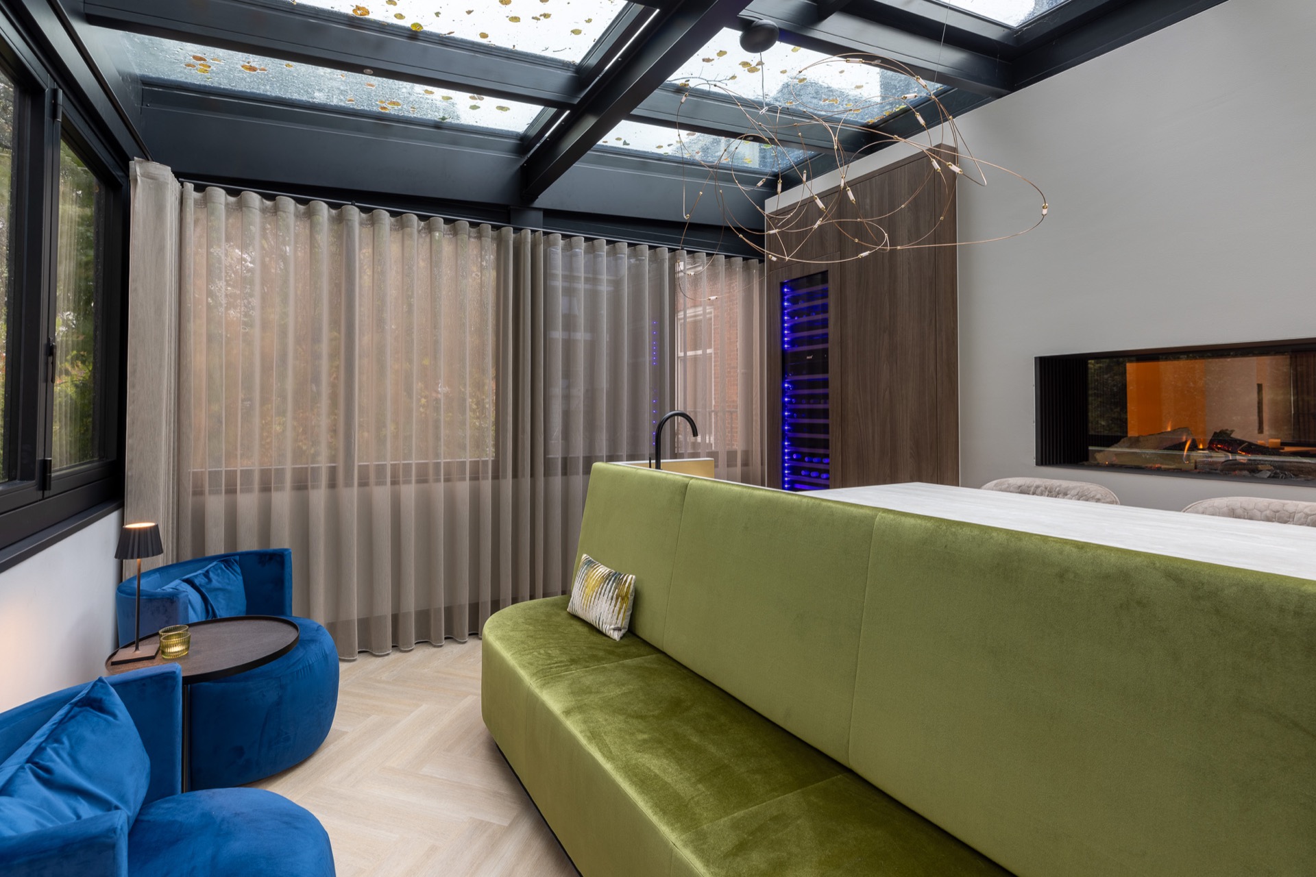
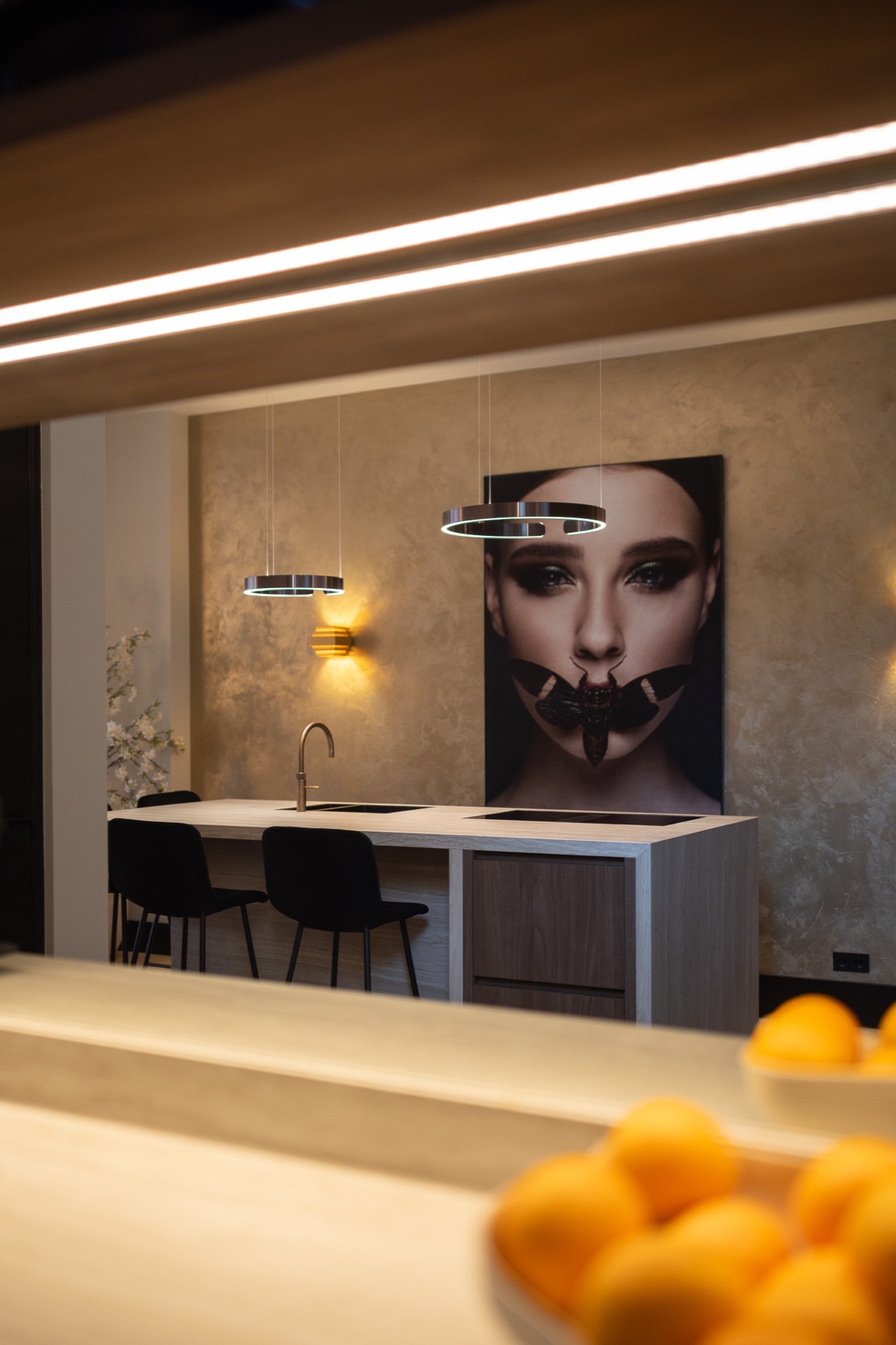
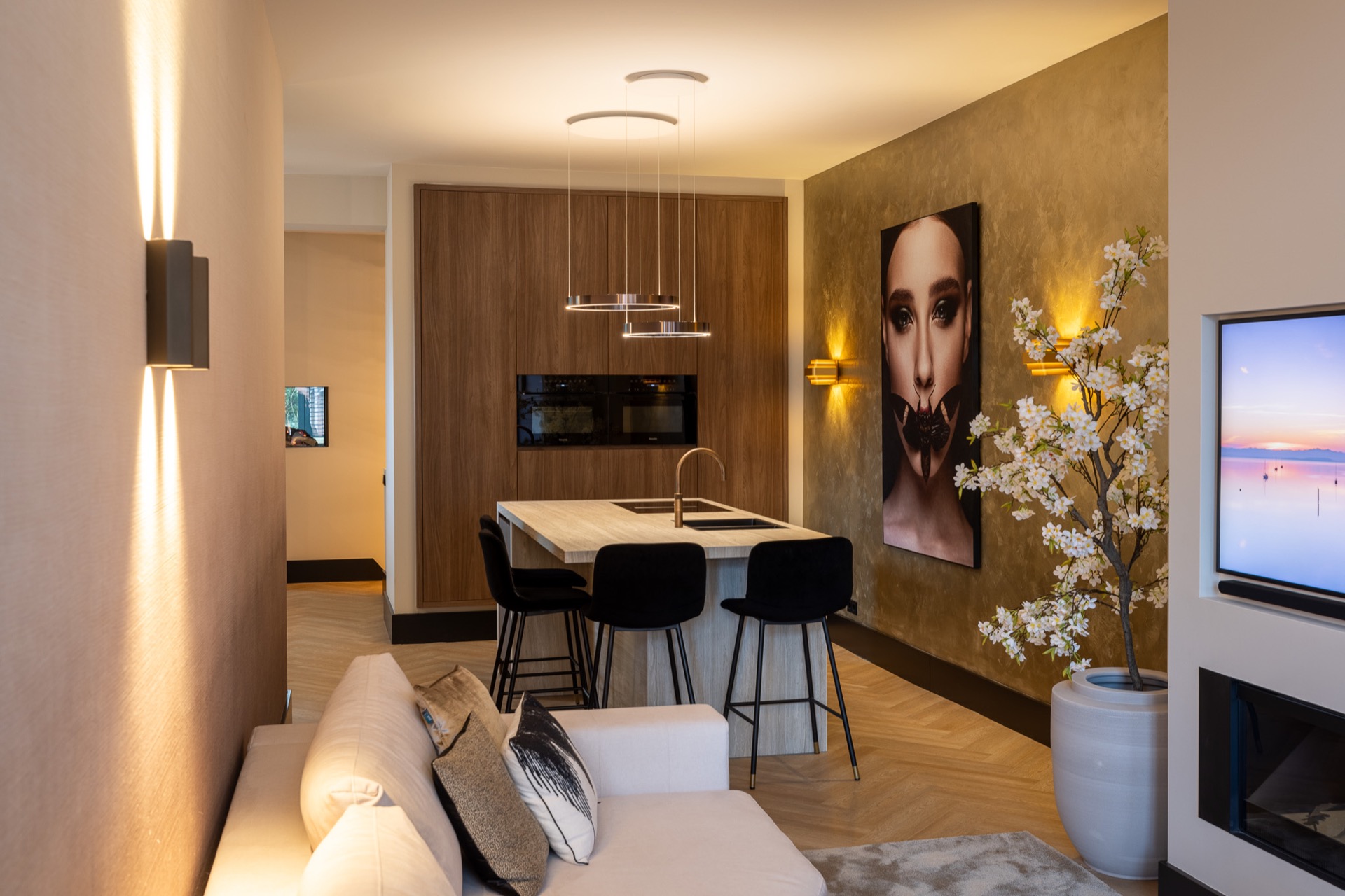
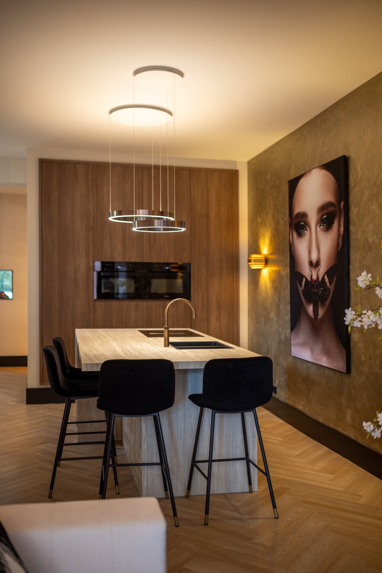
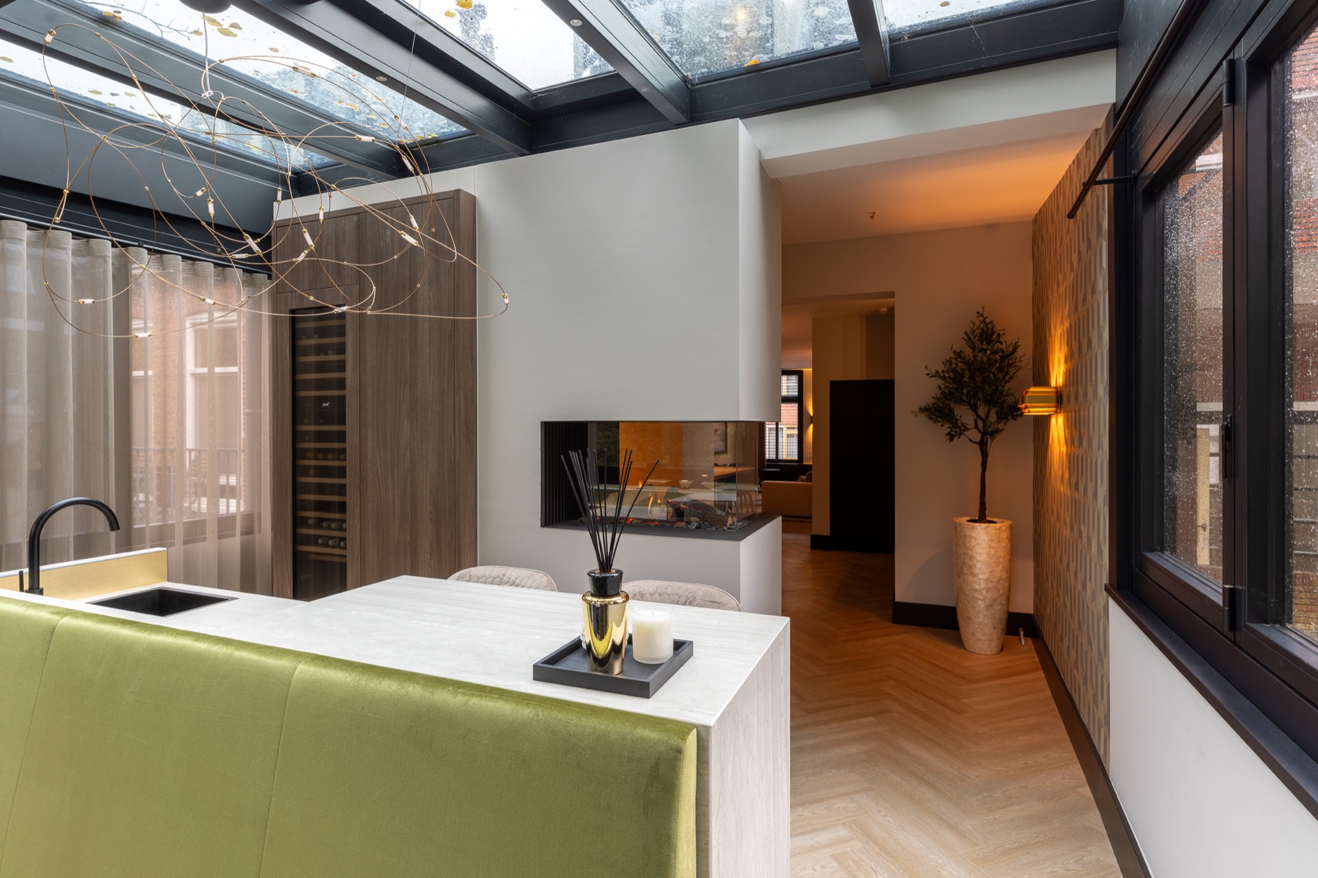
Lighting does much of the spatial work here. Circular pendant lights hover above the kitchen and dining zone, and their rings are visible as objects as well as sources of light. They give the room a layered rhythm: a bright line across the worktop, a softer wash against the wall, and smaller wall points that mark the depth of the apartment. The result is a warm ambient lighting scheme that changes the room after dusk without turning it theatrical.
Seen from the dining side, the lamps connect the table to the cabinetry behind it. Bar stools sit close to the island edge, so the kitchen reads as a social zone rather than a hidden work surface. The hanging fixtures sit low enough to define the zone, but not so low that they block the long view through the apartment. Light, in this room, is used as a way to measure distance.
Layered light over a restrained palette
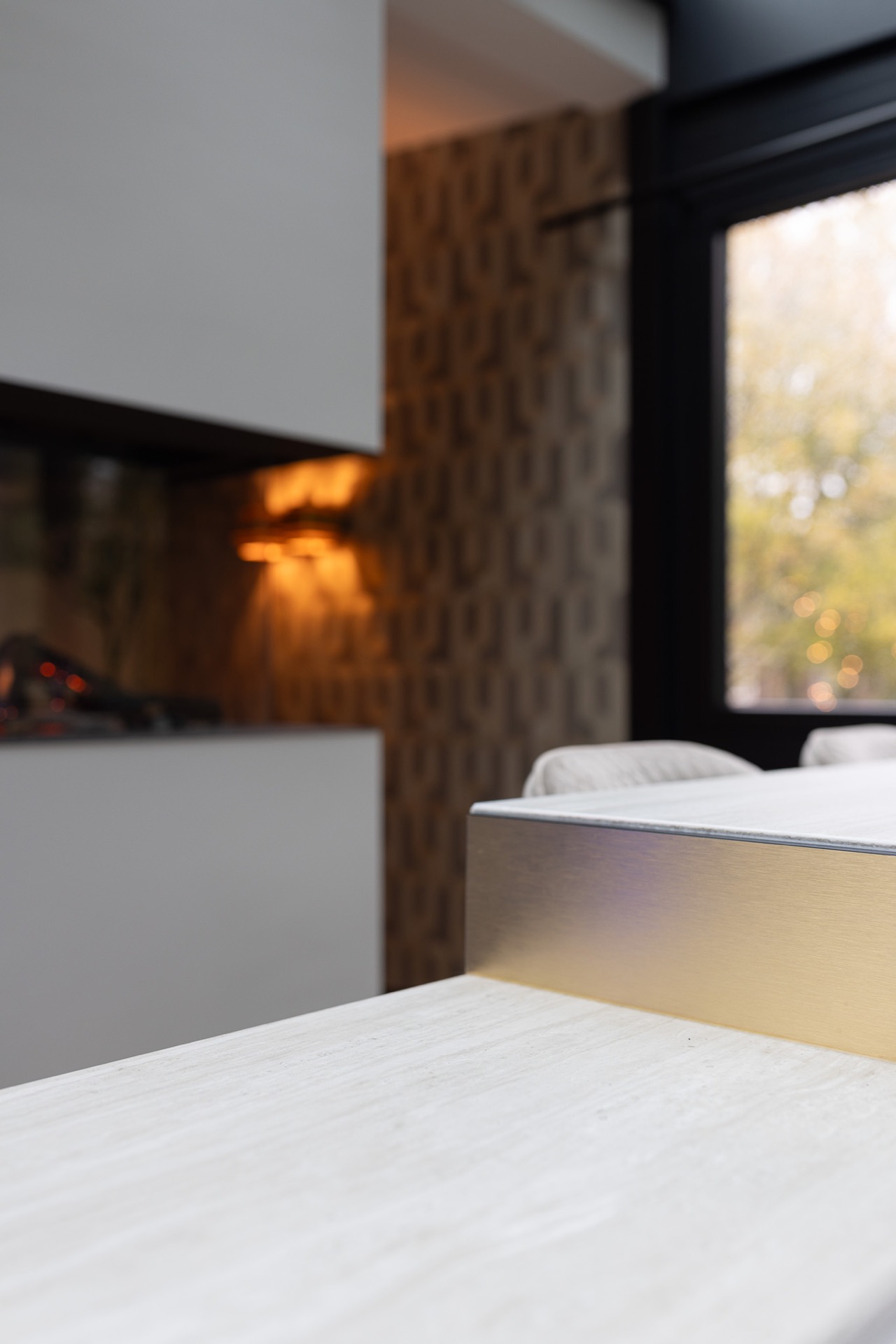
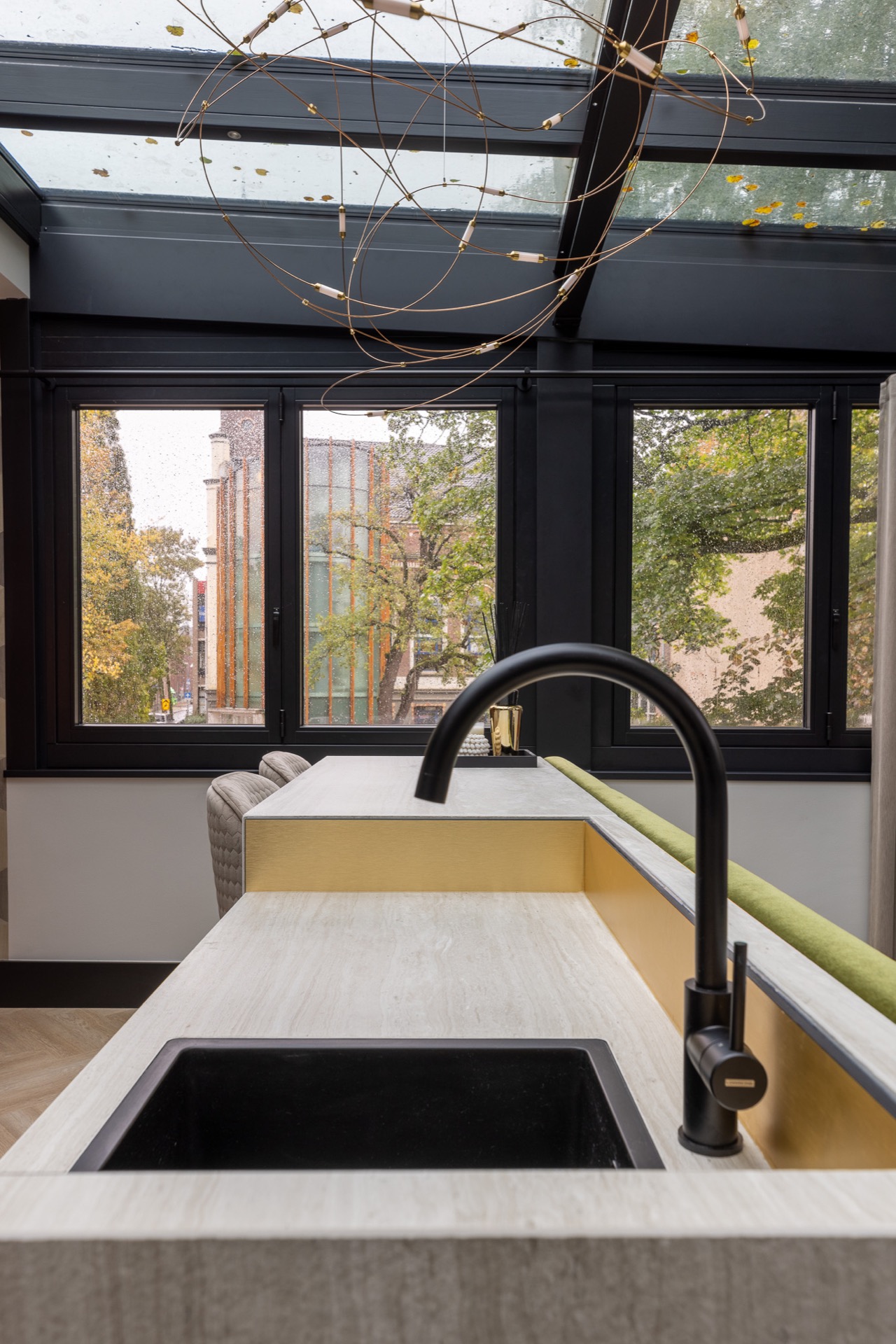
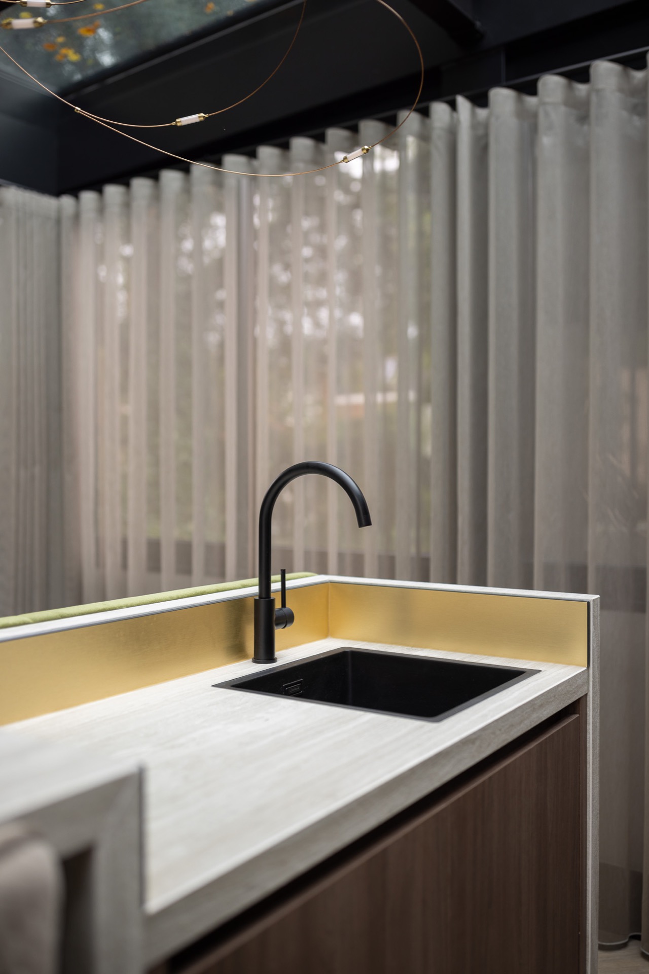
The palette stays within warm neutrals, dark accents and the natural tone of wood. Black details appear in the appliance openings, the window framing and the sink insert. Brass- or bronze-toned touches near the tap and fittings add a small shift in tone without changing the overall calm of the room. Because the surfaces are limited, each material gets room to register: the plaster finish, the timber fronts, the stone-look countertop and the glazed dark recesses all remain legible.
A timeless apartment interior shaped by surface and proportion
What gives the apartment its lasting character is not a single statement element, but the way every surface has been allowed to support the next one. The tall cabinetry closes one side of the room; the open table zone interrupts that mass; the light fixtures sit between both. This makes the apartment interior feel composed from use, not from decoration. You notice the transition from wood to plaster, from matte to reflective, from shadow to a more open wash of daylight.
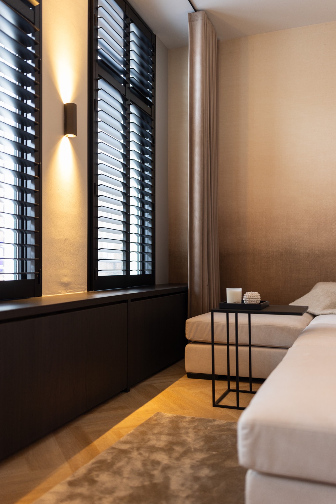
That attention to transition continues in the living area, where large windows pull daylight deep into the space. Dark frames and warm curtains soften the edge of the opening. Wall lights punctuate the background and keep the room active after evening falls. The apartment reads as one sequence rather than separate rooms, with each zone defined by a different combination of material, brightness and scale.
What the detail shots reveal
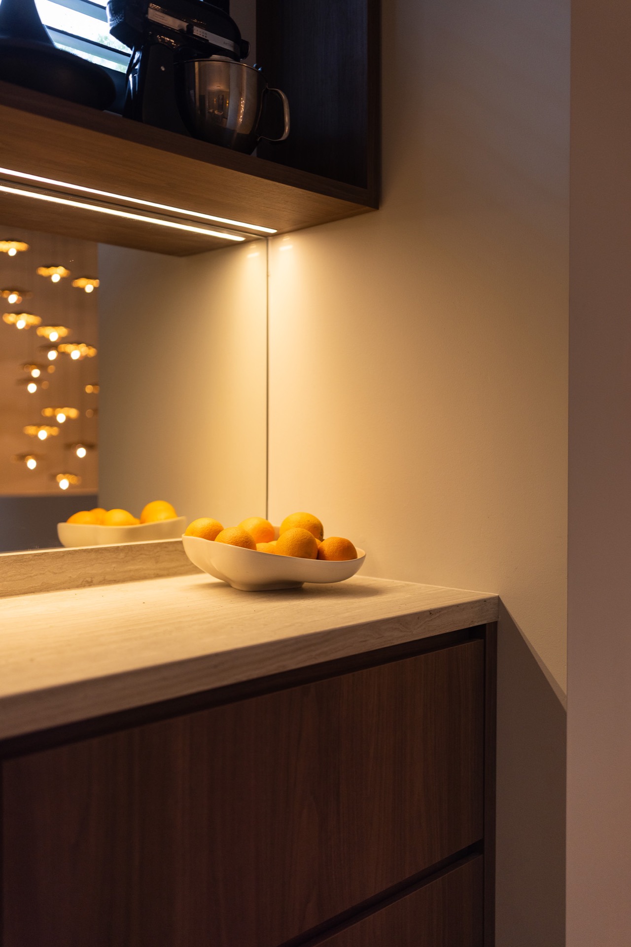
The close-up images make the project even more direct. One frame focuses on the sink zone, where the dark inset sits within a pale, stone-like worktop. Another shows the curved tap against the wood grain and the reflected glow from the surrounding lamps. A third brings the cabinetry into view as a quiet field of timber and shadow, with integrated equipment hidden in the recesses. These details explain how the custom apartment interior works: through measured joins, controlled contrasts and a clear material hierarchy.
There is a similar restraint in the way the ceiling and wall edges are handled. Indirect light traces the upper and lower parts of the kitchen zone, while a few points of accent light break up the larger surfaces. Nothing here feels overdrawn. The apartment relies on repeated cues — circular pendants, timber planes, plastered surfaces, a dark sink zone — to keep the eye moving from one part of the room to the next.
Viewed as a whole, the apartment is less about furnishing a space than about shaping how it is read. The custom kitchen anchors the plan, the lighting sets the tempo, and the warm material palette keeps the rooms visually connected. Because the design and realization were handled together, the finish feels resolved at the level of the join and the shadow line. It is a calm interior, but never flat; the surfaces keep changing as the light moves across them.
Photography – The Place to Bibi
Contributors: custom interior joinery – Puur maatwerk Interieur; lighting – Occhio
Want to see more of Studio Damhuis? View the page of Studio Damhuis for even more great projects and company information.


NEW 2026 Jubileum Edition The Best Interior Designers Benelux
Order Now €125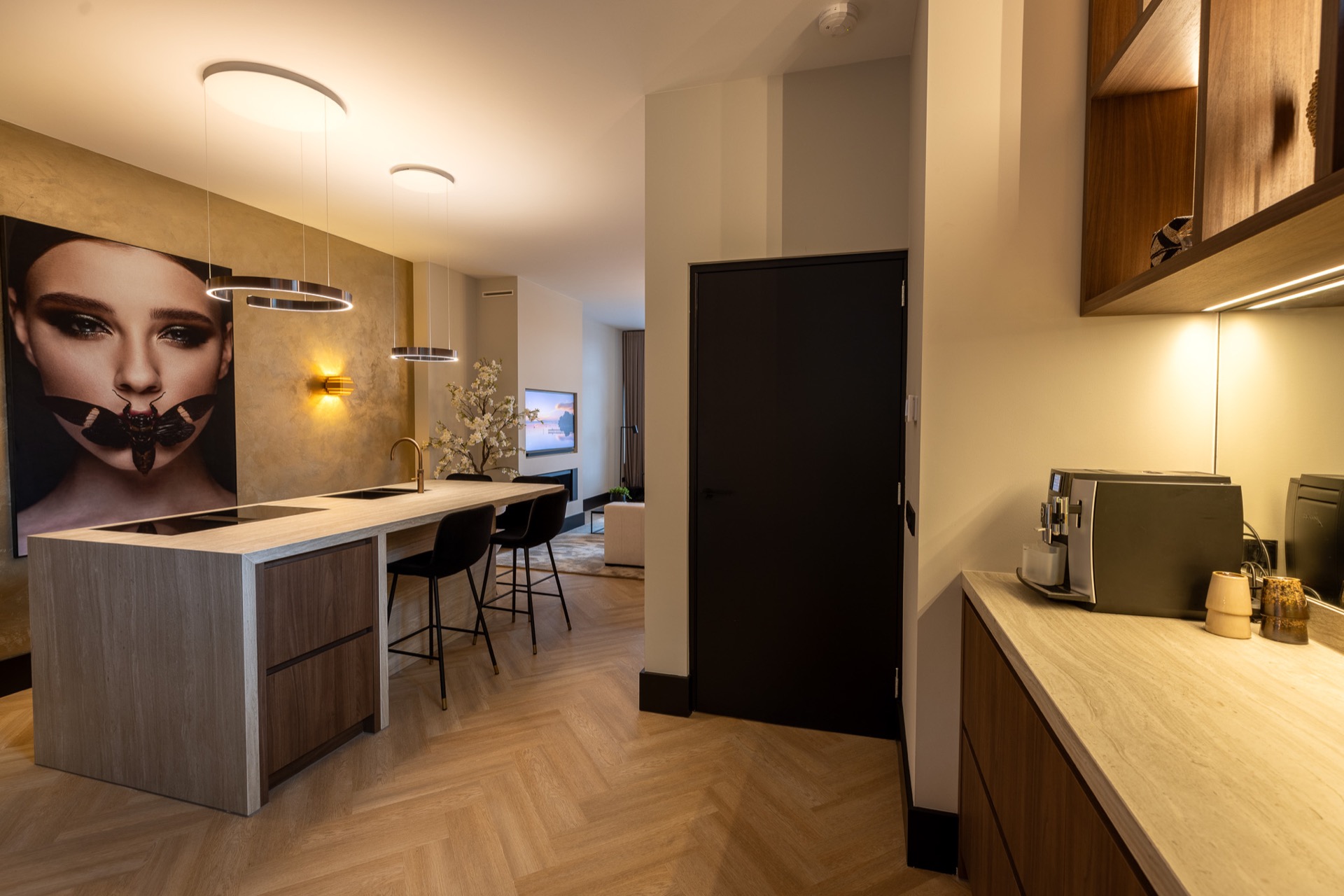
NEW 2026 Jubileum Edition The Best Interior Designers Benelux
Order Now €125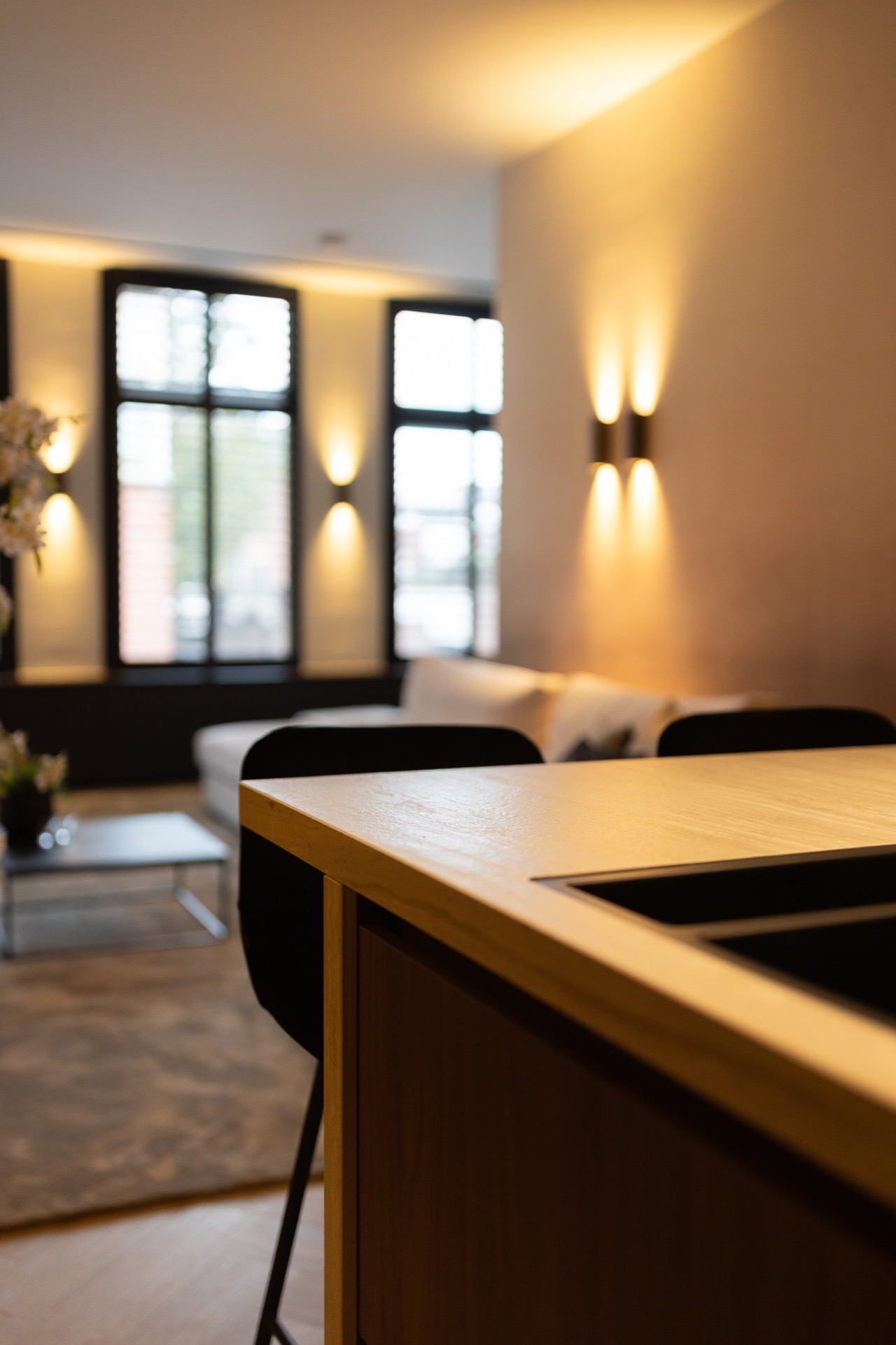
NEW 2026 Jubileum Edition The Best Interior Designers Benelux
Order Now €125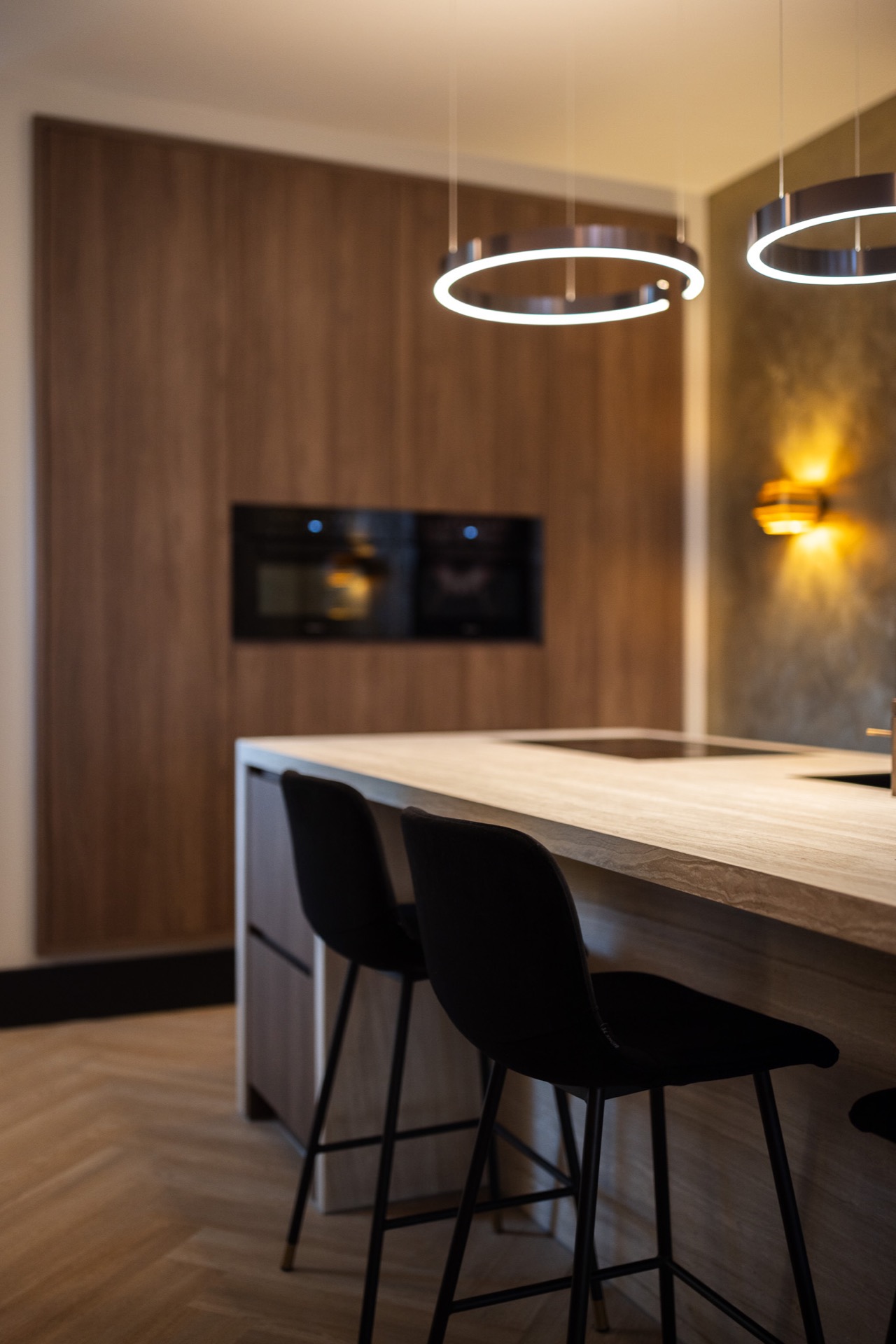
NEW 2026 Jubileum Edition The Best Interior Designers Benelux
Order Now €125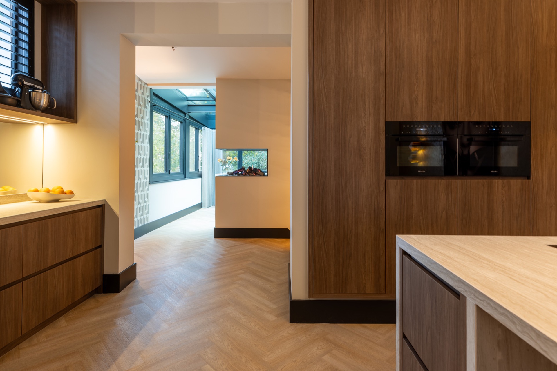
NEW 2026 Jubileum Edition The Best Interior Designers Benelux
Order Now €125