Renovated bakery: modern custom kitchen with round shapes
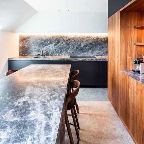
The former bakery is now read through curves, timber, and a kitchen that turns the lower floor into one continuous living zone. The kitchen, bar, and lounge sit side by side, but the round forms in the joinery tie the rooms together. A round kitchen island anchors the plan, while the wood slat kitchen fronts add rhythm to the darker openings and the light stone-look surfaces.
A ground floor shaped around kitchen, bar and lounge
On the lower level, the layout keeps the kitchen close to the bar and lounge without breaking the view across the space. The composition is calm, but not flat: the island projects into the room, the bar reads as a separate gesture, and the lounge sits just beyond. The renovated bakery interior avoids hard transitions. Instead, the furniture follows the room’s flow, with rounded edges softening the shift from work surface to seating and from storage to open space.
That rounded language is visible in the cabinetry itself. Cabinet fronts and the island base carry curved lines that repeat rather than decorate. It gives the modern custom kitchen with round shapes a clear structure, especially where the pale worktop meets the warmer wood below. A grey stone-look countertop draws a crisp line across the top, while the slatted surfaces beneath keep the volume from feeling heavy.
Wood slat fronts that give the island depth
The wood slat kitchen fronts are not treated as an accent strip. They form part of the island’s body and change how the light falls across it. Thin vertical elements create a measured texture, and that repetition is echoed in the wider interior through paneled walls and inset details. The slats are carefully mounted, so the surface reads as one controlled layer rather than loose decoration. In photographs, the grain catches the light differently from one angle to the next, which keeps the island visually active even when the room is quiet.
Across the lower level, timber returns in panels, trims, and built-ins. The wood does more than warm the palette; it marks edges, frames openings, and gives the kitchen a tactile surface that contrasts with the smoother countertop and floor. The result is a room where material changes signal function. You can read where the cooking zone starts, where the bar takes over, and where the seating area begins.
A kitchen bar with niche and open shelving
The kitchen bar with niche is one of the clearest points in the plan. A recessed opening cuts into the joinery, creating a pause in the wall of wood and giving the bar a more architectural presence. Dark frames sharpen the opening, while shelving inside the recess introduces another layer of depth. In the images, glasses and open elements sit behind the frame, making the niche feel like part of the room rather than a closed cabinet.
That same idea appears in the bar zone, where open and built-in parts alternate. The bar is not just a place to sit; it also works as a transition between preparation and use. Rail spot lighting runs above it, tracing the line of the work area and making the surfaces below read more clearly. The lighting is layered rather than decorative. Some fixtures aim directly at the countertop, while others pick up the wall and the niche, which keeps the room legible at different times of day.
Layered light over the work zone
Track spot lighting brings definition to the kitchen and bar without adding visual noise. The rails sit close to the ceiling line, leaving the furniture to carry the room. Underneath, the light lands on the worktop, the rounded island edge, and the darker detailing around the recesses. This is where the renovation’s precision becomes visible. The lighting does not fight the timber or stone-look finish; it reveals their changes in depth, edge, and sheen.
From one angle, the composition feels almost horizontal: countertop, bar ledge, and floor moving in long bands across the room. Then the vertical slats and the niche opening interrupt that calm. Those shifts are what make the modern minimalist kitchen feel considered. Nothing is exaggerated, but every line has a role, from the black frame around a cut-out to the slim shadow under the island base.
A built-in window bench as part of the same language
The built-in window bench extends the same joinery logic into the seating area. Finished in wood and set low beneath the window, it reads as a quiet counterpoint to the kitchen island. The bench’s long horizontal line settles the room, while the dark base detail keeps it from floating too softly against the wall. In close views, the panel joints and rounded corner at the end show that the same attention given to the cooking zone continues into the lounge edge.
This bench matters because it links the living space back to the former bakery renovation without leaning on nostalgia. It is simply another piece of fixed furniture, shaped to the room and aligned with the other built-ins. The effect is practical in a visual sense: the window seat gives the wall a use, and the wood finish carries the same tone seen in the kitchen fronts and niche details. The result is a clear line through the interior, from cooking to resting to sitting.
Materials that hold the composition together
The project text names a set of kitchen components and finishes that support the visible scheme: Jetstone composite, a Quooker tap, a Lorreine sink, ATAG cooking and cooling appliances, Vinata wine and beer climate storage, and sheet material from Baars and Bloemhoff and Hout Import Reuver b.v. In the room, those elements sit behind the stronger visual cues of wood, light stone-look surfaces, and dark edge details. They help explain how the kitchen functions, but the impression stays with the joinery, the rounded island, and the layered finish.
What stands out most is the way the renovation turns an ordinary floor plate into a sequence of connected moments. The island, the bar, the niche, and the bench each take a clear role. Their shared curves and slatted faces prevent the room from fragmenting, while the rail and spot lighting keeps the surfaces readable. Seen together, the former bakery becomes a living interior shaped by custom work, careful joins, and a measured use of light.
Want to see more of Hubbers interieurmakers? View the page of Hubbers interieurmakers for even more great projects and company information.




NEW 2026 Jubileum Edition The Best Interior Designers Benelux
Order Now €125