









Classic grandeur, reworked in a modern way: home renovation with custom interiors
Original stained-glass windows throw colored light across the new white marble floor, and that first contrast sets the tone for this home renovation. The house began as a late-19th-century villa, later used for a different purpose for years, and has now been returned to residential use. Inside, the language is clear: sharp lines, dark timber, marble, and a few precisely placed insertions that let the older shell stay readable while the rooms work differently.
A new route through the ground floor
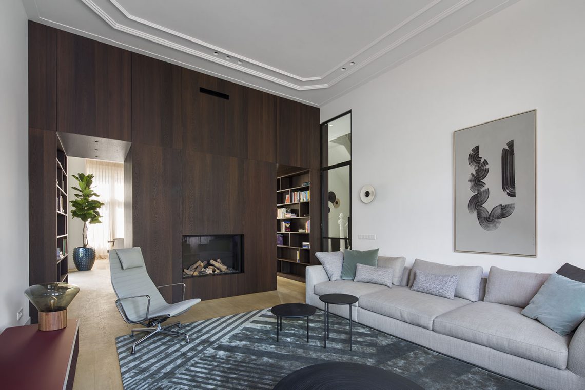
The most visible shift is in the way the rooms connect. Instead of a central opening between the en suite spaces, the passage now sits to both sides. That move leaves the middle free for a smoked-oak cabinet that links the two rooms and marks the change from one zone to the next. On the front-room side, a built-in fireplace is folded into the joinery, while storage continues around the back and along both sides. It is a small architectural adjustment, but it changes how the ground floor is read and used.
Black-framed glass doors and dark green steel door frames bring a clear edge to the softer surfaces around them. The staircase carries the same dark green tone into the velour covering on the steps, so the materials repeat without feeling mirrored. Above, restored crown mouldings hide modern lighting, keeping the ceiling line clean while still adding a brighter layer to the room. The result fits the idea of a modern classic interior without leaning on ornament for its own sake.
Light, marble, and the staircase as a vertical moment
At the center of the house, the staircase glass overlook draws the eye upward. A contemporary chandelier drops from the ridge to the ground floor, extending the view through the stairwell in one long vertical line. The combination of glass, height, and white marble flooring gives the space a cooler surface than the wood-heavy rooms nearby. Rather than competing with the older structure, the lighting uses it as a frame.
The floor below is laid in Arabescato marble, its pale surface catching the light from the stained-glass windows. That reflected brightness keeps the ground floor from feeling heavy, even where the timber details are dark and the doors are edged in black metal. The contrast is not decorative only. It guides movement, showing where the eye should pause and where the route continues.
A marble cooking island set inside dark joinery
The kitchen sits within the same sequence, but the materials shift again. A marble cooking island anchors the room, wrapped on all sides in Fioro di Bosco marble. Its block-like mass is softened by the veining in the stone, while the surrounding joinery stays restrained and dark. Above it, an asymmetrical steel composition suspends a single shelf and the light in one slim frame, a custom piece designed specifically for this house.
That steel structure does more than mark the cooking zone. It gives the kitchen a lighter upper line, which keeps the island from feeling isolated in the room. Behind it, the smoked-oak cabinet continues the visual thread from the en suite opening, and the built-in fireplace remains visible at the edge of the plan. This is where the home renovation shows its logic most clearly: each room keeps its own function, but the finishes and openings keep pulling the eye onward.
Dark wood, stone, and a fixed line of sight
From one side of the kitchen to the other, the materials stay disciplined. Dark wood surfaces meet marble and steel, then give way to white walls and the soft texture of the older mouldings. The room does not rely on excess to read as complete. It works because the cabinet, island, and light above it all take on separate roles, each one precise enough to hold the composition together.
The upper floor keeps the same material logic
Upstairs, the bedroom and bathroom continue that pattern of measured transitions. A bath unit has been built into the niche of the projecting tower, where the wall itself could not be altered. The fitted piece slides into place like a built-in alcove, and because it occupies that niche, it also helps insulate the walls and window. That practical move is invisible at first glance, but it changes how the corner reads: less like leftover space, more like part of the room’s architecture.
Above the bath hangs a bubble-like lamp, echoed by another version downstairs over the dining table. The repetition is subtle, but it ties the floors together without copying one room into the other. In the bedroom, a timber wall behind the bed uses the same material as the en suite cabinet below, so the custom dark wood wall becomes a thread running through the house. It is one of the reasons the plan feels steady when moving from floor to floor.
A bathroom built into a niche, not added on top
The bathroom built-in alcove keeps the visual line of the tower intact. A large opening brings in daylight, while the pale surfaces around the bath and shower keep the room from closing in on itself. In the shower area, the marble-look finish extends the material language of the rest of the house into a more enclosed zone. Glass panels keep the space readable from the bedroom side, and the whole arrangement stays tied to the same quiet order as the rooms below.
What makes this home renovation memorable is not a single dramatic gesture, but the way each insertion responds to the old structure. The staircase sees through to the ground floor, the kitchen island sits under a custom steel frame, and the upper bath occupies a niche that could not be changed. Across all of it, the same material notes return: white marble flooring, dark timber, glass doors with black frames, and the kind of joinery that turns a leftover wall into part of the plan. The house now moves like a residence again, with each room connected by detail rather than by overt statement.
Want to see more of Studio Ruim? View the page of Studio Ruim for even more great projects and company information.




NEW 2026 Jubileum Edition The Best Interior Designers Benelux
Order Now €125


NEW 2026 Jubileum Edition The Best Interior Designers Benelux
Order Now €125


NEW 2026 Jubileum Edition The Best Interior Designers Benelux
Order Now €125


NEW 2026 Jubileum Edition The Best Interior Designers Benelux
Order Now €125


