










Luxury modern interior with custom cabinetry and black accents
Black window frames, long runs of joinery, and a pale floor set the pace from the first room. The interior reads as a luxury modern interior not because it is decorated heavily, but because each zone is drawn with restraint: wall cabinets sit flush, the dining table is left clear around the edges, and the light is allowed to move across stone, timber, and painted surfaces without interruption.
Dining light meets built-in storage
The dining area brings together custom built-in cabinetry and pendant lighting in a way that feels measured rather than staged. Above the table, the hanging fixtures mark the centre of the room, while the cabinetry behind them absorbs the practical load: closed fronts, open niches, and a few visible objects placed where the eye lands naturally. The result is a room that keeps its edges tidy while still showing the hand of the joinery.
Large openings sit beside the dining zone, and the black frames do more than outline the glass. They sharpen the view, hold the curtains in place, and give the surrounding neutral finishes a harder line to work against. In daylight, the frames cut clear verticals through the room; by evening, the pendants and cabinet lighting take over and leave the windows as dark outlines against the interior.
Storage that stays part of the room
Several of the built-in units are treated as part of the architecture rather than as separate furniture. Tall panels, low cupboards, and glass-front storage sit in the same visual field as the dining and kitchen areas, so the eye reads the room as a single sequence. Some niches are lit from within, which makes the objects inside appear deliberately placed instead of hidden. That small shift changes the mood of the space without adding clutter.
A kitchen island anchored by straight lines
The kitchen is arranged around a kitchen island that sits under pendant lighting and works as a clear centre point between the cooking wall and the seating areas beyond. Its edges are crisp, and the surrounding cabinets stay visually quiet, which lets the island carry more weight in the composition. The black fittings, the straight fronts, and the reflective surfaces nearby keep the room precise without making it severe.
Across the room, the wall cabinets extend the same language of flat planes and concealed storage. Their scale is generous, but the treatment stays controlled: no decorative pull of attention, only long horizontal bands that keep the room calm and ordered. In one detail, a glass-front cabinet reveals a lit interior, turning storage into a visible layer rather than a closed block. That small opening offers a change of rhythm inside the broader kitchen wall.
Black frames, glass fronts, and a clear edge
One of the most distinctive details is the use of black framing around glazed openings and cabinet fronts. It appears in the partition elements as well as in the storage modules, where the dark outline gives depth to the glazed surfaces. Because the frames are so precise, the lighter materials around them feel even more open. The contrast is sharp, but it is carried through the room with consistency, from the kitchen wall to the transition into the living area.
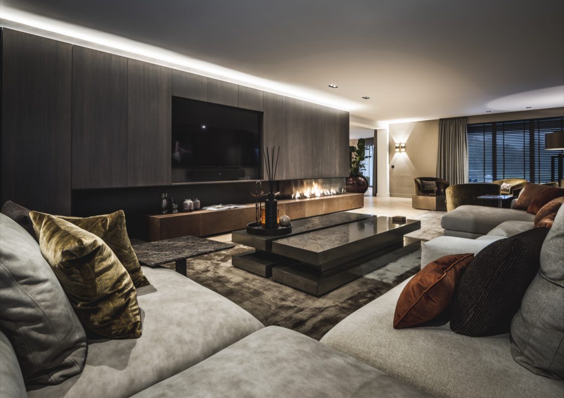
The corner fireplace holds the living room together
In the living room, the corner fireplace becomes the main fixed point. Its surround reads as a built element, not a freestanding object, and the dark finish gives it enough weight to stand against the pale walls and the broad floor boards. The seating sits low around it, with the room opening out toward the glazing at the side, so the fireplace does not compete with the windows; it settles the space instead.
The surrounding surfaces are kept restrained, which makes the flame opening and the surrounding wall plane more noticeable. Even when the fire is not lit, the fireplace remains a visible marker in the plan. It tells the room where to slow down. The black accents near the window line and the larger cabinet pieces outside the living area continue that same visual thread, so the room does not break away from the rest of the interior.
Layered lighting across the villa interior
The lighting scheme moves in layers. Pendant lighting hovers over the main social zones, while concealed strips and interior lights bring depth to the cabinets and shelves. In the image details, the lit niches show how lighting is used to define volume rather than to decorate a surface. That approach matters in a modern villa interior where the rooms rely on proportion, not ornament, to hold their attention.
At night, the darker frames around the glazing and the illuminated joinery create a clearer contrast than the daylight scenes do. In one kitchen view, the light inside a glazed unit turns the cabinet into a display box; in another, the pendants cast a small pool over the island and the tabletop beneath. The rooms stay readable from one end to the other because each light source has a clear job.
Details from the quieter rooms
The smaller interior scenes keep the same discipline. A tiled niche, a mirror above the basin, and tall vertical cabinet panels show how the material palette is carried into utility and bathroom-adjacent spaces. Nothing is overdrawn. The surfaces are smooth, the joints are neat, and the reflected light in the mirror gives the compact area more depth than its footprint suggests. It is a modest detail, but it extends the project’s language beyond the main living rooms.
Elsewhere, the black-framed glass partition adds a thin, architectural edge between zones. It allows a glimpse through while still separating one use from another. That mix of visibility and division suits the rest of the home, where the kitchen, dining area, and living room remain distinct but never disconnected. The same is true of the built-in storage pieces: they hold the plan in place and keep the surfaces free for the stronger elements to stand out.
Across the full sequence, the project stays focused on line, frame, and light. The black accents sharpen the glazing, the joinery folds storage into the walls, and the fireplace gives the lounge a fixed centre. Even in the quieter details, the interior keeps returning to the same ideas: clear edges, practical depth, and rooms that read as one spatial story rather than separate scenes.
Want to see more of Ecker? View the page of Ecker for even more great projects and company information.




NEW 2026 Jubileum Edition The Best Interior Designers Benelux
Order Now €125


NEW 2026 Jubileum Edition The Best Interior Designers Benelux
Order Now €125


NEW 2026 Jubileum Edition The Best Interior Designers Benelux
Order Now €125


