










Modern classic interior in a historic canal house
Dark stone, pale plaster and warm timber set the tone before the first room is even fully visible. Inside this historic canal house, the interior language moves between heritage details and sharper contemporary lines. High ceilings, imposing doors and decorative stucco give the rooms their scale, while large window openings pull daylight deep into the plan. The result is a modern classic interior that reads clearly from one space to the next, without losing the texture of the original shell.
Historic details framed with a lighter touch
What stands out first is the way the architecture is allowed to remain visible. The ceilings rise above paneled walls and broad door openings, and the plasterwork sits close to the light rather than hiding in shadow. In the hall, a rounded arch softens the transition between rooms, while marble underfoot changes the pace of the walk. These gestures belong to classic interior design, but they are handled with a cleaner line that keeps the space from feeling heavy.
That contrast continues in the living spaces. Patterned wall finishes, a chandelier above the seating area and a strong floor pattern give the room a composed rhythm, yet the large window openings keep breaking it open with reflections and views. Curtains and textured blinds filter the light instead of blocking it, so the room can shift through the day. In a modern classic interior design scheme, that kind of daylight matters as much as the furnishings themselves.
A kitchen built around stone, timber and clear lines
The kitchen is anchored by a marble kitchen island that reads as one solid block before the cabinetry appears around it. Wood fronts temper the stone, and the darker fitted elements disappear into the background so the room stays calm even with appliances built in. The surface mix is direct: marble, wood and metal, each with a different job. Stone takes the centre, timber softens the edges, and the line of the room remains open enough to work in without feeling closed off.
Seen from another angle, the kitchen continues that wood and natural stone mix with very little visual clutter. The island’s rounded corner, the straight cabinet runs and the overhead spots all work against one another in a useful way. Nothing is overdesigned. Instead, the room is arranged so the materials do the talking. That approach suits a modern classic interior because it lets the finish quality stay visible while the plan remains practical for everyday use.
Bathrooms where glass and stone carry the room
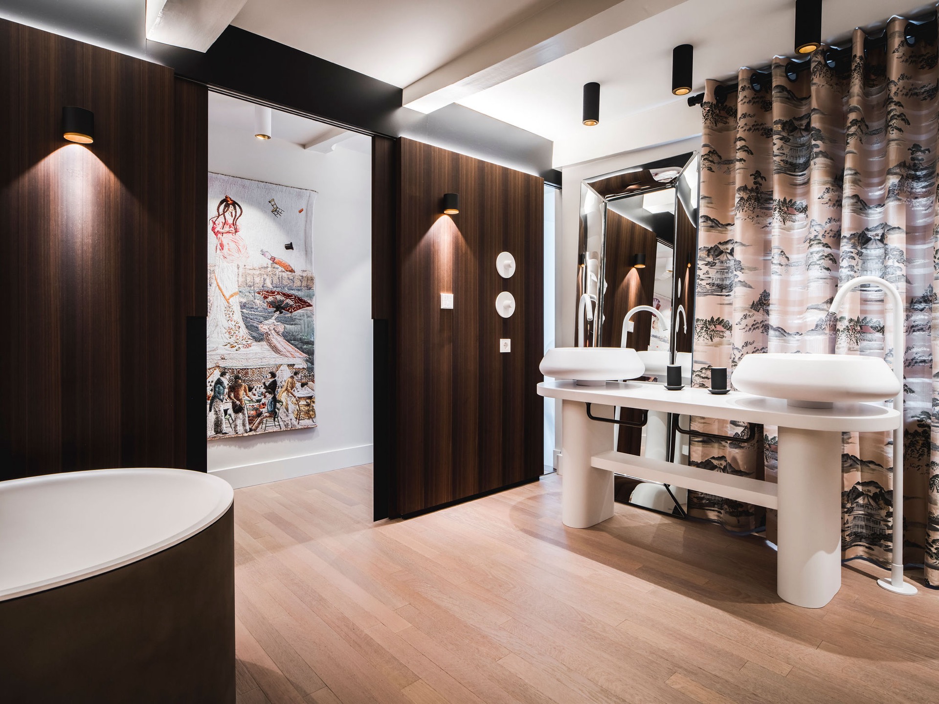
The bathrooms shift the mood again. Here, the surface treatment becomes more tactile, with large stone-look panels, marble-toned walls and dark tile zones that add depth to smaller spaces. One bathroom shows a glass shower enclosure with a slender frame, which keeps the shower area visually light while the surrounding stone gives it weight. Another image reveals a freestanding basin unit in a white stone look, placed under linear lighting that sharpens every edge.
These rooms are where the luxury bathroom natural stone theme is most evident, though the effect is quieter than a showpiece spa. A mosaic accent appears in one of the smaller wet rooms, breaking up the darker tile field with a tighter pattern. In the shower zone, the glass panel, spot lighting and stone surfaces create clear layers: wet, dry, reflective, matte. The arrangement is practical, but it also makes the boundaries of the room easy to read at a glance.
Small rooms with a strong material register
Even the compact toilet space is handled with attention to surface changes. Dark tiles sit below a band of multi-coloured mosaic, so the wall shifts from solid to patterned in one short rise. It is a small room, but the treatment gives it a distinct presence. The same logic appears elsewhere in the house: a detail does not need to be loud to register. It only needs to be precise, especially when it sits close to stone, glass or polished metal.
In the corridor, classic interior design shows up through the arch shapes, marble plinths and recessed light points that wash the walls evenly. The route through the house feels measured because the materials keep changing underfoot and at eye level. Wood panels appear beside stone, then a darker doorway or a glazed opening takes over. These transitions do more than mark circulation. They make the journey through the house part of the composition, room by room.
Bedrooms, stair and wellness space in the same language
The bedrooms turn down the contrast and keep the material palette softer. Upholstered surfaces, carefully chosen furniture and restrained finishes give the rooms a quieter register, while the architectural envelope remains present through mouldings, framed walls and the weight of the ceiling. The effect is less about decoration than about proportion. A modern classic interior often depends on that restraint: enough detail to keep the room from feeling bare, enough open surface to let the architecture breathe.
The stair brings in another layer of craft. A curved wooden handrail follows the rise, and the steps are finished with dark upholstery that absorbs light rather than bouncing it back. Nearby, built-in lighting picks out the wall and the landings, turning the stair into a transitional space instead of a simple passage. The wellness area works in a different direction again, with wooden benches and a slatted timber ceiling that holds the light close and gives the room a compact, enclosed character.
Light, view and the canal-side setting
Large window openings are one of the project’s clearest features. They bring daylight into the living and dining spaces, but they also frame the water outside so the interior never feels sealed off. In the main rooms, the view sits beside chandeliers, paneled walls and textured fabrics rather than above them. That pairing is important. It keeps the house connected to its setting while the interior remains focused on stone, timber and plaster.
Outside, a courtyard and waterside terrace extend the plan in a more open direction. The surfaces are simpler there, but the relation to the house stays strong: the terrace sits close to the water, and the courtyard creates a pause between the enclosed rooms and the canal edge. Taken together, these spaces reinforce what the interior already suggests. This is a modern classic interior shaped by historic structure, visible craftsmanship and a material palette that stays clear from one room to the next.
Want to see more of François Hannes? View the page of François Hannes for even more great projects and company information.





NEW 2026 Jubileum Edition The Best Interior Designers Benelux
Order Now €125


NEW 2026 Jubileum Edition The Best Interior Designers Benelux
Order Now €125


NEW 2026 Jubileum Edition The Best Interior Designers Benelux
Order Now €125


NEW 2026 Jubileum Edition The Best Interior Designers Benelux
Order Now €125


NEW 2026 Jubileum Edition The Best Interior Designers Benelux
Order Now €125


NEW 2026 Jubileum Edition The Best Interior Designers Benelux
Order Now €125


