


Modern farmhouse interior with a dark kitchen feature wall
Light walls, wood tones and sharp joinery give the house its quiet rhythm. The kitchen pulls the eye first, with a dark wall zone, a recessed niche and integrated appliances set into a custom composition. Elsewhere, white-and-wood built-in cabinets keep storage close to the wall, while an open staircase with wooden steps connects the floors without closing off the view. The result is a modern farmhouse kitchen with dark feature wall that stays calm, but never flat.
Modern farmhouse kitchen with dark feature wall as a spatial starting point
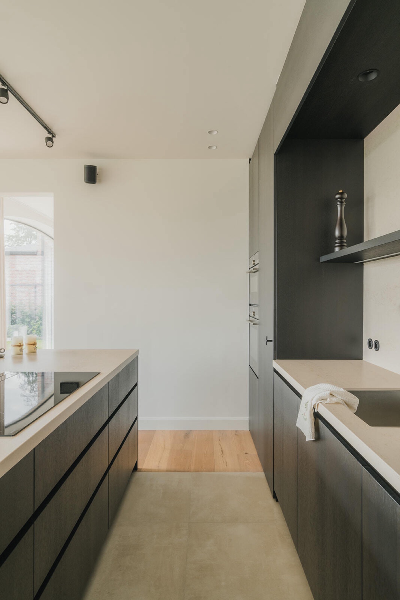
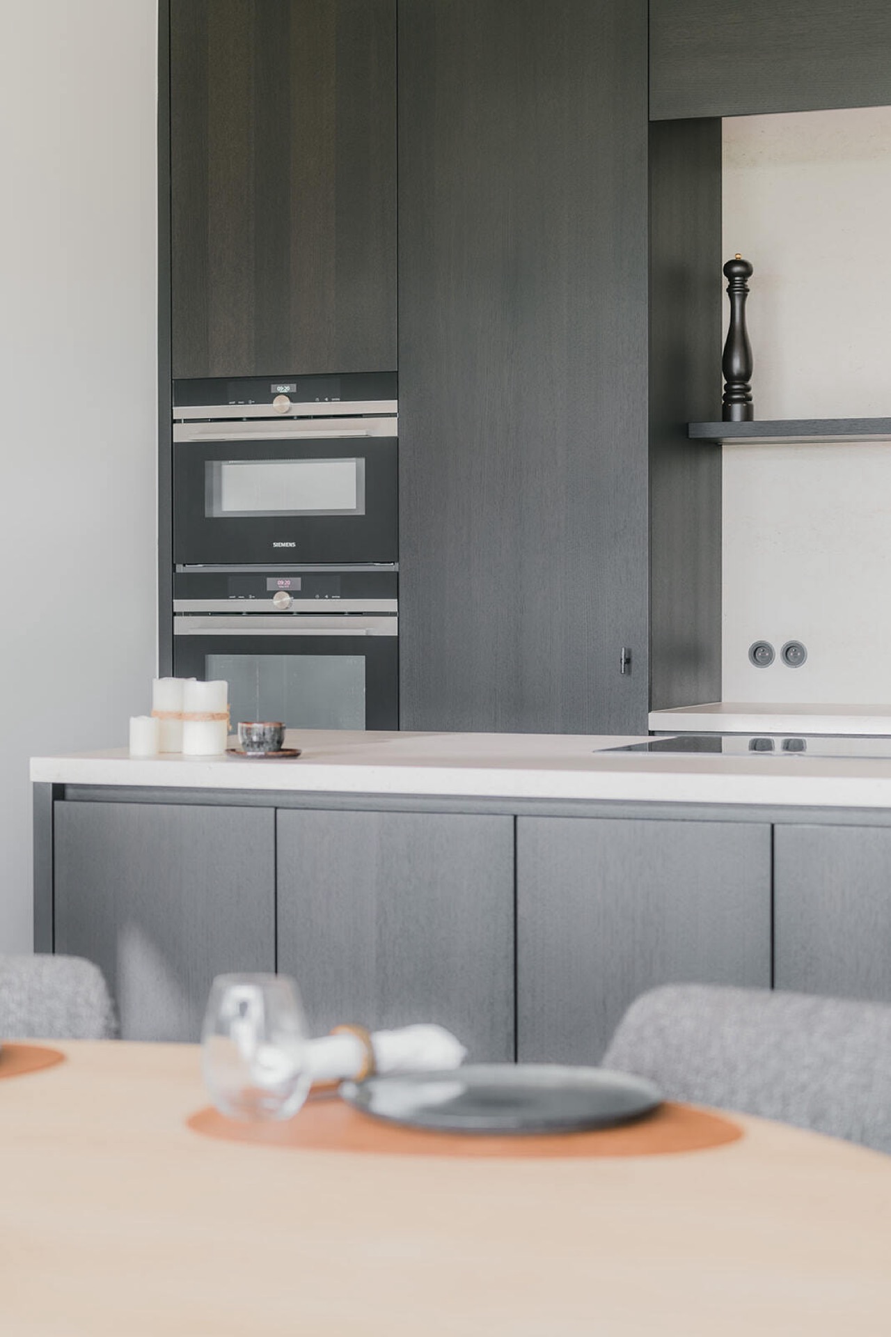
The kitchen is anchored by a dark front wall that reads as one continuous plane until the eye catches the niche and the built-in oven. The appliances sit inside the joinery instead of breaking it up, so the surfaces stay disciplined. A lighter worktop softens the depth of the darker panels, and the nearby floor keeps the room from feeling boxed in. In photographs, the kitchen works best when seen straight on, because the vertical lines and the recessed opening give the room its clearest structure.
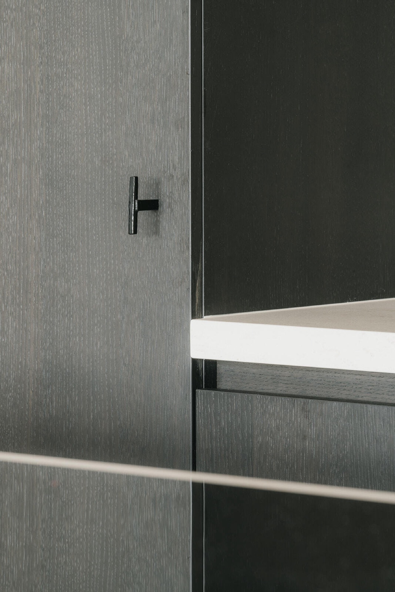
That dark kitchen wall niche is more than a visual accent. It organizes the room into zones without adding extra partitions. The opening holds the eye, the surrounding fronts absorb the darker tone, and the integrated appliances keep the wall tidy. This is where the project’s farmhouse reference becomes visible in a precise way: not through ornament, but through the mix of wood, painted surfaces and measured proportions. The room feels composed around use, yet the details remain visible.
Integrated appliances set into the joinery
Built-in appliances in a custom kitchen often disappear completely, but here they are framed by contrast. The tall oven stack sits inside a dark vertical niche, while adjacent surfaces shift toward lighter tones and wood. That change in material marks the working area without calling attention to itself. The island and counter surfaces appear to extend the same language, so the kitchen reads as one designed assembly rather than a collection of separate units. It is a practical setup, but the visual story comes from the joins, edges and the way each panel stops and starts.
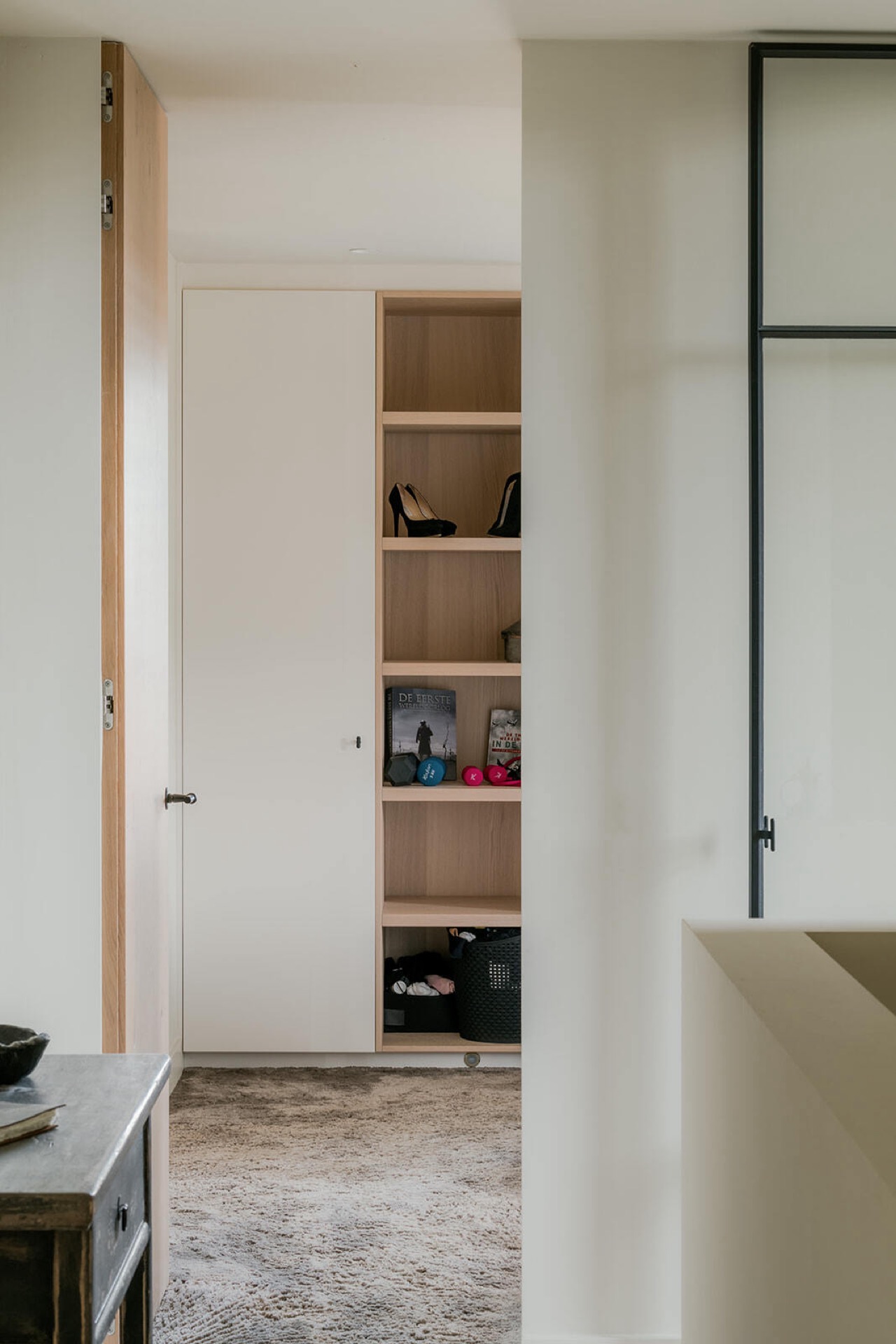
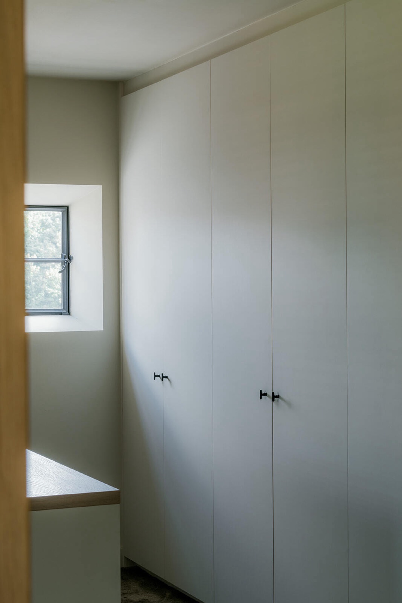
White and wood built-in cabinets shape the rooms beyond
Storage is treated as part of the architecture. White panels run across the walls, then open into wood-colored shelves and compartments that break the flatter surfaces with depth. These white and wood built-in cabinets keep everyday objects close at hand, but they also create a clear backdrop for the circulation spaces. The contrast between matte white and natural wood gives the rooms a measured, domestic feel. Nothing is pushed forward unnecessarily; most of the volume sits flush with the wall.
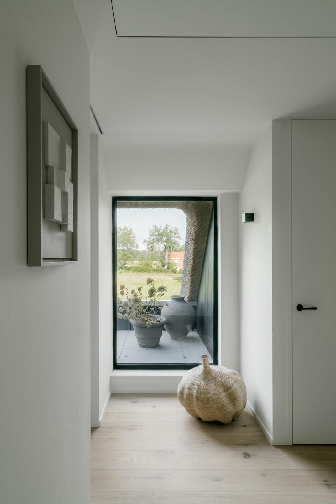
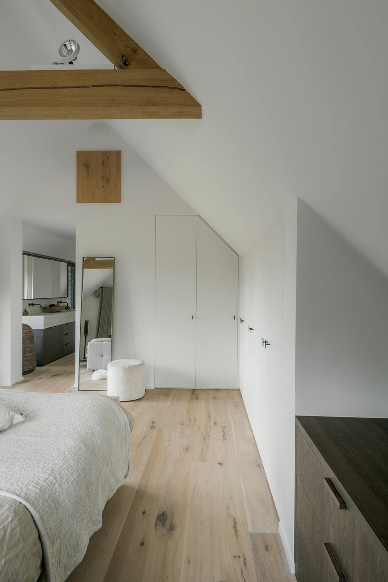
One of the strongest sequences in the project is the wall of built-in storage near the hall. A narrow opening, a set of open shelves and a run of white doors turn the passage into an organised threshold. In another room, built-in wardrobes and shelving line the route toward the sleeping area, so the storage is part of the movement rather than an afterthought. The cabinetry keeps the floor area open and lets the wood details appear in controlled strips instead of broad gestures.
Because the cabinets are finished in both white and wood, they register differently from every angle. From the side, the open compartments create shadows; from the front, the flat doors keep the wall legible. This is where the project’s discipline shows most clearly. The joinery does not shout for attention, but it changes how the light lands in the room. A small shelf, a flush door, a clean corner: these are the pieces that hold the interior together.
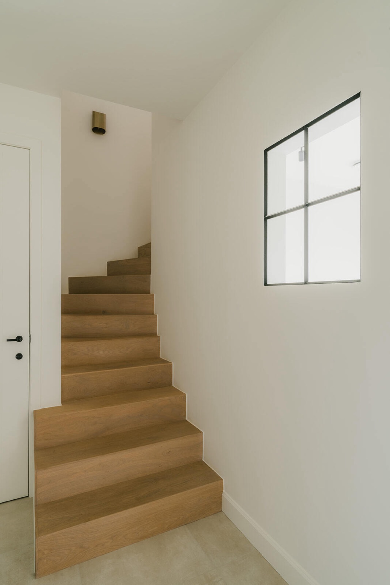
An open staircase with wooden steps keeps the sightline open
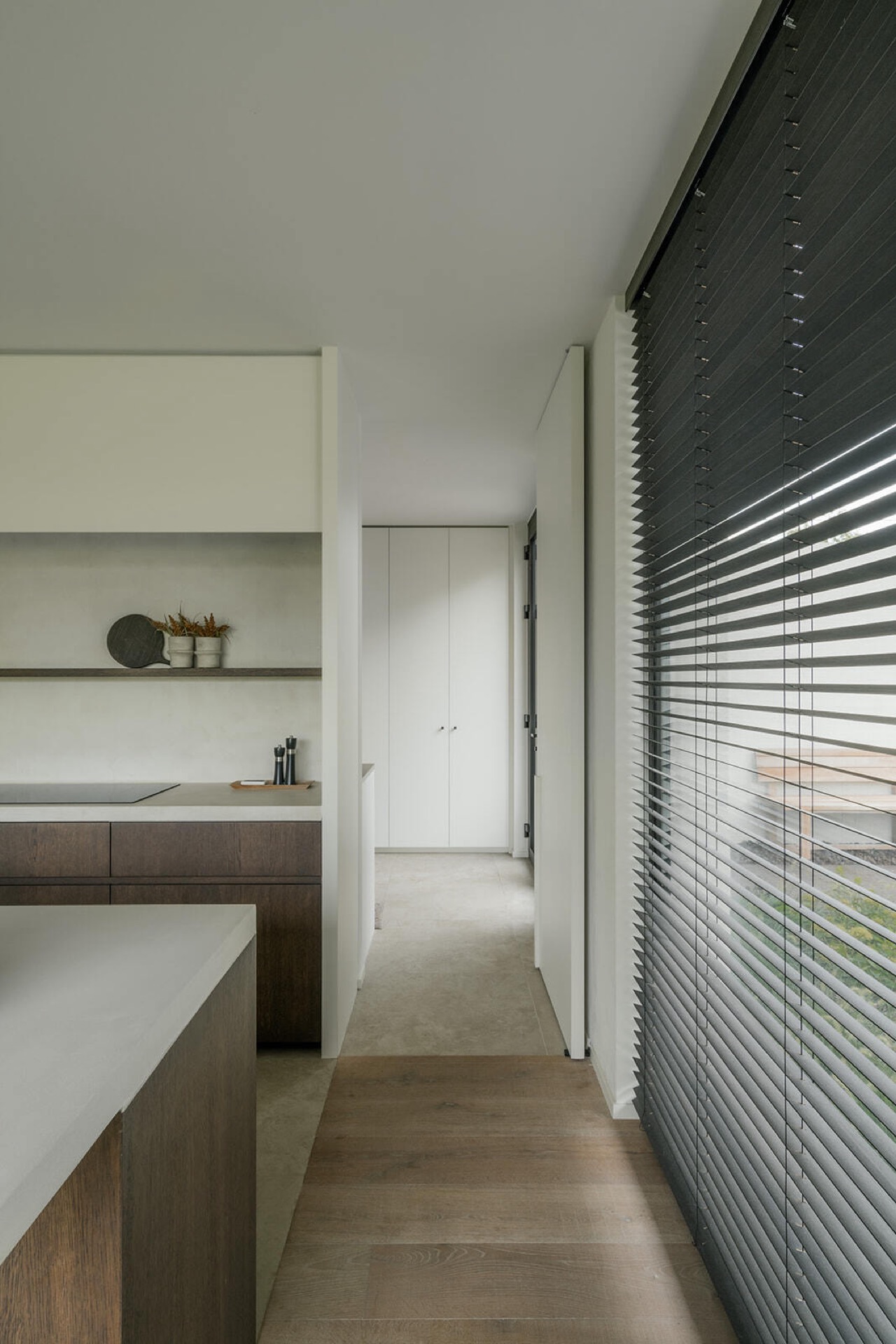
The staircase is light in its footprint and clear in its line. White walls run alongside the rise, while the wooden steps carry the eye upward to the landing. Because the stair remains open, the view extends beyond it instead of stopping at a solid wall. That makes the transition between floors feel readable from several points in the house. A small ceiling spot and the slim window nearby add to the sense of a passage shaped by light rather than by bulk. Modern farmhouse kitchen with dark feature wall remains connected to the layout, materials and daily use of the home.
Seen from the landing, the stair reads almost like a drawing: white planes, one dark edge, and the warm grain of the treads. The open staircase with wooden steps becomes a connective element between the kitchen, hall and upper rooms. Its role is not decorative, but the clean geometry gives the interior a clear vertical pause. The route upward is obvious, yet the structure remains visually light enough to let the surrounding cabinetry and door openings stay in view.
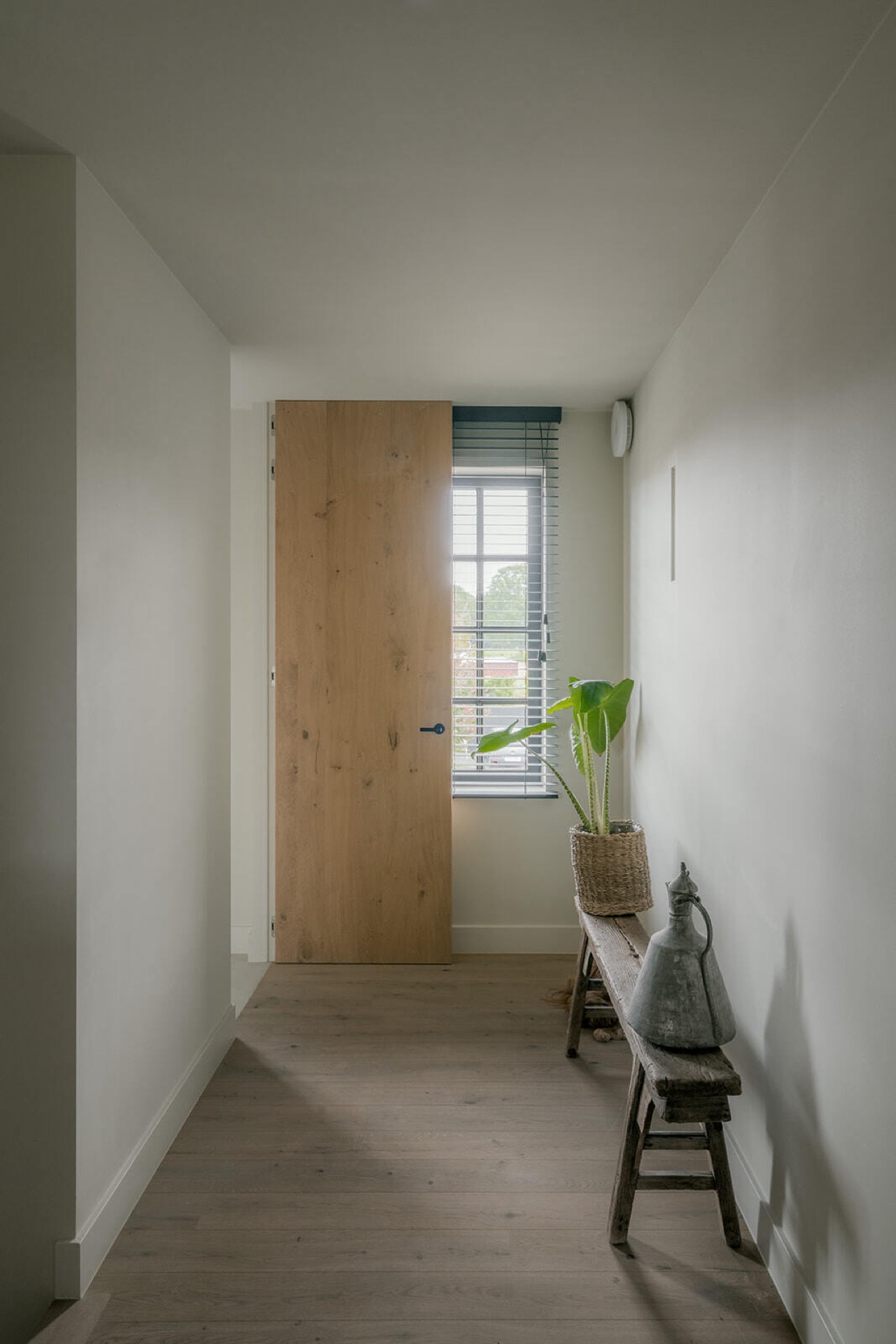
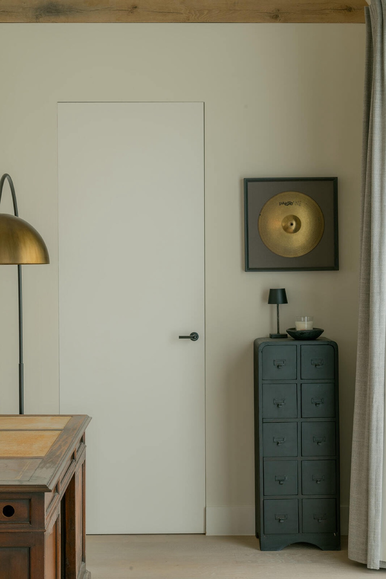
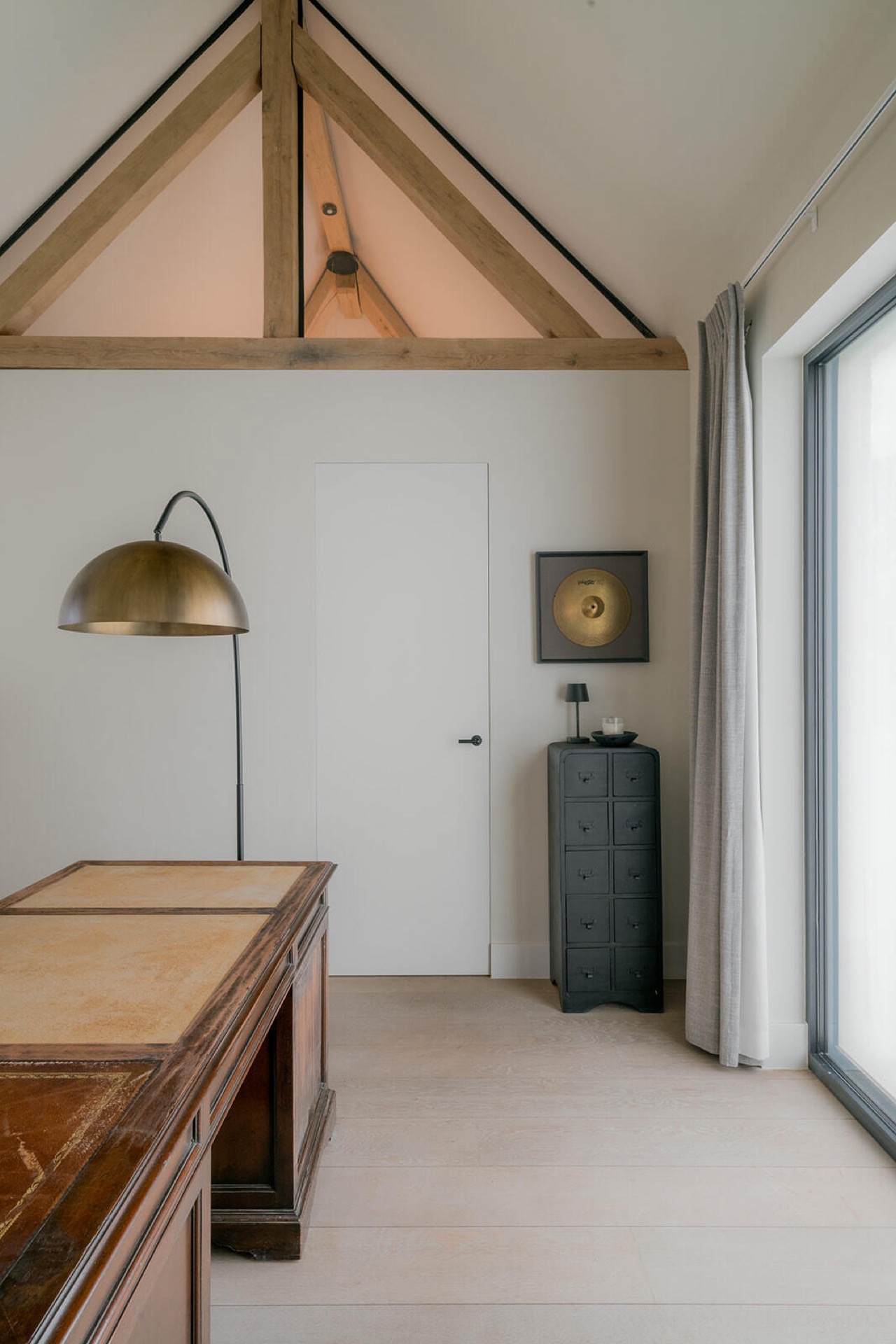
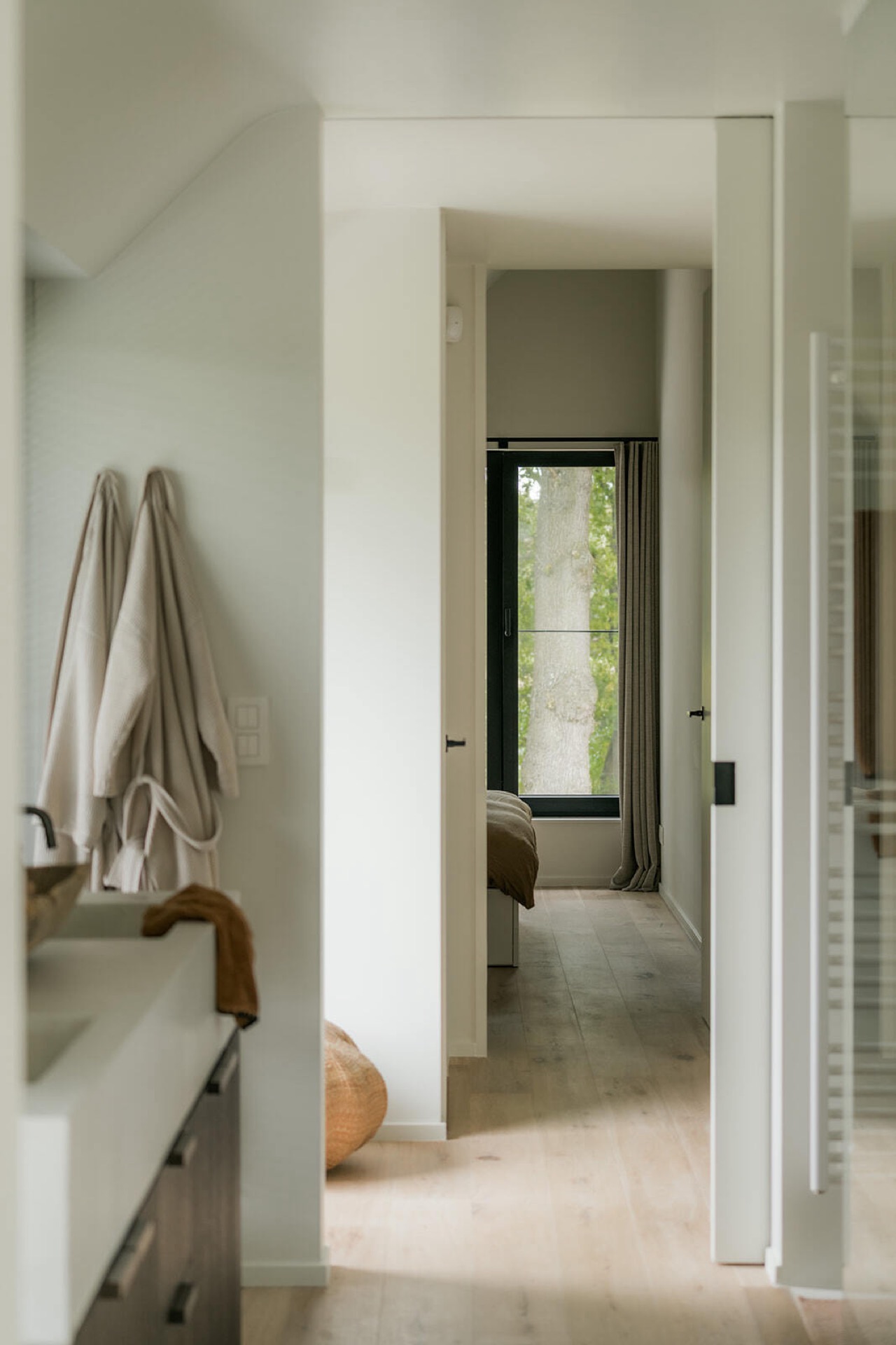
Doorways, frames and a bedroom threshold
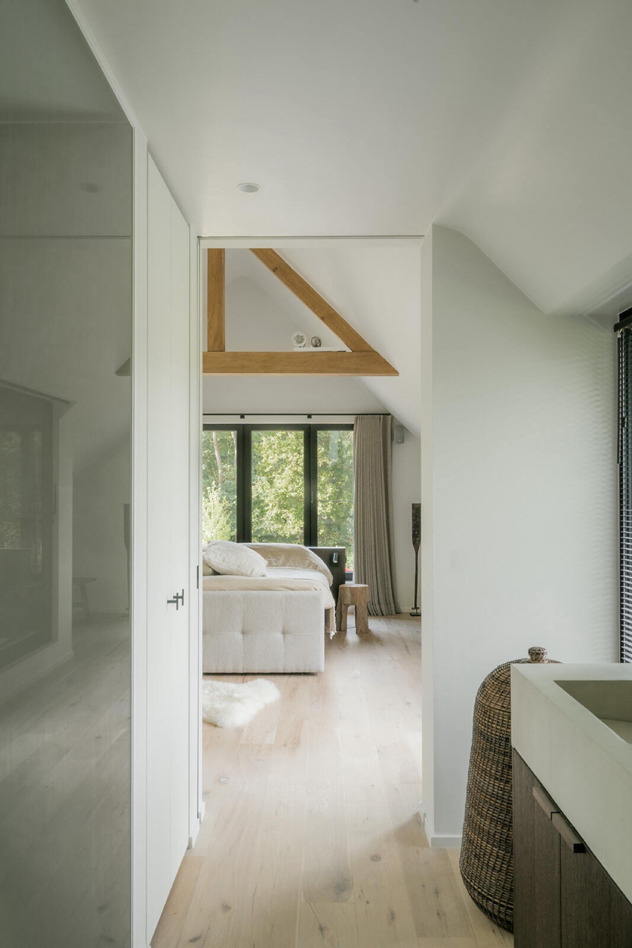
Several openings in the upper level repeat the same restrained language. Slender frames, white wall surfaces and darker trims create a sequence of thresholds that feels deliberate rather than repetitive. In the bedroom view, the bed sits beyond a pair of openings, with built-in shelving and storage along the sides. The route into the room is narrow, which makes the opening itself feel more important. Instead of widening the passage with extra gestures, the project keeps the edges sharp and lets the furniture and joinery do the framing.
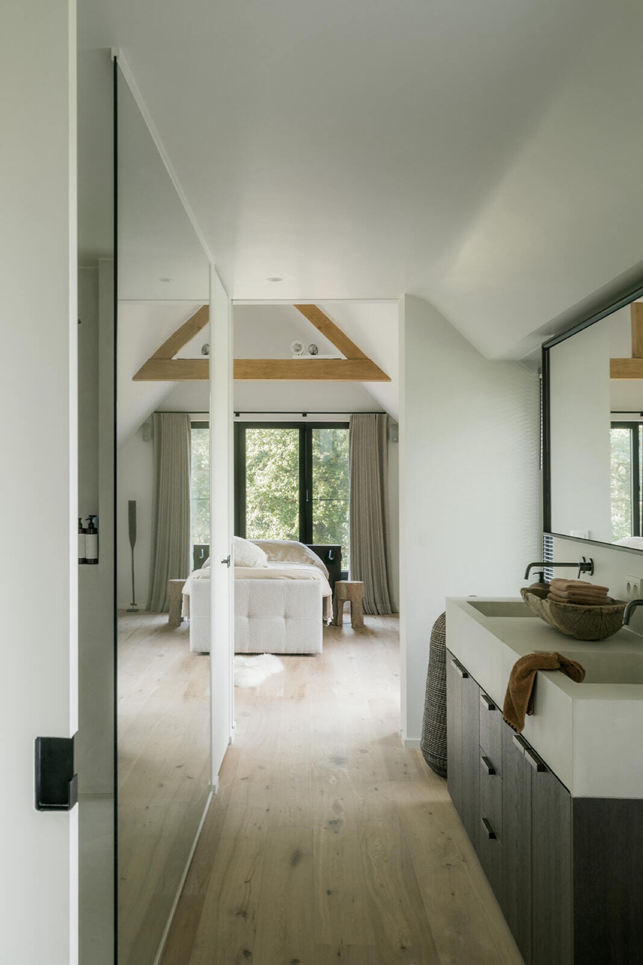
A bright bathroom with a freestanding bathtub and glass shower enclosure
The bathroom changes the tone without losing the project’s clarity. Light surfaces, a large window and slim shutters or lamellae keep the room bright, but the space avoids glare through a careful mix of soft reflection and shadow. A freestanding bathtub sits in front of the window, leaving space around it so the basin reads as a separate object rather than built-in furniture. The glass shower enclosure stays visually thin, which allows the room to remain open even with two bathing zones present.
What stands out in the bathroom is the way the window treatment modulates the light. The bathroom window shutters lamellae filter the daylight and leave a subtle pattern on the surfaces nearby. That detail matters because the room depends on the window for its character. A freestanding bath, a clear shower screen and the pale floor finish keep the composition simple, while the window and its slats provide the only repeated texture. It is a quiet room, but not an empty one.
The glass shower enclosure sits beside the bath without crowding it. The separation is readable at once: solid porcelain, transparent glass, then wall and window. In a room with this much daylight, that transparency helps preserve depth. The bathroom remains part of the larger interior language — white walls, wood accents, measured lines — but it has its own pace. Here, the project relies on restraint, measured openings and the exact placement of each fixture to make the room work visually.
Across the whole house, the same choices return: white planes, warm timber, fitted storage and dark accents used where they can sharpen the composition. The modern farmhouse kitchen with dark feature wall sets the tone, then the built-in cabinets, staircase and bathroom continue it in quieter ways. Nothing is forced into emphasis. Instead, the interior is built from clear transitions, precise joinery and a palette that lets each room carry a distinct piece of the story.
Rooms and details that define the page
The strongest images focus on the parts of the house where material and movement meet. A dark kitchen wall niche with integrated appliances gives the kitchen its anchor. The white and wood built-in cabinets keep the hall and sleeping areas ordered. The open staircase with wooden steps creates a clear vertical route. In the bathroom, the freestanding bathtub, the glass shower enclosure and the window shutters or lamellae form a compact composition around daylight. Together they show an interior that relies on exact placement rather than excess.
Even the smallest details matter here: the dark trim beside a doorway, the open shelf in a recessed cabinet, the narrow strip of light along the stair wall. These moments keep the interior grounded. They also explain why the modern farmhouse kitchen with dark feature wall remains the visual starting point for the project. It is not just a single room, but the clearest expression of the house’s material logic — wood against white, dark against light, closed storage against open circulation.
Want to see more of Dauby: exclusief deur-, raam- en meubelbeslag? View the page of Dauby: exclusief deur-, raam- en meubelbeslag for even more great projects and company information.

.png)
NEW 2026 Jubileum Edition The Best Interior Designers Benelux
Order Now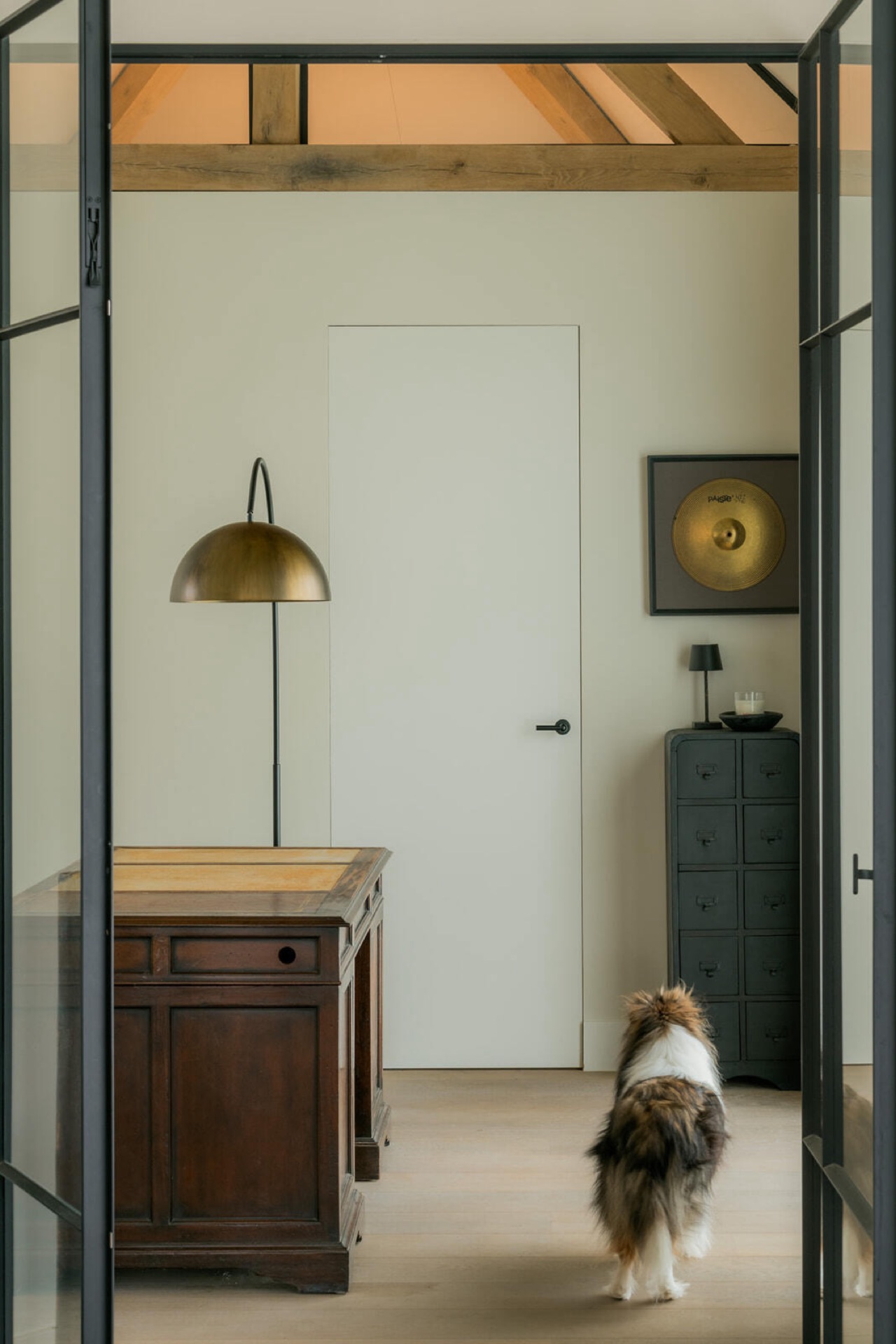
NEW 2026 Jubileum Edition The Best Interior Designers Benelux
Order Now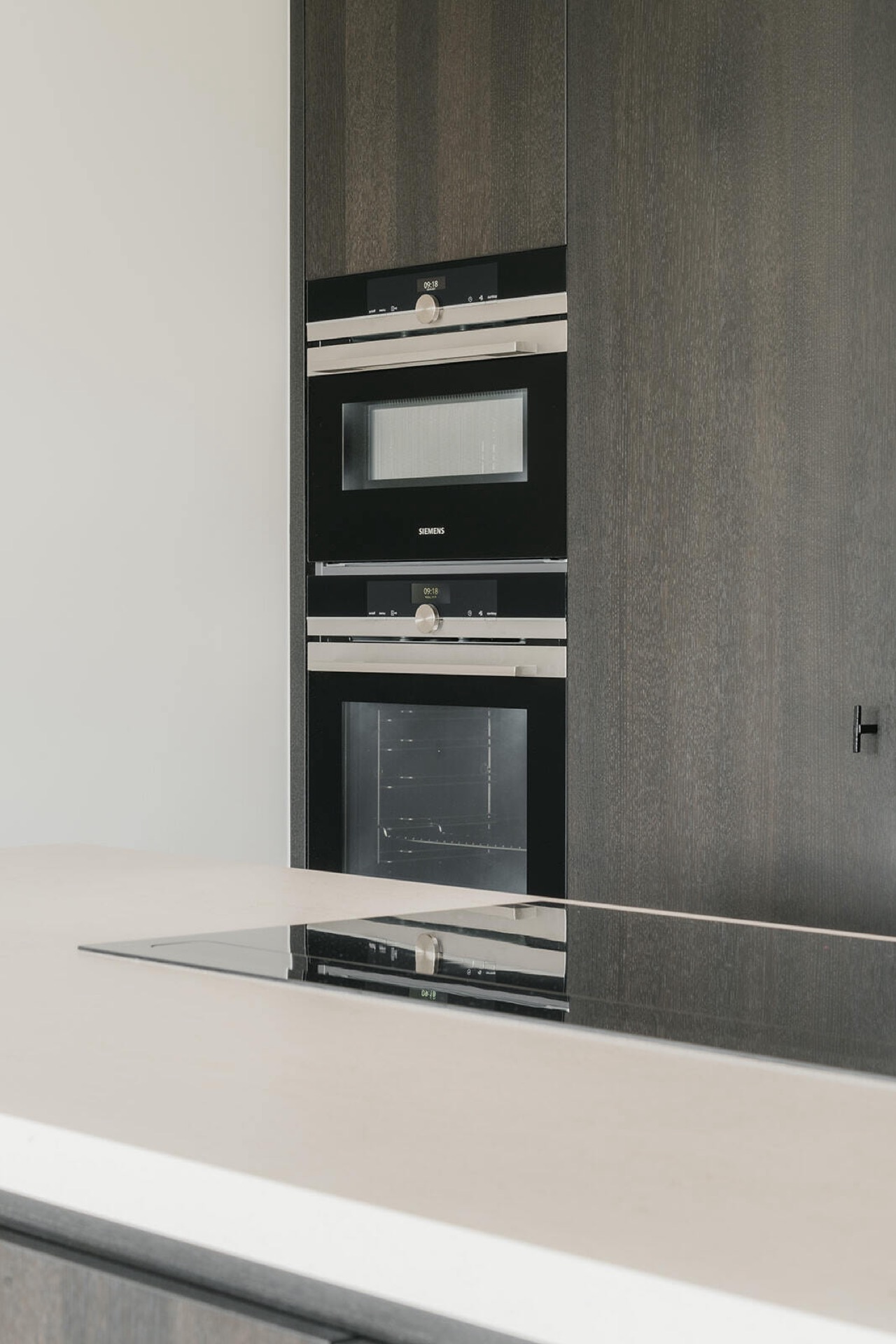
NEW 2026 Jubileum Edition The Best Interior Designers Benelux
Order Now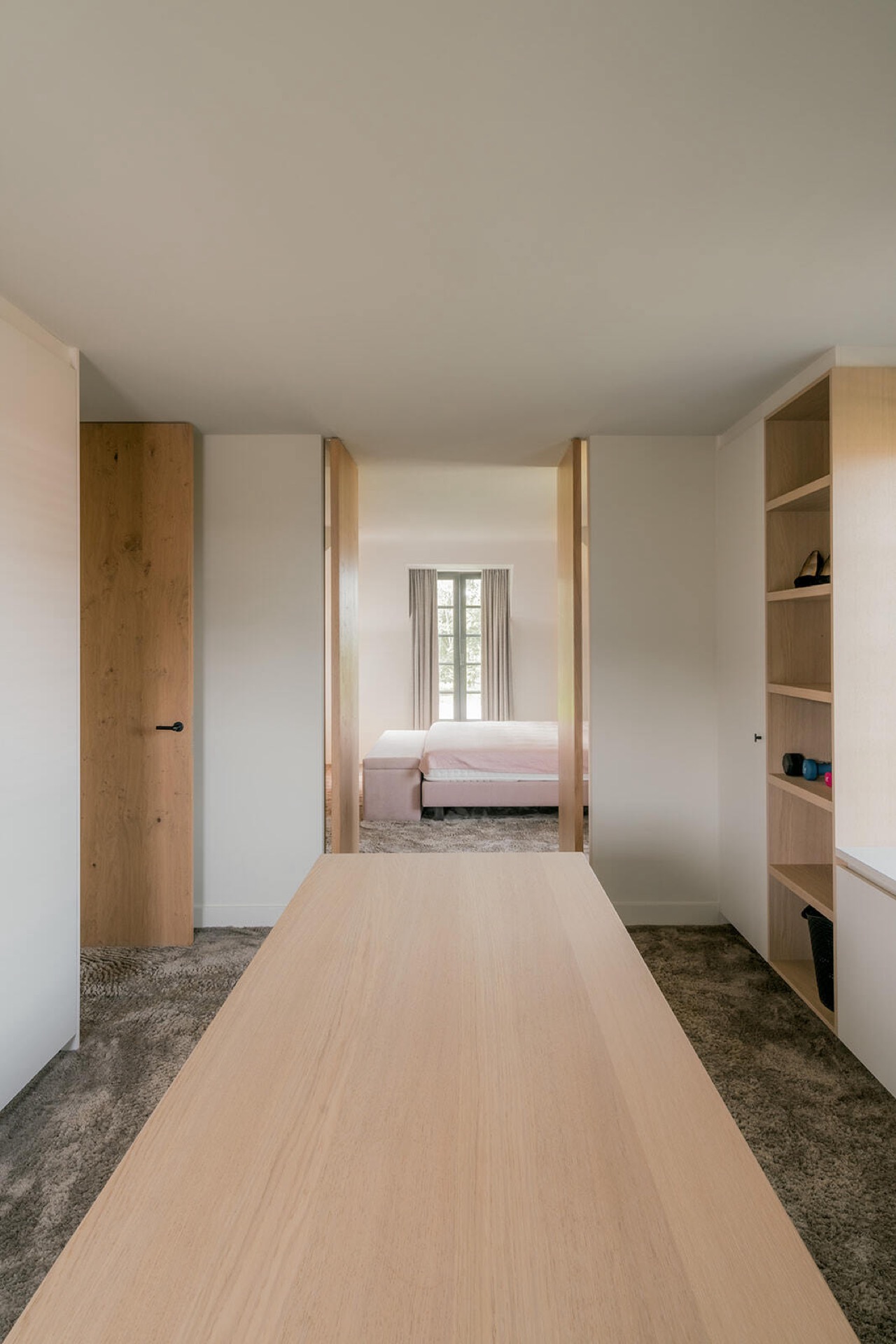
NEW 2026 Jubileum Edition The Best Interior Designers Benelux
Order Now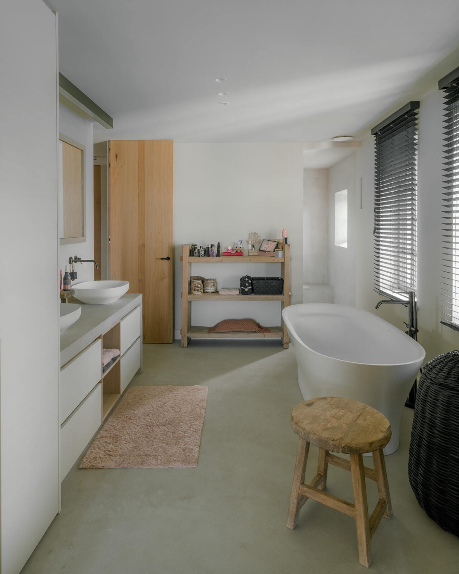
NEW 2026 Jubileum Edition The Best Interior Designers Benelux
Order Now


