


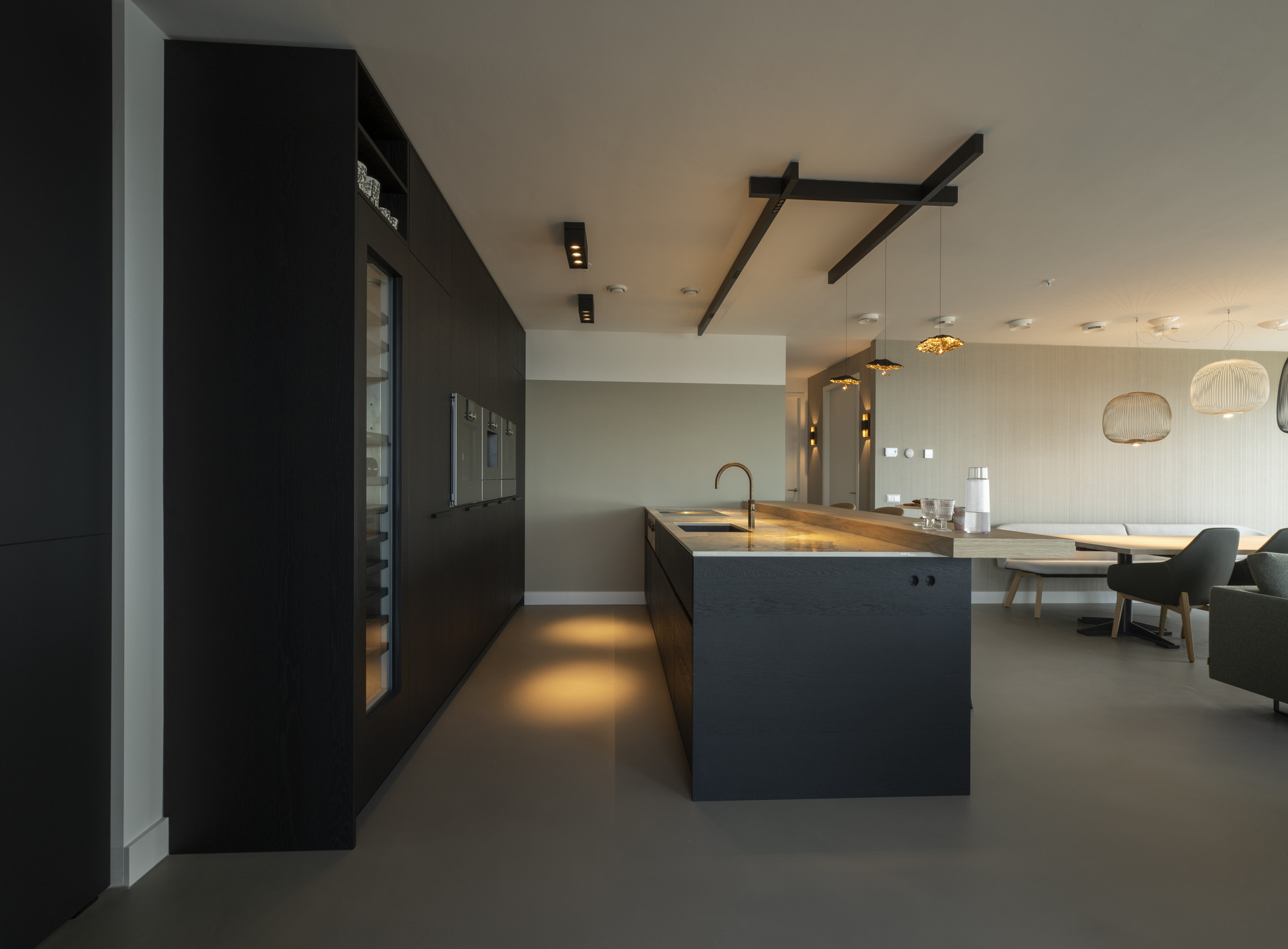
Dark cabinetry sets the tone before the room even opens up. Against the pale wall panels, the kitchen reads as a sequence of straight lines, recessed details and measured light. This modern new-build apartment interior keeps the surfaces quiet, but never flat. A bar table projects from the kitchen zone toward the dining area, while the stone-look flooring runs underneath everything with a pale grey cast that softens the contrast between wood, glass and metal.
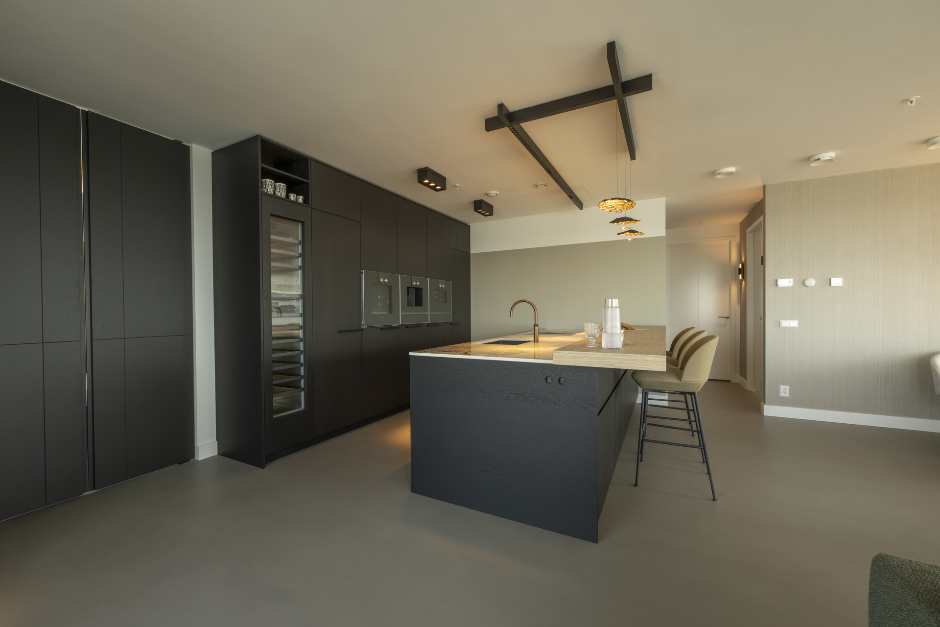
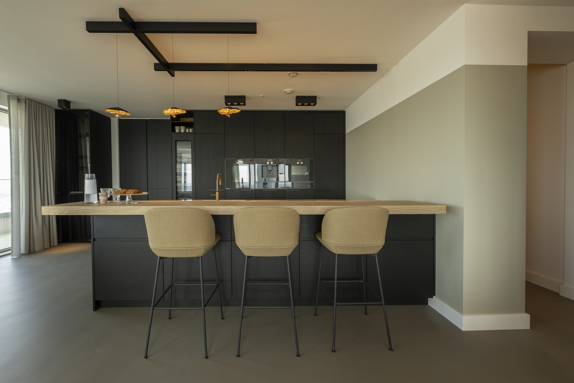
The kitchen is arranged as a lived-in working zone rather than a showpiece. The island and bar table form one clear center, with stools lined up at the edge and pendant lights hanging low enough to mark the seating area. On the wall, dark custom cabinetry holds the tall appliances in a single vertical block. Glass panels and integrated lighting break up the dark fronts, so the volume does more than store; it also frames the room and keeps the sightlines open.
modern new-build apartment interior as the architectural starting point
The open kitchen with bar table gives the apartment its first real spatial move. From the seating side, the eye travels across the counter, over the worktop, and on toward the dining area. That sequence is easy to read because the finishes stay restrained. Light wall panels, dark fronts and a stone-textured floor keep each part distinct. The bar edge works as a hinge between cooking and gathering, without forcing a hard break in the plan.
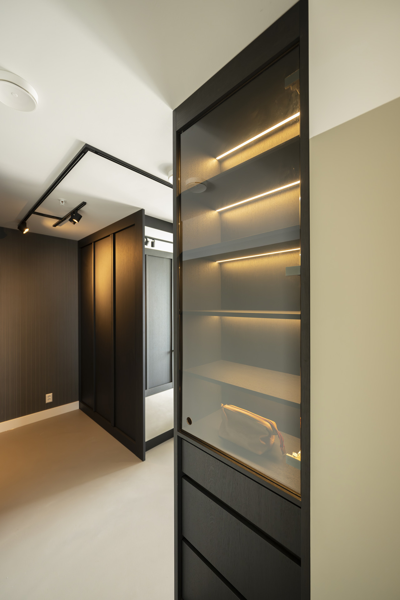
In the kitchen wall, the refrigerator sits inside a dark tall cabinet, with an open niche set beside it. That opening matters because it interrupts the block and gives the wall a pause. Above and around it, the built-in cabinet LED detail draws a thin line of light through the storage zone. It is a small gesture, but one that changes how the cabinet reads after dark, when the edge lighting defines the recess more clearly than the furniture itself.
Dark custom cabinetry and light walls in close contrast
Dark custom cabinetry carries much of the composition. The fronts are plain, but the arrangement is not. Tall units, open shelves, glazed sections and flush panels alternate across the wall, so the kitchen and adjacent storage read as one continuous set of built elements. The lighter wall cladding behind them keeps the mass from closing in. Instead, the room feels edited, with each cabinet line placed to sharpen the geometry of the plan.
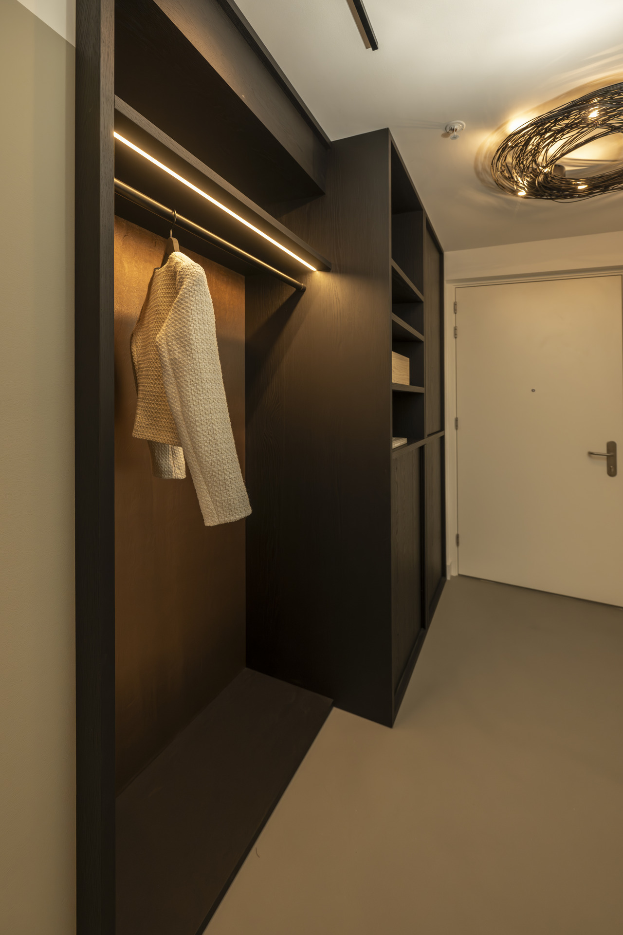
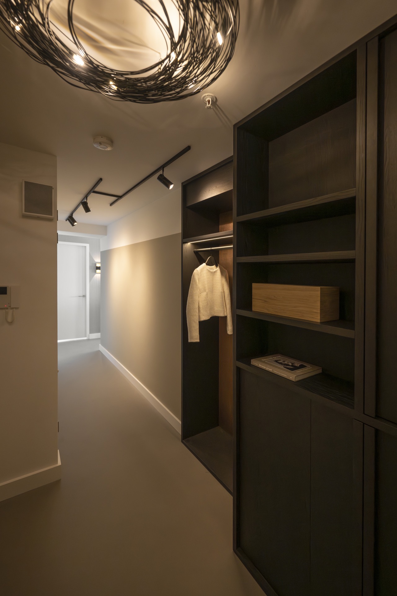
That contrast continues into the hall and entrance, where built-in storage is treated with the same discipline. Open compartments and a vertical LED strip turn a functional wall into a visible feature. The light does not flood the space; it traces the joins. In a narrow route, that matters. It makes the passage easier to read and gives the storage wall a clearer outline without adding visual noise.
Warm LED accent lighting in the ceiling and niches
Warm LED accent lighting does most of the quiet work here. Recessed spots puncture the ceiling in a regular rhythm, while rail lighting and focused fittings pick out the kitchen and cabinet edges. Because the sources are spread across the room, no single fixture has to carry the scene. The light lifts the darker materials instead of washing them out, and the ceiling remains legible as a separate plane above the furniture.
One of the most effective details is the LED line inside the built-in cabinet opening. It runs vertically, then meets the horizontal shelf lines around it, giving the niche a crisp outline. That same logic returns in the hallway storage and in the kitchen area, where small strips of light sit inside recesses rather than on display. The result is subtle, but very specific: the furniture reads as built into the architecture, not placed in front of it. That makes the modern new-build apartment interior part of the architectural character rather than a loose finish.
Stone-look flooring that quiets the room
The stone-look flooring is the surface that ties the apartment together. Its pale grey tone sits between the darker cabinetry and the lighter walls, which prevents either side from feeling too heavy. The floor also keeps the room visually open, especially where the kitchen meets the dining zone and the route into the bedroom. In that transition, the material does what a good floor should do: it carries the space without insisting on attention.
The project text notes that the floor is easy to maintain and made to last. That practical reading fits what the eye sees. The surface is continuous, without decorative interruption, and the matte look reduces glare under the LED spots. It supports the apartment’s calm tone while still giving the rooms enough definition to feel finished. The grey blush tint mentioned in the project description sits close to the visual effect in the photos: restrained, soft and suited to the dark-and-light contrast elsewhere.
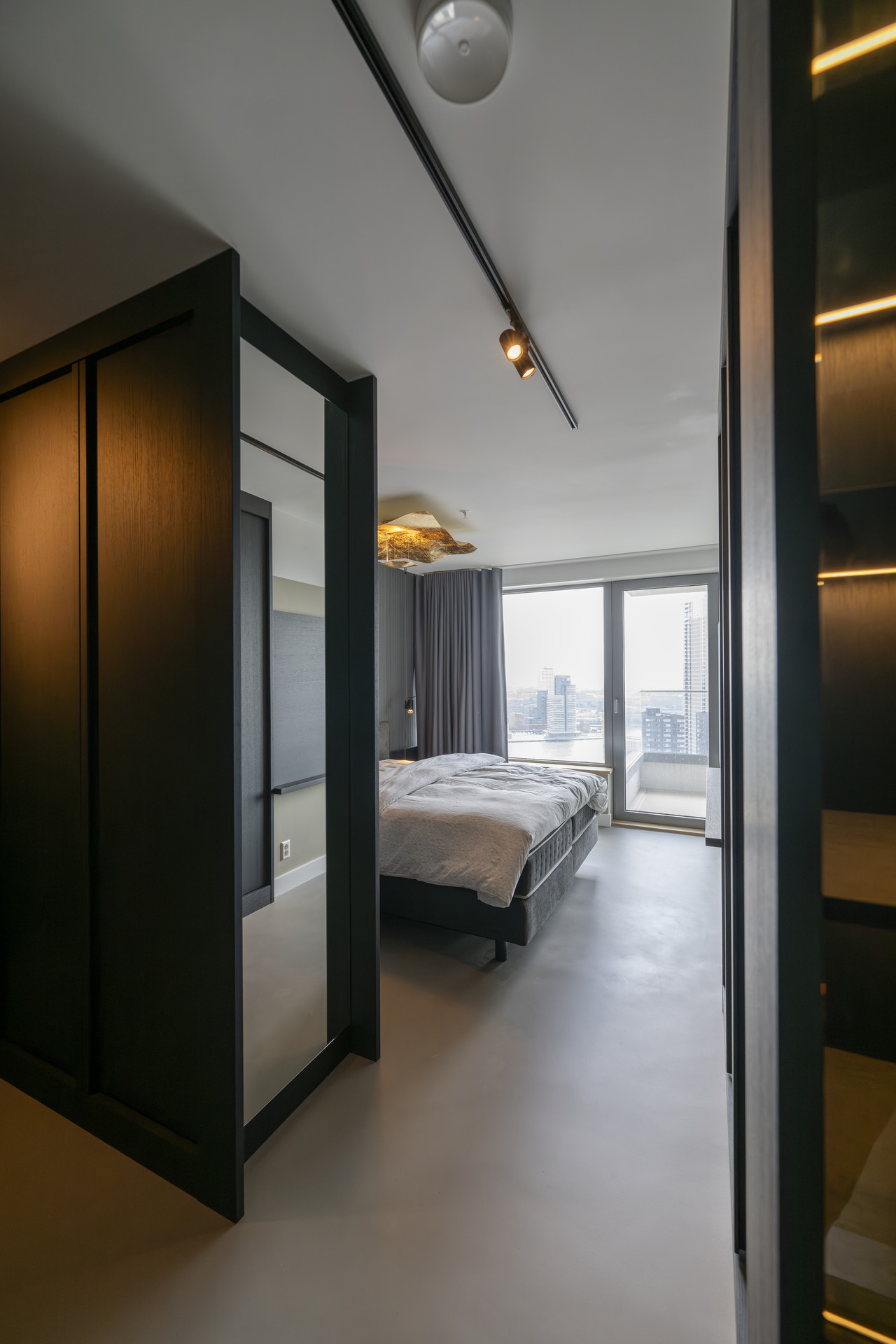
A bedroom framed by a large window
In the bedroom, the large window becomes the main architectural element. The bed is placed in front of it, with curtains drawn to the sides and the view held back as a pale rectangle of daylight. The room stays stripped down to a few clear parts: bed, wall, drapery, glazing. That restraint makes the opening feel larger, because there is little else competing with it. Even the ceiling lighting stays secondary to the window line.
From the bedroom zone, the apartment’s quieter side becomes visible. The finishes remain controlled, but the scene shifts from the kitchen’s built-in precision to a room that relies on proportion and light. The window depth, the curtain track and the dark adjoining surfaces give the bedroom a measured frame. It is a direct contrast to the more active kitchen zone, yet the same material discipline keeps both spaces connected.
Storage details that are part of the architecture
Across the hall, storage is not treated as an afterthought. The open cubbies, closed fronts and linear light strips are aligned with the route through the apartment, so the storage wall supports movement instead of interrupting it. In the corner openings, the LED lines sharpen the depth of the niche and make the structure easier to read. That same effect appears in the kitchen and entrance, where built-in elements are set back just enough to create shadow.
What holds the project together is not decoration, but repetition of a few precise moves: dark cabinetry, light wall surfaces, stone-look flooring, and warm light placed inside or beside the join. The apartment relies on those moves to shape its atmosphere. Each room keeps a clear role, whether it is the kitchen with its bar table, the hallway with its recessed storage, or the bedroom with its large window. The result is calm, but it is a calm built from visible parts.
Photography: Dave van Hout That makes the modern new-build apartment interior part of the architectural character rather than a loose finish.
Want to see more of ? View the page of for even more great projects and company information.
.png)


