Natural Stone Interior Project
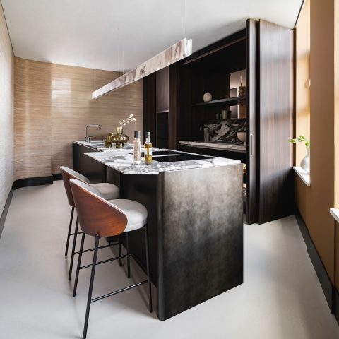
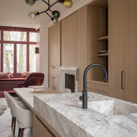
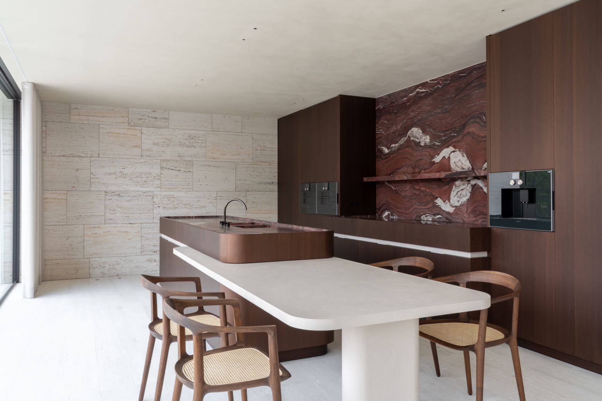
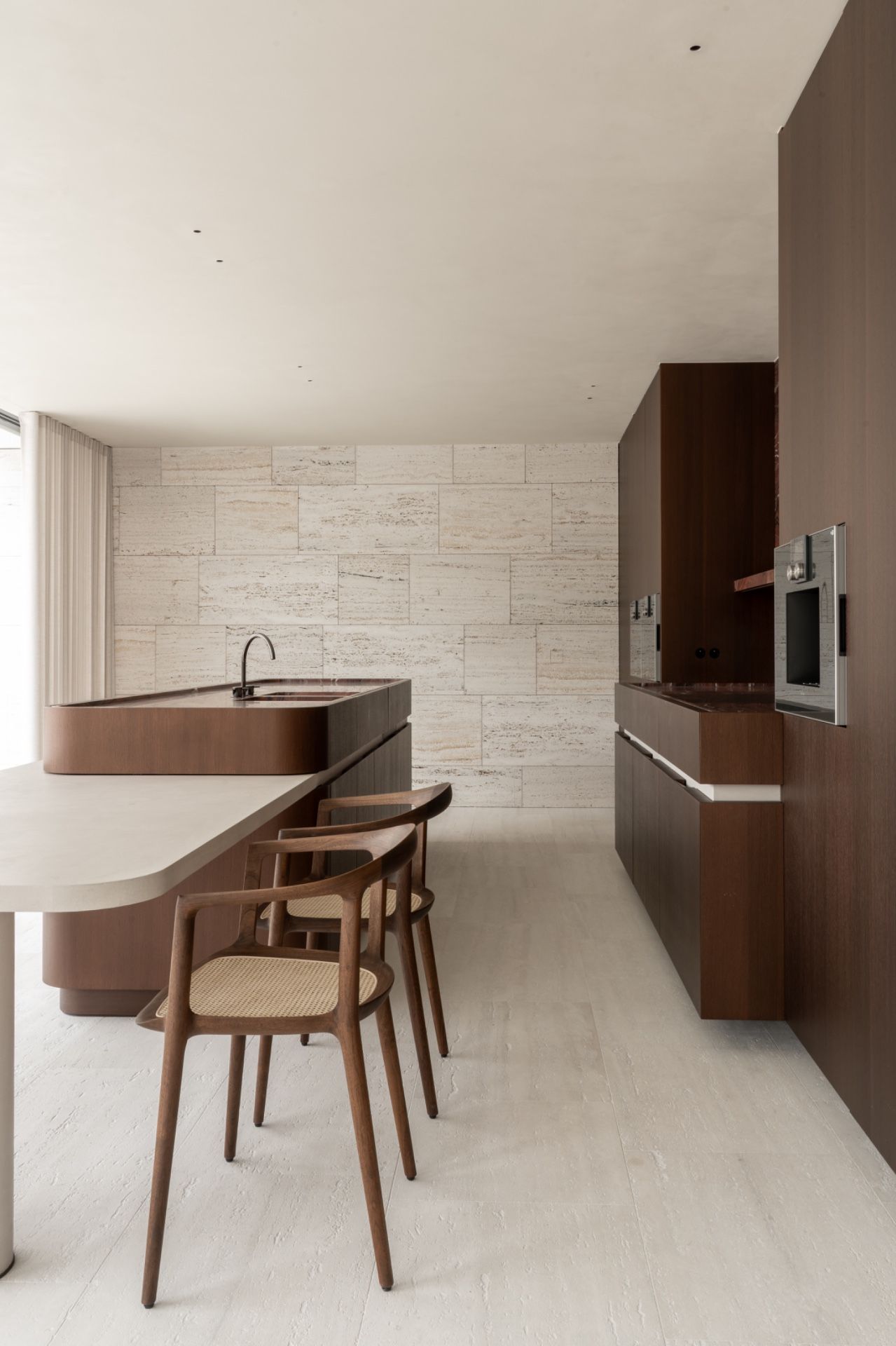
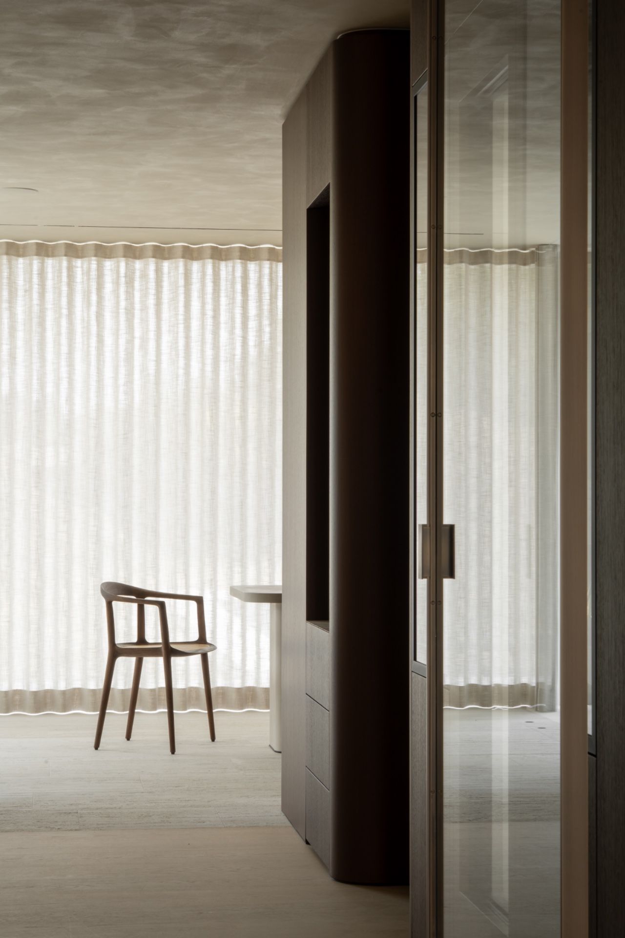
The travertine catches the light first. On the wall, the pale stone reads in wide panels, while darker timber and a red-brown veined surface pull the eye deeper into the room. The setting is a natural stone interior project shaped around kitchen and bar scenes, with round forms, integrated work zones and custom cabinetry guiding the view from one surface to the next.
Travertine that sets the tone
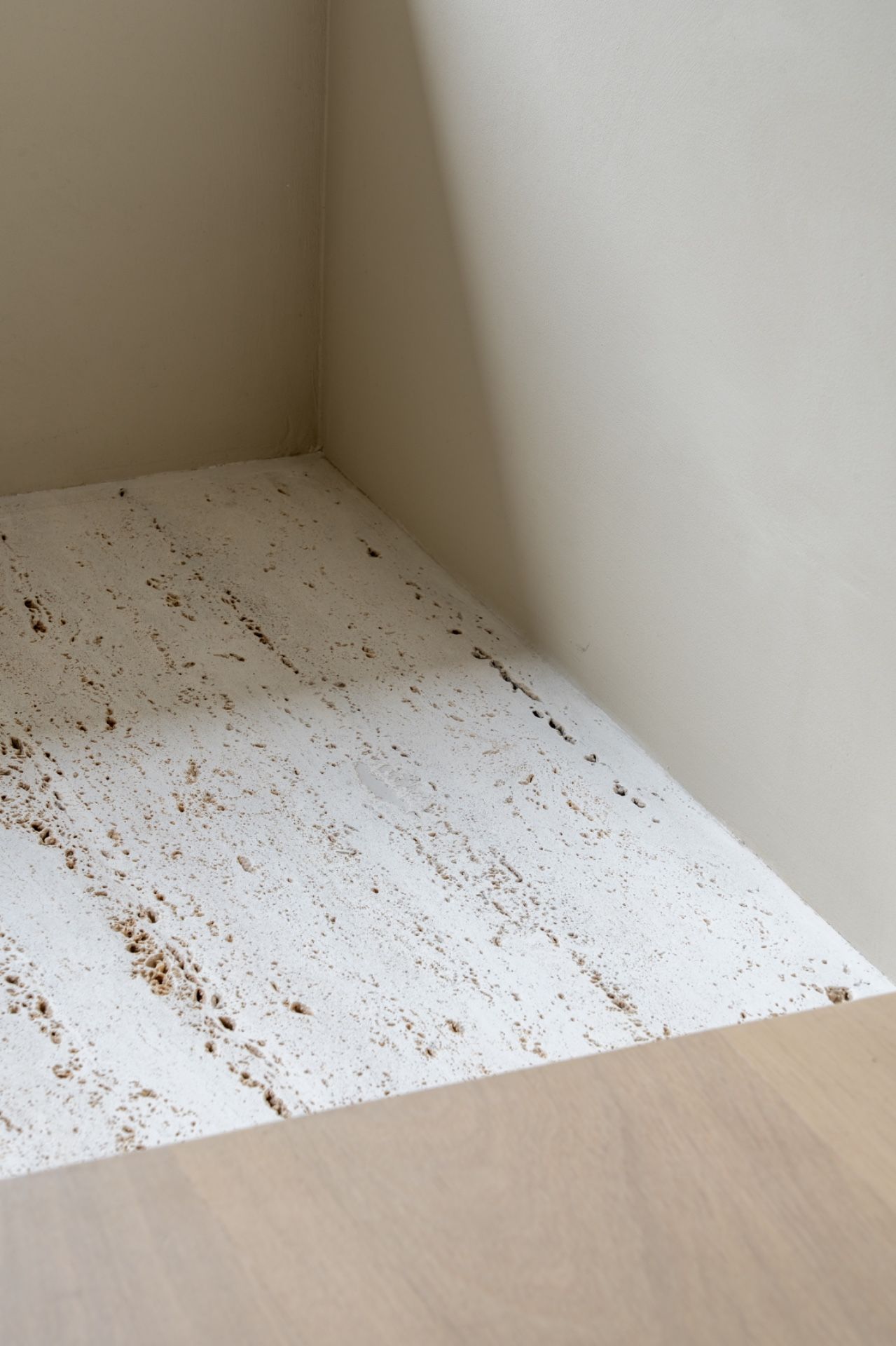
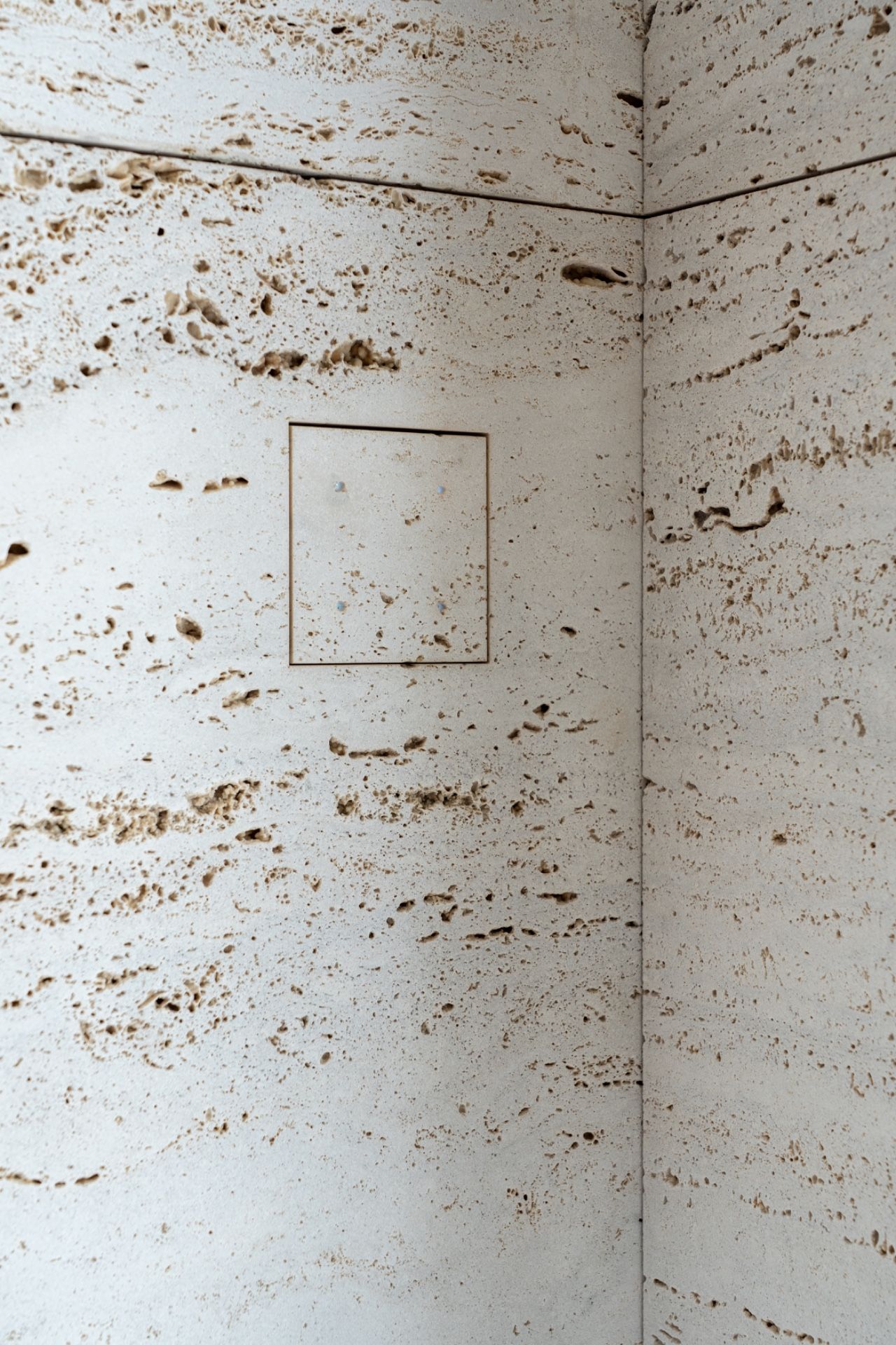
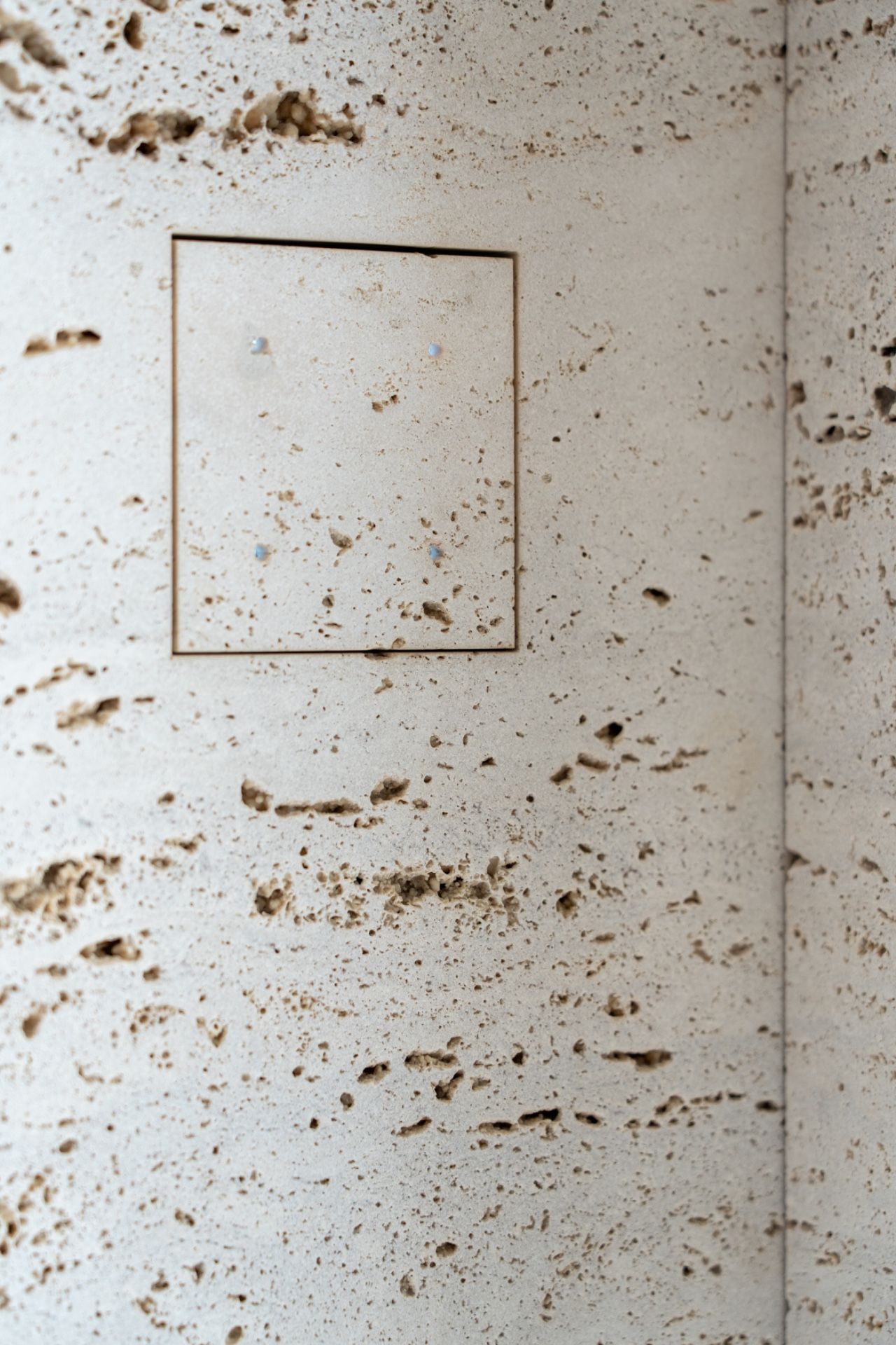
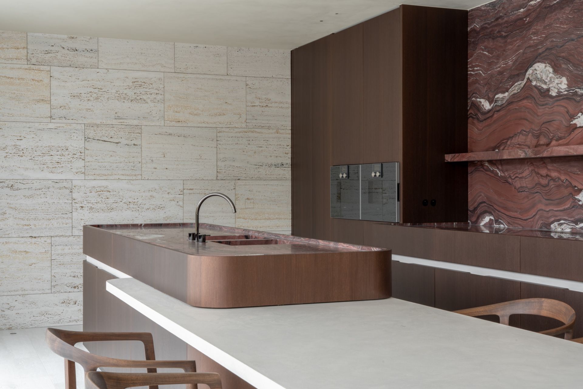
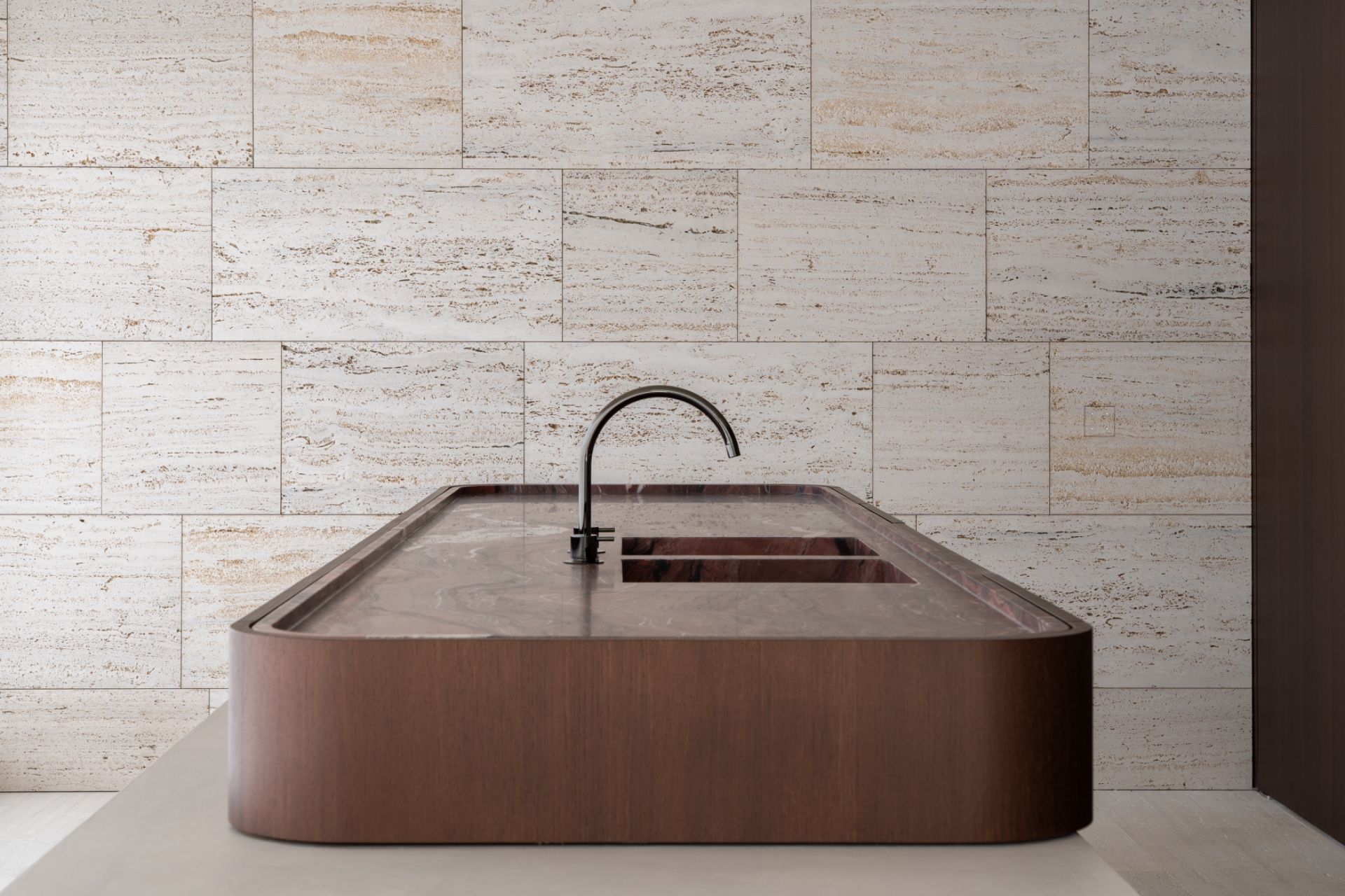
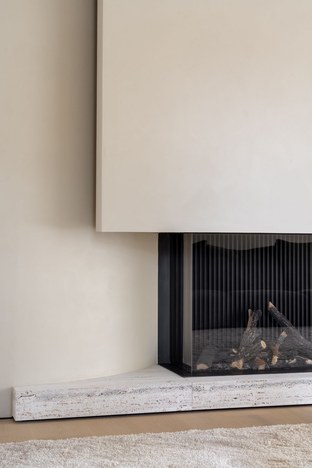
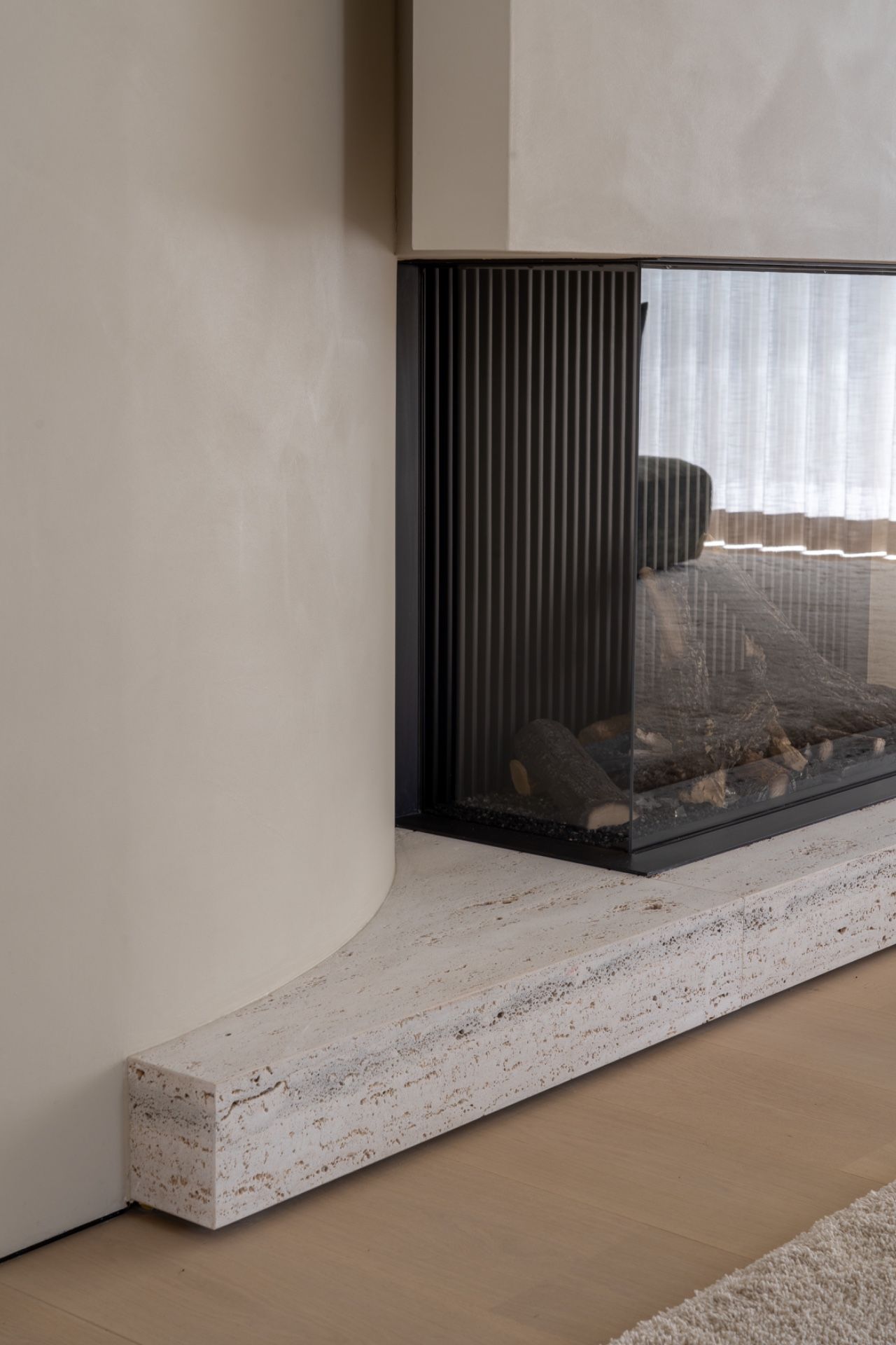
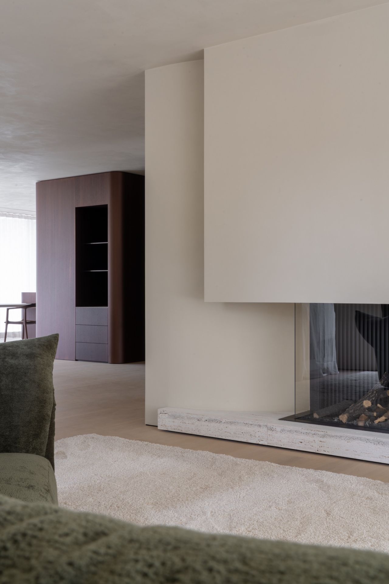
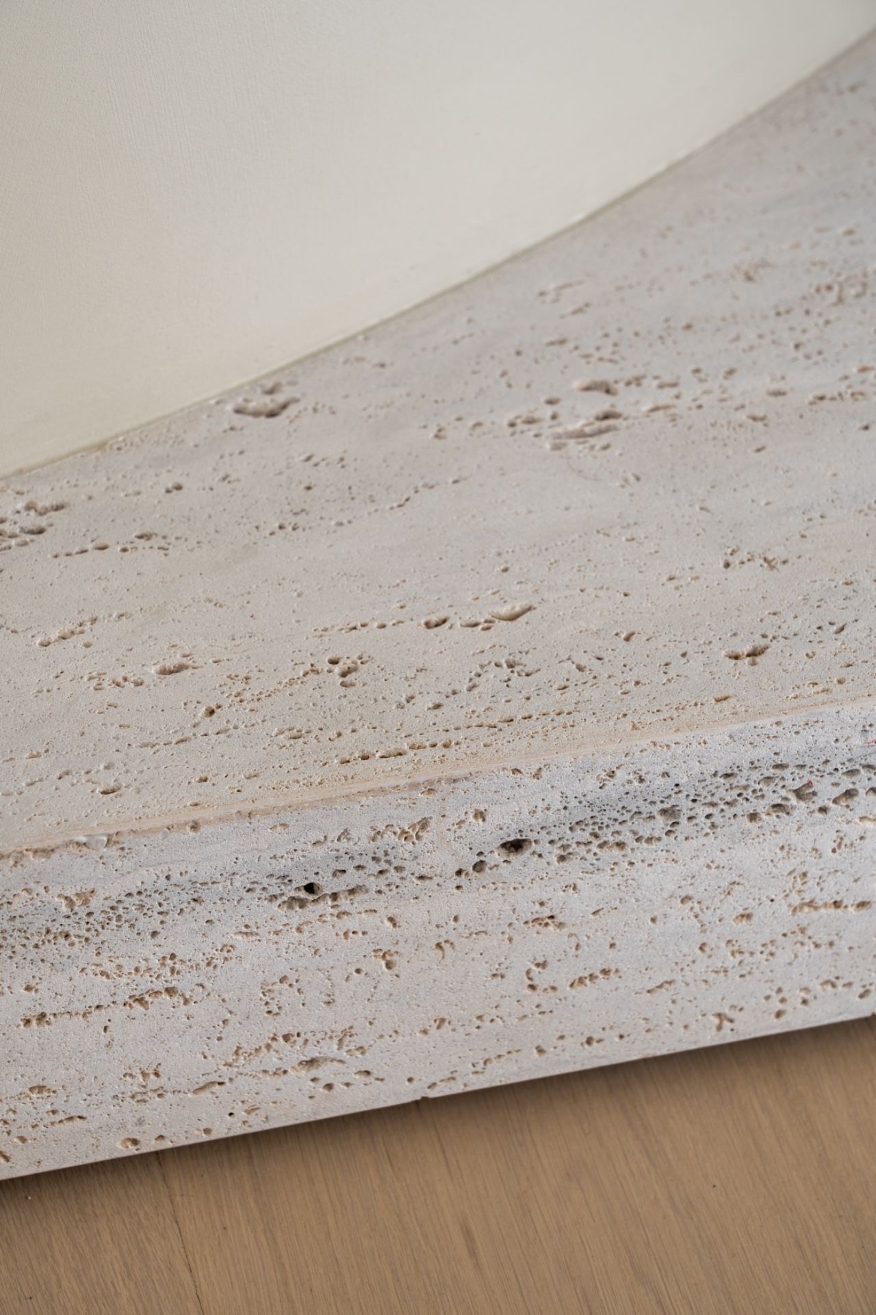
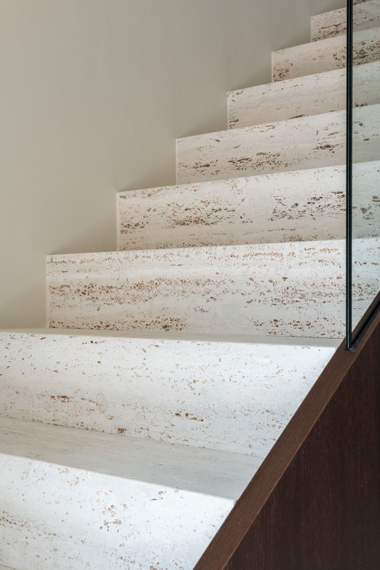
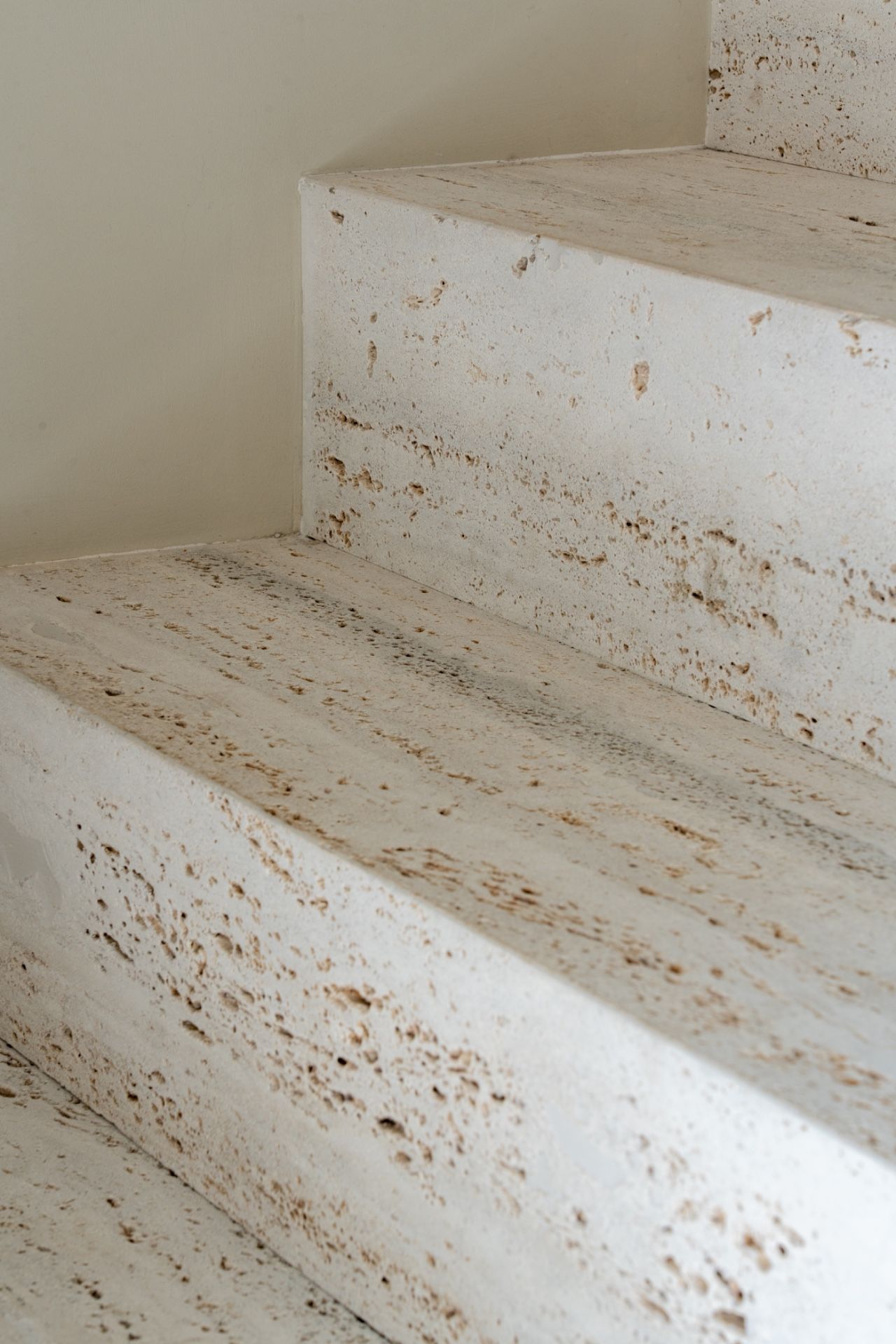
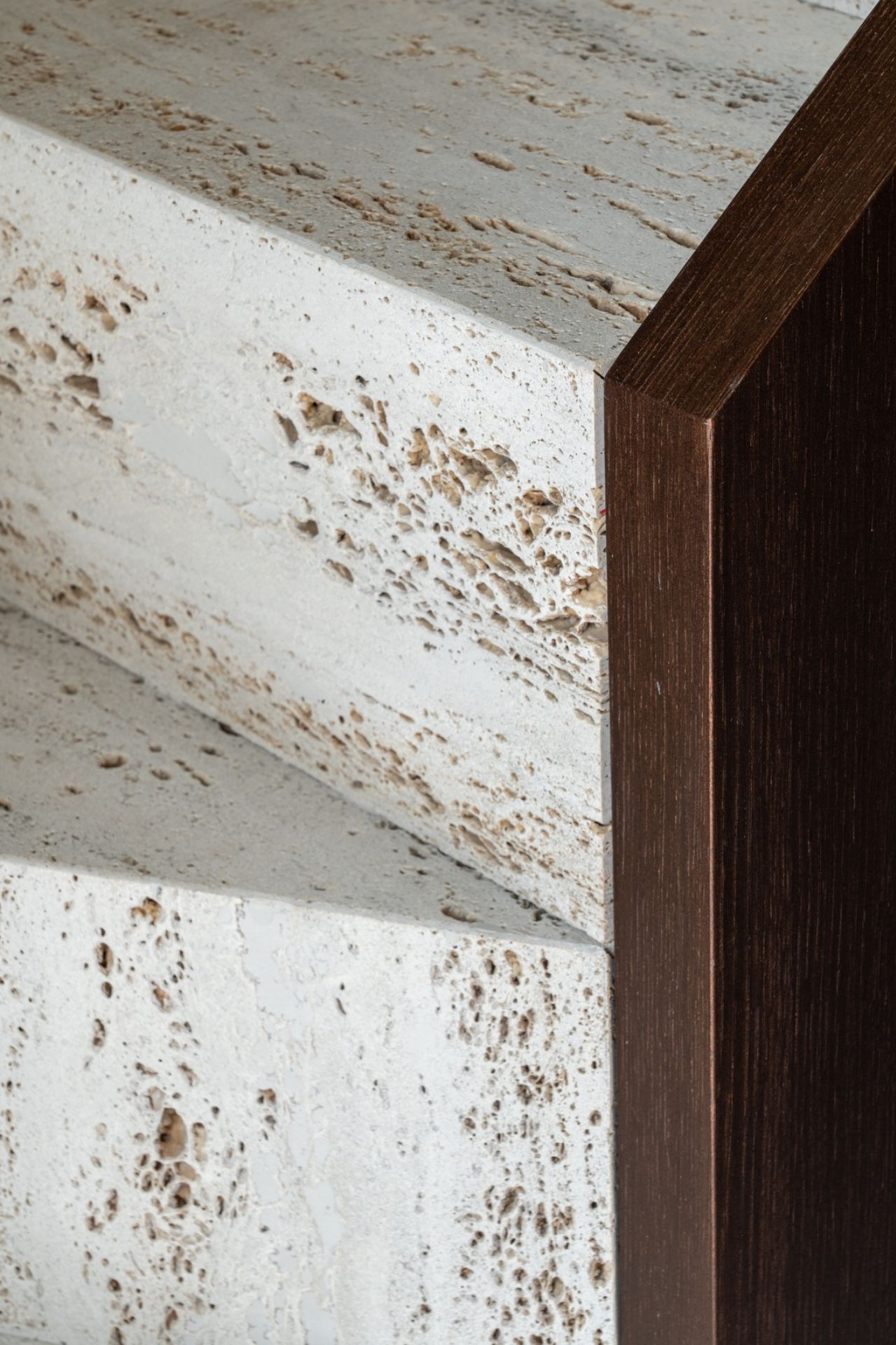
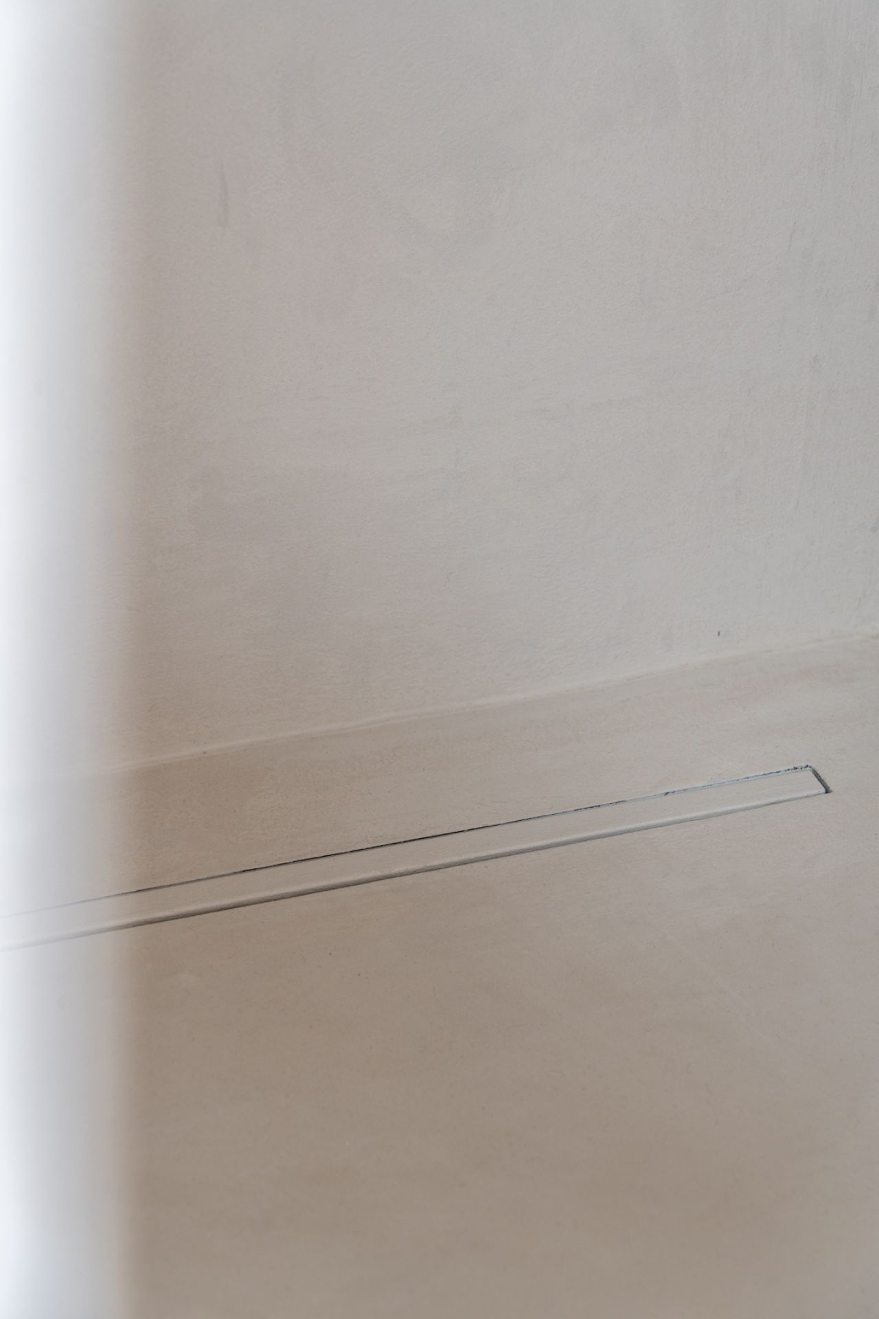
Travertino Classico microsabbiato is used across the walls and floors in the source project, and the stone’s soft texture is visible in the images as a calm, open field for the other materials. Its beige and earth-toned surface keeps the room from feeling overly polished. In this natural stone interior project, that travertine wall cladding does more than cover a plane: it defines the pace of the interior and gives the joinery a clear backdrop.
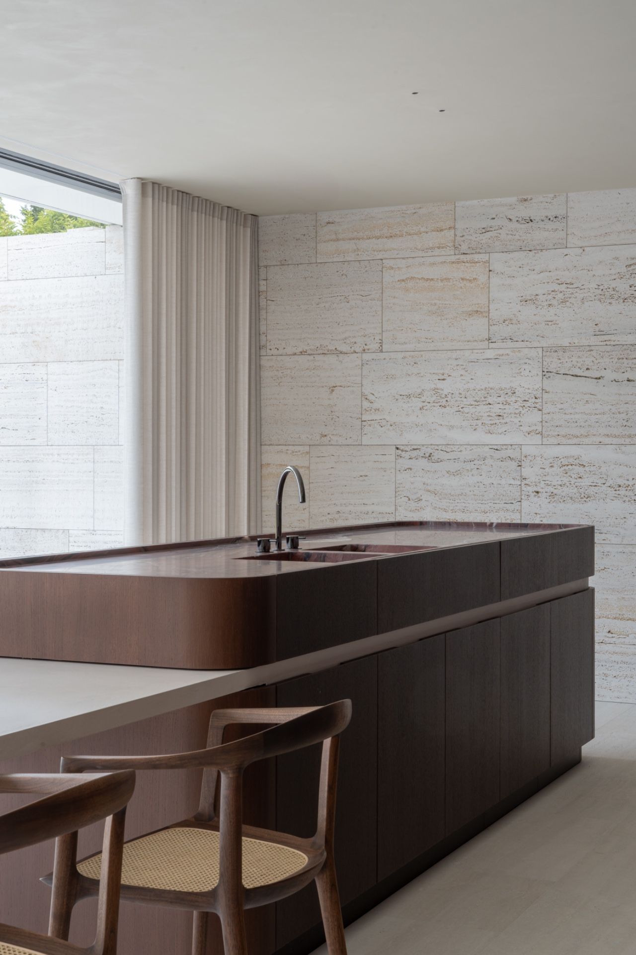
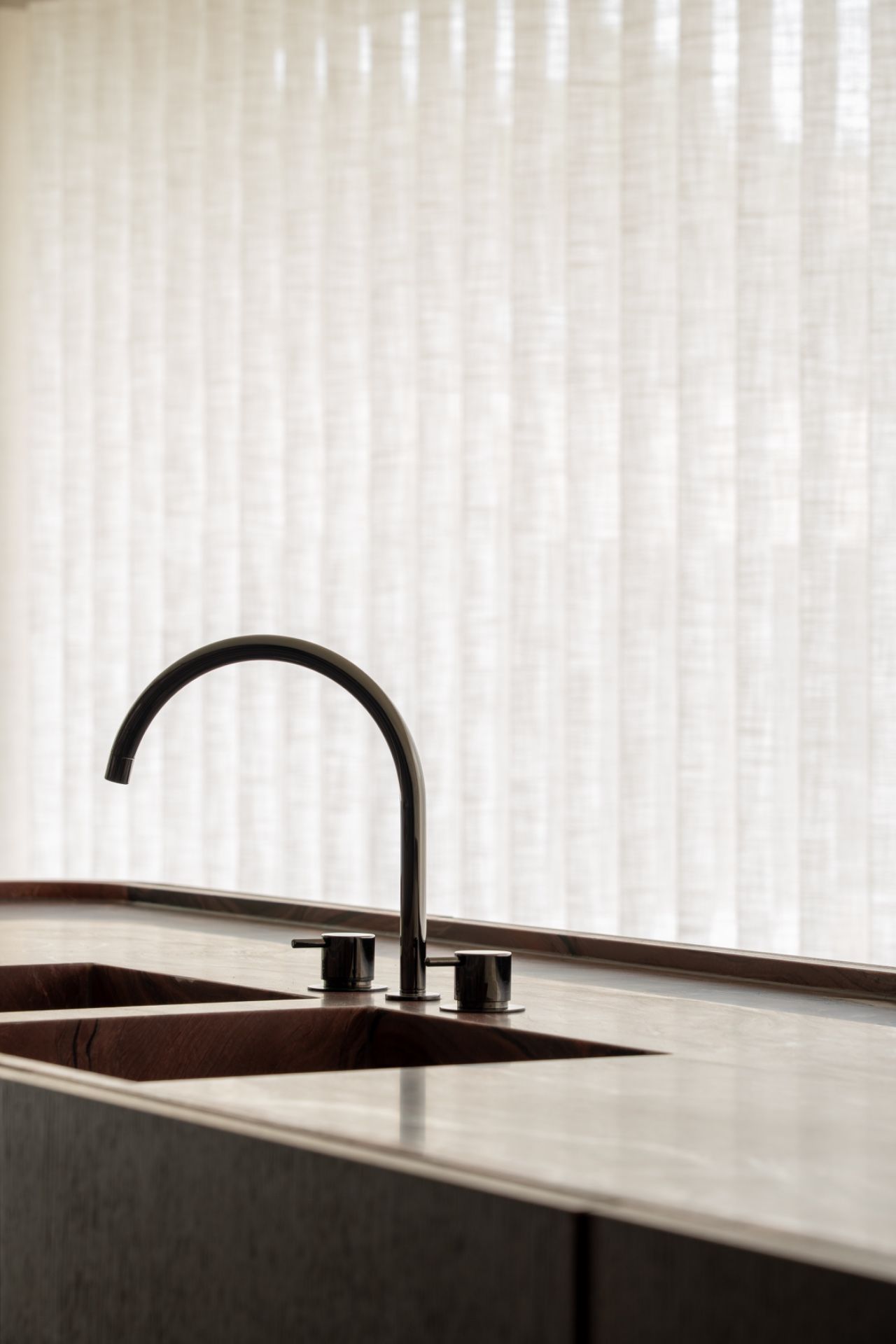
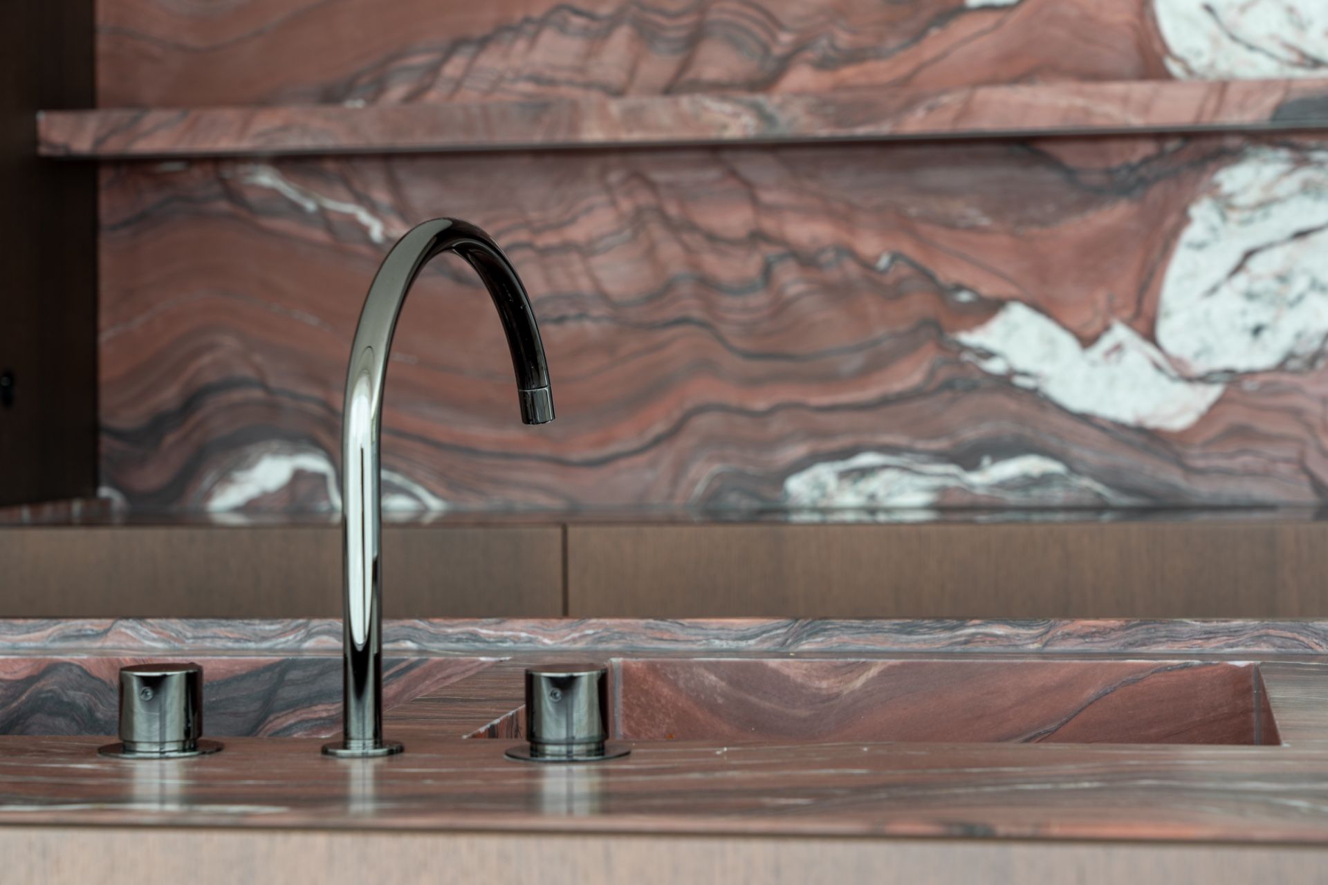
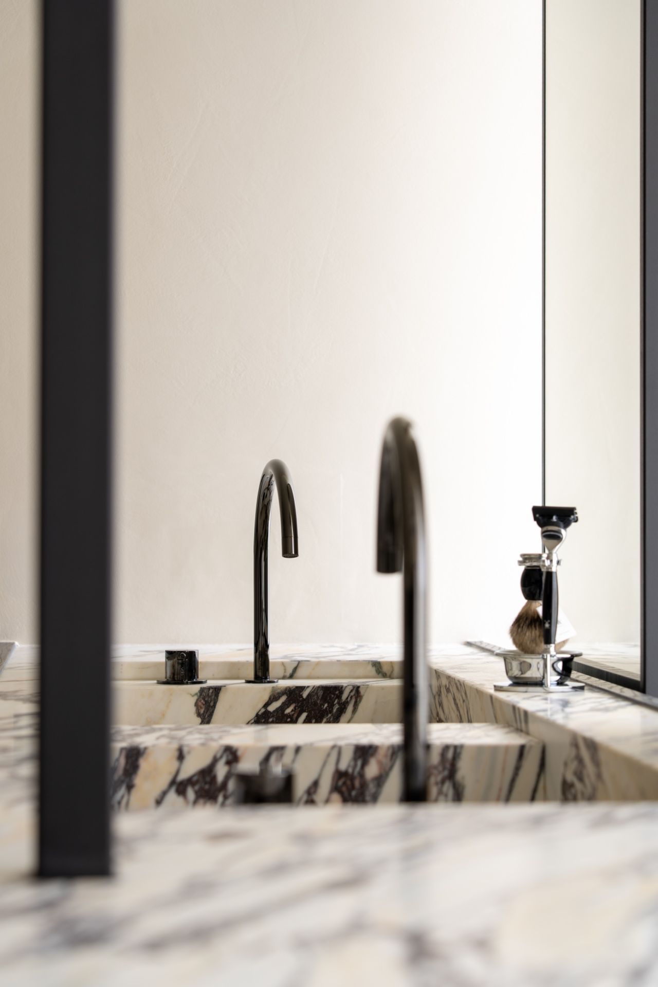
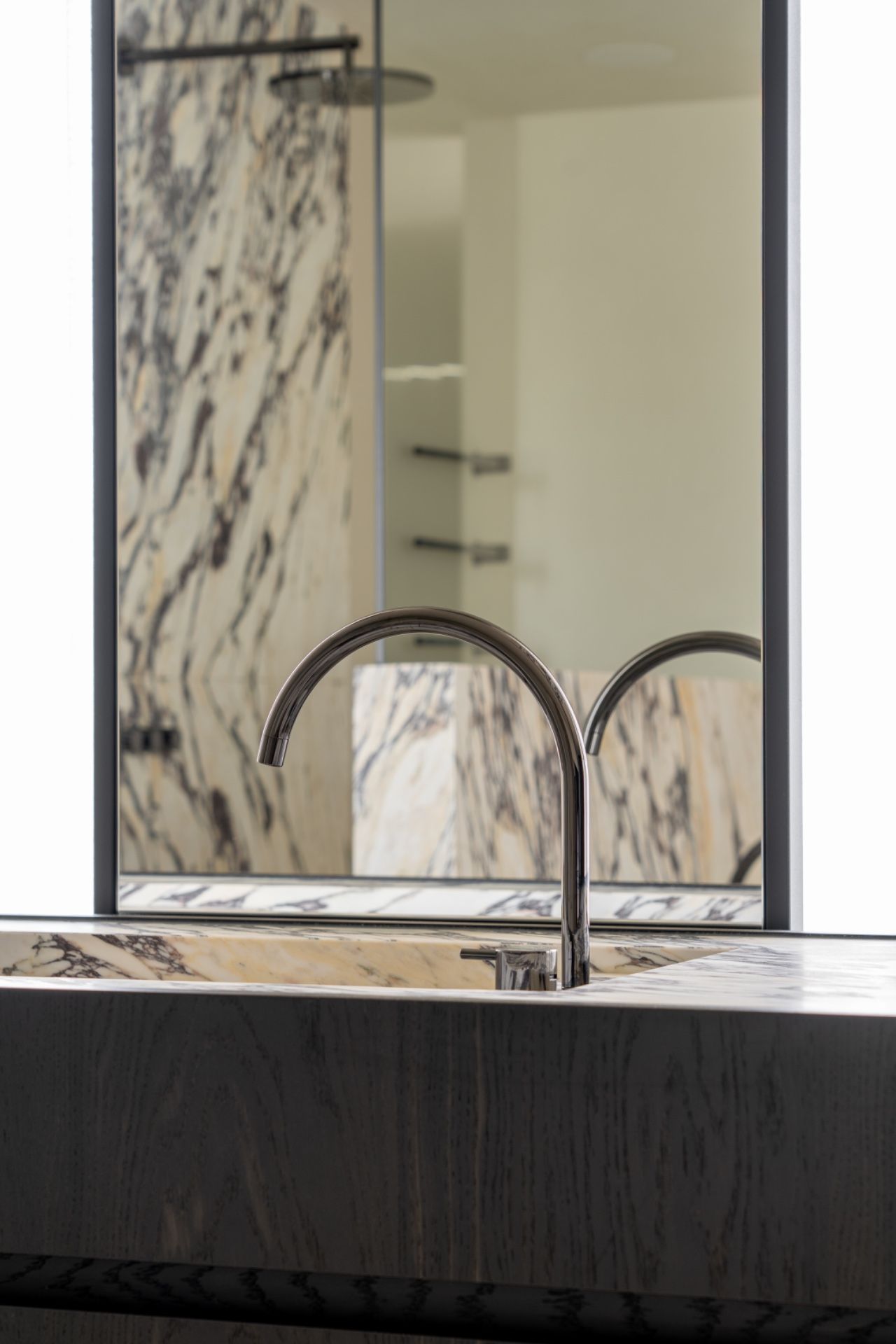
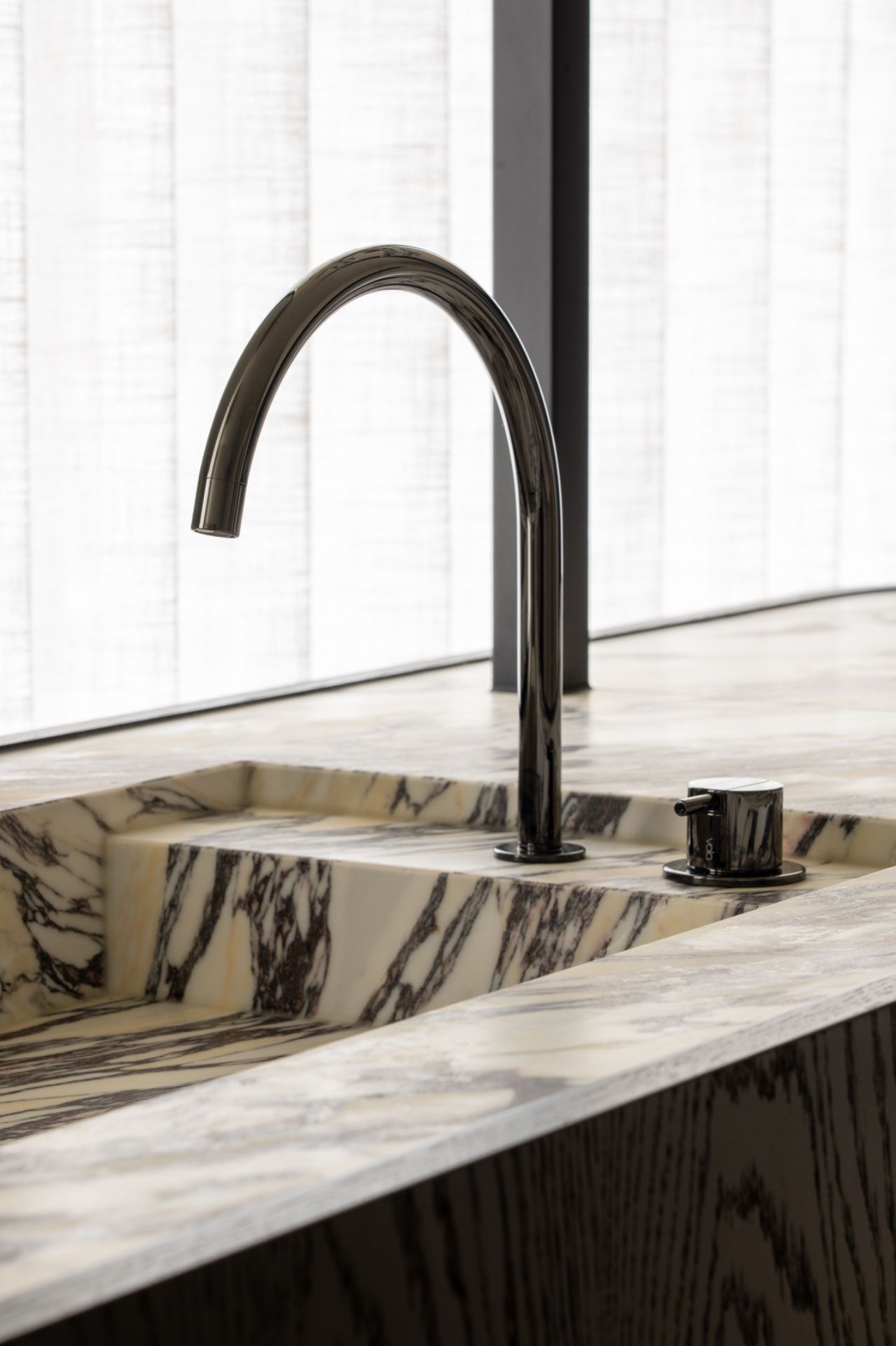
The photographs show the stone in large panels beside darker wood elements, with a high faucet and a round sink area breaking the surface into smaller moments. Those details matter because they keep the wall from becoming just a flat field. The eye moves from the stone texture to the sink opening, then to the edge of the cabinet run and back to the wall again. That visual rhythm is central to the way the room reads.
A kitchen built around stone and wood
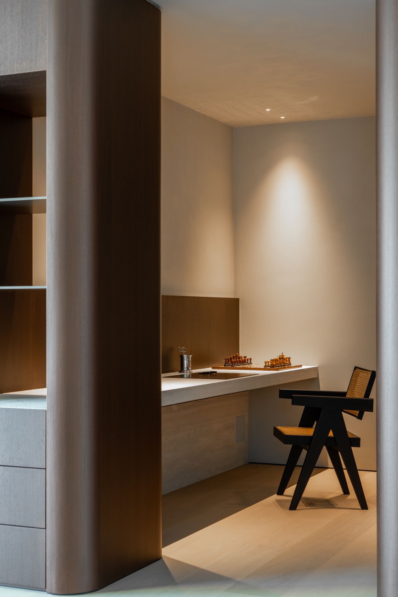
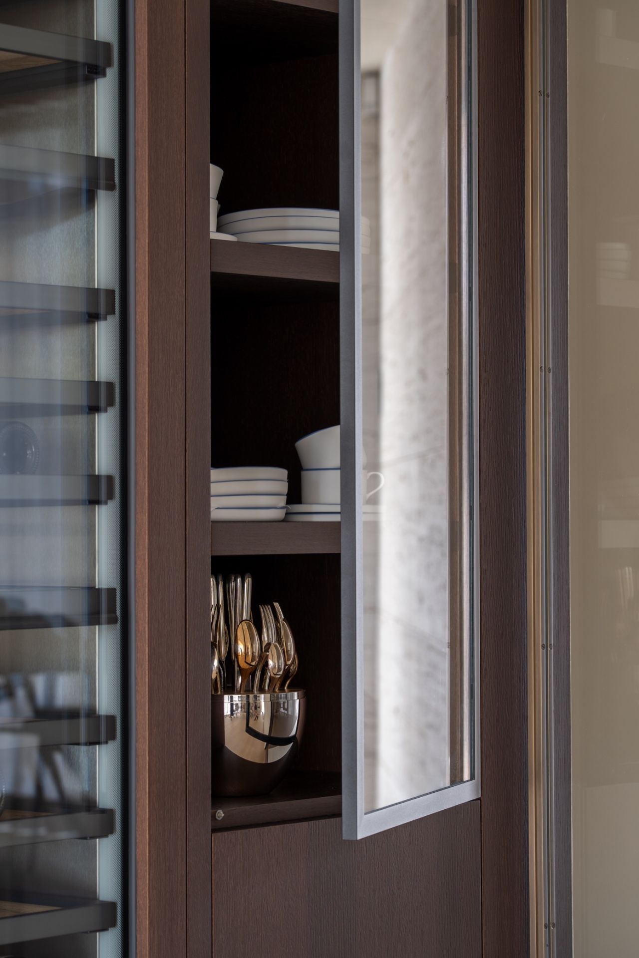
The kitchen is where the project feels most immediate. A round bar or worktable sits in the foreground in several images, its light edge cutting against the darker timber below. Behind it, custom kitchen niches and integrated storage units sit flush in the wall, with openings that hold the scene together without crowding it. The result is a natural stone kitchen that feels planned around everyday use, yet still lets the material palette stay in focus.
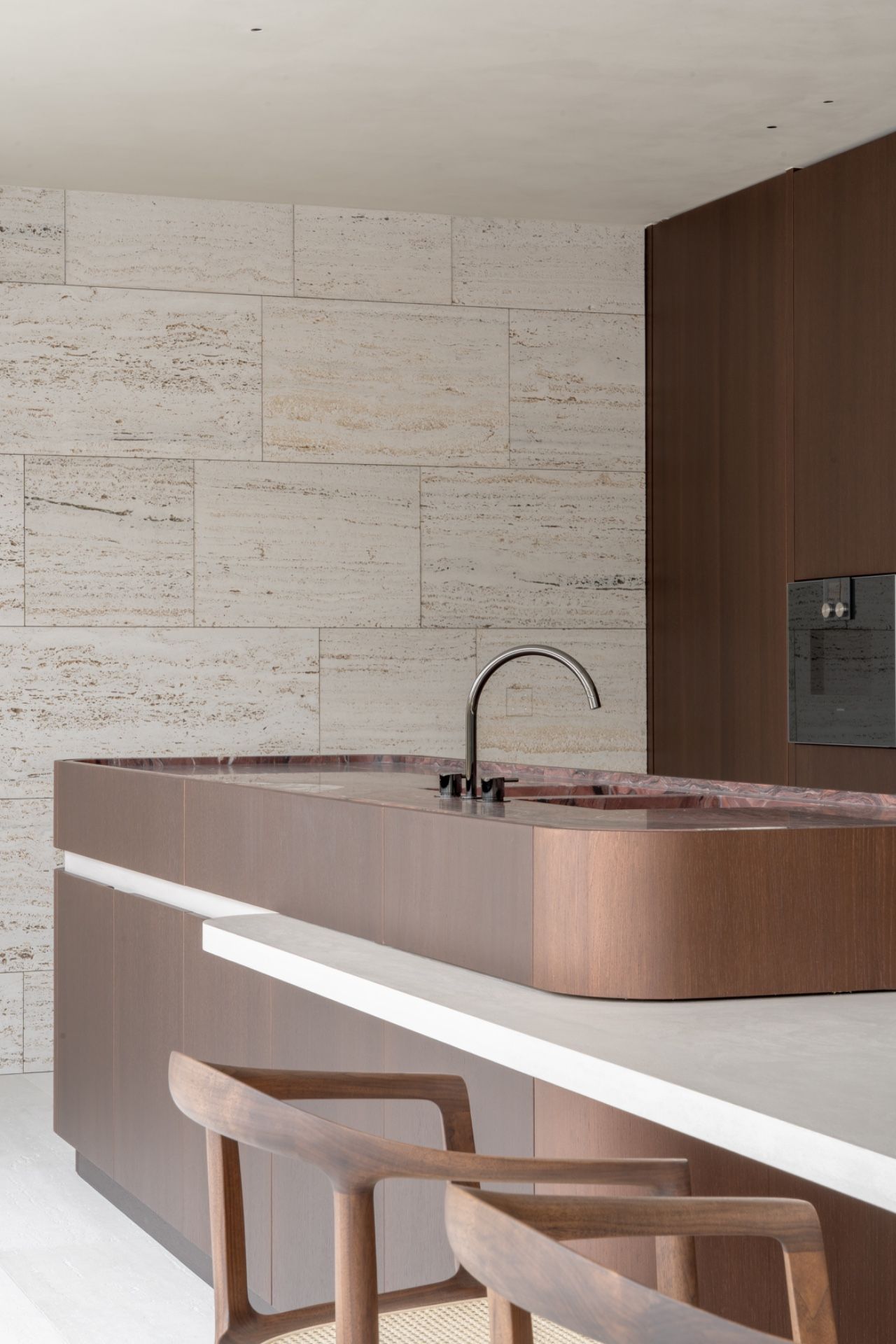
Dark wood veneer, stainless steel and stone surfaces do the main work here. The contrast is not loud, but it is direct: pale travertine behind the work zone, deeper timber at the base, and metal fittings standing upright in the center of the composition. The kitchen’s rounded edges soften the geometry of the room, especially where the worktop curves and the sink opening is set into the block. It is a careful use of shape, not decoration.
Custom kitchen niches and integrated work zones
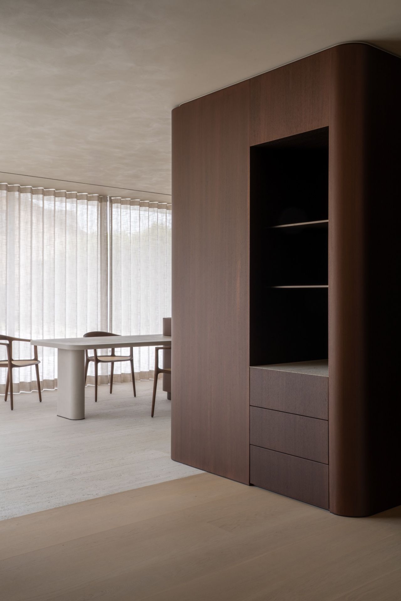
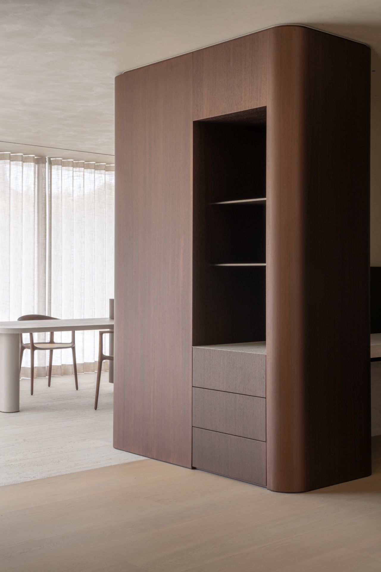
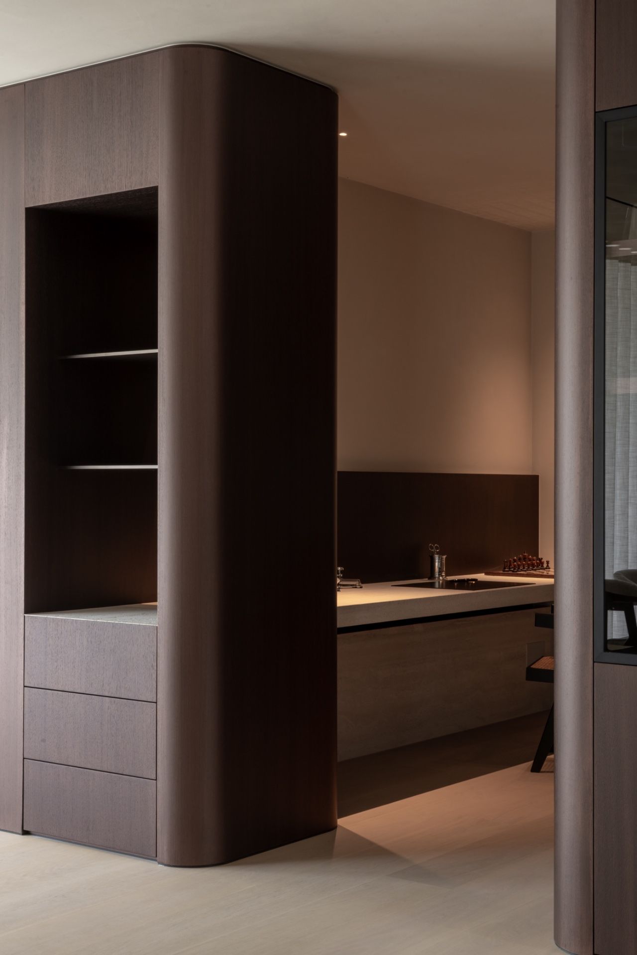
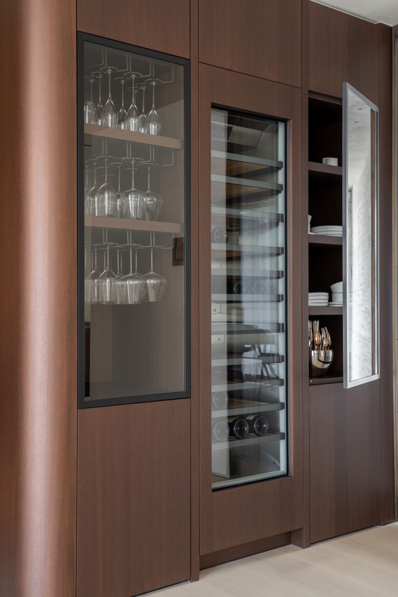
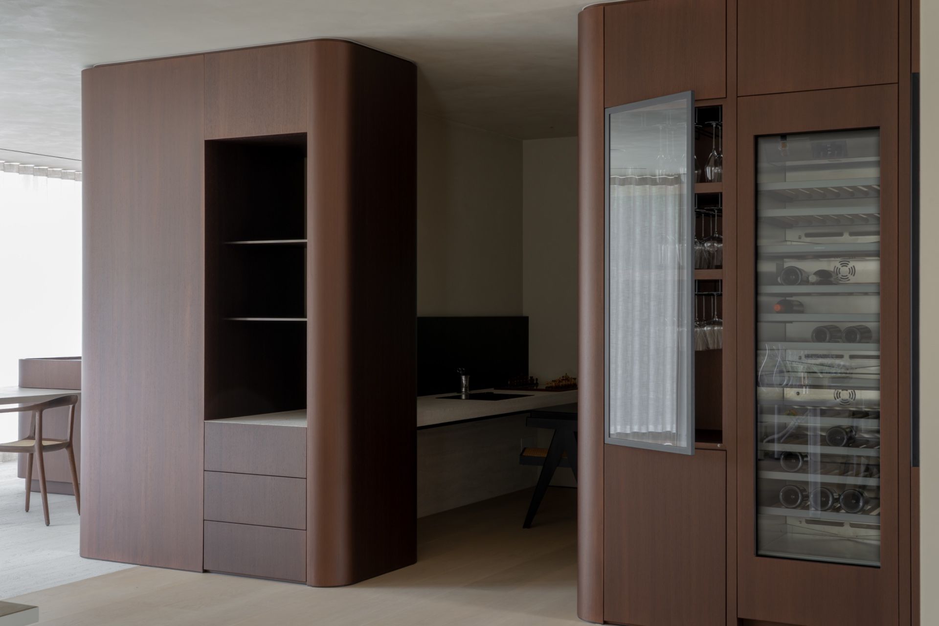
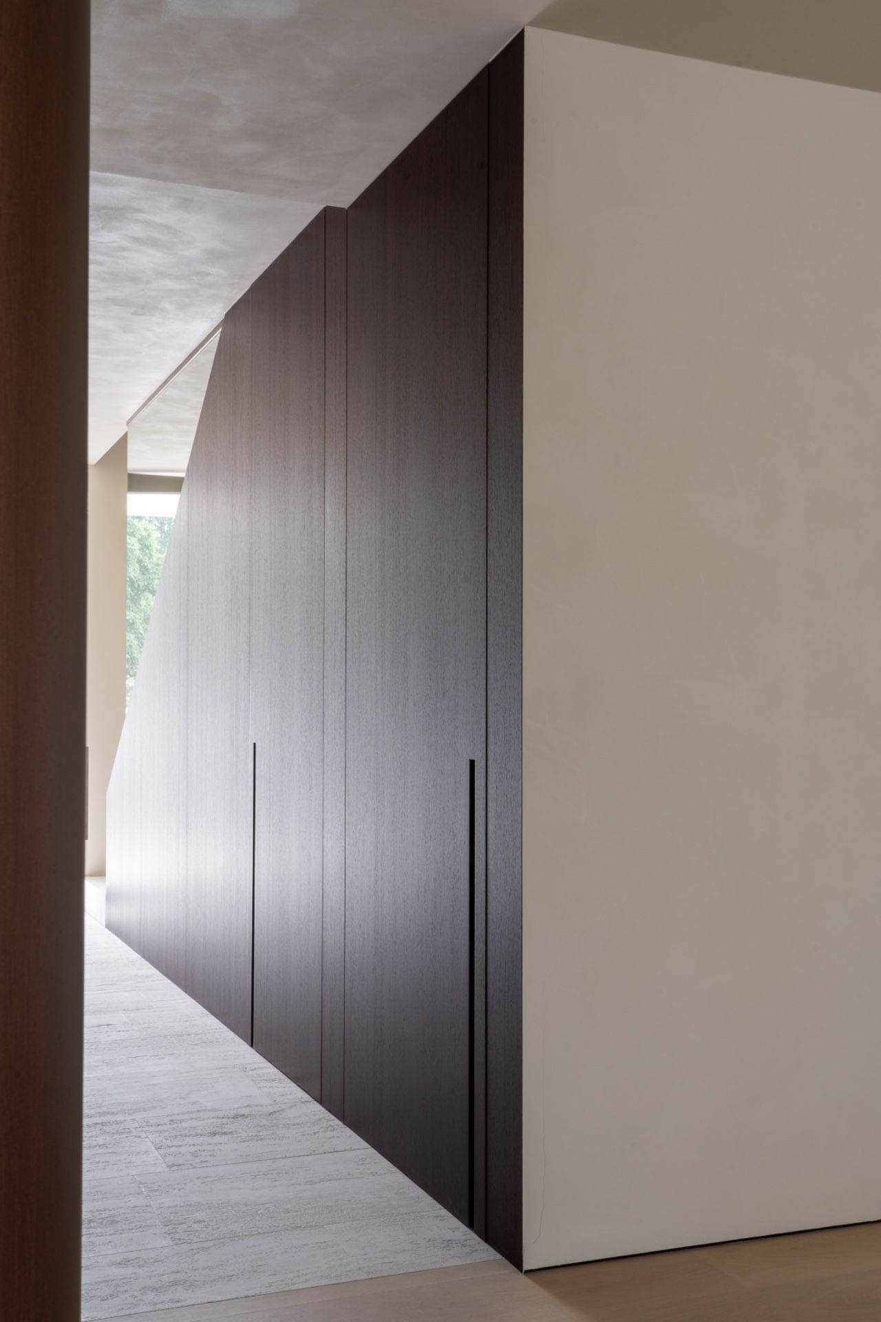
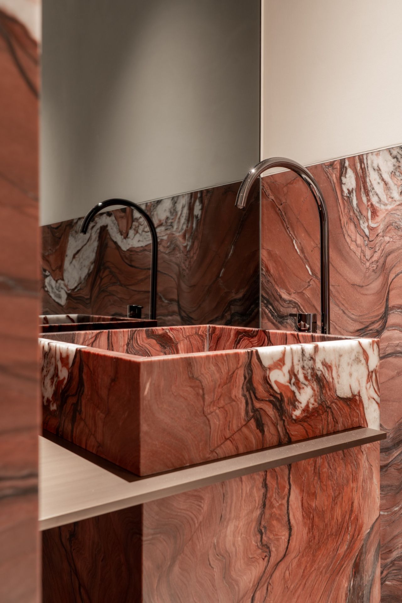
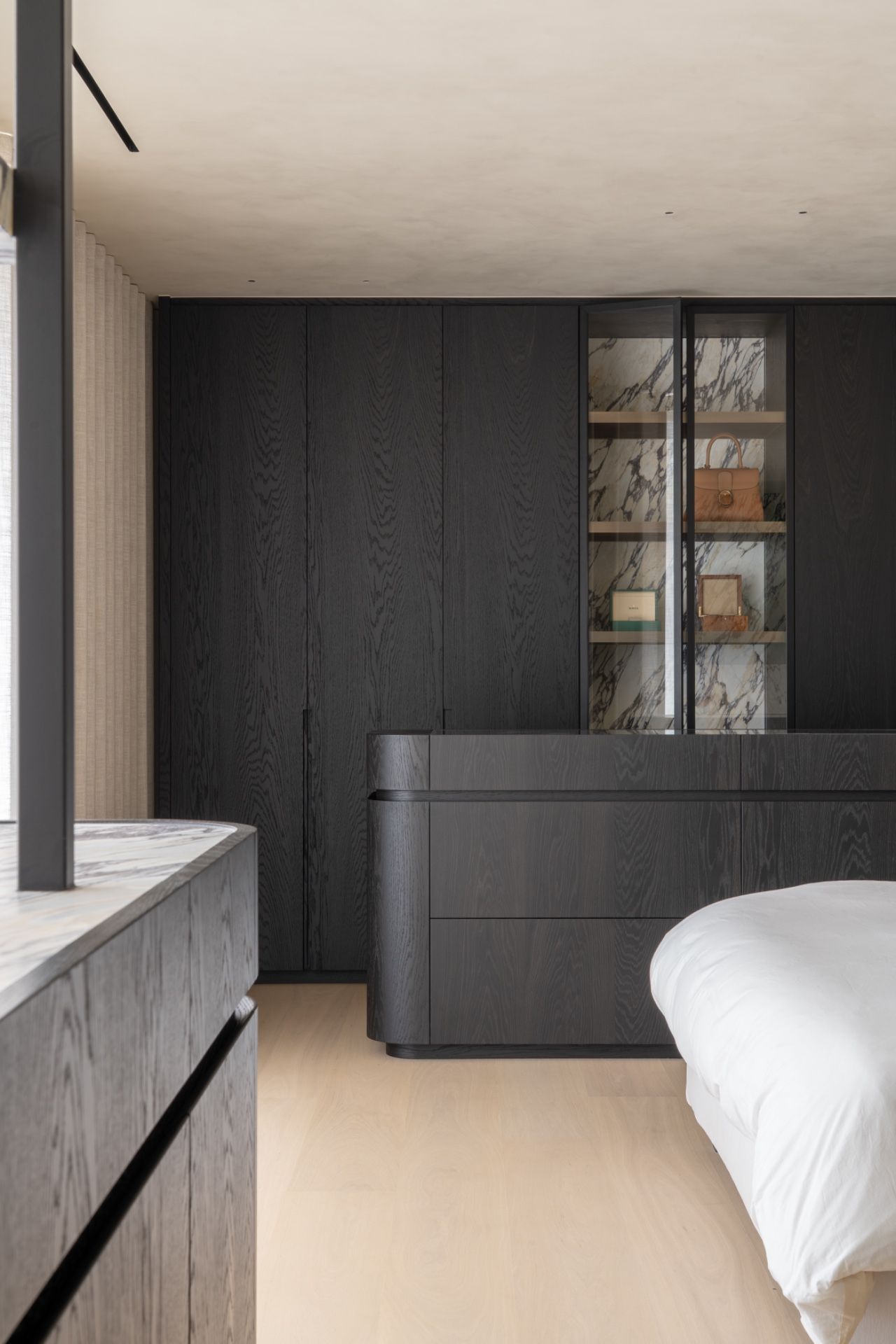
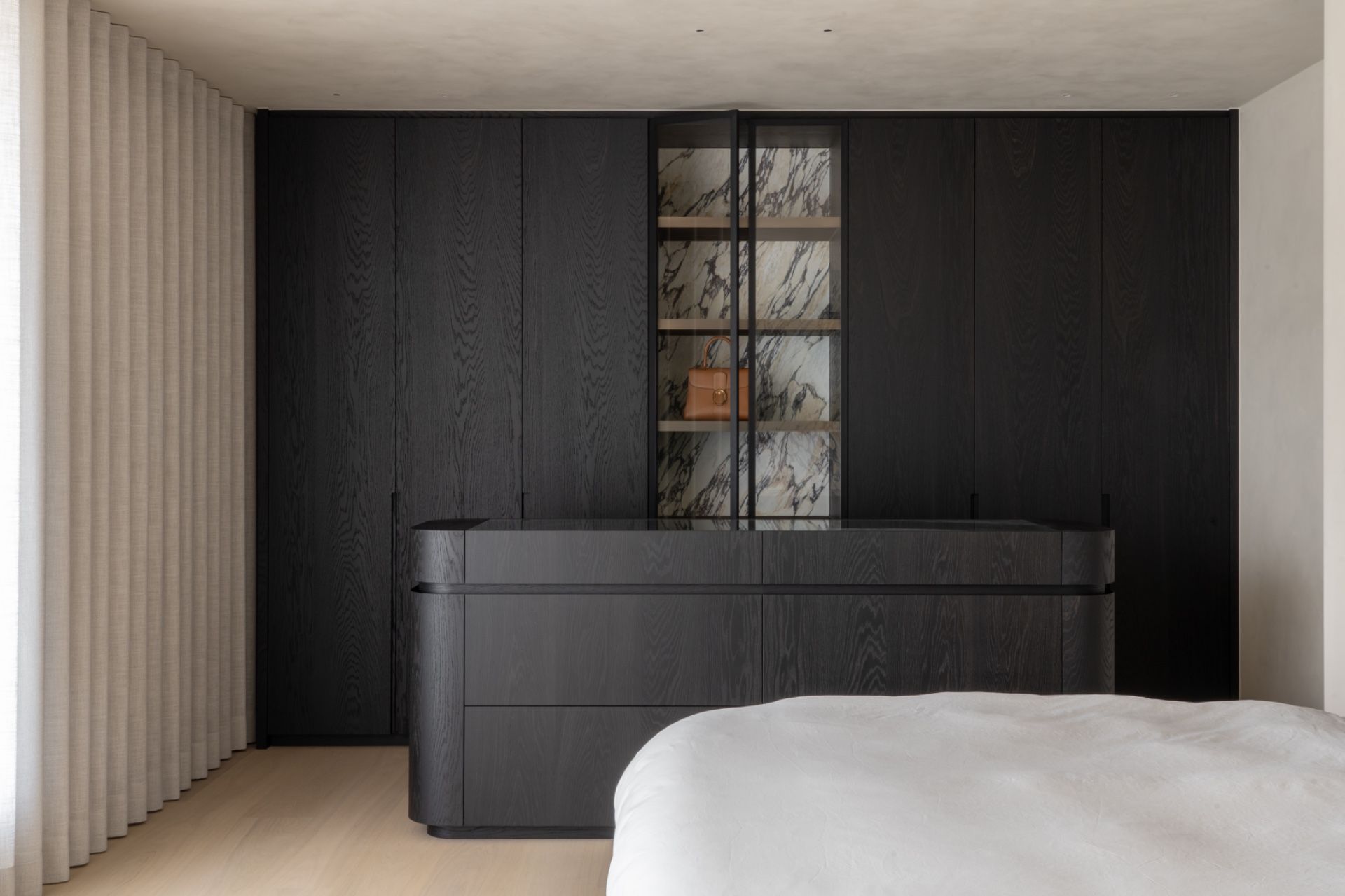
The custom kitchen niches are easy to read in the wall cabinetry. They are not filled with objects; instead, they appear as deliberate voids carved into the joinery. That makes the cabinets feel lighter and gives the larger surfaces room to breathe. In the detail images, the work zone is integrated into a timber base with a clean cut-out for the sink and a tall faucet rising in front of the travertine. The material transition is crisp, but not abrupt.
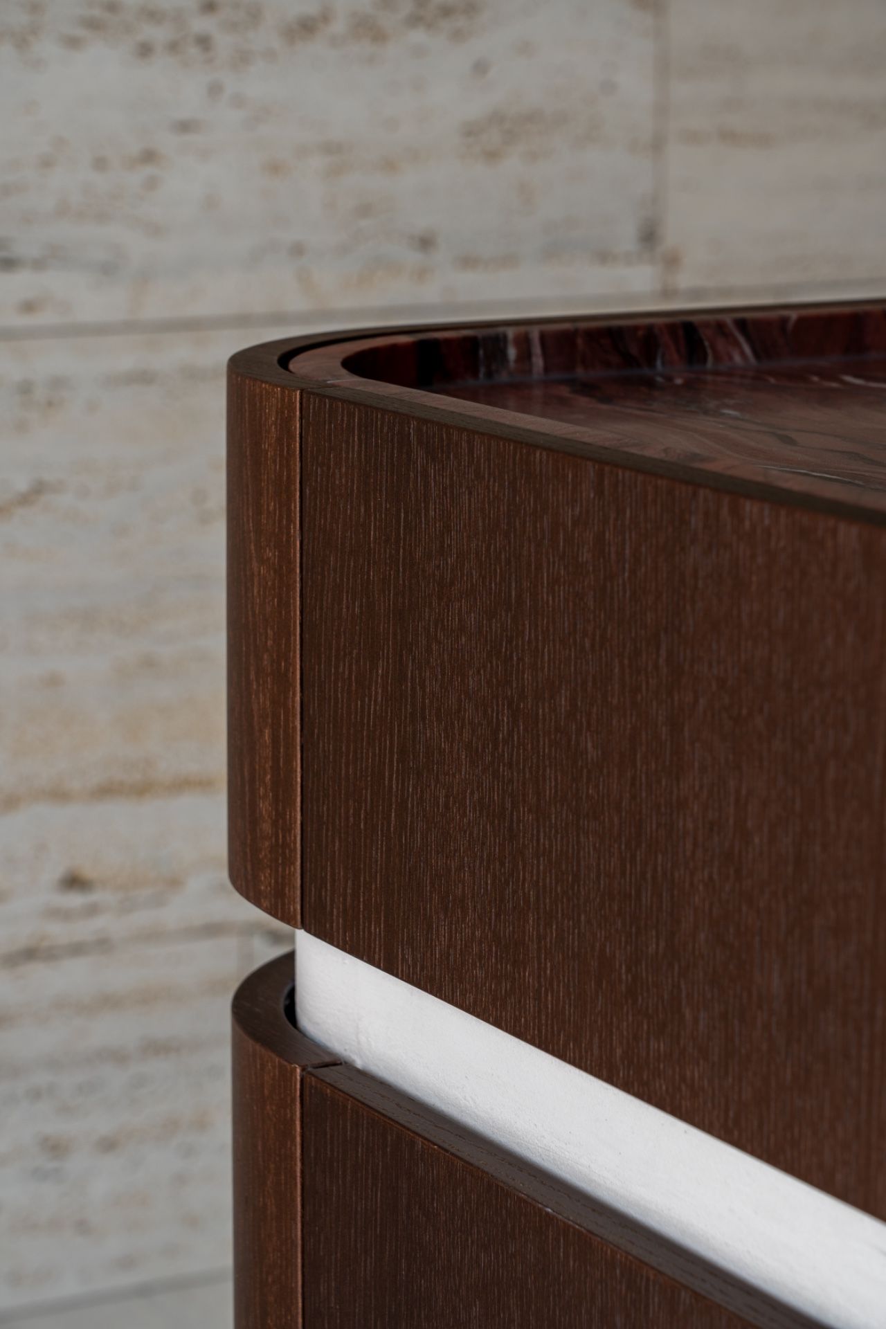
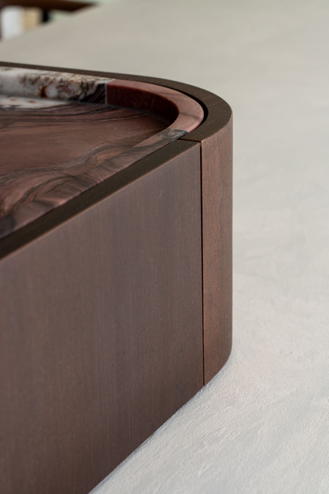
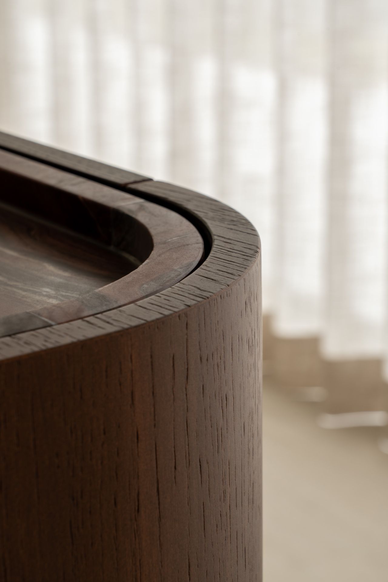
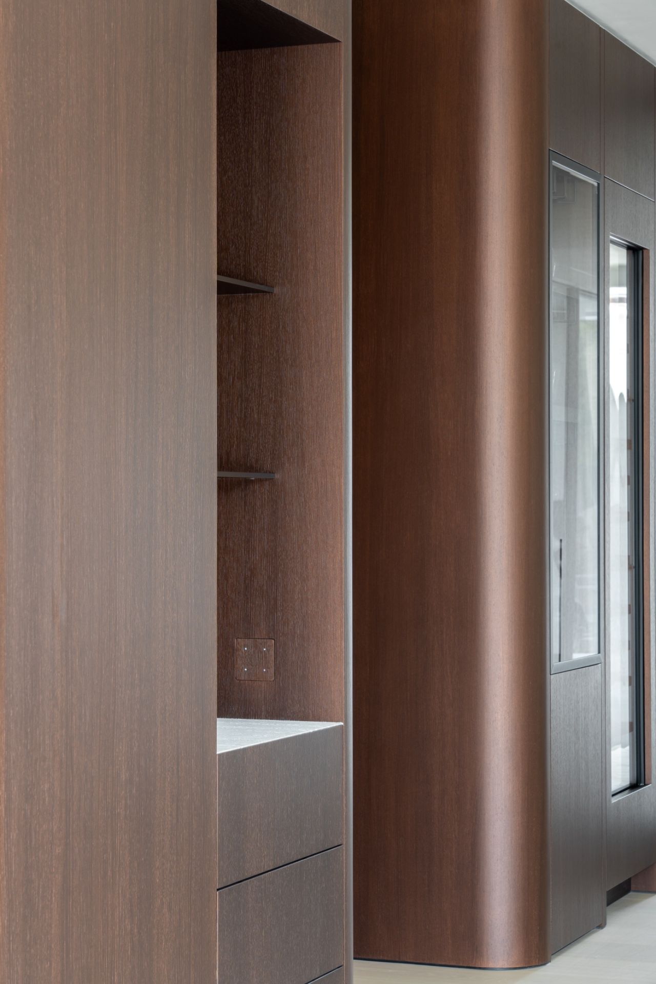
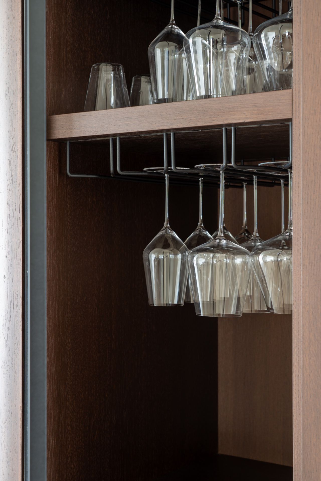
There is also a strong sense of hand-finished precision in the rounded openings and the visible wood grain. One close-up shows the curved edge of a block with a stone-like red-brown surface nearby, another isolates the grain of the timber against a soft background of stone. These are small moments, yet they carry the whole room. The project does not rely on a single statement piece; it builds its character from repeated material contact points.
Quartzite as a deeper register
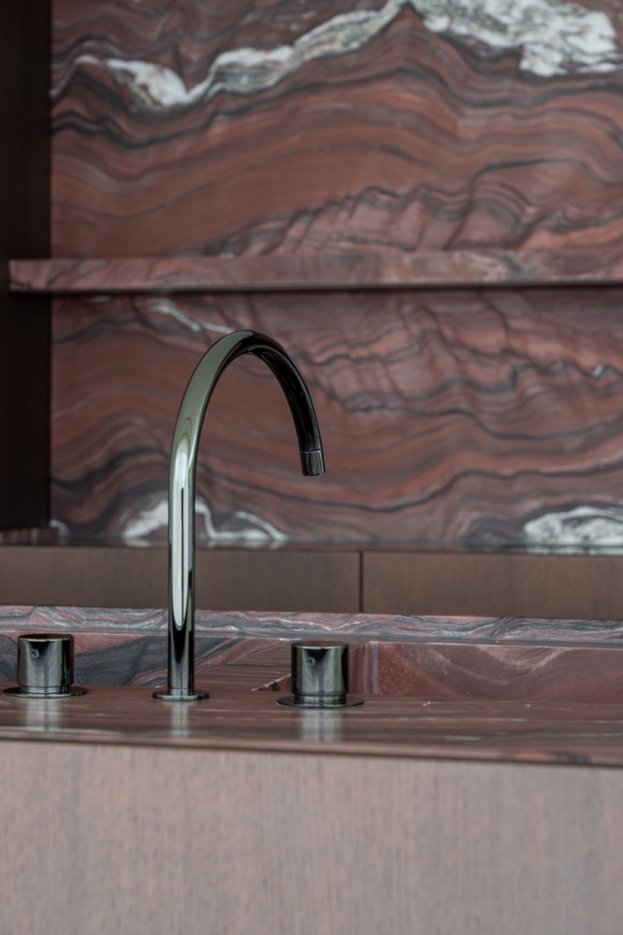
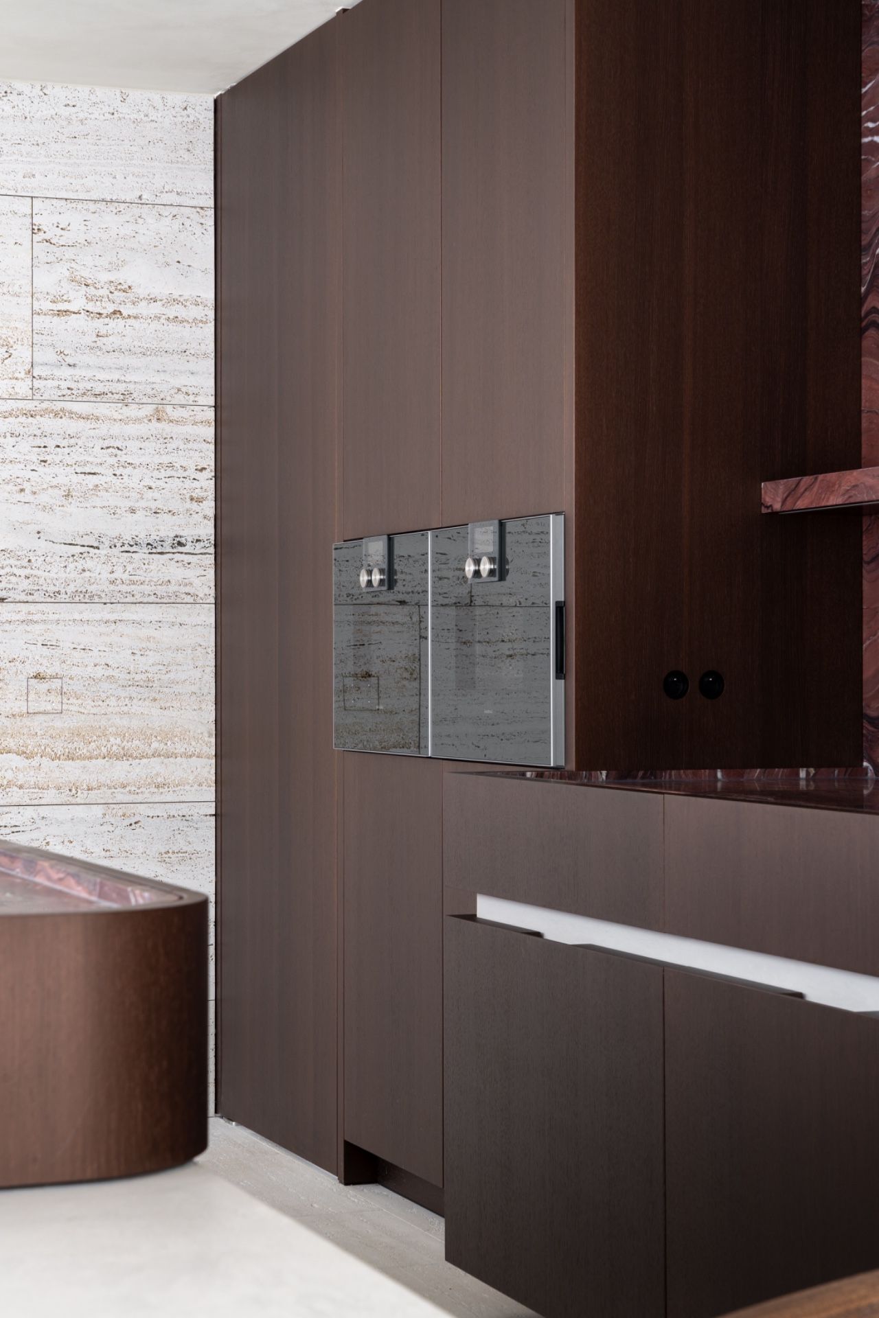
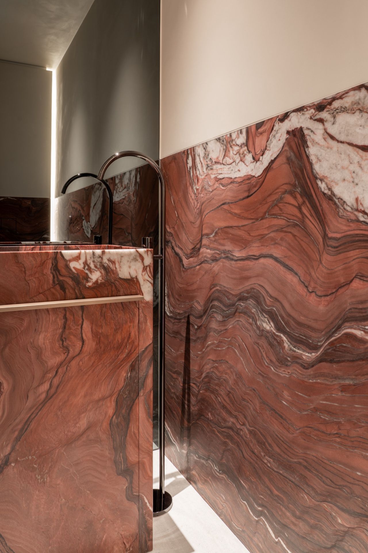
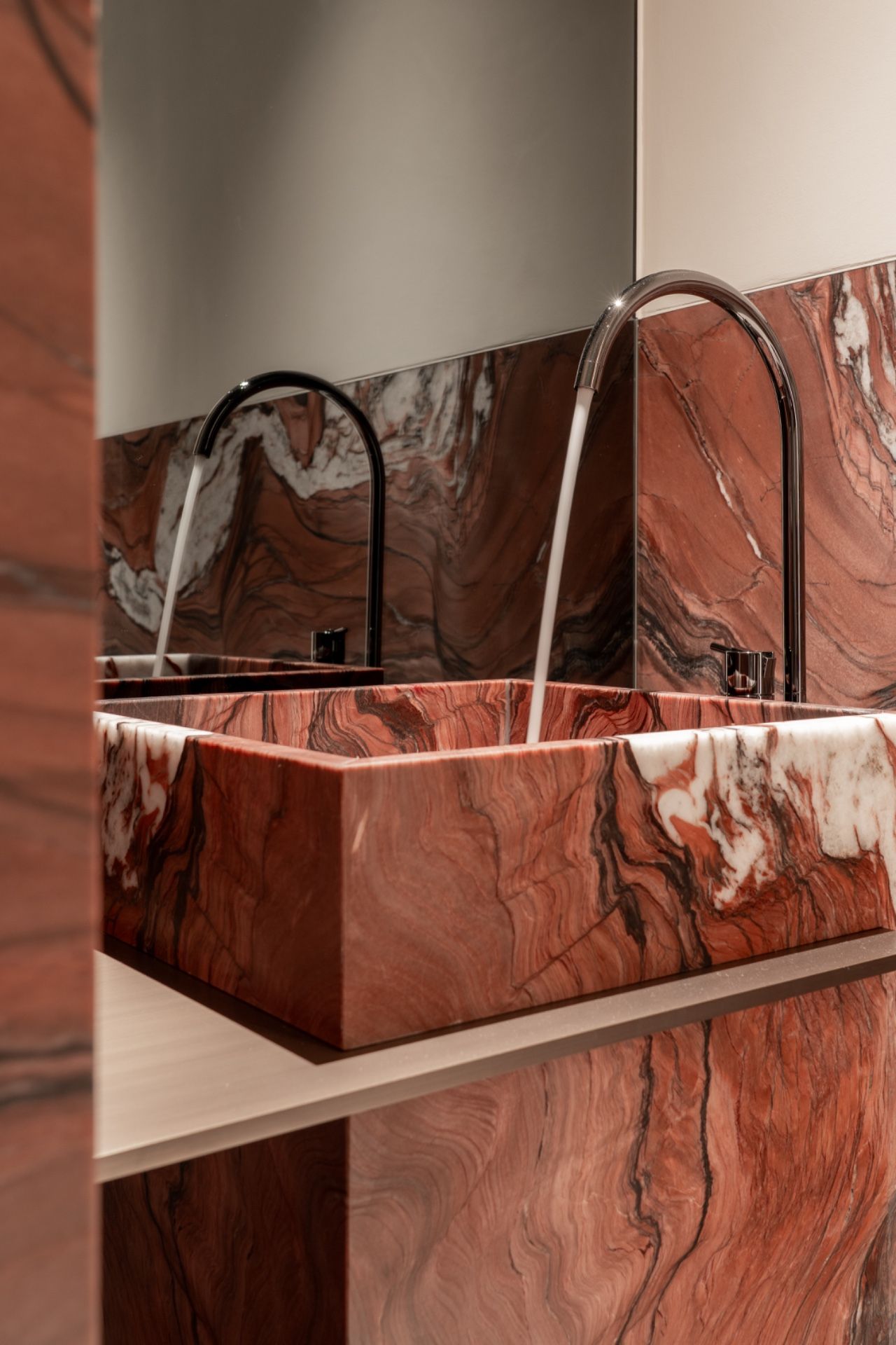
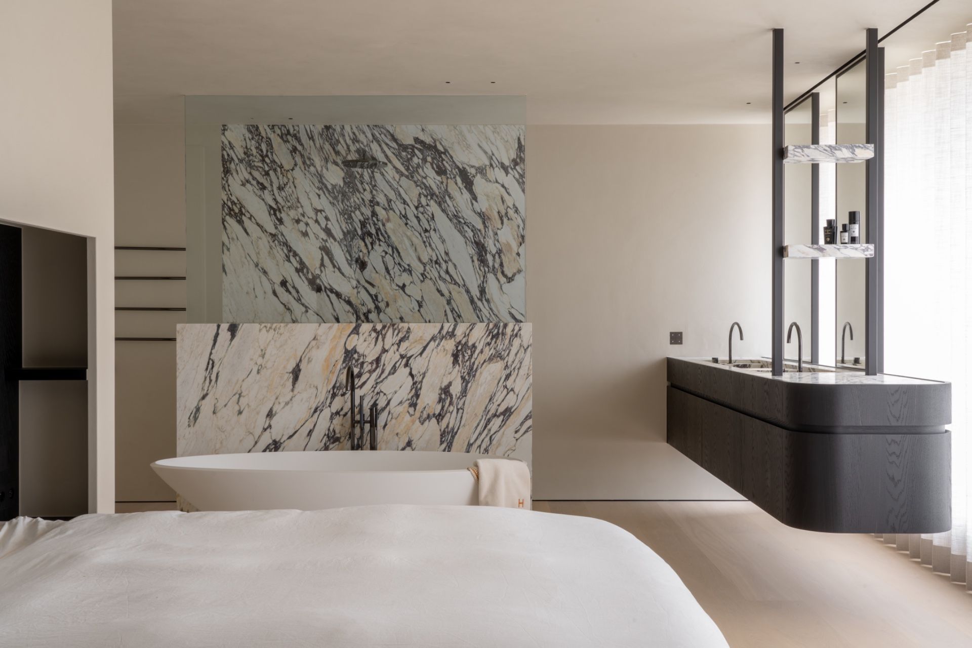
Quartzite interior surfaces add a denser note to the palette. Fusion Red and Calacatta Viola are both named in the source, and the images support that reading through the reddish-brown veined accent wall and the stronger stone contrasts around the work areas. Quartzite interior details are useful here because they interrupt the light travertine without breaking the overall material logic. They bring a richer line through the room, especially where the stone is allowed to dominate a smaller surface.
In the kitchen and adjoining interior views, the reddish-brown veining sits beside pale stone and dark timber, so the contrast feels layered rather than isolated. That is one reason the project reads as a natural stone interior project rather than a simple surface showcase. Each stone type takes on a different role: travertine sets the base, quartzite sharpens the contrast, and the wood frames both. The mix is visible, not theoretical.
Calacatta Viola in the quieter rooms
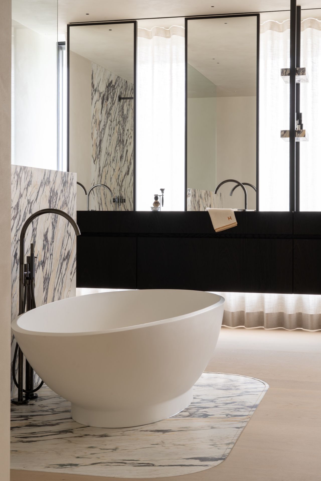
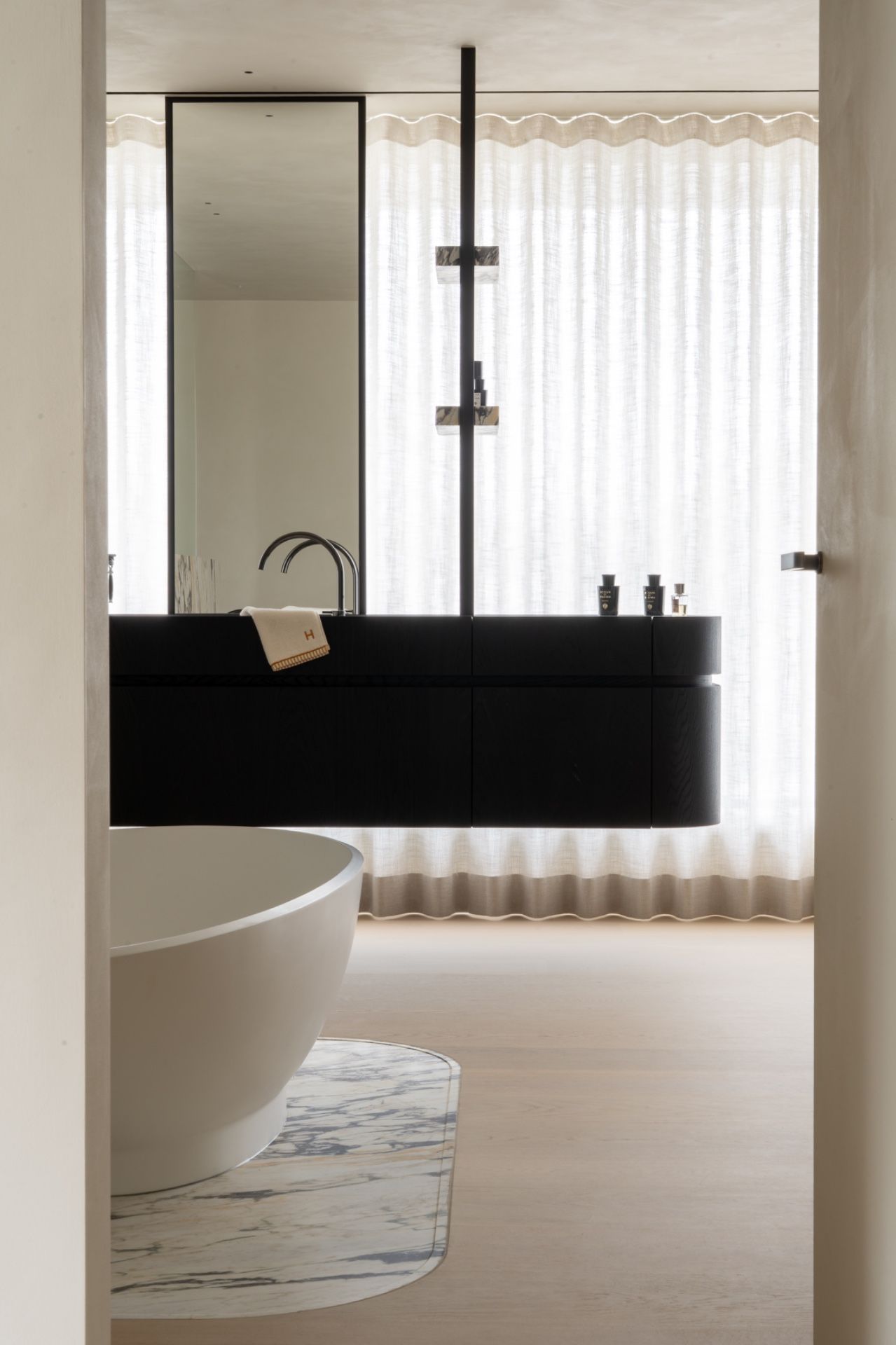
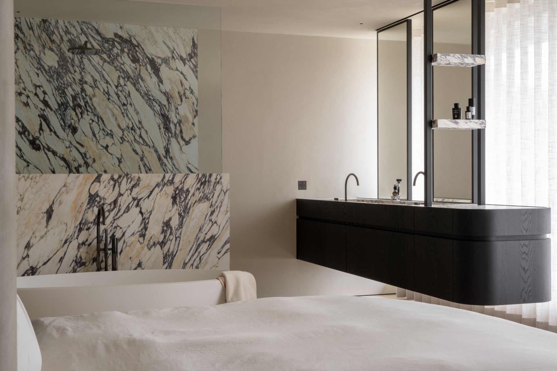
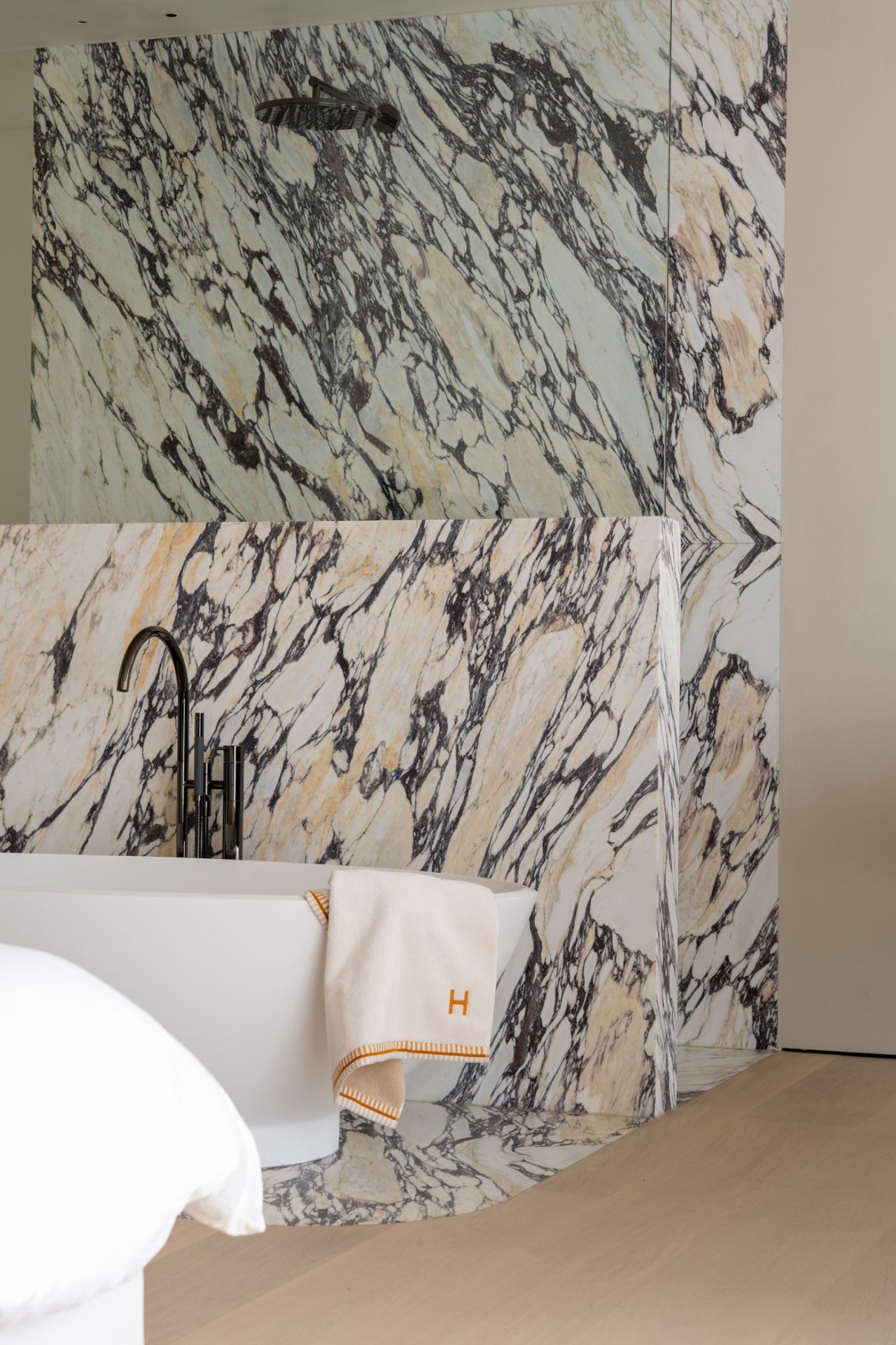
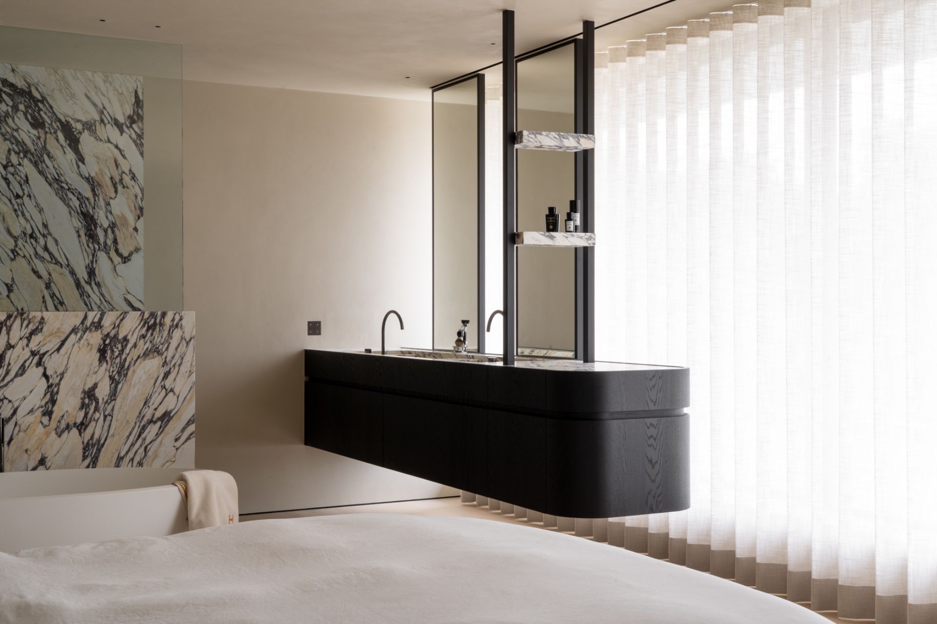
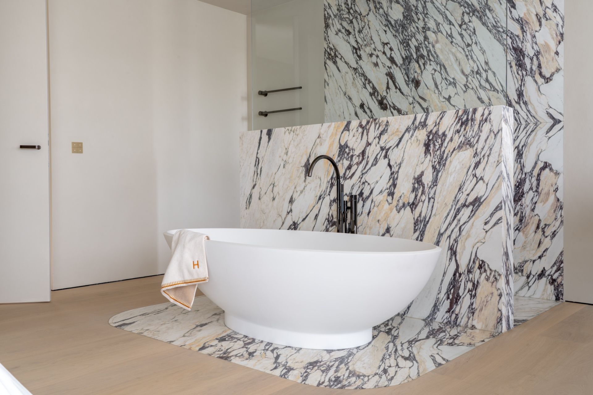
Calacatta Viola is used in the bathroom and upper floor, where its violet veining introduces a stronger gesture into a quieter setting. The source text describes it as a characteristic marble, and that description fits the way the material is introduced: with enough presence to be noticed, but not enough to disturb the room’s overall restraint. Its use on the upper level keeps the project’s stone language consistent while shifting the tone toward something more distinct.
That consistency matters. The project moves from kitchen and bar spaces into more private rooms without changing its material vocabulary. The same attention to surface, edge and joinery remains visible, only the mood shifts. In the bathroom, the veining becomes more legible against flatter planes. On the upper floor, Calacatta Viola reads as a stronger accent, a break in the quieter surfaces rather than a full departure from them.
How the stone surfaces were carried through the home
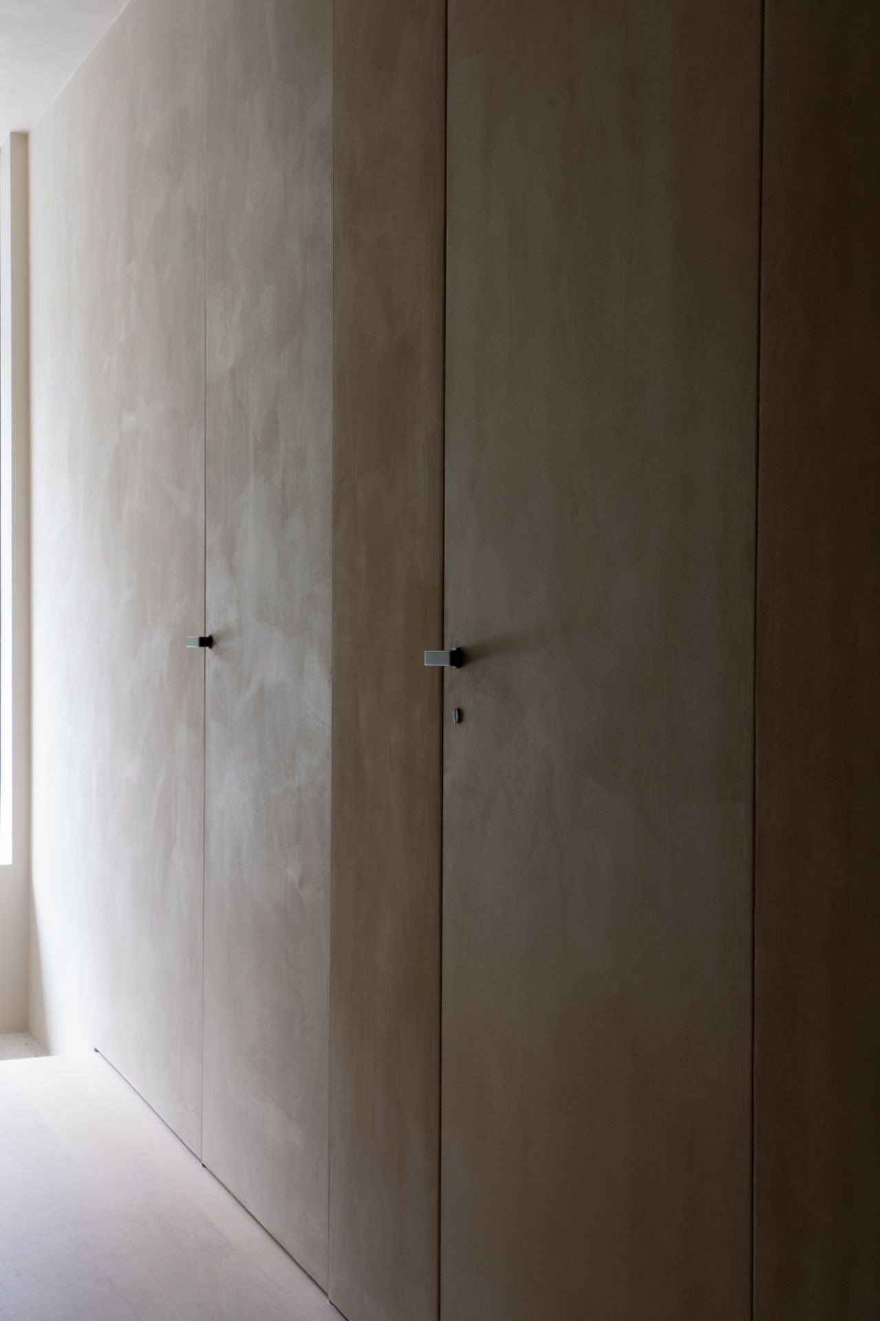
The source notes that Pas Normal translated the architectural vision into the final stone work with precision and custom fabrication. What this means in the images is straightforward: edges align, openings are cut cleanly, and the stone surfaces sit tightly against the timber elements. Nothing looks provisional. The wall and floor finishes stay consistent from one area to another, which lets the room sequence feel connected without turning repetitive.
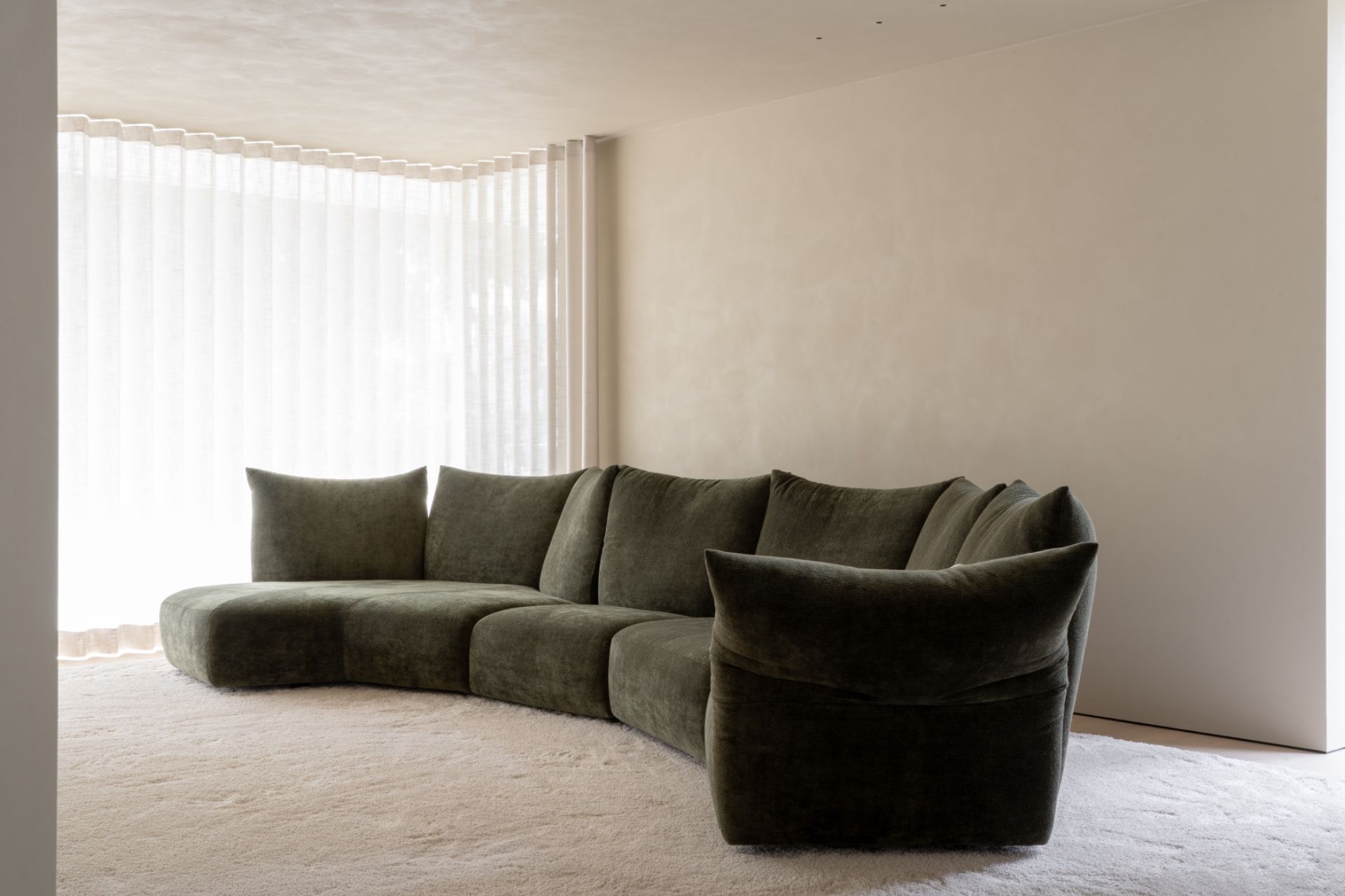
Photography by Stephanie Mathias captures that sequence clearly. The framing favors detail over overview, which suits a natural stone interior project like this one. A faucet against travertine, a curved countertop, a niche in dark wood, a close-up of grain and edge profile — each image registers a different part of the same material system. Seen together, they show a residential interior where stone is not used as a finishing layer at the end, but as the starting point for the layout itself.
There are 73 photographs in the project series, and that number makes sense once you follow the surfaces through the rooms. The eye keeps returning to the stone accent wall, the pale travertine planes and the stronger quartzite notes. Around them, the joinery stays measured and the forms stay rounded where the room needs relief. The project holds its focus through repetition of material, not repetition of gesture.
What remains most visible is the way the kitchen, bar and quieter upper rooms share one material language. Travertine wall cladding, quartzite interior accents and Calacatta Viola each take a distinct role, while the custom kitchen niches and integrated work zones keep the plan grounded in use. It is a residential interior built from stone surfaces that are clearly seen, carefully placed and allowed to speak for themselves.
Want to see more of Pas Normal? View the page of Pas Normal for even more great projects and company information.

Contributors

NEW 2026 Jubileum Edition The Best Interior Designers Benelux
Order Now €125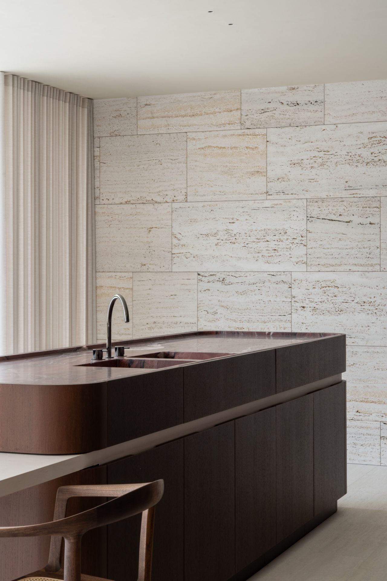
NEW 2026 Jubileum Edition The Best Interior Designers Benelux
Order Now €125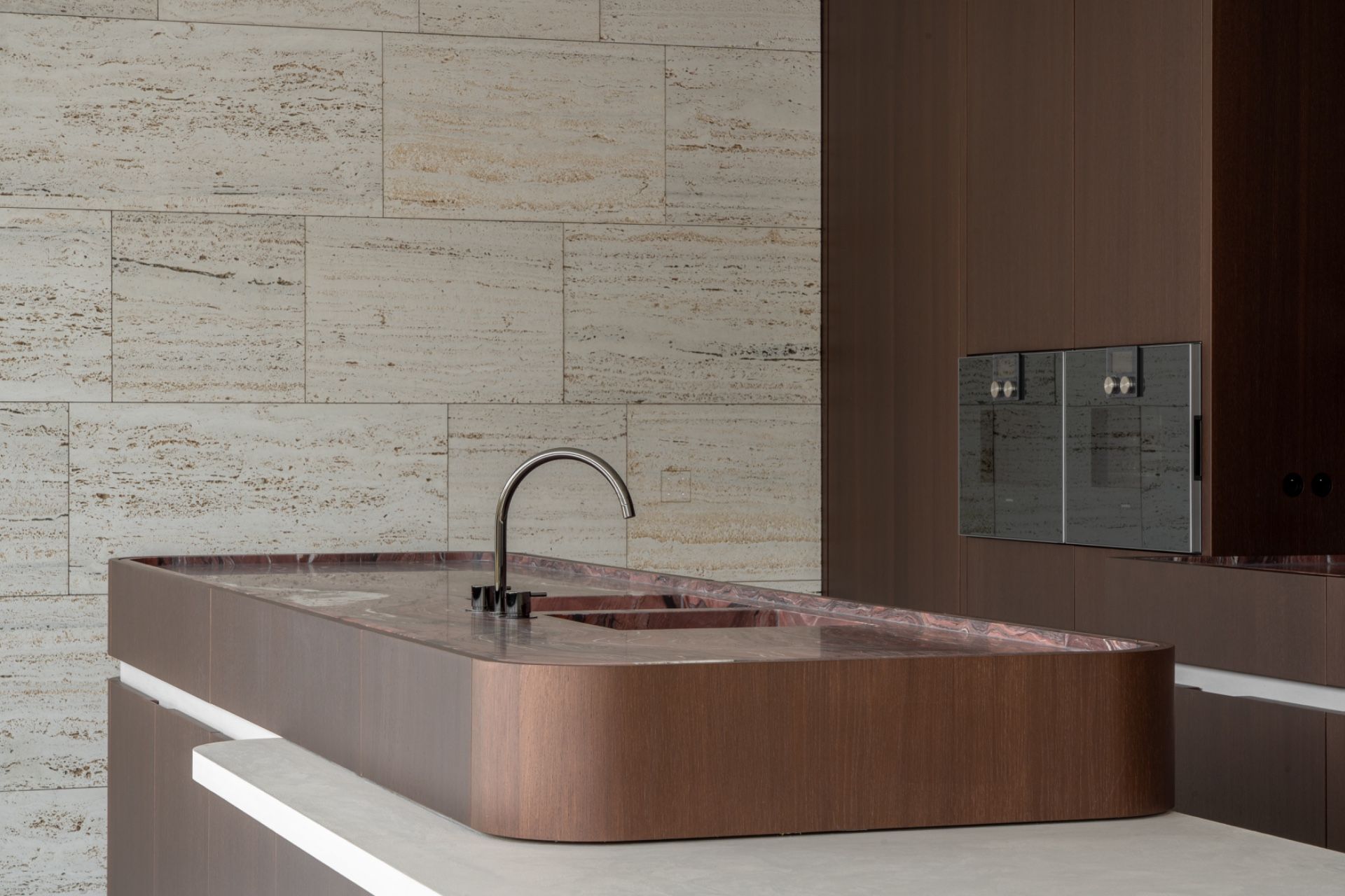
NEW 2026 Jubileum Edition The Best Interior Designers Benelux
Order Now €125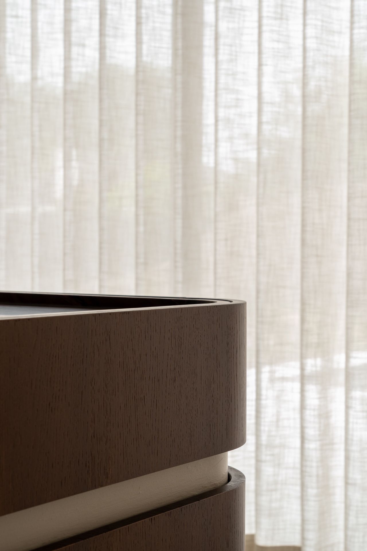
NEW 2026 Jubileum Edition The Best Interior Designers Benelux
Order Now €125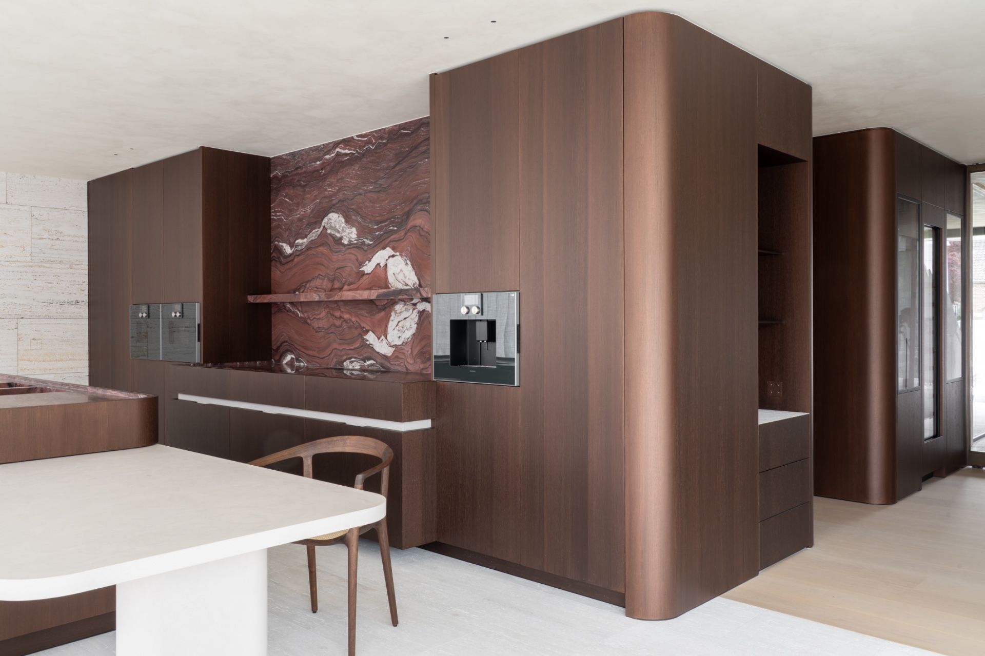
NEW 2026 Jubileum Edition The Best Interior Designers Benelux
Order Now €125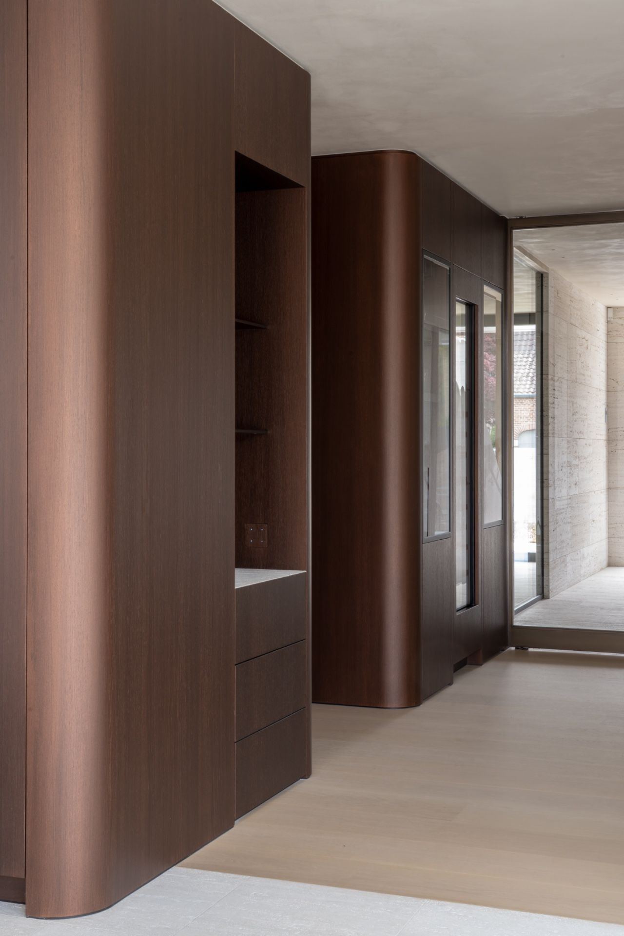
NEW 2026 Jubileum Edition The Best Interior Designers Benelux
Order Now €125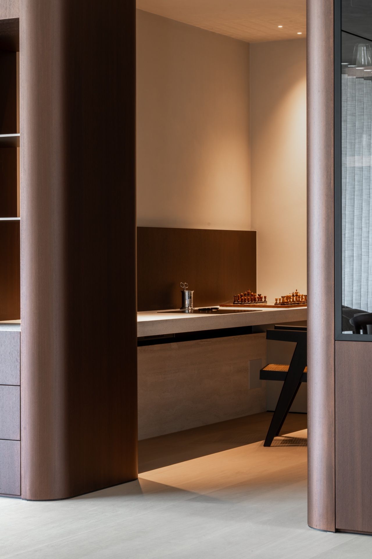
NEW 2026 Jubileum Edition The Best Interior Designers Benelux
Order Now €125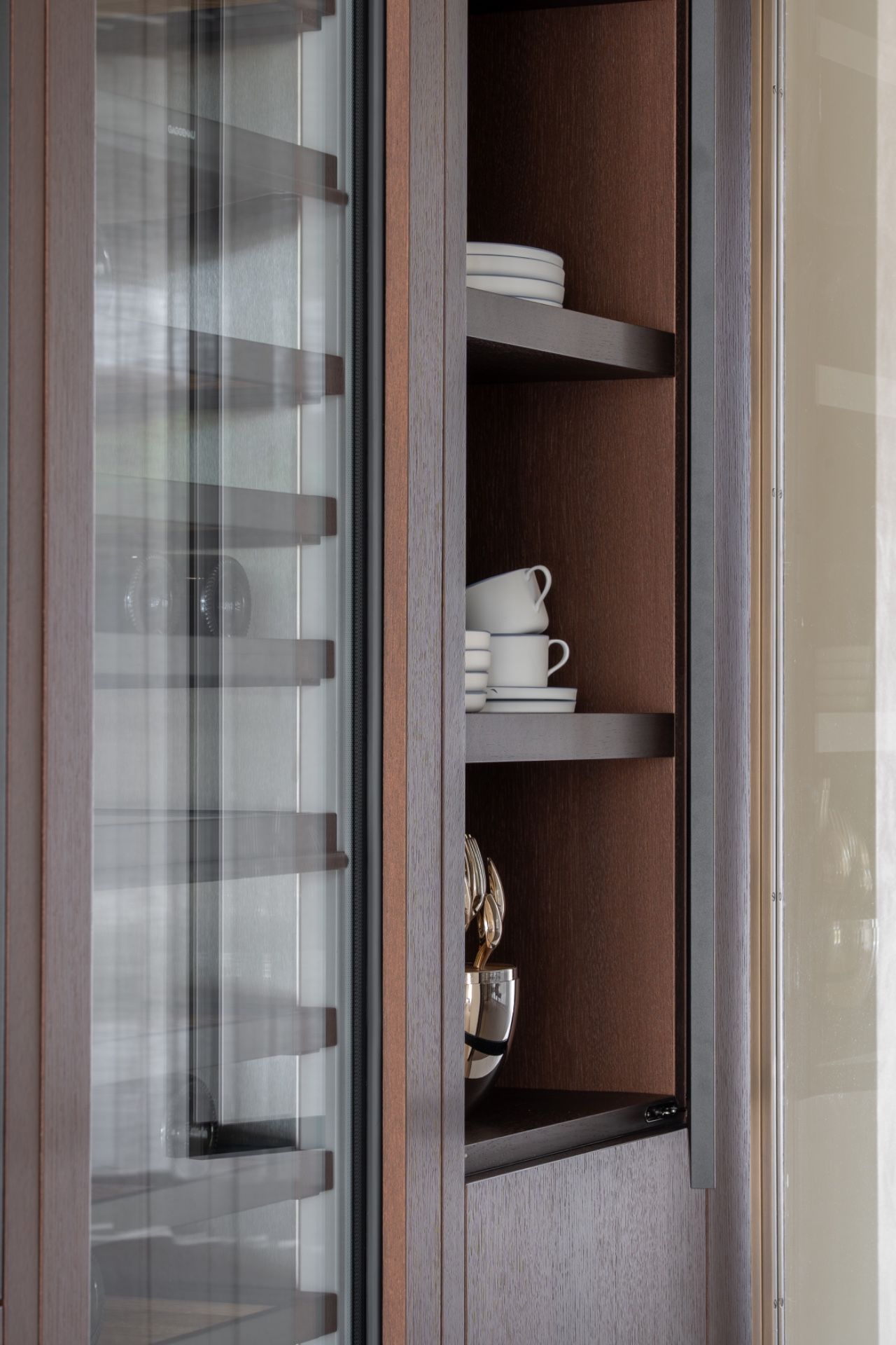
NEW 2026 Jubileum Edition The Best Interior Designers Benelux
Order Now €125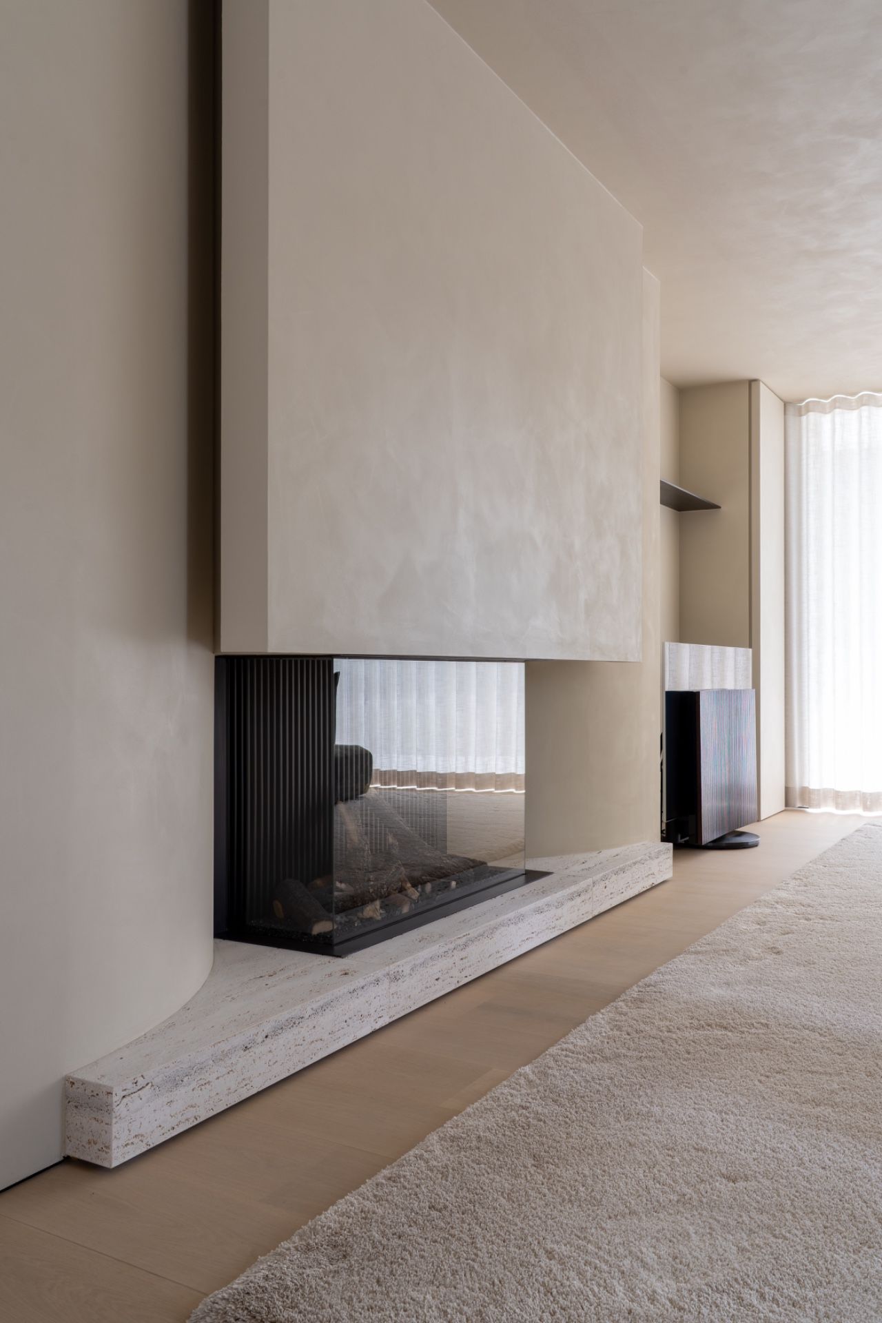
NEW 2026 Jubileum Edition The Best Interior Designers Benelux
Order Now €125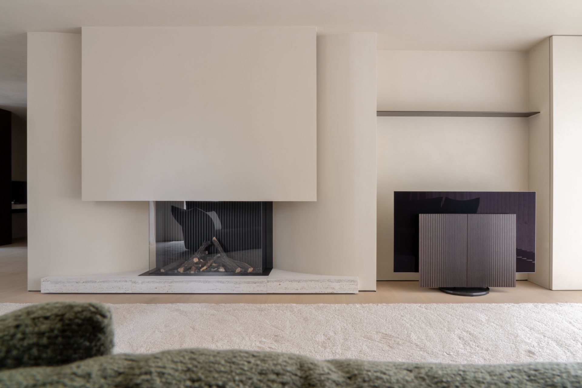
NEW 2026 Jubileum Edition The Best Interior Designers Benelux
Order Now €125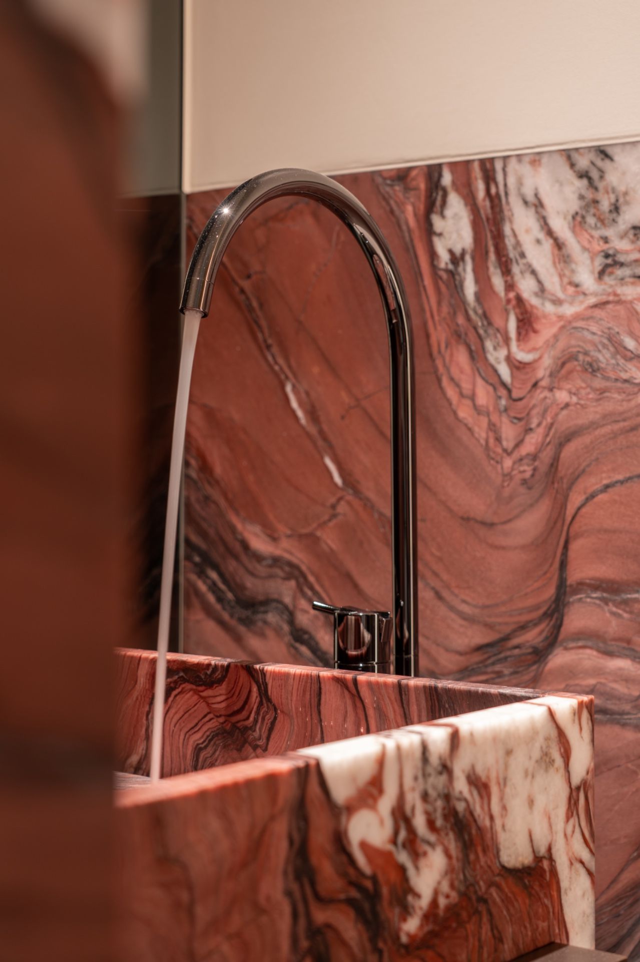
NEW 2026 Jubileum Edition The Best Interior Designers Benelux
Order Now €125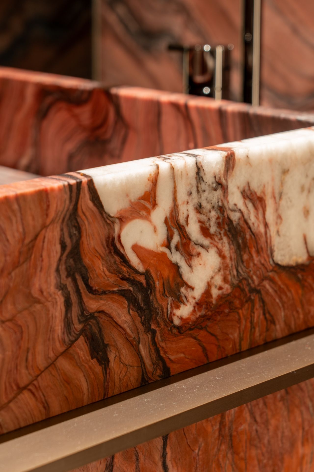
NEW 2026 Jubileum Edition The Best Interior Designers Benelux
Order Now €125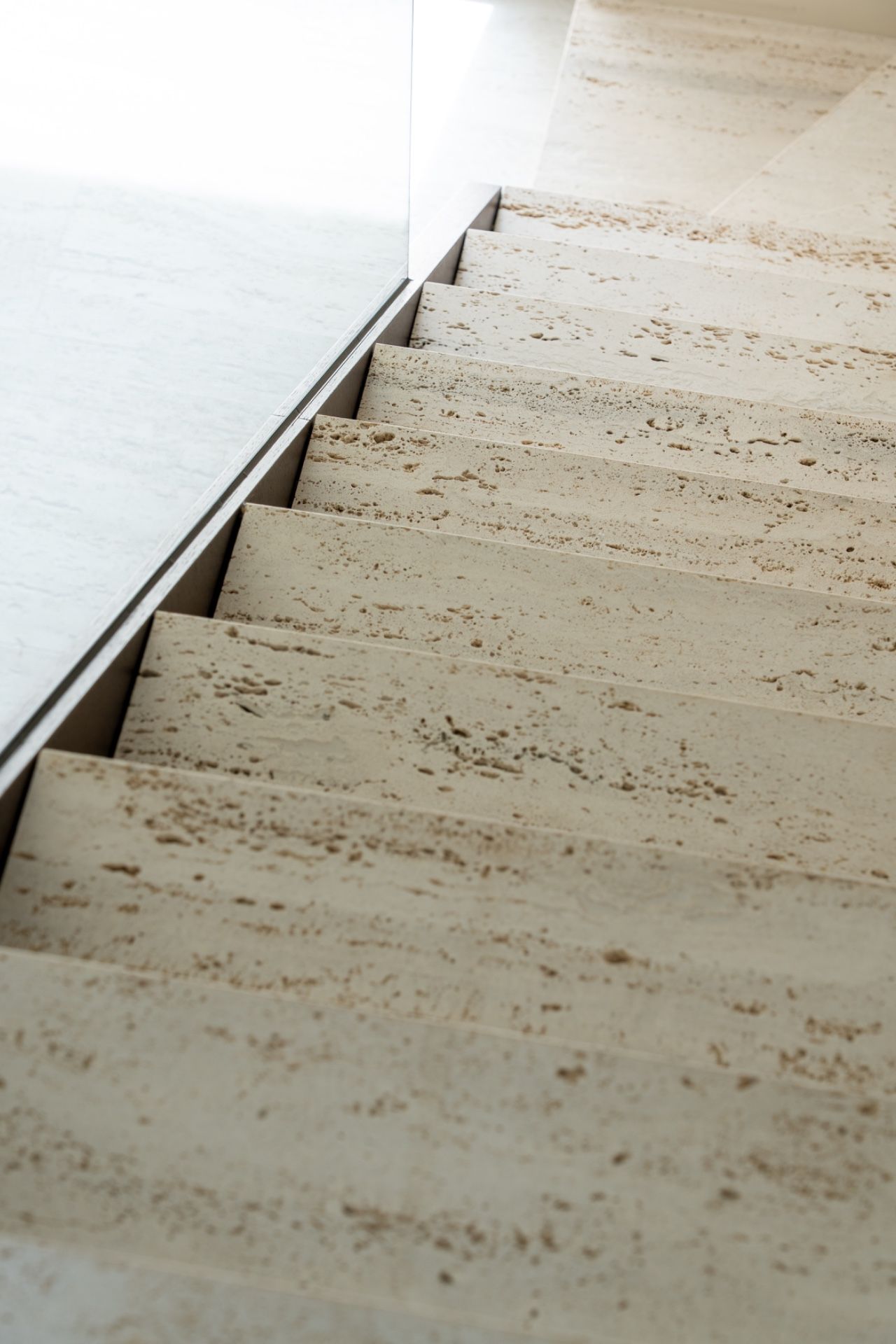
NEW 2026 Jubileum Edition The Best Interior Designers Benelux
Order Now €125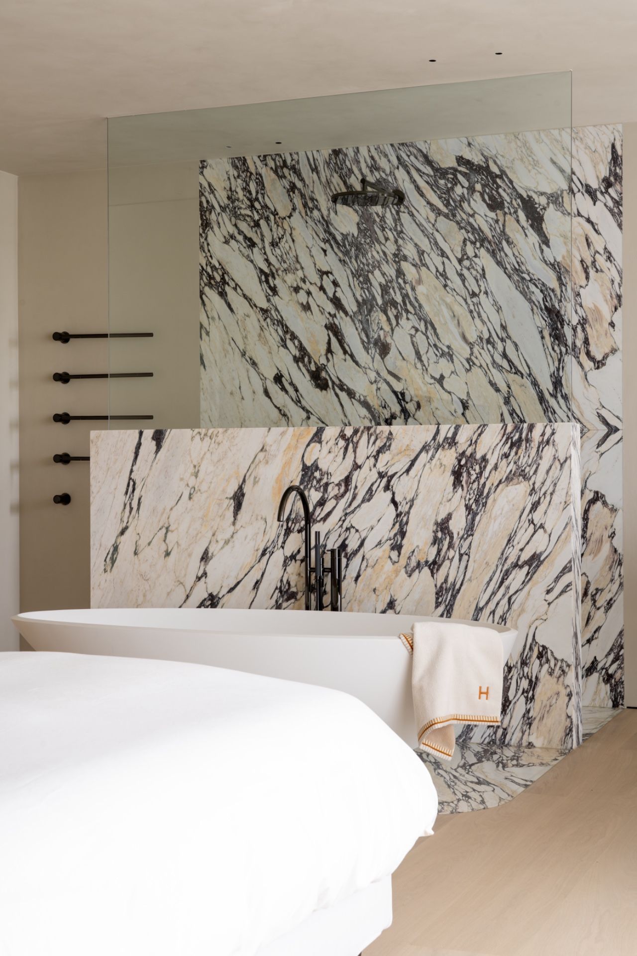
NEW 2026 Jubileum Edition The Best Interior Designers Benelux
Order Now €125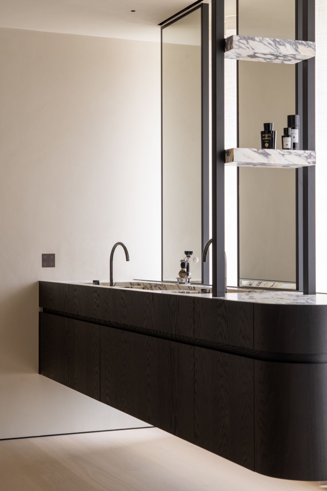
NEW 2026 Jubileum Edition The Best Interior Designers Benelux
Order Now €125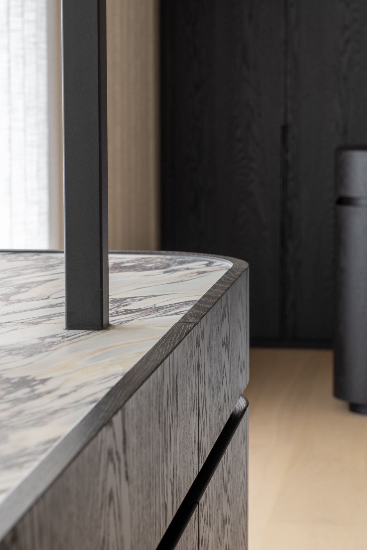
NEW 2026 Jubileum Edition The Best Interior Designers Benelux
Order Now €125
NEW 2026 Jubileum Edition The Best Interior Designers Benelux
Order Now €125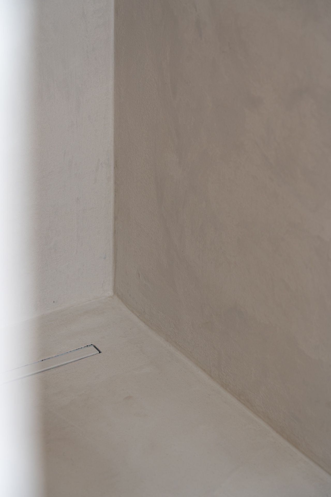
NEW 2026 Jubileum Edition The Best Interior Designers Benelux
Order Now €125