Light Grey Polished Concrete Floor in a Renovated Home With Modern Kitchen and Indoor-Outdoor Glazing
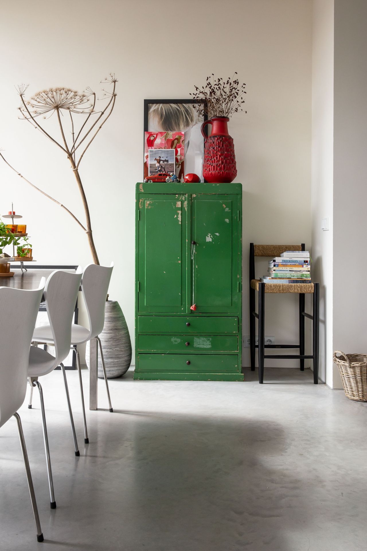
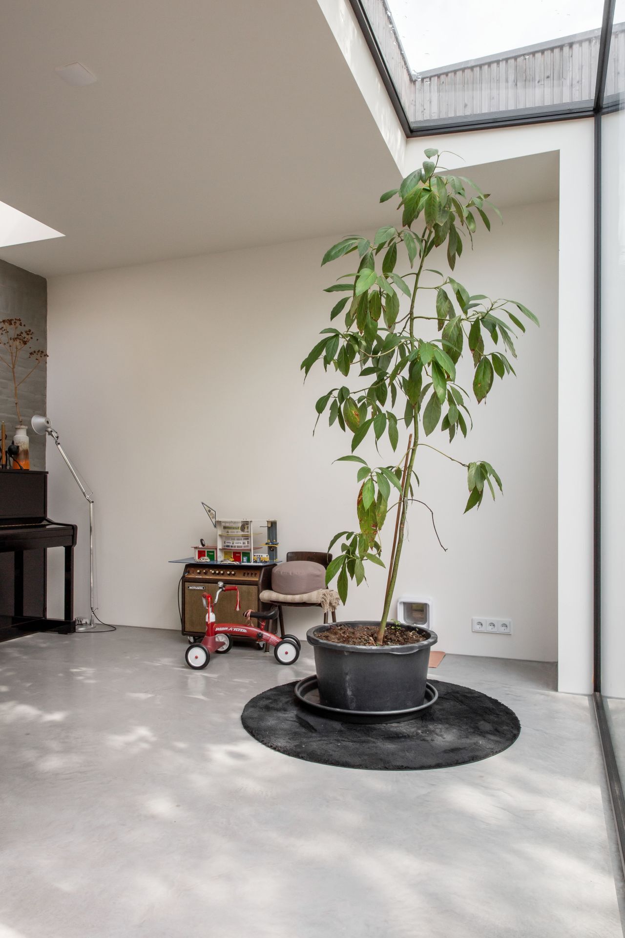
The light grey polished concrete floor sets the tone as soon as you enter. It runs through a 1932 home that was renovated and extended, where the new parts follow the quieter feel of the original house instead of competing with it. The surface is the visual thread through the kitchen, the living area, and the glazed opening toward the rear.
A floor that carries the renovation from one room to the next
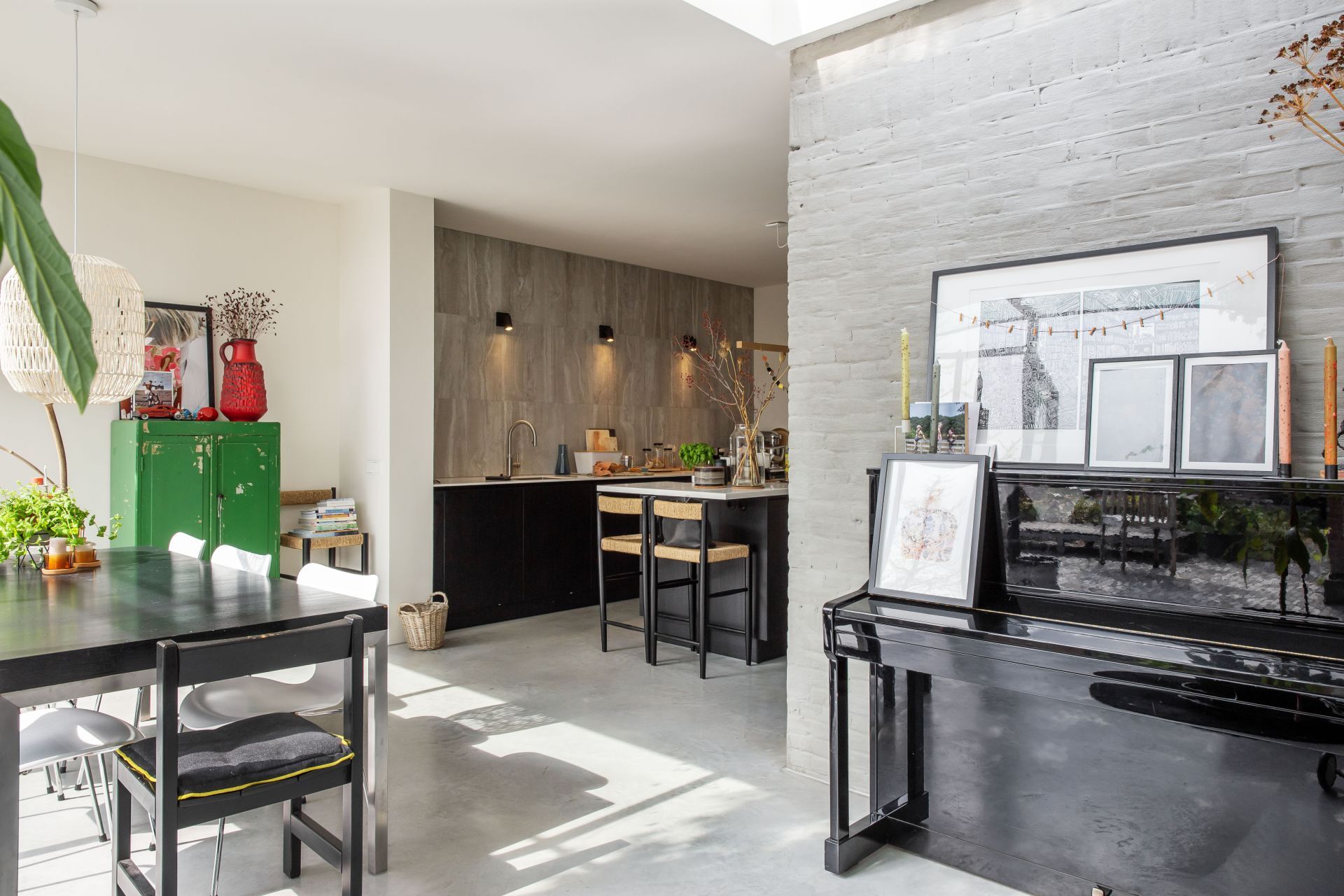
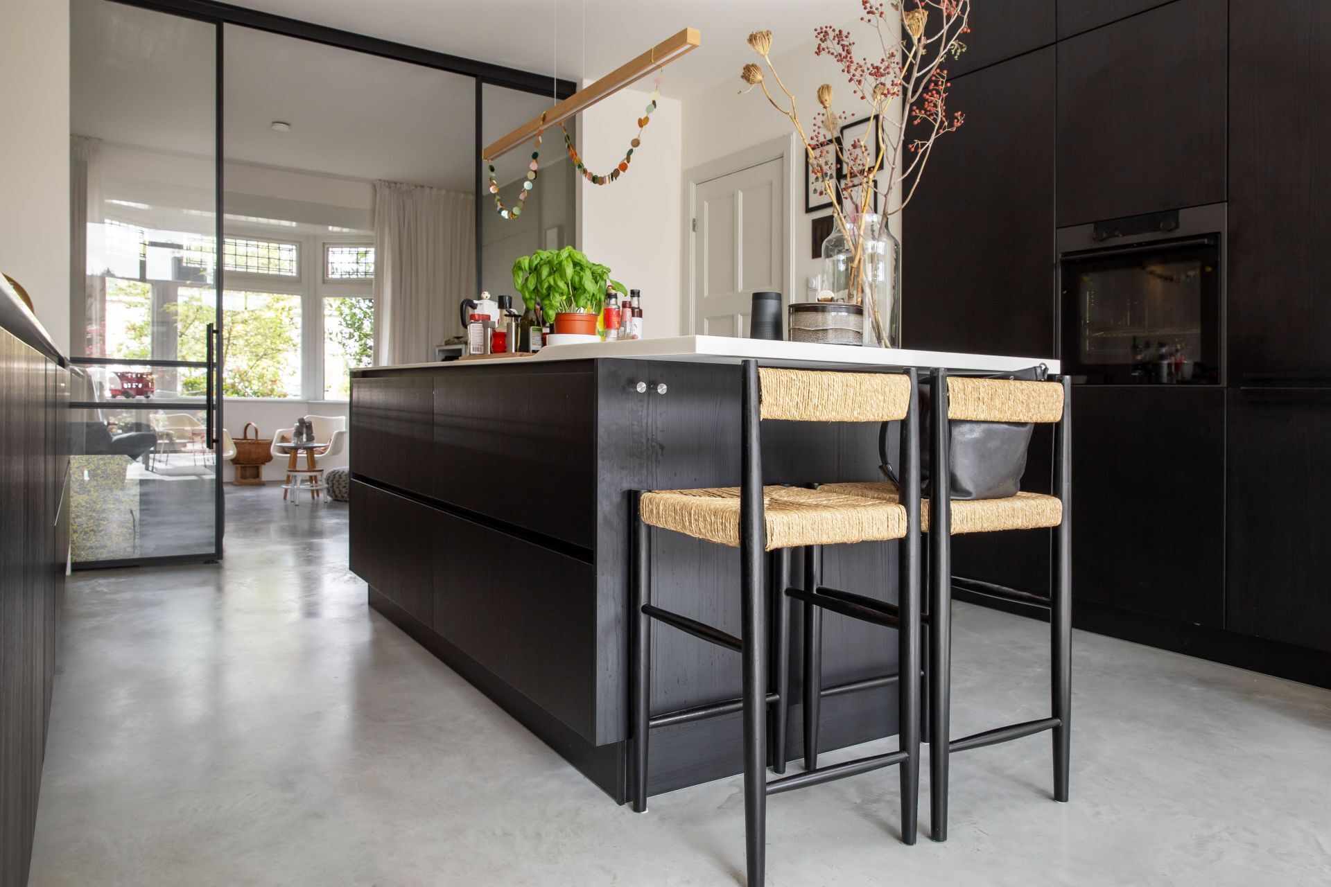
The polished concrete floor renovation was carried out during the works, and the result is a base grey tone that stays calm under changing light. In the kitchen, the floor meets dark cabinet fronts, a pale worktop, and a wall finish with a stone look. That contrast keeps the room clear and lets the floor read as one continuous plane rather than a separate feature.
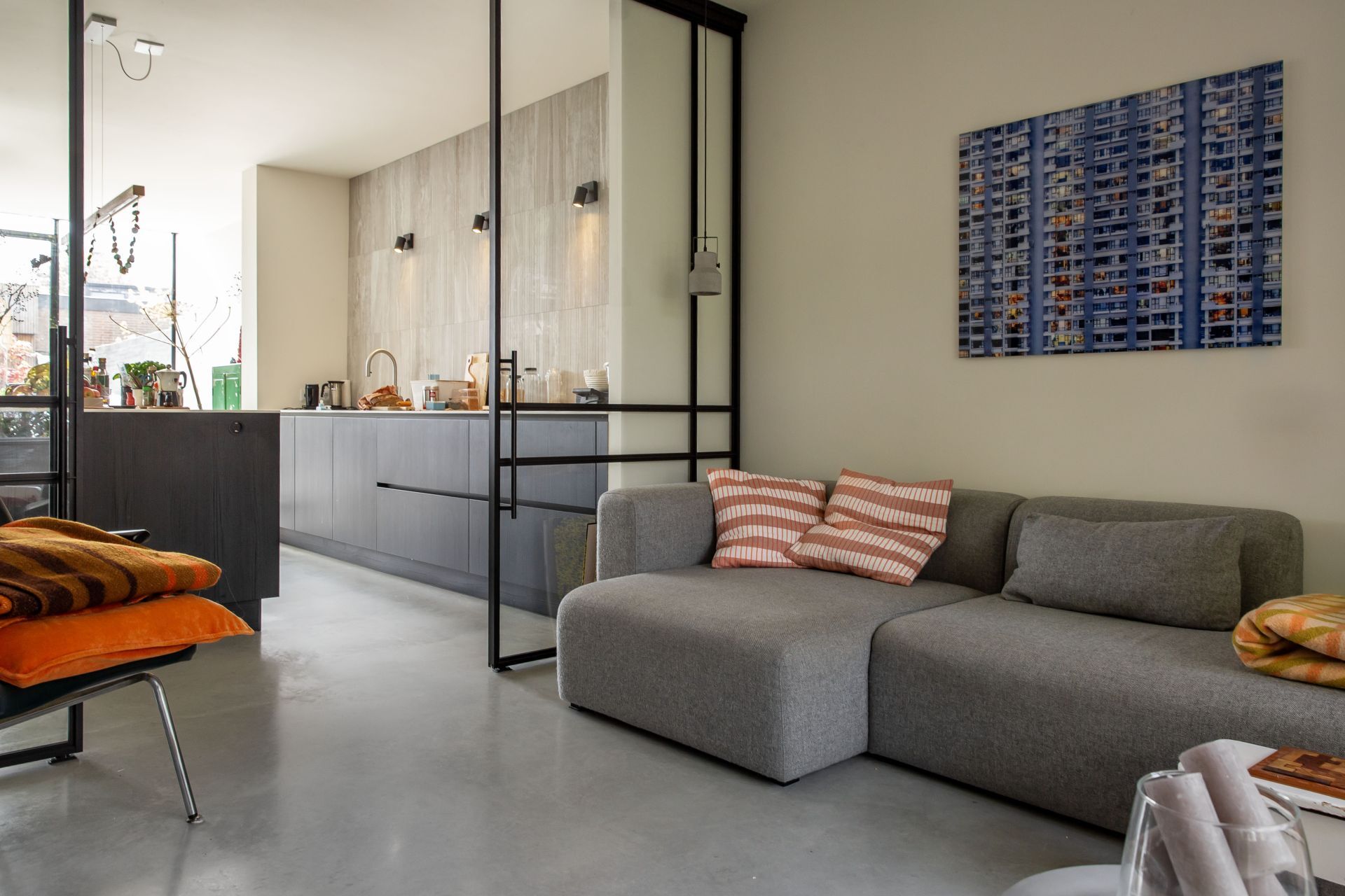
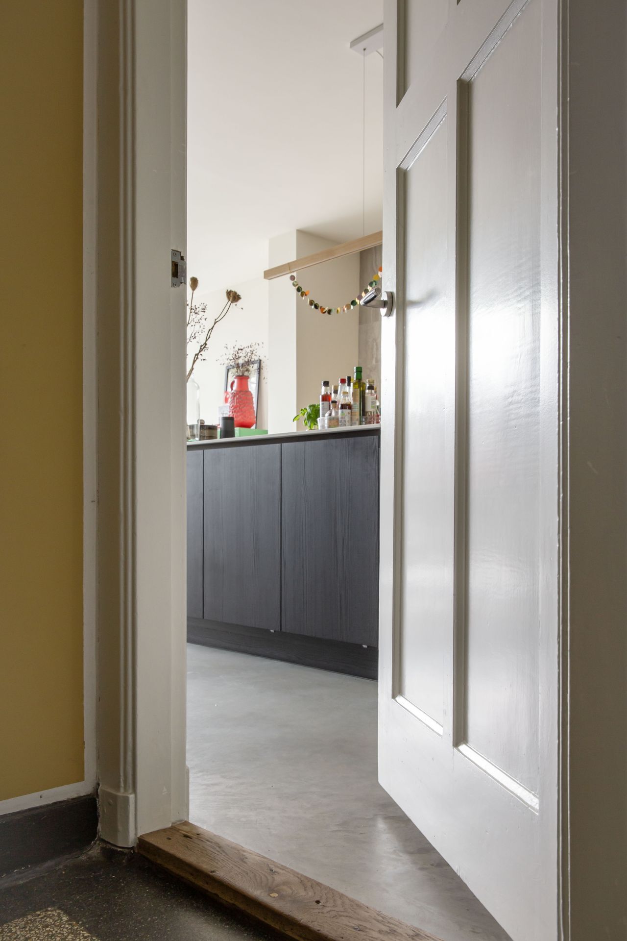
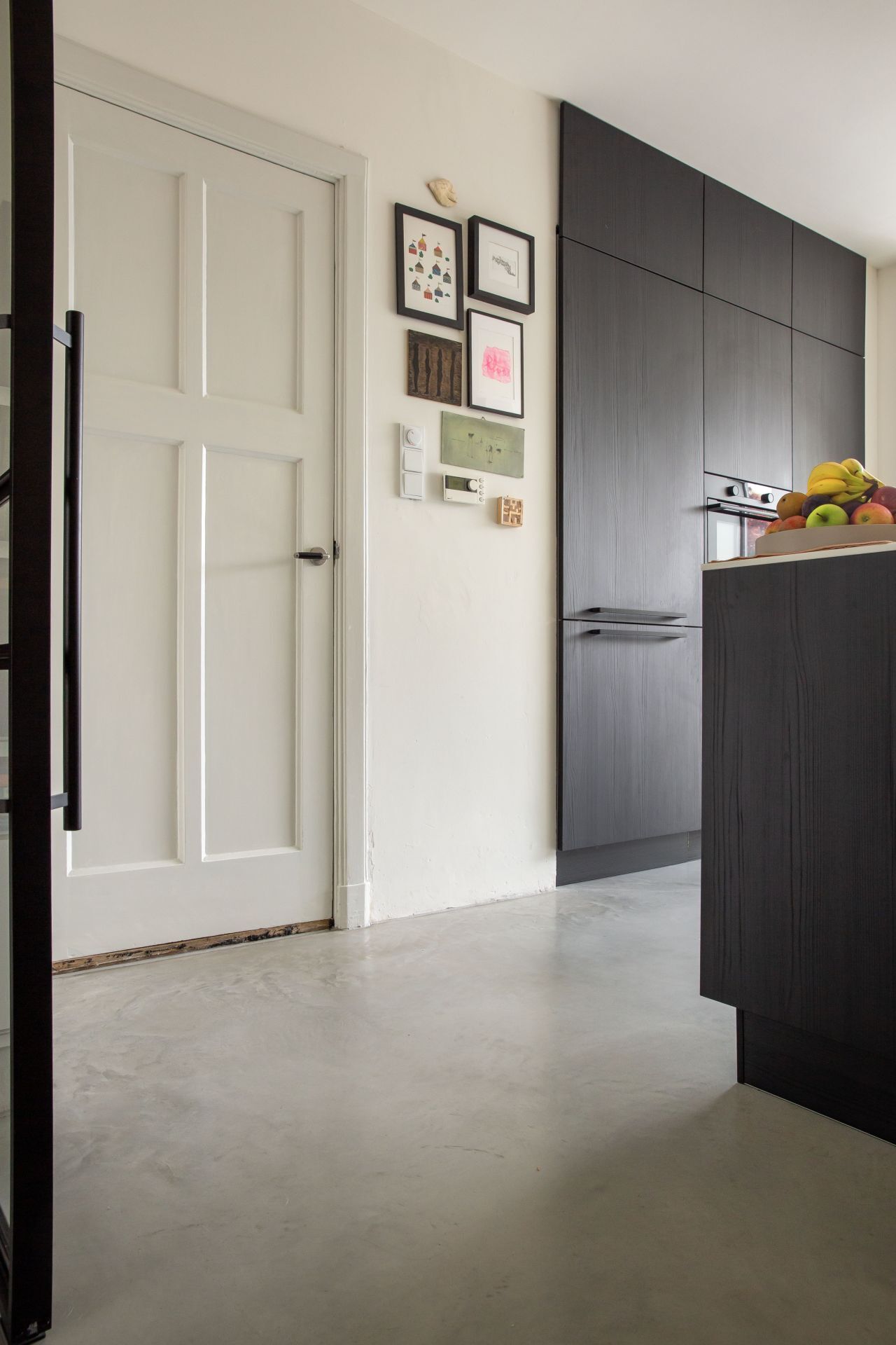
Seen from the side, the light grey concrete floor also helps to define the shift between old and new. One end of the plan still holds part of the former living room, while the other opens toward the extension. The floor draws those zones together without hiding the transition. It is visible in the hallway views as well, where white door frames and darker storage elements sit above the same grey surface.
Kitchen placed in the middle of the plan
The modern kitchen renovation sits in the centre of the space, with the old living area on one side and the bright extension on the other. That position gives the room a clear order. Instead of pushing the kitchen to the edge, the layout places it where movement naturally passes around it. The result is easy to read in the images: a long, straight kitchen line, dark fronts, and a pale worktop that catches the light.
Stone-look wall finish and sharp lines
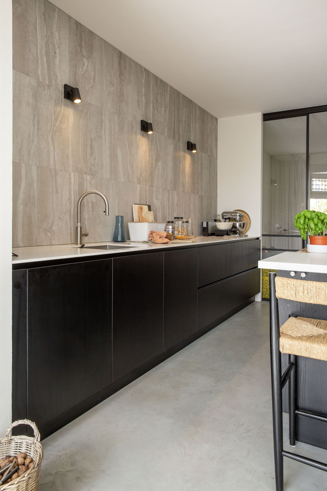
The wall behind the work zone has a stone-look surface, broken up by built-in spotlights. It adds texture without changing the quiet palette. Below it, the light grey polished concrete floor keeps the base of the room visually open. The kitchen does not rely on ornament; it uses straight edges, flat fronts, and the contrast between dark cabinetry and the lighter floor to carry the space.
From another angle, the same kitchen reads as a clear strip of furniture and finish. Dark lower cabinets, a light surface, and the grey floor create distinct horizontal bands. This is where the polished concrete floor renovation becomes most visible as a design choice: it gives the kitchen a steady ground plane and keeps the surrounding materials from feeling heavy. The floor remains visible even where the cabinet run extends deep into the room.
Glass at the back wall, and the ceiling line above it
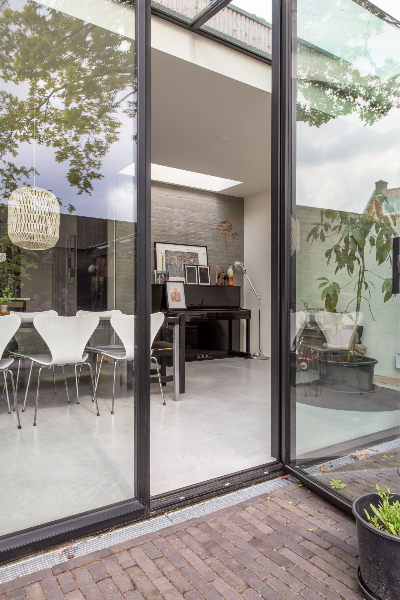
The rear wall is almost entirely glass, and that glass continues into part of the ceiling. It is a simple move, but it changes how the room is read. Daylight comes in across the grey floor, and the interior starts to feel connected to the outdoor space beyond the glazing. The frame is kept dark, which sharpens the outline of the opening and lets the floor remain the calmest element in view.
Through the glazed rear wall, the same light grey concrete floor appears to carry on toward the outside. That visual continuation matters more than a decorative gesture. It shows how the indoor-outdoor glazing works in the project: not as a statement, but as a line that lets the inside and outside share the same direction. In the images, the floor and the glazing frame each other, while the outside greenery stays soft in the background.
Old room, steel doors, and the extension beyond
On one side of the kitchen, part of the old living room remains visible behind steel internal doors. Their darker grid contrasts with the pale walls and the base grey floor. On the other side, the extension opens up in a lighter tone. This split gives the plan a clear reading: one side remembers the older house, the other side brings in the added volume. The light grey polished concrete floor moves between both without interruption.
That same continuity can also be seen in the entrance and passage views. White wall surfaces, slim frames, and the grey floor keep the circulation simple. Nothing in the palette shouts for attention. Instead, the room changes through light, edge, and material junctions. The polished concrete floor renovation anchors those changes, especially where the old part of the house meets the glazed rear extension.
How the space reads in the photographs
The images make the project easy to follow because each one returns to a visible detail: the floor close to the kitchen, the dark cabinet faces, the stone-look wall, or the large glass opening. In close-ups, the floor surface carries a fine movement in the light. In wider views, it becomes the base that links the kitchen, the living area, and the rear opening. The light grey concrete floor is never isolated from the architecture around it.
Several views also show how the interior finishes work with the extension. The glass frames, the pale walls, and the darker kitchen elements keep the room legible, while the floor holds the entire sequence together. In a renovation like this, that is what makes the material choice easy to read: the floor is not there as a separate finish, but as the surface that lets the 1932 house, the new kitchen, and the glazed rear space share one visual rhythm.
Photography: Studio Bern.
Want to see more of Willem Designvloeren? View the page of Willem Designvloeren for even more great projects and company information.



NEW 2026 Jubileum Edition The Best Interior Designers Benelux
Order Now €125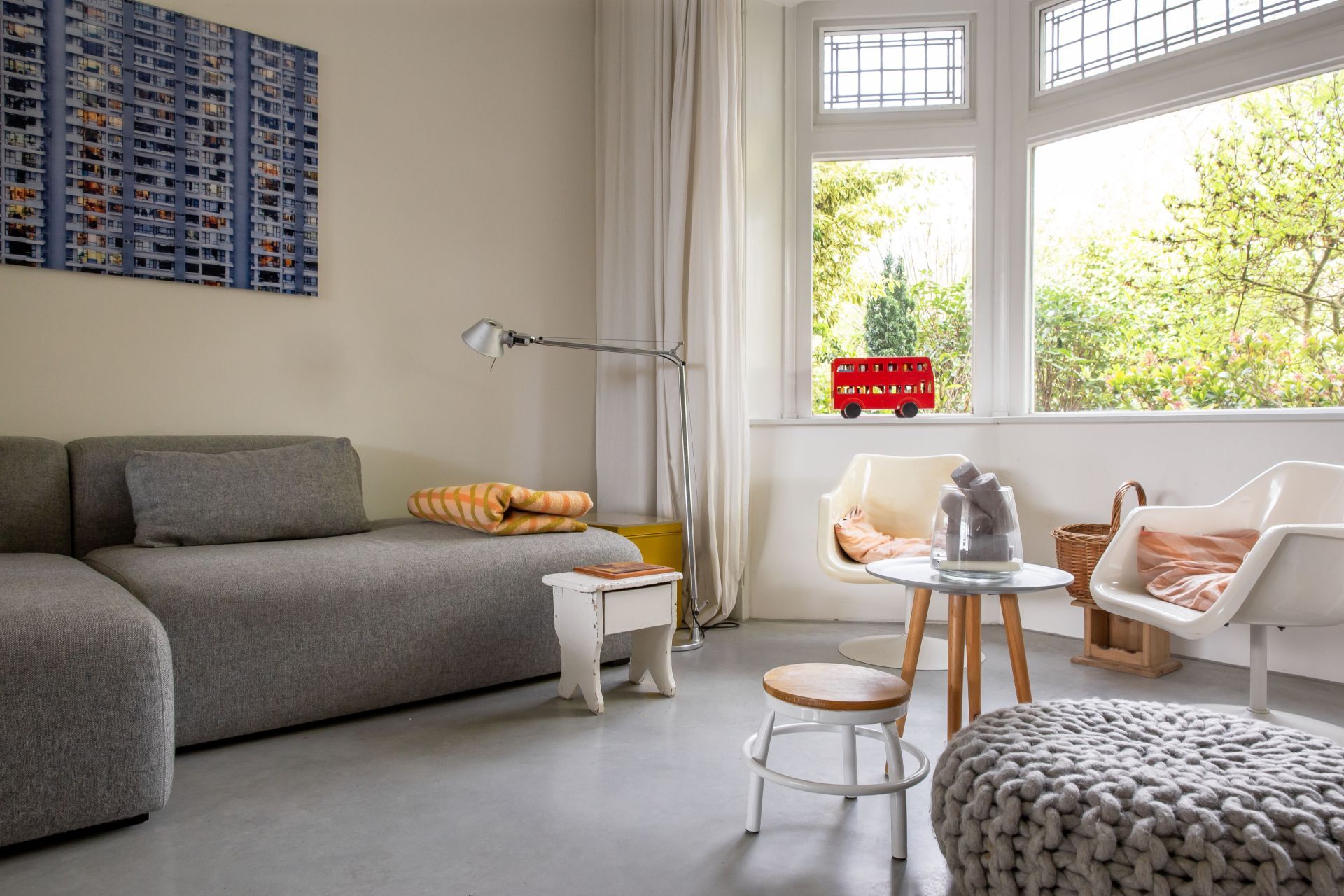
NEW 2026 Jubileum Edition The Best Interior Designers Benelux
Order Now €125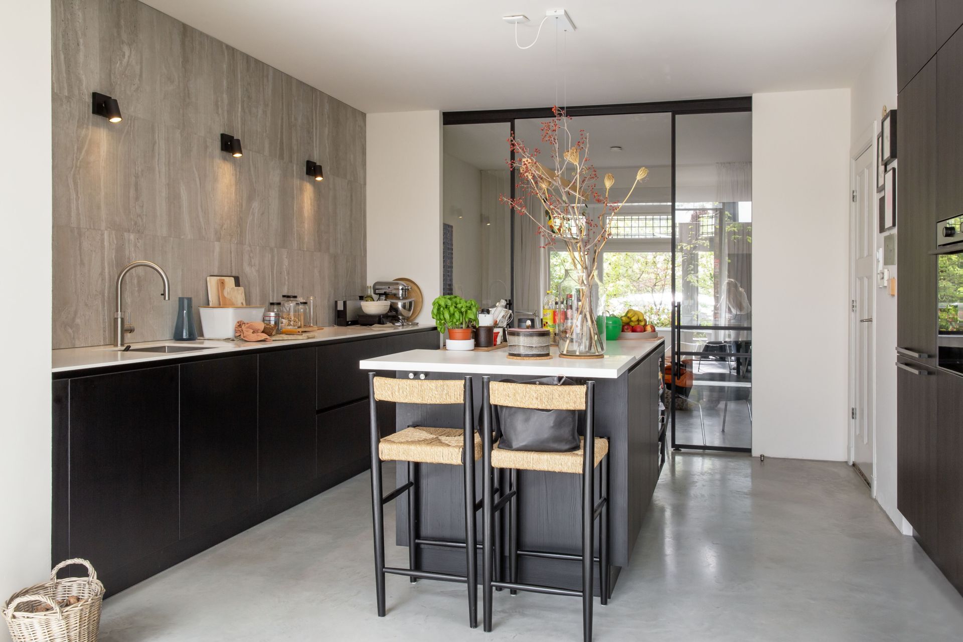
NEW 2026 Jubileum Edition The Best Interior Designers Benelux
Order Now €125