Interior project connecting old and new
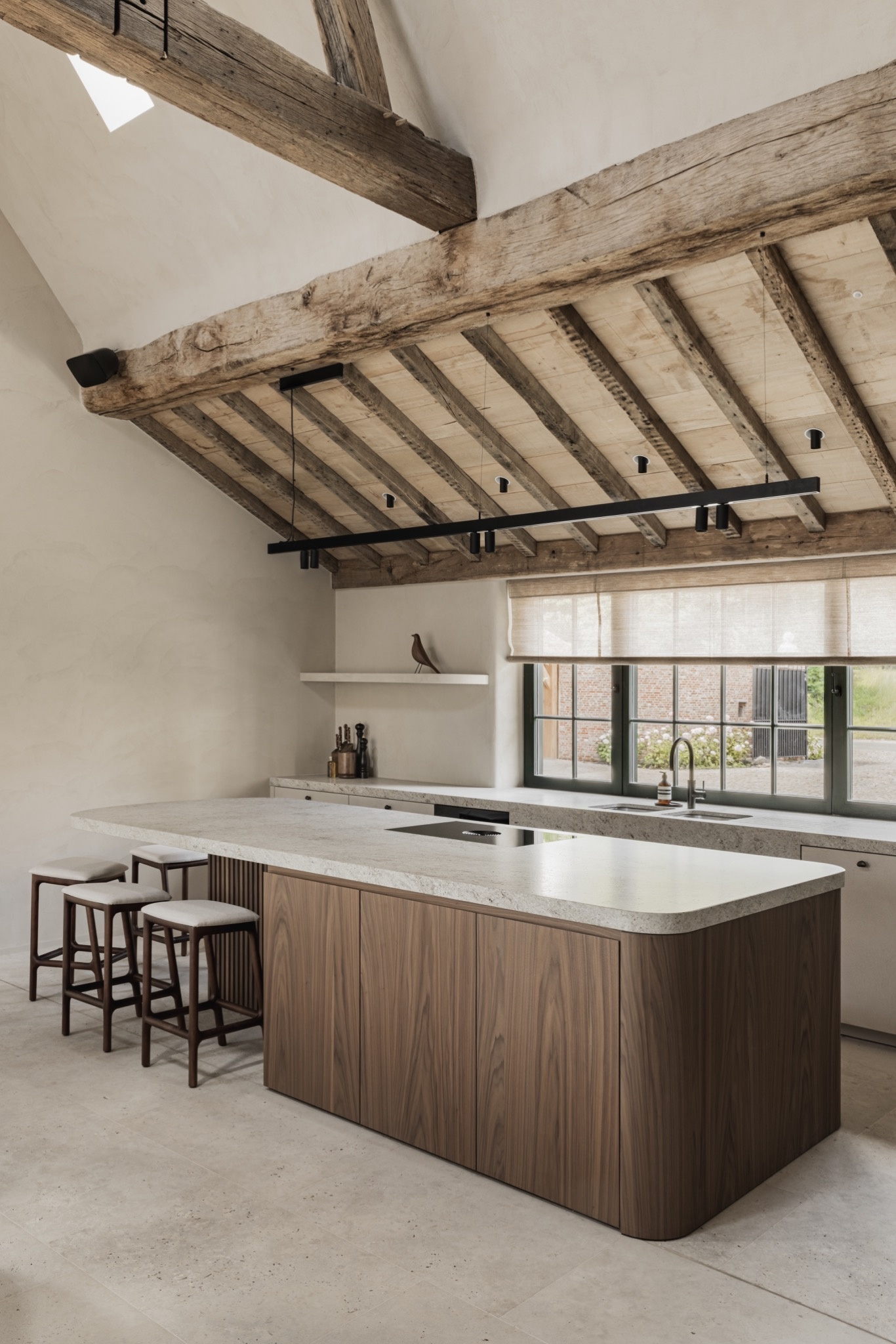
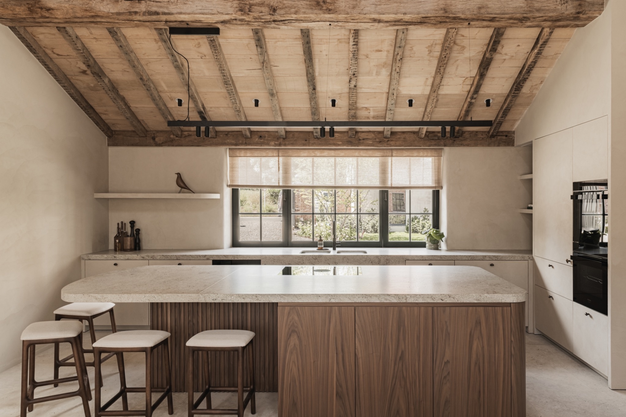
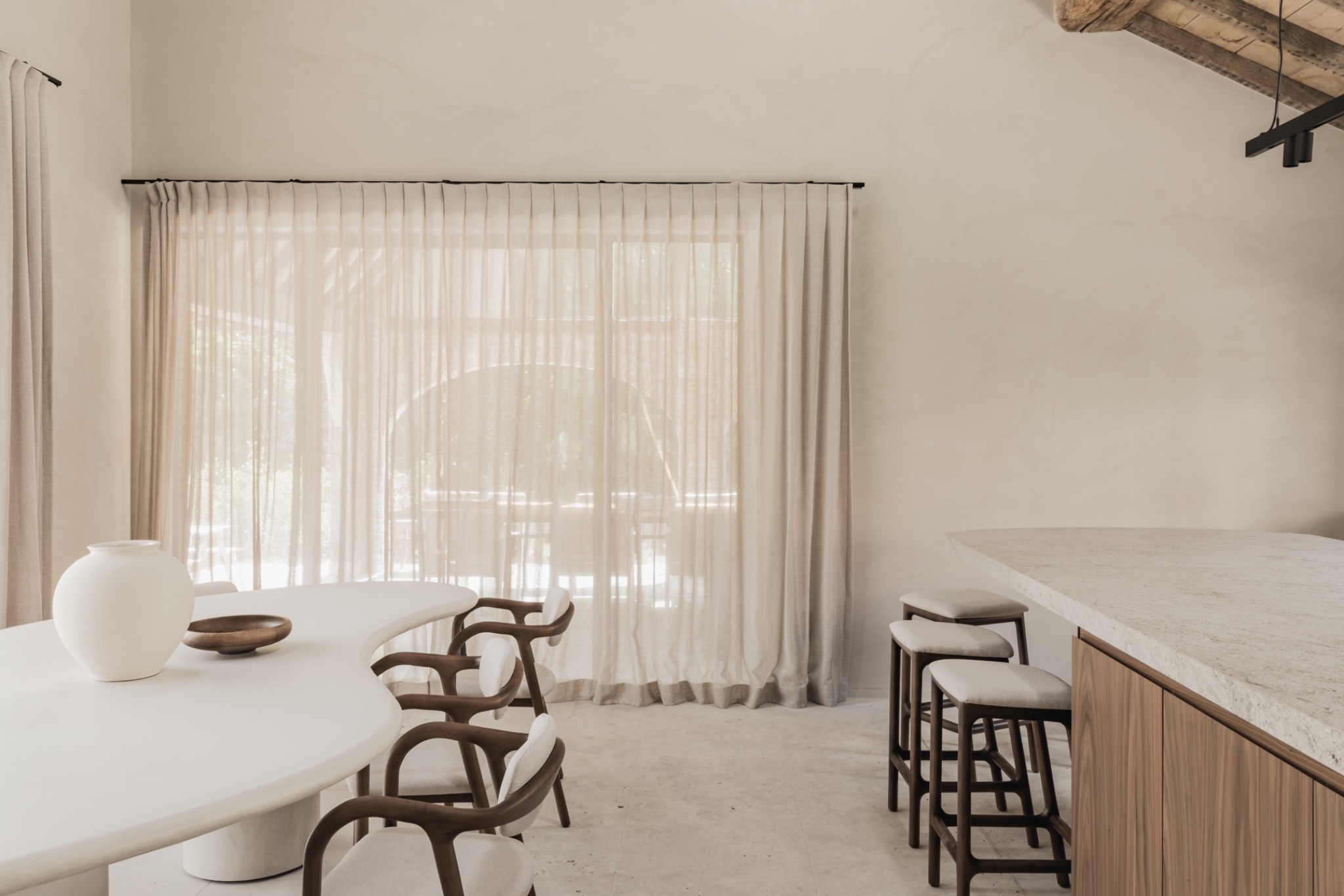
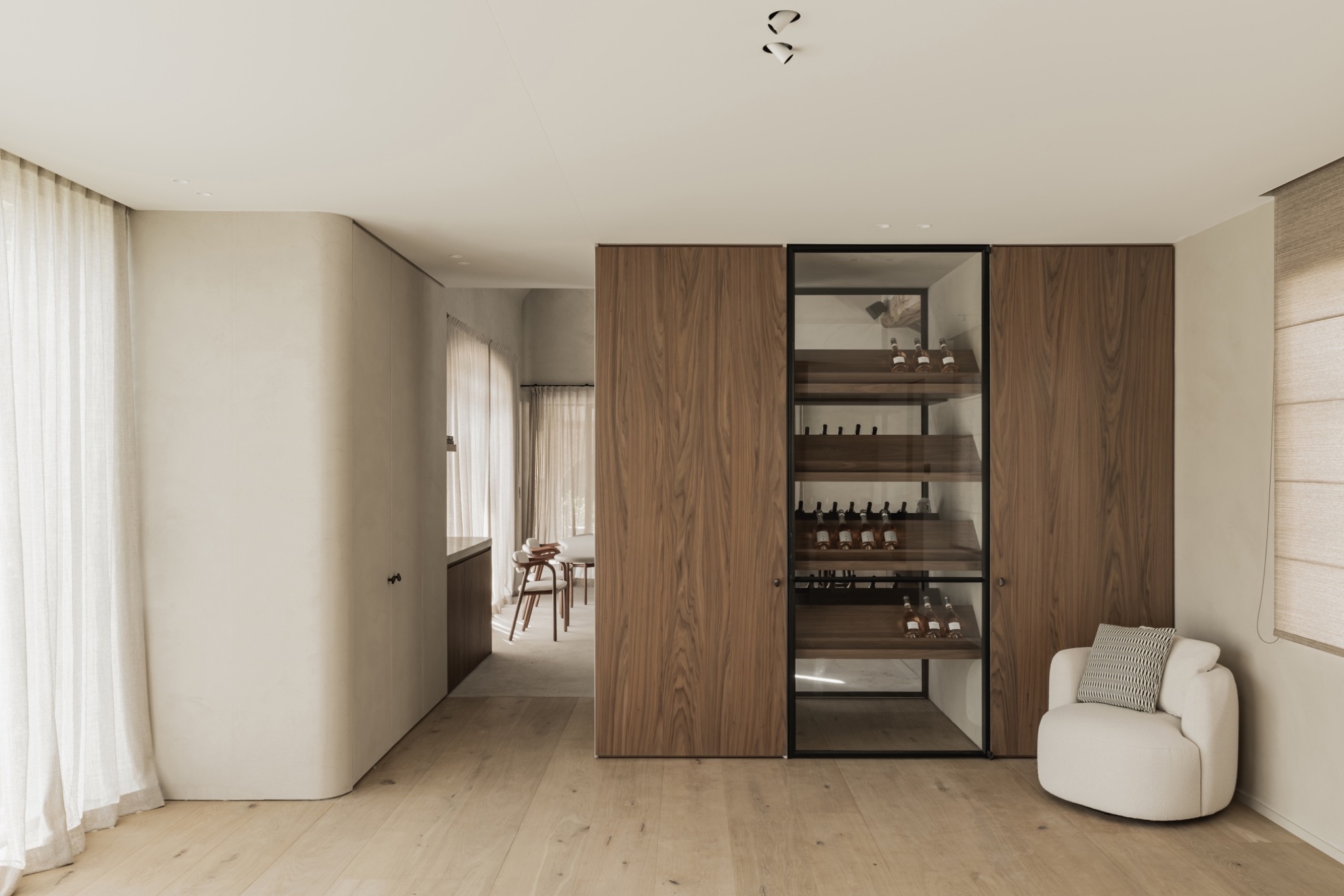
Warm walnut fronts run along the room before the eye meets the stone surface and the open view beyond. In this interior project, an existing farmhouse was renovated while a new extension was built from the ground up, and the main task was to connect old and new interior spaces without flattening their character. The result is an open plan that still keeps clear transitions between kitchen, dining area and lounge.
A farmhouse renovation with a new extension beside it
The renovated farmhouse and the new volume do not compete for attention. Instead, the plan lets them speak through openings, long sightlines and changes in material. Stained oak beams remain visible overhead, while newer surfaces are kept crisp and restrained. That contrast gives the rooms their structure. The spaces feel larger because the boundaries are not closed off, yet each zone still reads as its own part of the house.
One of the most visible moves is the way the architecture rises toward the ridge in several places. Those openings pull daylight deeper inside and make the ceiling line part of the room rather than a hidden layer above it. Steel windows reinforce that directness. Their slim profiles frame the larger openings without adding visual weight, so the rooms keep their calm but do not lose the link with the older shell around them.
Materials that let the rooms stay connected
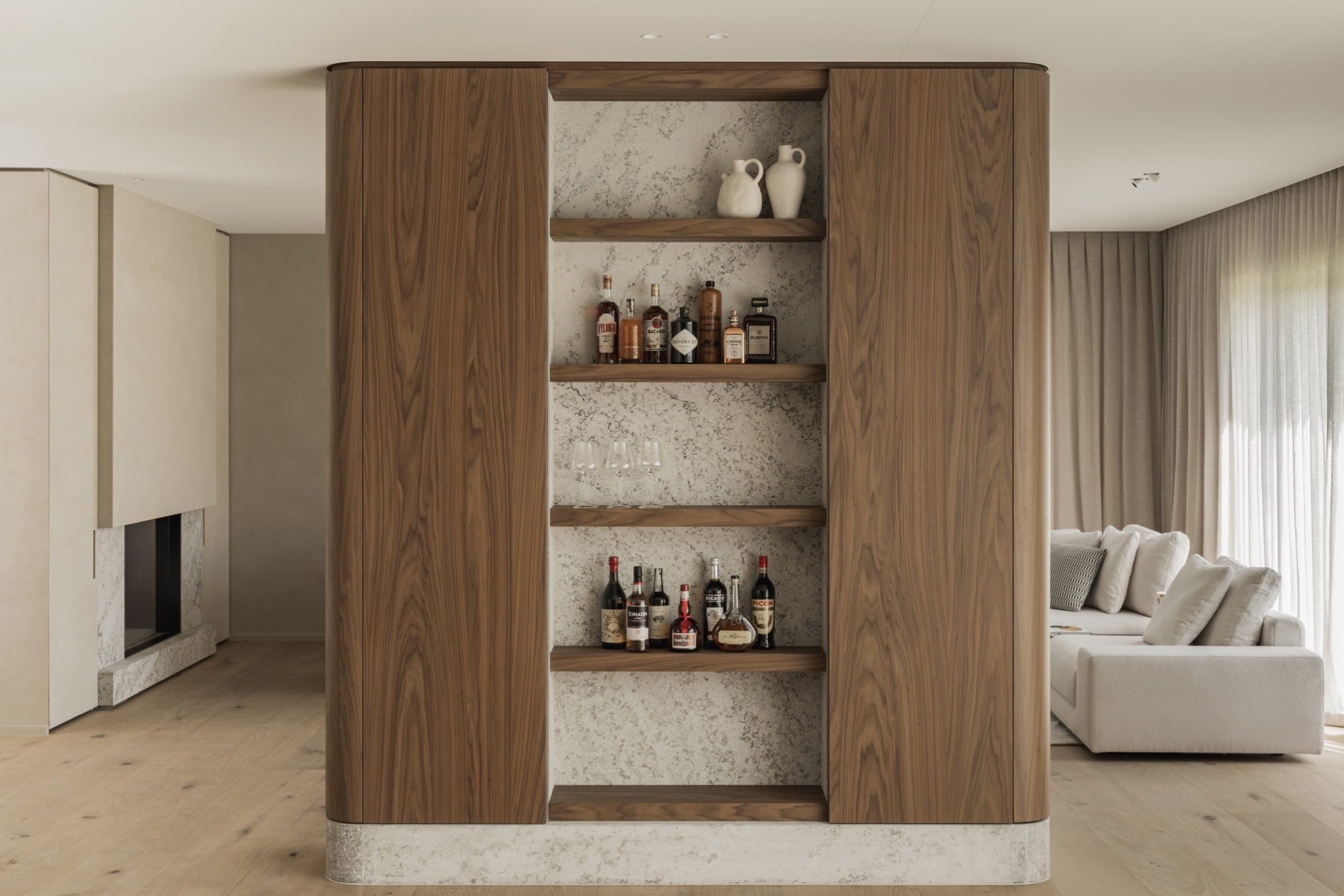
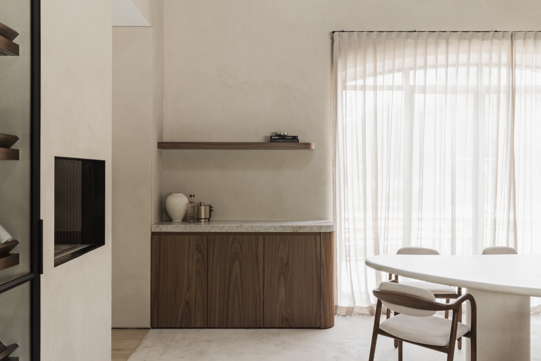
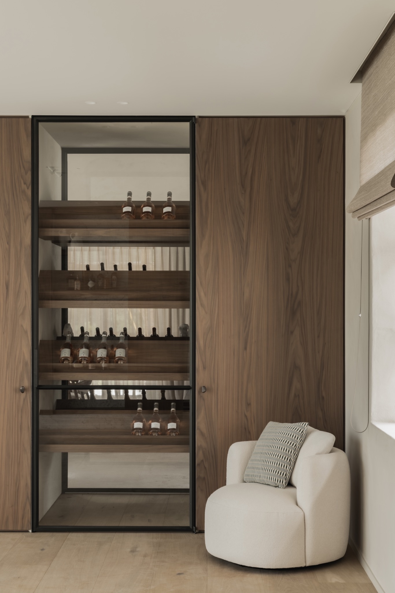
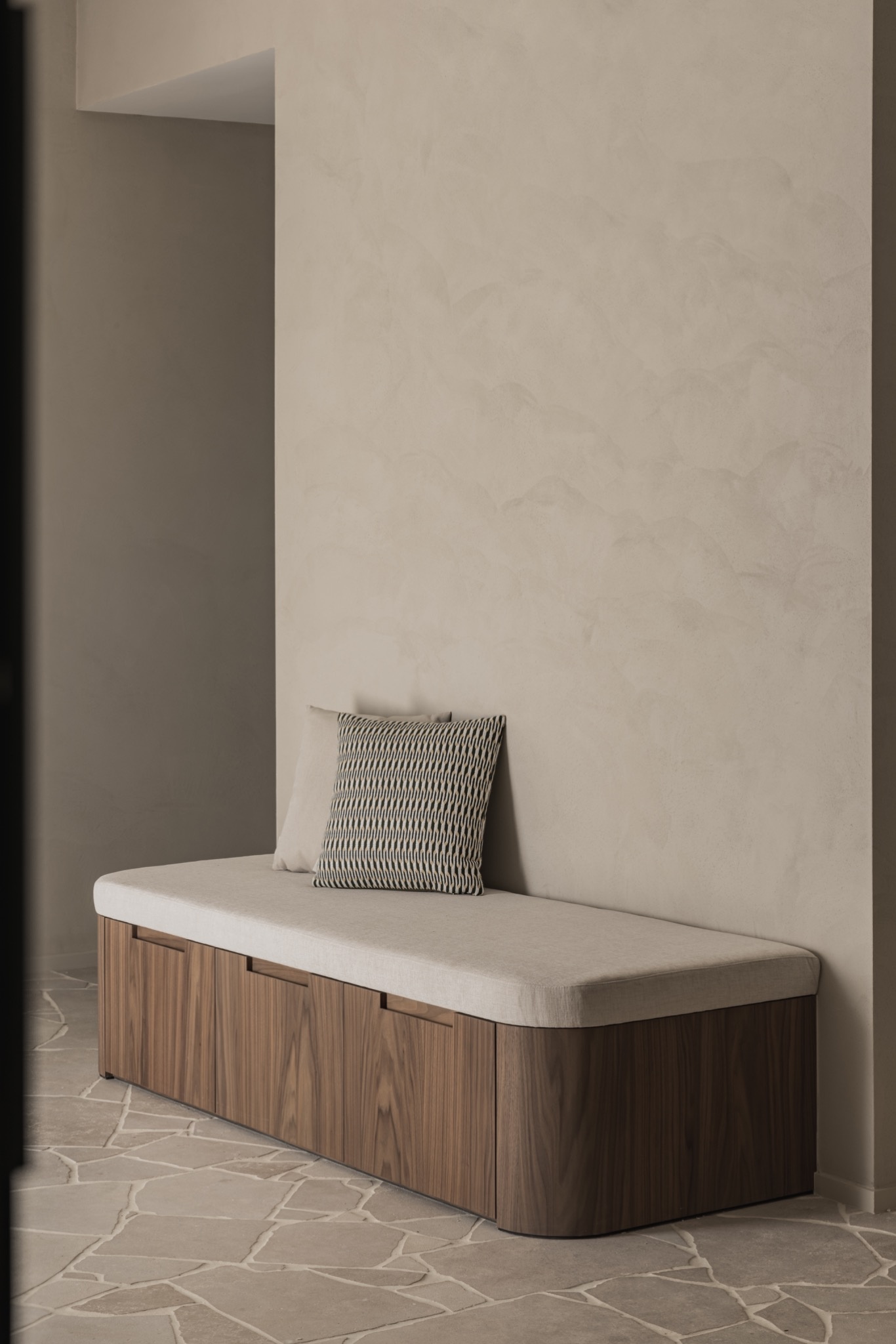
Walnut wood and natural stone give the interior its strongest tactile contrast. The walnut appears in the kitchen fronts and in curved custom joinery, where its darker tone softens the longer wall runs. Natural stone returns in the worktop and in lower wall details, where the veining catches light differently from the smooth wood grain. Together, the materials do more than decorate; they mark thresholds, edges and work surfaces, helping the eye move from one zone to the next.
Fresh painted surfaces sit beside the older timber and the stone. That mix keeps the renovated farmhouse interior from feeling overly polished. Instead, the finish changes from room to room in a measured way: matte walls, textured wood, the cool face of stone, then the lighter surfaces of the new joinery. Each material is readable on its own, but none of them breaks the overall flow between kitchen, dining area and sitting room.
Restored beams above the main living spaces
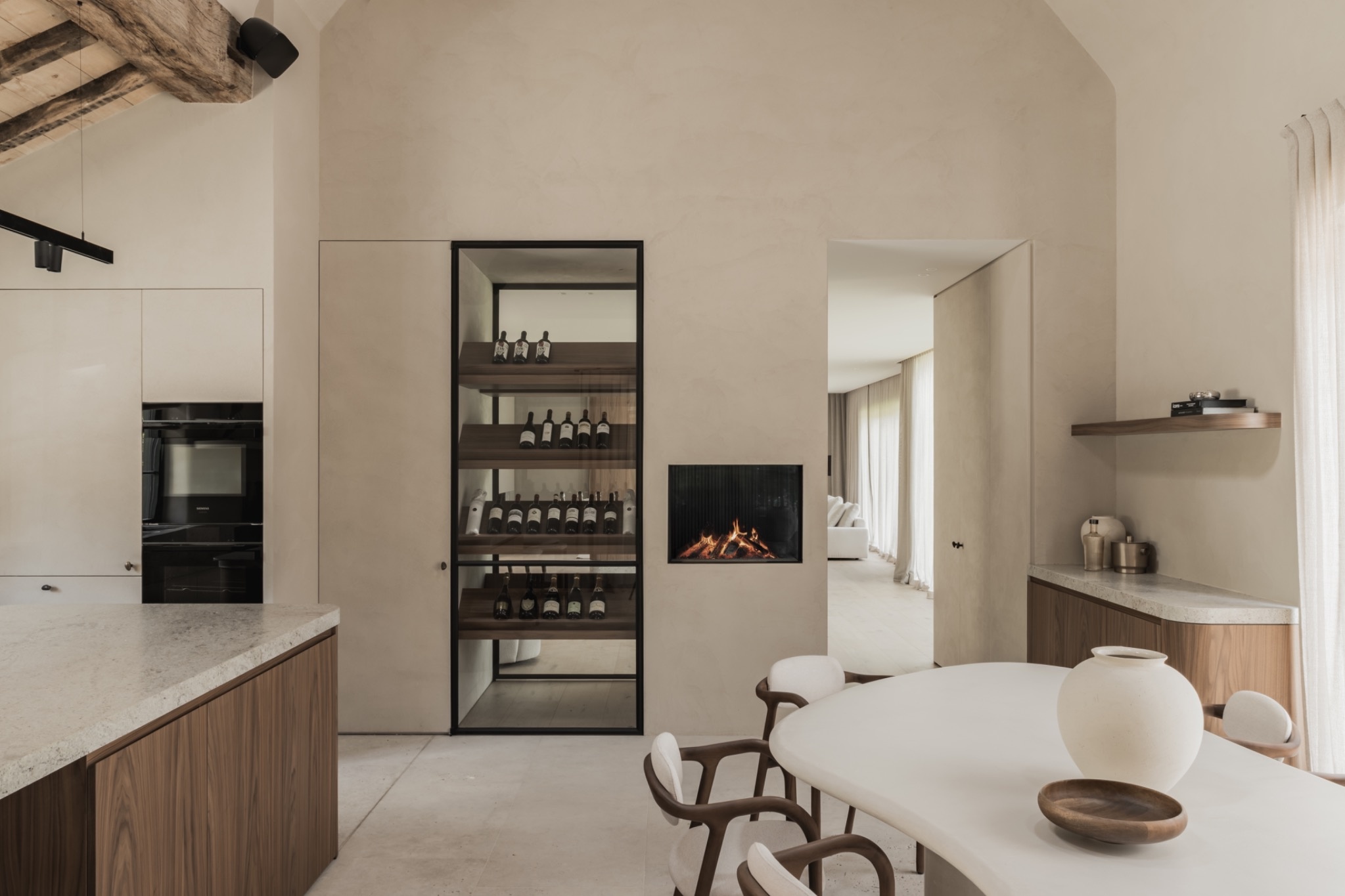
The restored ceiling beams remain one of the clearest traces of the original farmhouse. Their weathered surface brings age into the rooms without turning the interior nostalgic. Above the kitchen and living zones, the timber runs across the ceiling in a way that gives the long spaces a steady rhythm. Black spotlights sit between the beams and keep the lighting discreet, so the structure stays visible even in the evening.
These beams also help define scale. In the larger open areas, they break up the ceiling plane and stop the rooms from feeling too flat. That matters in a plan where old and new are connected through wide openings and fewer walls. The timber overhead gives each zone a point of reference, especially where the sightline continues from one room to another through the custom dividers.
Room dividers that guide kitchen, dining and lounge
The clearest expression of the connect old and new interior idea appears in the room divider between living zones. Rather than closing a room, the divider filters the view. Open niches and curved edges make it possible to read the kitchen, the dining area and the sitting room at the same time, while still giving each space its own edge. The divider acts as a pause in the plan, not a wall.
In the kitchen-to-dining sequence, and again between dining and lounge, the custom joinery sets up narrow sightlines. You can see through the openings, but not all at once, which keeps the interior layered. That layering is what makes the open plan work here. It lets the house stay visually connected while still allowing the furniture and joinery to shape separate uses. The result is an open interior with custom joinery that carries the plan rather than simply filling it.
Curved joinery with openings and a glass wine niche
One rounded element becomes a pivot in the room. Its curved front softens the geometry of the straight wall runs around it, and the open shelves introduce depth without clutter. Nearby, a glazed wine niche with a black frame sits into the wall like a compact cabinet display. It is a small detail, but it shows how the project uses built-in elements to connect functions instead of isolating them. Storage, display and passage sit in the same visual field.
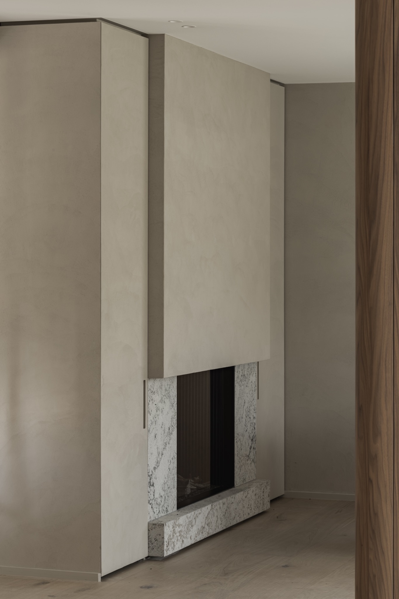
Elsewhere, the wall surfaces stay quieter. Narrow recesses, black-framed openings and built-in appliances keep the kitchen line tidy, while the lower stone sections anchor the composition. This is where the room divider between living zones becomes more than a piece of joinery. It links the kitchen with the rest of the floor plan through cut-outs and transparent moments, allowing light and movement to pass while the functional parts remain organised.
Light, curtains and the long view to the lounge
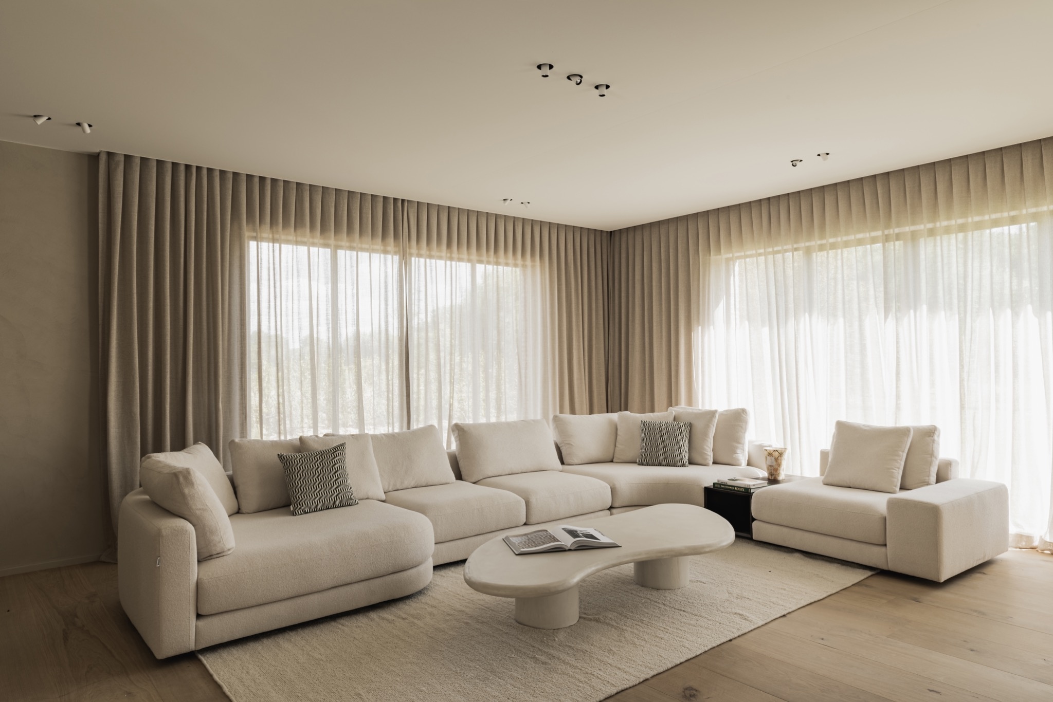
At the far end of the main space, tall beige curtains soften the large openings and stretch the height of the room. Their vertical folds slow the light and keep the interior from feeling hard-edged. In front of them, a pale sofa and low table sit within a wide field of floor and wall, which makes the lounge read as part of the same sequence rather than a separate, closed sitting room. The transition is quiet, but it is clearly drawn.
That same calm line continues along the kitchen wall. White fronts, darker built-in elements and the stone worktop sit beneath the exposed timber ceiling, so the room carries both the older roof structure and the newer joinery in one view. The project stays close to its brief: a renovated farmhouse interior that connects old and new through openings, beams and materials, without losing the distinction between the original house and the extension beside it.
Seen across the whole plan, the spaces rely on proportion as much as on finish. The connection between kitchen, dining area and lounge is not handled with one large gesture, but with several smaller ones: a changed ceiling line, a filtered opening, a curved partition, a strip of stone, a steel frame, a beam left visible. Together they keep the interior open and legible, while the older farmhouse character remains present in the structure above and in the way the rooms are divided.
Want to see more of Laura Calleeuw? View the page of Laura Calleeuw for even more great projects and company information.



NEW 2026 Jubileum Edition The Best Interior Designers Benelux
Order Now €125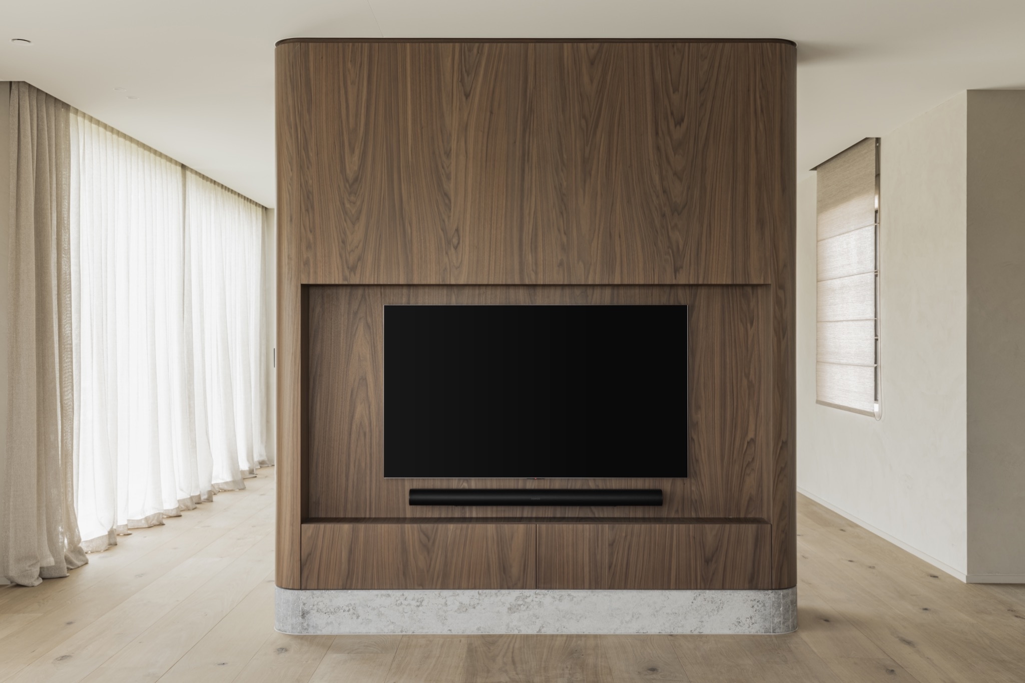
NEW 2026 Jubileum Edition The Best Interior Designers Benelux
Order Now €125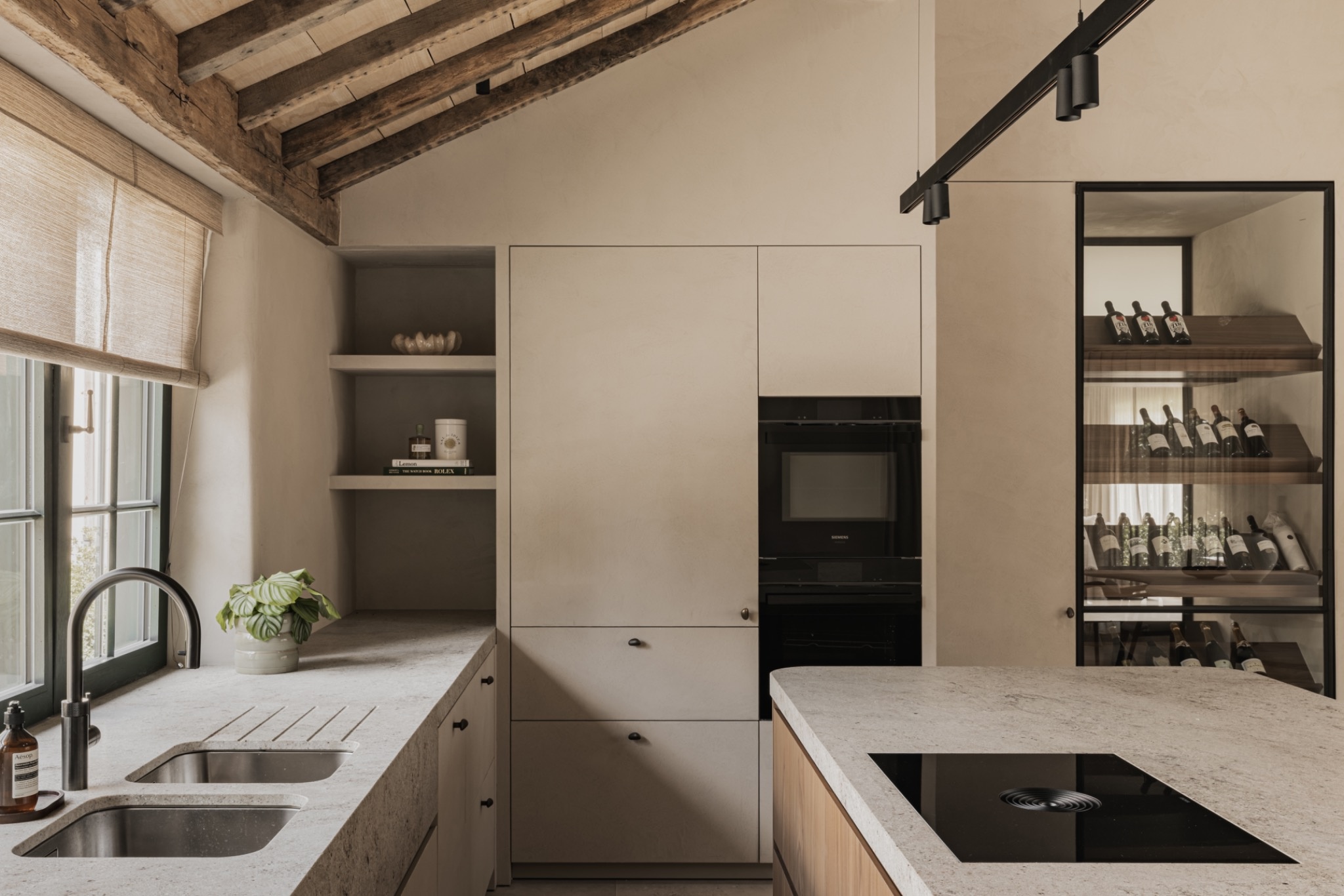
NEW 2026 Jubileum Edition The Best Interior Designers Benelux
Order Now €125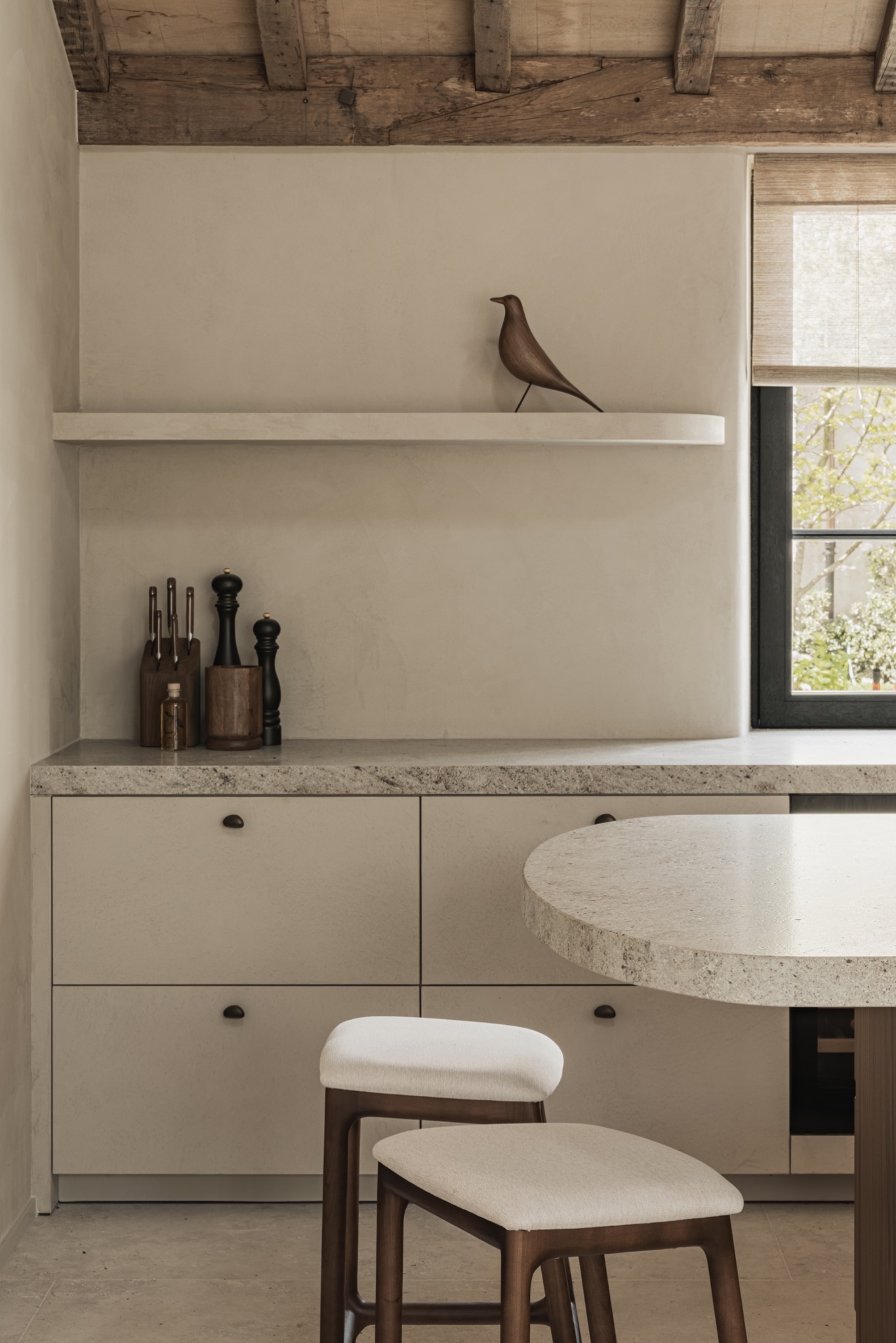
NEW 2026 Jubileum Edition The Best Interior Designers Benelux
Order Now €125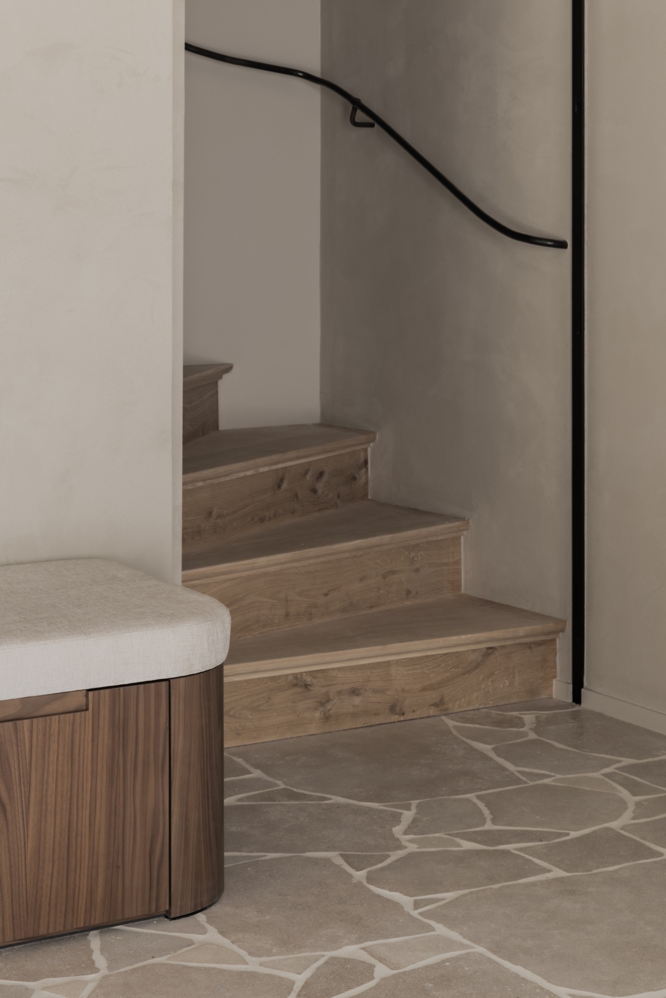
NEW 2026 Jubileum Edition The Best Interior Designers Benelux
Order Now €125