Pre-war villa interior with modern custom details and patterned finishes
High ceilings set the pace here. Decorative trim traces the rooms, while pendant lights hang low enough to draw attention to the table, the floor pattern, and the way daylight reaches the corners. In this pre-war villa interior, the older shell is not left to sit quietly in the background; it frames a sequence of rooms filled with custom cabinetry, patterned tile, and surfaces that shift between white, dark wood, and stone-like finishes.
The entrance and hall establish that contrast immediately. White walls, paneling, and mouldings guide the eye upward, then back down to a tiled floor that catches the light. A single pendant with glass elements hangs in the passage, turning a practical route into a visible pause. The ceiling line stays crisp, but the room never feels bare. Every surface seems arranged to make the transition from one space to the next feel deliberate, from the first step in the hall to the open rooms beyond.
Classic lines, cleaner surfaces
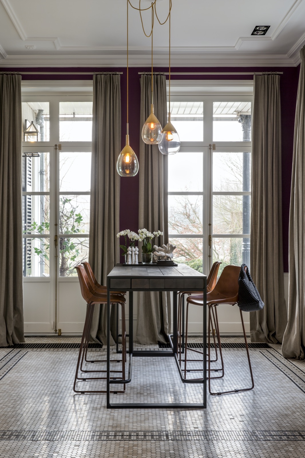
What stands out in the dining zone is the height. The room opens around a rectangular table, with multiple pendant lights suspended above it and high windows dressed with curtains. The lights have glass elements that soften the fixtures without hiding their structure. Below, a geometric tile floor adds another layer of pattern, but the room stays restrained because the palette is kept close: white, pale stone, dark accents, and the warm tone of wood in the table and adjoining details. It reads as a classic modern interior without leaning on either side too hard.
The table sits almost as an anchor between the windows and the rest of the plan. Daylight lands on the tiled floor first, then moves across the tabletop and up to the hanging lamps. That simple vertical sequence gives the room its rhythm. The ceiling trim remains visible at the edge of the frame, and that detail matters: it keeps the room tied to the villa’s original proportions while the furniture and lighting speak in a more recent language.
A modern luxury kitchen with patterned tile
The kitchen shifts the mood with darker surfaces. A wall of dark custom cabinetry gathers storage into one plane, with a niche and glass display space breaking up the mass. Instead of a flat run of units, the composition has depth: open pockets for objects, a raised section for display, and a backsplash that introduces a patterned tile surface behind the work area. The pattern keeps the kitchen from becoming too rigid, while the dark joinery gives the room its strongest line.
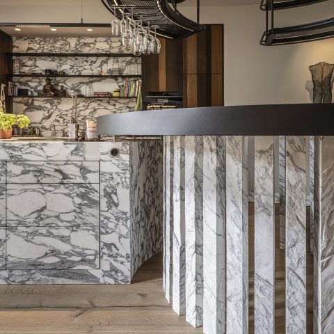
Across the middle, the island or worktop brings a lighter note. The top has a marble-like appearance, and the contrast with the dark cabinetry sharpens the geometry of the room. Wood and metal appear in smaller accents, not as decoration but as part of the room’s construction. A modern luxury kitchen with patterned tile can easily become busy; here, the materials are kept to a readable set so the cabinetry, tile, and work surface each hold their own place.
Close range: cabinetry, niche, and tile
Seen up close, the kitchen is about edges. The backsplash pattern runs behind the work zone like a textured field, while the cabinetry lines stay clean and vertical. The glass storage area catches reflections from the room, and that slight shift in brightness breaks the darker wall into sections. Even the smallest opening in the joinery changes the pace. It gives the kitchen a measured feel, not because it is minimal, but because each surface has a clear task.
Another kitchen view shows the same dark wall from a slightly different angle, with the patterned backsplash and integrated equipment drawing the eye across the frame. The island returns as a light block in the foreground, its surface reading almost like stone. Together they show how the pre-war villa interior handles contrast: the shell stays calm and bright, while the kitchen introduces denser color and a more compressed material field. The result is a room that feels edited rather than added on.
Bathroom surfaces with pattern and reflection
The bathroom continues that editing process. One wall uses a geometric patterned finish with hexagonal character, set against dark-framed mirrors and a double vanity. The basin area is pale, but the countertop reads like marble or stone, so the whole zone has a sharper, harder edge than a standard white bathroom. The round basin and round tap soften the straight lines of the mirrors and cabinet fronts, which keeps the room from becoming too mechanical.
Another bathroom view introduces a freestanding oval tub with a glass partition beside it. The arrangement is compact and open at the same time. The glass screen holds the shower space back without closing the room off, and the tub sits in front of it like a separate object rather than part of a built-in system. Horizontal blinds and ceiling spotlights appear in the background, adding more controlled lines to a room already built from rectangles, curves, and reflective surfaces.
Double vanity, dark frames, and stone-like texture
The double vanity area shows how repetition can work without feeling heavy. Two basins sit in a row beneath large mirrors divided by black framing, and the framing turns the mirror into a grid rather than a single sheet. That detail matters because it echoes the order of the cabinetry and the tiled wall behind it. The stone-like texture around the vanity gives the space weight, while the darker frames and fittings keep the composition visually contained.
In both bathroom scenes, the pattern does more than decorate. It marks the wet zones and gives those surfaces a different tempo from the rest of the interior. The pre-war villa interior depends on that kind of distinction: white wall panels in the hall, a geometric floor in the dining area, a patterned backsplash in the kitchen, and patterned wall surfaces in the bathroom. Each room has its own pace, yet the material language stays linked through wood, glass, metal, and stone-like finishes.
How the rooms connect
What ties the project together is not a single gesture but a repeated conversation between old volume and new insertions. Ceiling ornaments, panelled walls, and tall windows establish the base. Dark custom cabinetry, patterned tile, and glass lighting bring the newer layer in. None of these elements tries to overpower the others. Instead, they move from room to room in a way that lets the eye keep finding the same themes in different forms: height, reflection, pattern, and clear-lined joinery.
That consistency is what gives the interior its strength. The hall prepares the transition, the dining area stretches the volume, the kitchen compresses it with darker storage, and the bathroom opens it again through glass and pale surfaces. Seen together, the rooms form a pre-war villa interior that relies on visible structure and carefully placed detail rather than excess. The decorative trim, the pendant lights with glass elements, and the patterned finishes keep the sequence grounded in what is actually there: a house with a classical frame and a set of modern custom rooms inside it.
Want to see more of Maaike van Diemen? View the page of Maaike van Diemen for even more great projects and company information.





NEW 2026 Jubileum Edition The Best Interior Designers Benelux
Order Now €125


NEW 2026 Jubileum Edition The Best Interior Designers Benelux
Order Now €125


NEW 2026 Jubileum Edition The Best Interior Designers Benelux
Order Now €125