Kitchen with dark cabinets and glass cabinet wall
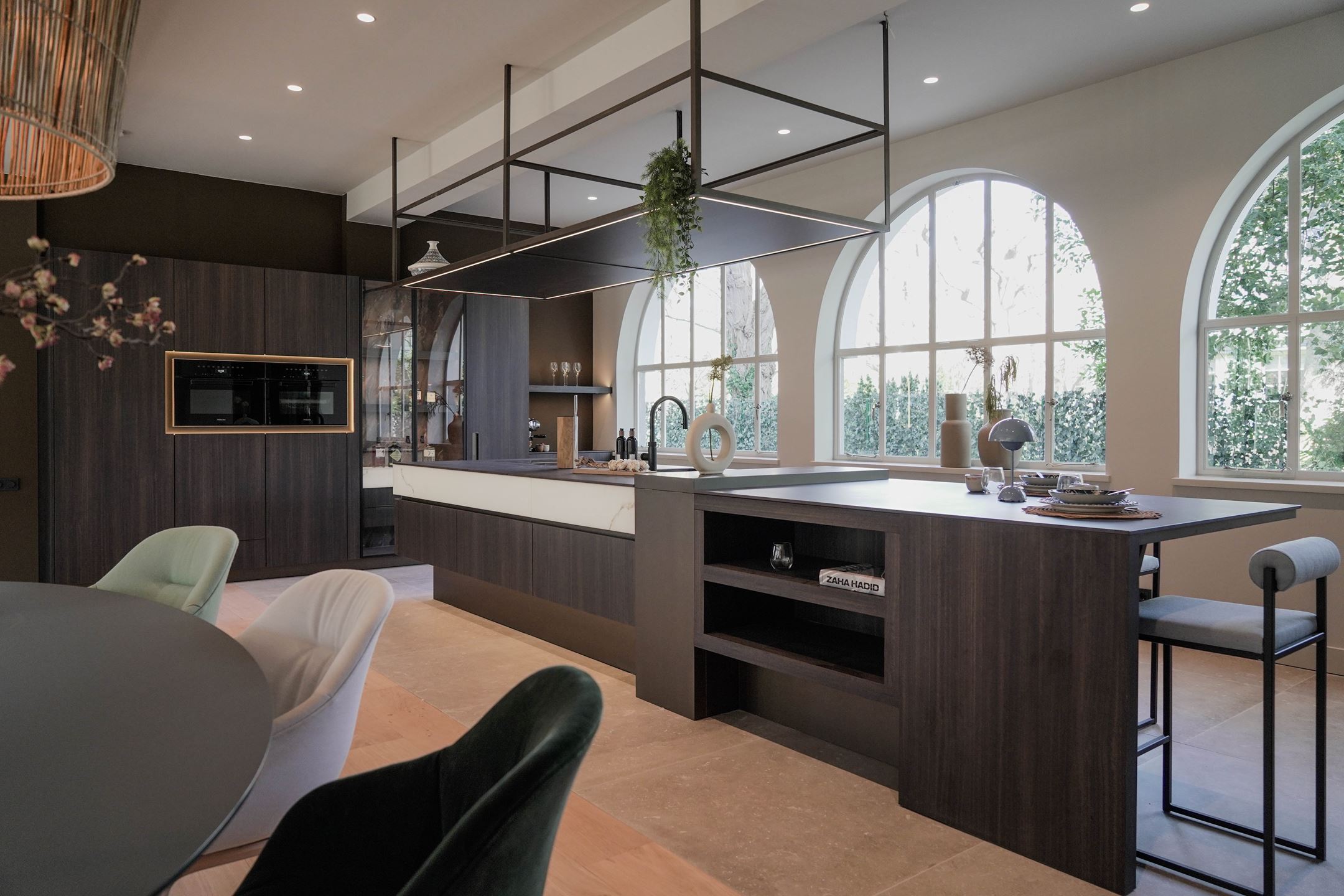
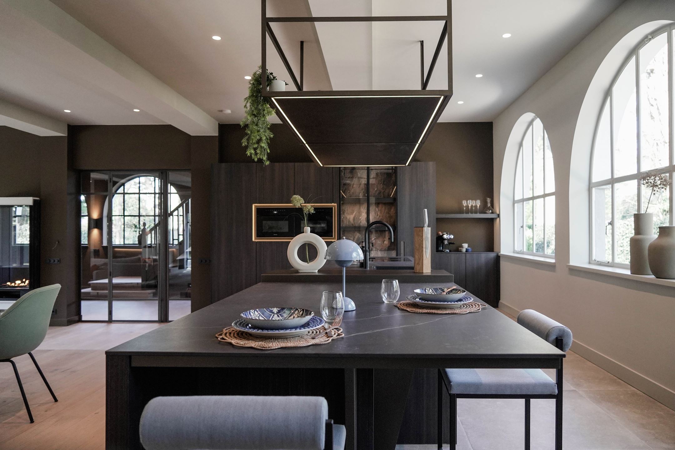
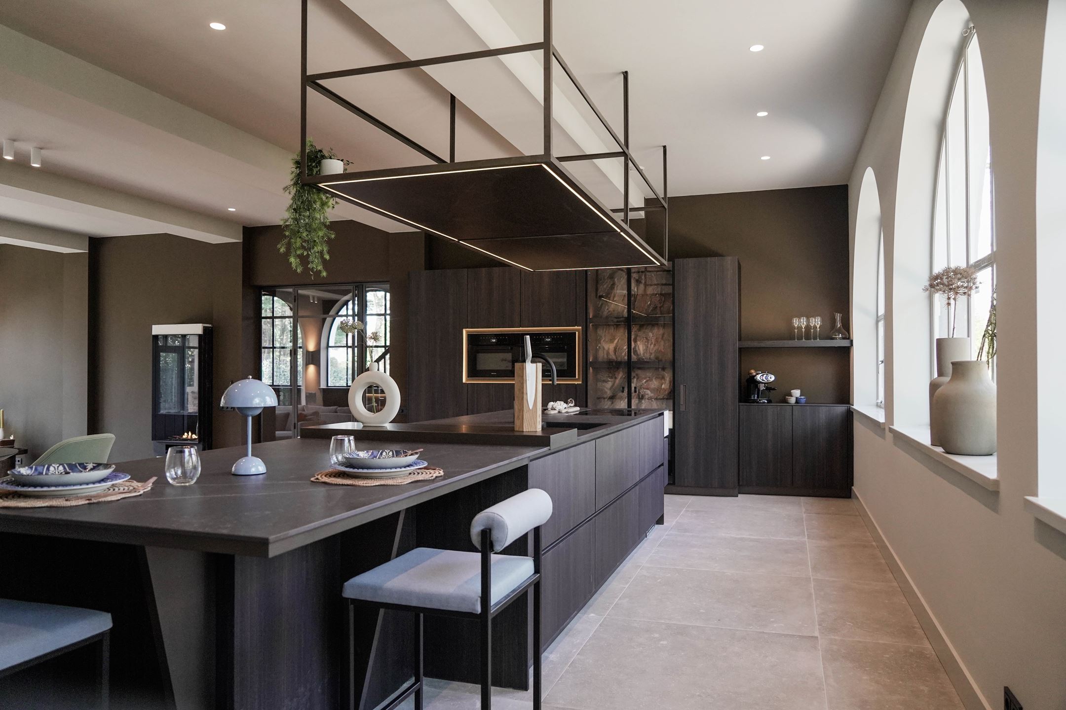
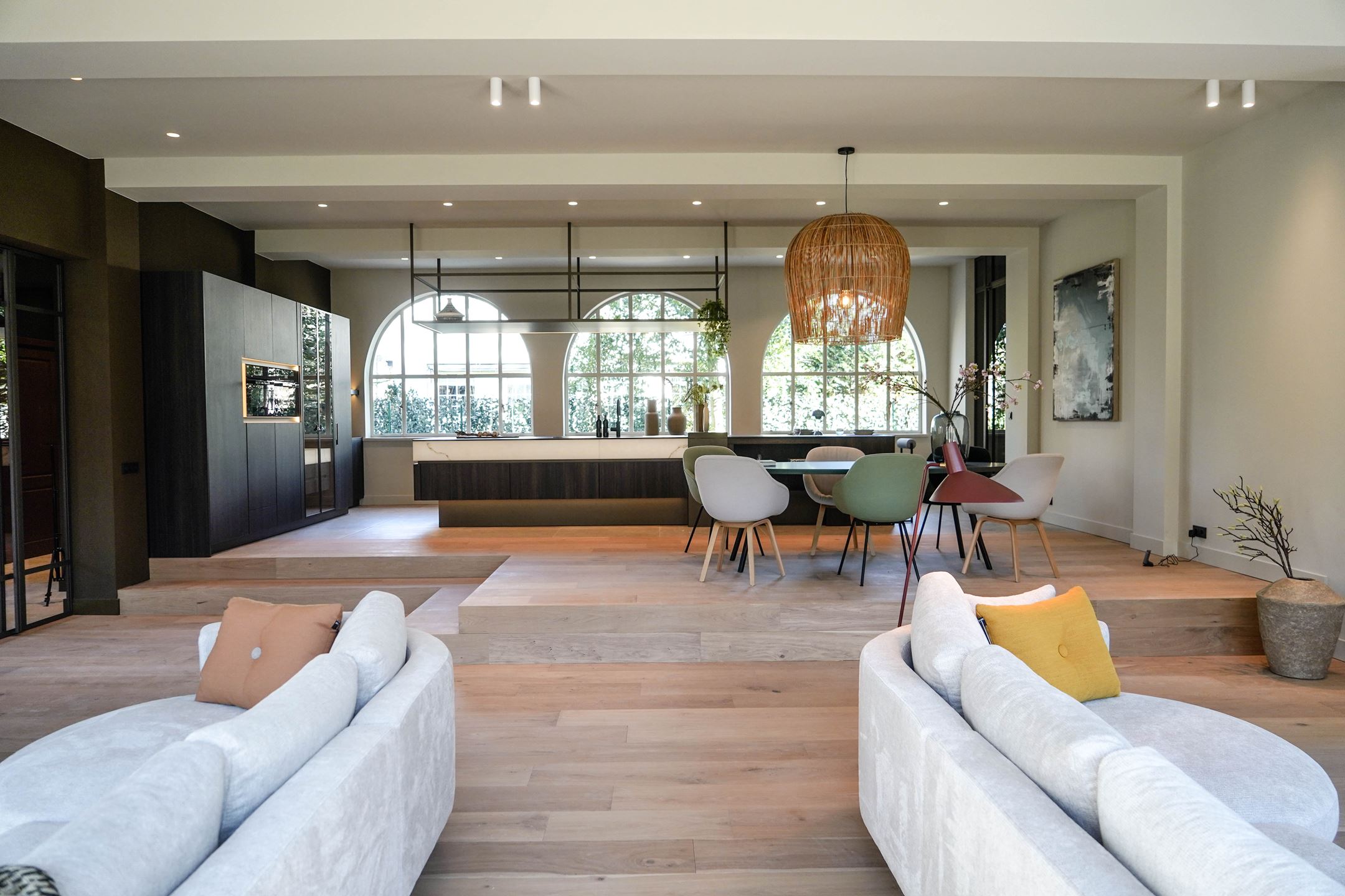
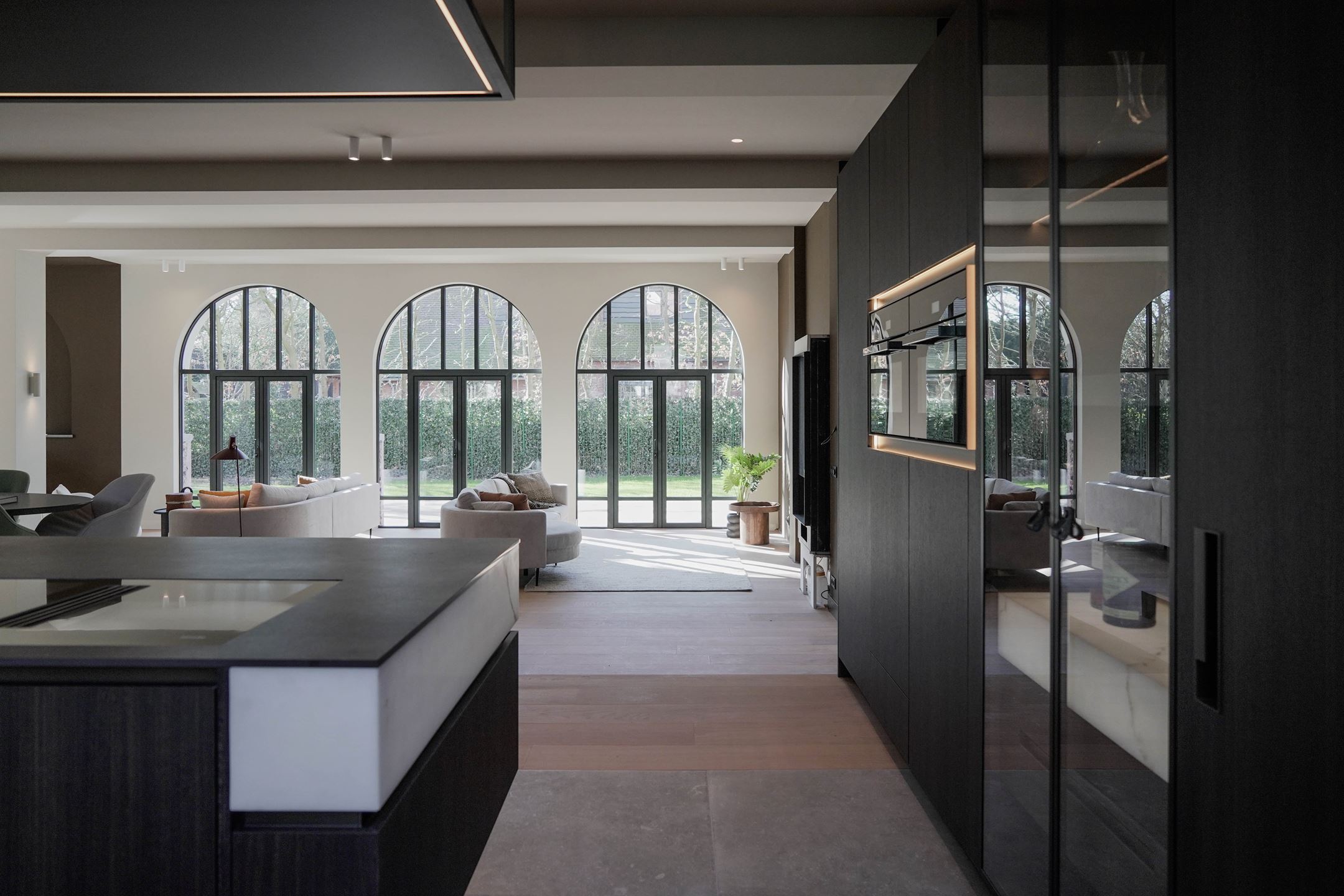
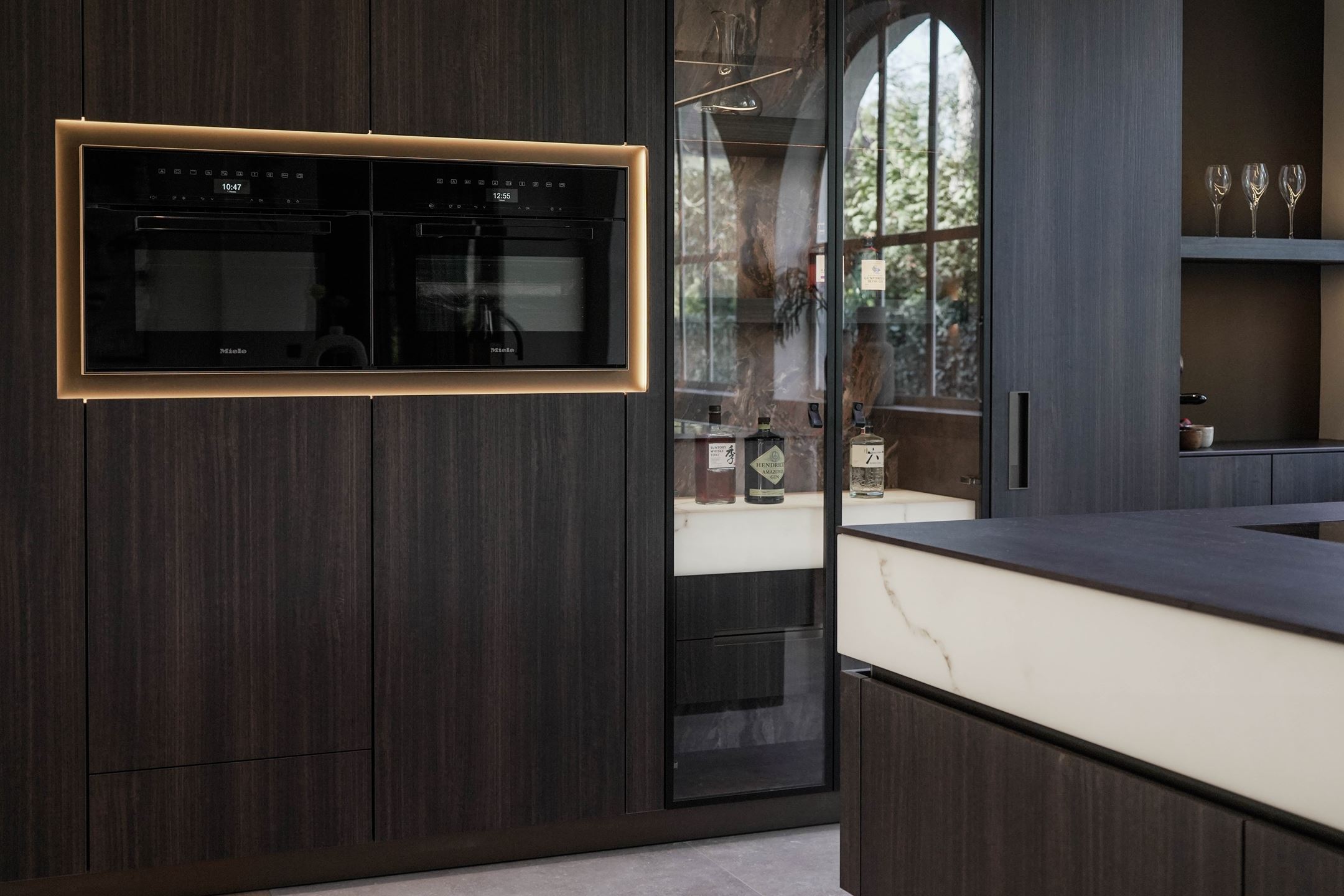
Dark kitchen cabinets set the tone immediately, with a black-framed glass section cutting through the run of fronted storage. The detail is quiet but direct: wood, glass and stone meet in one compact composition, and the opening beside it pulls the eye toward the integrated appliance niche. A stone-like countertop runs along that edge and marks the line where the cabinet wall opens up.
Black-framed glass cabinet segment
The glass cabinet wall kitchen detail is easy to read from the first glance. Transparent panels sit inside dark framing, so the contents behind them stay secondary to the grid of lines and reflections. That treatment gives the wall cabinet glass a lighter middle section without breaking the discipline of the darker fronts around it. The contrast is strongest where the glass meets the solid cabinetry, and that change in surface keeps the composition from flattening out.
Because the glass segment is set into the broader cabinet wall, it works like a pause between heavier elements. The darker units continue on either side, while the glazed part introduces depth and a slight shift in brightness. In a kitchen with black cabinets, that small interruption matters. It changes how the storage wall is read, from one continuous block to a sequence of surfaces with different weights and reflections.
Dark cabinetry as the main visual anchor
Dark kitchen cabinets give the project its strongest visual anchor. Their front surfaces absorb more light than the surrounding materials, so the eye lands on the cabinetry before anything else. That effect is reinforced by the straight lines of the run and the measured proportions of the doors. Nothing is exaggerated; the cabinet fronts simply hold the composition together and make the opening in the wall read more clearly.
The wood tones visible in the detail soften that darkness without changing its impact. They appear in a restrained way, mostly as a material layer behind the more dominant fronts and glass. The result is not about decoration. It is about how the darker planes, the reflective glass and the stone-like worktop relate to one another across a short span of wall.
Built-in oven fridge niche in the cabinet wall
The built-in oven fridge niche sits as a deliberate opening within the cabinet wall. Instead of standing apart, the appliance zone is framed by the same storage logic as the rest of the composition. That makes the niche read as part of the wall rather than as a separate insertion. The clean outline of the opening gives the eye a clear stop between closed storage and the recessed technical zone.
What stands out here is the way the niche is held by surrounding cabinetry. The vertical edges are precise, and the recess is deep enough to register as a distinct bay. In a kitchen with black cabinets, that built-in zone adds another layer of order to the layout. The wall does not simply store; it also houses the appliances within a defined architectural frame.
Stone-like kitchen countertop along the opening
The stone-like kitchen countertop traces the lower edge of the opening and brings a lighter surface into the scheme. Its texture reads as firm and dense, which suits the straight run beneath the cabinet wall. The countertop does not try to dominate the view. It works as a line that connects the dark storage, the recessed niche and the glazed segment above it. That horizontal move is what steadies the whole detail.
Seen beside the darker fronts, the worktop gives the composition a practical base. It also helps define the depth of the opening, because the change from vertical cabinet face to horizontal surface is sharply visible. The stone-like finish is one of the clearest cues in the image, and it links the wood, glass and dark cabinetry into a readable sequence of materials.
Wood, stone and glass in one cabinet wall
The material mix stays focused: wood, stone and glass are the only notes that need to be heard. Each one plays a different role. Wood adds tone behind the fronts, stone defines the working edge, and glass breaks the mass of the wall cabinet with a more open segment. Because the palette is limited, the details become more legible. You notice how the black profiles around the glass sharpen the view, and how the countertop ends the run with a hard line.
That restraint gives the project its strength. The kitchen wall is not crowded with detail; it is built from a few clear elements arranged with care. The dark kitchen cabinets carry most of the weight, but the glass cabinet wall kitchen segment and the built-in oven fridge niche keep the composition from becoming uniform. Each part has a visible job, and the whole reads through those parts rather than through decoration.
A compact detail with clear depth
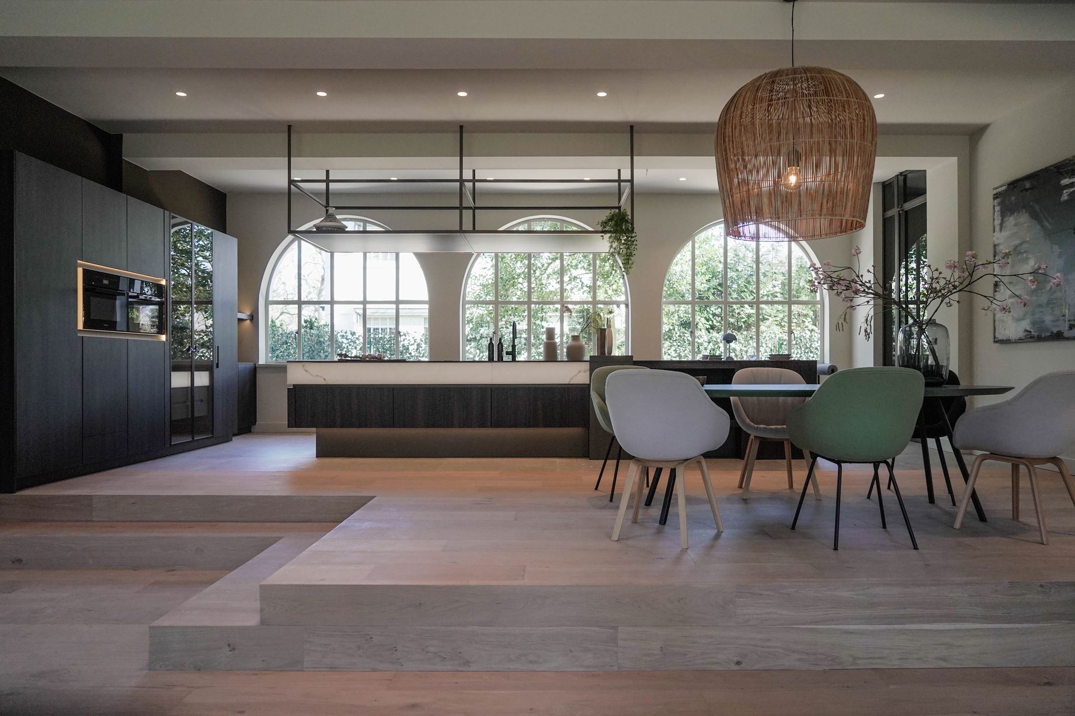
The opening in the cabinet wall gives the kitchen its sense of depth. From one angle, the dark fronts read as a flat plane; from another, the glazed section and recessed niche pull that plane inward. The countertop extends across the lower edge, so the eye can trace the full movement from solid to open to solid again. That shift is small, but it changes the way the kitchen with black cabinets is understood.
What remains after that first reading is the precision of the layout. The lines are straight, the materials are limited, and the transitions are controlled. In a short detail like this, that control matters more than scale. The wall cabinet glass, the integrated appliance niche and the stone-like kitchen countertop all work together to make the cabinet wall readable at a glance, while the dark kitchen cabinets keep the composition grounded.
Want to see more of TK Studio? View the page of TK Studio for even more great projects and company information.


NEW 2026 Jubileum Edition The Best Interior Designers Benelux
Order Now €125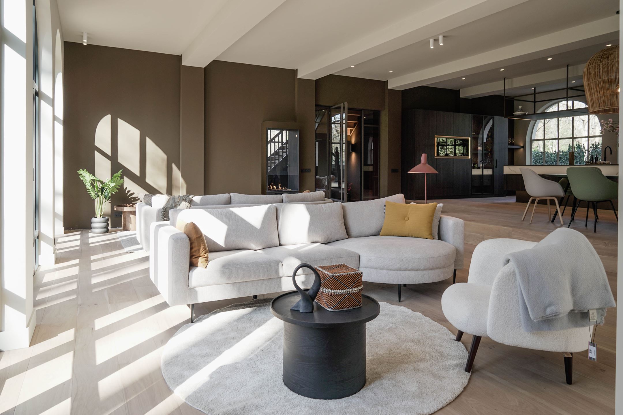
NEW 2026 Jubileum Edition The Best Interior Designers Benelux
Order Now €125