30s-style house
Red brick and dark roof tiles set the tone before the front door even comes into view. The arched opening gives the entrance a soft outline, while the white window frames cut through the brickwork and keep the elevation from feeling heavy. It reads as a 30s-style house with a clear link to that period, yet the overall impression is lighter than the familiar references suggest. Large panes and a restrained material palette pull the eye toward the living spaces behind the façade.
Brickwork, roof lines, and the arched entrance
The exterior is built from a straightforward combination of red masonry and dark tiles, but the proportions do much of the work. Deep roof overhangs sharpen the silhouette. The entrance arch introduces a rounder note, and that shape returns in the curved opening of the front door. On the driveway side, the paving sits low against the façade, so the house meets the ground in a measured way rather than with a hard edge. It is a house that relies on profile and rhythm more than ornament.
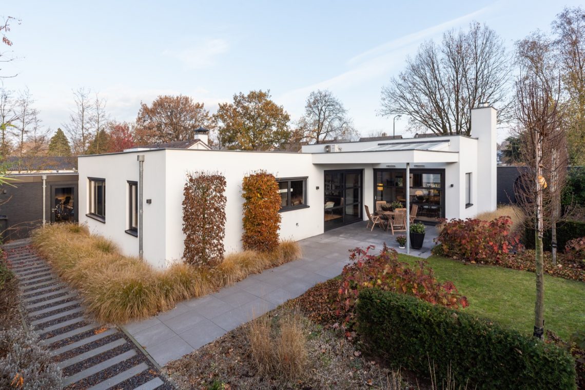
From the side and rear, the same measured language continues. Large windows and glazed openings widen the connection between inside and outside, and the gray tiled terrace sits directly against the brick walls. The pale paving reflects daylight back toward the openings, which makes the lower level feel more open. This is where the 30s-style house becomes less formal and more spatial: the masonry remains present, but glass and light take over the composition.
Large windows shape the living spaces
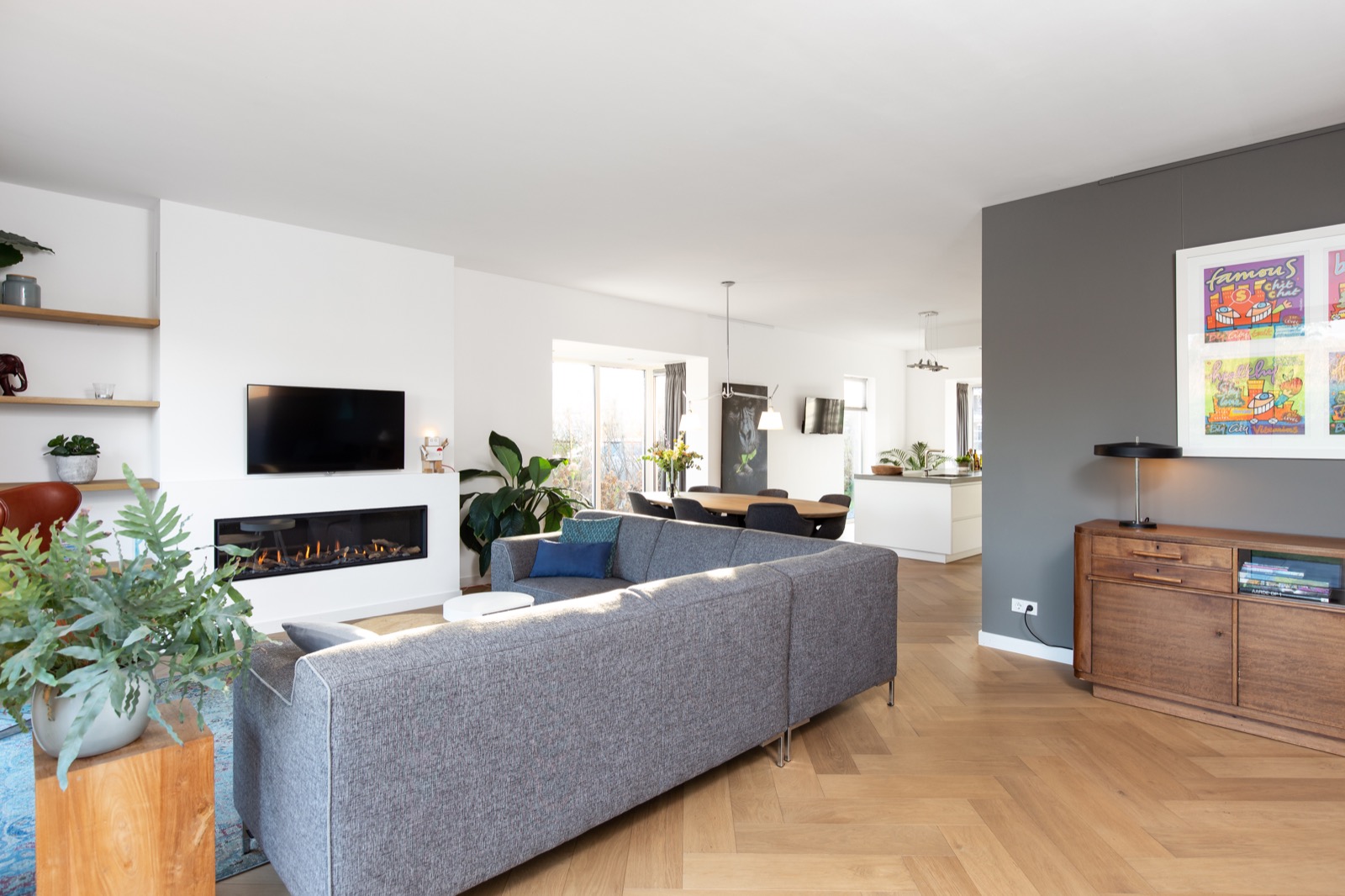
Inside, the first impression is brightness. The living room is arranged around wide openings that bring in daylight from more than one direction, and the pale walls help that light travel farther into the room. A corner sofa sits low against the space, leaving clear sightlines toward the dining area and kitchen. The room does not depend on decoration. Instead, it uses openings, wall planes, and the position of the furniture to define its calm, open character. The light living room feels connected to the rest of the house rather than separated from it.
That connection is visible in the way the rooms line up. The view moves from seating to dining, then toward the kitchen wall at the back. Darker accents appear sparingly, mostly in the fireplace zone and the frame around the television, so the room keeps its brightness. The result is not a showpiece living room, but one where circulation and sightlines matter. Even the furniture placement leaves the windows and openings readable from several points in the room.
A kitchen that stays calm and direct
The kitchen uses white fronts and a gray worktop, with the cabinet run kept level and uncomplicated. A black-glass appliance detail is set into the wall, breaking the white surface in a controlled way. Because the kitchen sits by large rear windows, the daylight lands cleanly on the counter and makes the straight lines of the cabinetry easy to read. This is a modern kitchen with white cabinets that avoids excess. The materials are few, and the layout lets the window wall do part of the visual work.
Closer in, the kitchen detail becomes more exact. The front panels are flat, the horizontal lines stay tight, and the worktop creates a clear band across the room. The black inset around the built-in appliance adds contrast without turning into a feature wall. Seen from the living area, the kitchen reads as part of one continuous interior rather than a separate service zone. That makes the transition between cooking, dining, and sitting feel direct, with little interruption from one space to the next.
White fronts, gray worktop, and a black inset
The combination of white cabinetry and a gray surface gives the kitchen its visual order. Light is reflected rather than absorbed, which suits the open layout and the large glazing behind it. The black inset adds depth where the appliance is placed, but it remains restrained. Nothing competes with the window wall. For a project page, this kitchen matters because it shows how a compact material set can hold a room together without drawing attention away from the rest of the house.
The fireplace anchors the room without closing it in
The living room fireplace sits in a white surround with a black fire opening, and the contrast is immediate. Above it, the television is placed on the same wall, turning one plane into a focal point without adding bulk. The surround stays simple, so the opening and screen remain legible as separate parts. In a room with several views toward the kitchen and dining area, that matters. The fireplace gives the seating zone a clear center while still leaving the room open to the rest of the plan. It is a straightforward built-in fireplace, and that simplicity suits the interior.
A closer image shows the fire opening almost as a line cut into the white wall. The effect is precise rather than decorative. Around it, the darker accents are limited to the inset and the television, which keeps the wall from becoming visually heavy. The rest of the living room can stay light: pale walls, a soft-toned sofa, and the reflection from the nearby windows. As a room element, the fireplace works because it organizes the wall and leaves the volume around it untouched.
One wall, two functions
Placing the television above the fireplace creates a compact wall composition. The choice saves floor area and keeps the seating zone focused toward one point, but it also means the wall has to remain visually quiet. Here, that is handled through a white surround and minimal detailing. The effect is measured rather than dramatic. You notice the black opening first, then the screen, then the way the wall frames the whole arrangement. It is a clear example of how a living room can be ordered with a few elements.
Gray tiles and wood details in the bathroom
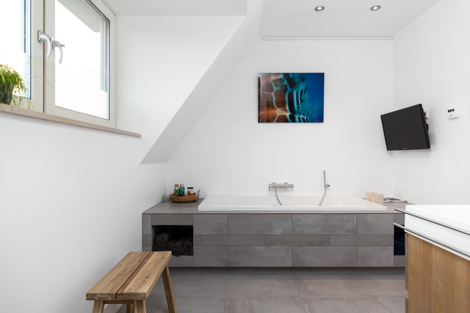
The bathroom shifts to a softer, more enclosed palette. A wooden vanity with a white basin introduces texture, while the mirrored wall above it keeps the room from feeling narrow. The shower area is tiled, and the sloped ceiling gives the space a particular outline that is easy to read in the photographs. A separate bath with gray cladding extends that same measured use of surface. The room is not large or overworked; it relies on the contrast between tile, wood, and white sanitaryware to stay clear. This is where the bathroom with wooden vanity comes through most clearly.
Seen across the room, the floor tiles continue the calm material base, and the bath edge sits low against the wall. The vanity front brings in a warmer tone, but it does not overpower the rest of the room. Light from the windows and ceiling spots catches the mirror and the glazed shower area, which gives the bathroom depth without clutter. As part of the project, it mirrors the same approach found elsewhere: direct lines, few materials, and surfaces that let the room stay readable.
The terrace outside keeps that reading going. Gray paving runs along the brick walls and beneath the glazed openings, so the transition from inside to outside is mostly a matter of floor level and light. From there, the architecture remains easy to follow: red brick, dark roof tiles, and wide window openings. The project holds those pieces together without forcing them into a formal display. If you want to explore more houses like this, the related pages on house projects, kitchen projects, bathroom projects, fireplace projects, and architecture projects offer the same kind of close reading of materials and layout.
Want to see more of Van Boven Aannemers? View the page of Van Boven Aannemers for even more great projects and company information.




NEW 2026 Jubileum Edition The Best Interior Designers Benelux
Order Now €125


NEW 2026 Jubileum Edition The Best Interior Designers Benelux
Order Now €125