Bakery interior with a round counter and Dekton worktop
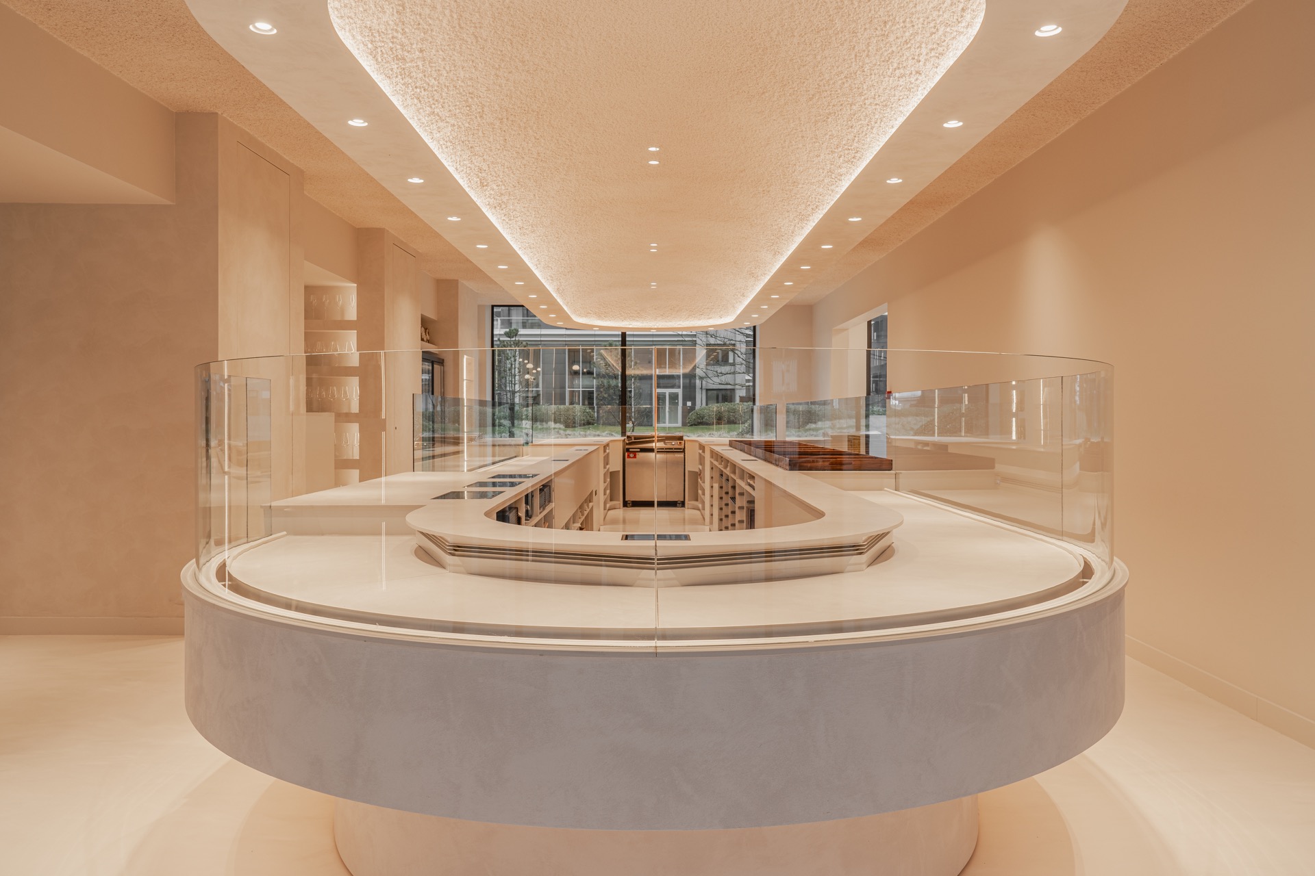
A low, round counter sets the pace of the room. Its stone-look edge catches the light before the rest of the interior settles into view: glass partitions, sand and beige surfaces, and a ceiling packed with small spotlights. The result is a retail interior design that reads through its materials rather than through decoration. At the centre, the Dekton worktop project shows how a single surface can carry the entire service zone, from display to preparation, without breaking the visual line.
The round counter as the room’s anchor
The first thing you notice is the curve. The counter turns gently through the space instead of cutting across it, and that shift changes the whole rhythm of the bakery interior. The rounded form softens the large, open footprint and gives the service area a clear focus. Around it, the surface stays restrained: warm beige walls, pale flooring, and a counter top that reads as stone without competing with the rest of the room. This is where the Dekton worktop project becomes legible at once.
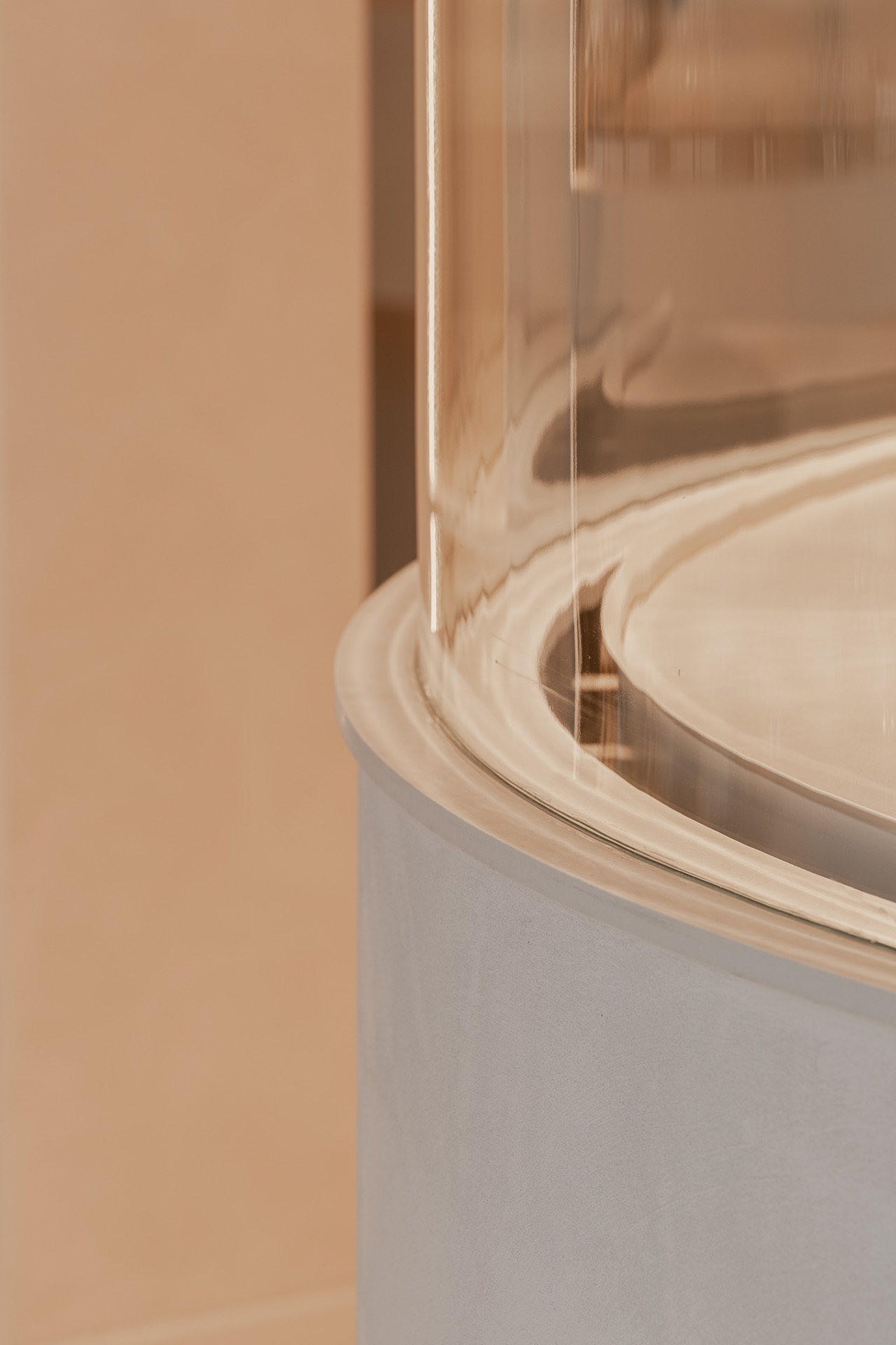
The counter volume is not treated as a separate object. It grows out of the room through continuous planes and flush transitions, with the stone-look counter edge tracing the curve in a single move. That edge is visible in several views, especially where the counter wraps toward the glass. The shape also leaves room for movement behind the work zone, so the central element stays visually strong while still feeling integrated into daily use.
Glass partitions and a clear view through the space
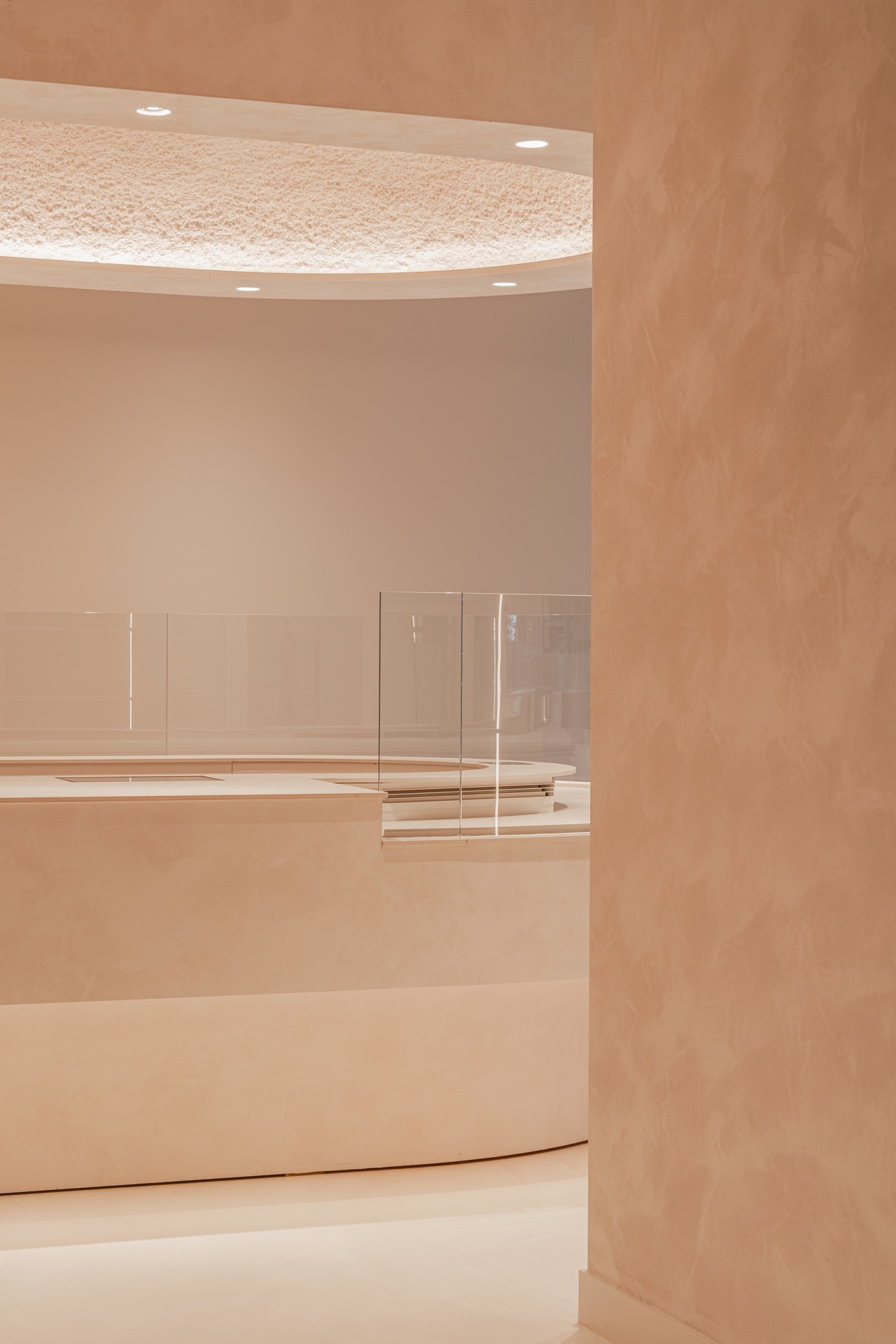
Glass partitions draw a clear boundary without closing the room. They let the eye pass from one side of the bakery interior to the other, while reflections on the panels add a second layer of movement. In the wider views, the glazing frames the counter and keeps the service area readable from multiple angles. It is a quiet spatial decision, but an important one: the transparent division allows the round counter to remain the main focal point.
Seen beside the glazing, the Dekton surface feels more precise. The material gives the work zone a crisp outline, while the glass adds lightness and visibility. Together they shape a retail interior design that depends on clarity rather than ornament. The view through the partitions also makes the ceiling detail more noticeable, because the eye picks up the repeated spotlights and the textured plane above them.
A worktop that follows the curve
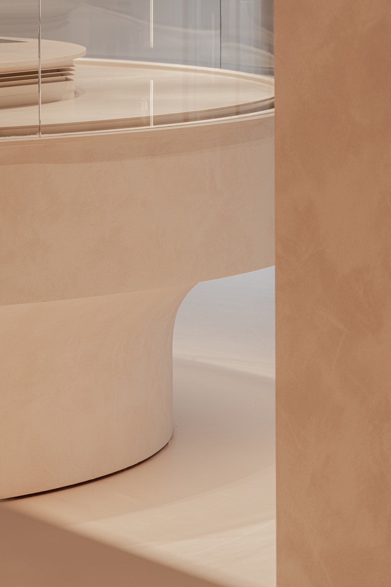
In close-up, the worktop reads as a controlled surface with a subtle stone appearance. The Albarium tone sits between silver grey and warm mineral beige, which keeps it aligned with the room’s soft palette. The rounded edges are especially important here. They follow the counter’s curve and prevent the work zone from feeling rigid. This is where the Dekton worktop project becomes more than a material choice: it is part of the geometry of the room.
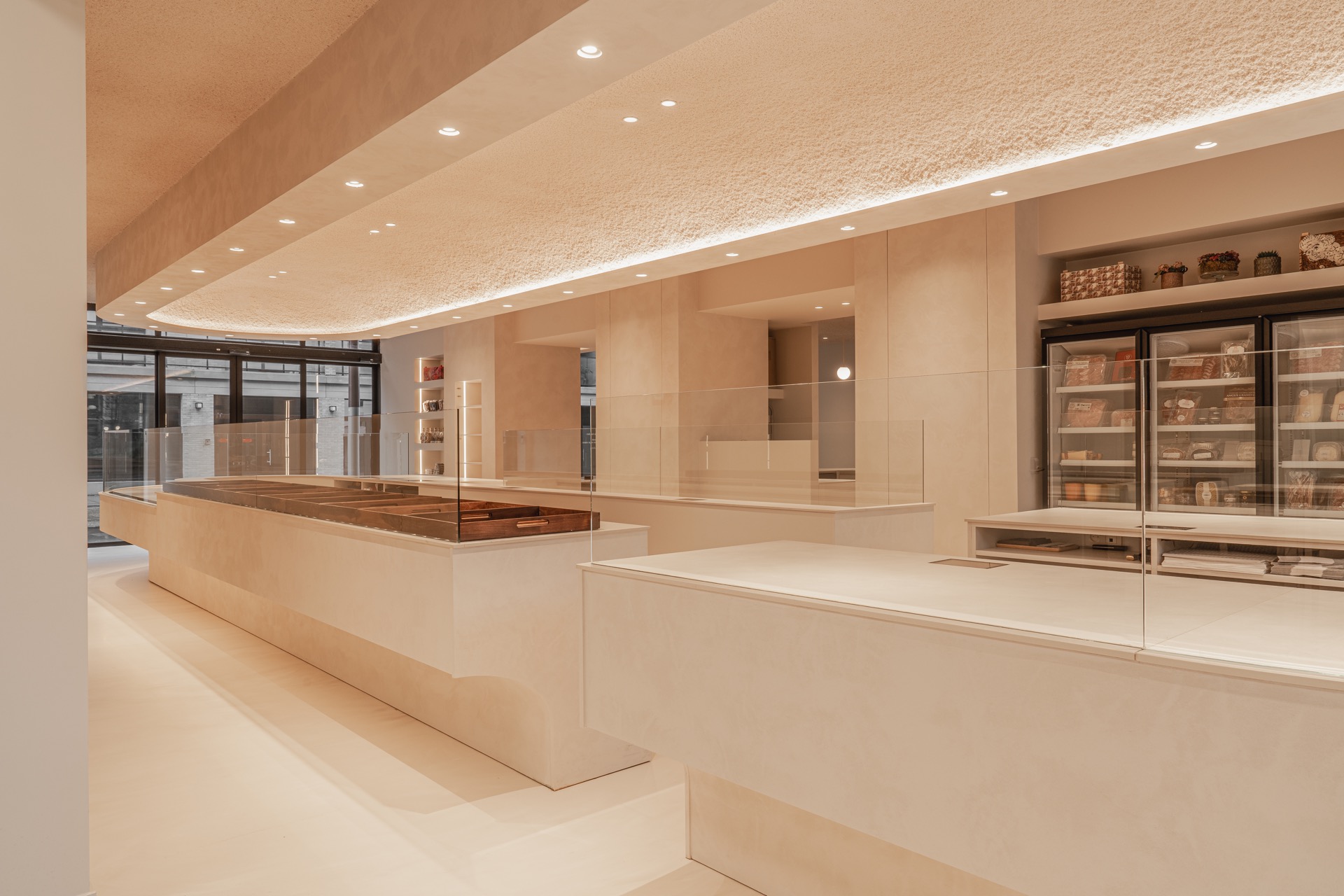
The worktop and counter surface are detailed as one continuous element, and that continuity helps the space feel composed even when seen through glass. There is no visual break between the main service counter and the surrounding work areas. Instead, the stone-look counter edge leads the eye around the perimeter and back into the centre. For a bakery interior, that matters. The surface has to hold attention without demanding it.
Warm beige surfaces and a restrained palette
The room stays close to a warm beige interior register. Sand-toned walls, light neutrals, and the muted surface of the counter keep the palette calm, but not flat. Small changes in finish do the work here: a matte wall, a reflective glass panel, a denser stone-like worktop. These shifts become visible in the daylight and under the ceiling spots. Rather than adding colour, the design builds depth through texture and tone.
That restraint suits the bakery setting. The display area, the counter, and the circulation path all remain easy to read because nothing is fighting for attention. The neutral palette also gives the round form more presence. Against the pale background, the curve stands out immediately, and the work zone reads as a clear centre rather than another fitted element. The overall effect is measured and direct, with each surface contributing to the same visual language.
Light from the textured ceiling
Above the counter, the ceiling has a textured finish with rows of built-in spotlights. The pattern gives the upper plane a stronger presence than a plain white ceiling would have, and the small lights break it up in a regular rhythm. That rhythm is visible across the room, especially where the beams of light land on the counter and glass. It brings the material contrasts forward: glossy reflections, matte walls, and the more solid look of the Dekton worktop.
The lighting does not try to become the feature. It stays embedded in the ceiling and follows the architecture of the room. Still, it changes the way the bakery interior is read. The curve of the counter sharpens under the spots. The glass partitions catch narrow reflections. The stone-look counter edge picks up a clean highlight along its line. In a retail interior design like this, light is part of the structure, not an afterthought.
Details that keep the service zone readable
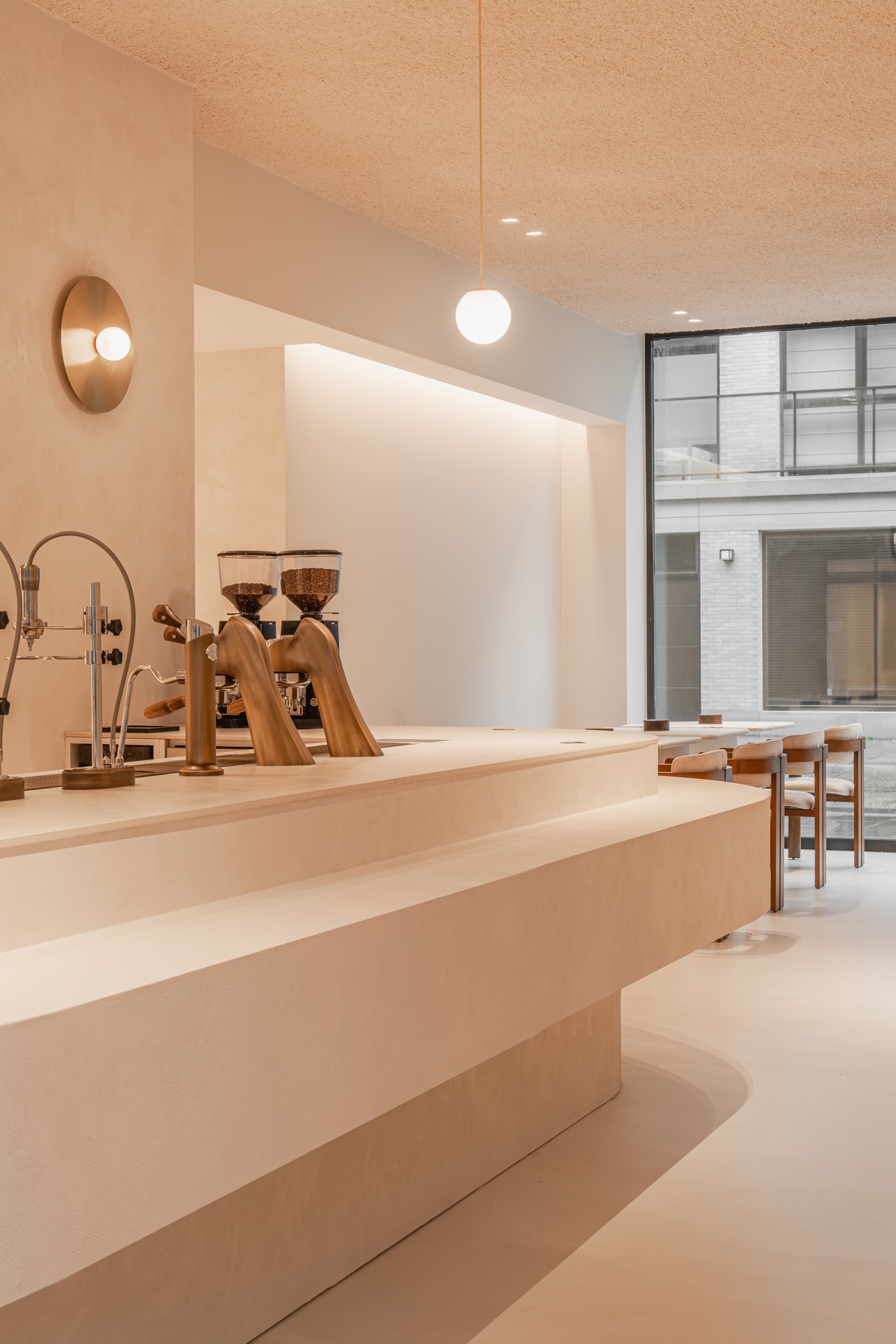
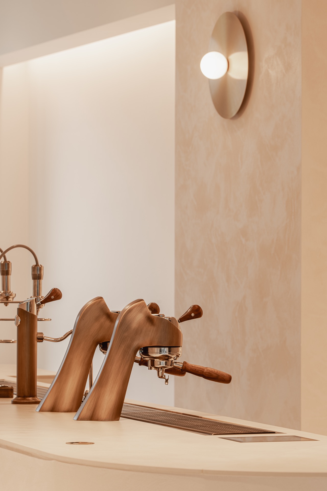
Several smaller elements support that reading. Rounded wall lamps appear in the side views, adding warm points of light near the work area. Recessed niches and cut-outs sit close to the counter, creating short pauses in the wall surface. A metallic tap detail appears in one of the close-ups, set against the same pale tones and smooth planes. These are not decorative additions. They tighten the relationship between the counter, the wall surfaces, and the working point.
The visible joins matter as much as the larger forms. Where glass meets the counter and where the stone-look surface turns a corner, the transitions are kept neat and direct. That precision helps the space stay legible from every angle. The round counter interior works because the details never interrupt the shape. Instead, they reinforce it, from the edge profile to the surrounding wall openings.
A project built around one clear centre
What stays with you is the way the room holds onto its centre. The round counter gathers the functions of the bakery into one visible point, and the Dekton worktop project gives that point its material weight. Around it, glass partitions, warm neutrals, and a textured ceiling keep the atmosphere controlled and easy to read. Nothing here feels overworked. The room relies on proportion, curve, and surface, and those three elements are enough to define the whole interior.
That clarity makes the bakery interior easy to remember. The counter shape guides circulation. The glass keeps the sightlines open. The ceiling spots pull the surfaces into focus. And the stone-look worktop ties the service zone together without becoming loud. It is a retail interior design built from visible decisions, each one tied to how the room is used and how it is seen.
Project facts in brief
Application: worktop. Material: Dekton. Colour: Albarium. Thickness: 2 cm. Counter: Integral. The project combines a central round counter, glass partitions, warm beige tones, rounded edges, and a textured ceiling with integrated spots. In the imagery, the same composition repeats from different angles, which makes the material choices easy to compare across the room. The Dekton worktop project remains the common thread throughout.
Want to see more of Cosentino België? View the page of Cosentino België for even more great projects and company information.



NEW 2026 Jubileum Edition The Best Interior Designers Benelux
Order Now €125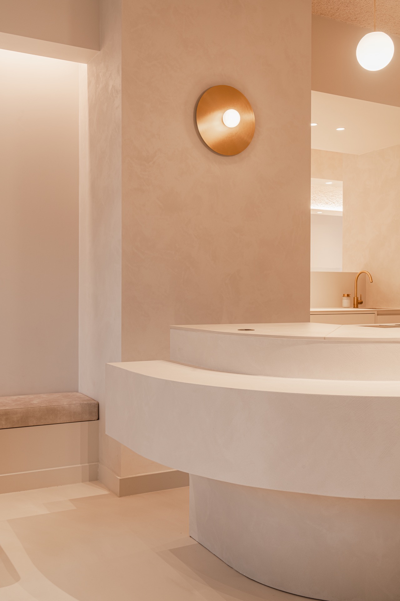
NEW 2026 Jubileum Edition The Best Interior Designers Benelux
Order Now €125