Black kitchen with marble-look countertop and island
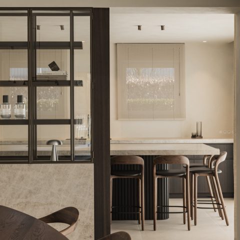
The dark fronts set the tone at once. Against them, the marble-look countertop reads as a pale, veined surface that pulls the eye across the room and onto the central island. The contrast is direct, without extra ornament. Around it, the composition stays controlled: black kitchen cabinets, a light worktop, and a layout that keeps the room open enough to read the island as the main element.
Dark cabinets and a pale work surface
The black kitchen cabinets create a solid frame for the lighter countertop. Rather than disappearing into the background, the veining on the marble-look countertop adds movement along the edge and across the work zone. That pattern is visible in several views, including close-ups where the surface curves around the corners. The result is a kitchen that relies on contrast, not decoration, to define its character.
From the first angle, the materials do most of the work. Dark fronts, a reflective surface, and a floor in a wood tone make the room feel layered without crowding it. The marble-look countertop is used across the island and the working side, so the same surface keeps returning as a visual thread. That repetition ties the different views together and makes the island design feel part of one clear plan.
The island as the centre of the room
The island sits low and broad in the middle of the kitchen, with a dark base and a pale top that extends beyond the cabinet line. Its size gives the room a clear axis. On one side it works as a preparation zone; on the other, it reads as a piece of furniture within the space. The island design is not presented as an isolated object but as the anchor around which the rest of the kitchen is arranged.
Seen from a wider angle, the island also separates the kitchen from the dining area without closing it off. Chairs and a table appear in the background, while the island keeps its own presence in the foreground. That shift in depth matters. It shows how the layout handles movement through the room, with the central block holding the eye while the surrounding zones stay readable. The black kitchen gains structure from that single piece.
Work zone placed along the window
At the window side, the sink area by window brings daylight right onto the countertop. Horizontal blinds soften the light and give the glass a measured rhythm. The work surface runs directly beneath the opening, so the kitchen feels connected to the exterior view without relying on large gestures. The line of the sill, the blind slats, and the pale stone-look top all sit close together, which keeps the zone practical and visually restrained.
The window treatment matters here. The blinds break up the tall opening and sit neatly above the worktop, keeping reflections under control. In this part of the room, the black kitchen cabinets are lower and more compact, letting the surface and the window share attention. It is one of the clearest places to see how the kitchen handles light: daylight from outside, glossy reflections from the surface, and a steady band of shade from the blinds.
Lighting that defines the ceiling
Recessed ceiling spots run across the ceiling in a regular pattern. They do not compete with the cabinetry or the island; instead, they map the room and keep the surfaces legible after dark. In the photos, the spots are spaced to support both the centre of the room and the edges near the walls. The effect is practical, but it also sharpens the geometry of the kitchen, especially over the black fronts and the lighter worktop.
Warm wall lighting adds another layer. The golden tone of the fixtures sits against the darker finishes and the tiled surfaces, introducing a softer note without changing the clear palette. Because the light is placed at wall height, it picks up texture in the glossy tile backsplash and gives the room a second reading beyond the ceiling spots. The kitchen remains calm, but the surfaces now respond differently as the light shifts across them.
Tiles, edges, and reflected light
The glossy tile backsplash appears in smaller sections, but it plays an important role in the composition. Its reflective surface catches both the spot lighting and the warmer wall light, so the back wall never feels flat. In some views the tiles read as a mosaic-like field; in others they appear as a more linear block pattern. Either way, they introduce texture between the dark cabinets and the pale countertop, adding depth where the work zone meets the wall.
Several detail shots focus on the edge of the marble-look countertop. The rounded corners and the visible veining make the material feel deliberate rather than decorative. These close views also show how the surface turns around the island and the sink area by window. It is a useful reminder that the kitchen’s visual strength comes from the way its parts are joined: cabinet line, edge profile, tile surface, and the clean break between dark and light.
How the room reads from one view to the next
Across the wider images, the kitchen keeps its own rhythm. A tall black unit appears beside the main working zone, then the eye moves to the island design, and from there to the dining table in the background. The transitions are easy to follow because each material has a clear role. Black kitchen cabinets hold the perimeter, the marble-look countertop marks the active zones, and the wood floor grounds everything with a quieter tone beneath.
That sense of order comes from the way the surfaces are repeated, not from any extra decoration. The same countertop surface appears in several places, the blinds return beside the windows, and the ceiling spots carry the same spacing from one frame to the next. In a black kitchen like this, those repeats are what give the room its clarity. The result is a project that is easy to read in photographs and equally direct in the details on the wall, the ceiling, and the island.
Seen in detail: veining, metal, and finish
Closer views reveal the quieter parts of the composition. The veining in the marble-look countertop is more visible at the edges, where the stone-like pattern shifts across rounded corners and straight runs. The black surfaces nearby are smoother and less expressive, which lets the countertop carry more of the visual movement. Even the wall lighting takes on a decorative role only through reflection, not through shape. It is the finish of each surface, rather than ornament, that gives the kitchen its depth.
For readers looking at the project as a portfolio example, the appeal lies in that measured contrast. The room shows how a black kitchen can be built around a few well-judged elements: dark fronts, a marble-look worktop, a central island, recessed ceiling spots, and blinds that regulate the daylight at the window. Nothing here feels overstated. The surfaces stay close to their function, and the composition lets each one be seen clearly.
Want to see more of Diepeveen Keukens en Badkamers? View the page of Diepeveen Keukens en Badkamers for even more great projects and company information.




NEW 2026 Jubileum Edition The Best Interior Designers Benelux
Order Now €125


NEW 2026 Jubileum Edition The Best Interior Designers Benelux
Order Now €125


NEW 2026 Jubileum Edition The Best Interior Designers Benelux
Order Now €125


NEW 2026 Jubileum Edition The Best Interior Designers Benelux
Order Now €125