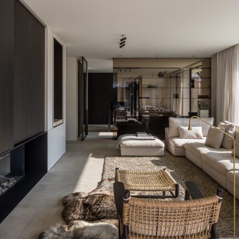
Bright minimalist loft for living & working with 15–25 meter sightlines and clear lines
Light travels far in this bright minimalist loft, and the long view is part of the room’s logic. Sightlines run from 15 to 25 meters, so every opening, wall edge and cabinet line has to hold its place. The result is a home renovation that feels measured rather than decorated, with daylight doing most of the work. The interior keeps the focus on movement through the space, not on display. Views stay open, and the plan leaves room for both living and working without breaking the line of sight.
Long views shaped by the site
The design takes its cues from what was already there: distant views, a historical background and the architectural elements present on the site. Those cues are not turned into ornament. Instead, they guide how the loft is read from one end to the other. The room stretches visibly, and the eye keeps finding the old Leie in the distance. That connection is quiet but persistent. It gives the interior a clear orientation and explains why the layout feels so open, even when the materials stay restrained.
There is no attempt to dress up the structure. The building is described as sober, with a simple but solid concrete structure and thick brick walls. That combination gives the space its weight. Against that solid shell, the bright minimalist loft interior becomes lighter in tone and line. The contrast is direct: rougher mass at the edges, cleaner surfaces inside. It is a practical way to let the interior speak without competing with the building itself.
Daylight across a minimal loft interior
What stands out first inside is the amount of light. Large openings pull daylight deep into the plan, and the brightness softens the long proportions of the room. In a minimal loft interior, that matters. The surfaces stay calm enough for the light to register on them: white walls, pale ceiling planes and clean transitions between rooms. The space does not feel empty. It feels edited, with each opening and surface chosen to keep the view moving.
The walls show a white plastered texture that catches light differently from one angle to the next. That slight grain keeps the room from becoming flat. It also works well beside the darker fixed elements, which define the edges of the interior. The white field of the walls, the light ceiling and the wood-look floor create a narrow palette, but the textures prevent it from becoming rigid. You notice the shift from smooth to rough, matte to reflective, as you move through the loft.
A white kitchen, black backdrop, and a clear working line
The kitchen stretches lengthwise and fits the plan instead of interrupting it. A white work zone sits against darker elements, including a black backsplash or rear panel that sharpens the composition. That white kitchen black backsplash contrast is more than a visual accent; it keeps the working edge readable from across the room. The kitchen reads as part of the living space, not a separate block, and its length helps reinforce the loft’s long proportions.
Several images show how the kitchen handles both storage and movement. Built-in cabinets white and black line up with the rest of the interior, their flat fronts avoiding visual noise. Plinths, panel joints and countertop edges stay close to the wall plane. The effect is practical and precise. Even the lighting follows that logic, with round and flat surface-mounted or recessed fixtures placed where the eye needs a pause rather than another object.
Storage that stays within the wall line
Built-in cabinets white and black appear as part of the architecture rather than as loose furniture. Their panel divisions are simple, and the surfaces stay flush. In one view, a pale cabinet wall sits under a ceiling spot and over a wood floor, while another frame shows an open ladder structure and recessed storage openings. These details matter because they keep the room usable without breaking the openness. The storage is visible, but it does not take over the room.
One of the smaller scenes shows a white door set into a recessed opening with rougher plaster nearby and a dark furniture zone to one side. That kind of threshold is typical of the project’s approach: different functions are present, yet the transitions remain quiet. The same applies to the work corner, where an open wooden structure sits beside a large white wall. The space can carry work, circulation and rest, but the room never loses its long, clear read.
Material contrast without excess
The palette stays disciplined: white plaster, dark kitchen elements, concrete-like surfaces, brick and wood underfoot. The floor brings a warmer note through its wood look, but it does not dominate the room. It anchors the space and gives the long plan a horizontal base. Above it, the walls and cabinetry keep the loft bright. The contrast is strongest where the black kitchen backdrop meets the white fronts, and that contrast helps define the working zone without adding bulk.
Several details repeat the project’s preference for restraint. A metal tap with curved parts stands out against a white wall and a shallow niche. A gray-toned wet room surface shows a more rugged, concrete-like texture, while the shower detail remains pared back to lines and openings. Even the bedroom corner, with narrow windows and white plastered walls, follows the same rule: the room is shaped by light and surface, not by decoration. That consistency gives the home renovation its clarity.
Rooms that remain readable from end to end
Because the sightlines run so far, each part of the loft has to support the larger sequence. The kitchen, work corner, sleeping area and wet room all sit within a frame of long perspectives and direct daylight. A large window view opens the interior to the outside, while smaller window slots in the bedroom bring in a more controlled strip of light. Together they keep the interior legible, even when the plan shifts from living to working to resting.
The project’s goal is not to add more objects, but to sharpen what is already there. That is why the lines stay clear, the surfaces stay light, and the structural reading remains visible. The concrete structure brick walls set a steady base; the interior responds with white planes, black accents and built-in elements that follow the same discipline. Seen as a whole, the bright minimalist loft turns long views, light and material contrast into the main features of everyday use.
Details that support the larger composition
Round and flat lighting units are placed with the same restraint as the cabinetry. They do not try to become decorative features. Instead, they pick out the ceiling, the kitchen edge or the wall plane and leave the room intact. A few carefully placed spots are enough to keep the white surfaces readable after daylight fades. That is especially visible near the kitchen and cabinet runs, where light has to support the long, narrow geometry rather than interrupt it.
The final impression is one of control without stiffness. There is space for work, but also for the daily movement of living with a long perspective in view. The interior remains tied to the building’s concrete structure brick walls, yet the finish inside is lighter, cleaner and more open. Held together by daylight, a white kitchen black backsplash, and built-in cabinets white and black, the bright minimalist loft keeps its focus on line, distance and use.
Want to see more of in.architectuur? View the page of in.architectuur for even more great projects and company information.



NEW 2026 Jubileum Edition The Best Interior Designers Benelux
Order Now €125


NEW 2026 Jubileum Edition The Best Interior Designers Benelux
Order Now €125


NEW 2026 Jubileum Edition The Best Interior Designers Benelux
Order Now €125


NEW 2026 Jubileum Edition The Best Interior Designers Benelux
Order Now €125