Bright modern interior with custom joinery and kitchen island
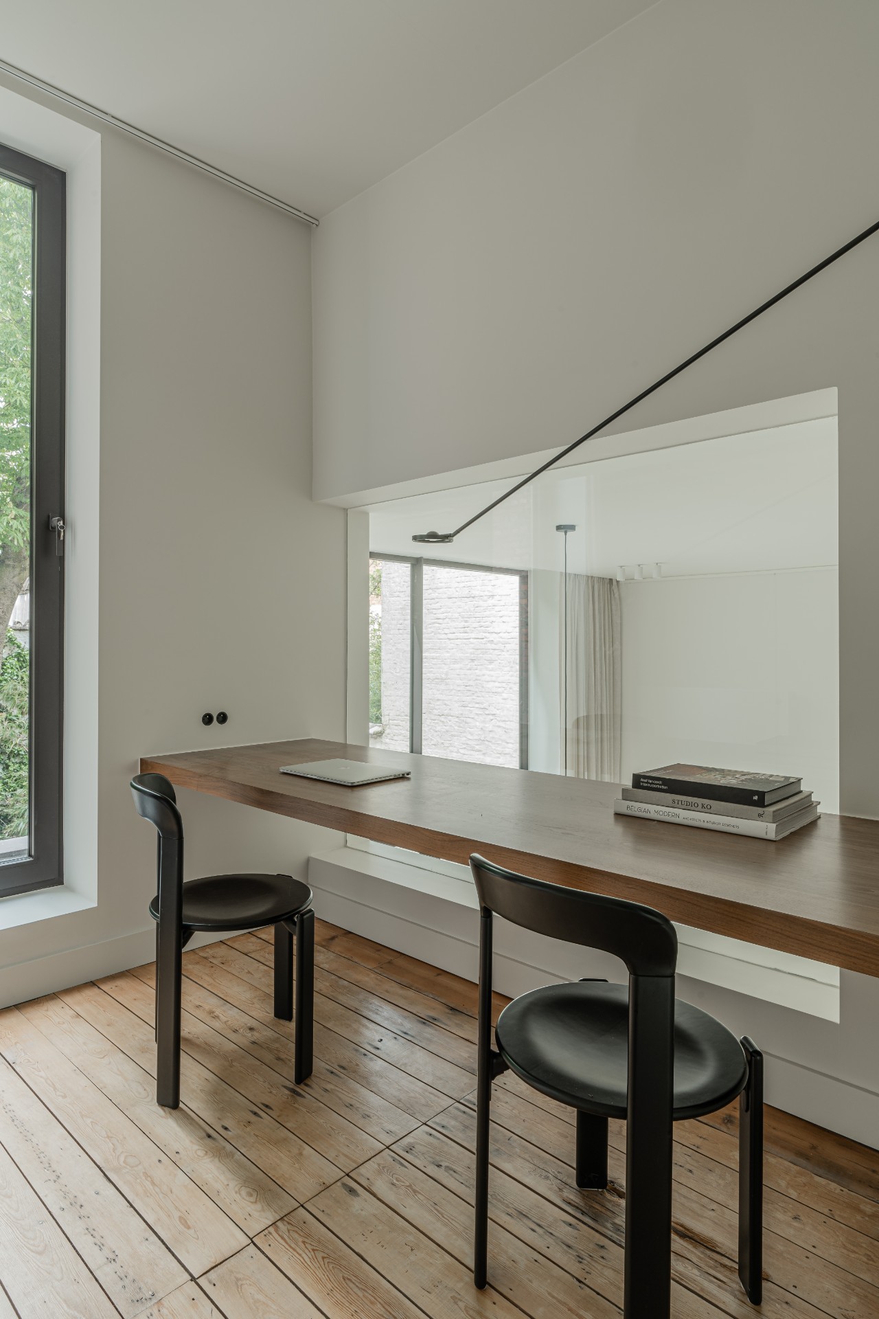
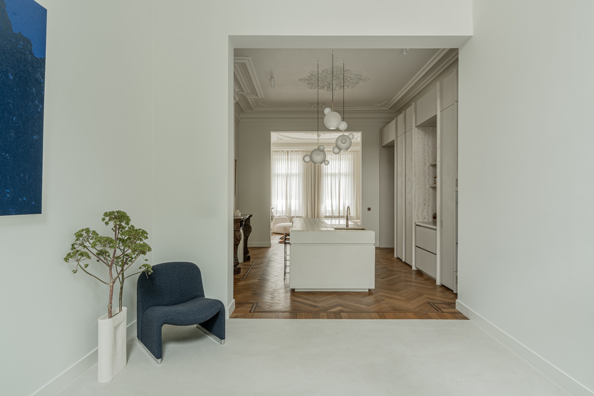
Light takes the lead from the first view inside: pale walls, a striped wood floor and tall curtains that soften the full width of the glazing. Above that quiet base, the ceiling carries profiled mouldings and ornamented edges, giving the room a more layered profile than a standard contemporary interior. The result is a bright modern interior that feels open but not bare, with detail gathered at the perimeter rather than spread everywhere at once.
Ceiling lines that frame the rooms
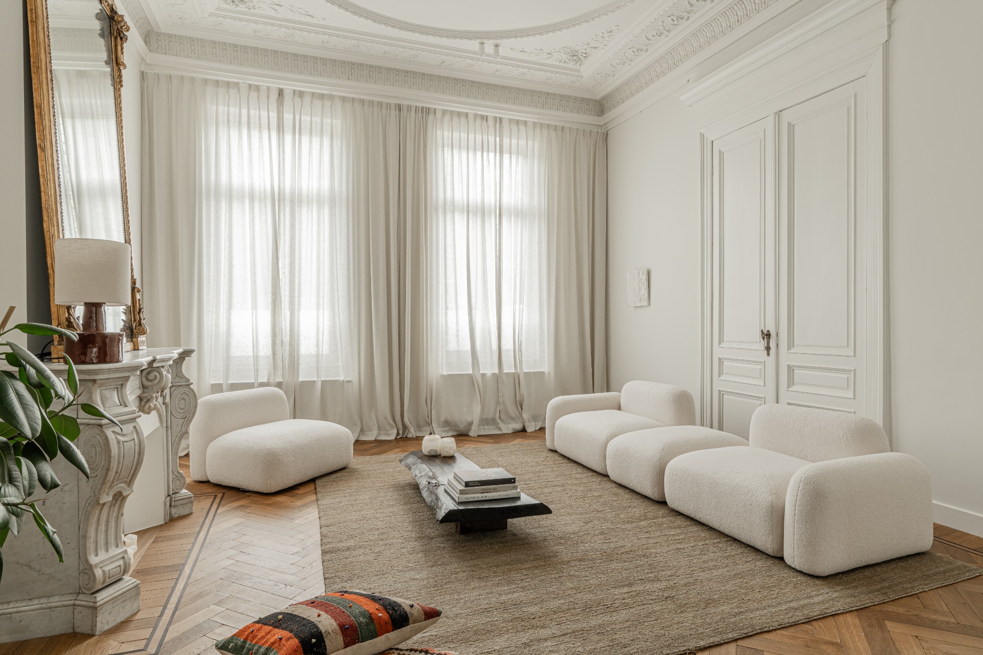
The ornate high ceilings do much of the visual work here. Their profiled bands trace the upper edge of the rooms and make the wall height feel more deliberate, especially where the pale surfaces meet the decorative trim. Instead of a single flat plane, the ceiling reads as a defined border that catches light along its edges. That framing sets the tone for the rest of the interior, where white, ecru and soft grey surfaces are broken up by a few warmer timber notes.
In the living area, the furniture keeps to the same calm register. A light-upholstered sofa with rounded lines sits low against the floor, while the curtains run almost the full wall width behind it. The fabric diffuses the garden light and leaves the room open to the outside without exposing the interior too abruptly. It is a simple move, but it gives the space its rhythm: soft textile, clear glazing, then the patterned grain of the wood floor.
Custom cabinetry built into the wall
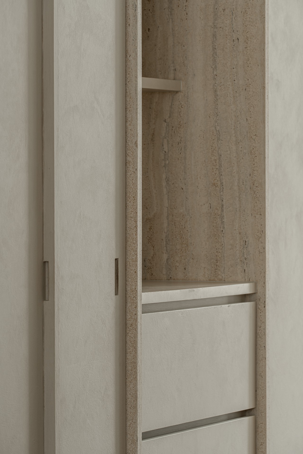
Along the kitchen and adjoining walls, custom cabinetry turns storage into part of the architecture. Open niches, shallow shelves and closed fronts are set into a light grey, concrete-like finish, so the wall surface keeps its depth even when it is not holding objects. The shelves are narrow and practical, with enough space for everyday pieces but no excess visual weight. This is where the project shifts from open living room to ordered service wall, and the change is handled quietly.
The built-in niches concrete-look treatment appears again in several details, but it never becomes decorative for its own sake. Instead, it works as a backdrop for the white joinery and the more solid kitchen volumes. The contrast between smooth painted surfaces and rougher-looking panels gives the wall a tactile edge. It also keeps the cabinetry from reading as a single block; doors, recesses and ledges each sit at a slightly different depth, which helps the room feel measured rather than rigid.
A kitchen island set at the centre
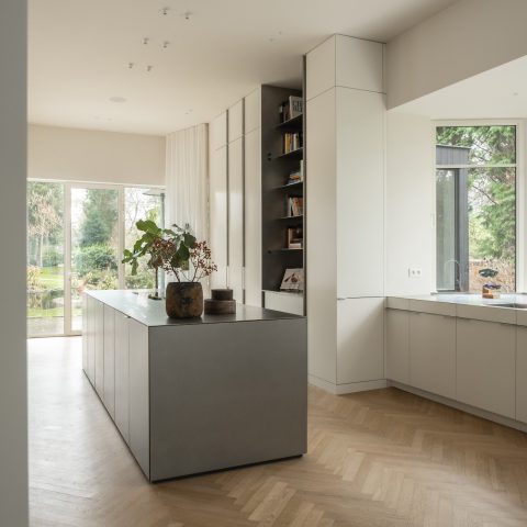
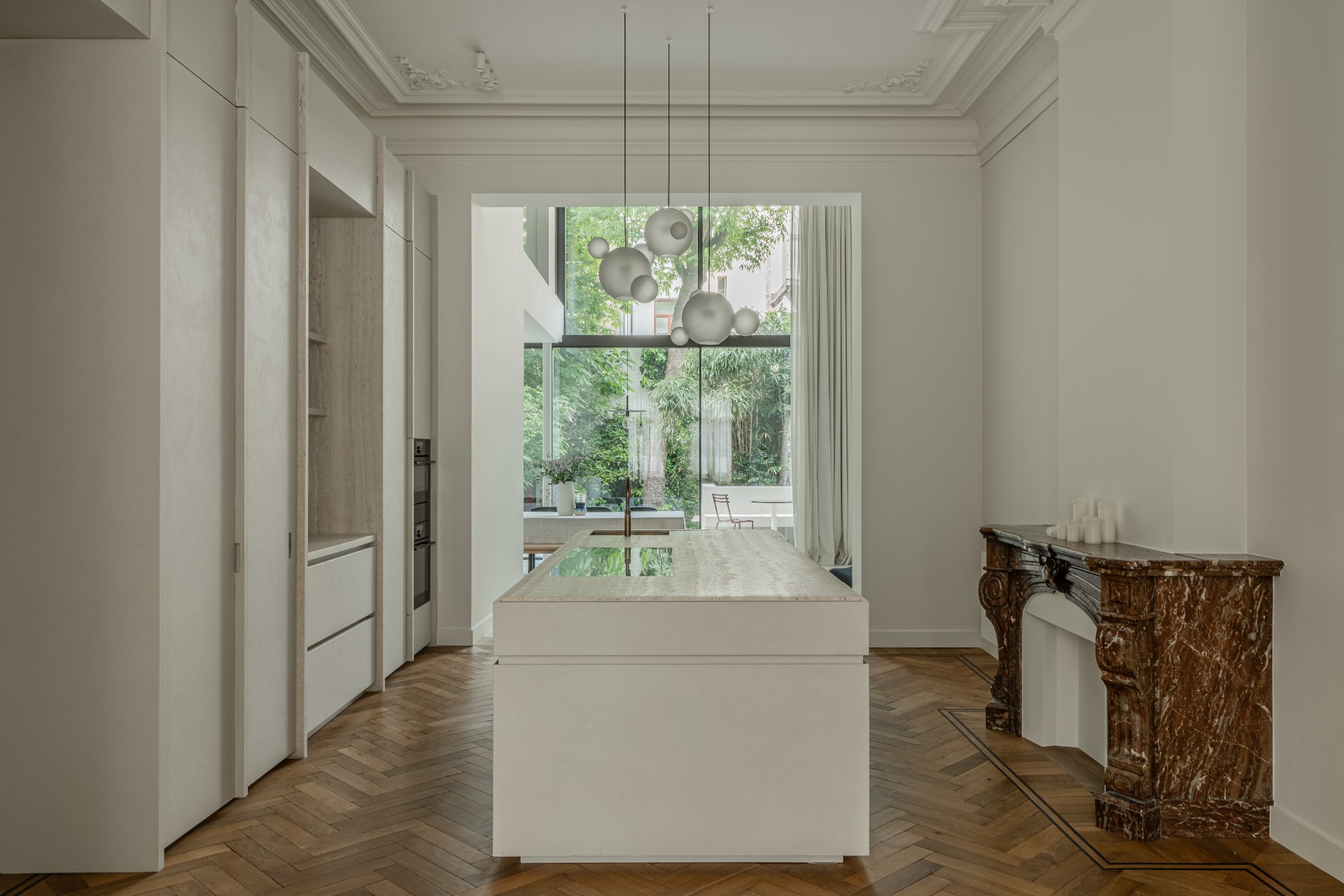
At the heart of the plan, the kitchen island anchors the room. Its white surface has a marble-look quality that catches the light in a softer way than a fully polished slab would, and the integrated sink zone keeps the working face calm. Pendant lights with round globes hover above the island and mark out the cooking area without closing it off. Around it, the floor’s linear pattern and the pale cabinetry keep the eye moving, so the island reads as the fixed point in a larger flow of space.
Because the island sits between the glazing and the storage wall, it becomes part of the route through the interior. A view toward the garden is always nearby: through the large glass doors, across the curtains, and out to the planting that runs along the exterior edge. The kitchen island marble-look finish links with the nearby light surfaces, but its role is practical first. It is wide enough to gather work, display and circulation into one place without overpowering the room.
Glass, curtains and the garden line
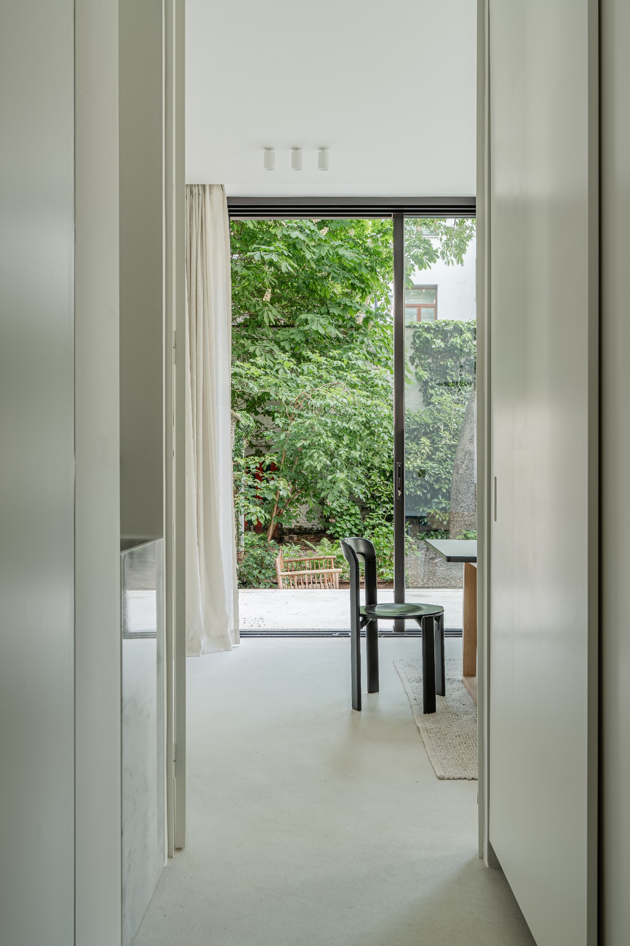
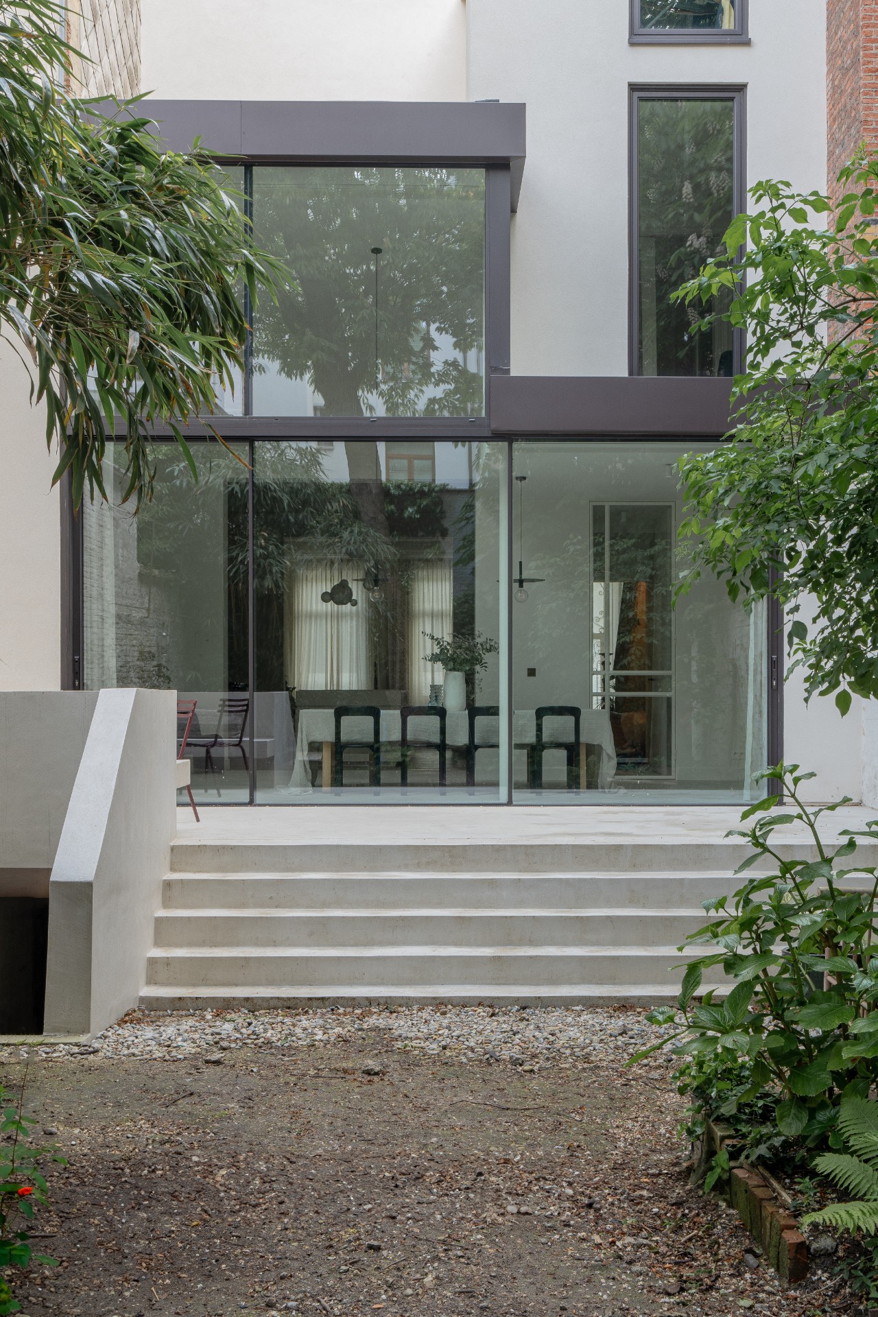
The large glass doors do more than open the house to the outside. They pull daylight deep into the plan and make the garden read as part of the interior sequence. Dark frames sharpen the edge of the opening, while the sheer curtains temper the view and stop the room from feeling exposed. From the dining side, the eye moves from the wooden table to the planting beyond the glass, then to the stone steps and built-up exterior edges that sit just outside the wall. The connection is direct, but it is filtered through layers.
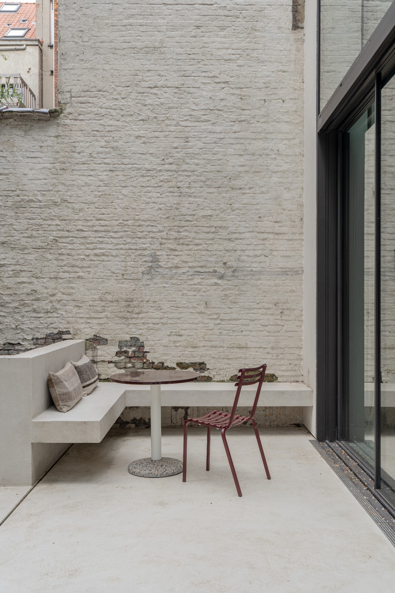
That same relationship appears in the exterior-facing views, where the glazed openings sit in a plain masonry envelope and the terrace zone is picked out by stone treads and a low built-in seat. The architecture stays restrained, leaving the glass and the planted edge to carry most of the visual movement. Seen from inside, those openings extend the bright modern interior beyond the walls without shifting the focus away from the rooms themselves.
Bathroom details in a lighter register
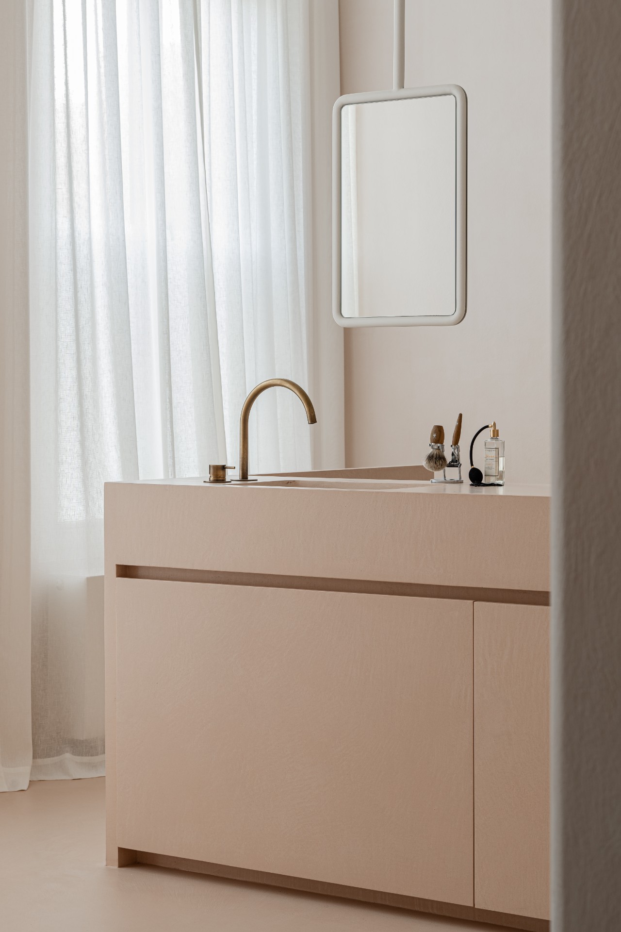
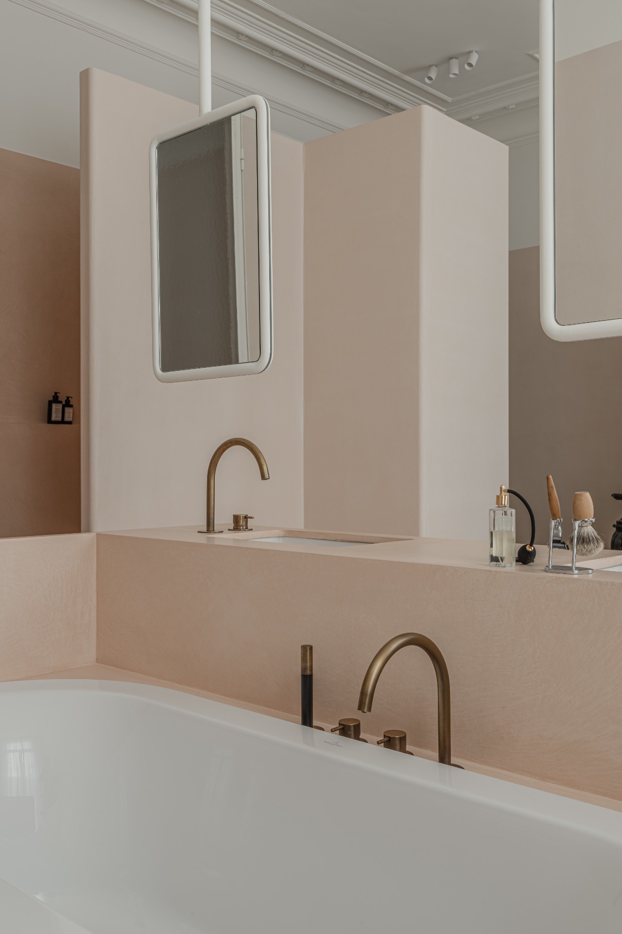
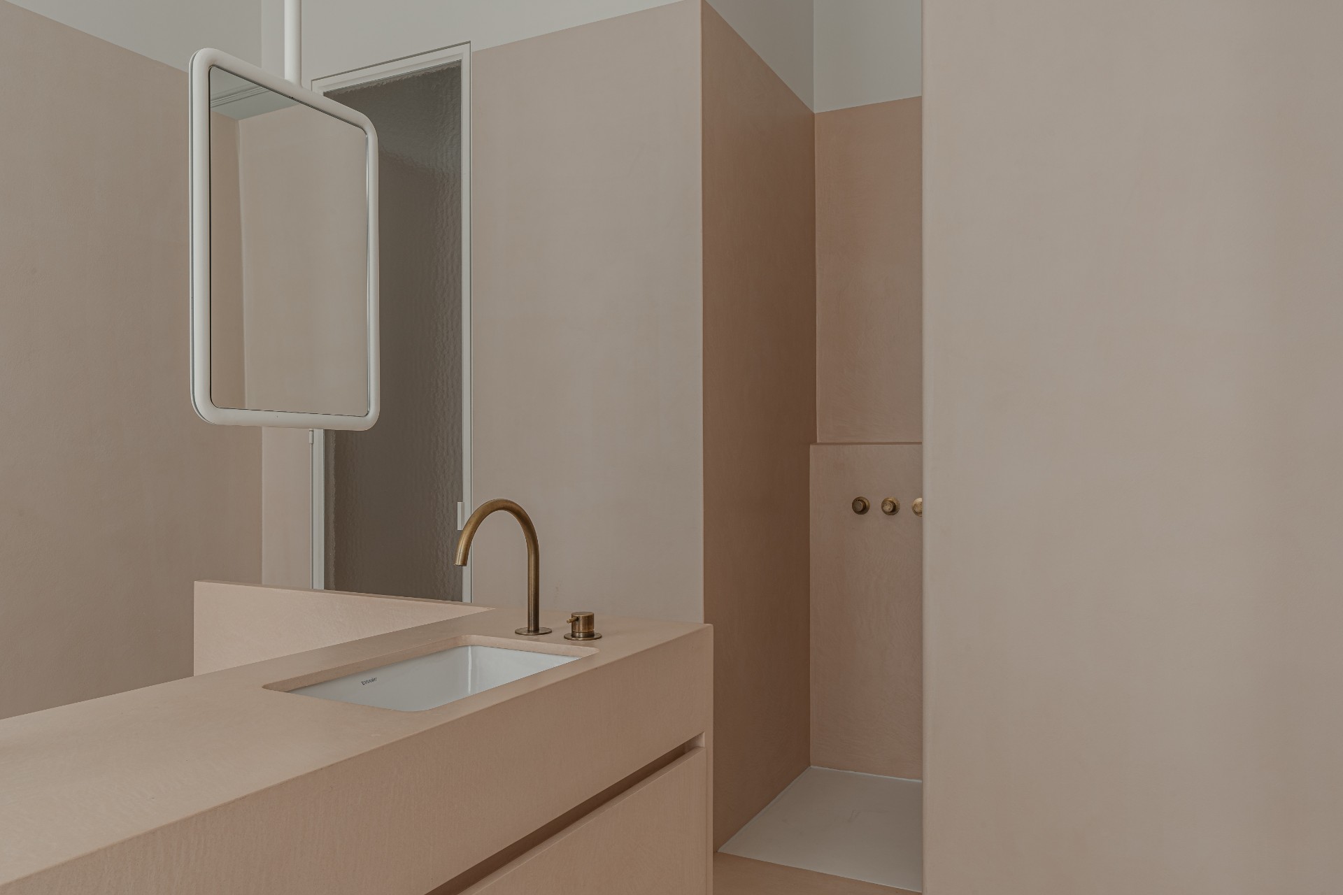
The bathroom and wash area continue the same palette, but with a more compact reading. A marble-look bathroom vanity runs under rectangular mirrors with rounded corners, and the basin surfaces are integrated into the top rather than added as separate pieces. The effect is crisp, but not glossy. Panelled wall sections beside the basin include recessed openings that repeat the project’s interest in niches, just in a quieter domestic scale. The whole arrangement stays close to the wall, keeping the room clear and easy to read.
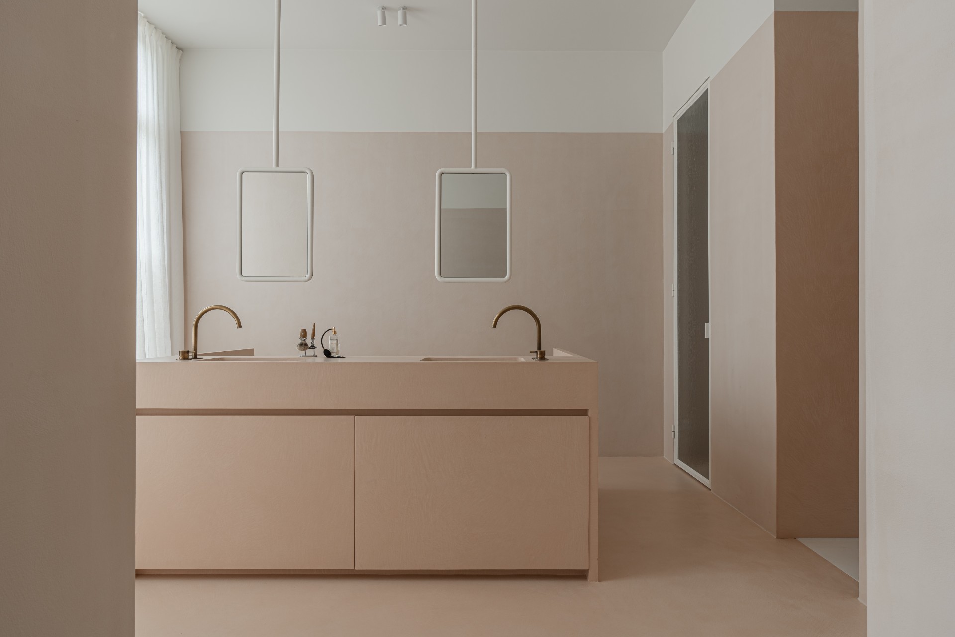
Elsewhere in the wash zone, a longer vanity stretches beneath two mirrors, each set in a neat rectangular outline with softened corners. The symmetry is straightforward, yet the rounded mirror edges prevent the composition from feeling too hard. The pale worktop, the lower cabinets and the wall recesses line up carefully, so the bathroom feels ordered through proportion rather than decoration. It is one of the clearest examples of how the project uses custom cabinetry to shape everyday routines.
Materials kept in a narrow range
Across the interior, the palette stays deliberately limited: white, ecru, beige, light grey and timber. That restraint lets small changes in texture matter more. The wood floor introduces grain; the concrete-look shelving adds a matte surface; the marble-look tops bring a softer veining; and the curtains absorb light instead of bouncing it back. Nothing competes for attention. Even the hanging globes above the island and the rounded sofa arms repeat the same soft geometry found in the mirrors and recessed openings.
Seen as a whole, the project works through alignment and measured contrast. Ceiling ornament, custom joinery, the kitchen island and the glazed openings each hold a clear role, and the rooms move between them without visual clutter. What remains is a bright modern interior shaped by edges, recesses and long lines of light, with the garden always present at the far side of the glass.
Want to see more of LO Architectuur? View the page of LO Architectuur for even more great projects and company information.



NEW 2026 Jubileum Edition The Best Interior Designers Benelux
Order Now €125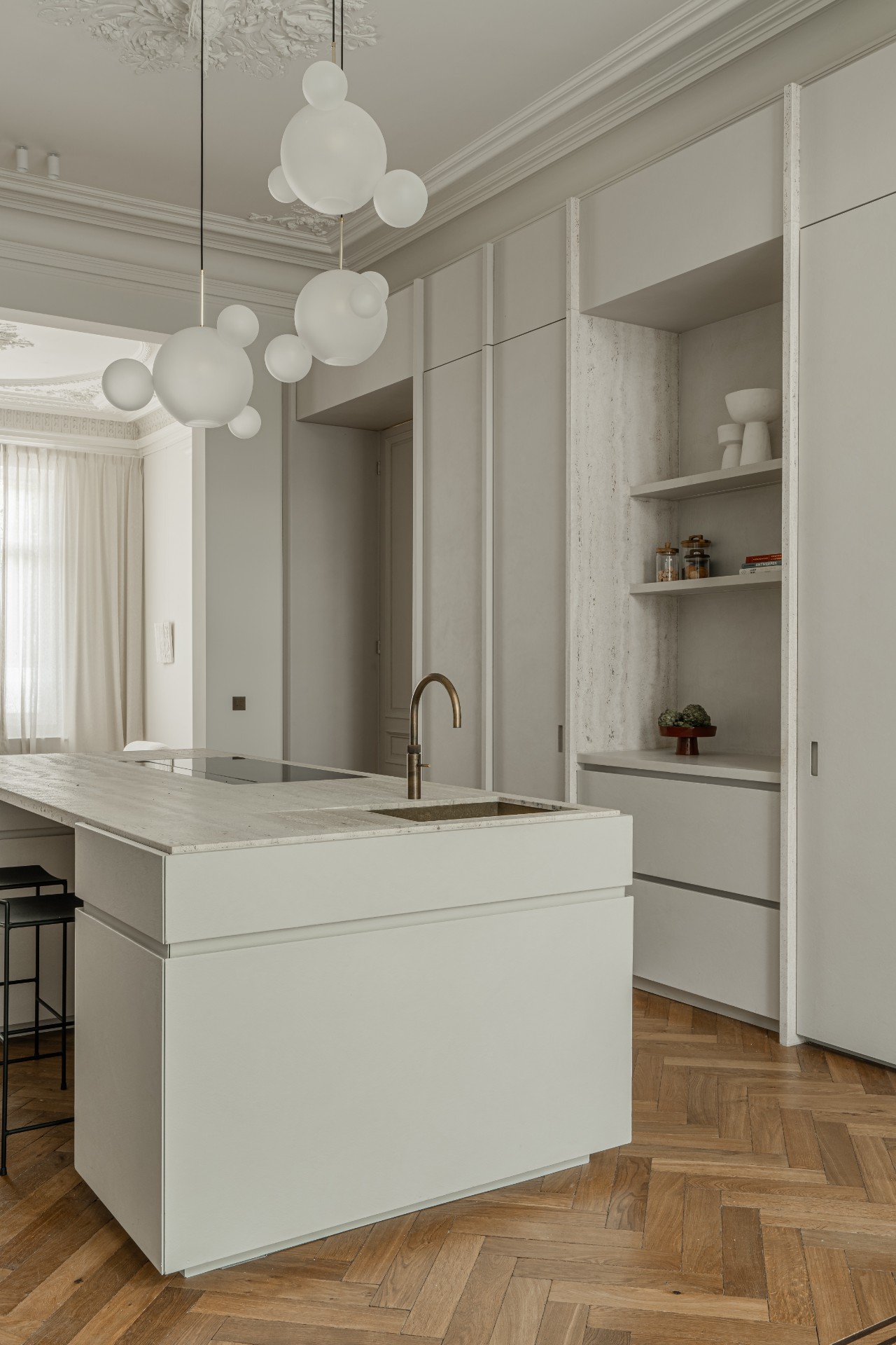
NEW 2026 Jubileum Edition The Best Interior Designers Benelux
Order Now €125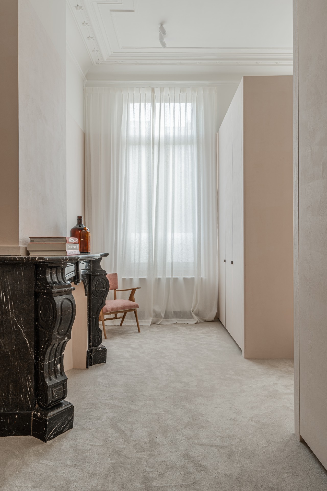
NEW 2026 Jubileum Edition The Best Interior Designers Benelux
Order Now €125