Bright townhouse interior with open kitchen and classic details
Daylight sets the tone from the first view: pale walls, white joinery and a clear line of sight from one room to the next. In this bright townhouse interior, the renovation uses the existing character of the house as a starting point rather than covering it up. Ceiling ornament, profiled trim and generous openings remain visible, while the new work stays restrained. The result is a light-filled interior where the eye keeps moving, from the entrance to the living spaces and onward through the house.
Space that opens up without losing the house’s character
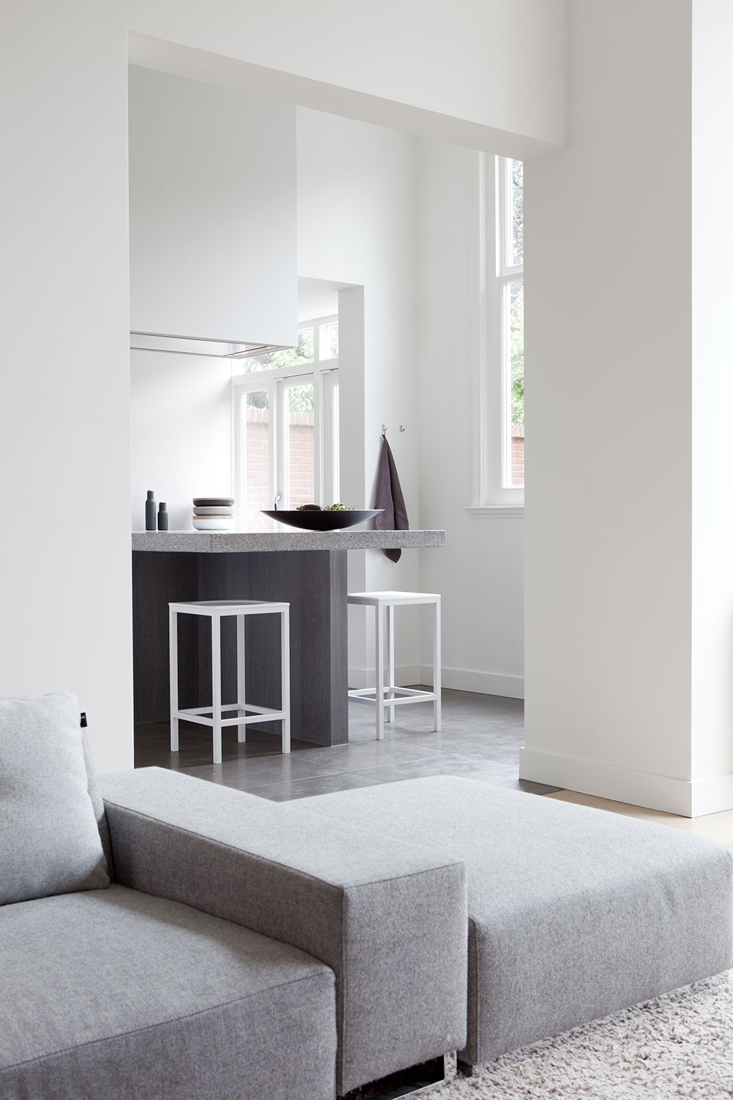
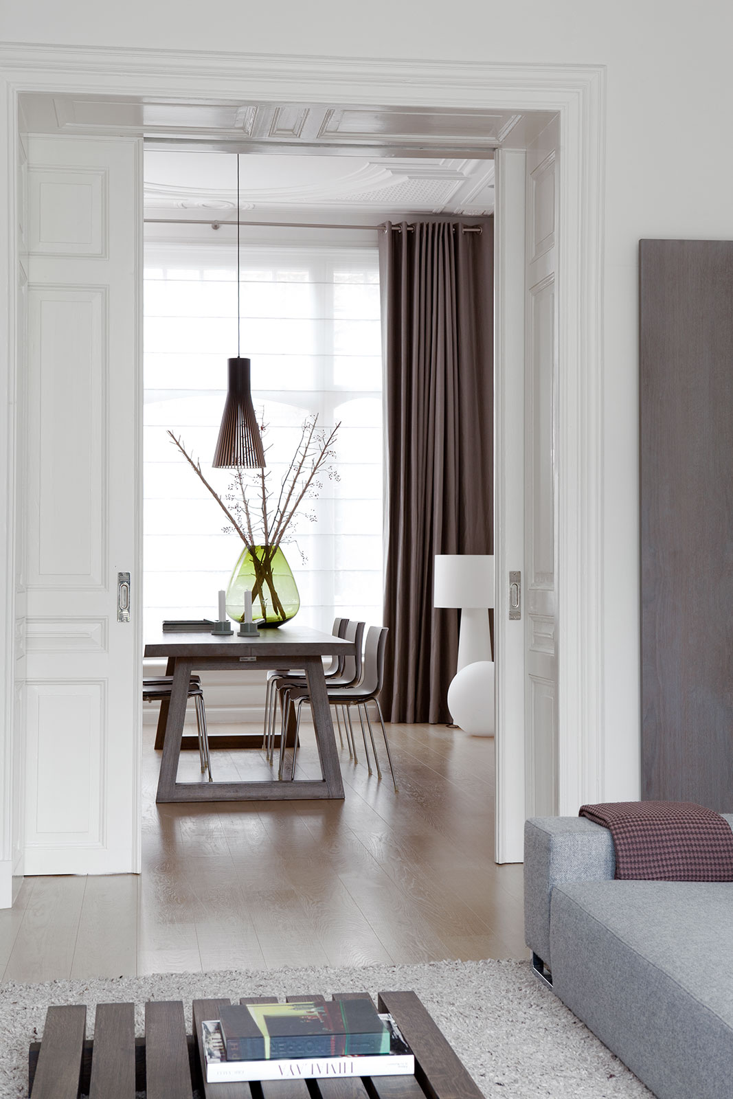
The strongest move is the open concept kitchen living room, which brings kitchen and living functions into one wider zone. That change lets daylight travel deeper into the plan and gives the room a steadier rhythm of light and shadow. Large openings and sliding doors interior details reinforce the connection between spaces, so each room reads as part of the same composition. The white finish of the walls keeps the surfaces calm, while the outlines of doors, frames and wall panels remain crisp and visible.
Instead of flattening the townhouse into something anonymous, the renovation keeps the older proportions legible. Door surrounds, ceiling ornament and wall framing are not treated as decoration on top of the interior; they shape how the rooms are read. Against that classical structure, the newer elements are deliberately straight-lined. Custom joinery sits flush with the walls, and the built-in volumes avoid unnecessary depth or ornament. That contrast gives the bright townhouse interior its clarity.
Classic interior details carried forward
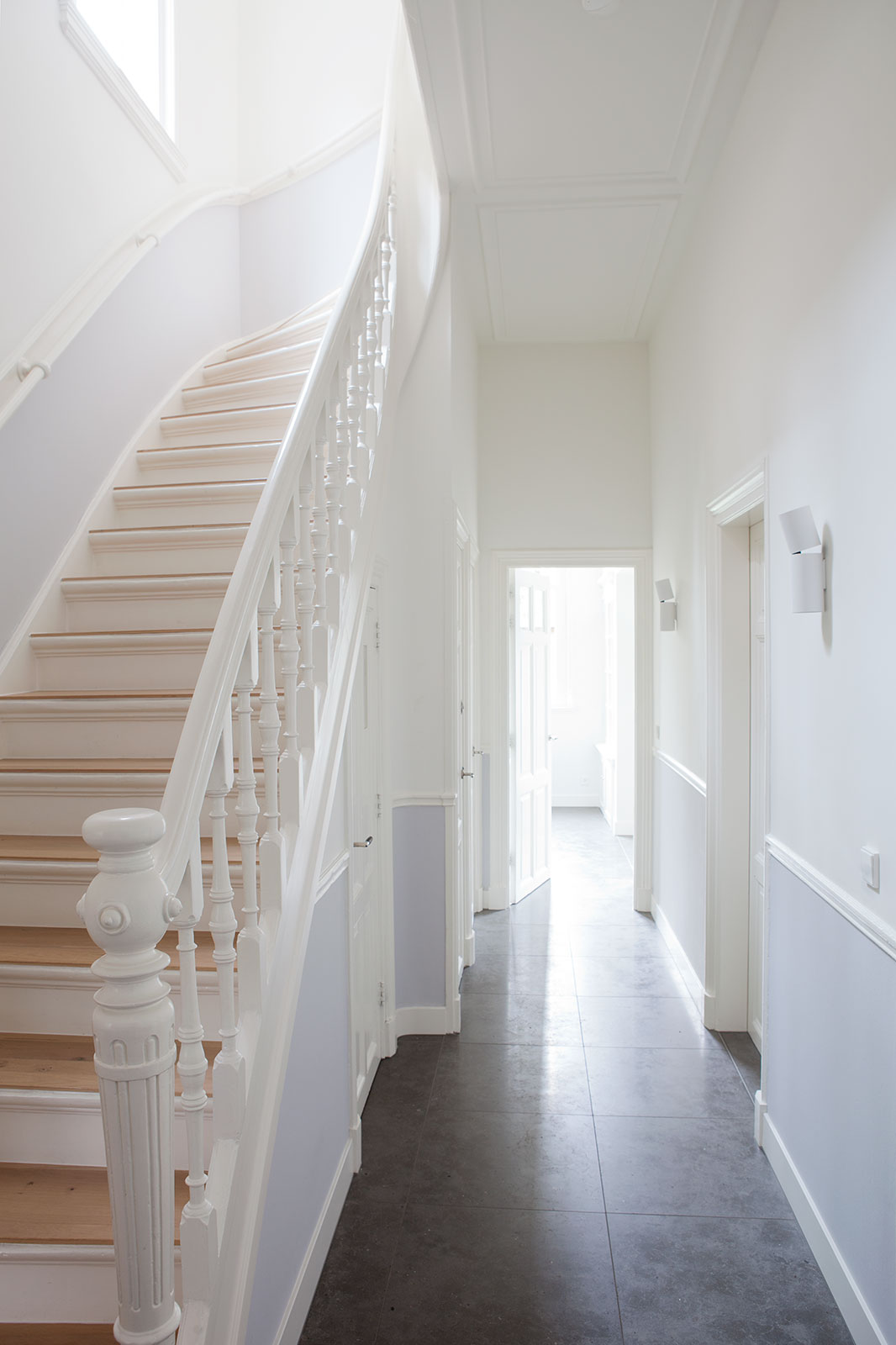
The classical layer is easy to spot in the profiled plasterwork, the ornate ceiling pieces and the framed wall sections that appear throughout the house. These classic interior details create pauses in the otherwise open sequence of rooms. On the staircase, the white balusters and panelled walls continue that language in a more vertical setting, where the route between floors is as present as the rooms themselves. The detailing is modest in colour, but precise in outline, which keeps it present without overpowering the lighter scheme.
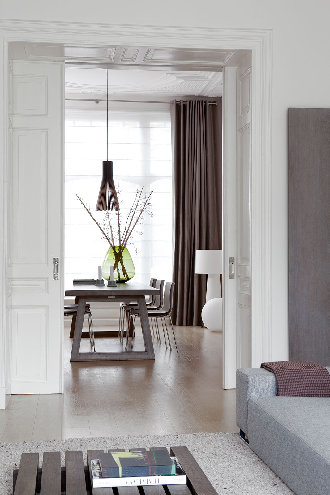
Sliding openings and framed passages make the transitions feel considered. In several views, the house reveals itself in layers: a room opens into another, then into a third, with thresholds marked by white profiles and dark curtains where needed. That sequence works well in a townhouse, where depth matters. The spaces do not depend on one oversized gesture. Instead, they are linked through sightlines, proportion and the careful placement of openings that let daylight pass through the centre of the interior.
Living and dining spaces in one visual field
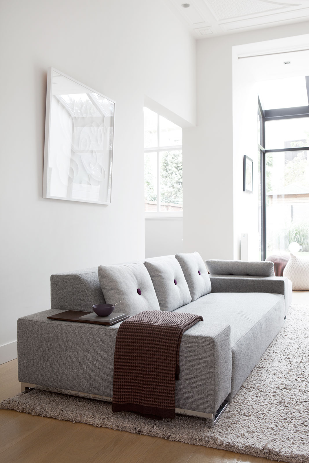
The living area and dining zone share the same visual language. A neutral palette of white, cream and light grey keeps the background quiet, while wood adds a warmer note in tables, cabinet fronts and selected details. In one room, a built-in seating element sits low against a pared-back wall; in another, a television wall is integrated into cabinetry with clean edges. These interventions keep the room free from clutter and let the furniture read as part of the architecture rather than an afterthought.
Daylight becomes more tangible near the larger windows, where a grey sofa and simple plinths are set against bright wall surfaces. The effect is not about decoration but about spacing: the house leaves room for the window openings to do their work. Darker curtains appear in a few views, drawing a vertical frame around the glazing and giving the interior a slower edge. The overall impression is of a light-filled interior that still has enough surface variation to avoid feeling flat.
A kitchen defined by clean lines and stone texture
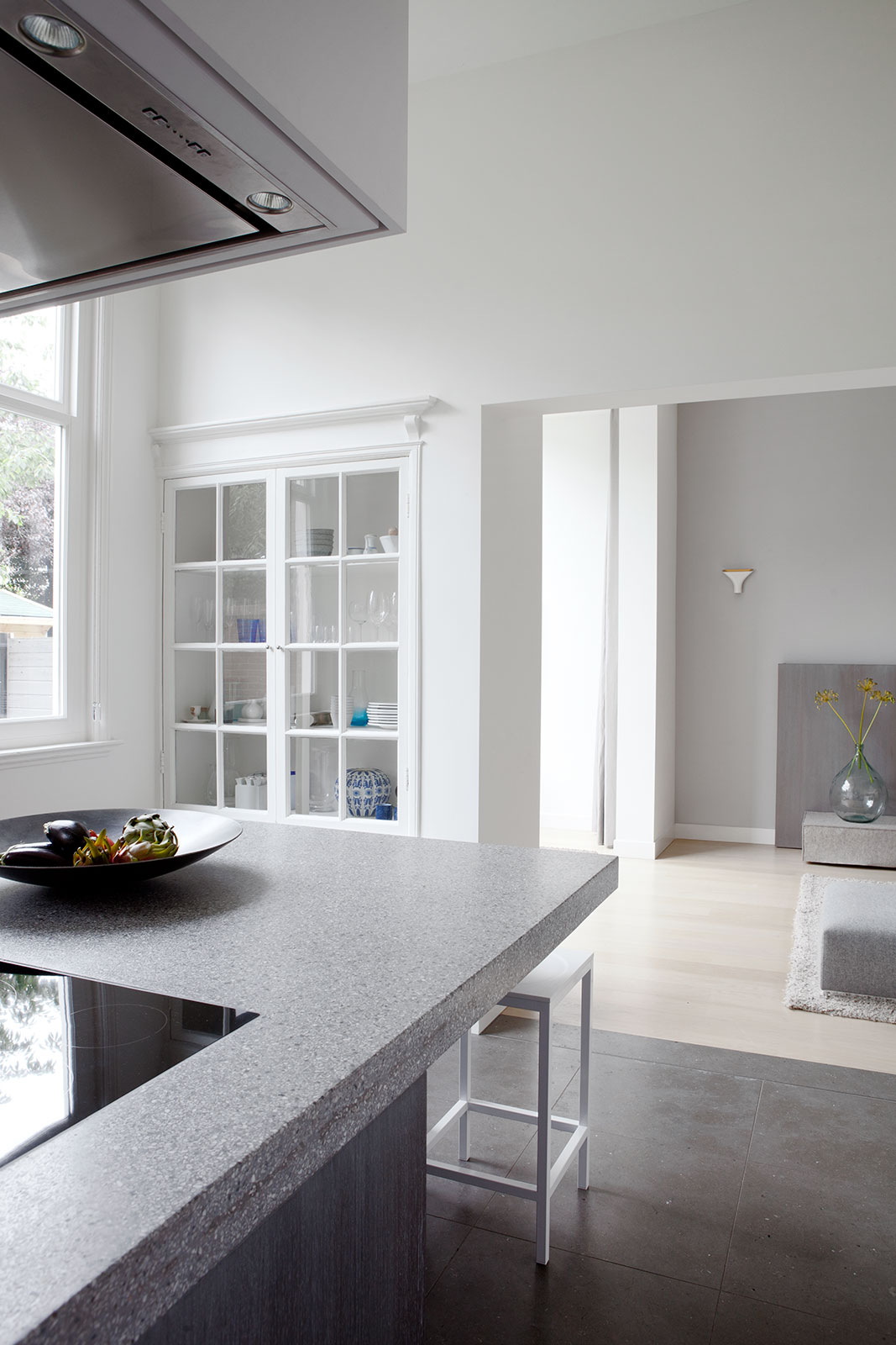
The kitchen is built with a clear, restrained hand. White cabinetry runs in long planes, and the worktop has a stone-like finish that adds weight to the otherwise pale room. In the open concept kitchen living room, that material shift matters: it anchors the kitchen without isolating it. Glass-fronted cabinet sections and open shelving appear in select places, but most of the composition stays closed and measured. The result is a kitchen that works as part of the townhouse interior rather than as a separate display piece.
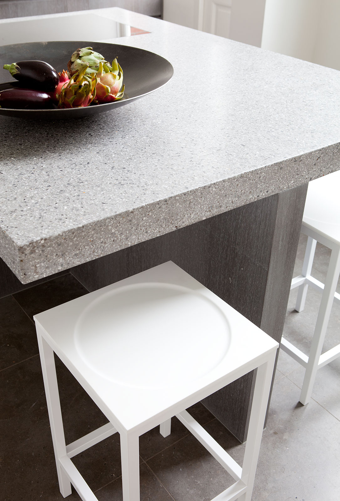
Close-up views make the material story more specific. The countertop edge, the integrated sink zone and the dark base elements show a practical build-up without visual noise. Hout accents appear in a controlled way, softening the white surfaces and connecting the kitchen to the rest of the house. The stone look is repeated in smaller details elsewhere, including wall surfaces and tiled finishes, which helps the interior feel consistent without becoming repetitive. Even in the most functional zones, the lines stay calm and direct.
Custom joinery that keeps surfaces disciplined
Across the house, custom joinery takes over where loose furniture would have broken the line. Tall cabinets, low built-in benches and integrated storage all sit tightly against the walls. That makes the rooms easier to read. The joinery does not compete with the classic framework; it slots into it. In the living room, this approach allows the seating and storage to share the same wall plane. In the kitchen, it keeps the composition compact and leaves the circulation clear.
The materials remain deliberately limited. White surfaces, wood tones and stone-like finishes appear repeatedly, but each one is used for a different effect. White holds the light. Wood breaks up the severity of the larger planes. Stone adds density at the points where the hand touches the house most often: the worktop, the basin area, the floor in some zones. This measured palette suits a modern classic interior, where texture matters more than contrast for its own sake.
Details that give the townhouse its rhythm
What gives the renovation pace is the way the rooms shift from open to enclosed and back again. A framed opening leads into a dining space; a stair landing turns into a moment of ornament; a cabinet wall resolves into a blank plane. The architecture keeps moving, but never hurriedly. That is also why the bright townhouse interior feels settled. It relies on thresholds, not tricks. Light, profiles, joinery and openings carry the project, and each of them is allowed to remain legible.
Seen as a whole, the interior is not about erasing the past or copying it. It keeps the older shell visible and uses the new work to sharpen it. The classical details set the tone, the open plan improves daylight, and the custom elements hold the rooms together. That balance between visible structure and measured intervention is what gives this renovated townhouse its character. The house reads clearly, from the first white doorway to the last stretch of cabinetry and stone.
Want to see more of Remy Meijers? View the page of Remy Meijers for even more great projects and company information.




NEW 2026 Jubileum Edition The Best Interior Designers Benelux
Order Now €125

NEW 2026 Jubileum Edition The Best Interior Designers Benelux
Order Now €125