









Classic luxury interior with marble fireplace and round pendant lighting
The first thing that reads clearly is the round pendant light, suspended like a marker above the marble fireplace. Around it, the room stays restrained: pale plaster surfaces, dark trim, and a fireplace surround cut with sharp edges and shallow profiles. The contrast is direct rather than decorative. It lets the stone, the light, and the finish of the walls do the talking, which is exactly what gives this classic luxury interior project its focus.
A marble fireplace framed by light and shadow
The marble fireplace detail anchors one of the main views. Its surround is built up with ledges, panels, and a defined mantel line, so the eye moves across the surface instead of stopping at one flat plane. On top, a small decorative arrangement adds a darker note against the pale stone. Above it, the round pendant light interior element softens the geometry and keeps the composition from feeling rigid. The result is measured, but never plain.
That mix of stone, plaster, and darker accents continues through the room. Dark wooden doors and furniture pieces break up the lighter envelope, while the walls keep their classic plasterwork and trim along ceiling edges and junctions. Those lines are not background detail here; they guide the room. In a classic luxury interior project, small changes in profile matter, and this one uses them to make the space feel built rather than simply furnished.
Waiting area details that carry the room
One of the clearest zones is the waiting area, where a long red bench runs under a round pendant light. The bench introduces color without competing with the architecture, and its length stretches the room horizontally. Along the window wall, curtain rails or slim slats create a second layer of line and shadow. Underfoot, the parquet floor and stone references keep the surface varied, so the room feels assembled from materials rather than from decoration alone.
The seating area also shows how the interior avoids excess. The pale wall finish stays calm, but the red upholstery gives the space a visible centre. Nearby, dark furniture and door details add weight, which keeps the lighter finishes from drifting into softness. The balance comes from surfaces with different reflections: matte plaster, polished-looking stone, and the warmer grain of wood. That mix is repeated throughout the classic luxury interior project, making the waiting zone feel like part of a larger composition.
Light over the seating zone
The round pendant light interior feature appears again here as a clear focal point. Its shape is simple, but the scale matters. It hangs low enough to register as an object, not just a source of light. Because the surrounding finishes are quiet, the pendant becomes part of the room’s structure. It marks the seating area, ties the red bench to the ceiling plane, and helps the interior read as a sequence of deliberate zones rather than one open field.
Classic plasterwork and trim across the walls
What gives the project its character is not ornament piled on top of the room, but the way the classic plasterwork and trim are set into the edges. Ceiling transitions are drawn with profiles, wall panels sit inside broad pale fields, and dark skirting lines sharpen the lower edge of the rooms. These details show up in several views, especially where the walls meet doors and openings. The overall effect is quiet, but the workmanship is visible in every line.
In one of the more neutral rooms, large light wall panels sit beside a dark desk and office chair. The paneling is smooth and broad, which makes the furniture read more clearly. A slim light line in the wall or niche introduces a precise horizontal detail, almost like a cut in the surface. This office wall paneling does not try to dominate the room; it gives a clean backdrop that lets the darker pieces stand out.
A work zone with clear edges
The work area is defined by contrast. A dark chair, a dark desk surface, and large pale panels create a strong difference between mass and background. The parquet floor keeps that contrast from becoming stark, because its pattern adds texture under the more controlled wall surfaces. In this part of the classic luxury interior project, the office wall paneling is less about display and more about order: it frames the desk, catches the light, and keeps the room visually calm without flattening it.
Steps, stone, and the route through the interior
The stair zone introduces another material shift. Here, the treads read as stone or tile-like surfaces, paired with balusters and a dark handrail. The wall beside the stairs keeps the same classic language as the other rooms, with base details and layered surface treatment rather than a plain plaster plane. This is where the interior becomes more sectional. The route changes, the floor changes, and the railing creates a strong vertical rhythm that breaks the movement into pauses.
Dark wooden doors appear again near the stair area, reinforcing the project’s restrained use of contrast. They sit against light walls and pale trims, so their weight is immediately visible. Nothing here feels accidental. Even the shift from parquet floor and stone references to the stair landing is carefully legible through surface rather than through signage or ornament. That clarity helps the project hold together while still letting each zone keep its own character.
Parketvloer en steen in a measured palette
The combination of parquet floor and stone is one of the strongest recurring materials in the interior. The wood brings grain and a slightly warmer base tone, while the stone elements add a harder, more reflective note. Together they keep the rooms from feeling one-dimensional. In the brighter spaces, the floor helps the pale walls stand out; in the darker zones, it softens the transition between furniture, doors, and wall panels. This material pairing gives the classic luxury interior project a clear rhythm from room to room.
Across the whole sequence, the same idea returns in different forms: round pendant light interior moments above seating and stone, marble fireplace detail as a focal wall, office wall paneling as a plain but exact background, and classic plasterwork and trim holding the edges in place. The rooms do not rely on one dramatic gesture. Instead, they use proportion, surface, and a controlled mix of light and dark to keep each area readable. That is where the project’s strength sits, in the details that are visible before anything else is named.
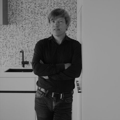
Want to see more of Steven van Compernol? View the page of Steven van Compernol for even more great projects and company information.



NEW 2026 Jubileum Edition The Best Interior Designers Benelux
Order Now €125


